
ABSTRACT
Our regional graphic maps deprivation for small neighbourhoods in England in a way that enables the extent, distribution and spatial structure of deprivation to be perceived at multiple levels of geography. All 32,844 neighbourhoods are depicted using rectangles of constant size and with an approximate geographical arrangement. This approach overcomes familiar cartographic challenges when representing demographic data, exposing local pockets of deprivation that would otherwise be obscured in a conventional map. Neighbourhoods are nested hierarchically, and this hierarchy is emphasized in our design, allowing analysis within and between regions. The graphic reveals important spatial processes – rich patterns of continuity and discontinuity at multiple spatial scales – that may not be as effectively represented using non-visual means.
BACKGROUND
First published in 2000, The English Index of Multiple Deprivation 2019 (IMD) measures relative deprivation at the small area neighbourhood level in England. The IMD is built using various nationally administered datasets organized into seven deprivation domains. It is a relative measure of deprivation; the neighbourhoods on which the IMD is built, lower layer super output areas (LSOAs), are ranked from 1 (most deprived) to 32,844 (least deprived). The IMD appears routinely in the popular press when discussing issues of inequality and is used in government for targeting funding, assessing need and evaluating policy impact (Noble et al., Citation2019).
As a relative indicator, the IMD is typically analysed by assigning LSOAs into quantile bins, most often deciles. Standard practice in government reports (e.g., Noble et al., Citation2019) is to group data over some administrative hierarchy and use frequency-based statistical summaries and graphics to show how LSOAs are distributed by IMD decile. Once decisions around the level of aggregation are made, depicting both the distribution and geography of the IMD graphically is not straightforward. The usual challenge of salience bias of sparsely populated areas applies especially to the IMD dataset. Areas containing the highest amounts of deprivation are most often found in cities and towns, the parts of a conventional map that are the least visually salient. This makes judgements around the absolute and relative distribution of LSOAs by IMD decile impracticable. Our regional graphic (), a spatially ordered treemap (Wood & Dykes, Citation2008), is one approach to dealing with this problem.
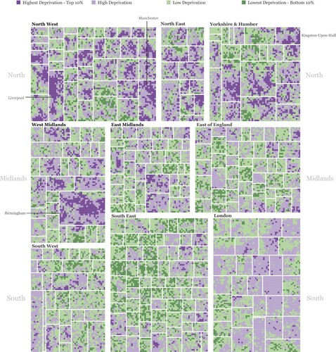
Figure 1. Spatially ordered treemap (Wood & Dykes Citation2008) of 32,844 lower layer super output areas (LSOAs) in England, nested within local authority and region, and given an approximate geographical arrangement. Each LSOA is depicted using a rectangle of equal size. LSOAs are coloured according to Index of Multiple Deprivation 2019 (IMD) rank and using a ColorBrewer diverging scheme (Brewer Citation2002).
MOTIVATION AND RESEARCH QUESTIONS
We wished to design a graphic that depicts the IMD such that the quantity, distribution and geography of deprivation could be reliably perceived. The graphic needed to support a synoptic overview of IMD across the country, comparison of regions and subregions according to relative levels of deprivation, and identification of localities around the extremes of this distribution. Research questions that guided our design are as follows:
RQ1: To what extent is there spatial structure between and within regions in the distribution of the IMD?
RQ2: Where and what is the pattern of spatial concentration at the extremes?
THE GRAPHIC
Footnote1 is a spatially ordered treemap (Wood & Dykes Citation2008) with a three-level hierarchy. Each data item (an LSOA) is represented with the same graphical element (a rectangle) and occupies the same graphic area. LSOAs are nested within local authorities and then further within regions – and this hierarchy is visually reinforced using containment. At each level of the hierarchy, LSOAs, local authorities and regions are given a two-dimensional geographical arrangement, generated using the layout algorithm published by Wood and Dykes (Citation2008). This is an approximate arrangement. Many spatial relations are displaced with the familiar ‘shape’ of the country’s regions distorted.
That the layout is space-filling means that we can accommodate and make discernible all 32,844 LSOAs. Size comparisons can be reliably made because each element is a consistent shape and size – the graphic works in a similar way to count arrays or waffle charts in this respect. This enables judgements around how much deprivation exists in different parts of the country. Crucially, the fact that LSOAs are nested hierarchically and arranged geographically means that both categorical aggregation and spatial patterns can be discerned.
Each rectangle representing an LSOA is coloured according to a binned IMD rank and using a diverging ColorBrewer scheme (Brewer, Citation2002). Four bins were selected: top 10% most deprived, 11–50% most deprived, 11–50% least deprived and top 10% least deprived. The extremes of the IMD distribution tend to be of greatest interest to policymakers when allocating resources, and so we tried to reflect this priority with our choice of bins.
INTERPRETATION
An initial scan of the graphic allows regions to be compared and ranked according to deprivation (RQ1): the deep purple representing high deprivation areas at the top of the graphic (northern regions); mid-purple representing mid-deprivation areas in most of the bottom right (London), and dark green representing the least deprived areas in the bottom middle (South East). For those familiar with England’s socioeconomic geography, this pattern is as expected. It makes sense that most LSOAs in London are classified in the mid-deprivation bins. The IMD is a measure of deprivation and not affluence – it looks only for residents presenting in the deprivation domains. London perhaps uniquely contains neighbourhoods that are socioeconomically diverse, and this diversity appears to have a regression-to-the-mean-type effect on its IMD scores. Also immediately obvious is the fact that deprivation concentrates geographically: areas of dark purple and dark green in contiguous blocks.
Looking in more detail at the extremes (RQ2), Birmingham is most apparent in containing LSOAs in the highest deprivation decile. This is partly due to its size; Liverpool and Manchester (labelled) also contain LSOAs with consistently high deprivation. Kingston-upon-Hull is noteworthy. It contains many LSOAs in the highest deprivation decile, and whilst these areas are spatially concentrated, they do not form a single block – the distribution of high deprivation in this local authority can be described as multimodal.
IMPLEMENTATION
The 2019 IMD dataset and data describing the geographic centres of LSOAs were collected from the Housing, Communities and Local Government website.Footnote2 The graphic was built in TableauFootnote3 and the two-dimensional arrangement using treeMappa.Footnote4
DISCLOSURE STATEMENT
No potential conflict of interest was reported by the authors.
Additional information
Funding
Notes
1 For an interactive version via Tableau Public, see https://public.tableau.com/profile/robradburn/#!/vizhome/IMD2019/IMD2019.
4 See http://www.treemappa.com/.
REFERENCES
- Brewer, C. A. (2002). ColorBrewer: Color advice for maps. https://colorbrewer2.org/
- Noble, S., McLennan, D., Noble, M., Plunkett, E., Gutacker, N., Silk, M., & Wright, G. (2019). The English indices of deprivation 2019. Ministry of Housing Communities & Local Government.
- Wood, J., & Dykes, J. (2008). Spatially ordered treemaps. IEEE Transactions on Visualization and Computer Graphics, 14(6), 1348–1355. https://doi.org/https://doi.org/10.1109/TVCG.2008.165