?Mathematical formulae have been encoded as MathML and are displayed in this HTML version using MathJax in order to improve their display. Uncheck the box to turn MathJax off. This feature requires Javascript. Click on a formula to zoom.
ABSTRACT
This study identifies pediatric cancer clusters in Florida for the years 2000–2015. Unlike previous publications on pediatric cancers in Florida, it draws upon an Environmental Protection Agency dataset on carcinogenic air pollution, the National Air Toxics Assessment, as well as more customary demographic variables (age, sex, race). The focus is upon the three most widely seen pediatric cancer types in the USA: brain tumors, leukemia, and lymphomas. The covariates are used in a Poisson regression to predict cancer incidence. The adjusted cluster analysis quantifies the role of each covariate. Using Florida Association of Pediatric Tumor Programs data for 2000–2015, we find statistically significant pediatric cancer clusters, but we cannot associate air pollution with the cancer incidence. Supplementary materials for this article are available online.
1 Introduction
Amin et al. (Citation2010) studied the clustering of pediatric cancer incidences in Florida for 2000–2007. The paper used data from the Florida Association of Pediatric Tumor Programs (FAPTP), and focused on the three major subtypes of pediatric cancers: brain tumors, leukemia, and lymphoma. The study initially adjusted for age and sex, but not race, because of the likelihood that race and environmental pollution are confounded with each other (see American Academy of Pediatrics, Committee on Pediatric Research 2000). If so, then adjusting for race could remove some of the possible effect that pollution has on cancer rates. It is more likely that race is associated with cancer mortality which is known to be associated with environmental pollution, but this may not be the case for cancer incidence. To have a better understanding of the role of race on the pediatric cancer incidences, we then adjusted for race in addition to age and sex in this study for data covering the period 2000–2015. To study the possible relationship between pollution and cancer incidence directly, this paper uses the Environmental Protection Agency (EPA)’s National Air Toxics Assessment (NATA) dataset on carcinogenic air pollution. The EPA provides good documentation of the data sources along with the types of carcinogenic pollutants that went into the NATA score to assess cancer risk. The latest NATA survey released by the EPA by 2017 was in 2011, which gives a relatively short exposure time between exposure and disease expression for the cancers considered. An option would be to use the NATA 2005 results instead. It is assumed that carcinogenic releases by major chemical companies into the air do not change abruptly from year to year. We perform a purely spatial analysis for the data covering the years 2000–2015 using the software SaTScan under a Poisson model. Also, we find several statistically significant spatial clusters, notably near Miami and Jacksonville.
In 2014, the journal Statistics and Public Policy had five teams of statisticians and epidemiologists independently analyze the FAPTP data for the years 2000–2010. The analysts used different models and made different assumptions, and the five papers were published in a special issue of the journal: Amin et al. (Citation2014), Lawson and Rotejanaprasert (2018), Wang and Rodriguez (Citation2014), Heaton (Citation2014), and Zhang, Lim, and Maiti (Citation2014). Waller (Citation2015) provided a detailed overview of each of the five articles on the pediatric cancers in Florida, along with a very useful comparison of the characteristics of each of the approaches used. In particular, he discussed four specific questions that each of the five research articles addressed slightly differently, with the common goal to identify clusters if they existed (Waller Citation2015). The questions were: (i) Which general question do we want to answer? (ii) Which type of data are available to address that question? (iii) Which specific questions does each methodology answer? (iv) What do the answered questions reveal about the motivating primary question? No method was declared as being inferior or superior. The methods used differed based on what the goals were in each of the five research articles that analyzed dataset. Our main goal here is to test for any outlying values in cancer rates, and to make our current results more comparable with our past two articles on this topic. We want to strive for comparability without compromising the improvements represented in this paper in comparison to those used previously. For these reasons we opted to use SaTScan as was done in our past two papers on pediatric cancers in Florida (Amin et al. Citation2010, Citation2014). Using the same surveillance software package will reduce any differences in how clusters are identified, and this should allow for a clearer comparison with our past papers. This paper extends the work of Amin et al. (Citation2014) in three ways; (i) it covers a longer span of time (2000–2015), (ii) it brings in the EPA’s NATA carcinogenic data, and (iii) it now also adjusts for race.
2 Data
The FAPTP data consist of cancer incidence counts for children aged 0–19 years for the years 2000–2015. FAPTP is not the only source of data on pediatric cancers in Florida, but it is one part of a system by which the Florida Cancer Data System (FCDS) collects such data. FAPTP is a reliable source for pediatric cancer data in Florida (Krischer et al. Citation1993; Roush et al. Citation1993). Amin et al. (Citation2010) provide a useful discussion of the FAPTP data. The data on leukemia, lymphoma, and brain/CNS cancers include information on year of birth, age, and residence at the time of cancer diagnosis, sex, race, and the FAPTP diagnosis code.
The population data were obtained from the 2000 US Census and the 2010 U.S. Census. Linear interpolation provided estimates for the years 2001–2009. For the years 2011–2015, we used estimates from the Census Bureau’s American Community Survey (ACS). Since the ACS population data are based on sampling, each population estimate has an associated confidence interval (Spielman and Folch Citation2015; Spielman and Singleton Citation2015). However, we did not make use of such confidence intervals to modify the analyses for the years 2011–2015 though there are arguments for doing so. A reasonable additional testing for the cluster analysis results could be to study in more depth the demographics of the most prominent cluster by obtaining the standard error of each population estimate, and then compare such errors with population estimates and accompanying standard errors for counties falling outside the cluster. It is well known that having a large sampling error in a small estimate could possibly reduce the usefulness of the estimate. On the other hand, a small sampling error in a large estimate may suggest that the estimate is reliable. Such adjustments or tests are outside the scope of this article.
The EPA collects ambient and exposure concentrations to monitor chemical facilities in the USA, in addition to using street monitors to obtain data for the NATA tool. The 2011 NATA is a national-level risk assessment based on the emissions of air toxics that produces census-tract level estimates of ambient and exposure concentrations for 180 air toxics, plus diesel particulate matter (PM), which EPA assessed for noncancer effects only. Using the concentration estimates for the 180 air toxics and diesel PM, NATA estimates cancer risk and noncancer hazard for 138 of these. For 42 air toxins, concentration estimates are available but not health effect information. The Hazardous Air Pollutant Exposure Model (HAPEM) is used by the EPA to estimate exposure concentrations by combining information on concentrations of ambient air toxins, population data from the U.S. Census Bureau, population activity data, and micro environmental data to estimate the final exposure concentrations in NATA (Office of Air Quality Planning and Standards 2002). The U.S. census data are used to build the simulation population. The EPA calculates a daily-averaged exposure and dose for each individual to obtain a distribution of exposure and dose for the population. The estimates are created from each state at both county and census-tract levels. The sources of the air toxic emissions are categorized as point, nonpoint, mobile on-road, nonroad, biogenic, and fires in the United States.
While the EPA does not provide data or information on specific air pollutants that have been linked to specific pediatric cancer types, the literature includes several articles in which such associations are claimed by the authors. For example, Hernández and Menéndez (Citation2016) and Reynolds et al. (1993) found associations linking pesticide exposure to childhood leukemia. Filippini et al. (Citation2015) provided a review and meta-analysis of outdoor air pollution and risk of pediatric leukemia. Their findings support a link between ambient exposure to traffic pollution and pediatric leukemia risk. García-Pérez et al. (Citation2015) identified excess risk of childhood leukemia for children living near industrial and urban sites which use organic solvents and also industries of glass and mineral fibers.
3 Methods
We used the disease surveillance software SaTScan (Kulldorff 1993; Kulldorff and Information Management Services, Inc. 2009) to identify spatial cancer clusters (Kulldorff and Nagarwalla 2014). No space-time analysis was done as the focus here is on a purely spatial analysis. Our analysis reapplies the methodology in Amin et al. (Citation2010, Citation2014), performing univariate cluster analyses for three cancer types (brain tumor, leukemia, lymphomas). The units analyzed for the cancer rates are ZIP Code Tabulation Areas (ZCTAs). The ZCTAs were created by the U.S. Census Bureau to correct for instability of US Postal Service zip codes over the years 2000–2015, which are based on mail delivery routes (www.census.gov/geo/reference/zctas.html) rather than fixed locations. It is a challenge that matching ZIP codes to ZCTA numbers will match for most, but not all addresses. The ZCTAs incorporate full census blocks, but some ZIP codes may change within blocks. The ZCTA number is associated with the ZIP code that is associated with the majority of addresses within the census block. The census blocks are aggregated to create ZCTAs, and the cancer incidence counts in each ZCTA are used for spatial analysis. We assumed that pediatric cancer counts in each ZCTA follow a Poisson distribution with parameter depending on the location. This method tests the null hypothesis that cancer rates are constant for all ZCTAs in Florida.
The Centers for Disease Control defines a cancer cluster as a statistically significant excess over the expected number of cancer cases among people in a geographic area during a period of time (www.cdc.gov/nceh/clusters/default.htm). SaTScan searches for clusters by imposing a moving window on a map, including different sets of neighboring ZCTAs whose centroids lie within the window. If the window includes the centroid of a specific ZCTA, then this geographical unit is included in the window. For each window, the spatial scan statistic tests the null hypothesis of equal risk of cancer incidence for all ZCTAs against the alternative that there is an elevated risk of cancer for ZCTAs within the scan window.
The likelihood function for the Poisson model is proportional towhere n is the number of cancer incidences within the scan window, N is the total number of cancer incidences in the population, and E is the expected number of cancer incidences under the null hypothesis. SaTScan performs a Monte Carlo approximation of a one-tailed permutation test. It can be shown that for fixed N and E, the likelihood increases as the number of incidences (n) increases in the scan window. This means that the likelihood ratio increases as one adds more incident cases to a potential cluster with a fixed population size and expected number of cases.
The literature is rich with modern cluster analysis algorithms, such as EigenSpot (Fanaee-T and Gama Citation2015) and others, while more established algorithms, such as Moran’s I or the Getis-Ord Gi* or Geary’s C are also options available to researchers. SaTScan can detect outbreak locations on the map and also detect and test for space–time interactions if they exist. Moran’s I or Geary’s C can estimate the strength of clustering or dependence which could be monitored over time to check for any changes. SaTScan allows for circular shaped windows or for elliptically shaped windows, and there is little practical difference between using either type of analysis. The National Cancer Institute seems to be favoring the elliptically shaped cluster, while Martin Kulldorff, the creator of SaTScan, seems to favor the circular clusters. The other methods that Waller (Citation2015) discussed do not assume windows of particular shapes. Also, FleXScan allows for irregular shaped clusters (Tango and Takahashi Citation2005), which is based on the strategy for the detection of arbitrarily shaped clusters (Duczmal and Assunção Citation2004). EigenSpot (Fanaee-T and Gama Citation2015) is a new cluster methodology by which the space–time correlation structure is tracked without making assumptions about the data distribution or hotspot shape. It can handle only a single hotspot for each cluster analysis. There are a variety of cluster analysis algorithms available to the researcher, and our choice to use SaTScan does not imply that other algorithms are inferior.
4 Results
We performed a spatial cluster analysis for five cases:
counts adjusted for age and sex
counts adjusted for age, sex, and race
counts adjusted for age, sex, and air pollution
counts adjusted for age, sex, race, and air pollution
counts adjusted for age, with data for boys and girls analyzed separately
To clarify comparisons between the first two cases, each of the three cancer types is analyzed first by using Poisson regression to obtain residuals representing counts that are corrected for contributions from age and sex, followed immediately by a cluster map that uses cancer counts which were similarly corrected with Poisson regression for age, sex, and race. To show any clusters clearly on each cluster map, the counties falling into a significant cluster are shown in color while the rest of the counties are not colored based on cancer rates. The reason for not being able to show the adjusted cancer rates for each county in Florida is the inability for extracting adjusted rates from SaTScan. In the Appendix, heat maps showing the raw cancer rates for all counties are provided. Only clusters with are considered as being significant. Clusters with p slightly greater than 0.05 may still be shown on the cluster maps since such clusters may warrant some attention if there is future worsening of the situation there. The “Most Likely Cluster” is the cluster that is the most likely cluster not to be due to chance.
shows the annual unadjusted brain tumor rates for Florida and for the “Most Likely Cluster” (based on what is shown in ). The graph shows that brain tumor rates in the cluster stayed above the Florida rates almost each year for 2000–2015, indicating that this spatial cluster is persistent. Brain tumor rates, adjusted for age and sex, yield only one significant cluster (p = 0.00037; RR ), shown in . The area between Jacksonville and Orlando has 60% higher brain tumor rates than the rest of Florida. We also show a nearly significant possible cluster containing Miami, with p = 0.0543 and RR
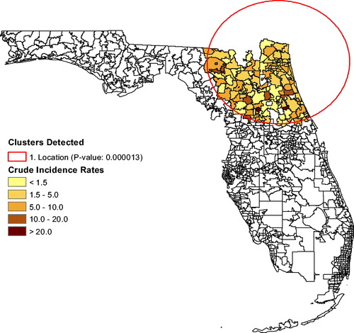
. When we adjust for age, sex, and for race, the first cluster persists, but shifts to the north as seen in . The secondary cluster vanishes, implying that race explains the elevated brain tumor rates near Miami. The race distribution in the population plays a role in the brain tumor clustering.
Fig. 1 Plot of annual unadjusted brain tumor rates (2000–2015).
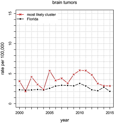
Fig. 2 Cluster map of brain tumor rates adjusted for age and sex (2000–2015).
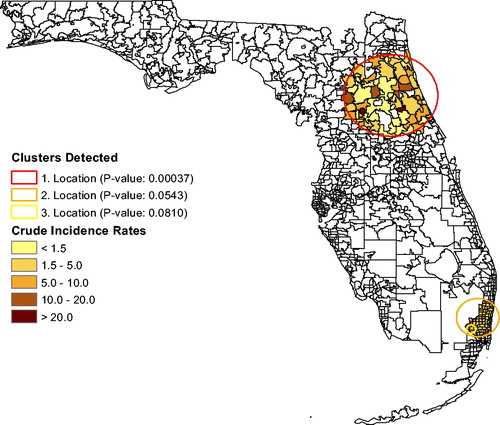
Fig. 3 Cluster map of brain tumor rates adjusted for age, sex, and race (2000–2015).
shows the annual unadjusted Leukemia rates for Florida and for the “Most Likely Cluster” (based on what is shown in ). The graph shows that leukemia rates in the cluster stayed above the Florida rates each year for 2000–2015 except in 2003, indicating that this spatial cluster is persistent. In , and for leukemia rates, the analysis that adjusts for age and sex finds a small (significant) cluster of seven ZCTAs northwest of Tampa near Clearwater (p = 0.0075; RR ). There is a possible secondary cluster near Ocala (p = 0.0547; RR
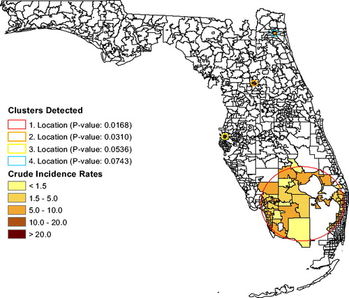
), also shown in , but its p-value exceeds 0.05. Without using race as a covariate, the cluster analysis could be associated with social justice issues regarding the siting of unhealthy industries and occupations. After adjusting leukemia rates for age, sex, and for race, a large cluster emerges in south Florida (p = 0.0168; RR
) based on the race-adjusted risk. Several secondary clusters are also shown in . The large cluster only appeared after adjusting for race, so it is associated with race. The most significant secondary cluster (p = 0.0310; RR
) is located near Ocala, in the same ZCTAs as the brain tumor cluster. The third most significant cluster is close to Clearwater (p = 0.0536; RR
), in the same location as the brain tumor cluster. The last possible cluster is in Jacksonville (p = 0.0743; RR
). While the significance level has been set to 0.05 in this study, it is useful to also report clusters with p-values smaller than 0.10 as clusters that need to be monitored over time for a possible disease outbreak.
Fig. 4 Plot of annual unadjusted leukemia rates (2000–2015).
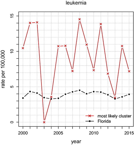
Fig. 5 Clusters of leukemia rates adjusted for age and sex.
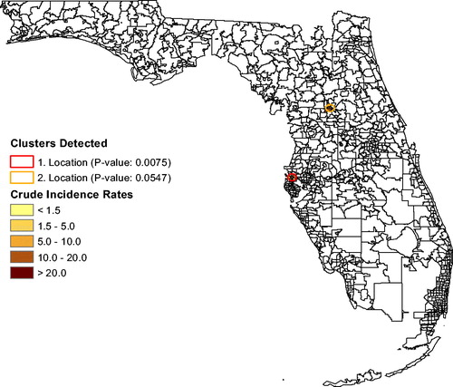
Fig. 6 Clusters of leukemia rates adjusted for age, sex, and race.
shows the annual unadjusted lymphoma rates for Florida and for the “Most Likely Cluster” (based on what is shown in ). The graph shows that lymphoma rates in the cluster stayed above the Florida rates almost each year for 2000–2015, indicating that this spatial cluster is persistent. In , the lymphoma analysis (adjusting for age and sex) finds a cluster of eight ZCTAs north of Miami (p = 0.0091; RR ). Its lymphoma rate is 239% that of the rest of Florida. There are no secondary clusters identified. After also adjusting for race, the same ZCTAs remained a cluster (p = 0.0040; RR
), as seen in .
Fig. 7 Plot of annual unadjusted lymphoma rates (2000–2015).
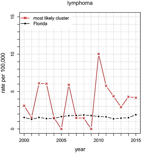
Fig. 8 Clusters of lymphoma adjusted for age and sex.
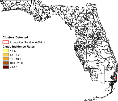
Fig. 9 Clusters of lymphoma adjusted for age, sex, and race.

shows the total cancer risk for each ZCTA in Florida. The darker the coloring of a ZCTA, the higher is the cancer risk. To explore a possible association between cancer and air pollution, we used the software Stata to carry out Poisson regression with covariates age, sex, race, and air pollution (using the NATA data). This methodology is widely used in the literature for adjusting of cancer incidence or mortality for covariates. The NATA data are at the census tract level while data on age, sex, and race are measured at the ZCTA level, so ArcGIS was used to aggregate all data to the ZCTA level for the Poisson regression. We first used Poisson regression to predict counts for each of the three cancer types using age, sex, and NATA. Using the random-effects model, the Poisson regression adjusted for spatial correlation. Next, we repeated this, but also included race in the model. This gives additional insight on the extent to which race is confounded with pollution exposure. Specifically, the regression model for the first case for a maximum likelihood random-effects specification was (see, e.g., Allison Citation2009; Stata Citation2018) as follows:where
and
, with
where X is Poisson distributed with mean
, predictor variables xit
(age, sex, air pollution) and parameter vector β. In the standard random-effects model, vi
is assumed to be iid such that
is gamma distributed with mean one and variance α (estimated from the data). If normal is specified, vi
is assumed to be iid
. For more details on the differences between models using Stata, see chapter 4 in Allison (Citation2009). In the second case, we just added the race covariate to obtain cancer counts (and rates) adjusted for age, sex, race, and air pollution.
Fig. 10 Map of carcinogenic air pollution (EPA National Air Toxics Assessment 2011).
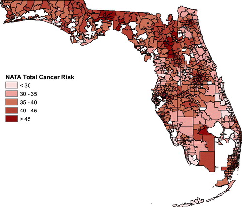
Many epidemiologic studies have shown an association between air pollution levels and mortality in the USA (Gwynn and Thurston Citation2001). In our study, for brain tumors the NATA covariate was not significant () for the model with age, sex, and NATA. When race was added to this model, neither NATA nor race was significant. For leukemia, in the model with age, sex, and NATA, no variable was significant at the 0.05 level, but when race was added, it was significant (p < 0.001) but NATA was not (
). Last, for lymphomas, NATA was not significant for the first model (p = 0.384). When race was added, neither NATA nor race was significant. These results make it clear that carcinogenic air pollution cannot be linked to any of these three cancer types (brain, leukemia, lymphomas) in our study.
Finally, we used SaTScan to study boys and girls separately. It is shown in the literature that there are differences in cancer incidence between males and females in childhood (Dorak and Karpuzoglu Citation2012). They conclude that some cancers are more common in females, but overall, males have higher susceptibility. In this study, for brain tumors in girls it found one significant ZCTA west of Fort Lauderdale with population 1370 (; RR
). But for boys, it identified a large cluster (p = 0.0024; RR
) of 101 ZCTAs close to Jacksonville. For girls, there was one significant leukemia cluster (p = 0.0089; RR
) in southern Florida. For boys, the only significant cluster (p = 0.0231; RR
) was in Fort Lauderdale. There were no significant lymphoma clusters for either boys or girls.
5 Discussion
The most important finding was a negative one, but it is valuable. There is no apparent relationship between the atmospheric carcinogens included in the NATA files and any of the three classes of pediatric cancers considered in this paper. It would be good to see if a similar result holds for water borne carcinogens.
In terms of public health, the analysis found a number of pediatric cancer clusters that appear to be significant and problematic. For brain tumors, the area between Jacksonville and Orlando has small p-value and large relative risk. For leukemia, the area near Clearwater stands out. For lymphomas, there are eight ZCTAs north of Miami that appear dangerous. We note that in some clusters, but not all, the inference depends upon whether one adjusts for race or not. It is noteworthy that for each of the three types of cancer the annual raw rates for the most likely clusters were much higher than the corresponding rates in Florida. Future research could look into the possibility of confounding between race and exposure to carcinogens, which can result from income and education disparities.
Also, we emphasize that a single study, or even a collection of studies, is not definitive. As Waller (Citation2015) pointed out causal epidemiological conclusions are difficult to draw, and that apparent associations often collapse or become ambiguous under closer scrutiny. Nonetheless, the point of this kind of study is to flag locations that appear problematic. It directs future research resources to areas and topics that are more likely to be useful, and can help in prioritizing public health attention.
References
- Allison, P. D. (2009), Fixed Effects Regression Models, Newbury Park, CA: Sage.
- American Academy of Pediatrics (2000), “Race/Ethnicity, Gender, Socioeconomic Status—Research Exploring Their Effects on Child Health: A Subject Review,” Pediatrics, 105, 1349–1351.
- Amin, R., Bohnert, A., Holmes, L., Rajasekaran, A., and Assanasen, C. (2010), “Epidemiologic Mapping of Florida Childhood Cancer Clusters,” Pediatric Blood and Cancer, 54, 511–518.
- Amin, R. W., Hendryx, M., Shull, M., and Bohnert, A. (2014), “A Cluster Analysis of Pediatric Cancer Incidence Rates in Florida: 2000–2010,” Statistics and Public Policy, 1, 69–77. DOI: 10.1080/2330443X.2014.928245.
- Dorak, M. T., and Karpuzoglu, E. (2012), “Gender Differences in Cancer Susceptibility: An Inadequately Addressed Issue,” Frontiers in Genetics, 3, 1–11.
- Duczmal, L., and Assunção, R. (2004), “A Simulated Annealing Strategy for the Detection of Arbitrarily Shaped Spatial Clusters,” Computational Statistics & Data Analysis, 45, 269–286, DOI: 10.1016/S0167-9473(02)00302-X.
- Fanaee-T, H., and Gama, J. (2015), “Eigenspace Method for Spatiotemporal Hotspot Detection,” Expert Systems, 32, 364–454. DOI: 10.1111/exsy.12088.
- Filippini, T., Heck, J. E., Malagoli, C., Del Giovane, C., and Vinceti, M. (2015), “A Review and Meta-Analysis of Outdoor Air Pollution and Risk of Childhood Leukemia,” Journal of Environmental Science and Health, Part C, 33, 36–66, DOI: 10.1080/10590501.2015.1002999.
- García-Pérez, J., López-Abente, G., Gómez-Barroso, D., Morales-Piga, A., Romaguera, E. P., Tamayo, I., Fernández-Navarro, P., and Ramis, R. (2015), “Childhood Leukemia and Residential Proximity to Industrial and Urban Sites,” Environmental Research, 140, 542–553. DOI: 10.1016/j.envres.2015.05.014.
- Gwynn, R. C., and Thurston, G. D. (2001), “The Burden of Air Pollution: Impacts Among Racial Minorities,” Environmental Health Perspectives, 109, 501–506. DOI: 10.2307/3454660.
- Heaton, M. J. (2014), “Wombling Analysis of Childhood Tumor Rates in Florida,” Statistics and Public Policy, 1, 60–67. DOI: 10.1080/2330443X.2014.913512.
- Hernández, A. F., and Menéndez, P. (2016), “Linking Pesticide Exposure With Pediatric Leukemia: Potential Underlying Mechanisms,” International Journal of Molecular Sciences, 17, 461, DOI: 10.3390/ijms17040461.
- Krischer, J. P., Roush, S. W., Cox, M. W., and Pollock, B. H. (1993),“Using a Population-Based Registry to Identify Patterns of Care in Childhood Cancer in Florida,” Cancer, 71, 3331–3336. DOI: 10.1002/1097-0142(19930515)71:10+<3331::AID-CNCR2820711732>3.0.CO;2-S.
- Kulldorff, M. (1997), “A Spatial Scan Statistic,” Communications in Statistics—Theory and Methods, 26, 1481–1496. DOI: 10.1080/03610929708831995.
- Kulldorff, M., and Information Management Services, Inc. (2009), “SaTScan: Software for the Spatial and Space-Time Scan Statistics,” available at www.satscan.org.
- Kulldorff, M., and Nagarwalla, N. (1995), “Spatial Disease Clusters: Detection and Inference,” Statistics in Medicine, 14, 799–810.
- Lawson, A. B., and Rotejanaprasert, C. (2014), “Childhood Brain Cancer in Florida: A Bayesian Clustering Approach,” Statistics and Public Policy, 1, 99–107. DOI: 10.1080/2330443X.2014.970247.
- Office of Air Quality Planning and Standards (2018), “Technical Support Document: EPA’s 2014 National Air Toxics Assessment,” Research Triangle Park, NC 27711.
- Reynolds, P., Von Behren, J., Gunier, R. B., Goldberg, D. E., Hertz, A., and Harnly, M. E. (2002), “Childhood Cancer and Agricultural Pesticide Use: An Ecologic Study in California,” Environmental Health Perspectives, 110, 319–324. DOI: 10.1289/ehp.02110319.
- Roush, S. W., Krischer, J. P., Cox, M. W., Bayer, J., Pollock, N. C., Wilkinson, A. H., and Talbert, J. L. (1993), “Progress in Childhood Cancer Care in Florida 1970 – 1992,” The Journal of the Florida Medical Association, 80, 747–751.
- Spielman, S. E., and Folch, D. C. (2015), “Reducing Uncertainty in the American Community Survey Through Data-Driven Regionalization,” PLoS One, 10, e0115626, DOI: 10.1371/journal.pone.0115626.
- Spielman, S. E., and Singleton, A. (2015), “Studying Neighborhoods Using Uncertain Data From the American Community Survey: A Contextual Approach,” Annals of the Association of American Geographers, 105, 1003–1025, R implementation at https://github.com/geoss/acs_demographic_clusters. DOI: 10.1080/00045608.2015.1052335,.
- Stata (2018), “Reference Manual,” available at https://www.stata.com/manuals14/xtxtpoisson.pdf.
- Tango, T., and Takahashi, K. (2005), “A Flexibly Shaped Spatial Scan Statistic for Detecting Clusters,” International Journal of Health Geographics, 4, 11. DOI: 10.1186/1476-072X-4-11.
- Waller, L. A. (2015), “Discussion: Statistical Cluster Detection, Epidemiologic Interpretation, and Public Health Policy,” Statistics and Public Policy, 2, 1–8. DOI: 10.1080/2330443X.2015.1026621.
- Wang, H., and Rodriguez, A. (2014), “Identifying Pediatric Cancer Clusters in Florida Using Loglinear Models and Generalized Lasso Penalties,” Statistics and Public Policy, 1, 86–96. DOI: 10.1080/2330443X.2014.960120.
- Zhang, Z., Lim, C. Y., and Maiti, T. (2014), “Analyzing 2000–2010 Childhood Age-Adjusted Cancer Rates in Florida: A Spatial Clustering Approach,” Statistics and Public Policy, 1, 120–128. DOI: 10.1080/2330443X.2014.979962.
APPENDIX
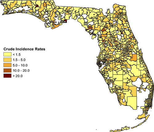
Fig. A1 Incidence rates for brain tumor.
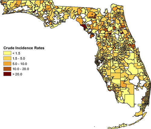
Fig. A2 Incidence rates for leukemia.
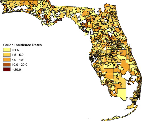
Fig. A3 Incidence rates for lymphoma.