
 ?Mathematical formulae have been encoded as MathML and are displayed in this HTML version using MathJax in order to improve their display. Uncheck the box to turn MathJax off. This feature requires Javascript. Click on a formula to zoom.
Abstract
Recently, Gastwirth proposed two transformations and
of the Lorenz curve, which calculates the proportion of a population, cumulated from the poorest or middle, respectively, needed to have the same amount of income as top
. Economists and policy makers are often interested in the comparative status of two groups, for example, females versus males or minority versus majority. This article adapts and extends the concept underlying the
and
curves to provide analogous curves comparing the relative status of two groups. Now one calculates the proportion of the minority group, cumulated from the bottom or middle needed to have the same total income as the top qth fraction of the majority group (after adjusting for sample size). The areas between these curves and the line of equality are analogous to the Gini index. The methodology is used to illustrate the change in the degree of inequality between males and females, as well as between black and white males, in the United States between 2000 and 2017, and can be used to examine disparities between the expenditures on health of minorities and white people.
1 Introduction
Recently, Gastwirth (Citation2016) proposed a transformation of the Lorenz curve, which calculates the proportion of a population, cumulated from the poorest, needed to have the same amount of income as the top
. Economists and policy makers are often interested in the comparative status of two groups, for example, females and males or minority and majority. This article adapts and extends the concept underlying the
curve to provide analogous curves comparing relative status of two groups. Because the number of minority individuals is usually less than the majority, the data for the smaller group are adjusted so the sample sizes are equal. The new curve
, which adapts
, is based on the fraction of the minority group cumulated from bottom needed to have the income as the top q th fraction of the majority. The area between the
and the line of equality is analogous to the Gini index. When the
curve is higher than the
curve for the majority group, the area between the curves can be considered as the additional inequality the minority group experiences relative to the majority group, compared to the inequality within the majority group.
Two related curves are based on the fraction of the minority group cumulated from the top or the middle needed to have the same income (adjusted for sample size) as the top of the majority are also explored. The methodology is used to illustrate the change in the degree of inequality of income between males and females, as well as between black and white males, in the United States between 2000 and 2017. The curves indicate that there has been a little progress in equalizing female and male incomes, primarily resulting from an increase in income for females in the upper portion of the income distribution. On the other hand, the curves and corresponding areas comparing the incomes of black males to white males, have hardly changed during the period.
Section 2 presents the formulas defining the original curve and the extensions proposed here. Section 3 illustrates the proposed curves and their area-based measures, when applied to the Pareto distribution. Section 4 presents the results comparing male and female incomes and Section 5 presents the comparison of black and white male incomes. Unfortunately, the data reported by the Census Bureau for the incomes of black females were not sufficiently detailed, especially in the upper regions, to accurately calculate the curves for black and white females. Section 6 summarizes the results and makes suggestions for more informative summaries of income and earnings data. The section ends with a brief description of the applicability of the new measures to summarize data on health disparities.
2 The Graphical Measures
The most commonly used graphical measure of summarizing an income distribution is the Lorenz curve, defined mathematically as (Gastwirth Citation1971; Cowell Citation2011). A related measure of income inequality is based on the fraction
of units, cumulated from the lowest, needed in order that their share of the total income equals
, the share of the top
was suggested by Gastwirth (Citation2016). Thus,
is the value of
for which
, or
(1)
(1)
The curve was introduced by Leimkuhler (Citation1967) and its statistical properties were studied by Sarabia (Citation2008) and Sarabia et al. (Citation2010). Its relationship to Lorenz ordering and related literature is discussed by Arnold (Citation2015, p.169). Arnold and Sarabia (Citation2018, chap. 6) studied the relationship between the Lorenz and Leimkuler curves and other curves used to summarize income and earnings data. A related curve, based on the ratio
is described by Jasso (Citation2018).
When comparing two populations, say minority and majority, or females and males, the analogous measure is based on the fraction of the minority group needed to have the same total income as the top of the majority receive. Because the two groups usually are of different sizes, one needs to adjust the population size and hence total income of the smaller group (usually minority). Thus, one multiplies the number of minorities by the ratio, r, of the size of the majority to the size of the minority and assumes that the additional minorities have the same income distribution as in the original data. Thus, the distribution of income within the minority population remains the same but their total income is r times the original total. The curves will be described in terms of comparing female incomes to that of males, so
denotes the female (male) mean and
the Lorenz curve of female (male) incomes.
Letting be the Lorenz curve of the adjusted income data of the females and
be the Lorenz curve of the males, the analogue of the
curve is
(2)
(2)
Formula (2) is a consequence of the fact that when the sample sizes are equal to N, is determined from the requirement that
, should equal the total income of the top
of the majority, that is,
If one cumulates the incomes of the minority group from the top, so denotes the top fraction of the adjusted minority group that one needs to have the same income as the top
of the majority, then
(3)
(3)
Similarly, if one cumulates the adjusted female income distribution from the middle, then is defined by
(4)
(4)
EquationEquations (2)(2)
(2) and Equation(4)
(4)
(4) correspond to formulas (3) and (4) in Gastwirth (Citation2016). The term
, the fraction of the total income of males that the top
of them have, occurs in both EquationEquations (3)
(3)
(3) and Equation(4)
(4)
(4) . EquationEquation (3)
(3)
(3) gives the fraction
of the highest female incomes needed to have the same income as the top
of males. In contrast, EquationEquation (4)
(4)
(4) gives the middle fraction,
of females needed to have the same income as the top
of males.
Analogous to the Gini index, twice the areas between the and
curves and the line of equality will be referred to as the Income Shortfall Index (ISI) for each measure.
One way of illustrating the gap between female and male incomes is to compare the curves giving the fraction of females needed to have the same total income as the top
of males with the corresponding fraction,
of males, needed to have the same income as the top
of males. If the inequality of male incomes is considered an approximation to the inherent variability in the skill and abilities of people, then the difference
and corresponding areas between the two curves is a measure of the excess shortfall in the incomes of females relative to male incomes, over the inherent distribution of abilities within each group.
While the above interpretation does not account for other forms of discrimination, for example, against a racial, ethnic or religious subgroup, within each of the male and female distributions, changes over time in the curves should indicate whether females are making economic progress.
3 Measures for the Pareto Distribution
To illustrate the proposed curves and their area-based measures, they will be applied to the Pareto distribution, defined by
This distribution (Arnold Citation2015) has mean , Gini index
, and Lorenz curve
. For convenience, A is set to 1. From (1)
and
where
Thus,
. so
because
. Thus,
Suppose we set and
, then
and
, and
and
, and thus we have
Note that when
. This means that income of the top 56.25% of males equals the total income of all females.
Similarly
These two curves are illustrated in .
Fig. 1 and
curves for two Pareto distributions with
and
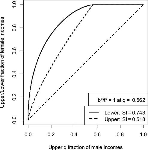
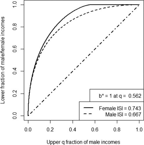
compares the curve, which compares the bottom portion of females incomes to the top males, to the corresponding
curve, which compares the bottom portion of male income to the top males.
Fig. 2 and
curves for two Pareto distributions with
and
4 Comparison of the Female–Male Income Disparities in 2000 and 2017
This section presents the various curves and associated ISI’s comparing the incomes received by females to the incomes of males, using income reported in the Current Population Survey (CPS) conducted by the U.S. Census Bureau. gives some summary measures (mean and quartiles) for men and women in 2000 and 2017. The Lorenz curves, which underlie the three recently proposed curves, were estimated from the publically available summary of the income data obtained in the CPS. This data reports both the number of individuals in each income interval and their average income, which provides more information than data without the group means, as noted by Krieger (Citation1983) and Lyon et al. (Citation2016), therefore, the split histogram technique of Cowell and Mehta (Citation1982) was used. The split histogram method works as follows: suppose the income interval , contains a fraction γ of the sample, and their mean is m. The split histogram method divides the interval (a, b) into two sub-intervals (a, m) and (m, b), which contains the fractions
and
of the sample, respectively. The data within each sub-interval are assumed to follow a uniform distribution.
Table 1 Summary measures of the CPS data.
and show the , and
curves for 2000 and 2017, respectively. All three curves in reach 1 when
, because the income received by the top 18.8% of males in 2000 equaled the total income received by all females. While one can distinguish the
curve from the
curve, they are quite similar; this is reflected by the values 0.954 and 0.913 of their respective ISIs. This demonstrates that the the middle portion of the female distribution did not fare much better than the lower portion relative to higher income males in 2000. The
curve, which cumulates the incomes of females from the top, is somewhat closer to the line of equality than the
and
curves, but still reflects substantial inequality, with an ISI of 0.748.
Fig. 3 Fraction of females required to equal the top qth fraction of males in 2000, cumulated from the bottom, middle, and upper portions of the female distribution (U.S. Census Bureau. Citation2017) (Source: the data are given in Table PINC-11 at https://www.census.gov/data/tables/time-series/demo/income-poverty/cps-pinc/pinc-11.html).
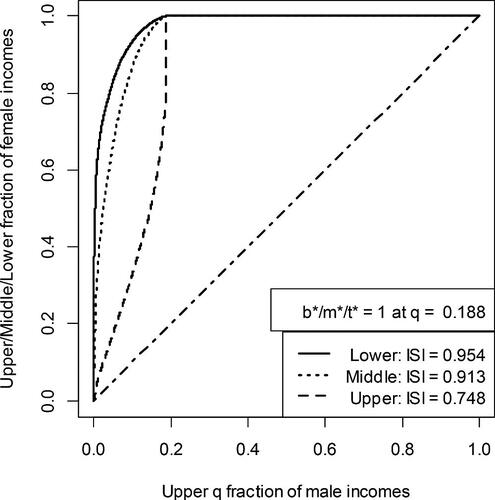
Fig. 4 Fraction of females required to equal the top qth fraction of males in 2017, cumulated from the bottom, middle, and upper portions of the female distribution. Same source as .
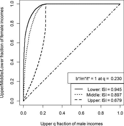
shows that in 2017 the total income received by females equaled that of the upper 23% of males. Comparing the ISIs derived from the , and
curves for the two years indicates that most of the increase in income received by females occured primarily in the upper region of their distribution, as the ISI of the
curve declined from 0.748 to 0.679. This may be due to the increase in the proportion of females who continued their education, and the decline of blue collar jobs during the 2000–2017 period.
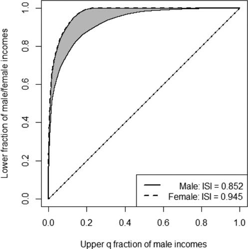
It is interesting to compare the changes in the curves in 2000 and 2017 focusing on the status of females (cumulated from the bottom) to the top males to the corresponding change the bottom males experienced relative to the top males during that period. The ISI for females declined slightly from 0.954 to 0.945. On the other hand, the corresponding areas under the male
curves, comparing the bottom portion of male income to the top males, increased from 0.845 in 2000 to 0.852 in 2017. From the curves presented in and , one can see that the “excess” inequality (shaded region) experienced by females relative to males decreased slightly (the area of the “excess inequality” declined slightly from 0.109 to 0.093). This result is consistent with the decline in “blue collar” jobs, primarily employing males, that occurred during this time.
Fig. 5 Fraction of males and females, cumulated from the bottom, required to equal the top qth fraction of males in 2000. Same source as .
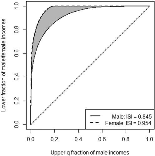
Fig. 6 Fraction of males and females, cumulated from the bottom, required to equal the top qth fraction of males in 2017. Same source as .
5 Comparison of the Black-White Male Income Disparities in 2000 and 2017
This section presents the various curves and associated ISIs comparing the incomes received by black males to the incomes of white males. Only men are considered here because the census data had too few black women in the upper region for reliable estimation of the Lorenz curve. For example, the mean of 11 out of the 17 intervals for incomes of at least $65,000 were not reported due to the small sample size. and show the , and
for 2000 and 2017, respectively. These plots suggest that there has been very little change in the income received by black males relative to white males. In 2000 the total income of all black males equaled that of the top 25.5% of white males In 2017, however, the total income of black males declined to 24.2% that of white males, which is reflected in the ISI’s for the middle
and top
curves in and .
Fig. 7 Fraction of black males required to equal the top qth fraction of white males in 2000. Same source as .
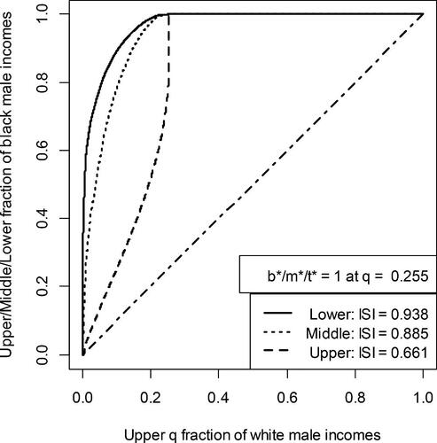
Fig. 8 Fraction of black males required to equal the top qth fraction of white males in 2017. Same source as .

6 Summary and Discussion
Several authors (Gastwirth Citation1975; Divine et al. Citation2018) suggested that the Mann–Whitney–Wilcoxon probability that an observation from a random variable X is at least as large an observation from another random variable, Y, that is, be used to measure the relative status of two groups. The probability a randomly selected female had at least as much income as a randomly chosen male equaled 0.351 in 2000, 0.375 in 2008, and 0.382 in 2017. This indicates that there was a small improvement in the incomes of women relative to men during the period, most of which occurred between 2000 and 2008. These results are consistent with those obtained from the change in the areas under the curves proposed here, however the values of the ISIs of the three curves provide more information than just the Mann–Whitney–Wilcoxon probability because they enable one to examine changes in different regions of the two distributions. Indeed, the decrease of 0.069, between the ISIs of the
curves of the incomes of females relative to males for 2017 and 2000 was much larger than the decreases (0.009 and 0.016) in the corresponding ISI’s of the
and
curves. This indicates that most of the “progress” females made came from increases in the incomes of the upper portion of the income distribution, while females in the lower and middle parts of the income only had a small gain relative to the males in the upper portion of the distribution. The probability a randomly selected black male had at least as much income as a randomly chosen white male equaled 0.379 in 2000, 0.374 in 2008, and 0.383 in 2017. This indicates that there was virtually no improvement in the incomes of black men relative to white men during the period; which corresponds to the small changes in the ISI’s.
The measures developed here would be useful in assessing earning inequality. Earnings are the money received from work and is a component of income. Some data on earnings only refer to wages and salaries from an employer, while other data include self-employment income (Bureau of Labor Statistics Citation2021). The income of a household also includes payments from social security, public assistance, pensions and annuities, alimony, child support, unemployment insurance as well as interest and dividends. For families in the lower 50% of the distribution of wealth wages account for about 80% of their income, about 70% for families in the third quarter, but only 45% for families in the top 10%. In contrast, capital gains were 11.2% of the income of families in the top 10% of the wealth distribution but only 0.2% and 0.3% of the income received by families in the second and third quartiles of the wealth distribution (Federal Reserve Board Citation2020). Unfortunately, the largest interval in earnings data reported by the Census Bureau is $100,000+, and 7.2% of females and 16.0% of males fall in this category. Thus any analysis would rely on assumptions about the underlying distribution tail and within each interval and it would be difficult to estimate the effect of any such interpolation. Hopefully, the Bureau will report earnings in the same format as income in the future.
The focus of this article is on graphical representations of the inequality between groups, along with a summary measure based on the area between the new curves and the line of equality. In order to examine the main factors underlying changes in the income distribution illustrated in this article, more detailed data incorporating education are needed; see Blau and Kahn (Citation2000, Citation2017) and Goldin et al. (Citation2017). The curves and measure discussed here can also be used to compare the income or earnings of subgroups of two populations that have similar education and occupation and then an overall summary measure can be obtained by a suitable weighted average of the subgroup measures, as in the combined Wilcoxon procedure (Oosterhoff Citation1969).
Combined Wilcoxon’s tests are used to combine the analysis of stratified data, for example, income data by the educational level of the household’s primary earner, and the Wilcoxon test is applied to the data in each strata. Van Elteren (Citation1960) weighted the estimates of obtained from the Mann–Whitney form of the test in the strata by the inverse of their variances (see Gastwirth Citation1988, p. 331 for an example). It is a powerful test when the values of
in each strata are similar and other procedures (Mehrota et al. Citation2010) are appropriate for other situations.
The concepts underlying the extension of the transformation of the Lorenz curve proposed by Gastwirth (Citation2016) can be applied to the recently proposed measures of inequality by Prendergast and Staudte (Citation2018). They consider the ratio of the bottom th quantile of a distribution to the upper
th quantile. The analogue of our
would be the ratio of the
th quantile of the minority distribution to the upper
th quantile of the majority distribution. As in Section 3, the area between these curves and the original one for inequality within the majority measure the excess inequality.
While the proposed graphical methods were illustrated by studying income inequality, they also can be used to study health disparities between minority groups and the majority. For example, the , and
of Medicare expenditures of black or hispanic people versus white people to ascertain whether the money spent on the medical care of minorities is comparable to that of white people. There is some concern that minorities need to wait longer to receive treatment, especially in emergency rooms, or obtain an appointment than white people. In addition to the usual comparison of mean and median times, the data could be further examined by exchanging the role of black and white people in calculating the
curve. Then, the area on which the ISI is based would represent the decreased time white people wait for appointments or treatment than black people. Comparing the
curve and the corresponding ISI to the
curve for black people alone, as in , would also reflect how much faster white people receive treatment or appointments than black people.
When there are several groups, if there is a well-defined majority group one can use it as the basic comparator and calculate the , and
curves comparing their income or other variable to the basic one. Alternatively, one can follow the Uniform Guidelines (1978) approach to assessing an employment practice for a disparate impact and select the group with the highest average income as the basic comparator.
References
- Arnold, B. C. (2015), Pareto Distributions (2nd. ed.), Boca Raton, FL: Chapman and Hall/CRC.
- Arnold, B. C., Sarabia, J. M. (2018), Majorization and the Lorenz Order with Applications in Applied Mathematics and Economics, Springer International Publishing.
- Bureau of Labor Statistics. (2021), “Earnings Concepts and Definitions.” Available at https://www.bls.gov/cps/definitions.htm#earnings.
- Blau, F. D., and Kahn, L. M. (2000), “Gender Differences in Pay,” Journal of Economic Perspectives, 14, 75–99. DOI: 10.1257/jep.14.4.75.
- Blau, F. D., and Kahn, L. M. (2017), “The Gender Wage Gap: Extent, Trends, and Explanations,” Journal of Economic Literature, 55, 789–865.
- Cowell, F. (2011), Measuring Inequality (3rd ed.), Oxford: Oxford University Press.
- Cowell, F., and Mehta, F. (1982), “The Estimation and Interpolation of Inequality Measures,” The Review of Economic Studies, 49, 273–290. DOI: 10.2307/2297275.
- Divine, G. W., Norton, H. J., Baron, A. E., and Juarez-Colunga, E. (2018), “The Wilcoxon–Mann–Whitney Procedure Fails as a Test of Medians,” The American Statistician, 72, 278–286. DOI: 10.1080/00031305.2017.1305291.
- Federal Reserve Board (2020), “Changes in U.S. Family Finances from 2016 to 2019: Evidence from the Survey of Consumer Finances,” Federal Reserve Bulletin, 106, 1–42. DOI: 10.17016/bulletin.2020.106.
- Gastwirth, J. L. (1971), “A General Definition of the Lorenz Curve,” Econometrica, 39, 1037–1039. DOI: 10.2307/1909675.
- Gastwirth, J. L. (1975), “Statistical Measures of Earnings Differentials,” The American Statistician, 29, 32–35.
- Gastwirth, J. L. (1988), Statistical Reasoning in Law and Public Policy (Vol. 1), Statistical Concepts an Issues of Fairness, New York: Academic Press.
- Gastwirth, J. L. (2016), “Measures of Economic Inequality Focusing on the Status of the Lower and Middle Income Groups,” Statistics and Public Policy, 3, 1–9.
- Goldin C., Kerr S. P., Olivetti C., and Barth E. (2017), “The Expanding Gender Earnings Gap: Evidence from the LEHD-2000 Census,” American Economic Review: Papers and Proceedings, 107, 110–114. DOI: 10.1257/aer.p20171065.
- Jasso, G. (2018), “Anything Lorenz Curves Can Do, Top Shares Can Do: Assessing the TopBot Family of Inequality Measures,” Sociological Methods & Research, 49, 947–981.
- Krieger, A. M. (1983), “Bounding Moments from Grouped Data and the Importance of Group Means,” Sankhya, Series B, 45, 309–319.
- Leimkuhler, F. F. (1967), “The Bradford Distribution,” Journal of Documentation, 23, 197–207. DOI: 10.1108/eb026430.
- Lyon, M., Cheung, L. C., and Gastwirth, J. L. (2016), “The Advantages of Using Group Means in Estimating the Lorenz Curve and Gini Index From Grouped Data,” The American Statistician, 70, 25–32. DOI: 10.1080/00031305.2015.1105152.
- Mehrota, D., Lu, X., and Li, X. (2010), “Rank-Based Analyses of Stratified Experiments: Alternatives to the van Elteren Test,” The American Statistician, 64, 121–130. DOI: 10.1198/tast.2010.08121.
- Oosterhoff, J. (1969), Combination of One-sided Statistical Tests (Vol. 28), Amsterdam: Mathematical Centre Tracts.
- Prendergast, L. A., and Staudte, R. G. (2018), “A Simple and Effective Inequality Measure,” The American Statistician, 72, 328–343. DOI: 10.1080/00031305.2017.1366366.
- Sarabia, J. M. (2008), “A General Definition of the Leimkuhler Curve,” Journal of Infometrics, 2, 156–163. DOI: 10.1016/j.joi.2008.01.002.
- Sarabia, J. M., Gomez-Deniz, E. Sarabia, M., and Prieto, F. (2010), “A General Method for Generating Parametric Lorenz and Leimkuhler Curves,” Journal of Infometrics, 4, 524–539. DOI: 10.1016/j.joi.2010.06.002.
- Uniform Guidelines on Employee Selection Procedures (1978), 43 Fed. Reg. 38290-38315.
- U.S. Census Bureau (2017), “Table PINC-11. Income Distribution to $250,000 or More for Males and Females. Current Population Survey.” Available at https://www.census.gov/data/tables/time-series/demo/income-poverty/cps-pinc/pinc-11.html
- Van Elteren, P. H. (1960), “On the Combination of Independent Two Sample Tests of Wilcoxon,” Bulletin of the International Institute of Statistics, 37, 351–361.