
 ?Mathematical formulae have been encoded as MathML and are displayed in this HTML version using MathJax in order to improve their display. Uncheck the box to turn MathJax off. This feature requires Javascript. Click on a formula to zoom.
Abstract
We assess the treatment effect of juvenile stay-at-home orders (JSAHO) on reducing the rate of SARS-CoV-2 infection spread in Saline County (“Saline”), Arkansas, by examining the difference between Saline’s and control Arkansas counties’ changes in daily and mean log infection rates of pretreatment (March 28–April 5, 2020) and treatment periods (April 6–May 6, 2020). A synthetic control county is constructed based on the parallel-trends assumption, least-squares fitting on pretreatment and socio-demographic covariates, and elastic-net-based methods, from which the counterfactual outcome is predicted and the treatment effect is estimated using the difference-in-differences, the synthetic control, and the changes-in-changes methodologies. Both the daily and average treatment effects of JSAHO are shown to be significant. Despite its narrow scope and lack of enforcement for compliance, JSAHO reduced the rate of the infection spread in Saline. Supplementary materials for this article are available online.
1 Introduction
In response to rising numbers of Covid-19 cases, state and local governments in the United States have used their jurisdictional authorities to implement a wide class of public health and social measures (PHSMs) aimed at slowing the spread of the SARS-CoV-2 (“Covid-19”) infections. At times, local governments have stepped up and issued orders when the policies they deemed necessary were not implemented at the state level. Much of these policy responses has focused on enforcing social-distancing through measures ranging from temporary closures of public-facing businesses, shelter-in-place orders (SIPO), and stay-at-home orders (SAHO) to mandatory mask-wearing orders (Courtemanche et al. Citation2020; Friedson et al. Citation2020; Hsiang et al. Citation2020; Dave et al. Citation2021; Abouk and Heydari Citation2021; Chernozhukov, Kasahara, and Schrimpf Citation2021a). There have been a number of studies to: quantify association between Covid-19 infection spread and implementation of SIPO and SAHO (Gao et al. Citation2020; Le et al. Citation2020; Lurie et al. Citation2020); evaluate causal effects of SAHO on restraining social interactions (e.g., see Abouk and Heydari Citation2021) and mobility (Chen et al. Citation2020); understand the effectiveness of SIPO in reducing the number of cases and fatalities (Friedson et al. Citation2020; Courtemanche et al. Citation2020); and demonstrate the importance of time (relative to the pandemic) and place of the implementation of SIPO on its impact.
SIPO is the most restrictive form of social-distancing measures with its compliance assurance coming from law enforcement and punitive fines (Caswell Citation2020; Friedson et al. Citation2020; Napoleon Citation2020; Dave et al. Citation2021) as well as social pressures (Ronayne and Thompson Citation2020; Dave et al. Citation2021). Some governments have considered more lenient measures, including issuing advisories (instead of orders) for all residents to restrict their movements out of home only to essential ones and narrowing the scope of orders to a certain segment of the residents. However, strict adherence to such measures is often not enforced; instead, its effectiveness to a large extent relies on the willingness of residents to voluntarily modify their behaviors to comply in light of the pandemic (Arey Citation2020). A natural question that arises is whether these measures are effective and, if so, to what extent.
The juvenile stay-at-home order (JSAHO) was put into effect in certain parts of Saline County of Arkansas (“Saline”) (Arey Citation2020; Simpson Citation2020) from April 6 through May 6 as a response to the pandemic. Its scope was limited in two respects. First, while JSAHO was declared by Saline County, it only applied to unincorporated areas of the county. Of the incorporated cities and townships in Saline, Benton City was the only one to implement JSAHO over the same period. The unincorporated areas and Benton had a combined population of 45,231, or approximately 42% of the county population according to the 2010 U.S. Census. Second, JSAHO was restricted to residents under the age of 18 and allowed them to leave home only if accompanied by adults. To the best of our knowledge, Saline was unique among the counties in Arkansas in having direct jurisdiction to impose JSAHO on certain parts of the county without having to work through local townships.
Among the few states in the United States that did not impose either SIPO or SAHO, Arkansas is unique in that a narrower-scope SAHO was nonetheless implemented in one of its counties. This provides an invaluable setting for a natural experiment to assess the effectiveness of the policy action adopted at the county level while controlling the effects of other policies that were concurrently implemented at the state-level.
Our main objective in this article is to study the effectiveness of policy measures on reducing Covid-19 infection spread when the scope is limited, and compliance is largely voluntary. The details of the methods used in the article are covered in Section 2. The results on the treatment effect of JSAHO based on the log infection rates is covered in Section 3. Section 4 contains a discussion on the results of the analysis and the effect of JSAHO on public health. The supplementary material contains an alternative analysis based on raw (rather than log) infection counts, along with a comprehensive list of tables and figures referenced throughout this article. Our implementation code in R is also available as supplementary material.
2 Methods
Drawing causal inference often entails choosing a comparison group to construct a “synthetic unit” and using it to estimate counterfactual outcomes, and computing and checking the significance of implied treatment effects. In this section, we discuss each of these steps in sequence. To start, we first describe the notation we use in this article.
2.1 Notation
A county i is classified as either a treatment group Gi = 1 or a control group Gi = 0, and is observed in time points with the first T0 points denoting the pretreatment period and
denoting the treatment period. Our outcome of interest is the log of infection rates, defined as the number of infections per 100,000 residents in a county and denoted Yit. As is standard in the literature, we use the notation introduced in (Rubin Citation1974, Citation1978) and denote by
the potential outcome for the treated county without treatment and
with treatment. Observed outcome for county i at time t is denoted Yit. Hence, the treatment effect is denoted
. In our study, Saline County is the sole treatment group and “control county” refers to either one of the other counties in Arkansas that meet the “parallel-trends” criteria or a synthetic county, as discussed in Section 2.2 below. {
denotes the set of counties that comprise the synthetic control county and NC refers to the number of counties in that set. Following the terminology in the matching literature, we refer to the pool of potential counties from which a comparison group is chosen as the “donor pool.”
2.2 Selection of Control Counties
The composition of synthetic control depends on the choice of a similarity measure to be optimized relative to the treatment unit. A common approach to selecting a control group is to apply the parallel-trends assumption, in which those whose fitted lines based on pretreatment outcomes are most parallel to the treatment unit’s comprise the comparison group.Footnote1 Other approaches select control groups that minimize the difference in pretreatment observations and covariate values deemed relevant for the situation.Footnote2 Depending on the specific form in which individual units are combined to produce the counterfactual outcome, the set that optimizes the given similarity measure is selected. Different methodologies make different assumptions on the parameters of this counterfactual estimation model. Popular methodologies in the Covid-19 policy evaluation literature include difference-in-differences (DID) (Ashenfelter and Card Citation1984; Card Citation1990; Meyer, Viscusi, and Durbin Citation1995; Bertrand, Duflo, and Mullainathan Citation2004; Abadie Citation2005; Doudchenko and Imbens Citation2016; Abouk and Heydari Citation2021), synthetic control (SC) (Abadie and Gardeazabal Citation2003; Abadie Citation2005; Abadie, Diamond, and Hainmueller Citation2010, Citation2015; Hainmueller Citation2012; Doudchenko and Imbens Citation2016; Friedson et al. Citation2020), and elastic-net-based methods (Doudchenko and Imbens Citation2016; Chernozhukov, Wüthrich, and Zhu Citation2021b). Other methods discussed in the causal inference literature include propensity scores matching (Courtemanche et al. Citation2020), event-studies (Courtemanche et al. Citation2020; Dave et al. Citation2021; Abouk and Heydari Citation2021), matrix completion, interactive fixed effects, and changes-in-changes (CIC) (Athey and Imbens Citation2006).
An assumption that is of particular importance in the literature is that counterfactual outcomes can be represented as a linear combination of control unit outcomes, that is, . Doudchenko and Imbens (Citation2016) presented a simple canonical context for considering the parameteric constraints underlying many popular linear methods, namely:
a = 0 (systematic additive difference between the control and the treated);
(positive coefficients);
As we will see shortly, constraints (1)–(3) characterize SC and several of its variants, and (2)–(4) comprise what is known as the “parallel trends” assumption that underlie DID, while certain elastic-net based methods relax these constraints (Doudchenko and Imbens Citation2016). On the other hand, CIC allows the underlying counterfactual representational form to be nonlinear (Athey and Imbens Citation2006). Below, we discuss each of these methodologies in the context of control county selection.
2.2.1 Control Selection Based on the Parallel Trends Assumption
DID relies on the “parallel trends assumption,” that is, that the time trends for the treatment and control counties are similar, and assigns equal positive weighting to each control unit that adds up to 1. To select counties that best satisfy this assumption, we plotted the gap in logs of pretreatment infection rates for each county in Arkansas that had reported pretreatment infections:(1)
(1) and chose as control counties those for which the trends of this difference in logs are relatively flatter over the latter part of the pretreatment period, that is, days near the JSAHO start date of April 6. We use SC-DID to denote the synthetic county comprised of counties selected based on the parallel trends assumption.
2.2.2 Synthetic Control Construction
Constructing the comparison group for SC is a bit more involved. This is due in part to the question of whether considering socio-demographic covariates on top of pretreatment outcomes leads to a more accurate synthetic treated unit (see Doudchenko and Imbens (Citation2016) for the negative argument and Abadie and Gardeazabal (Citation2003) and Abadie, Diamond, and Hainmueller (Citation2015) for the affirmative). We construct the synthetic control county in two ways. In one approach, we only use pretreatment outcomes to construct the comparison group. In the other approach, we consider both the pretreatment outcomes and socio-demographic covariates deemed relevant in the literature. We discuss each of these approaches in more detail below.
SC Based Only on Pretreatment Data
In this approach, we follow the methodology outlined in Doudchenko and Imbens (Citation2016) and consider different choices for numbers of counties in the synthetic county, ranging from 3 to 8. These values are obtained by varying the size of the donor pool of counties in SC. One rationale for this approach is that by conditioning on the pretreatment trends, the counterfactual estimation models may effectively account for effects of covariates that contribute to the pretreatment trends as long as the covariate effects do not interact with the policy. For example, compared to control counties, Saline has the lowest ratio of smokers and the heart disease mortality rate (see Tables 4, 5, and 6 in the supplementary materials). While these covariates may impact infection rates, there is no obvious reason to suspect that the effects of such covariates on COVID susceptibility should dramatically change before and after the implementation of JSAHO. We use SC to denote the synthetic county comprised of counties selected using this methodology.
SC Based on Both Pretreatment and Covariate Data
We proceed as in Abadie and Gardeazabal (Citation2003) and Abadie, Diamond, and Hainmueller (Citation2015) and incorporate a total of 82 socio-demographic covariates discussed in the literature in addition to pretreatment log infections. Tables 4, 5 and 6 in the supplementary materials list all of the variables we used in our synthetic control county construction and show how Saline compares vis-a-vis control counties along each covariate. We denote the synthetic county constructed under this approach by .
In Tables 4, 5, and 6 in the supplementary materials, one can observe that Saline ranks close to the median on most covariates with a few exceptions. To mention a few, note that while Saline has much lower poverty rate and the social vulnerability index (SVI) than the control counties, the association between these covariates and the infection rate is mixed with some studies reporting that higher income levels and lower disability rates are correlated with higher infection rates (Masetti et al. Citation2020) while others observe the opposite (Brown and Ravallion Citation2020; Siddique et al. Citation2020). Further, it was observed that counties with very low poverty levels reported the highest number of cases (Jung, Manley, and Shrestha Citation2021). Saline also has lower smoker percentage and heart disease mortality rate, but these covariates have been found to be associated with mortality rates of the disease rather than infections (Abedi et al. Citation2020; Masetti et al. Citation2020; Brown and Ravallion Citation2020). For a more complete discussion of the covariates considered in our analyze, see the supplementary materials.
As noted in Doudchenko and Imbens (Citation2016), incorporating covariates other than pretreatment data into counterfactual estimation is not feasible in model specifications that allow either nonzero systematic additive difference between the treated and control (e.g., DID), or control weights to sum to a value other than one (e.g., elastic-net-based methods). Hence, we consider pretreatment outcomes only for SC.
2.3 Counterfactual Estimation
Broadly, there are two ways to estimate counterfactual outcomes. One approach (“linear methods”) assumes that the counterfactual outcome is a linear combination of the observed outcomes of the control group, while the other (“nonlinear methods”) relaxes this assumption. The former can be further classified depending on particular modeling constraints. For instance, in SC-DID, each control unit is given the same weight that adds up to one and a permanent additive difference exists between the treated and control groups. SC differs from SC-DID in that weights are allowed to differ from each other as long as they remain positive and there is no systematic additive difference between the treated and control. For the classic SC method that makes explicit the role of covariates, see Abadie and Gardeazabal (Citation2003), Abadie, Diamond, and Hainmueller (Citation2010), and Abadie, Diamond, and Hainmueller (Citation2015). Lastly, Doudchenko and Imbens (Citation2016) proposed a method in which the constraints in SC, namely, the positive weights and the zero additive difference, are relaxed in exchange for the elastic-net penalty term to narrow down the optimization search space. We refer to this method as “SC-EN” which can be written as follows:(2)
(2)
Nonlinear methods relax the aforementioned constraints. CIC relaxes a key assumption in DID that outcomes are linear in time and group membership. Instead, it assumes that a general, nonparameteric monotone function maps unobserved, time-invariant but unit-dependent, characteristic to an outcome of interest.
In this article, we consider the following methods to estimate the counterfactual outcomes of Saline and assess the implied treatment effects:
SC-DID, SC, and SC-EN as laid out in Doudchenko and Imbens (Citation2016), with SC estimated based only on pretreatment outcomes;
CIC with the comparison group constructed with SC-EN.
The empirical results corresponding to these methods are presented in Sections 3.2, 3.3, and 3.4, respectively.
2.4 Treatment Effect Estimation
In this article, we demonstrate evidence of the causal effect of JSAHO in two ways. First, we show that pointwise (i.e., daily) confidence intervals of the treatment effect with the synthetic comparison county constructed based on the parallel-trends assumption and subset selection using the squared differences are significant using the conformal inference method in Chernozhukov, Wüthrich, and Zhu (Citation2021b). Second, we show that the average treatment effect under more general assumptions estimated with CIC (Athey and Imbens Citation2006) is significant. In the supplementary materials, we also present alternative analyses based on raw (versus log) infection rates and show that the average treatment effect is significant.
2.4.1 Pointwise Treatment Effect with Linear Estimation
The counterfactual model in (Chernozhukov, Wüthrich, and Zhu Citation2021b) expresses potential outcomes as and
where
are mean-unbiased proxies for
and
are intervention-invariant stochastic shock process with
. Estimates for the proxies are obtained using one of the linear methods based on hypothesized values of
under a sharp null and data from pretreatment and treatment periods. Then, residuals
are computed, from which the following test statistic is obtained:
(3)
(3)
Chernozhukov, Wüthrich, and Zhu (Citation2021b) use moving block permutations over time to compute and pointwise confidence intervals for
based on their observation that with stable estimators under mild regularity conditions,
has a uniform distribution under the null hypothesis (see Chernozhukov, Wüthrich, and Zhu (Citation2021b) for a complete discussion). For computations and implementation of this method, we used the open source software in Chernozhukov, Wüthrich, and Zhu (Citation2021b).
2.4.2 Average Treatment Effect with Nonlinear Estimation
Athey and Imbens (Citation2006) generalize DID by postulating that and
for the treated group, where h(u, t) is a monotonically increasing function in u and u represents unobservable characteristics of the group. A key assumption in this model is that while the distribution of Ug can vary across groups, it is time-invariant within groups. In our case, this implies that populations in each county did not change during the time periods in question. Hence, all differences in infection rates of a pair of counties can be attributed to the differences in the distribution of Ug in those counties. Under these assumptions, the cumulative distribution of the counterfactual, denoted
, is identified in terms of the other observed distributions as follows:
(4)
(4) where the subscript gt denotes group
with
treated and time
with 1 indicating the treatment period. The distribution of the counterfactual is empirically estimated as
(5)
(5)
where
denotes the observed outcome of county i belong to group g at time t. The average treatment effect is written as
(6)
(6)
This is empirically estimated as(7)
(7)
It is then shown that is consistent and that
is asymptoticall normally distributed. See Athey and Imbens (Citation2006) for details.
We apply SC-EN from Doudchenko and Imbens (Citation2016) to select control counties and compute their weights. We have directly implemented the main algorithm and accompanying procedures needed for CIC in the R programming language, and provide the full code as a reference in the supplementary materials.
3 Empirical Results
Daily case counts for the counties in Arkansas were accessed on September 5, 2020, at The New York Times Covid-19 data repository (Github Citation2020). The dates covered pretreatment period preceding the JSAHO start date of April 6, the policy effective dates from April 6 through May 6, and a month of posttreatment period. In our visualizations, we include 31 extra days after the end of the treatment period keeping in mind the incubation period of the virus (Dave et al. Citation2021; Guan et al. 2020; Lauer et al. Citation2020) and the delays in policy effectiveness (Abouk and Heydari Citation2021).
3.1 Selection of Control Counties
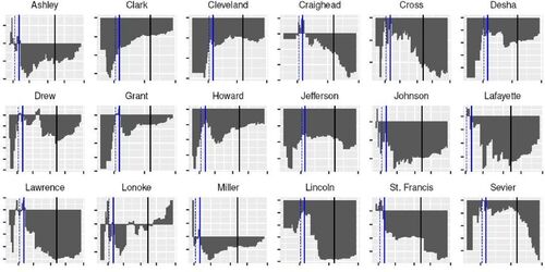
Confirming the parallel-trends assumption, displays plots of the 18 counties selected from the donor pool of 74 with relatively flatter trends in the differences of logs of infection rates for the last few days in the pretreatment period. Visual inspection of it confirms that the differences are approximately flat leading up to April 6. For robustness over control selection, we also consider comparison groups comprised of different numbers of counties. In the supplementary materials we include as a reference such plots for all counties. To construct the synthetic county, we first consider only pretreatment outcomes (i.e., the SC methodology discussed in Section 2.2.2). Using the 18 counties from SC-DID as the donor pool results in three counties that comprise the synthetic control while considering a larger pool of 36 with more variable pretreatment trends yield eight counties in the comparison group. shows counties and weights for synthetic control computed using best-fitting least squares of pretreatment outcomes of varying numbers of counties.
Fig. 1 Y-axis: infections in Saline per
—
infections in Control County per
, X-axis: pretreatment period. Dotted line denotes JSAHO announcement date (April 2) and solid line denotes the start date (April 6).
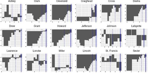
Table 1 Synthetic control counties (SC) and weights using only pretreatment outcomes.
Next, we consider both the pretreatment outcomes and socio-demographic covariates using the methodology following Abadie and Gardeazabal (Citation2003) and Abadie, Diamond, and Hainmueller (Citation2015) discussed in Section 2.2.2. Unlike in the previous SC approach based on the DID specification, the
here allows the length of the pretreatment period to vary. shows the counties that comprise various synthetic control groups, each defined by the length of the pretreament period in days preceding the treatment period.
Fig. 2 Log infection rate gap between Saline and synthetic counties constructed using the SC-DID (left) and SC (right) methodologies. The labels denote the synthetic control sizes, for example, “SC-8” denotes a synthetic control composed of eight counties shown in . Dotted line denotes JSAHO announcement date (April 2), solid blue line denotes the start date (April 6), and solid black line denotes the end date of the JSAHO.
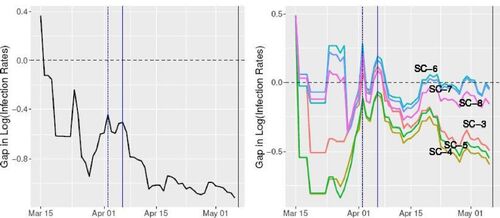
From , we can readily see that county selections and weights are heavily dependent on the size of the pretreatment window, although it is much smaller than the covariates.
Table 2 Synthetic counties () and weights using both pretreatment and covariate data.
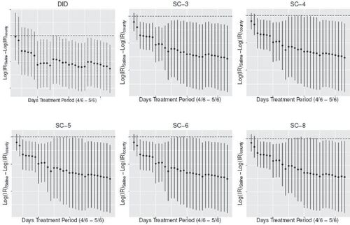
3.2 Treatment Effect Estimation with SC-DID and SC
With synthetic counties constructed using SC-DID and SC, we examine the estimated impact of JSAHO on log infection rates in Saline. Similar to the Proposition 99 study in Abadie, Diamond, and Hainmueller (Citation2010), our estimate for this treatment effect is the gap between log infection rates in Saline and those in the control unit, as expressed in EquationEquation (1)(1)
(1) . As shown in for SC-DID, soon after JSAHO was implemented, the gap between Saline and the mean of the 18 control counties widens drastically. A similar pattern emerges in the SC case, although the effect is more pronounced for the smaller control group sizes described in .
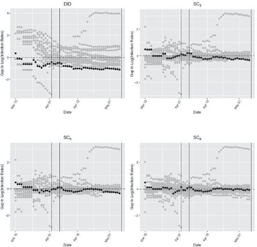
To assess the robustness of our results, we perform a series of placebo analyses using the methodology discussed in Abadie, Diamond, and Hainmueller (Citation2010). We compare the treatment effect in Saline to placebo treated units by iteratively applying SC-DID and SC to each of the other counties in the donor pool. These placebo studies generate a distribution of estimated treatment effects when no JSAHO was implemented at the county-level.
shows our robustness test results. The gray dots represent the gaps defined in EquationEquation (1)(1)
(1) for various placebo treated counties while the black dots represent the gaps for Saline. From the plots for SC-DID and SC3, one can readily see that the estimated gaps for Saline are wider than those for placebo counties, while it is less apparent in SC8. It is also apparent that the 18-county control group provides a confirmation of the parallel-trends assumption, while SC methods provide a good fit for Saline’s pretreatment trends. As discussed in Section 2.2, this is due to the fact that SC-DID allows for a permanent additive difference between the treatment and control groups, while SC forces this difference to be zero.
Fig. 3 Log infection rate gaps in Saline and placebo gaps in other counties. Subscripts denote the sizes of control counties in the case of SC. Dotted line denotes JSAHO announcement date (April 2), solid blue line denotes the start date (April 6), and solid black line denotes the end date of the JSAHO.
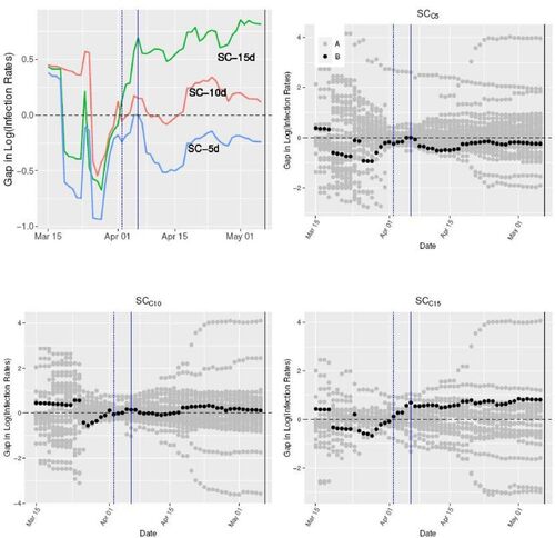
Next, as discussed in Section 2.2, we estimate the SC counterfactual using both the pretreatment data and covariates (Abadie and Gardeazabal Citation2003; Abadie, Diamond, and Hainmueller Citation2010), and study the magnitude of Saline’s treatment effect. The upper-left plot in displays log infection rate gap between Saline and various comparison groups constructed using different windows of pretreatment period. One can observe similar patterns as in synthetic controls fitted with pretreatment data only in , reaffirming similar observations made in Abadie, Diamond, and Hainmueller (Citation2010) and explanation in Doudchenko and Imbens (Citation2016). For instance, one can see that immediately after JSAHO was put into effect, the gap widened in Saline relative to controls. Synthetic controls constructed with shorter pretreatment windows seem to exhibit stronger treatment effects. This can be explained by the higher relevance of more recent pretreatment outcomes closer to the policy intervention date. The other three remaining scatterplots in show the log infection rate gaps in Saline and placebo treatment counties for the synthetic counties constructed with each respective pretreatment windows. For SC, it is clear that the gaps in Saline are larger than those of placebo units.
Fig. 4 Log infection rate gap between Saline and “” Counties. The labels denote the length of pretreatment windows preceding the treatment period, for example, “
” denotes a synthetic control fit with 5 pretreatment days and covariates. Dotted line denotes JSAHO announcement date (April 2), solid blue line denotes the start date (April 6), and solid black line denotes the end date of the JSAHO.
3.3 Pointwise Treatment Effect
shows the differences in the log of daily reported infection rates over pretreatment and treatment periods in Saline and the 18 control counties. One can readily see that in all 18 counties, the differences are predominantly negative in the treatment period.
Fig. 5 Y-axis: infections in Saline per
—
infections in Control County per
, X-axis: pretreatment (first reported date ∼ April 5) and treatment (April 6–May 6) periods, plus additional month (May 7–May 31). Dotted line denotes JSAHO announcement date (April 2), solid blue line denotes the start date (April 6), and solid black line denotes the end date of the JSAHO.
shows pointwise confidence intervals for the JSAHO treatment effect at the 10% significance level based on the test inversion method discussed in Chernozhukov, Wüthrich, and Zhu (Citation2021b). Except for the first few days and SC with 8 control counties (denoted SC-8), the treatment effects under SC-DID and SC all appear to be significant at the 10% level.
Fig. 6 Pointwise confidence intervals at 10% significance level. Synthetic counties constructed using only pretreatment outcomes. Software credits: Chernozhukov, Wüthrich, and Zhu (Citation2021b).
summarizes the results of placebo tests of where
April 5, 2021 and
days. One can easily confirm that we are not able to reject the null hypothesis at 10% level that treatment effect in the pretreatment period is zero, rendering support to the appropriateness of the underlying assumptions of the conformal model in Chernozhukov, Wüthrich, and Zhu (Citation2021b) for our data setting.
Table 3 Placebo specification tests based on moving block permutations (Chernozhukov, Wüthrich, and Zhu Citation2021b).
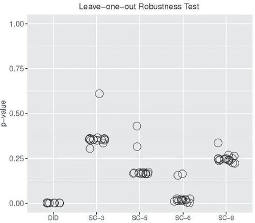
To demonstrate that our results do not depend on any one particular dominant county in the synthetic controls, we perform a leave-one-out robustness test, following the methodology in Chernozhukov, Wüthrich, and Zhu (Citation2021b). displays the p-values obtained from testing where
April 5, 2020, and
May 6, 2020, with each county in the synthetic control iteratively left out. Overall, it provides strong support for the claim that the results are not overly dependent on one specific county in comprising the comparison group. The small sizes of the synthetic controls in
and
explain the proportionally higher values of p-values.
Fig. 7 p-Values obtained with block permutations with one control county left out at a time. The x-axis labels denote the synthetic counties constructed with the given number of constituent counties, for example, “SC-3” denotes a synthetic control composed of three counties as shown in .
3.4 Average Treatment Effect
We first applied the 5-fold cross-validation to find the optimal values for the hyper-parameters α and λ in EquationEquation (2)(2)
(2) . Solving Model 2 yielded the control group composed of 15 counties, which we denote “SC-EN.” displays the log difference of infection rates of Saline and synthetic county constructed using SC-EN.
Fig. 8 Differences in log infection rates of saline and EN-synthetic county.
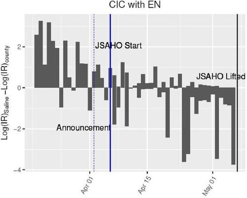
With the empirical distribution computed in (5) and the point estimate for the average treatment effect in (7), we obtained that with the p-value of 0.0454. See accompanying code for the full implementation details.
4 Conclusion
There has been active multi-disciplinary research on Covid-19. However, to date little has been said about the causal impact of SAHO with limited scopes, such as JSAHO in Saline County. This article presents evidence of the effectiveness of county-level JSAHO on reducing the growth rate of infection spreads. The methods used here can be applied to assess situations in other counties or local jurisdictions, and in the process strengthen the external validity of the findings by addressing the issues of limited duration and geographic specificity of the present study. There are other states that had not adopted statewide SIPO or SAHO while some of their local governments went ahead with their own orders at some point in the past, such as Utah, Wyoming, and Oklahoma (Mervosh, Lu, and Swales Citation2020). In addition, the analyses conducted in this article can be applied to study the effectiveness of other policy measures.
While it is possible that one or more of socio-demographic covariates, including those we did not consider here, for which Saline is an outlier could have been confounders, our results lend unequivocable credence to the association of JSAHO to lower increase in infection rate of Covid-19 in Saline.
The effect of JSAHO should be interpreted broadly: for example, it is not possible to tell whether the reduced rate of increase in cases is due to the direct effect of increased social distancing, or it is mediated by the effect of changes in residents’ behaviors, such as better hand-washing.
Supplemental Material
Download PDF (366.5 KB)Supplementary Materials
The supplementary materials contain two sections: (1) Estimation of treatment effect using raw infection count data, and (2) Supplemental Tables.
Funding
The authors gratefully acknowledge support by NSF DMS 1812148 and PSC-CUNY grant 62781-00 50 grant.
Additional information
Funding
Notes
1 This assumption underlies the difference-in-differences methodology of estimating the counterfactual outcomes.
2 These are used in various forms of the counterfactual estimation methodology known as the synthetic control.
References
- Abadie, A. (2005), “Semiparametric Difference-in-Differences Estimators,” The Review of Economic Studies, 72, 1–19. DOI: 10.1111/0034-6527.00321.
- Abadie, A., Diamond, A., and Hainmueller, J. (2010), “Synthetic Control Methods for Comparative Case Studies: Estimating the Effect of California’s Tobacco Control Program,” Journal of the American Statistical Association, 105, 493–505. DOI: 10.1198/jasa.2009.ap08746.
- Abadie, A., Diamond, A., and Hainmueller, J (2015), “Comparative Politics and the Synthetic Control Method,” American Journal of Political Science, 59, 495–510.
- Abadie, A., and Gardeazabal, J. (2003), “The Economic Costs of Conflict: A Case Study of the Basque Country,” American Economic Review, 93, 113–132. DOI: 10.1257/000282803321455188.
- Abedi, V., Olulana, O., Avula, V., Chaudhary, D., Khan, A., Shahjouei, S., Li, J., and Zand, R. (2020), “Racial, Economic, and Health Inequality and Covid-19 Infection in the United States,” Journal of Racial and Ethnic Health Disparities, 8, 732–742. DOI: 10.1007/s40615-020-00833-4.
- Abouk, R., and Heydari, B. (2021), “The Immediate Effect of Covid-19 Policies on Social-Distancing Behavior in the United States,” Public Health Reports, 136, 245–252. DOI: 10.1177/0033354920976575.
- Arey, J. (2020), “Saline County Judge Issues Juvenile Stay at Home’ Executive Order,” Saline County.
- Ashenfelter, O., and Card, D. (1984), “Using the Longitudinal Structure of Earnings to Estimate the Effect of Training Programs,” Review of Economics and Statistics, 67, 648–660. DOI: 10.2307/1924810.
- Athey, S., and Imbens, G. W. (2006), “Identification and Inference in Nonlinear Difference-in-Differences Models,” Econometrica, 74, 431–497. DOI: 10.1111/j.1468-0262.2006.00668.x.
- Bertrand, M., Duflo, E., and Mullainathan, S. (2004), “How much Should We Trust Differences-in-Differences Estimates?” The Quarterly Journal of Economics, 119, 249–275. DOI: 10.1162/003355304772839588.
- Brown, C. S., and Ravallion, M. (2020), “Inequality and the Coronavirus: Socioeconomic Covariates of Behavioral Responses and Viral Outcomes Across US Counties,” Technical report, National Bureau of Economic Research.
- Card, D. (1990), “The Impact of the Mariel Boatlift on the Miami Labor Market,” ILR Review, 4, 245–257. DOI: 10.1177/001979399004300205.
- Caswell, B. (2020), “Stay-at-Home Order Now in Effect: What you Need to Know,” Dayton Now.
- Chen, M. K., Zhuo, Y., de la Fuente, M., Rohla, R., and Long, E. F. (2020), “Causal Estimation of Stay-at-Home Orders on Sars-cov-2 Transmission,” arXiv preprint arXiv:2005.05469.
- Chernozhukov, V., Kasahara, H., and Schrimpf, P. (2021a), “Causal Impact of Masks, Policies, Behavior on Early Covid-19 Pandemic in the US,” Journal of Econometrics, 220, 23–62. DOI: 10.1016/j.jeconom.2020.09.003.
- Chernozhukov, V., Wüthrich, K., and Zhu, Y. (2021b), “An Exact and Robust Conformal Inference Method for Counterfactual and Synthetic Controls,” Journal of the American Statistical Association, pp. 1–16. DOI: 10.1080/01621459.2021.1920957.
- Courtemanche, C., Garuccio, J., Le, A., Pinkston, J., and Yelowitz, A. (2020), “Strong Social Distancing Measures in the United States Reduced the Covid-19 Growth Rate: Study Evaluates the Impact of Social Distancing Measures on the Growth Rate of Confirmed Covid-19 Cases Across the United States,” Health Affairs, 39, 1237–1246.
- Dave, D., Friedson, A. I., Matsuzawa, K., and Sabia, J. J. (2021), “When do Shelter-in-Place Orders Fight Covid-19 Best? Policy Heterogeneity Across States and Adoption Time,” Economic Inquiry, 59, 29–52. DOI: 10.1111/ecin.12944.
- Doudchenko, N., and Imbens, G. W. (2016), “Balancing, Regression, Difference-in-Differences and Synthetic Control Methods: A Synthesis,” Technical report, National Bureau of Economic Research.
- Friedson, A. I., McNichols, D., Sabia, J. J., and Dave, D. (2020), “Did California’s Shelter-in-Place Order Work? Early Coronavirus-Related Public Health Effects,” Technical Report, National Bureau of Economic Research.
- Gao, S., Rao, J., Kang, Y., Liang, Y., Kruse, J., Dopfer, D., Sethi, A. K., Reyes, J. F. M., Yandell, B. S., and Patz, J. A. (2020), “Association of Mobile Phone Location Data Indications of Travel and Stay-at-Home Mandates with Covid-19 Infection Rates in the US,” JAMA Network Open, 3, e2020485. DOI: 10.1001/jamanetworkopen.2020.20485.
- Github (2020), “Covid-19-data Repository,” available at https://github.com/nytimes/covid-19-data.
- Guan, W.-j., Ni, Z.-y., Hu, Y., Liang, W.-h., Ou, C.-q., He, J.-x., Liu, L., Shan, H., Lei, C.-l., Hui, D. S., Du, B., Li, L.-j., Zeng, G., Yuen, K.-Y., Chen, R.-c., Tang, C.-l., Wang, T., Chen, P.-y., Xiang, J., Li, S.-y., Wang, J.-l., Liang, Z.-j., Peng, Y.-x., Wei, L., Liu, Y., Hu, Y.-h., Peng, P., Wang, J.-m., Liu, J.-y., Chen, Z., Li, G., Zheng, Z.-j., Qiu, S.-q., Luo, J., Ye, C.-j., Zhu, S.-y., and Zhong, N.-s. (2020), “Clinical Characteristics of Coronavirus Disease 2019 in China,” New England Journal of Medicine, 382, 1708–1720. DOI: 10.1056/NEJMoa2002032.
- Hainmueller, J. (2012), “Entropy Balancing for Causal Effects: A Multivariate Reweighting Method to Produce Balanced Samples in Observational Studies,” Political Analysis, 20, 25–46. DOI: 10.1093/pan/mpr025.
- Hsiang, S., Allen, D., Annan-Phan, S., Bell, K., Bolliger, I., Chong, T., Druckenmiller, H., Huang, L. Y., Hultgren, A., Krasovich, E., Lau, P., Lee, J., Rolf, E., Tseng, J., and Wu, T. (2020), “The Effect of Large-Scale Anti-contagion Policies on the Covid-19 Pandemic,” Nature, 584, 262–267. DOI: 10.1038/s41586-020-2404-8.
- Jung, J., Manley, J., and Shrestha, V. (2021), “Coronavirus Infections and Deaths by Poverty Status: The Effects of Social Distancing,” Journal of Economic Behavior & Organization, 182, 311–330.
- Lauer, S. A., Grantz, K. H., Bi, Q., Jones, F. K., Zheng, Q., Meredith, H. R., Azman, A. S., Reich, N. G., and Lessler, J. (2020), “The Incubation Period of Coronavirus Disease 2019 (covid-19) from Publicly Reported Confirmed Cases: Estimation and Application,” Annals of Internal Medicine, 172, 577–582. DOI: 10.7326/M20-0504.
- Le, N., Le, A., Brooks, J., Khetpal, S., Liauw, D., Izurieta, R., and Reina Ortiz, M. (2020), “Impact of Government-Imposed Social Distancing Measures on Covid-19 Morbidity and Mortality Around the World,” Bulletin of the World Health Organization, 10, 1–20.
- Lurie, M. N., Silva, J., Yorlets, R. R., Tao, J., and Chan, P. A. (2020), “Corrigendum to: Covid-19 Epidemic Doubling Time in the United States before and during Stay-at-Home Restrictions,” The Journal of Infectious Diseases, 222, 1601–1606 DOI: 10.1093/infdis/jiaa506.
- Masetti, C., Generali, E., Colapietro, F., Voza, A., Cecconi, M., Messina, A., Omodei, P., Angelini, C., Ciccarelli, M., Badalamenti, S., Walter Canonica, G., Lleo, A., and Aghemo, A. (2020), “High Mortality in Covid-19 Patients with Mild Respiratory Disease,” European Journal of Clinical Investigation, 50, e13314. DOI: 10.1111/eci.13314.
- Mervosh, S., Lu, D., and Swales, V. (2020), “See Which States and Cities have told Residents to Stay at Home,” The New York Times.
- Meyer, B. D., Viscusi, W. K., and Durbin, D. (1995), “Workers’ Compensation and Injury Duration: Evidence from a Natural Experiment,” American Economic Review, 85, 322–340.
- Napoleon, C. (2020), “Police Hoping Public Adheres to Holcomb’s Shelter-in-Place Order, but will be Vigilant about Enforcement,” Chicago Tribune.
- Ronayne, K., and Thompson, D. (2020), “California Governor Issues Statewide Stay-at Home Order.” AP News.
- Rubin, D. B. (1974), “Estimating Causal Effects of Treatments in Randomized and Nonrandomized Studies,” Journal of Educational Psychology, 66, 688–670. DOI: 10.1037/h0037350.
- Rubin, D. B. (1978), “Bayesian Inference for Causal Effects: The Role of Randomization,” The Annals of Statistics, 6, 34–58. DOI: 10.1214/aos/1176344064.
- Siddique, A. B., Haynes, K. E., Kulkarni, R., and Li, M.-H. (2020), “Impact of Poverty on Covid-19 Infections and Fatalities: A Regional Perspective,” Available at SSRN 3702682.
- Simpson, S. (2020), “Saline County, Benton Youths Ordered to Stay Home.” Arkansas Democrat Gazette.