
 ?Mathematical formulae have been encoded as MathML and are displayed in this HTML version using MathJax in order to improve their display. Uncheck the box to turn MathJax off. This feature requires Javascript. Click on a formula to zoom.
Abstract
Motivated by incongruences between today’s complex data, problems and requirements and available methodological frameworks, we propose data quilting as a means of combining and presenting the analysis of multiple types of data to create a single cohesive deliverable. We introduce data quilting as a new analysis methodology that combines both art and science to address a research problem. Using a three-layer approach and drawing on the comparable and parallel process of quilting, we introduce and describe each layer: backing, batting and top. The backing of the data quilt is the research problem and method, which supports the upper layers. The batting of the data quilt is the data and data analysis, which adds depth and dimension to the data quilt. Finally, the top layer of the data quilt is the presentation, visualization and storytelling, which pieces together the results into a single, cohesive deliverable. For illustrative purposes, we demonstrate a data quilt analysis using a real-world example concerning identity theft.
PUBLIC INTEREST STATEMENT
Data quilting, the new data analytics methodology introduced in this research, proposes a framework for the analysis of both structured and unstructured data. The data quilting methodology relies on the parallel process of quilt creation to simplify an otherwise complicated process into three quilt layers: backing, which establishes the research problem and design; batting, which includes the data and analysis; and top, which creates the data quilting deliverable through storytelling, reporting and visualization. Data quilting provides a flexible methodology that can be used by individuals and organizations to guide the data analytics process and create a meaningful deliverable to address their business and research problems.
1. Introduction
Today, data is an abundant and accessible resource to both individuals and organizations. In fact, digital information increases tenfold every five years (Cukier, Citation2010, p. 2). There is now more open access to both public and private data, often through APIs. Additionally, the very nature of available data has changed. There has been a clear transition from static, stationary data to dynamic, streaming data. Social media and social networking have even changed the nature and content of such data, which can include links, text, images, videos, tags, hashtags, symbols and emojis. Structured and unstructured data are no longer separate entities. With these changes, there is an increasing need to adapt research and analysis methods to this new data-rich environment.
Methodologies for gaining insight into many different data types are becoming increasingly necessary in both research and practice. In fact, according to LaValle, Lesser, Shockley, Hopkins, and Kruschwitz (Citation2011), “executives want better ways to communicate complex insights, so they can quickly absorb the meaning of the data and take action” (p. 23). The ability to analyze data and gain insight is not enough. For business analysis to produce actionable insights, the presentation of the results can play a pivotal role. For this reason, storytelling is a critical component of the analysis, ensuring that such complex, multifaceted information is understood by the intended audience. The ability to evaluate and assess the analysis of different types of data to make decisions based on the big picture is crucial to address today’s research problems. However, traditional research involving disparate types of data, the research is planned, conducted and reported in isolation. According to Davenport (Citation2013), in the current analytics age, Analytics 3.0, companies need “multiple types of data, often combined” to compete (p. 7).
Motivated by incongruences between today’s complex data, problems and requirements and available methodological frameworks, we propose data quilting as a means of combining and presenting the analysis of multiple types of data to create a single cohesive deliverable. Just as quilting involves the creation of a quilt by sewing multiple layers of fabric together, data quilting combines the analysis of many types of data to support reporting and decision making. We view the data quilting concept as a framework of assorted sets of research methods, data, data analytics techniques and storytelling strategies threaded together to aid in finding solutions to real world research problems.
While data analytics and quilting are two things that are not ordinarily associated, the suggestion of the metaphor between the two makes one realize the potential richness and depth such a metaphor could provide. Deleuze and Guattari (Citation1987) described a quilt as a gathering of disjointed elements. Each patch in the quilt is a separate and unique element, but the distinct patches are combined to form a whole. The quilt has multiple entryways for analysis, no necessary center, and the ability to grow in multiple directions. The quilt metaphor is a means to present individual data as both unique and part of a larger whole. Both a quilt and a data set can be appreciated on its own, but both are better understood by knowing the particular socio-historical conditions surrounding their creation.
The quilt metaphor has been shown to be a useful when presenting the results of a qualitative research projects. For example, Sermijn, Devlieger, and Loots (Citation2008) used the patchwork quilt metaphor to model the disparate elements that combine to form an experience as a unified identity. Feminist scholars and researchers such as Flannery (Citation2001) have suggested that quilt making is a feminine metaphor for scientific inquiry. Warren (Citation1994) offered the metaphor of theory-building as quilt-making, and Saukko (Citation2000) described the process of quilting as a way of connecting individual stories to larger cultural discourses.
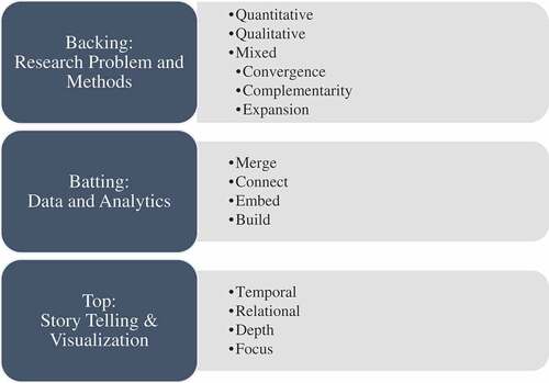
A quilt is not merely a hodgepodge of fabric, but rather, each component has a specific purpose and context. Quilts are created with a backing layer for support, a batting layer for insulation and a decorative top layer for aesthetic design and artistic expression. The data analyst, as the data quilter, is the story teller and ultimately responsible for the final quilt. However, the quilt is constrained by the available data, theory, and context. Similar to a quilt, a data quilt also requires three layers, serving parallel purposes. The backing of the data quilt is the research problem and method, which supports the upper layers. The batting of the data quilt is the data and data analysis, which adds depth and dimension to the data quilt. Finally, the top layer of the data quilt is the presentation, visualization and storytelling, which pieces together the results into a single, cohesive deliverable. Figure presents the data quilt layers and concepts.
Figure 1. Data quilting framework.
2. Data quilt methodology
The data quilting methodological framework is described in this section. We describe each layer in the order in which a real data quilt would be constructed: beginning with the least visible layer and ending with the most visible layer.
2.1. Backing: research problem and method
The analysis of many different types of data requires methodology from multiple fields of study. In a similarly diverse field of research, organizational research, Buchanan and Bryman (Citation2007) describe methodological innovations that arise as a result of the collision of varying streams of thought. As Buchanan and Bryman (Citation2007) describe, the role of research context becomes an important dimension guiding methodological choices. In this vein, the data quilter can incorporate contextual properties of their research when choosing their research method, with increasing contextualization leading to a decrease in the potential generalizability of the research findings (Kivunja & Kuyini, Citation2017). Contextual information including research scope, organization, intended audience and field of study can be incorporated into the data quilt. Depending on the importance of various contextual dimensions, the researcher can shape the bottom layer of the quilt through their methodology selection.
The backing of the quilt is the research question or problem. The backing of a traditional quilt is a single sheet of fabric and can generally only be seen if the quilt is turned over, but it is fundamental to the structure of the quilt. In between these two layers is the batting, which helps give the quilt shape and provide warmth. This is perhaps the least visible layer of the quilt but is a foundational part of the entire quilt. Similarly, the data quilt is comprised of all these pieces, as discussed below.
The bottom layer of the data quilt is the research problem or question. The purpose of any research study is to make inferences and draw conclusions based on the results of an analysis. In business analytics endeavors, these inferences should produce actionable results. These inferences largely fall into one of two categories: inductive or deductive. The type of inference further classifies the type of research approach as either largely qualitative or quantitative. Quantitative research for deductive inference is conducted with existing theory as its foundation. This research is problem-based and typically uses a form of statistical testing to test hypotheses. Qualitative research for inductive inference, on the other hand, is data-driven. Rather than testing existing theory, qualitative research seeks to create new theory. This method is exploratory in nature, without theoretical pre-conceptions. The data quilting methodology
An important distinction must be made between the type of data and type of research, since both research and data can be categorized as quantitative or qualitative. Either type of research, quantitative or qualitative, can be used with either qualitative or quantitative data.The data quilting process can also use a mixed methods research approach, combining both quantitative and qualitative research methods. Mixed methods describe a wide range of research methods that combine quantitative and qualitative research (Creswell, Citation2014). Some examples of mixed methods approaches are described below.
Convergent/Concurrent Triangulation: In the convergent mixed method approach, the quantitative and qualitative analysis are conducted at the same time and results are combined to address the research question (Halcomb & Hickman, Citation2015). Using both types of methods to answer the same question, either through comparison of results to see if they reach the same conclusion (triangulation) or by converting a data set from one type into another (e.g. quantifying qualitative data or qualifying quantitative data).
Explanatory Sequential: In the explanatory sequential mixed method approach, the data is collected sequentially and the analysis is completed in phases. In this approach, the quantitative analysis precedes the qualitative analysis. In this method, the qualitative analysis is conducted to bolster or complement the quantitative analysis results.
Exploratory Sequential: In the exploratory sequential mixed method approach, the data is collected sequentially and the analysis phases are reversed—qualitative analysis is completed first and quantitative is completed second. In this method, the quantitative analysis has the supporting role, and is meant to complement the qualitative analysis results.
Embedded: In the embedded mixed method approach, the analysis can either be completed sequentially or concurrently. In this method, one of the analysis approaches is sandwiched in between the more dominant analysis method.
Complementarity: Using each set of methods to answer a related question or series of questions for purposes of evaluation (e.g., using quantitative data to evaluate outcomes and qualitative data to evaluate process) or elaboration (e.g., using qualitative data to provide depth of understanding and quantitative data to provide breadth of understanding).
Expansion: Using one type of method to answer questions raised by the other type of method (e.g., using qualitative data set to explain results of analysis of quantitative data set)
2.2. Batting: data and analytics
The batting of the quilt is made up of the data and analytics drawn from various sources and types of data, such as text, visual, conversation and spatial. The types of data that can be analyzed and the analysis methods will also vary. Data types can include (but are not limited to): numeric, text, music, visual and spatial. Further, we do not limit the analysis methods to a singular disciplinary approach. Any analysis method that is appropriate for the data type and to answer the research question can be utilized and chosen by the data quilter. Like physical batting, analytics are often rendered invisible, but they are “seen” by those who know they are there. The analytics provide structure to meaning-making and add “thickness” to social interactions.
The integration of quantitative and qualitative data can occur in for ways, merging the data, connecting the data, and embedding the data (Fetters, Curry, & Creswell, Citation2013). These are described briefly below:
Merge: Merge or converge the two datasets by actually bringing them together (e.g., convergence—triangulation to validate one dataset using another type of dataset)
Connect: Have one dataset build upon another data set (e.g., complementarity—elaboration, transformation, expansion, initiation or sampling)
Build: One database informs the collection of another dataset
Embed: Conduct one study within another so that one type of data provides a supportive role to the other dataset.
2.2.1. Numeric analytics
By numeric data, we mean data that can be analyzed using traditional data mining methods. This type of data is found in most business databases. Numeric data can be analyzed using statistical and machine learning methods, sometimes referred to as data mining. There are two types of numeric data that we consider: continuous and discrete. Measurement data are numbers that are used to represent amounts, dimensions, sizes or frequencies. Discrete data represents counts, and is integer valued. Categorical data can also fall in this data category. Categorical data includes observations belonging to defined groups, or categories. Categorical data can be unordered or ordered and can be summarized by category frequency. While categorical data is qualitative, rather than quantitative in nature, the analysis of categorical data is completed through transformations undertaken to convert the data for a format that conforms with numerical data.
2.2.2. Text analytics
Text analytics is the automatic discovery of new, previously unknown, information from unstructured textual data (Hearst, Citation1999). Text analytics uses of technology to “turn text into numbers” by adding structure to the text data to make the analysis possible. An estimated 80% of data is text data. Text data is unstructured qualitative data that cannot be analyzed using traditional data mining methods. Some sources of text data include: web pages, emails, social media, blogs and message boards, newspaper and journal articles, corporate reports and online consumer reviews and complaints. Analysis approaches to text data come from a variety of research disciplines and include: natural language processing (NLP), text mining (TM), computational linguistics (CL) and content analysis (CA). Some analysis methods include: sentiment analysis, latent semantic analysis (LSA), topic models and data mining techniques, including machine learning.
2.2.3. Conversation analytics
Conversation analysis, which developed in the field of sociology, “seeks to describe the underlying social organization—conceived as an institutionalized substratum of interactional rules, procedures, and conventions—through which orderly and intelligible social interaction is made possible” (Goodwin & Heritage, Citation1990, p. 283). Conversation takes written discourse one step forward, to consider the spoken communication and interaction. According to Sacks, Schegloff, and Jefferson (Citation1974), conversations are a system of turn-taking, in which participants speak sequentially in social interactions. Conversation analysis uses a form of coding or annotation to denote spoken and unspoken elements of conversations, such as: pauses, emphasis, intonation, non-lexical sounds, overlap in turn-taking and ambiguity (Wooffitt, Citation2005).
2.2.4. Music analytics
Music is widely analyzed in marketing, measuring the impact of musical variables/qualities on purchases and shopping duration (Oakes, Citation2000). Bruner (Citation1990) suggests time, pitch and texture are the three structural components of music. We use this framework to identify time, pitch and texture-related variables that should be considered when analyzing music.
2.2.5. Visual analytics
Visual data is comprised of images, images in motion, or videos. Image and video content include many dimensions, including: color, space and time (Winkler, Citation2012). Visual analysis can be done in a variety of ways, including thematic, symptomatic, and semiotic perspectives (Bordwell, Citation1989). In general terms visual analysis can be defined as an empirical and objective procedure for quantifying recorded audio-video representation using reliable, explicitly defined categories (Bell, Citation2001). Kress and van Leeuwen (Citation1996) identified four type of categories, namely, contact (gaze), social distance, modality and attitude. These are briefly described in Table .
Table 1. Types of visual categories
2.2.6. Spatial analytics
Spatial data represents geographical locations, or space. Spatial data can be found in geographic information systems (GIS), which are “sets of computer tools for the storage, retrieval, analysis and display of spatial data” (Burrough, Citation2001, p. 363). Spatial data lends itself well to visualization, in the form of maps. Spatial data can be used for the purpose of description and prediction, and spatial statistical analysis involves the prediction of patterns and trends in spatial data (Unwin, Citation1996). Descriptive and exploratory analysis of spatial data often uses visualizations to present spatial analysis results.
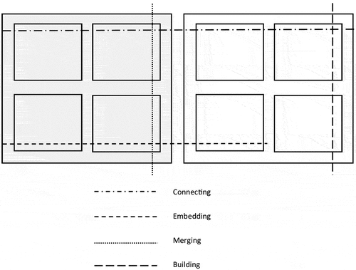
To combine the middle layer to the foundational layer, we follow Moran-Ellis et al. (Citation2006), which describes a technique for integrating the findings from the various methods of a study, called following a thread. They state that this takes place at the analysis stage of the research process. In our conception of the data quilt, this following the thread, which is akin to stitching the layers together, occurs after the middle layer is completed, and again becomes a fundamental part of the creation of the top layer. In stitching together the bottom and middle layers, we use the thread to designate the shared connections across analysis patches. These connections are made regardless of the methods choices made in the bottom layer, and can be made across methods, data, and analysis types, as shown in Figure , where the gray region depicts quantitative research methods and the white region represents qualitative research methods.
Figure 2. Stitching threads.
2.3. Top layer: presentation, reporting, visualization & storytelling
The top cover of the quilt is the presentation layer, which tells the various data stories. These stories can be of four major types: temporal (past, present and future), relational (causation or correlational), depth-related and focus-related (what, why and how). It is also important to address how to combine everything into the data quilt. While in quilting, stitching accomplishes this, in data quilting, we rely on data and database management methods. In the analysis of many different data types, integration may be necessary to analyze related data. Analytics from the disparate data sources are not combined for interpretive purposes. We argue that combining the results from these disparate data sources, data types and research methodologies can provide more insightful findings to the decision maker.
It begins with an initial analysis of each component to identify key themes and questions requiring further exploration. Then the researchers select a question or theme from one component and follow it across the other components—Moran-Ellis et al. (Citation2006) refer to this the thread. Similarly, data quilting pieces the different elements of the research together to form a single, cohesive deliverable that serves as the response to the research question. Each layer that precedes it helps to inform the connections that are displayed on the decorative top layer. The finished product is a rich, multi-layer, multidimensional story, connected by shared themes, attributes and stories.
The top layer of the data quilt builds the insights and reporting based on the layer analysis below. This layer is the personalized layer of the quilt, which makes each data quilt unique. The focus, depth, presentation and methods are chosen by the analyst. The top layer tells the story of the analysis conducted, connecting each smaller analysis component into a comprehensive, cohesive and appealing finished product. The top layer combines storytelling and visualization to tell the data story. As such, we draw on storytelling elements to define the top layer.
The data quilter must choose the elements of the story, including the focus, depth and methods, to ensure congruence with the foundational layers that are hidden from audience view and the visible top layer. The focus of the analysis will inform the presentation of the results in the top layer. Identifying the focus is about knowing what scientific inquiry your data quilt answers. We also want to consider the depth of the analysis. We may want to focus our analysis on one aspect of the business, which we analyze minutely. On the other hand, we may want to create a quilt that presents a more holistic view of the business. In this case, we take a less-detailed look, which allows us to consider a broader range of insights.
It is also important to determine time and space dimensions when presenting analysis insights. This includes a timeframe of study and any physical or geographic constraints on the analysis and ultimate story. The use of the time dimension can produce descriptive and/or predictive results. For instance, data from a single day will likely produce a story in which the data is described. On the other hand, data collected over many years can be used for prediction. The time dimension of the data helps to inform the type of narrative and the overall construction of the top-layer. In the section that follows, we present an illustrative data quilting example.
3. Example: data quilting analysis
To demonstrate the creation process of a data quilt, we use a CitiBank identity theft commercial, which is available on YouTube.Footnote1 CitiBank began airing identity theft commercials following this template in 2003, which earned AdWeek’s 2003 Campaign of Year (Parpis, Citation2004). According to Parpis (Citation2004), “Dissonance between picture and sound is at the core of Fallon’s campaign for Citibank’s Identity Theft Solutions. But it was only five days before the shoot that the creative team realized it’s the sound—the creepy boasts of identity thieves—that makes the spots, deciding to record the voiceovers before casting their radical opposites to lip-sync the tracks.” The specific commercial used in our example focuses on a character named Darrel P., whose identity has been stolen by a vanity-obsessed female.
Identity theft refers to the unauthorized use of another person’s identifying information for financial or personal gain. Identity theft is a growing threat in this information age. Eleven million adults were victims of identity theft in 2010, which is an increase of one million over the previous year (Miceli & Kim, Citation2010). The proliferation of the use of identity information by employers, government agencies, and businesses has tremendously increased the risk of identity theft.
3.1. Backing layer: research problem and approach
Organizations appeal to the emotions of customers, and these appeals are a hallmark of the advertising identity theft service that dominate television. In the case of identity theft organizations appeal to the negative emotion of fear towards identity theft with the hope that it leads to high arousal and action. Fear is conceptualized as an emotional state that protects a person from danger, and is considered to be a motivational factor that facilitates persuasion and increases the effectiveness of persuasion (Witte, Citation1992). Fear heightens arousal and generates a greater interest in a message related to the fear and the recommendations offered by the message to overcome fear (Ray & Wilkie, Citation1970). In fact, according to CitiBank’s website: “even the mere thought of identity theft is scary”.Footnote2
We use an explanatory sequential research approach to address our research question. In explanatory sequential research, we first conduct quantitative research to explain the commercial content within the context of existing theory. Then, we conduct qualitative analysis to further explore our research question, disregarding existing constructs. In this part of the analysis, we use alternative data and methods to address the treatment of fear concerning the commercial content.
Parpis (Citation2004) suggests picture and sounds are the most important aspects of the award-winning commercials. For this reason, we first study the effectiveness of fear appeal on the attention towards a television advertisement and the attitude towards identity theft. Fear appeals are explicitly intended to draw the attention to the message and the goal of all persuasive messages is to convince people to change attitude and/or behavior. We perform content analysis applied to the commercial, coding based on the three metafunctions: representation, orientation and organization.
3.2. Batting layer: data and analytics
3.2.1. Visual and music data analytics
To understand the visual and musical elements of the video, we use Iedema (Citation2001)’s framework which is described in Table , below. The representational metafunction analyzes the meanings represent visually, verbally, musically or sound-wise. In other words, we ask questions about “what is the subject of the shot?” The orientation metafunction, focus is on the position of the characters. Which meanings are created by their physical positions? The third metafunction, organization, concerns how meanings are sequenced and integrated into a dynamic text.
Six coders viewed the video and three coders listen to the voice and music. The summary of their coding is described below and provided in Table .
Table 2. Metafunction definitions for video analytics (Source: Carmen D. Maier)
Table 3. Summary of visual and music analytics
3.2.1.1. Representational
This commercial portrays an identity theft victim who we know as Darrel P. He is sitting at an in-home gym in what appears to be his garage when he begins to address the viewer. His voice and actions are that of the person who stole his identity who tells the viewer how she has used his money to buy herself things. The obvious clash between the voice and what Darrel’s perceived voice would be is apparent and grabs the attention of the viewer to understand why he speaks like this.
3.2.1.2. Orientational
The camera angle is always frontal on Darrel, and he gazes directly at the viewer for the entirety of the commercial, signifying that we are to identify with Darrel. The sequence begins with a full frame shot of Darrel and his gym, and then zooms in to a closer shot of Darrel. This allows the user to identify with his surroundings and realize that it could be anyone who has had their identity stolen. Once it closes in on Darrel, the viewer’s main focus is clearly defined to be Darrel.
3.2.1.3. Organizational
The entire sequence until the ending frame is all one scene. This makes the commercial easy to follow, only one focus for about 20 or so seconds and then a simple frame at the end. The information is easily linked because extension: temporal—simultaneous event is the most frequent.
Next, we analyze the music in the identity theft video with respect to time, pitch and texture for four frames of the video’s audio information. The music starts of frightening of the unknown, which is represented by the strong base repetitive rhythm. Time-related variables include medium tempo with an uneven rhythm, pitch-related variables include medium pitch, minor mode and a dissonant harmony. The overall volume was considered frightening. The video ends with an upbeat hopeful, whistling, and calmer tone in voice.
After evaluating the visual and aural content of the commercial, we expand our research approach to explore, rather than explain the role of fear. Coding has allowed us to explain the content and message contained in the video, but not the response to the message. For this, we use sentiment analysis to analyze the text of viewer’s comments in response to the video on YouTube.
3.2.2. Analysis of viewer comments
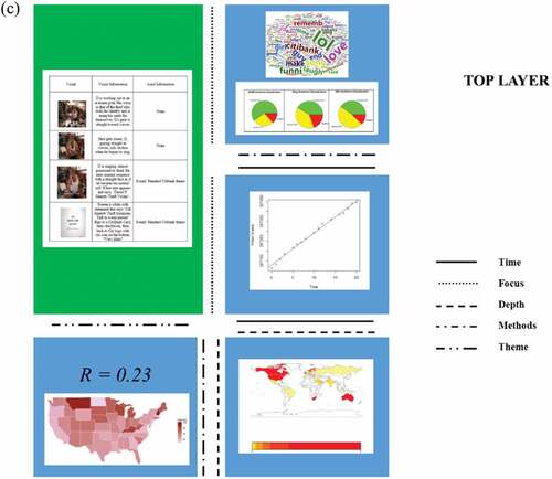
Sentiment analysis, a text analytics method, measures the polarity of text and can be used by businesses to understand consumers opinions of a brand or product releases (Mullich, Citation2013). We use sentiment analysis to gain insight into 82 viewer comments collected from the two most popular YouTube videos of the Citibank Darrel P. identity theft commercial from 78 unique YouTube users. Figure presents a word cloud of the comments. Word clouds are popular visual aids in text analytics, in which the word size corresponds to the chosen frequency measure.
Figure 3. Video comment text word cloud.
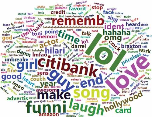
Three lexicons, afinn (Nielsen, Citation2011), bing (Hu & Liu, Citation2004) and nrc (Mohammad & Turney, Citation2013), are used in our analysis to classify comments as either positive, negative or neutral. Figure displays the sentiment classification based on these lexicons. Based on the results, two of the three lexicons classify most of the comments as positive, and one lexicon classifies the majority of the comments as neutral. The sentiment analysis and word cloud both suggest that the comedic nature of the video is what is drawing an audience and the importance of fear may be overshadowed.
Figure 4. Sentiment classification using AFINN, bing and NRC lexicons.
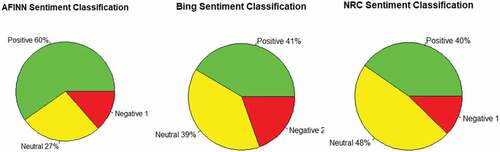
Figure 5. Video views regression plot.
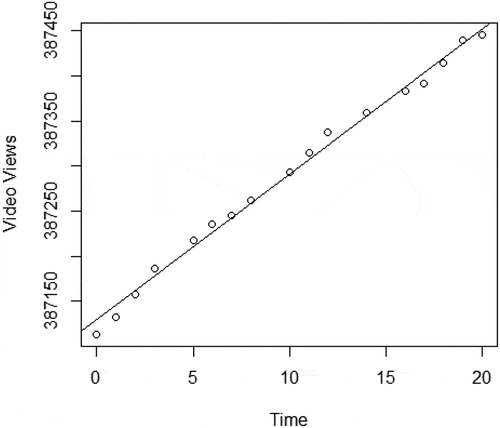
Rather than narrowly focusing on the small collection of commenters, we can gain a better understanding of the larger population of interested YouTube video viewers watching the video by modeling viewers over time. While the Citibank identity theft videos starting airing over a decade ago, the video continues to attract an audience, suggesting the continued relevance of the content. We tracked the total number of views over 20 days. Using the elapsed time from the beginning of our tracking as our independent variable and the number of views as our dependent variable, we fit a linear regression model to forecast video views, depicted in Figure . The line of best fit based on our small-scale example is:
where represents video views and
represents time. As demonstrated, each day we expect the number of views to rise by 16.
While interest in the video continues well beyond its release, the relevance of this particular video likely waned over the years. This leads us to consider the more general public interest in YouTube videos about identity theft in recent years.
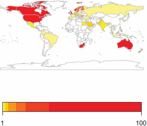
We perform exploratory spatial data analysis using visualization to display the results. Aggregated YouTube search interest data for “identity theft” from 1/1/2008 until the present, 7/6/2018Footnote3 is used. The data is collected on the country-level and at the state-level for U.S-only data. Figure displays interest on the country-level. As shown, the U.S., South Africa, Canada and Australia have high levels of interest in identity theft-related videos. Smaller countries that may not be as noticeable that have high levels of interest in identity theft include Jamaica, Trinidad & Tobago and Puerto Rico. Some countries with little to no interest in identity theft videos include: China, Russia, Nigeria, Ukraine, Iceland, Hungary and Greece.
Figure 6. YouTube search interest (google trends) in “identity theft” from 1/1/2008–7/6/2018.
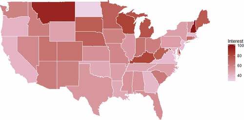
Next, we analyze identity theft video interest in the US by state in the same timeframe. As shown in Figure , the states with the most interest are: New Hampshire, Montana, Wisconsin, Kentucky and Delaware. The states with the least interest are: North Dakota, Hawaii, Alaska, New Jersey and Massachusetts.
Figure 7. YouTube Search Interest (google trends) in “identity theft” from 1/1/2008–7/6/2018, US only.
After visualizing worldwide interest and more narrowly considering identity theft YouTube video interest in identity theft, the extent to which video interest correlates to identity theft incidence is considered. The Consumer Sentinel Network Data Book (Citation2017), which was created by the Federal Trade Commission of the US, contains aggregated yearly information about identity theft reports in US states. We calculate the correlation between the FTC data and google trend data per US state for 2017. We find a weak positive correlation of 0.23 between search interest and the total reports and an even weaker positive correlation of 0.10 between search interest and reports per 100,000 population. Our findings suggest that there is a clear disconnect between the reality of identity theft and public interest in the topic.
3.3. Top layer: data storytelling
The top layer of our data quilt combines all of the elements of our data quilt together. We weave the story of the objective, data, process and analysis results into a single cohesive package, made up of the smaller elements of the data story. Our analysis was a multidimensional, multilayered consideration of the role of fear in identity theft. Beginning with a structured analysis of the visual and aural content of a CitiBank commercial, we evaluate the divergence between the fear message and the commercial content, which relies heavily on humor to convey the marketing message.
From this initial analysis, the importance of this lack of connection between content and message is uncovered. The story of our data quilt begins with the quantitative content analysis of the commercial video. Analyzing the image, video and sound content, we explain the divergence between the humorous content and fear message. Next, we identify a similar difference between the fear message and the commercial video viewer reaction. We present the word cloud displaying term frequency and the sentiment analysis results, showing that two of the three lexicons find viewers comments are positive and one suggests that the comments are neutral.
The comments represent viewer response since the posting of the video. For this reason, we explore the present relevance of the video by tracking viewership and representing the relationship over time using regression. The nominal increase in viewership over the sample period leads us to explore if spatial or geographic patterns of topical interest are present. Instead of narrowly focusing our analysis on interest in the specific video, we widen the scope to include interest in all videos on identity theft. We also widen the timeframe of our analysis.
Finally, we turn our attention to the reality of identity theft, narrowing our depth both geographically and temporally. In measuring the correlation between identity theft occurrence and search interest in the United States, we find a very weak, positive correlation. This final analysis further solidifies the overall theme of our story: dissonance. We find a disconnect between: video content and message, video message and viewer response, and identity theft interest and occurrence.
The three layers of the illustrative data quilting example are displayed in Figure . The findings presented in the data quilt are important because, while the ad was critically acclaimed by the advertising industry, the seriousness of the threat of identity theft, considered in the data quilt as fear, is lost on video viewers and those most impacted by identity theft are not the most interested in it. This data quilting analysis can help to inform stakeholders in identity theft, including people, companies, regulators and governments.
Figure 8. a. Data quilting example layers. b. Data quilting example layers. c. Data quilting example layers.
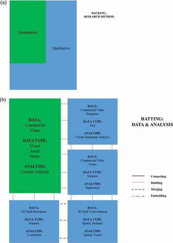
Figure 8. Continued.
4. Conclusion
In this research, we have introduced data quilting as a new analysis methodology that combines both art and science to address a research problem. Using a three-layer approach and drawing on the parallel process of quilting, we introduce and describe each layer. Finally, we demonstrate a data quilt analysis using a real-world example.
With the increasing complexity associated with understanding and analyzing real-world phenomena, traditional methods and approaches used in isolation often fail to capture the big-picture of today’s data. Business problems and, more generally, research questions, need not be static or singular, but instead can be dynamic and evolutionary. As such, finding the answers through data analysis may require the multidimensional analysis of diverse but related data. Data quilting is ideal in the analysis of many different types of data to address the same research problem.
As described, data quilting provides a means of making sense of both structured and unstructured data without compromising the research, methodological and analytical foundations enabling the method. The deliverable of data quilt creation is the data quilt, which includes the backing, insulation and decorative top layer, with the most visible layer being the top layer. With this forward-facing deliverable in mind, the data quilter’s analysis benefits from the flexibility of the method, without compromising the analytical foundations. Data quilting provides analysts with a practical framework to guide decision making regarding the research approach, data analysis and storytelling. These decisions contribute to the uniqueness of each data quilting project.
Cover image
Source: Author.
Additional information
Funding
Notes on contributors
Murugan Anandarajan
Murugan Anandarajan is a Professor of MIS at Drexel University. His current research interests lie in the intersections of areas Crime, IoT, and Analytics. His work has been published in journals such as Decision Sciences, Journal of MIS, and Journal of International Business Studies. He co-authored eight books, including Internet and Workplace Transformation (2006) and its follow up volume, The Internet of People, Things and Services (2018). He has been awarded over $2.5 million in research grants from various government agencies including the National Science Foundation, U.S. Department of Justice, National Institute of Justice, and the State of PA.
Chelsey Hill
Chelsey Hill is an Assistant Professor of Business Analytics in the Information Management and Business Analytics Department of the Feliciano School of Business at Montclair State University. She holds a BA in Political Science from The College of New Jersey, an MS in Business Intelligence from Saint Joseph’s University and a PhD in Business Administration with a concentration in Decision Sciences from Drexel University. Her research interests include consumer product recalls, online consumer reviews, safety and security, public policy and humanitarian operations.
Notes
1. CitiBank Identity Theft Commercial- Darrel P.: https://youtu.be/Iy5jiYWuNKo.
3. YouTube search interest collected using Google Interest search capabilities. Geographic information for specific video views is not available to the public.
Related Research Data
References
- Bell, P. (2001). Content analysis of visual images. In T. Van Leeuwen & C. Jewitt (Eds.), Handbook of visual analysis (pp. 10–19). Thousand Oaks, CA: Sage.
- Bordwell, D. (1989). Making meaning: Inference and rhetoric in the interpretation of cinema. Harvard University Press.
- Bruner, G. C. (1990). Music, mood, and marketing. The Journal of Marketing, 54, 94–104. doi:10.1177/002224299005400408
- Buchanan, D. A., & Bryman, A. (2007). Contextualizing methods choice in organizational research. Organizational Research Methods, 10(3), 483–501. doi:10.1177/1094428106295046
- Burrough, P. A. (2001). GIS and geostatistics: Essential partners for spatial analysis. Environmental and Ecological Statistics, 8(4), 361–377. doi:10.1023/A:1012734519752
- Consumer sentinel network data book 2017: State rankings: identity theft reports. (2018, March 1). Retrieved from https://www.ftc.gov/policy/reports/policy-reports/commission-staff-reports/consumer-sentinel-network-data-book-2017/state-rankings-id-theft-reports
- Creswell, J. W. (2014). A concise introduction to mixed methods research. Thousand Oaks, CA: Sage Publications.
- Cukier, K. (2010). Data, data everywhere: A special report on managing information. Economist Newspaper.
- Davenport, T. H. (2013). Analytics 3.0. Harvard Business Review, 91(12), 64-+.
- Fetters, M. D., Curry, L. A., & Creswell, J. W. (2013). Achieving integration in mixed methods designs—Principles and practices. Health Services Research, 48(6pt2), 2134–2156. doi:10.1111/1475-6773.12117
- Flannery, M. C. (2001). Quilting: A feminist metaphor for scientific inquiry. Qualitative Inquiry, 7(5), 628–645. doi:10.1177/107780040100700507
- Goodwin, C., & Heritage, J. (1990). Conversation analysis. Annual Review of Anthropology, 19(1), 283–307. doi:10.1146/annurev.an.19.100190.001435
- Guattari, F., & Deleuze, G. (1987). A thousand plateaus: Capitalism and schizophrenia. London: Athlone Press.
- Halcomb, E. J., & Hickman, L. (2015). Nursing standard: Promoting excellence in nursing care. Mixed methods research, 29(32), 41–47.
- Hearst, M. A. (1999). Untangling text data mining. In Proceedings of the 37th annual meeting of the Association for Computational Linguistics on Computational Linguistics (pp. 3–10). Association for Computational Linguistics.
- Hu, M., & Liu, B. (2004, August). Mining and summarizing customer reviews. In Proceedings of the tenth ACM SIGKDD international conference on Knowledge discovery and data mining (pp. 168–177). ACM.
- Iedema, R. (2001). Analysing film and television: A social semiotic account of hospital: An unhealthy business. Handbook of visual analysis, 183–204.
- Kivunja, C., & Kuyini, A. B. (2017). Understanding and applying research paradigms in educational contexts. International Journal of Higher Education, 6(5), 26–41. doi:10.5430/ijhe.v6n5p26
- Kress, G. R., & Van Leeuwen, T. (1996). Reading images: The grammar of visual design. New York, NY: Routledge.
- LaValle, S., Lesser, E., Shockley, R., Hopkins, M. S., & Kruschwitz, N. (2011). Big data, analytics and the path from insights to value. MIT Sloan Management Review, 52(2), 21.
- Miceli, D., & Kim, R. (2010). 2010 Identity fraud survey report: Consumer version. Javelin Strategy & Research.
- Mohammad, S. M., & Turney, P. D. (2013). Crowdsourcing a word–Emotion association lexicon. Computational Intelligence, 29(3), 436–465. doi:10.1111/j.1467-8640.2012.00460.x
- Moran-Ellis, J., Alexander, V. D., Cronin, A., Dickinson, M., Fielding, J., Sleney, J., & Thomas, H. (2006). Triangulation and integration: Processes, claims and implications. Qualitative Research, 6(1), 45–59. doi:10.1177/1468794106058870
- Mullich, J. (2013). Guide to sentiment analysis. Data Informed 2013, Febeuary 4. Retrieved from data-informed.com/guides/guide-to-sentiment-analysis/.
- Nielsen, F. Å. (2011). A new ANEW: Evaluation of a word list for sentiment analysis in microblogs. arXiv Preprint, arXiv:1103.2903.
- Oakes, S. (2000). The influence of the musicscape within service environments. Journal of Services Marketing, 14(7), 539–556. doi:10.1108/08876040010352673
- Parpis, E. (2004, February 09). Creative best spots: Campaign of the year - Citibank. Retrieved from https://www.adweek.com/brand-marketing/creative-best-spots-campaign-year-citibank-70263/
- Ray, M. L., & Wilkie, W. L. (1970). Fear: The potential of an appeal neglected by marketing. Journal of Marketing, 34(1), 54–62.
- Sacks, H., Schegloff, E., & Jefferson, G. (1974). A simplest systematics for the organization of turn-taking for conversation. Language, 50, 696–735. doi:10.1353/lan.1974.0010
- Saukko, P. (2000). Between voice and discourse: Quilting interviews on anorexia. Qualitative Inquiry, 6, 299–317.
- Sermijn, J., Devlieger, P., & Loots, G. (2008). The narrative construction of the self: Selfhood as a rhizomatic story. Qualitative Inquiry, 14(4), 632–650.
- Unwin, D. J. (1996). GIS, spatial analysis and spatial statistics. Progress in Human Geography, 20(4), 540–551. doi:10.1177/030913259602000408
- Warren, K. J. (1994). Toward an ecofeminist peace politics. In K. J. Warren (Ed.), Ecological Feminism (pp. 179–200). London: Routledge.
- Winkler, S. (2012). Analysis of public image and video databases for quality assessment. IEEE Journal of Selected Topics in Signal Processing, 6(6), 616–625. doi:10.1109/JSTSP.2012.2215007
- Witte, K. (1992). Putting the fear back into fear appeals: The extended parallel process model. Communication Monographs, 59(4), 329–349.
- Wooffitt, R. (2005). Conversation analysis and discourse analysis: A comparative and critical introduction. London: Sage.