
Abstract
Revolution stamps are stamp collections published in 1946 that commemorate the first anniversary of Indonesia’s independence. Before the revolution stamps, the circulation of stamps in Indonesia was owned by the Dutch and Japanese. This revolution series was chosen for this research topic, especially for ‘Banteng’ stamps. This study was conducted to find the meanings of the stamps of a revolution series. The method used was qualitative with an iconographic and iconological approach. The results of the study revealed that the primary meaning of the stamps is the real meaning of breaking the chain containing the expression of force. The secondary purpose is the expression of power, embodied symbolically in themes and concepts. Finally, the intrinsic meaning of this stamp is the life of the Indonesian people during the revolution, which was filled with conflicts of struggle. Thus, the use of themes and concepts of the expressions of strength is presented symbolically to motivate the people to defend Indonesia’s independence.
Introduction
Historically, mail and postal activities have been carried out since 4000 BC (Bramadi, Citation2001, p. 4). Mail delivery at that time was done in various ways, such as by using carrier pigeons, horses, or simply on foot (Schwartz, Citation2021). Along with the development of transportation tools that make it easier for humans to travel from one region to another, the demand for postal deliveries has increased. However, an effective postal system, including shipping cost rates and payments, was not invented until the mid-17th century (Kielbowicz, Citation2002).
Postal delivery in those days was vulnerable to misuse of shipping cost rates. The payment rates were in cash and charged to the postal recipient at a non-fixed rate. This shortcoming moved an English nobleman, Sir Rowland Hill, to create a ‘small piece of paper’ with a nominal postal fee rate as proof of payment for postal delivery called stamps. On 6 May 1840, stamps were officially used for every postal delivery in England (Hill & Hill, Citation1880).
Based on the basic concept of stamp creation, it can be stated that stamps have two main functions, which are a communicative function and an aesthetic function. The communicative function of stamps lies in their use as payment rates for postal delivery services. Meanwhile, the aesthetic function of stamps is to create media that contain an aesthetic value through visual elements consisting of colors, shapes, images, spaces, and typography that are realized to convey a message (Cullen, Citation2012, p. 73). This is realized in stamps; thus, stamps have an aesthetic function.
The aesthetic function of stamps was then developed with the presence of philatelists, who made stamps collectible. For Indonesian philatelists, stamps are not the only medium of exchange for postal delivery payments. Old-printed stamps, as historical artifacts, have become a worthy collection. One of the old-printed stamps targeting philatelists is the stamp of the revolution series published in 1946–1947 in Indonesia with 14 design illustrations, some of which have the same design illustrations but with different colors and nominals.
The search for the meaning of philosophical value in the design of the stamps of the revolution series published in 1946 interested the author to make it a research topic. The search for meaning will focus on analyzing stamp designs by observing the trends that developed in Indonesia during that period. This effort was made without disregarding other factors like the situation and the political, economic, social, and cultural conditions that developed when this stamp was issued in 1946. Thus, through these efforts, the process of understanding the meaning will become clear and relevant to the context of the time.
Additionally, the aim of this study is to clarify how visual communication media, such as stamps, play a role in revealing the national identity, particularly in Indonesia. Essentially, national identity is the manifestation of cultural values that flourish and evolve within various aspects of a nation’s life, characterized by specific traits that distinguish it from other nations in their way of life. In this context, it pertains to the Indonesian nation, with diverse noble values and cultural heritage (Tilaar, Citation2000, p. 598). The cultural values prevalent among most of the population within a nation, reflected as the national identity in this study, are embodied in stamps. This aligns with Anderson’s conception of nationalism and a sense of nationhood which emerges through the process of ‘imagined’ underpinned by technological advancements, such as printing presses, maps, newspapers, etc. (Arianto, Citation2017, p. 49). This study examines one of the contexts in which national identity is ‘imprinted’ through stamps.
This study applies iconography and an iconological theory. This theory is used to determine the meaning of the stamp design of the revolution series through the symbols used. The meaning process in this study was carried out by limiting and choosing one stamp design as a sample in the stamp population of the revolution series. Internal sampling was used as the sample-selection technique. This technique is intended not to generalize the population of stamps of the revolution series, but rather to obtain the depth of study in a context with certain characteristics, as well as the samples are used to represent information (Sutopo, Citation2006, p. 86).
From the revolution series, two stamps were found that had a certain character that interested the author, which were the stamps with a bull, as illustrated by the banteng stamps. This interest is based on the following: (1) these stamps were issued to commemorate the one-year anniversary of the independence of the Republic of Indonesia; and (2) from the other stamps in the revolution series, only these stamps used animals as objects. These two factors became the background for the author to conduct a search for the meaning of the banteng stamps from the revolution series.
Literature review
The iconography and iconology
The process of finding meaning in this study used iconography and an iconological theory. The iconography and iconology used in this study depart from Erwin Panofsky’s work (Panofsky, Citation1955). Iconography and iconology are used to study the relationships among themes, concepts, and various visual marks built into art objects. This reflects the history of the art object, as well as the history that prevailed during the time the object was created (Burhan, Citation2013, p. 11). There are three stages in iconography and iconology that must be studied: the iconographical description, iconographical analysis, and iconological interpretation (). These three stages have corrective principles, including a history of the style, types, and cultural symptoms (Carollina, Citation2016, p. 54).
Table 1. The stages of iconography and iconology.
The ‘Banteng’ stamps
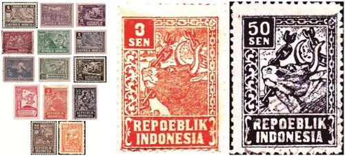
The revolutionary series stamps were issued by the Indonesian government from 1946 to 1947 and printed in Jakarta. These stamps were published in ten different designs (). Some were published in two nominals and in two different colors. The object of this study is banteng stamps of the revolution series, which uses a bull as an illustration. The banteng stamps are one of the stamps from the revolution series issued to commemorate the one-year anniversary of Indonesia’s independence.
Figure 1. The revolution series including Banteng stamps.
Source: Carollina (Citation2016).
The news of the revolution series stamps itself was announced through the newspaper ‘Lasjkar’ published on Saturday, Pon, 24 August 1946. The information conveyed in the newspaper was about the issuance of new stamps with the revolution series (Antara, Citation1946). The process of printing stamps still used a simple technique that involved high printing by utilizing plates as print clichés. The paper used in those days was HoutVrij Schrijpfapier. Because of the limited printing technology in Indonesia at that time, stamps were printed in only one color.
Methods
This research was qualitative research, where the qualitative research emphasized detailed, complete, and in-depth sentence descriptions, which were used to describe the actual situation to support the presentation of data. Qualitative research is characterized by the collection of data in the form of words, sentences, or images that have a more evocative meaning and can trigger the emergence of a real understanding compared to presentations in the form of numbers or frequencies (Sutopo, Citation2006, p. 88).
The approach used in this study was iconographic. An iconographic design considers the meaning of a work, so the focus of the research is in terms of the content rather than the form (Drainville, Citation2018, p. 8). The data analysis applied in this study used iconography and an iconological theory. The data sources used in this study were documents and literature. The data analysis technique applied in this study was inductive.
Results
Iconographical description
The pre-iconography description stage examines the visual aspects of a work of art. This stage comprised factual and expressional meanings. The main discussion at the pre-iconography description stage of this study was to try to identify the visual aspects of the banteng stamp illustration. The results of the description were then used to search for factual and expressive meanings in the stamp illustrations of the banteng stamp.
The search for factual meaning was first carried out by identifying each of the basic or visual elements contained in the banteng stamps. Before identifying the visual elements in the stamps, some brief information will be presented about the banteng stamp series which can be used to complete information when identifying the visual elements of the stamps. The banteng stamps were issued in 1946. These stamps were printed into two different nominals, including 3 cents (3 sen) and 50 cents (50 sen). For the 3 sen stamps, they were printed in red, whereas the 50 sen stamps were printed in black. Although they were printed in different nominals and colors, these two stamps used the same design.
The search for factual meaning in Banteng stamps was carried out by identifying the basic elements or visual elements that were manifested in a unified stamp design. In an image design or bi-dimensional visual form for the purpose of communication, the elements that make up the unity include illustrations, photography, symbols, and typography (Adityawan, Citation1999, p. 3). The collaboration of these visual elements can then convey a functional and effective message.
Visual elements were observed on the surface of the banteng stamp, including illustrations, symbols, and typography. An illustration is an artistic image used to visually explain an intention or purpose. The scope of illustrations is images that reflect the narrative in the text or image as the text itself (Susanto, Citation2011, p. 190). In the banteng stamps, there is a picture that can be categorized as an illustration that depicts a bull breaking a chain. This illustration depicts a scene in which a bull appears to push up a chain with its horns, so the chain is broken. The bull’s eyes are fiercely staring at the broken chains. The background in the scene is not clearly visible, but in some forms, the background used is a cloud landscape.
The bull illustration of breaking the chain is surrounded by a picture of the chain on the top and right sides of the illustration. On the left side of the illustration, there are several ornamental images. Ornaments are decorations made by drawing, sculpting, or printing to improve the quality and value of an object or work of art (Susanto, Citation2011, p. 284). Ornaments are often staple sources of natural origin, such as plants or flora. Likewise, in this stamp, the ornament on the left side of the illustration of the bull breaking the chain is included in the basic ornamental variety of plants with leaf and flower shapes. These ornaments of plants or flora are often depicted stylistically or are subjected to simplification in both form and detail. In stamps, ornaments of plants or flora are also depicted as stylized and are similar to the stylization of the ‘Chinese lotus’ flower from West Sumatra when referring to a picture in Toekio’s book (Toekio, Citation1987, pp. 74–82).
At the top of the ornamental image in each of the banteng stamps with both 3 sen and 50 sen types, the three sen square boxes are red, while the 50 sen square boxes are black. The arrangement of the lines on the 3 sen stamps is composed center-set in the text 3 sen. The text ‘3’ is in the upper position with a vertical alignment in the center of the text ‘SEN’. For the 50 sen stamps, the arrangement of the rows is composed at a justified level. The text ‘50’ is located at the top, with an equal vertical alignment on the left and right sides with the text ‘SEN’. Each of the ‘3’ text and the ‘50’ text has a larger scale size compared to the ‘SEN’ text.
The typography of each stamp of the ‘bull’ revolution series, both numbered 3 sen and 50 sen, was printed using the Serif typeface. Serif is a font or letter with transverse lines in each stroke (Ambrose & Harris, Citation2011, p. 89). In simple terms, a Serif font or font type is a font that has a hook on each letter. The word ‘SEN’ in stamps is printed in majuscules or capital letters. At the bottom of the illustration of the bull breaking the chain is the text ‘REPOEBLIK INDONESIA’. The text ‘REPOEBLIK INDONESIA’ is composed of a central alignment. The text ‘REPOEBLIK’ is at the top, with the vertical line alignment in the middle of the text ‘INDONESIA’. The size of each text has the same large scale, so the text ‘INDONESIA’ appears to be indented more than the text ‘REPOEBLIK’. The typeface used in the text ‘REPOEBLIK INDONESIA’ is included in the category of Serif or related letters printed in majuscules or capital letters.
The arrangement of these visual elements creates a stamp design for the banteng stamp that is symmetrically balanced and has unity. In principle, symmetrical/formal equilibrium is the equal division of the weight of time between the left or right, and between the top and bottom symmetrically or equivalently. While unity is one of the basic principles in a design that can be said to be unified when the whole seems harmonious, and there is unity between the typography and illustration (Anggraini & Nathalia, Citation2014, p. 56). In addition to balance and unity, dominance is another principle that must be present in every design. Domination is used as an attraction that makes it the center of attention (Sanyoto, Citation2009, p. 113). Domination can also divide visual elements into a hierarchy consisting of the main and supporting elements (Cullen, Citation2012, p. 54).
A further observation of the bull breaking the chain illustration as the dominant element in the banteng stamp design revealed that the illustration used was not a realistic depiction of the illustration, but rather a symbolic one. This is observed from the scale of the size of the broken chain, which is large compared to the size of the bull’s body. In reality, the body size of a bull is larger than that of a chain. Illustrations using symbolic depictions, such as banteng stamps are common. As in all types of images, illustrations can be depicted concretely, objectively, realistically, abstractly, or symbolically (Samara, Citation2007, p. 145). One of the properties or characteristics of the presentation of illustrations can be achieved, among others, with allusions or symbols (Sukardi, Citation1982, p. 77). This is because symbols are an effective method for presenting illustrations (Kleppner, Citation1966, p. 23).
The illustrations depicted symbolically in the banteng stamps appear using the hand-drawn technique. This can be seen from the line used to distinguish between dark and light in the image plane. Historically, in 1946, the year of the issuance of the banteng stamps, there was insufficient digital technology to make smooth and detailed illustrations in Indonesia. Currently, work on stamp design illustrations is performed manually by artists or drawing experts.
At the beginning of Indonesia’s independence, art, and design mediums, such as posters, plaques, wall scribbles (murals), and paintings were created by artists. At that time, products that are now categorized as designs were originally created by artists (Adityawan, Citation1999, p. 20). Similar to illustrations in an art medium, at this time the creator of the illustration was known as an illustrator, but in the pre-independence to post-independence period, it was still known as an artist. Indonesian illustrators from 1909 to the 1960s were numerous (Hermanu, Citation2014, p. 56). However, most of these illustrators at that time had backgrounds as painters, draftsmen, and drawing teachers, who were also known as artists.
The process of working on stamp illustrations in 1946 was carried out by making drawings or illustrations on ordinary-sized paper. Then, it was given a color (usually black) in the field, which would later become colored when printed. The paper in which there was an illustration would then become a printed reference for the stamps to be printed. Starting from a large sheet, the printed reference was photographed and then reduced and arranged in such a way as to be later made into several smaller stamp designs that had been arranged in such a way as to be printable.
After the printing plate was finished, the process of printing the stamps could also be done. In 1946, a common printing technique used was a high printing technique in hand printing. This technique was called this term because the part that was printed was higher than the part that was not printed. The working principle of high printing by hand is to print a flat on a flat top, which is the work between back pressure and a printed reference with a very high print pressure (Wasono, Citation2010, pp. 278; 287). Using this high printing technique, only the printing field that is inked or the higher part (in this stamp uses red and black ink, respectively) becomes colored, whereas, in the field that is not exposed to ink, the lower part follows the color according to the paper material used (in this stamp, it is white).
The paper material used on the banteng stamps is HoutVrij Schrijfpapier with a 50–60 gsm. HoutVrij Schrijfpapier paper is included in the paper or printing material as an uncoated type. Uncoated paper has a large ink absorption, a rough surface, easy picking, and low PH so that it dries slowly because the surface is corrugated, and the print results do not cause gloss. HoutVrij Schrijfpapier paper itself has wood-free fiber, which makes it resistant to long-term storage. The author could not determine the ink used in the high-printing technique in the banteng stamps. However, broadly speaking, the ink used for the high printing technique on these stamps does not evaporate quickly. In principle, inks that do not evaporate quickly consist of mineral oils and pigments (Wasono, Citation2010, p. 14).
The description of the visual elements in banteng stamps can be used to reveal the factual meaning of the dominant element, namely the symbolically depicted illustration. The factual meaning contained in banteng stamps is that the bull breaks the chain. This discovery of the factual meaning of banteng stamps can be used to express the expressive meaning contained therein. The appearance of expressive meaning is carried out to reveal empathy based on the habits and familiarity of an object. On the banteng stamps, there is the symbol of the bull breaking the chain, as the factual meaning of the stamp has an expression of power. This expression is symbolically shown in the illustration, where the bull can break the chain that is relatively large.
Clarifying the description at the pre-iconographic stage requires corrective principles for the history of the style. Style or stijl is a fixed or constant form possessed by a person or group, both in terms of its elements, qualities, and expressions (Soekiman, Citation2011, p. 42). Art style is a grouping or classification of works through various approaches including time, place, form, technique, and subject matter (Susanto, Citation2011). According to Henk Baren, styles can be classified into: (1) Objectieve stijl, (2) Persoonlijk stijl, (3) Stijl massa or Nationale stijl, and (4) Technische stijl. Attempts to categorize the use of force on the banteng stamps can be made using the approach of time, place, technique, and subject matter when the banteng stamps are published. This approach is then elaborated upon with the findings of the factual meaning and expressional meaning of the banteng stamps.
Such efforts can reveal the forces used in these stamps. Banteng stamps were published in Indonesia in 1946, using a simple printing technique. In that period, Indonesia had just become independent and was trying to maintain its independence from the arrival of the NICA (Netherlands-Indies Civil Administration). This condition is also in accordance with what was expressed by H. B. Yasin that the revolutionary force saw everything from the center of suffering; they not only knew but also experienced and felt it in the body and soul (Toer, Citation1994, p. vi). In addition, looking at the background of the historical social conditions behind the creation of banteng stamps, the discovery of the factual and expressional meanings of these stamps can also be used to identify the style categories used in the banteng stamps.
Banteng stamps, with the factual meaning of the bull breaking the chain, have an expressive meaning of power. The results obtained from the elaboration process revealed that the force used in the banteng stamps was an expression of strength. This style of expression of strength departs from the creed of suffering experienced during colonialism (oppression and suffering), as well as the ideal dreams of the Indonesian people who were very eager to maintain independence. The style used can be classified into the category of mass stijl or nationale stijl. Mass stijl in Dutch has the meaning of mass style, while nationale stijl has the meaning of national style. Definitively, a mass stijl or nationale stijl characterizes or foreshadows (disposition) a nation (Soekiman, Citation2011, p. 43). In simple terms, the nationale stijl can be interpreted as a style with aesthetic values or tastes that are able to show the characteristics or disposition of a nation. In the banteng stamps, the mass stijl or nationale stijl is used as a style to express the strength of human nature that affects all thoughts and behaviors, including the ideal of independence, which at that time was the dream of every Indonesian citizen during the revolution to maintain independence from NICA.
Iconographical analysis
The second stage in iconography and iconology refers to an iconographical analysis. This stage seeks to identify secondary meanings related to themes and concepts in the design of stamp illustrations of banteng stamps. The process is carried out by looking at the relationships between the objects in the illustration, theme, and concept of the banteng stamps, based on a daily and general experience. Sources that can be used to make these observations are obtained from various images, literary sources, and allegories (Panofsky, Citation1955, p. 35).
At the pre-iconographic stage, it was discovered that the dominant element in the stamps of the banteng stamps lies in the symbolically depicted illustrations. The illustration symbolically depicts a bull breaking a chain using a nationale stijl. The bull breaks the chain at once, creating a factual meaning in the Banteng stamp. In addition to the factual meaning found in the pre-iconographic description stage, there is also the expressional meaning of the bull breaking the chain in the illustration. The expressional meaning of the symbol shows the expression of power symbolized through the image of the bull breaking the chain.
The characteristics of bulls that symbolically express power have been discussed in the literature. The power that is the expression of a bull is possible because the bull is a wild animal that has been known to Indonesian people for a long time. According to the results of research conducted by Kurniawan, bulls played an important role in human life for 1000 years BC as a source of protein, equipment, beliefs, and body-covering tools (Kurniawan, Citation2009, p. 2).
The various important roles of bulls in human life are not surprising, because there are many traditional artworks that symbolically use bulls as inspiration for works of art. This was observed in Java and Bali. In addition to the various symbols or motifs of birds formed by sculptors, painters, metalsmiths, and weavers, distinctive winged creatures have been obtained. The creatures considered important include winged lions, bulls, and snakes. These three motifs are considered mythologically important in Java and Bali (Holt, Citation1967, p. 11). A novel set at the time when Indonesia was in the Dutch colonial period titled Sekar Mahardika, it is told briefly about the symbol of a winged bull. In the story, the symbol of a winged bull called Lamassu is used as a symbol for a money storage box at Javasche Bank. Lamassu was a mythical creature of the Assyrians in the Mesopotamian era, in the form of a human-headed winged bull with a beard. This emblem has the meaning of being a protector for either the dead or the living (Sujarwo, Citation2015, p. 72).
Referring to old literature, such as the Babat Jawi story, bulls were also used as symbols. In the story of Babat Jawi during the Mayadwipa era (Kingdom of Jenggala, Kahuripan, Gajahyana), the bull parade was carried out by the king’s courtiers to review his territory. This parade was also conducted as a symbol of the king’s concern for the parade. Even a bull is a symbol of the country’s strength and fertility. Symbolically, the king usually rides a bull (Herwanto, Citation2012, p. 12). These bull parade symbols can be found in the reliefs of Jago Temple, located in the Tumpang area of the city of Malang.
The exploitation of bulls’ power has also been known for a long time before Indonesia became independent. On a trip made by Stockdale in Java in 1774–1775, he revealed that one of the forms of entertainment favored by the Javanese emperors was the fights between wild beasts. The animals that were used were tigers and bulls. These fights were conducted on the fighting ground and were held for the pleasure of the palace lord. In many cases, the bull triumphed over the tiger (Stockdale, Citation2010, p. 138).
Because of its mighty shape and power, the bull is often used as a symbol of strength in facing enemies by the Javanese people, namely as the banteng ketaton (Alikodra, Citation1983, p. 12). In the Indonesian dictionary, the term banteng ketaton is Javanese language which figuratively refers to a bull wounded by a weapon—a person who resists or defends himself tenaciously. Ketaton in Javanese means being injured or hurt.
In the days of the independence movement, the bull symbol that became the concept of the theme of the expression of power behind oppression was used as a symbol in the party. The Indonesian National Party (PNI) uses the bull symbol. Sukarno founded the Indonesian National Party (PNI) on 4 July 1927 (Hering, Citation2013, p. 10). Regarding the bull symbol as a party emblem, Claire Holt revealed that Indonesia is like a bull and can be restrained by its nose, but once it rises, it will start to rage (Holt, Citation1967, p. 18).
The theme and concept of the symbolic expression of power using the nationale stijl in the medium of art and visual communication in 1946 was created by the social conditions that occurred in Indonesia at that time. Knowledge about the social sphere of Indonesian society at that time can be used as a foundation based on the history that applies to the medium of art and the medium of visual communication at that time. The type of history is a corrective principle at the iconographic analysis stage. Specifically, the type of history is a historical condition that influences the convention of a theme or concept expressed in specific objects and events that prevail at a certain time and region (Panofsky, Citation1955, pp. 36–37).
The principle of the historical corrective type seeks to reveal how the various historical conditions that occurred at that time influenced the formation of the theme of the expression of the great powers behind oppression through the bull symbol as a concept in the design illustration of banteng stamps. The use of art and visual communication media as propaganda media to encourage the enthusiasm and trust of the people in achieving independence began with the birth of Persatuan Ahli Gambar Indonesia). PERSAGI was founded in 1937 by Sudjojono and Djajasuminta (Kardinata, Citation2015, p. 83). After PERSAGI was disbanded, it was during the Japanese occupation that the Cultural Center (Keimin Bunko Sidhosjo) was established, which became a special art section for Japan to carry out its propaganda. However, the Cultural Center, which contained several artists from PERSAGI, made it a way to launch a national goal (Holt, Citation1967, p. 285).
During the Indonesian revolution, the use of themes and concepts of the symbolic expression of power in the style of nationale stijl became a specific convention that is commonly used in the medium of art as well as the medium of visual communication, such as posters, plaques, murals, paintings, and state objects, such as stamps. This is due to the social conditions of the Indonesian people who defended their independence from the presence of NICA, which later contributed to the creation of banteng stamps.
Iconological interpretation
The last stage of this study is the iconological interpretation. This is an essential stage that departs from the corrected analysis at the iconographic analysis stage. The nature of this stage is the result of the synthesis intuition of the two previous stages that were able to reveal the meanings of the stamp design illustrations of the banteng stamps. This synthesis intuition is based on the psychological state or outlook of the life of the creator of the work (Panofsky, Citation1955, p. 38).
The psychological tendencies and outlook on the lives of Indonesian people during the revolution tended to lead to the nationale stijl style. This style embodies illustrations that depart from the theme and concept of the symbolic expression of power. This is because, during that period, Indonesia’s independence was threatened by the arrival of the NICA. Thus, the theme and concept of symbolic expression of strength in the style of nationale stijl could arouse the spirit of struggle and trust of the Indonesian people for independence.
The symbolic expression of power as an illustration in the medium of visual communication at that time was realized by using various symbols, such as bulls, figures of youths or nationalistic figures, war scenes, and others. These symbols were used to make it easier for communicants and the public to understand the message conveyed based on their familiarity with the objects symbolized in the visual communication medium of the time.
The limitations of Indonesian society have also affected visual communication in Indonesia, even since the 1930s. The trend of visual communication messages that began in that year had a single-minded orientation. This orientation is in the sense that messages must be focused and efficient. These demands are especially important in terms of simplification, both in a verbal form and with illustrations (Subakti, Citation1993, p. 55). Thus, even though Indonesia entered a period of independence, the use of symbols in the medium of visual communication is still used as an effective method to convey messages. One of them is seen on the banteng stamps, which use symbols as illustrations in their designs.
Symbols at one time can change their expression according to the evolving souls of the time (zeitgeist). Therefore, it is necessary to understand the condition of the scope of life of the people who became the souls of the time to be able to understand the symbolism. H.G. Wells in his book The Fate of Man wrote: ‘The stalemate (Western value system) between conservative instincts and creative revamping has failed to control the constrained Beast’ (Mangunwijaya, Citation1987, p. 18). This expression seems to imply the desire of colonists from Europe to conquer the colonies in the East, one of which is Indonesia. Indonesia is analogous to constrained animals that cannot be controlled or subdued. This is a logical reasoning framework when animal symbols embody the expression of power.
In this case, the expression of power manifests itself symbolically through the object of the bull breaking the chain in the stamp illustration. The object of the bull for Indonesian people signifies an animal that has great power. In addition, the concept of a bull’s power is further strengthened, especially in Javanese society, through the philosophy of banteng ketaton which in old literature refers to the behavior of bulls that continue to fight even though they are injured. In addition to the bull, a chain was utilized in the banteng stamps.
Chains are recognized as objects that bind or curb and then break off. This scene can be understood as a form of freedom gained from the power to break a chain. The embodiment of the theme and concept of a symbolic expression of power is certainly influenced by various conditions and events, as well as the outlook on life of Indonesian people in 1946 when this stamp was issued for the first time, as they were struggling to maintain the independence of the Republic of Indonesia from NICA.
In the iconological interpretation stage, corrective principles are needed that depart from the symptoms of culture according to the context of the object of art. This principle of the corrective history of cultural symptoms is used to correct the interpretation of the history of cultural symptoms in building symbols on art objects. This can be done by reviewing the different symptoms that exist around the object of art and referring to the psychology and outlook on the life (weltanschauung) of its people (Panofsky, Citation1955, p. 38). Thus, it is necessary to review the cultural history that built the symbols in the banteng stamps, referring to the psychological conditions and outlook on life of the Indonesian people in the period around 1946—the time of the revolution—to obtain a synthesis in the stage of the iconological interpretation.
Suwardi Suryaningrat also known as Ki Hadjar Dewantara was banished to the Netherlands in 1913, he established a press bureau under the name Indonesische Persbureau. The name Indonesische is the Dutch pronunciation for ‘Indonesia’. The name was also introduced by Prof. Cornelis van Vollenhoven in place of the Indisch or Indies. Correspondingly, the inlander or designation for indigenous people changed to Indonesier or ‘Indonesians’ (Sudirman, Citation2014, p. 13). A review of Indonesia during the revolution cannot be conducted without looking at some of the major occurrences of the previous period. Before Indonesia achieved independence, it was colonized by Europeans for ∼350 years, most of which were carried out by the Dutch. The Dutch exploited the natural and human resources of Indonesia (known as the Dutch East Indies) for the benefit of the Netherlands. This exploitation is known as the forced cultivation system. The wave of suffering, such as poverty, hunger, and even death caused by the system, was felt by every Indonesian person (Sudirman, Citation2014, p. 272).
A few months after the inception of Indonesia’s independence, NICA successfully landed in Indonesia. The arrival of NICA was considered as an intervention against the sovereignty of Indonesia’s independence. The people who experienced the joy of welcoming independence again faced the challenges. With the entry of NICA back into the homeland, it became a challenge for most people to maintain independence. In the early days of the revolution, an agreement was made with independence as the main goal. Everything seemed possible, except defeat (Ricklefs, Citation2016, p. 318).
The revolutionary period in the annals is indeed one of the brilliant epochs in Indonesian history, which is shown through the sacrifices made in the name of the revolution (Ricklefs, Citation2016, p. 317). However, this brilliance was previously barely achieved and provided a chance of victory for the NICA side. This was caused by internal factors of Indonesian society, which, although they wanted independence, have a sense of fatigue with all the impacts caused, such as hunger, pain, backwardness, and even death (Mangunwijaya, Citation1987, pp. 30; 55).
Various backgrounds surrounding various events that occurred during the revolution then became a tendency to create the visual form of a visual communication medium. The tendency to raise the spirit of nationalism and rally the confidence of the people was used to keep them in the spirit of defending independence. Thus, themes and concepts of the symbolic expression of power were used in the visual communication media of that time. The purpose of using the themes and concepts of the symbolic expression of power was to rally the people and warriors who felt tired and demoralized again, motivated by the strength that they had to defend their independence.
When reviewed from the period of the 1920s to 1945, what was sought to be embedded in all the minds and passions of the Indonesian people was an effort to foster a national consciousness. This effort has become a symptom of culture that is not only seen in political aspects but also in all aspects of Indonesian people’s lives. This is based on the belief that a deep spirit of nationalism can form an identity, encourage national pride and prestige, increase people’s loyalty to the nation, and make sacrifices for the benefits of the struggle. Thus, the nation’s driving figures, including artists, vigorously voiced the importance of fostering the spirit of nationalism among the Indonesian people. Consequently, the use of themes and concepts that raise the issue of the symbolic expression of power has become a common theme used in visual communication media during the revolution.
The same depiction is seen in the banteng stamps published in 1946. During the Revolution of 1946, Sukarno occupied the government’s position. The new government during the conflict also encouraged the creation of state objects, such as stamps, by using themes and concepts of the symbolic expression of power. The use of themes and concepts of the symbolic expression of power embodied in the nationale stijl style was one of the efforts made to motivate all Indonesians to embrace nationalism, which could be conveyed in all aspects, even with communication mediums, such as stamps. The presence of symbols in this visually embodied stamp illustration of the banteng stamps departs from all the conditions that occurred during the revolution. The conditions created behind this struggle had a great impact and influence on the psychology of the creator and the communicants. Thus, with the theme and concept of power expression that was embodied symbolically, it was able to convey a message regarding feelings of harmony and tranquility in a national consciousness to defend Indonesia’s independence.
Conclusion
After conducting a data search and analyzing the data used to reveal the meanings of the banteng stamps, the inferences of this study were obtained. The first conclusion was that the primary meaning contained in the banteng stamps consisted of the factual meaning of the bull breaking the chain and the expressional meaning of power. The second finding concerned the secondary meaning revealed through the themes and concepts that made up the illustrations of the banteng stamps. The theme found in the stamp illustrations sought to convey the expression of power. This theme of power expression was then realized using a symbolic concept. The third assumption concerned the intrinsic meaning of the banteng stamp design. It was found that by using the themes and concepts of the symbolic expression of power embodied by the bull symbol breaking the chain, the communicants were able to understand the message conveyed based on their familiarity with the symbolized objects.
The expression of strength, which is symbolically realized through the bull as an object, is known as a powerful animal that can continue to fight, even in a wounded state. Meanwhile, a broken chain can be understood as a form of freedom obtained from the power to break it. The embodiment of the theme and concept of the symbolic expression of power is also influenced by various conditions and events, as well as the outlook on the life of the Indonesian people during the revolution, which became a historical value of their culture. The Indonesian people’s lives during the revolution were filled with conflicts of struggle against NICA. As a continuation of what started in the 1920s, all efforts were made to instill beliefs and a passion for a national consciousness in every Indonesian. One of the efforts was to use the medium of visual communication, which was embodied in the theme and concept of the symbolic expression of power. This was done so that common people and adherents remained motivated by a national consciousness that emphasized the strength of the people in defending Indonesia’s independence.
Authors contributions
Mita Purbasari Wahidiyat drafted the work and reviewed it critically for important intellectual content, determined the final approval of the version to be published, and made an agreement to be accountable for all aspects of the work in ensuring the questions related to the accuracy or integrity of any part of the work were appropriately investigated and resolved. Donna Carollina devised the conception or design of the work, including the analysis and interpretation of the data for the work.
Disclosure statement
No potential conflict of interest was reported by the author(s).
Data availability statement
The author confirms that the data supporting the findings of this study is available in the article and/or its Supplementary Materials.
Additional information
Funding
Notes on contributors

Mita Purbasari Wahidiyat
Mita Purbasari Wahidiyat is a lecturer of the Graphic Design and New Media program at Bina Nusantara University, Indonesia. She earned her bachelor’s degree in Graphic Design in 1986. Her research interests include color and culture, the fundamental principles of design, and design methods.
Donna Carollina
Donna Carollina is a lecturer of Bina Nusantara University in the Visual Communication Design Department, School of Design.
References
- Adityawan, A. (1999). Tinjauan desain: Dari revolusi industri hingga posmoderen. UPT Penerbitan Universitas Tarumanegara.
- Alikodra, H. S. (1983). Ekologi banteng (bos javanicus d’alton) di Taman Nasional Ujung Kulon. Fakultas Pasca Sarjana Institut Pertanian Bogor.
- Ambrose, G., & Harris, P. (2011). The fundamentals of typography. AVA Publishing SA.
- Anggraini, S. L., & Nathalia, K. (2014). Desain komunikasi visual: Dasar-dasar panduan untuk pemula. Nuansa Cendekia.
- Antara (1946, August 22). Prangko baroe. Lasjkar Newspaper.
- Arianto (2017). Reviving Benedict Anderson: Imagined communities, Ben Anderson, dunia maritim, dan pembentukan identitas bangsa. International Conference, Universitas Sanata Dharma, Yogyakarta, Indonesia.
- Bramadi (2001). Filateli sebagai hobi dan investasi. Balai Pustaka.
- Burhan, M. A. (2013). Ikonografi dan ikonologi lukisan Djoko Pekik: ‘Tuan Tanah Kawin Muda’. Panggung, 23(3), 1. https://doi.org/10.26742/panggung.v23i3.137
- Carollina, D. (2016). Tinjauan ikonografi dan ikonologi ilustrasi kemasan produk Seduh Teh Cap Botol. Nirmana, 16(1), 50–12. https://doi.org/10.9744/nirmana.16.1.50-63
- Cullen, K. (2012). Design elements typography fundamentals. Rockport Publishers.
- Drainville, R. (2018). Iconography for the age of social media. Humanities, 7(1), 12. https://doi.org/10.3390/h7010012
- Hering, B. (2013). Soekarno arsitek bangsa. PT. Kompas Media Nusantara.
- Hermanu (2014). Djalan ke Barat: Jawa di mata C. Jetses. Bentara Budaya Yogyakarta.
- Herwanto, A. P. (2012). Perancangan buku etnografi kesenian bantengan. Program Pascasarjana Institut Seni Indonesia Yogyakarta.
- Hill, S. R., & Hill, G. B. (1880). The life of Sir Rowland Hill and the history of penny postage (Vol. 1). Thos. De La Rue & Co.
- Holt, C. (1967). Melacak jejak perkembangan seni di Indonesia. Artline.
- Kardinata, H. (2015). Desain grafis Indonesia dalam pusaran desain grafis dunia. DGI Press.
- Kielbowicz, R. B. (2002). Universal postal service: A policy history, 1790–1970. University of Washington.
- Kleppner, O. (1966). Advertising procedure. Prentice Hall Inc.
- Kurniawan, I. (2009). Peran Taman Nasional Alas Purwo sebagai benteng terakhir pelestarian banteng (bos javanicus d’alton) di bagian timur pulau Jawa. Library of IPB University.
- Mangunwijaya, Y. B. (1987). Esei-esei orang republik. PT. Midas Surya Grafindo.
- Panofsky, E. (1955). Meaning in the visual arts. Doubleday & Company, Inc.
- Ricklefs, M. C. (2016). Sejarah Indonesia modern. Gadjah Mada Press.
- Samara, T. (2007). Design elements: A graphic style manual. Rockport Publisher, Inc.
- Sanyoto, S. E. (2009). Nirmana: Elemen-elemen seni dan desain. Jalasutra.
- Schwartz, R. M. (2021). Mail, rail, and legwork: State and nation building through postal service in France and Great Britain, 1830–1914. Social Science History, 45(2), 291–316. https://doi.org/10.1017/ssh.2021.6
- Soekiman, D. (2011). Kebudayaan Indies dari zaman kompeni sampai revolusi. Komunitas Bambu.
- Stockdale, J. J. (2010). Eksotisme Jawa: Ragam kehidupan dan kebudayaan masyarakat Jawa. Progresif Book.
- Subakti, B. (1993). Reka reklame: Sejarah periklanan Indonesia periode 1774–1984. Galangpress.
- Sudirman, A. (2014). Sejarah lengkap Indonesia. Diva Press.
- Sujarwo, Y. (2015). Sekar Mahardika. Indie Book Corner.
- Sukardi, K. (1982). Bimbingan dan konseling. Bina Aksara.
- Susanto, M. (2011). Diksi rupa. DictiArtLab.
- Sutopo, H. B. (2006). Metodologi penelitian kualitatif. Universitas Sebelas Maret.
- Tilaar, H. A. R. (2000). Perubahan sosial dan pendidikan, pengantar pedagogik transformatif untuk Indonesia. Gramedia.
- Toekio, S. (1987). Mengenal ragam hias Indonesia. Angkasa.
- Toer, P. A. (1994). Percikan revolusi subuh. Hasta Mitra.
- Wasono, A. B. (2010). Teknik grafika dan industri grafika (1st–3rd ed.). Departemen Pendidikan Nasional.