
 ?Mathematical formulae have been encoded as MathML and are displayed in this HTML version using MathJax in order to improve their display. Uncheck the box to turn MathJax off. This feature requires Javascript. Click on a formula to zoom.
Abstract
This paper analyzes and predicts the changes of relationship between income and fertility rate of cross-countries using a bivariate mixture model and a latent change score model. This paper has shown that there is a negative relationship between income and fertility rate, which is presented in the form of inverted S-shaped curve which shows the three regimes of demographic transition. Some developed countries have completed their demographic transition in fertility rate, and in developing countries, the demographic transition in fertility rate is still in progress. This paper has also shown that the number of peaks of income distribution has increased in recent years comparing to 1960s and the number won’t decrease in the future. However, the number of peaks of fertility rate distribution hasn’t changed from 1960s to recent years but due to the shift, finally, the distribution will change to a uni-modal distribution in the future. The income will be applied to the conditional convergence and the fertility rate will be applied to the absolute convergence. The fertility gap among cross-countries will disappear, but the income gap won’t. Although the population conditions in developing countries will improve, income inequality in cross-country may not be improved after all.
Public Interest Statement
This research analyzes and predicts the changes of relationship between income and fertility rate of cross countries. Income and fertility rate have a strong interrelationship. The changes of fertility rate itself have been studied long time ago in demography. However, the study on the changes of distribution is pretty new. Furthermore, this research analyzes the changes in the joint distribution of income and fertility rate. This research shows not only the negative relationship between income and fertility rate which is a well-known fact, but also change, convergence, and prediction of their distributions. The fertility gap among cross countries will disappear but the income gap will not. Even though the population conditions in developing countries will improve, income inequality in cross-country may not be improved after all. By playing animations, readers can observe the results visually.
1. Introduction
This research analyzes the changes in income distribution of cross-countries and the changes in fertility rate distribution of cross-countries. There are already plenty of studies which have analyzed each of the changes, that is the changes in income distribution and the changes in fertility rate distribution, individually. But, there are a few empirical researches which analyze the changes in the distribution of the two variables at the same time. This research analyzes the joint distribution of the two variables which are per capita income and fertility rate using cross-country data and aims to predict the future distributions of the two variables.
The changes of birth and death rates itself, not their distribution, have been studied very long time ago in demography. Among the classic literature, Thompson (Citation1929) classified all countries into three types by a combination of birth rates and death rates. Notestein (Citation1945) generalized the Western demographic experience in similar ways and is regarded as the first definition of the transition. Landry (Citation1934) also suggested the existence of three types of demographic regime. The process in which birth and death rates shift from a pre-modern regime of high birth and death rates to a post-modern regime of low birth and death rates through the intermediate regime of high birth rates and low death rates is well known as demographic transition.Footnote1 However, the study on the changes of the distribution is pretty new comparing to the study of the changes of birth and death rates itself. Furthermore, this research analyzes the changes in the joint distribution of income and fertility rate.
Since Quah (Citation1996), many empirical studies on the changes in income distribution of cross-country have been actively carried out. Paapaa and Dijk (Citation1998), Bianchi (Citation1997), Kumar and Russell (Citation2002), etc. analyze the changes in income distribution of cross-country. According to their analyses, the income distribution of cross-country in the 1960s was one peak, but the income distribution in recent years has been changed to twin-peak which is composed of the low-income group and high-income group. Holzmann, Vollmer, and Weisbrod (Citation2007) also analyze the changes in income distribution of cross-country; however, they analyze the distribution using the log GDP per capita, not GDP per capita itself. Income data are often analyzed using the logarithmic scale. The number of modes of the log-income distribution may differ substantially from the number of modes of the income distribution itself due to usage of the different scales. Holzmann et al. (Citation2007) report that the shape of income distribution has changed from the twin-peak in the 1960s to three-peaks in recent years. When the number of peaks is estimated, the results may be different, particularly using level data and using log data as mentioned in the examples above. However, the conclusion that the number of peaks has increased in recent years comparing to 1960s is common.
On the other hand, Strulik and Vollmer (Citation2010) analyze the changes in fertility rate distribution of cross-country. Strulik and Vollmer (Citation2010) show a fertility trap and twin-peaks that are composed by the two groups with high fertility rate and low fertility rate. Strulik and Vollmer (Citation2010) also offer an empirical evidence to the theoretic model of Galor and Weil (Citation1996) which explains the change in fertility using the two periods overlapping generation model and shows that multiple steady states can be found.
In many economic theory models, the fertility rate is decided endogenously and is inevitably linked with income and social fundamentals, etc. It is well known that there is a close relationship between the fertility rate and income, which is the fertility rate decreases as the income increases.Footnote2 For example, Easterlin (Citation1966), Becker (Citation1960), and Nerlove, Assaf, and Efraim (Citation1978) are static studies, and Becker and Barro (Citation1988), Barro and Becker (Citation1989), Lapan and Enders (Citation1990), Benhabib and Nishimura (Citation1989), Becker, Murphy, and Tamura (Citation1990), Kremer (Citation1993), Galor and Weil (Citation1996), Dahan and Tsiddon (Citation1998) and Qi and Kanaya (Citation2010) are dynamic studies. The determinants of birth rate have been sought in the decline of death rate, emphasizing the quality of children, the increase of the opportunity cost of the women, an increase in the status and education of women, urbanization (movement off the farms), social security systems, religious values, social values, etc. Except for religious values and social values, the declining factors in birth rate are deeply related to the economic development. However, as in the examples above, almost all of the empirical studies, on the distribution of fertility rate and income, analyze only univariate system. In other words, they do not look at the mutual interrelationship. This research takes into account the strong relationship between both variables and analyzes the joint distribution of the two variables, the income and the fertility rate. When both variables are decided with mutual interrelationship simultaneously, the distribution of both variables is also decided with mutual interrelationship simultaneously. This research analyzes the change of joint distribution of the two variables, GDP per capita and fertility rate, using a bivariate mixture model. After that, this research calculates the joint movement of the two variables using a latent change score model and predicts the future joint distribution of the two variables and analyzes the changes in the distribution. This research shows not only the negative relationship between income and fertility rate which is a well-known fact, but also change, convergence, and prediction of their distributions. The mutual interrelationship can make them explainable.Footnote3
This research analyzes the changes in the two variables using the GDP per capita and fertility rate of 106 countries in 51 years, from 1960 to 2010, and predicts the changes in the two variables up to 2030. Even though we did not find a new determinant of birth rate theoretically, this research yields several intriguing results about the changes and convergences of distribution of income and fertility rate by the econometric analysis: (i) the income distribution in 1960 was a twin-peak, but the income distribution in 2010 has changed to a three-peak. This result is consistent with Holzmann et al. (Citation2007; ii) the distributions of fertility rate in 1960 and 2010 were both twin-peak. It is important to highlight that in 1960, the right peak is higher than the left peak comparing to the ones in 2010, when the left peak is higher than the right peak. This result is consistent with Strulik and Vollmer (Citation2010; iii) according to our forecast until 2030, the distribution of GDP per capita in 2030 will be similar to that in 2010, that is the distribution of income in 2030 will still have a three-peak. However, the distribution of fertility rate in 2030 will be changed to a uni-modal distribution from the twin-peak. The result that the distribution of fertility rate will become a uni-modal distribution is consistent with the population forecasts of the United Nations. Weil (Citation2013) mentions that in making its population forecasts, the United Nations predicts that in all of the countries in the world, the total fertility rate (TFR) will move from its current level toward the replacement fertility over the next 50 years—specifically, that in almost all countries, the TFR would be exactly 2.1 by the year 2050. From Weil (Citation2013), it can be guessed that the TFR distribution of cross-country has a uni-modal distribution with the mean 2.1. For many developing countries, this world population forecast of United Nations will mean a sharp fall in fertility and for many rich countries, it will mean a significant rise in fertility; (iv) growth trend of GDP per capita is clustered into two, but growth trend of the fertility rate is clustered only into one. The result (iv) could be an important cause for the result (iii) which is the distribution of GDP per capita will be still three-peaks in 2030, but the distribution of fertility rate will be changed to uni-modal distribution in 2030; (v) the income per capita will be applied to the conditional convergence and the fertility rate will be applied to the absolute convergence. The fertility gap among cross-countries will disappear, but the income gap will not. Even though the population conditions in developing countries will be improved, income inequality in cross-country may not be improved after all.
This research is organized as follows: Section 2 describes the data used. Section 3 summarizes the analytical methodology on multivariate mixture model and analyzes the results. Section 4 summarizes the analytical methodology on the latent change score model and analyzes the results. Section 5 offers conclusions on this research. Finally, more information on each country as well as animations, which show the changes of variables, can be found in Appendix.
2. Data
The GDP per capita (in PPP terms at 2005 constant prices) and the total fertility rate for each country are used. The data were drawn from the Penn World Table (PWT) and World Development Indicators (WDI) in the World Bank. Table shows the detailed data sources. The PWT and WDI listed about 200 countries. However, among them, only 106 countries were taken into the consideration for the two kinds of data and for 51 years, from 1960 to 2010. Therefore, these 106 countries are analyzed.Footnote4 Due to the limitation of the space, only the GDP per capita and the fertility rate in the first year (1960) and the last year (2010) are reported in Table in Appendix.
The logarithm GDP per capita instead of the GDP per capita itself is used in the following analysis. The GDP per capita in this paper means the logarithm GDP per capita instead of the GDP per capita itself hereinafter. Both numbers of digits of GDP per capita and logarithm GDP per capita are so clearly different, so it is easy to make a judgment on whether it is the GDP per capita or the logarithm GDP per capita by the number of digits, even though we make no mention of it each time.
The relationship between both data is plotted in Figure . The GDP per capita is plotted on the horizontal axis and the total fertility rate is plotted on the vertical axis. The label of horizontal axis in Figure , GDP per capita, means the logarithm GDP per capita as mentioned before. Figure suggests that there is negative relationship between both of them, especially it looks like an inverted S-shaped curve. And, even though Figure is depicted by income level instead of time flowing in the previous studies, Figure still shows the three regimes of the demographic transition well, that is in birth rate, the first regime is the period that shows a gradual change before the demographic transition begins, and the second regime is the period that shows a rapid drop after the first regime. Finally, the third regime is the final period that shows a gradual change again.Footnote5 Table reports the quantile and mean of the GDP per capita and the fertility rate. The mean of each of the distributions is not equal to the median of each of the distributions. It turns out that the distributions of GDP per capita and fertility rate in 1960 and 2010 are asymmetric.
Table 1. Data source
Figure 1. GDP per capita and fertility rate.
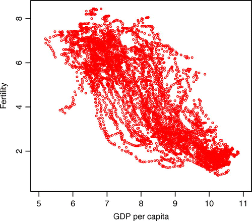
Table 2. Quantile and mean
3. Mixture model
As mixture models have been widely used for data clustering, it is proposed a parametric mixture model for data clustering in order to detect clusters generated from arbitrary unknown distributions.
3.1. Method
Although there is no novelty in the method shown in Section 3.1, it is briefly discussed on the estimation methods of mixture distribution for the convenience of readers. This research considers a multivariate Gaussian mixture model which is an effective clustering algorithm in data minding. Mixture models provide an intuitive statistical representation of data structured in groups. Thus, assuming the model as G-component normal mixture model (see McLachlan and Peel (Citation2000), Chapter 3, for details). Fraley, Raftery, Murphy, and Scrucca (Citation2012) is also very helpful), besides, density of a random variable is specified as follows:(1)
(1)
where ,
,
, G and
are the observed random sample, the component mean, the component covariance matrix, the number of components, and the mixing proportion, respectively. The
’s are nonnegative quantities that sum to one; that is,
(2)
(2)
The denotes the multivariate normal density function with mean
and covariance
; that is,Footnote6
(3)
(3)
where d is the dimensionality of . The parameters of the model can be estimated by the method of maximum likelihood. The log likelihood function takes the form
(4)
(4)
where N is the number of sample. The Bayesian information criterion (BIC) is used to decide the number of components (G) in the mixture model. To decide the number of components, BIC decision rule is considered, which decides the number of components by the highest BIC among each of the BIC values which are obtained from one-component model to m-component model, where m is a natural number.
3.2. Results
The results of the distributions of GDP per capita and fertility rate using the G-component normal mixture model, which is introduced in Section 3.1, are reported. The results of univariate mixture model and the results of bivariate mixture model are both reported in Sections 3.2.1 and 3.2.2, respectively.
3.2.1. Univariate mixture model
Figure shows the histograms and the distributions of GDP per capita and fertility rate. The densities are estimated by the univariate mixture model. Figure (1), (2), (3), and (4) in the first row shows the histograms of GDP per capita and fertility rate in 1960 and 2010. Figure (5), (6), (7), and (8) in the second row shows the distributions of GDP per capita and fertility rate in 1960 and 2010. Figure (1), (2), (5), and (6) in the first and second columns shows the histograms and the distributions of GDP per capita in 1960 and 2010. Figure (3), (4), (7), and (8) in the third and fourth columns shows the histograms and the distributions of fertility rate in 1960 and 2010. The characteristic features of the distributions of GDP per capita and fertility rate are also reported in Tables and , respectively.
Figure 2. Histograms and densities of the GDP per capita and the fertility rate in 1960 and 2010.
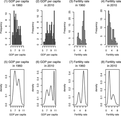
Table 3. The details of the distributions of GDP per capita in 1960 and 2010
Table 4. The details of the distributions of fertility rate in 1960 and 2010
From the analysis of GDP per capita, in 1960 and
in 2010 are gotten by the BIC decision rule using the univariate mixture model. As seen in Figure (5), the distribution of GDP per capita in 1960 has a twin-peak unlike the distribution of GDP per capita in 2010 that has a three-peak in Figure (6). The number of peaks has increased by one from two to three during 1960–2010 period. It means that the income of each country diverges over time, not converges. Income inequality may not be improved after all. Holzmann et al. (Citation2007) also use the logarithm of GDP per capita and report that the distribution appears to have only two clusters in 1970–1975, but consists of three clusters—low-, middle-, and high-income groups—from 1976 onwards. Even though the analysis period of this paper is different from Holzmann et al. (Citation2007), the results are the same, that is the number of peaks of income distribution has changed from two to three.Footnote7 Meanwhile, in Kumar and Russell (Citation2002), which analyzes the distribution with GDP per worker, not using logarithm value, the world income distribution in 1960 was one-peak, but the distribution has changed to twin-peaks in 1985. The three researches, Holzmann et al. (Citation2007), Kumar and Russell (Citation2002), and this research, have one key thing in common: that the number of peaks of income distribution increases as time passes, even though the period of analysis, the handling of data, the method of analysis, etc. in each research are different.
From the analysis of fertility rate, the result that the number of components is two in both 1960 and 2010 is obtained by the BIC decision rule. Looking at the distributions of fertility rate in Figure (7) and (8), both distributions in 1960 and 2010 have twin peaks. In 1960, the right peak is higher than the left peak, but the height is reversed in 2010, the left peak is higher than the right peak.Footnote8 This result is consistent with Strulik and Vollmer (Citation2010) using data from 1950 to 2005. However, Strulik and Vollmer (Citation2010) assume the two-component model from the very beginning, but this research does not assume the number of components and decides the number of components using the mixture model by the BIC decision rule, which is an ex-post decision-making.
3.2.2. Bivariate mixture model
An attempt of this research, which has not performed in previous studies, is to analyze the distribution of GDP per capita and fertility rate simultaneously instead separately. There are lots of studies using a univariate mixture model which analyzes the distributions of each variable. As far as I know, there are no previous studies using a bivariate mixture model which analyzes the joint distribution of two variables, GDP per capita and fertility rate, in the framework of demographic transition. Figure presents the results by the bivariate mixture model. Figure shows the scatter plot and contour lines. Table reports the characteristic features of the bivariate joint distributions of GDP per capita and fertility rate of each cluster in 1960 and 2010.
Figure 3. Scatter plots and contour lines.Note: The range of vertical axis and horizontal axis is different between two graphs.
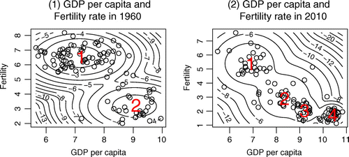
Table 5. The details of the bivariate joint distributions of the GDP per capita and the fertility rate in 1960 and 2010
In 1960, there were two clusters , but in 2010, the clusters were divided into four clusters (
). The number of clusters is decided by the BIC decision rule as in the univariate mixture model in Section 3.2.1. In this paper, we follow the common rule, the BIC decision rule, everytime to decide the number of clusters. In 1960, there are two clusters of which cluster 1, the low-income and high-fertility group, has the mean of 7.153 and 6.540 and cluster 2, high-income and low-fertility group, has the mean of 9.045 and 3.187. In 2010, there are four clusters which include not only cluster 1 and the cluster 4; during this period, two more clusters have appeared which are marked as cluster 2 and cluster 3. Cluster 1 is the low-income and high-fertility group which has the mean of 6.835 and 5.389. Cluster 4 is high-income and low-fertility group which has the mean of 10.378 and 1.718. Cluster 2 is the lower middle-income and upper middle-fertility group which has the mean of 8.328 and 3.054. Cluster 3 is upper middle-income and lower middle-fertility group which has the mean of 9.1736 and 2.085.Footnote9 In Table , it is reported which country is classified in which cluster in each period between 1960 and 2010. More than half of the countries in cluster 1 in 1960 have shifted to cluster 2 or cluster 3 in 2010 and only three countries, which are Hong Kong, Republic of Korea, and Trinidad & Tobago, have shifted to cluster 4 in 2010. On the other hand, almost all of the countries in cluster 2 in 1960, except for five countries which are Gabon, Israel, Argentina, Romania, and Uruguay, have shifted to cluster 4 in 2010.
Table 6. Transition of the countries in the clusters
4. Bivariate dynamic model
4.1. Model and estimation method
4.1.1. Latent change score model
This research considers a bivariate dynamic model to examine an association between chronological change of GDP per capita and fertility rate simultaneously, using a latent change score model like Equation (5).(5)
(5)
In Equation (5), and
are the observed data which are the GDP per capita and the fertility rate for country i at time t, respectively.
and
are the latent scores of the variables which are the GDP per capita and the fertility rate for country i at time t, respectively.
and
are the errors in measurement of the variables, the GDP per capita and the fertility rate, for country i at time t, respectively. We have assumed the errors like
, and
. The latent scores have an autoregressive relationship such that the latent score at time t is equal to the latent score at time
plus the change that has occurred between the two. This can be written as
(6)
(6)
where, is the latent change score which is the difference between
and
. Because we have used logarithm GDP per capita,
shows the growth rate for country i at time t. And, as with
,
is the latent change score which is the difference between
and
.
We have specified a model for the latent change score as follows:(7)
(7)
where, ,
,
, and
mean constant trend, autoproportional effect, coupling effect, and cross-term effect, respectively. And,
s are error terms. We assume errors like
, and
.
Substituting Equation (7) into Equation (6), we then obtained:(8)
(8)
To substitute Equation (8) into Equation (5), we have gotten Equation (9). However, it is difficult to estimate the parameters directly using Equation (9) because Equation (9) has identification problems. Equation (9) has composite error structures which include multiple errors in each equation, that is there are two errors and
in the first equation of Equation (9) and there are also two errors
and
in the second equation of Equation (9).
(9)
(9)
4.1.2. Bayesian estimation method
The latent change score model has a hierarchical structure with two levels: the observed data and the latent scores. In case of a hierarchical structure, Bayesian estimation method is very useful and can easily estimate the parameters. So, the hierarchical Bayesian model is widely used to estimate the variables.
When we estimate the parameters in the hierarchical Bayesian model, we generate one conditional distribution after another, sequentially. In case of a hierarchical structure model, Bayes’ theorem for probability distribution is often stated as:(10)
(10)
To calculate Gibbs sampler for our model, posterior distribution is needed. The posterior distribution of our model is derived following the hierarchical modeling structure using conditional distribution. Our posterior density is:(11)
(11)
where is data. The hyperprior distributions for
,
,
, and
are specified to be normal distributions, with parameters m and
. Without prior knowledge, these parameters are specified to make the hyperprior vague,
and
, so that as much as possible the hyperprior should not affect the posterior. And the hyperprior distributions for
and
are specified to be inverse gamma distributions, with parameters a and b, and c and d, respectively. Once again, without prior information, these parameters are specified to make the hyperprior vague,
,
,
, and
(see Lynch (Citation2010) for details).
4.2. Estimation results
This research considers two kinds of regression models, which are the pooling model and fixed effect model. In the pooling model, the individual effects of constant terms are not considered, that is and
in Equation (8) are considered to be common in all countries. On the other hand, in the fixed effect model, the individual effects affect the intercept of each of the countries, that is
and
are considered to be
and
where the subscript i means individual occurrences.Footnote10
4.2.1. Pooling model
Table presents the estimation results of the pooling model which are the posterior mean, median, standard deviation, 95% posterior credible interval, and Geweke’s convergence diagnostic for the Bayesian estimation.Footnote11 The Bayesian credible interval is defined as the interval for which the posterior exceeds a given probability, in this case 0.95 (95%). The credible interval in Bayesian statistics is similar to the confidence interval in classical statistics, even though not same.Footnote12 It is needed to check if 95% credible interval includes 0 or not. If not, the parameter can be interpreted as “significant," which is the term used in classical statistics. In Table , the 95% credible intervals for all parameters, except , do not include 0.Footnote13 The sampling was run with a burn-in of 1,000,000 iterations with 2,000,000 iterations. Based on the results of Geweke’s convergence diagnostic, it is considered that this sampling has been converged completely.
Table 7. Estimation results of the pooling model
The signs of each constant trend ( and
), each autoproportional effect (
and
), each coupling effect (
and
), and each cross-term effect (
and
) are opposite, that is
is positive and
is negative,
is negative and
is positive,
is negative and
is positive, and
is positive and
is negative. The mean and the standard deviation of
and
are almost 0. It means that both, the observed data and the latent score, are very close.
To examine the changes in both, economic growth rate and fertility rate, due to income change, we have differentiated Equation (7) with respect to and have gotten Equation (12).
(12)
(12)
From Equation (12),(13)
(13)
From Table , the fertility rate 6.458 falls at about 75% of the whole, and 4.247 falls about 50% of the whole. In other words, based on the sample data, about 75% data satisfy . And about 50% data satisfy
and the rest about 50% data satisfy
. On the left (the second line) in Equation (13),
means that economic growth rate decreases as GDP per capita increases. The result shows the convergence in economic growth theory. On the right (the first line) in Equation (13),
means that the fertility rate decreases rapidly, as GDP per capita increases. Meanwhile, on the right (the second line) in Equation (13),
means that the fertility rate decreases slowly, as GDP per capita increases.
Figure 4. Joint movements for GDP per capita and fertility rate.
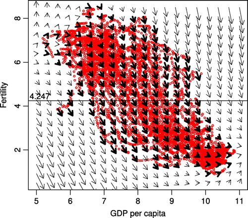
Figure shows the joint movements for GDP per capita and fertility rate in a dynamic vector field. Each arrow shows the general direction of all curves within that specific region of these curves. For any pair of latent scores at time t, the arrow points to where the pair of latent scores is expected to be at time . In Figure , we have assumed
, which means five-year movements. The joint movements were calculated from the coefficients which have been obtained from the pooling model. The bold arrow lines show the joint movements of the field where the data exist. And, the slim arrow lines show the joint movements of the field where the data do not exist. The bold arrow lines demonstrate the change of cross-section data well.
As it can be seen in Figure , the fertility rate reduces rapidly above 4.247 when demographic transition occurs from regime 1, where fertility rate is high and stable, to regime 2, where we can notice the rapid drop in fertility rate. By comparison, the fertility rate reduces slowly below 4.247 when demographic transition occurs from regime 2 to regime 3, where fertility rate is low and stable.
4.2.2. Fixed effect model
Table presents the estimation results of the fixed effect model.Footnote14 As it was done in Table , we reported the simple summaries about the posterior mean, median, standard deviation, 95% posterior credible interval, and Geweke’s convergence diagnostic for the Bayesian estimation. Due to the limitations of the space, we reported the summaries of and
in Table in Appendix. In Table , the 95% credible intervals for all parameters, except
, do not include 0. The sampling was run with a burn-in of 1,000,000 iterations with 2,000,000 iterations. Based on the results of Geweke’s convergence diagnostic, it is considered that this sampling has been converged completely.
Table 8. Estimation result of the fixed effect model
Figure 5. The distributions of posterior mean of and
.
As with the pooling model, the signs of each autoproportional effect ( and
), each coupling effect (
and
), and each cross-term effect (
and
) are opposite, that is
is negative and
is positive,
is negative and
is positive, and
is positive and
is negative. The mean and the standard deviation of
and
are almost 0. It means that both, the observed data and the latent score, are very close. The results of fixed effect model are very similar to the results of pooling model.
The parameters which are estimated by Bayesian estimation method have their distributions. To promote further analyzing using their distribution is a difficult task; so, it is analyzed using the representative values of the posterior distribution. To put it simply, from now on, this research will use the mean of the posterior distribution of and
as the representative value of the posterior distribution of
and
, instead of the posterior distribution itself. We denote the posterior mean of
and
as
and
, respectively.
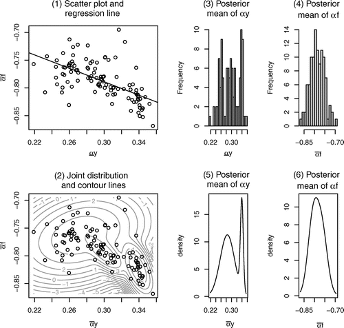
Figure shows the information of the posterior mean of and
. Figure (1) shows scatter plots and regression line of
and
. Figure (2) shows the joint distribution and the contour lines of
and
. Figure (3) and (4) shows the histograms of
and
, respectively. Figure (5) and (6) shows the univariate distributions of
and
, respectively. We determined the number of the clusters in Figure (2), (5), and (6) which is 3, 2, and 1, respectively, by the BIC decision rule, as before. From Figure (1), both variables,
and
, have a negative relationship. From Figure (2), the joint distribution is divided into three clusters. The values of
and
are important factors to determine the convergence destination.
Figure 6. Joint movements for GDP per capita and fertility rate.
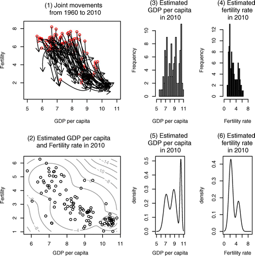
Figure 7. Comparing both distribution of the data and the estimated values.
The result, that the joint distribution of and
is divided into three clusters, can be taken as a major cause that the number of clusters of joint distribution of GDP per capita and fertility rate has increased in 2010 when compared to 1960. From Figure (5) and (6), the distribution of
is clustered into two; however, the distribution of
has one peak. It is believed that the distribution of
, which is clustered into two, is the reason for the previously mentioned that the distribution of fertility rate converges to one peak, but the distribution of GDP per capita does not converge to one peak and the number of peaks has increased. The multiple clusterization of
led to the multiple clusterization of convergence destination of the GDP per capita.
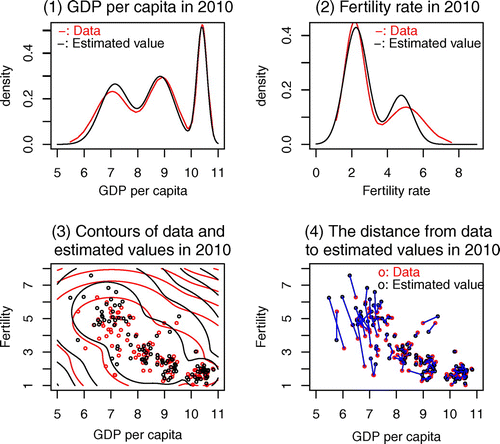
4.2.3. Fitness
We have predicted the values of GDP per capita and fertility rate in 2010 from GDP per capita and fertility rate in 1960 using the estimation results. After that, we have compared the prediction values and real data to check how this latent change score model fits with the real data. The panels of Figure show the information of the predicted values. Figure (1) has shown the joint movements for GDP per capita and fertility rate for 50 years, from 1960 to 2010. The red circles are the starting points which are the real data of GDP per capita and fertility rate in 1960. Some developed countries have completed their demographic transition in birth rate, and in developing countries, the demographic transition in birth rate is still in progress. Figure (2) has shown the joint distribution and the contour lines of the predicted values in 2010. The black circles are the predicted values in 2010 which are calculated by the latent change score model. The contour lines are calculated by the bivariate mixture model. Figure (3) and (4) shows the histograms of the predicted values of GDP per capita and fertility rate in 2010, respectively. Figure (5) and (6) shows the distributions of the predicted values of GDP per capita and fertility rate in 2010, respectively. We determined the number of clusters in Figure (2), (5), and (6) which is 3, 3, and 2, respectively, by the BIC decision rule, as before. Figure (2) corresponds to Figure (2), and Figure (3) and (4) corresponds to Figure (2) and (4), and Figure (5) and (6) corresponds to Figure (6) and (8).
To compare easily the data and the predicted values by our latent change score model, we have drawn both, the distribution from the data and the distribution from the estimated values, on the same coordinates over one another. Figure (1) shows that Figure (6) overlaid Figure (5). Figure (2) shows that Figure (8) overlaid Figure (6). Figure (3) shows that Figure (2) overlaid Figure (2). Finally, Figure (4) shows the distance from the data to the estimated values in 2010. We have connected both, the data and the estimated values, with lines. If the connected line is short, the estimated value represents real data well. In most of the countries, both the estimated value and the real data are consistent with each other. However, there are some cases in cluster 1 in which the deviation is present. Even though the prediction period of 50 years is quite long, as a whole, the estimated values are quite similar to the real data. This latent score model shows good performance.
4.2.4. Prediction
Because and
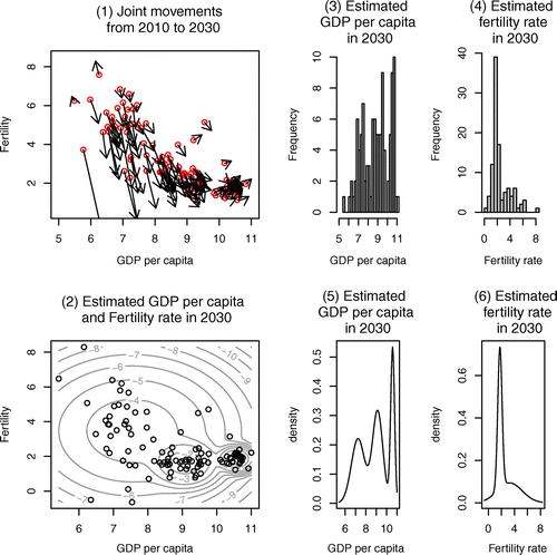
can be considered as constants in the short period time, we have tried to predict the values over the next 5, 10, 15, and 20 years.Footnote15 The panels in Figures – show joint movements, contour lines, histograms, and distributions which are based on the predicted value over 5 (in 2015), 10 (in 2020), 15 (in 2025), and 20 (in 2030) years, respectively. The predicted values in each year are reported in Table in Appendix. In Figures –, the red circles, which are the starting points, are the real data in 2010. The number of peaks of the distribution of fertility rate in 2030 is one, and the number of peaks of the distribution of GDP per capita is three. As time passes, the distribution of fertility rate converges from two-peaks to one-peak which is the left peak; contrariwise, the distribution of GDP per capita does not converge to one-peak and still remains three-peaks. In Figure , as we have seen in the demographic transition, the fertility rate, of the countries whose demographic transition in birth rate is still in progress, shows a sharp drop. However, for countries in the third regime, the fertility rate shows a gradual change again, and there is a lower bound (nonnegative).Footnote16 Therefore, the fertility rate converges to one peak, which means the fertility gap in the cross-country will disappear. The prediction of United Nations about the fertility rate over the next 50 years, that in almost all countries the TFR will be exactly 2.1 by the year 2050, and our result, that the fertility rate converges to one peak, are consistent. On the other hand, in economic growth, conditional convergence can be confirmed worldwide, not absolute convergence. There are many factors which lead to divergence in income like savings, human capital, etc. Countries with similar conditions might converge to the same level of steady state, but countries with different conditions will not automatically converge. Because of the conditional convergence, the number of peak of distribution of GDP per capita will not converge to one and the distribution might have multiple peaks.
Figure 8. Joint movements for GDP per capita and fertility rate from 2010 to 2015.
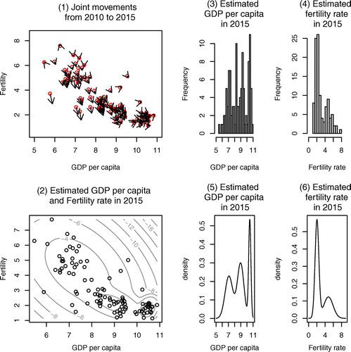
Figure 9. Joint movements for GDP per capita and fertility rate from 2010 to 2020.
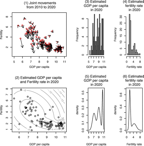
Figure 10. Joint movements for GDP per capita and fertility rate from 2010 to 2025.
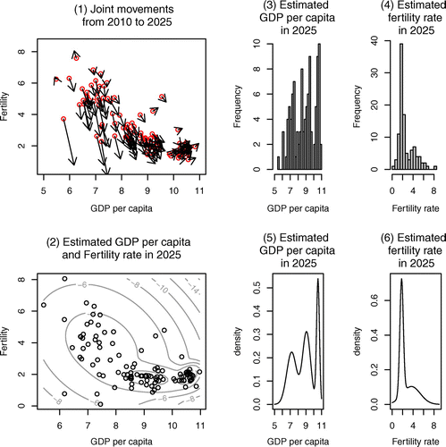
Figure 11. Joint movements for GDP per capita and fertility rate from 2010 to 2030.
4.3. Convergence
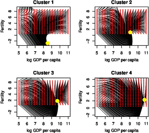
4.3.1. Points of convergence
In Figure (2), it has been seen that the joint distribution of GDP per capita and fertility rate in 2010 is divided into four clusters by the bivariate model. This section examines where each cluster converges. The mean of each cluster is used as the representative value of each cluster. The mean of each cluster is calculated as follows: and
, where
is the number of element of the cluster x,
. It is calculated where each cluster of GDP per capita and fertility rate converges, that is where
,
,
,
,
,
,
, and
converge. Table reported the mean of GDP per capita and fertility rate of each cluster and the steady state of GDP per capita and fertility rate of each cluster. The GDP per capita and fertility rate at the steady state of each cluster are calculated as Equation (14).
(14)
(14)
where, ,
and
.
Table 9. Estimation results on the convergence
In Table , the 95% credible intervals for all parameters do not include 0. The sampling was run with a burn-in of 1,000,000 iterations with 2,000,000 iterations. Based on the results of Geweke’s convergence diagnostic, it is considered that this sampling has been converged.
Figure 12. Convergence of the joint movements of each cluster to their steady state.
For simplification, the means of the posterior distribution of and
,
are used as the representative values of the posterior distribution of
and
,
. The posterior means of
and
are denoted as
and
, respectively. Cluster 1 converges at
, where the figures in parentheses are the posterior means of
and
, and the value of fertility rate at the steady state is negative. Since it is assumed that
and
do not change over time, the unrealistic values have been calculated at the steady state. It can be inferred that the countries that belong to cluster 1 are also going to change their
and
in the future. Clusters 2, 3, and 4 converge to
,
, and
, respectively, where the figures in parentheses are the posterior means of
and
,
. Comparing the values of GDP per capita and fertility rate at steady state of each cluster, we have gotten
and
. It is noticed that the fertility rate has been recovering slightly in recent years in developed countries like France and the UK. This may have been reflected in the
. If the fertility rate converges to a one peak as the prediction of the United Nations, there will be a fall in the birth rate in many developing countries and rise in the birth rate in many developed countries.
4.3.2. Stability at steady state
To examine the stability at the steady state of each cluster, we have used Hessian matrix as Equation (15) and calculated eigenvalues at their steady state ,
, where
and
are the posterior means of
and
.
(15)
(15)
The results are reported in Table . The systems have real and complex eigenvalues. Since the real parts are less than one, they converge to their steady state ,
.
Table 10. Eigenvalues of Hessian matrix at each steady state
We have presented the results visually in Figure that shows the joint movements of GDP per capita and fertility rate to each steady state. It can be seen that the joint movements have started from the red circles, and have converged to the yellow dot in the end. The each steady state in all of four clusters is stable. The value of fertility rate of cluster 1 in the steady state is negative. This model has assumed and
as constant, not variable. It can be considered that the negative fertility rate came from the assumption. Cohen (Citation1992) also has mentioned such points. Cohen (Citation1992) stressed that to estimate the convergence under the assumption, that conditional variable is a constant, is not sufficient for a dynamic model. The results obtained in this research are applicable to short- and medium-term predictions, where the conditional variables do not change. However, the results may be insufficient for long-term prediction where the conditional variables change.
5. Conclusion
This research has analyzed the changes in the distribution of fertility rate and GDP per capita using the cross-section data from 1960 to 2010. Especially, the mutual changes in the two variables, using the latent change score model and the bivariate mixture model, have been analyzed. There are many studies which have analyzed each of the changes in fertility distribution and in GDP per capita distribution, but few studies have analyzed the changes in the distribution of both variables at the same time. This is a contribution of this study. The analysis of mutual changes made the change, convergence, and prediction of distributions of the two variables explainable.
The results obtained by the bivariate mixture model in this research are consistent with the results of the previous studies obtained by univariate mixture model, e.g. Holzmann et al. (Citation2007) for GDP per capita and Strulik and Vollmer (Citation2010) for fertility rate as well as the population projections of the United Nations.
The number of peaks of the distribution of GDP per capita has increased from the 1960s to 2010. However, the number of peaks of fertility rate distribution has not changed in two until 2010, but there is a tendency that the right peak is getting smaller and the distribution will converge to the left peak. Additionally, we have calculated the joint movements of GDP per capita and fertility rate using the latent change score model. We have predicted the changes in the distributions of the two variables up to 2030 as follows: there will be no change in the distribution of GDP per capita which will still have three peaks in 2030; however, the distribution of fertility rate will converge to one peak, which means the per capita income will be applied to the conditional convergence and the fertility rate will be applied to the absolute convergence. It can be concluded that the fertility gap among cross-countries will disappear, but the income gap will not. Even though the population conditions in developing countries will be improved, income inequality in cross-country may not be improved after all.
The parameters in the latent change score model used in this paper have been estimated as constant. The value of the parameters may change over time. Introducing time in the estimation equation remains to be seen in our future research.
paper_anime.pdf
Download PDF (3.6 MB)Acknowledgements
I would like to thank the editor and anonymous referees for their very useful comments and suggestions.
Additional information
Funding
Notes on contributors
Inyong Shin
The author is an economist and statistician. His main research fields are Economic Growth, Computational Economics, Bayesian statistics and Dynamics. His current research area includes demographic transition. Demographic transition has been studied by Economics as well as Demography, Sociology, Statistics, etc. Almost all of previous studies on demographic transition depict the demographic transition due to time flowing. However, he depicts the demographic transition by income per capita level in this research, that is, the demographic transition is analyzed from an aspect of Economics. The problems like gap between rich and poor, and raising population are great economic and political issues of our time to be solved.
Notes
Supplemental material for this article can be accessed here http://dx.doi.org/10.1080/23322039.2015.1119367
1 The three types in Thompson (Citation1929), Landry (Citation1934), and Notestein (Citation1945) are closely parallel to each other. Kirk (Citation1996), Weber (Citation2010), and Galor (Citation2011) surveyed on the demographic transition in detail.
2 Some researches (e.g. Doepke (Citation2005), Murphy (Citation2009), Fernández-Villaverde (Citation2001), etc.) report that an increase in the income increases fertility.
3 This research, I believe, is the first one to consider and analyze the joint distribution of both variables at the same time using a bivariate mixture distribution model and a latent change score model in the framework of demographic transition.
4 In the data, there are unusual countries which are birth control countries, oil-producing countries, and negative growth countries. We have also analyzed the data, exclusive of 10 unusual countries. These countries are China (20), which carries out one-child policy, Iran (51) and Venezuela (104), which are two major oil-producing countries, and Central African Republic (17), Congo Dem. Rep. (23), Guinea (43), Haiti (45), Madagascar (61), Nicaragua (74), and Niger (75), which were poorer in 2010 than in 1960. These countries have lower GDP per capita in 2010 when compared to GDP per capita in 1960. The figures in parentheses are country numbers in Tables and .
5 Many previous studies depict the demographic transition due to time flowing; however, Figure is depicted by per capita income level. The horizontal axis shows GDP per capita, instead of time flowing.
6 The investigation of the results using other distributions instead of the normal distribution is left for further study.
7 In this analysis, the three-peaks start to appear from 1972.
8 In this analysis, the left peak starts to be higher than the right peak from 1990.
9 The names of classification in this research—low-income, lower middle-income, upper middle-income and high-income—are just for the sake of convenience. They differ from the classification of World Bank which is defined according to the GNI per capita, calculated using the World Bank Atlas method.
10 With the amendments in individual effects, this research assumes the distributions of priors for and
as follows:
and
where
,
and
.
11 We post the estimation results using 96 countries in Table in Appendix. Excluding these 10 countries has no significant effect on the results.
12 Credible interval estimates the probability of being in that interval, but confidence interval does not predict that the true value of the parameter has a particular probability.
13 The 0.0000s in Table mean very small positive numbers, not exact 0, because we have rounded to four decimal places.
14 We post the estimation results using 96 countries in Table in Appendix. Except that the 95% credible interval of includes 0, the results where we have used 96 countries are not so different from the results where we have used 106 countries. Excluding these 10 countries has no significant effect on the results.
15 Predicting and
over 20 years, the fertility rates of Bangladesh (5) and Zimbabwe (106) are negative values which are unrealistic values. So, predicting over more years has been stopped.
16 It is considered that the result, the arrows at the lower right corner are slightly upward, is due to the recent rising trend in the birth rates in some developed countries, e.g. Sweden, the UK, Spain, Italy, and Finland.
Related Research Data
References
- Barro, R. J., & Becker, G. S. (1989). Fertility choice in a model of economic growth. Econometrica, 57, 481–501.
- Becker, G. S. (1960). An economic analysis of fertility. In G. S. Becker (Ed.), Demographic and economic change in developed countries (pp. 209–240). Princeton, NJ: Princeton University Press.
- Becker, G. S., & Barro, R. J. (1988). A reformulation of the economic theory of fertility. Quarterly Journal of Economics, 103(1), 1–25.
- Becker, G. S., Murphy, K. M., & Tamura, R. (1990). Haman capital, fertility, and economic growth. Journal of Political Economy, 81, S12–S37.
- Benhabib, J., & Nishimura, K. (1989). Endogenous fluctuations in the Barro--Becker theory of fertility. In A. Wening (Ed.), Demographic change and economic development. Springer, Berlin, Heidelberg.
- Bianchi, M. (1997). Testing for convergence: Evidence from non-parametric multimodality tests. Journal of Applied Econometrics, 12, 393–409.
- Cohen, D. (1992). Tests of the “convergence hypothesis": A critical note (CEPR Discussion Papers 691). C.E.P.R. Discussion Papers. London: Centre for Economic Policy Research (CEPR).
- Dahan, M., & Tsiddon, D. (1998). Demographic transition, income distribution, and economic growth. Journal of Economic Growth, 3, 29–52.
- Doepke, M. (2005). Child motality and fertility decline: Does the Barro--Becker model fit the facts? Journal of Population Economics, 18, 337–366.
- Easterlin, R. A. (1966). On the relation of economic factors to recent and projected fertility changes. Demography, 3, 131–153.
- Fern\’{a}ndez-Villaverde, J. (2001). Was Malthus right? Economic growth and population dynamics ( Working Paper, Department of Economics). Philadelphia, PA: University of Pennsylvania.
- Fraley, C., Raftery, A. E., Murphy, T. B., & Scrucca, L. (2012). mclust Version 4 for R: Normal mixture modeling for model-based clustering, classification, and density estimation ( Technical Report No. 597). Seattle, WA: Department of Statistics, University of Washington.
- Galor, O. (2011). Unified growth theory. Princeton, NJ: Princeton University Press.
- Galor, O., & Weil, D. N. (1996). The gender gap, fertility, and growth. American Economic Review, 86, 374–387.
- Holzmann, H., Vollmer, S., & Weisbrod, J. (2007). Twin peaks or three components? Analyzing the world’s cross-country distribution of income ( Ibero-America Institute for Economic Research Discussion Papers, 162).Goettingen: Ibero-America Institute for Economic Research (IAI).
- Kirk, D. (1996). Demographic transition theory. Population Studies, 50, 361–387.
- Kremer, M. (1993). Population growth and technological change: One million B.C. to 1990. Quarterly Journal of Economics, 108, 681–716.
- Kumar, S., & Russell, R. R. (2002). Technological change, technological catch-up, and capital deepening: Relative contributions to growth and convergence. American Economic Review, 92, 527–548.
- Landry, A. (1934). La Révolution Démographique [The demographic revolution]. Paris: Sirey.
- Lapan, H. E., & Enders, W. (1990). “Endogenous fertility, ricardian equivalence, and debt management policy". Journal of Public Economics, 41, 227–248.
- Lynch, S. M. (2010). Introduction to applied Bayesian statistics and estimation for social scientists. New York, NY: Springer.
- McLachlan, G., & Peel, D. (2000). Finite mixture models. New York, NY: Wiley.
- Murphy, T. E. (2009). Old habits die hard (sometimes): What can department heterogeneneity tell us about the French fertility decline? ( Working Paper). Milano: Bocconi University.
- Nerlove, M., Assaf, R., & Efraim, S. (1978). Household and economy: Welfare economics of endogenous fertility. New York, NY: Academic Press.
- Notestein, F. (1945). Population: The long view. In T. Schultz (Ed.), Food for the world (pp. 36–57). Chicago, IL: University of Chicago Press.
- Paapaa, R., & van Dijk Herman, K. (1998). Distribution and mobility of wealth of nations. European Economic Review, 42, 1269–1293.
- Qi, L., & Kanaya, S. (2010). The concavity of the value function of the extended Barro--Becker model. Journal of Economic Dynamics and Control, 34, 314–329.
- Quah, D. T. (1996). Twin peaks: Growth and convergence in models of distribution dynamics. Economic Journal, 106, 1045–1055.
- Strulik, H., & Vollmer, S. (2010). The fertility transition around the World 1950--2005. Boston, MA: Harvard University.
- Thompson, W. S. (1929). Population. American Journal of Sociology, 34, 959–975.
- Weber, L. (2010). Demographic change and economic growth: Simulations on growth models. Heidelberg: Physica-Verlag.
- Weil, D. N. (2013). Economic growth. Harlow: Pearson Education.
Appendix 1
Appendix
Table shows the information of the cross-country data used in this research. Table includes the GDP per capita, fertility rate, and classification, i.e. which country is classified in what group. There are two and four clusters in 1960 and 2010, respectively.
Table A1. GDP per capita, fertility rate, and group
Table reports the posterior mean of and
, the data in 2010, and the predicted values in 2010, 2015, 2020, 2025, and 2030 which are estimated using the latent change score model. Due to the limitations of the space, the reports on 95% HPDI and Geweke’s CD of
and
are cut. All of the
and
fulfill the Geweke’s convergence diagnostic; consequently, we can consider that this sampling has been converged.
Table A2. The posterior mean of and
, the data in 2010, and the predicted values in 2010, 2015, 2020, 2025, and 2030
Tables and are the estimation results of the pooling model and the fixed effect model, respectively, using 96 countries not including 10 unusual countries which are: one birth control country, two oil-producing countries, and seven negative growth countries. Excluding these 10 countries has no significant effect on the results.
Table A3. Estimation results of the pooling model
Table A4. Estimation results of the fixed effect model
Figure A1 shows the animations which have been obtained using the real data from 1960 to 2010. The left-upper panel shows the joint movements of GDP per capita and fertility rate, the right-upper panel shows the bivariate distribution of the GDP per capita and the fertility rate, the left-lower panel shows the distribution of GDP per capita, and the right-lower panel shows the distribution of the fertility rate. Due to the limitation of the space in context, we have shown the panels for only two years, 1960 which is the first year and 2010 which is the last year in Figure and Figure . By playing the animations, readers can observe changes in the data of each year starting from 1960 to 2010.
Figure A1. The animations based on the data from 1960 to 2010.
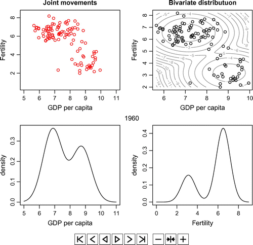
Figure A2. The animations based on the estimation results from 1960 to 2010.
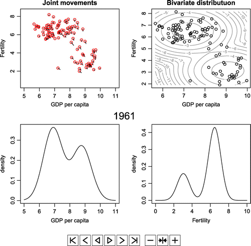
Figure A3. The animations based on the prediction results from 2010 to 2030.
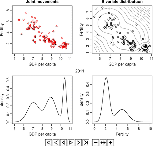
Figure A2 shows the animations which have been obtained using the results of the latent change score model. Figure A2 also shows the changes from 1960 to 2010 as Figure A1. Even though both periods in Figures and are same, they are different in that Figure A1 came from the real data and Figure A2 came from the estimated theoretical values. Due to the limitation of the space in context, we have shown the panels only for 2010 in Figure . By playing the animations, readers can observe changes in the estimated values of each year starting from 1960 to 2010.
Lastly, Figure A3 shows the animations which have obtained by the prediction using the latent change score model. Due to the limitation of the space in context, we have shown the panels for every fifth year starting from 2015 up to 2030 in Figures –, respectively. By playing the animations, readers can observe changes in the predicted values of each year starting from 2010 to 2030.
Readers with an interest in playing the animations can do so in the PDF version of the article.