
Introduction
Maps stimulate our minds and our senses. The best maps force us to stop, gaze, and to re-think the way we see their subject, often through their powerful combination of a new perspective with a new aesthetic. Some cartographic encounters, however, also transform the map. There has hardly been a greater demonstration of the ‘afterlife’ of maps than those produced in secrecy by the General Staff of the Soviet Union as they emerged from the collapse of the USSR. They have since been used in a range of contexts, from supporting the US invasion of Afghanistan in 2001 (Lee & Shumakov, Citation2003) to art exhibitions in the UK (Gec, Citation2019). The full extent of Soviet global military mapping project is yet to be revealed and only limited information has been gleaned from studies of the maps themselves (e.g. Davies & Kent, Citation2017). Today, however, their popular appeal transcends their value as historical documents. Soviet military maps present an unrealized vision of the world to the Western imagination – an unthinkable prospect to the cartographers who made them during the Cold War.
This short paper outlines the Soviet military global mapping project and focuses on the city plan of Dover (UK) – a town local to the author – to offer a personal view of how Soviet military maps may be regarded as supreme examples of cartographic design with an enduring power to fascinate. Discussions concerning the wider rationale for the maps, assessments of national coverage, and more detailed analyses of individual sheets are to be found elsewhere (e.g. Kent & Davies, Citation2013; Davies & Kent, Citation2017; Davis & Kent, Citation2017; Kent et al., Citation2019; Cruickshank, Citation2020; and Svenningsen & Perner, Citation2020.)
Mapping the world
The Soviet military global mapping project was the most comprehensive cartographic endeavour of the twentieth century. Specifications for mapping the USSR at a range of metric scales (1:10,000, 1:25,000, 1:50,000, 1:100,000, 1:200,000, 1:500,000) were introduced in 1919 and cartographic production accelerated during and after the Second World War, so that coverage of the Soviet Union was completed at 1:100,000 by 1954 and at 1:25,000 by 1988 (Vereshchaka, Citation2002). Together with topographic mapping at other scales (to which must be added the 1:300,000 series), the total inventory is estimated to have exceeded one million sheets (Böhme, Citation1993), which excludes coverage of selected (mostly urban) areas at larger scales (i.e. 1:500, 1:1000, 1:2000 and 1:5000). Mapping the vast domestic territories of the Soviet Union, however, forms only part of the story. From facilities located across the USSR, foreign territories were mapped during the Cold War at a wide range of scales (such as 1:5000, 1:10,000, 1:15,000, 1:20,000, 1:25;000, 1:50,000, 1:100,000, 1:200,000, 1:500,000 and 1:1,000,000). The exact coverage of Soviet mapping has not yet been established in the public domain, but a conservative estimate by Watt (Citation2005) suggests that Europe, the Middle East, North and Central America, large areas of South America, the Indian subcontinent, south-east Asia, China, and the populated areas of Africa were mapped at 1:50,000 and/or 1:100,000 scales, with the rest of the non-Soviet world covered at 1:200,000 or larger.
Soviet topographic maps present a range of detailed information that does not appear on national series of topographic mapping produced by other states. This includes the height of bridges above water, their dimensions, loading capacity, and their main construction material; the width of rivers, the direction of their flow, their depth, and whether they have a viscous bed; the type of trees in a forest, their height, girth, and spacing – much of which would have relied upon ground survey. The breadth of cartographic symbology used in these maps expanded over the twentieth century, but their fundamental specifications (i.e. datum, ellipsoid and projection) remained consistent. Their gridlines were based on those of the International Map of the World (IMW); a project initially proposed in 1891 by German geomorphologist Albrecht Penck to map the world at 1:1,000,000. Soviet maps adopted the global alphanumeric indexing system of the IMW but extended it to accommodate coverage at multiple scales.
In addition to creating topographic maps, the Soviet Union produced military plans of around 2000 foreign towns and cities, mostly at the scales of 1:10,000 and 1:25,000 (Davis & Kent, Citation2018). These include Washington, DC, New York, Paris, Berlin, Sydney, Beijing and London, as well as many smaller towns and cities (of which about 100 are located within the British Isles). While some of these locations have a clear strategic importance (e.g. as military ports, transport hubs, industrial and/or economic centres), the rationale behind the inclusion of others remains elusive. All Soviet military city plans carry the designation СЕКРЕТНО (secret), as marked in the top corner of each sheet, and any knowledge of their existence in the West was very limited before they were first offered for sale by a Latvian map publisher at the 16th International Cartographic Conference in Cologne, Germany, in May 1993.
There are several characteristic features of Soviet military city plans. Although the topographic maps offer a systematic coverage of territory, each city plan focuses on a particular settlement (or conurbation). Place names are transliterated into Cyrillic and are usually spelled phonetically to assist with local pronunciation (e.g. the English city of Gloucester is spelled ГЛОСТЕР – ‘Gloster’). The composition of each plan, which may extend over several sheets (each sheet being around one square metre in size), is centred on the main urban area and its environs. Most buildings are coloured brown, with strategically important objects colour-coded according to their function: green for military/communications objects (e.g. an army barracks); purple for governmental/administrative institutions (e.g. a town hall); and black for military-industrial facilities (e.g. a railway station). These are numbered and listed alphabetically in the plan’s margin, along with an alphabetical index to streets. Each plan is also accompanied by a spravka; a descriptive essay about the town or city and its environs that is placed either in the margin or produced separately as a booklet. Typically, this mentions the key characteristics of the town or city, such as its location and population, and provides an assessment of the surrounding terrain (including soils and hydrology) to indicate its accessibility to ground forces.
Mapping Dover
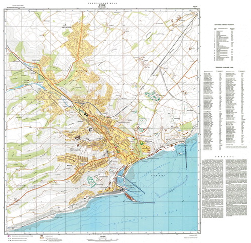
Home to the largest castle in England, military communications installations and a busy passenger and cargo docks, Dover has long played an important role in the defence and economy of Britain. The 1:10,000 Soviet military plan of the town () is a typical example of the type produced during the height of the Cold War and printed in 10 colours: black, brown, orange, light yellow, light green (full and halftone), dark green, light blue, dark blue and purple. Its print code (located within the border at the bottom right-hand corner) indicates that it was compiled in 1972 and printed at Saratov in February, 1974, with a note underneath stating that it was produced under the direction of unit commander A.D. Yudin. The sheet includes a numbered list of 29 strategically important objects, an alphabetical street index, and a spravka of around 1000 words. The latter describes Dover as an important transport hub in the south-east of the country; a major passenger and cargo port and a resort, with a population of 34,300.
Figure 1. The Soviet military 1:10,000 city plan of Dover (UK), compiled in 1972 and printed in February, 1974 at Saratov, Russia (approximately 86 × 84 cm; reproduced from a private collection).
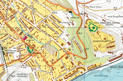
The main features shown on the plan are the large military forts overlooking the town, including Dover Castle, and the various facilities associated with industry and transportation, such as the railway station (). The radio masts of RAF Swingate (sometime observation post, communications hub and missile detection facility), are classified as military objects, but no further indication of their military significance is given. Neither the wartime bunker system ‘Hellfire Corner’ nor the substantial Regional Seat of Government (RSG), both of which are located deep inside Dover’s iconic white cliffs, are indicated on the Soviet plan or mentioned in the spravka.
Figure 2. An extract showing Dover town centre, indicating the street-level detail and the numbering and colour-coding of strategically important buildings. Military/communications objects (in green) include Dover Castle (No.9), labelled here as ‘coastguard station (fort)’ and the post office (No.10). The only governmental/administrative institution (purple) on the plan is the town hall (No.14). Military-industrial facilities (black) include the water works (No.18), Dover Priory railway station (No.20) and a saw mill (No.29), which has been misclassified as a power station (probably from copying a captured German plan from 1940).
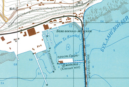
By contrast, the railway tunnel under Shakespeare Cliff is shown in detail; it is labelled with length of 1250 m and each of its ventilation shafts is clearly marked. Similarly, the aerial ropeway that used to transport coal from Tilmanstone Colliery (lying a few miles to the west) down a tunnel through the cliffs and along the harbour’s eastern breakwater is shown (), and the spravka even mentions that its unloading capacity is 500 tons per hour. This facility had, however, been dismantled by 1950, and provides another example of an anachronism common to Soviet military mapping – whether topographic map or city plan – in which disused industrial facilities (including dismantled railways) are indicated, as if they offer the possibility of being restored or re-purposed. It is therefore surprising that the town’s iron foundry, which had become an engineering works by the 1970s, is absent from the plan.
Figure 3. An extract showing Camber Dock within Dover harbour, which includes depictions of a dismantled railway running east-west above the cliffs and an aerial ropeway to transport coal via a tunnel down through the cliffs and along the eastern harbour arm.
It is likely that much of this information was gathered from guidebooks and trade directories, as well as existing mapping. However, a comparison with Ordnance Survey (OS) mapping indicates that the contours on the Soviet plan (at an interval of 5 metres) and other depictions of terrain, such as cliff drawings, were re-drawn and not simply copied from this readily available source. This lies in contrast to the 1940 German 1:10,000 plan of Dover (included with other British cities as part of the Planheft dossier), which is essentially an enlargement of the OS 1:10,560 plan and with the addition of various targets and annotations. Similarly, Soviet military maps at all scales include hydrographic information (unlike many national topographic map series), which appears to have been derived from original survey. On the plan of Dover, isobaths and soundings of the harbour seabed are shown precisely enough to outline the blockship Spanish Prince that was sunk inside the western entrance in 1915. The spravka mentions that the harbour is a base for submarines, and Camber Dock (now a deep-water cargo berth within Eastern Docks) provided this facility before and during the First World War, although the reinforced concrete ‘pens’ were constructed in the Second World War and housed motor torpedo- and motor gun-boats instead of submarines.
A masterpiece of design
Without exception, Soviet military maps invite evaluations of their content in terms of its accuracy and completeness. Since their coverage is global, Soviet maps have universal appeal. Reflections on their design, however, are rarely given, and it is equally important to examine them from this perspective. Indeed, the mapping of a wide range of information about different urban and natural environments from around the globe presents a unique set of design challenges. The solutions adopted by Soviet military cartographers therefore offer potentially useful insights to inform and inspire cartographers today, whether they are military or civilian.
As printed artefacts, Soviet maps are repositories of geospatial intelligence that were designed to store and present information simultaneously. Including such a considerable amount of information demands clarity and legibility of all symbols and lettering, as well as an effective visual hierarchy for prioritizing certain features. As a static medium, paper allows the final decisions concerning the optimization of cartographic design to be preserved, analysed and admired.
The first Soviet military plans of foreign cities, such as the 1974 plan of Dover described here, emerged during the Second World War. They were designed originally for the purpose of supporting the Soviet counter-offensive on the Eastern Front as the Red Army advanced towards Berlin, which culminated in the capture of that city and eventually the end of the war in Europe. Their design is therefore based on the need to indicate the key characteristics of a city to military commanders, who require a clear indication of its terrain, access routes and strategically important objects – as well as providing an accurate and reliable tool for planning effective artillery fire and close-quarter urban combat.
As an example of a Soviet military city plan produced in the early 1970s, the most significant aspect of the design of the Dover plan is its use of colour. Although printing with 10 plates allows for a wide range of features to be distinguished and easily identified, the particular assignment of these colours achieves an effective visual contrast and hierarchy (ordering) that facilitates both an overall assessment of the area and a close reading of urban detail. The paler colours indicate basic land cover: urban (light yellow); open water (light blue); and woodland (green), with all open land remaining white and contours shown in grey. The higher chromas are reserved for major roads (orange), rivers and coasts (dark blue) and important buildings (dark green and purple), with military-industrial facilities shown in black.
The visual hierarchy of the city plan is therefore ordered to allow an efficient visual organization into foreground and background elements, with major routes and strategically important objects – principally the military-industrial facilities – appearing most dominant on the plan and implying the greatest significance. The recessive elements, such as the areas of land cover and contours, provide context and reference. This organizing process may be interpreted according to the Gestalt theory of the psychology of visual perception (Koffka, Citation1935), with the design of the city plan utilizing a figure/ground effect to enable an efficient understanding of key features and their characteristics.
Although the specifications for Soviet maps evolved throughout the twentieth century to incorporate a wider vocabulary of symbols and their reproduction using more sophisticated printing techniques, they aimed to achieve standardization in the representation of topographic features. The mapping of thousands of towns and cities followed these specifications to ensure uniformity of style (as defined in terms of graphical content and appearance), allowing their users to identify and recognize features as efficiently as possible. The strong functionality of this style, with its focus on industry and transport and its utilization of a range of bold and vibrant colours, echoes the optimism of socialist realism – the dominant visual culture of the Soviet Union – and its distinctive aesthetic. The result achieves a clarity of purpose that perhaps remains unrivalled in any other state mapping series, even if, as with this plan of Dover from 1974, that purpose was never realized.
Conclusion
Historians of the Cold War tend to paint a picture of the Soviet Union as a political, economic and ideological failure (e.g. Gaddis, Citation2007). In terms of cartography, however, it achieved unparalleled success in its detailed coverage of the globe. Since the collapse of the USSR, the colossal scale of the Soviet military mapping project has emerged as its maps have become increasingly available. What has come to light has revealed a state-driven re-imagining of space and place through mapping; a process of re-ordering and re-purposing societies and their facilities towards a communist utopia. Perhaps this is reflected most in the maps’ distinctive cartographic style, which combines the optimism of socialist realism with a utilitarian focus on industry and transport. It is curious that these maps – practically unknown to the West until the closing years of the twentieth century – should themselves find their way to, and capture the imagination of, the very societies they were intended to subvert. Every map is becoming, and the journey of these examples has been nothing less than transformative.
The afterlife of Soviet maps, such as the 1974 military plan of Dover discussed here, perhaps owes more to their aesthetic appeal than to their content – they ‘deserved’ to be found. Certainly, they demonstrate the importance of the aesthetic appeal of maps in determining their versatility and enduring value, and their potential to outlive the ideologies (and the cartographers) that gave them life. In this sense, Soviet maps, such as this example, can take their place amongst the most successful cartographic products. Beyond the imagined realms of their potential function, they still manage to transform how we engage with our world and continually surprise us with the view from their cartographer’s eye.
Acknowledgements
The author is grateful to John Davies, Martin Davis and Catherine Gibson for their helpful comments on a draft of this paper.
Disclosure statement
No potential conflict of interest was reported by the author(s).
References
- Böhme, R. (1993). Inventory of world topographic mapping, volume 3: Eastern Europe, Asia, Oceania and Antarctica. International Cartographic Association via Elsevier Science.
- Cruickshank, J. (2020). A preliminary study of the Soviet topographic maps of the UK and their sources. Sheetlines, 119, 30–43.
- Davies, J., & Kent, A. J. (2017). The Red Atlas: How the Soviet Union secretly mapped the world. University of Chicago Press.
- Davis, M., & Kent, A. (2017). Improving user access to Soviet military mapping: Current issues in libraries and collections around the globe. Journal of Map and Geography Libraries, 13(2), 246–260. https://doi.org/10.1080/15420353.2017.1300206
- Davis, M., & Kent, A. J. (2018). Identifying metadata on Soviet military maps: An illustrated guide. In M. Altić, I. Demhardt, & S. Vervust (Eds), Dissemination of cartographic knowledge (pp. 301–313). Springer.
- Gaddis, J. L. (2007). The Cold War. Penguin Books.
- Gec, S. (2019). The Shepherd’s Whistle Exhibition at the John Hansard Gallery, Southampton (16th February to 27th April). Retrieved 15th March 2021. https://jhg.art/events/stefan-gec-the-shepherds-whistle/.
- Kent, A. J., & Davies, J. (2013). Hot geospatial intelligence from a Cold War: The Soviet Military mapping of towns and cities. Cartography and Geographic Information Science, 40(3), 248–253. https://doi.org/10.1080/15230406.2013.799734
- Kent, A. J., Davis, M., & Davies, J. (2019). The Soviet mapping of Poland – A brief overview. Miscellanea Geographica, 23(1), 1–11. https://doi.org/10.2478/mgrsd-2018-0034
- Koffka, K. (1935). Principles of Gestalt psychology (reprinted 1999). Routledge.
- Lee, K.D. and Shumakov, A. (2003) Russian data illuminate world mapping. Imaging notes (Spring) pp. 16–19. Retrieved 15th March 2021. https://gis-lab.info/docs/russian-topo.pdf
- Svenningsen, S. R., & Perner, M. L. (2020). Soviet Cold War maps: Examining the organization and practices of production through the case of Denmark. The Cartographic Journal, https://doi.org/10.1080/00087041.2019.1660518
- Vereshchaka, T. V. (2002). Топографические карты: научные основы содержания (Topographic maps: The scientific principles of their content). Maik Nauka/Interperiodika.
- Watt, D. (2005). Soviet military mapping. Sheetlines, 74, 9–12.