
Introduction
Maps are depictions of the real world. A lot of selection processes are taking place, a lot of decisions which influence what and how a story about a part of the world is being told. This does not always leave the map user with inspiration, with gained understanding, with pleasure.
Heinrich Berann’s panorama map of the Alps does. It comes close to showing the world as a perfect world, such as you would read this specific book or watch this specific movie which makes you feel somehow comfortable and gives you the feeling about how the world is just as it should be at the end eventually.
Berann’s magic was to achieve those feelings with maps. He is showing the world as a beautiful place, he crosses the border of art and cartography to evoke emotions and reactions. He arouses the desire to explore the map, to look into details while at the same time the overall composition is of such a coherent and harmonic type that it immerses yourself into the depiction right way.
Ultimately, the word which is used to describe the work of Berann is ‘panorama maps’. He is using a panorama style to allow for an optimal view on a particular landscape. He is overexaggerating heavily those parts and elements he wants to show while at the same time, he is rigorous in what he does not depict. Both make Berann’s panorama maps look somewhat ‘clean’, ‘ordered’ and kind of ‘perfect’. Berann gives us an illusion, allowing us to dream.
What
It is no coincidence, that most of the work of Berann focuses on mountainous areas. The effect of the distortions of the projection being used is especially powerful, if the third dimension helps to allow for shaping the landscape in a more dramatic manner. In all Berann panorama maps, the terrain representation is the central element, accompanied nearly always with a kind of artistic depiction of the sky by introducing some kind of clouds, generating a specific atmosphere.
While distortions are no concern for Berann, the illustrativeness of the map is always the most important aim. In this sense, you can call Berann’s panorama maps ‘user-centred’ cartographic products. The elements the user is supposed to see are presented like on a ‘silver platter’, leaving all elements which are not of the same importance being deselected, distorted or marginalized. It is especially interesting to see, what is NOT depicted in Berann’s panorama maps. Basically, all objects and phenomena of the real world, which somewhat disturb the illusion of a ‘perfect world’, are either not shown at all or represented in a very ordered way, being also clearly positioned and bounded. This includes especially manmade objects of all kinds which are not relevant in the context of the main map topic.
How
Whatever has been selected by Berann to be displayed is depicted clearly and somewhat ‘strongly’. This affects all style definitions being applied, such as the terrain representation, the terrain colouring, the trees, the water rendering and the atmospheric scattering.
Several attempts have been made to analyse the methods and techniques of Berann (Brown et al., Citation2017; Jenny et al., Citation2010; Patterson, Citation2000). The aims of those attempts have always been to find out in detail which of Berann’s methods work, and how, in order to eventually be entitled to reproduce the Berann style, ultimately also automatically.
The analysis of Patterson (Citation2000) and Brown et al. (Citation2017), especially included results such as the marginal importance of north orientation, the direction of the favoured views from lowlands near the bottom of the painting to highlands on the horizon, all brush strokes are clearly visible and used to add texture in certain areas such as forests, the colours used are always bright and eye-catching and also terrain types follow a kind of colour coding to make them easier to be identified.
Who
Berann has developed an iconic style, which has become known worldwide not only in cartography. He was born as Heinrich Caesar Berann into a family of sculptors and painters in Innsbruck, Austria, 1915. He had some training in the School of Art and Design in Innsbruck. When he won a competition to produce a panoramic map of Grossglockner High Alpine Road 1934, this led to commissions to paint landscapes for cartographic or tourism purposes.
Altogether, he then painted hundreds of maps (cp. https://www.berann.com/panorama/archive/index.html), including works produced for the Olympic Games in Cortina d'Ampezzo for the 1956 Winter Olympics, Rome for the 1960 Summer Olympics, Innsbruck in 1964 Winter Olympics and 1976 Winter Olympics, Sarajevo for the 1984 Winter Olympics and Nagano for the 1998 Winter Olympics. He also produces ski trail maps for European winter sports resorts, particularly in Austria, Switzerland, Germany and France.
He also became well-known worldwide, especially also for his Mount Everest map (Mason, Citation2018), which he did for the National Geographic Society 1962, as well as, for example, the topographic map of ocean floors and the panoramas he did for the US National Park Service of North Cascades National Park (1987), Yosemite National Park (1989), Yellowstone National Park (1991) and finally Denali National Park and Preserve (1994).
Berann’s grandson, Mathias Troyer, runs the website ‘The World of H.C. Berann – The Complete Panoramas’, listing a total number of 568 maps, including also maps such as from Africa, Asia, America the ocean floor and especially maps from Europe. Berann died 1999 and is buried in Innsbruck, Austria (Troyer, Citation2016).
The map
It is impossible to decide, which of the beautiful artefacts Berann has produced might be more favourable to others. I especially admire the Mt Everest map. A print of the Yellowstone National Park map has accompanied me for many years, as it has a prominent place just above my desk. However, to me, the map of the Alps (summer) from 1966 to 1967 is a specific masterpiece, combining Berann’s talent and particular gift (Berann & Graefe, Citation1966). The map shows the alps in its full extent all the way from Vienna to Nice. Usually, maps of central Europe depict a lot of objects of the highly populated areas, the high density of all those streets, railway lines, settlement and infrastructure then attract the attention ().
Figure 1. Panorama ‘Die Alpen’, Atelier Berann. Copyright Atelier Berann. Used with permission from Atelier Berann.
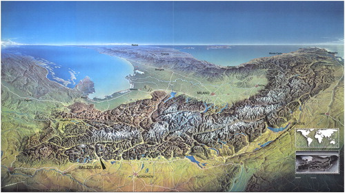
In this map, it is reverse, the mountains of the alps are in the centre, leaving all other areas somewhat as a decoration, helping to highlight the main story, the alps. It is fascinating to explore this map. There are so many details, which you can detect or rediscover, but superior to it all is the fantastic holistic impression you can gain from this map: the situation and context of the alps. By positioning the alps in the middle of depictions of the Adriatic Sea, the Italian peninsula and the Ligurian Sea as well as the Austrian, German and Swiss alpine foreland including the indication of the Rhine valley, the enormous significance of this high mountain range running across Europe from west to east becomes nearly tangible. The historical, economic, political and societal fate of Europe has been shaped by those mountains, and in Berann’s map you can see, touch and understand this intuitively.
Unfortunately, little is known about the discussions taking place when the order for producing this map was given to Berann. Thus, we don’t know what the costumer had in mind or if constraints have been put on Berann. It seems, as if the original map drawing has been edited later by adding labels of the bigger cities, which looks somewhat superficial and not integrated. The same is true for the two insert maps in the lower right corner, which should help to position the map view. Besides those elements, the map of the alps uses all of Berann’s well-established techniques: the illustrative depiction of mountains, the colour coding support of the terrain representation, the rigorous geometric distorsions in favour of the optimized readability and illustrativeness, the very selective depiction of the situation and the added clouds for the sake of creating some kind of ‘atmosphere’, which the map reader should be put in.
The inspiration
Berann has inspired not only countless map users with his artefacts but also other cartographers and artists, which try to reveal his methodology and pick up some of his techniques. Generally speaking, panorama maps are not rare, but, for example, in touristic areas such as ski stations are often to be found to help tourists to gain awareness of the environment they are in and what can be found around their location. However, the artists and cartographers producing hand-drawn panorama maps have a specific kind of style, which is hard to copy. That is why in the area of artefacts Berann’s style stands out as unique.
The opportunities given by digital cartography have also led to attempts to formalize and subsequently automate at least parts of Berann’s techniques. There have been impressive efforts being published (Brown et al., Citation2017; Jenny and Jenny, Citation2013; Patterson, Citation2000), which directly cite Berann’s work as their source of inspiration.
The legacy
Cartography as a discipline is generally concerned with communicating spatial information to human users. This is done through applying methods to communicate spatial information by (in most cases) visually perceivable graphical codes. This transfer to a perceivable code is primarily needed because of the restricted human perception system. The subsequently applied cartographic methods are generally sacrificing the accuracy, homogeneity and integrity of the processed spatial data for the sake of human-perceivable aggregated and subsequently abstracted information. Usually, this results in representation models, speaking of maps as the most common ones.
However, it can be argued, that even if we know a lot about how maps can be produced and modelled, and how they work, we ultimately are not able to say if a map is ‘good’ in terms of satisfying the needs and demands of a particular user in a particular situation and context, thus describing the concept of quality of maps in a functional manner (Gartner, Citation1998).
While a map can be designed in a way, that it is perceivable, has no graphic conflicts and communicates particular depicted spatial information, it might still not lead into the same satisfaction as another map depicting the same spatial information but in a different way. We can think of this as similar to other communication forms, e.g. human communication. Although two persons might express something similar, differences in the words which are used, how they are used, how they are pronounced, how quick/slow/loud they are spoken, of whom they are expressed and in which situation might all have an influence, whether one or the other communication is more effective and successful.
Ultimately, we might need to adopt an expanded understanding of maps as having a variety of functions. Some are related to the data and the information which is depicted in the map (how accurate, how complete), some are related to the way the data are visualized and graphically depicted (how perceivable, how clear) and some are related to the user and his context (how pleasing, how entertaining, how useful, how informative, how ‘enabling’).
Berann’s panorama maps might not be useful to help you to navigate. They would fail dramatically if you want to measure distances or other means from the map. They do not fulfil standard cartographic criteria of geometric accuracy and semantic integrity. However, in terms of allowing to gain spatial awareness, to enable understanding, to attract attention, to intuitively reach illustrativeness and to enable feelings of being pleased by looking at a map Berann’s work is eventually a benchmark for cartography, which will be hard to be pushed further.
A personal post-scriptum
I always felt attracted by maps. Ultimately, this determines my way into Cartography. When learning to make maps myself as a student, also by literally drawing contour lines, rivers, streets and playing around with graphic variables to visualize different map objects, I primarily learned to focus on accuracy, precision and exactness.
It was Berann’s map of the alps which made me aware of the enormous gap between being able to draw lines and polygons and yes, make maps, and the powerful language of aesthetically pleasing, harmonized visualizations which are taking their quality from both, the talent and creativity of a unique artist and cartographer and the clear focus on products meant to be user-oriented.
Disclosure statement
No potential conflict of interest was reported by the author(s).
Correction Statement
This article has been republished with minor changes. These changes do not impact the academic content of the article.
References
- Berann, H. C., & Graefe, H. A. (1966). Die Alpen im Panorama. Verlag Wolfgang Weidlich. p. 205.
- Brown, S., Brown, A., & Samavati, F. (2017). Real-time panorama maps. Proceedings of NPAR’17, Los Angeles, CA, USA. https://doi.org/10.1145/3092919.309292.
- Gartner, G. (1998). About the quality of maps. Cartographic Perspectives, 30(30), 38–46. https://doi.org/10.14714/CP30.662
- Jenny, H., & Jenny, B. (2013). Challenges in adapting example-based texture synthesis for panoramic map creation: A case study. Cartography and Geographic Information Science, 40(4), 297–304. https://doi.org/10.1080/15230406.2013.795001
- Jenny, H., Jenny, B., & Hurni, L. (2010). Interactive design of 3D maps with progressive projection. The Cartographic Journal, 47(3), 211–221. https://doi.org/10.1179/000870410X12786821061495
- Mason, B. (2018). Explore historic Mount Everest expeditions through national geographic maps. National Geographic, 29, 2018.
- Patterson, T. (2000). A view from on high: Heinrich Berann’s Panoramas and landscape visualization techniques for the U.S. National Park service. Cartographic Perspectives, 36(36), 38–65. https://doi.org/10.14714/CP36.824
- Troyer, M. (2016). The life of H. C. Berann. http://www.berann.com/life.html.