
ABSTRACT
With the rise of the Quantified-Self movement and widespread adoption of self tracking technologies, 'personal' has become a new dimension in the map and geovisualization design process. Despite a rich cartographic literature on how to map movement data, and an equally extensive geovisual analytics literature on how to make sense of complex visual representations of movement data at scale, opportunities exist to adapt and create new map and interaction design paradigms to meet the disparate needs of an ever-growing number of data creators. This paper presents a cross-disciplinary review of literature that reports on the design and evaluation of personal geovisualizations. Specifically, this review paper: contextualizes individual movement data types and provides a short synthesis of cartographic and geovisual analytics approaches that have been employed to explore such data in non-personal contexts; surveys a growing yet disconnected body of foundational work beyond the GIScience discipline; presents a detailed discussion on a collection of works that exemplifies the potential of applying a geographic perspective to personal visualization; and outlines key challenges and opportunities for advancing the state-of-the-art & science in the design of maps and geovisual analytics applications constructed from personal data and that benefit the data creator.
Avec l'augmentation de la quantification des déplacements personnels et la large diffusion des technologies d'enregistrement de traces personnelles, les ‘personnes' sont devenues une nouvelle dimension dans le processus de conception de cartes et de géovisualisation. Malgré l'existence d'une littérature cartographique riche sur la cartographie des données de déplacement, ainsi que d'une littérature tout aussi complète sur les analyses géovisuelles sur la façon de donner du sens à partir de représentations complexes de données de déplacement à l'échelle, il existe des opportunités pour adapter et créer de nouveaux paradigmes de conception de cartes et d'interactions pour répondre aux besoins disparates d'un nombre toujours grandissant de créateurs de données. L'article présente un état de l'art interdisciplinaire sur la conception et l'évaluation de géovisualisations personnelles. En particulier cet article : 1- contextualise les types de données de déplacements individuels et fournit une courte synthèse des approches cartographiques et de géovisualisations analytiques qui sont utilisées pour explorer de telles données dans des contextes non-personnels ; 2- identifie un corpus en augmentation et encore non connecté de travaux fondamentaux au-delà de la discipline des sciences géomatiques ; 3- présente une discussion détaillée sur un ensemble de travaux qui illustre le potentiel d'appliquer des perspectives géographiques aux visualisations personnelles ; et 4- souligne les principaux défis et opportunités pour améliorer l'état de l'art et les connaissances sur la conception de cartes et d’applications de géovisualisations analytiques construites à partir de données personnelles et qui bénéficient aux créateurs de données.
Introduction
Personal data of all types, structures, and complexities are being generated at an astonishing rate. The International Data Corporation (IDC) estimates that the ‘global datasphere’ (i.e. all data created, captured, and replicated) will reach 175 zettabytes by 2025, reflecting a 10x increase from 2016 (Reinsel et al., Citation2018). Embedded and cognitive systems continuously transform how we interact with connected devices and our ability to leverage real-time data for decision-making. Increasingly, these smart technologies are geo-enabled and integrated into our personal devices and wearables (e.g. smartphones, smartwatches, augmented eyewear, pedometers, textiles, wristbands, etc.), capable of capturing the spatial context of a myriad of digital footprints. Users of these devices are intentionally creating this data for personal consumption in a variety of interactive, visual mediums. For example, individuals are engaging with personal data visualizations to facilitate self-awareness and improvement (e.g. Epstein et al., Citation2015; Wood, Citation2015); support reflection, reminiscing, and curiosity (e.g. Parvinzamir et al., Citation2019; Rooksby et al., Citation2014); share life experiences (e.g. Thudt et al., Citation2015); and even enhance their interactions with companion pets (e.g. Nelson & Shih, Citation2017).
The accessibility and pervasiveness of these smart technologies has given rise to the Quantified Self (QS) movement and self-tracking for fitness, health, and general awareness becoming a mainstream activity (Swan, Citation2012). As a result, ‘personal’ has become a new dimension and challenge in the big data discussion (Gurrin et al., Citation2014; Swan, Citation2013). Human-data interaction (HDI) is an emerging area of study borne in response to the rapid increase in the collection, analysis, and trade of personal data (Mortier et al., Citation2014). HDI considers the evolution of data; how data trails, or digital traces of individual behavior, amass into data smog (or information overload) to be computed on and made sense of in the form of insights extracted from big data. Our personal data feeds into blackbox algorithms; however, the output inferences are often opaque, and the effects may or may not be known to us. In turn, this has implications for our behavior and the data we create in the future. Mortier et al. (Citation2014) identify three overarching goals of HDI:
Data legibility: to make data collection and processing transparent and comprehensible to those reflected in the data.
Data agency: to empower data creators with the necessary knowledge and tools to manage, modify, and act upon personal data.
Data negotiability: to facilitate a dynamic relationship between individuals and their data over time as attitudes, preferences, and social norms about data and data processing shift.
Realizing these three core HDI principles in practice is challenging. One issue stems from the fundamental disconnect between data generated (input) and value or insight output from that data. In 2013, an estimated 22% of all data created were collected and properly attributed while only 5% of that estimate was analyzed (Turner et al., Citation2014). Another related issue arises from what Manovich (Citation2011) describes as a societal imbalance between the three data classes: creators, collectors, and analysts. In this portrayal of a digital society, data creators represent the majority, contributing both consciously and unknowingly through digital footprints. Data collectors, a smaller group, possess the necessary resources for capturing, storing, maintaining, and controlling access over the data. Lastly, data analysts, the smallest group, have the expertise to generate insights from the data. Thus, insight or value extracted from the data becomes a commodity and is not necessarily returned to those who created it.
From a geographic perspective, this uneven distribution of data knowledge creates place-based digital divides between the data-rich and the data-poor, as well as an analytical divide between experts in spatial data science and others not trained in mapmaking or geovisualization. It is insufficient to assume that visualization techniques and geovisual analytics tools designed for expert use will be effective at delivering emotion-evoking experiences or insight in personal contexts (Huang et al., Citation2014; Parvinzamir et al., Citation2019) . However, there is a growing body of research focused on blurring the boundaries between these digital and analytical divides through reassessing what makes a visualization, map, or geovisual analytics application successful in personal contexts. The aim of this review paper is to familiarize the GIScience community with foundational work in this area – both within and beyond the discipline – and inspire new research efforts focused on making maps and geovisualization tools more accessible to non-expert audiences and more impactful in our personal lives.
In the following sections, I first contextualize personal movement data types and provide a short synthesis of cartographic and geovisual analytics approaches that have been employed to map and interact with such data in non-personal contexts. Next, a growing yet disconnected body of relevant work in the disciplines of human–computer interaction, personal informatics, and personal visualization/visual analytics is surveyed followed by a detailed discussion on a limited collection of works that exemplifies the potential of applying a geographic perspective to personal visualization. Special consideration is given to work that leverages personal movement data in professional contexts but for the purpose of indirectly serving the data creator via initiatives that improve our experiences in urban environments. The paper concludes with a summary of key challenges and opportunities for advancing the state-of-the art & science in the design of maps and geovisual analytics applications constructed from personal data and that benefit the data creator.
Mapping & interacting with movement data: considerations for personal contexts
This section provides an overview of how personal movement data can be collected and structured and highlights relevant cartographic and geovisual analytics approaches that have been employed to map and interact with movement data broadly, but not necessarily in personal contexts.
Personal movement data types
Personal movement data can be measured via accelerometers incorporated into devices such as pedometers or captured in place, space, and time using smartphones and other geo-enabled devices. Whereas step count data generated from pedometers provide an abstract representation of one’s overall physical activity based on estimating distance traveled, geospatial movement data capture the location of an individual at a given point in time. Spatial movement data can be categorized into at least three broad types: flow, trajectory, and three-dimensional (Demšar et al., Citation2019). Flows, commonly referred to as origin-destination pairs, represent known locations of where movement began and ended. The route between pairs can only be inferred from linking other data sources and/or domain expertise. Trajectories represent movement as a series of locations recorded at both irregular and regular intervals through space as a function of time. Irregular trajectories of personal movement can result from phone records or social media posts, and have been used to, for example, construct activity spaces and analyze human mobility (e.g. Xu et al., Citation2016), as well as support situational awareness during crisis events (e.g. Krueger et al., Citation2016; MacEachren et al., Citation2011). Whereas irregular trajectories facilitate reconstructing incomplete patterns of movement behavior, trajectories recorded at regular intervals by GPS tracking devices provide a more complete representation of movement (Andrienko et al., Citation2017; Giannotti et al., Citation2007). Three-dimensional movement data are even more complex and can be used to inform advanced activity recognition applications (Ramasamy Ramamurthy & Roy, Citation2018). Each data type affords unique opportunities for representing, exploring, and making sense of personal movement in a variety of contexts.
Mapping, visualizing, and interacting with personal movement data
There are many viable approaches to mapping and visualizing personal movement data. Step counts, for example, can be aggregated and plotted against time using a variety of simple data visualizations (e.g. line graph, calendar heat map, etc.). Personal trajectories can be represented using space time cubes [STC] (Hägerstrand, Citation1970; see a), or aggregated into origin-destination data and represented using flow (Tobler, Citation1987) or OD maps (Wood et al., Citation2010; see b). Cartographic movies (Tobler, Citation1970), animated maps (Moellering, Citation1976), small multiples (Bertin, Citation1983; Tufte et al., Citation1990), and schematized linear cartograms (Kraak et al., Citation2014; see c) can also be employed to further emphasize temporality, directionality, and other attributes of individual movement behavior. Combining cartographic representations of movement into interactive, linked view environments reduces visual clutter and overplotting issues (Dykes et al., Citation2005). While this approach can help make movement patterns easier to detect, it does not completely address challenges in visualizing and interacting with large datasets (Kraak et al., Citation2014).
Figure 1. Sample of cartographic (a, b, and c) and geovisual analytics (d, e, and f) approaches to mapping and making sense of movement data.
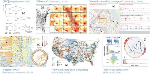
The geovisual analytics research community has extended many of these cartographic and visualization techniques to enable interactive reasoning between human analysts and complex visual representations of movement data at scale. For example, Andrienko and Andrienko (Citation2013) implemented a ‘trajectory wall’ and temporal lens technique to analyze a large amount of trajectory attributes which is not possible using traditional space–time cubes (see d). Similarly, researchers have advanced flow and OD maps to support interaction with large mobility datasets via flow density estimation and pattern extraction (Guo & Zhu, Citation2014; see e) as well as through analyzing interactions among high-dimensional OD flow vectors using natural language processing models and novel visual abstraction techniques, such as the ‘flow wheel’ (Zhou et al., Citation2018; see f).
A 2008 special edition of Information Visualization was dedicated to addressing key issues on the geovisualization of dynamics, movement, and change over time. In the introduction, Andrienko et al. (Citation2008) organize geovisual analytics approaches to visualizing and interacting with movement data based on three categories:
Visualization and direct depiction of movement traces
Visualization of movement trace derivatives or abstractions (e.g. aggregations, generalizations, samples, etc.)
Visualization of computationally extracted patterns
As the level of data abstraction increases from raw input to pre-computed complex pattern extractions, the visual analytical process must advance to bridge the conceptual divide between data and knowledge (or insight). As the visual analytical process advances, however, the complexity of the geovisual analytics application typically increases. In considering the use of such applications in personal and non-expert contexts, this creates an accessibility challenge in which only those with background and training in spatial data science and geovisualization can use and extract value from the tool.
Since the 2008 call to action, researchers have introduced a taxonomy of generic analytic techniques for analyzing movement (Andrienko et al., Citation2011); contributed reviews focused on effective techniques for aggregating and interacting with movement data in visual analytics environments (e.g. Andrienko & Andrienko, Citation2010, Citation2013); and advanced the state-of-the-art in interactive flow mapping and multivariate visualization (e.g. Guo, Citation2009; Zhu et al., Citation2019; Zhu & Guo, Citation2014). Major contributions from these works included methodological frameworks for applying computational and visualization approaches to different views of movement (e.g. situation- versus trajectory-oriented), as well as systematically parsing the ways in which different types of information can be extracted from movement data based on the unique characteristics of space, time, and objects (and the relationships among them). The type of information extractable can be related to analysis tasks focused on spatial and temporal data characteristics and relationships, which are then linkable to generic classes of computational and visualization techniques that can be employed to complete those tasks (Andrienko & Andrienko, Citation2010). These works, however, evaluated and aimed to inform map and visualization design for expert users performing complex analyses on a breadth of movement data types. Thus, these works do not adequately inform system design for potentially non-expert use in personal contexts. In the following section, I highlight a well-established and growing cross-disciplinary body of research that can help inform the design of maps and geovisual analytics applications for personal use.
Casual Infovis, LifeLogging & personal visual analytics
In response to the vast amount of personal (or personally-relevant) data being generated and collected, researchers in a variety of disciplines (e.g. human–computer interaction (HCI), information visualization, personal informatics (PI), ubiquitous computing, etc.) have developed interest in casual information visualization (Pousman et al., Citation2007) and understanding what motivates visualization use in non-professional contexts (Sprague & Tory, Citation2012). ‘LifeLogs’ is a term frequently used in the HCI and PI communities, which refers to digital traces of personal activities and interactions, automatically captured in totality or based on specific situations, and commonly studied in relation to memory (Sellen & Whittaker, Citation2010). Lifelogging has become a mainstream activity as a result of cheap computer storage, advancements in personal sensors, and an openness to creating and sharing personal information on social networks (Gurrin et al., Citation2014). PI extends beyond a class of tools designed to capture lifelogs. PI encompasses everything from what motivates self-tracking and how one prepares to collect lifelogs, to the collection and integration processes by which personal data are harvested and translated into graphical representations, and finally to how individuals reflect and decide to act on what is learned from the data and process (Li et al., Citation2010). Designing PI tools to support self-reflection requires understanding the breadth of questions individuals have about their data, why these questions are personally relevant, ways in which these questions can be answered, and critical challenges faced in trying to answer these questions (Li et al., Citation2011). Moreover, personal activity tracking is oftentimes a social and collaborative lived experience that supports individuals in reaching goals, documenting experiences, and satisfying curiosity (Rooksby et al., Citation2014).
At the most ambitious end of the self-tracking spectrum is the QS community, which is comprised of individuals who track biological, physical, behavioral, environmental, and other information about themselves (Swan, Citation2013). The QS community shares a common interest in ‘self-knowledge through numbers’ and has a dedicated website (https://quantifiedself.com/) to support a global audience in learning how to effectively reason with personal data. The QS website displays hundreds of user-generated personal visualizations, features blog posts authored by quantified-selfers wanting to share their experiences with using tracking devices, and provides links to international conferences, local meetups, and guides to self-tracking tools. Choe et al. (Citation2014) conducted a qualitative study with a group of ‘extreme’ quantified-selfers to investigate the challenges and pitfalls of self-tracking and the technology used to do so. The authors identified a key challenge faced by study participants – difficulty in data interpretation and inability to extract useful insight from personal data – and found that insight and sense making happen during both the act of data collection and subsequent data exploration.
In considering the needs of the audience at the other end of the self-tracking spectrum, Rapp and Cena (Citation2016) conducted a diary study with 14 participants who were completely unfamiliar with personal informatics and self-tracking. Participants were asked to use a variety of sensors to track personal data for 10 days to one month, and to report on their experiences in doing so. Unlike experienced self-trackers, the study group found many of the technologies to be burdensome to use and lacking in benefit or reward. With respect to visualization, participants felt overwhelmed by abstract data representations, and were unable to relate to themselves in the available design solutions. Participants wanted immediate and relatable engagement with their data visualizations, and for the displays to be able to provide a better combination of graphical and narrative synthesis, as well as be able to make recommendations on how to improve their lives. Epstein et al. (Citation2014) note that self-trackers face a burden from low-level interpretations of their data and limited ability to interact with their data and make sense of it. The authors explored ways to make personal data more actionable and developed unique visualizations based on direct feedback from self-trackers. The authors found that many of the generic visualizations often present in consumer applications are inadequate in personal contexts.
Due to the scattered yet growing nature of this research, Huang et al. (Citation2014) recognized a need to introduce a new field and research community called personal visualization (PV) and personal visual analytics (PVA). PV&PVA aims to address the question of how to design interactive data representations for personal use by individuals who may have limited or no experience with data, visualization, or statistics. The authors surveyed 59 works primarily in the VIS and HCI Communities, and developed a taxonomy of design dimensions based on:
data characteristics: who is the data about, how difficult was it to collect, how much control does the data creator possess?
context: who designed the tool, who is it intended to inform, and in what situations is it meant to be used?
interaction: how explorable are the data and how much attention is required?
insight support: how actionable are the data?
The authors then used these design dimensions to identify prominent clusters of research, such as ‘enabling exploration for curiosity,’ ‘supporting awareness for action,’ ‘taking care of family,’ and ‘reflecting on communities.’ The authors emphasized the potential of visualization and analytical tools for personal non-expert use, but argued that for this potential to be realized, visualization, interaction, and evaluation techniques will need to be revised, as will sensemaking models to encompass insight development and knowledge discovery in a personal context.
Despite research efforts focused on characterizing, defining, and measuring insight (e.g. Chang et al., Citation2009; North, Citation2006; Yi et al., Citation2008), the concept remains poorly understood in personal contexts (Choe & Lee, Citation2015). Beyond the traditional concept of task-based ‘analytic’ insight, we must also consider and attempt to evaluate how visualization can support more complex and nuanced insights achieved through maintaining awareness of personally relevant data streams (e.g. stock market, weather forecast, etc.), understanding social networks and community relations, and self-reflection and contemplation of one’s place in the world (Pousman et al., Citation2007).
To date, the visualization research community has focused primarily on developing objective visual data representations; however, Thudt et al. (Citation2017) argue that subjective design strategies discussed in art and design literature offer great potential for creating more compelling and meaningful personal narrative visualizations. The authors exemplified this potential through the analysis of 20 personal narrative visualizations in which they matched steps in the visualization creation process (e.g. data collection, processing, visual mapping, and presentation) to specific techniques for expressing subjective perspectives (e.g. reconstructing data from memory, visual metaphors for experience, media as contextual information, etc.). Therefore, the design of a personal visualization should consider the role of emotion and subjectivity in decision making and explore creative strategies for fostering affective, intellectual, and social engagement (Wang et al., Citation2019).
In summary, personal visualizations and visual analytics systems that are designed by consumer companies or researchers with little input from end users can create a disconnect between the data and the individual. This disconnect can make users feel powerless, stressed, and skeptical, which inhibits system use and adoption. A successful or ‘valuable’ design solution extends beyond just being useful and is also appealing, meaningful, and integrative within life routines (Pousman et al., Citation2007). The following section details the potential for engaging a geographic perspective in the PV&PVA discussion.
Geographic perspectives on personal visualization
While many casual information visualizations or LifeLogging applications do not capture and thus cannot reflect personal movement and location information, the relevance of space and time to everyday life cannot be overstated (Abdalla et al., Citation2013; Hägerstrand, Citation1970). Our interactions in places have implications for recollecting, reminiscing, retrieving, reflecting, and remembering intentions (Linton, Citation1982; Sellen & Whittaker, Citation2010). Therefore, mapped depictions of personal movement data can play an integral role in facilitating improved memory and self-awareness, as well as making our interactions in places better and more meaningful (Epstein et al., Citation2014). Such mapped depictions become even more effective when the intended user of the personal visualization is included in the design and evaluation process (Roth et al., Citation2017). This section explores the role of cartography and geovisualization in making personal movement data more valuable through design strategies focused on ensuring benefit is returned to the data creator be it directly in personal contexts or indirectly as a result of one’s personal data being used in professional contexts.
Personal movement data directly serving the data creator
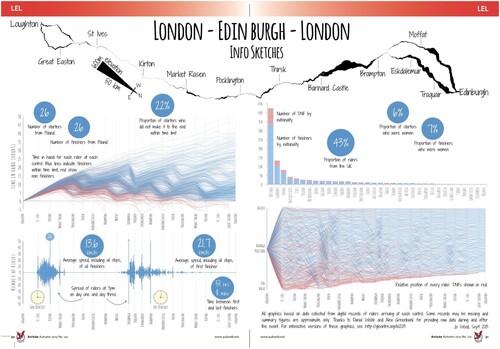
Personal movement data can aid in the process of retrieving and reminiscing about past experiences. For example, Kalnikaite et al. (Citation2010) investigated the extent to which mapped depictions of personal movement data and photographic records of everyday activity engender true recall versus inference. Results from a controlled within-subject experiment with 18 participants showed that photographs and personal movement data work very differently on memory. Images helped to facilitate true recollection, whereas locational information more effectively supported memory deduction based on spatiotemporal patterns revealed visually on maps. When integrated together in a map + photograph visualization, reflection on a more complete representation of past experiences was possible. While this work provides quantitative evidence on the value of personal visualization for supporting memory recall, the study did not allow users to provide input on how system design and functionality could be developed to support their needs. In contrast to this quantitative evaluation approach, Wood (Citation2015) aimed to specifically inform the question of how to reflect the data creator’s experience in the design of non-traditional visualizations for personal contexts. Drawing on first hand experiences and personal interests, the author designed interactive maps and visualizations to reflect on multi-day long distance cycling events. The design process emphasized road gradient and ‘time in hand’ to complete an event. The resulting visualizations supported spatial narratives unique to the participant, as well as position and progress charts that allowed participants to compare their overall situation relative to others (see ). While informal feedback from participants and organizers of a 2013 event indicated that the visualizations were helpful for future event planning, the author argued that personal engagement with data through such visualizations affords more affecting human-data interactions.
Figure 2. Compilation of graphics detailing the personal journey of a multi-day long distance cycling event. Adapted from ‘Visualizing personal progress in participatory sports cycling events’ by Wood (Citation2015).
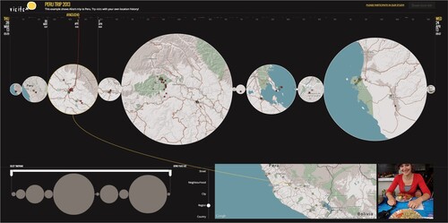
Like special events, significant trips and shared experiences with loved ones have a profound effect on memory and reminiscing. To explore the concept of ‘visual mementos,’ Thudt et al. (Citation2015) created Visits, an interactive map-timeline visualization designed to relay noteworthy trips and travels, as well as shared experiences with friends and family on those travels (see ). The authors ground their work in autobiographical research and the notion that artefacts play a crucial role in the creation of memories. To evaluate their design solution, Thudt et al. (Citation2015) conducted a qualitative study using a technology probe methodology to explore how well the system addressed the challenges of evoking familiarity over the unknown, extending data representation beyond the objective to reveal the subjective, and addressing privacy concerns through data agency. Forty-two participants engaged with the system to a varying extent, from interacting with the demo and completing a questionnaire to loading in their own personal data and sharing their memento. Response to Visits was overall positive though participants noted wanting the ability to further personalize the system, integrate other data sources to construct more comprehensive mementos, and support joint reminiscing (i.e. ability to draw from shared data sources to support collective mementos). Moreover, participants expressed concerns for long term system adoption because not all individuals will record the necessary data or be willing to upload the data due to privacy concerns or lack of commitment.
Figure 3. Visits, an interactive personal geovisualization that facilitates reminiscing and sharing travel memories. Adapted from ‘Visual mementos: Reflecting memories with personal data’ by Thudt et al. (Citation2015).
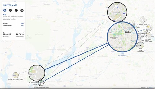
Related to self-reflection and reminiscing are the works of Otten et al. (Citation2018) and Parvinzamir et al. (Citation2019). Otten et al. (Citation2018) integrated map and network visualizations to explore spatial and temporal topologies in personal movement data (see ). The authors’ rationale in combining map and network representations of personal movement was to allow users to discover complex recurring patterns in long term activity traces. Similar to the evaluation approach taken by Thudt et al. (Citation2015), these authors conducted an iterative, three stage assessment consisting of a formative study; feedback gathered at an exhibition; and a qualitative user study. The formative study included three participants and aimed to inform the potential and shortcomings of an early prototype. Exhibition feedback from 150 visitors on a revised prototype provided informal input from a larger, broader audience and highlighted aspects of the visualization that were both enjoyable and confusing. After again revising the system based on the informal feedback, the authors conducted a qualitative user study with nine participants. Participants completed an introductory interview, a task entailing interacting with their own or sample dataset, and a follow-up interview. Results from the study showed that individuals were more interested in using the integrated map + network visualization when they were engaging with their own data rather than a sample. Also, participants found value in not just reminiscing on places visited frequently but in rediscovering the outliers that they visited infrequently. Participants, however, expressed having trouble with spatial orientation when using the various network layouts, and emphasized the value of geography and place in relaying personal movement data.
Figure 4. Shifted Maps, an integrated map and network geovisualization that enables exploration of spatial and temporal topologies in personal movement data. Adapted from ‘Shifted Maps: Revealing spatio-temporal topologies in movement data’ by Otten et al. (Citation2018).
Relatedly, Parvinzamir et al. (Citation2019) created a web-based personal visual analytics platform, MyEvents, that supports the collection of long-term location and movement data and allows users to create mementos through interacting with different visual representations of past events. The authors further develop a multi-significance event ranking model based on user preferences and frequency and regularity of events to aide in memory recall and reminiscence. The platform’s interface consists of a dashboard of linked views including an event timeline, map, photographs, and summary statistics on daily behavior and trends over time. To evaluate the design solution, the researchers conducted a user study with 16 participants aimed to assess the platform’s usability and usefulness in detecting noteworthy events and supporting reminiscence. The study consisted of a usability questionnaire, interface satisfaction survey, effectiveness profile questionnaire, open-ended comments, and task-based activities. Overall, participants found the platform to be effective at relaying an appealing and meaningful overview of daily events and in supporting recollection of notable events through different visual representations. Participants indicated the combination of timeline + map views facilitated better recall, however suggested that the map should be larger to provide better spatial context. These works again highlight the additional value gained by including the data creator/intended user of the visualization throughout the development process.
Mode of travel further affects our memory. For example, Meier and Glinka (Citation2017) explored how personal activity data can be used to algorithmically model mental maps in an urban setting. The authors calculated a personal level of potential memorization index (PMI) or ‘spatial knowledge’ based on mode of transportation. Highest values were given to walking followed by cycling and lastly any form of motorized transit. The premise being that the ways in which one actively moves through a city influences her or his memory of landmarks and perceptions of the urban environment. To evaluate mental map modeling, the authors recruited five participants who were willing to share a year’s worth of personal activity data recorded using, Moves, a now-obsolete activity tracking application owned by Facebook. Next, the authors created a web application that presented Google Street View imagery of 22 locations extracted from places participants visited during the past year, as well as three locations that participants had not visited. Participants were asked if they knew where each location was, and if so, to place a pin on a provided map. Results showed a trend between PMI calculated from their data and participants’ recollection and memory of locations throughout the city. Lastly, the authors created abstract cartographic physical models of each participant’s mental map. PMI values were mapped to buildings, and building height was extruded as a function of the value. The purpose of the physical models was to facilitate personal reflection and extend the ways in which one perceives the urban environment. Better understanding the relationship between mode of travel and memory recall provides valuable insight into how to design maps and geovisualation tools to support non-expert users in personal locational sensemaking.
Personal movement data indirectly serving the data creator
Crowdsourced personal movement data collected in urban environments also present new and under-explored opportunities that extend beyond just delivering direct personal value or insight to the individual who engages in QS activities (Ferster et al., Citation2021; Nelson & MacEachren, Citation2020). Paralleling trends in self-tracking is the realization of ubiquitous computing and onset of Internet of Things (IoT) technologies, which together create the potential for integrating aggregated and anonymized personal movement data into smart city initiatives to realize a more humanized, bottom-up approach to city planning (Smyth et al., Citation2013; Zanella et al., Citation2014). Moreover, maps and other data visualizations can play a critical role in engaging community stakeholders in the planning process (Romanillos & Zaltz Austwick, Citation2016).
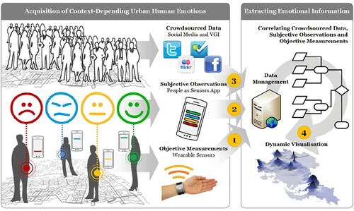
There is a growing body of research focused on the analysis and visualization of aggregated and anonymized personal movement data aimed at making cities safer and more efficient to move through. For example, Quartuccio et al. (Citation2014) integrated data from the Chicago bike sharing program with historical bicycle crash data to visualize high-risk areas in the City and communicate potential problematic infrastructure. Similarly, Bao et al. (Citation2017) leveraged personal movement traces from bike-share data in the City of Shanghai to develop a system for more effectively planning bike lanes. Visualization of aggregated arousal measurements from wearable bio-sensors, in combination with crowdsourced data and subjective observations, has also been explored to inform city safety (Resch et al., Citation2015; Zeile et al., Citation2015; see ).
Figure 5. The Urban Emotions concept integrates and correlates arousal measurements, subjective observations, and crowdsourced data in urban environments to enrich the city planning process. Adapted from ‘Urban emotions—Geo-semantic emotion extraction from technical sensors, human sensors and crowdsourced data’ by Resch et al. (Citation2015).
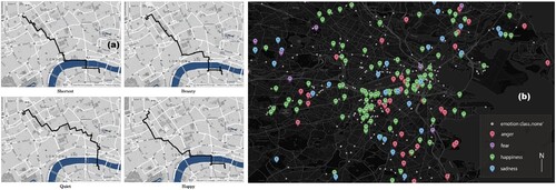
Personal movement data can also be used to improve how we navigate through urban centers, as well as help to communicate our perceptions of cities. Baker et al. (Citation2017), for example, leveraged crowdsourced cycling GPS traces to inform preferential route choices, whereas Quercia et al. (Citation2014) aggregated and mapped emotional responses to photographs of locations and landmarks to create quieter, happier, and more beautiful pedestrian routes in Boston and London (see a). Emotion information has also been extracted from tweets to reveal spatiotemporal patterns in citizens’ perceptions of cities (Resch et al., Citation2016; see b). However, emotional bonds with places are complex, and additional research is needed to better understand the triangular relationship between person, place, and technology (Stals et al., Citation2018).
Figure 6. Mapped depictions of emotion data used to create quieter, happier, and more beautiful pedestrian routes (Quercia et al., Citation2014; a) and reveal spatiotemporal patterns in citizens’ perceptions of cities (Resch et al., Citation2016; b).
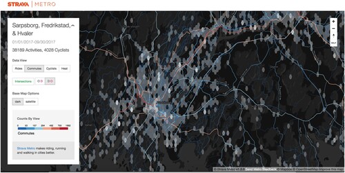
Finally, it is worth highlighting the broader adoption of activity tracking platforms and the myriad of ways in which the incoming data are being leveraged to indirectly serve data creators. Strava, for example, is one such platform which allows users of the application to record, analyze, and share all types of fitness-related activities. In 2021, Strava reported a single year record of 1.8 billion public activities uploaded to the platform, accounting for 20 billion miles of activities across the globe (Strava, Citation2021). Strava Metro is a division of the company that licenses data to a variety of organizations that are taking data-driven approaches to city planning and makes aggregated and anonymized data derivatives freely available to students and researchers investigating urban planning, tourism, and other bike and pedestrian applications. Researchers have demonstrated how the commercial crowdsourced data product can complement and extend more traditional approaches to active transportation monitoring (Ferster et al., Citation2017; Jestico et al., Citation2016). In a literature review dedicated to the topic of ‘Strava Metro data for bicycle monitoring,’ Lee and Sener (Citation2020) identified over forty journal articles detailing the use of Metro data for a variety of applications, such as identifying travel patterns and route choices; estimating travel demand; evaluating city infrastructure; and assessing bicycle crash and air pollution exposure. In an effort to make Metro data more accessible and actionable, Nelson and MacEachren (Citation2020) conducted a multi-year human-centered cartographic design study to create an interactive flow map that empowers a broad audience of stakeholders in the urban planning process to make more informed decisions on how to improve city safety and efficiency (see ).
Figure 7. Metro DataView, an interactive flow map that depicts volumes of bicycling trips, commute-designated trips, and bicyclists across an urban network to inform data-driven city planning processes. Adapted from ‘User-centered Design and Evaluation of a Geovisualization Application Leveraging Aggregated Quantified-Self Data’ by Nelson & MacEachren, Citation2020.
Conclusion
As is clear from above, maps and geovisual analytics tools can play an integral role in serving the data creator, both directly through re-envisioning what makes a design solution successful in non-expert use cases and indirectly when place-based personal data are leveraged by domain experts for improving the lived experience of data creators broadly. This potential, however, is constrained by the dispersed nature of research in this area, a gap this review paper aims to address, but more importantly by a lack of overarching design guidelines and evaluation methodologies for assessing not just the usability and utility of personal data visualizations but also their affective characteristics. Despite a rich cartographic literature on how to map movement data, and an equally extensive geovisual analytics literature on how to interact with and make sense of complex visual representations of movement data at scale, much work is left to be done to translate and create new map and interaction design paradigms that meet the disparate needs of an ever-growing number of non-expert data creators. These revised design strategies should further strive to be transparent and legible, and to provide data creators with agency in managing and making sense of their data.
The works synthesized in this review paper inform this gap in the research and offer helpful insights to designers of personal geovisualizations. A key takeaway is that context matters and data representations must foster relatability. For the map component of a personal visual analytics platform to enable reminiscence about noteworthy trips and everyday travels, as well as serve as a medium for sharing place-based experiences with family and friends, it must be imbued with personal meaning. This can be achieved through strategic integration of other visual artefacts, such as photographs, video clips, drawings, and timelines in combination with functionality that allows users to easily annotate these elements and transform them into a personal narrative for self-reflection and/or sharing with others. Effective design solutions must also balance automated extraction and depiction of potentially meaningful insights and patterns with flexibility that empowers users to detect and highlight nuances in the data that matter most to them. Personal geovisual analytics applications need to be able to dynamically identify when it is appropriate to guide, learn from, or make recommendations to users based on their data and how they are interacting with the platform. Thus, the design strategy needs to reflect the user in not just the data representations but also in the user experience.
The works reviewed in this paper also raise more important questions and promising directions for future research. For example, how do we measure the appeal, inclusivity, and relatability of a map or visualization or its ability to integrate within our daily routines? We recognize that emotion influences decision-making and that visual variables such as color can connote affective qualities (Anderson & Robinson, Citation2021; Bartram et al., Citation2017), so how can we strategically align human perception with symbology choices to foster more expressive, honest design solutions? How might we employ qualitative geovisual analytics concepts (Burns & Skupin, Citation2013), combine personal- with map-based storytelling elements (Roth, Citation2021; Thudt et al., Citation2017), or context-based services and adaptive cartography (Reichenbacher, Citation2013) to realize meaningful, personalized design experiences unique to the data creator?
Maps, in particular, play a controversial role in communicating movement data in personal contexts. On one hand, they can help us to reflect on personally relevant places, significant travels, and special events (e.g. Otten et al., Citation2018; Thudt et al., Citation2015; Wood, Citation2015). On the other, they have the potential to reveal sensitive personal information, causing unforeseen consequences to those reflected in the data (Bonchi et al., Citation2011; Sainio et al., Citation2015). There may be merit in returning to the fundamental question of what constitutes a map? Previous research has shown that personal definitions for a map vary widely (Kraak & Fabrikant, Citation2017), so how can we leverage ‘map-like’ visualizations (Hogräfer et al., Citation2020), privacy-preserving data publishing strategies (Fiore et al., Citation2020), or other visual cryptographic techniques (Ren, Citation2021) to obscure sensitive information while retaining meaning and delivering value to the data creator? Ultimately, the grand challenge is to figure out how to design maps and other geovisual analytics tools to transform the quantified self into the more qualified self, and to develop evaluation methodologies that consider the dynamic, intimate, and subjective sensemaking process that makes these visualization tools work.
Acknowledgements
The author thanks the anonymous reviewers for their helpful suggestions. Support for this research was provided by the Office of the Vice Chancellor for Research and Graduate Education at the University of Wisconsin–Madison with funding from the Wisconsin Alumni Research Foundation.
Disclosure statement
No potential conflict of interest was reported by the author(s).
Additional information
Notes on contributors
Jonathan K. Nelson
Jonathan K Nelson is an assistant professor of Geographic Information Science & Technology and Associate Director of GIS Professional Programs at the University of Wisconsin–Madison, specializing in cartography, geovisual analytics, and human–centered design with applications in environmental science, fitness and health, politics, socioeconomics, transportation, and urban planning. His work emphasizes the significant role of visual communication in making spatial data more accessible, legible, and valuable to broad and diverse audiences.
References
- Abdalla, A., Weiser, P., & Frank, A. U. (2013). Design principles for spatio-temporally enabled pim tools: A qualitative analysis of trip planning. In D. Vandenbroucke, B. Bucher, & J. Crompvoets (Eds.), Geographic information science at the heart of Europe. Lecture notes in geoinformation and cartography. (pp. 323–336). Springer. https://doi.org/10.1007/978-3-319-00615-4_18
- Anderson, C. L., & Robinson, A. C. (2021). Affective congruence in visualization design: Influences on Reading categorical maps. IEEE Transactions on Visualization and Computer Graphics, 28(8), 2867–2878. https://doi.org/10.1109/TVCG.2021.3050118.
- Andrienko, G., & Andrienko, N. (2010). A general framework for using aggregation in visual exploration of movement data. The Cartographic Journal, 47(1), 22–40. https://doi.org/10.1179/000870409X12525737905042
- Andrienko, G., Andrienko, N., Bak, P., Keim, D., Kisilevich, S., & Wrobel, S. (2011). A conceptual framework and taxonomy of techniques for analyzing movement. Journal of Visual Languages & Computing, 22(3), 213–232. https://doi.org/10.1016/j.jvlc.2011.02.003
- Andrienko, G., Andrienko, N., Chen, W., Maciejewski, R., & Zhao, Y. (2017). Visual analytics of mobility and transportation: State of the art and further research directions. IEEE Transactions on Intelligent Transportation Systems, 18(8), 2232–2249. https://doi.org/10.1109/TITS.2017.2683539
- Andrienko, G., Andrienko, N., Dykes, J., Fabrikant, S. I., & Wachowicz, M. (2008). Geovisualization of dynamics, movement and change: Key issues and developing approaches in visualization research. Information Visualization, 7(3-4), 173–180. https://doi.org/10.1057/IVS.2008.23
- Andrienko, N., & Andrienko, G. (2013). Visual analytics of movement: An overview of methods, tools and procedures. Information Visualization, 12(1), 3–24. https://doi.org/10.1177/1473871612457601
- Baker, K., Ooms, K., Verstockt, S., Brackman, P., De Maeyer, P., & Van de Walle, R. (2017). Crowdsourcing a cyclist perspective on suggested recreational paths in real-world networks. Cartography and Geographic Information Science, 44(5), 422–435. https://doi.org/10.1080/15230406.2016.1192486
- Bao, J., He, T., Ruan, S., Li, Y., & Zheng, Y. (2017, August). Planning bike lanes based on sharing-bikes’ trajectories. In Proceedings of the 23rd ACM SIGKDD international conference on knowledge discovery and data mining (pp. 1377–1386). Association for Computing Machinery.
- Bartram, L., Patra, A., & Stone, M. (2017, May). Affective color in visualization. In Proceedings of the 2017 CHI conference on human factors in computing systems (pp. 1364–1374). Association for Computing Machinery.
- Bertin, J. (1983). Semiology of graphics; diagrams networks maps (No. 04; QA90, B7.).
- Bonchi, F., Lakshmanan, L. V., & Wang, H. (2011). Trajectory anonymity in publishing personal mobility data. ACM Sigkdd Explorations Newsletter, 13(1), 30–42. https://doi.org/10.1145/2031331.2031336
- Burns, R., & Skupin, A. (2013). Towards qualitative geovisual analytics: A case study involving places, people, and mediated experience. Cartographica: The International Journal for Geographic Information and Geovisualization, 48(3), 157–176. https://doi.org/10.3138/carto.48.3.1691
- Chang, R., Ziemkiewicz, C., Green, T. M., & Ribarsky, W. (2009). Defining insight for visual analytics. IEEE Computer Graphics and Applications, 29(2), 14–17. https://doi.org/10.1109/MCG.2009.22
- Choe, E. K., & Lee, B. (2015). Characterizing visualization insights from quantified selfers’ personal data presentations. IEEE Computer Graphics and Applications, 35(4), 28–37. https://doi.org/10.1109/MCG.2015.51
- Choe, E. K., Lee, N. B., Lee, B., Pratt, W., & Kientz, J. A. (2014, April). Understanding quantified-selfers’ practices in collecting and exploring personal data. In Proceedings of the SIGCHI conference on human factors in computing systems (pp. 1143–1152). Association for Computing Machinery.
- Demšar, U., Slingsby, A., & Weibel, R. (2019). Introduction to the special section on visual movement analytics. Information Visualization, 18(1), 133–137. https://doi.org/10.1177/1473871618810849
- Dykes, J., MacEachren, A. M., & Kraak, M. J. (2005). Exploring geovisualization. Elsevier Science.
- Epstein, D. A., Cordeiro, F., Bales, E., Fogarty, J., & Munson, S. (2014, June). Taming data complexity in lifelogs: Exploring visual cuts of personal informatics data. In Proceedings of the 2014 conference on designing interactive systems (pp. 667–676). Association for Computing Machinery.
- Epstein, D. A., Ping, A., Fogarty, J., & Munson, S. A. (2015, September). A lived informatics model of personal informatics. In Proceedings of the 2015 ACM international joint conference on pervasive and ubiquitous computing (pp. 731–742). Association for Computing Machinery.
- Ferster, C. J., Nelson, T., Laberee, K., & Winters, M. (2021). Mapping bicycling exposure and safety risk using Strava Metro. Applied Geography, 127, 102388. https://doi.org/10.1016/j.apgeog.2021.102388
- Ferster, C. J., Nelson, T., Winters, M., & Laberee, K. (2017). Geographic age and gender representation in volunteered cycling safety data: A case study of BikeMaps.org. Applied Geography, 88, 144–150. https://doi.org/10.1016/j.apgeog.2017.09.007
- Fiore, M., Katsikouli, P., Zavou, E., Cunche, M., Fessant, F., Le Hello, D., Aivodji, U., Olivier, B., Quertier, T., & Stanica, R. (2020). Privacy in trajectory micro-data publishing: A survey. Transactions on Data Privacy, 13, 91–149. https://hal.inria.fr/hal-02968279/
- Giannotti, F., Nanni, M., Pinelli, F., & Pedreschi, D. (2007, August). Trajectory pattern mining. In Proceedings of the 13th ACM SIGKDD international conference on knowledge discovery and data mining (pp. 330–339). Association for Computing Machinery.
- Guo, D. (2009). Flow mapping and multivariate visualization of large spatial interaction data. IEEE Transactions on Visualization and Computer Graphics, 15(6), 1041–1048. https://doi.org/10.1109/TVCG.2009.143
- Guo, D., & Zhu, X. (2014). Origin-destination flow data smoothing and mapping. IEEE Transactions on Visualization and Computer Graphics, 20(12), 2043–2052. https://doi.org/10.1109/TVCG.2014.2346271
- Gurrin, C., Smeaton, A. F., & Doherty, A. R. (2014). Lifelogging: Personal big data. Foundations and Trends in Information Retrieval, 8(1), 1–125. https://doi.org/10.1561/1500000033
- Hägerstrand, T. (1970). What about people in regional science? Papers of the Regional Science Association, 24, 6–21. https://doi.org/10.1007/BF01936872
- Hogräfer, M., Heitzler, M., & Schulz, H. J. (2020). The state of the art in map-like visualization. Computer Graphics Forum, 39, 647–674. https://doi.org/10.1111/cgf.14031
- Huang, D., Tory, M., Aseniero, B. A., Bartram, L., Bateman, S., Carpendale, S., Tang, A., & Woodbury, R. (2014). Personal visualization and personal visual analytics. IEEE Transactions on Visualization and Computer Graphics, 21(3), 420–433. https://doi.org/10.1109/TVCG.2014.2359887
- Jestico, B., Nelson, T., & Winters, M. (2016). Mapping ridership using crowdsourced cycling data. Journal of Transport Geography, 52, 90–97. https://doi.org/10.1016/j.jtrangeo.2016.03.006
- Kalnikaite, V., Sellen, A., Whittaker, S., & Kirk, D. (2010, April). Now let me see where i was: Understanding how lifelogs mediate memory. In Proceedings of the SIGCHI conference on human factors in computing systems (pp. 2045–2054). Association for Computing Machinery.
- Kraak, M. J., & Fabrikant, S. I. (2017). Of maps, cartography and the geography of the International Cartographic Association. International Journal of Cartography, 3(sup1), 9–31. https://doi.org/10.1080/23729333.2017.1288535
- Kraak, M. J., Köbben, B., & Tong, Y. (2014). Integrated time and distance line cartogram: A schematic approach to understand the narrative of movements. Cartographic Perspectives, 77(77), 7–16. https://doi.org/10.14714/CP77.1234
- Krueger, R., Sun, G., Beck, F., Liang, R., & Ertl, T. (2016, April). Traveldiff: Visual comparison analytics for massive movement patterns derived from twitter. In 2016 IEEE pacific visualization symposium (PacificVis) (pp. 176–183). IEEE. https://doi.org/10.1109/PACIFICVIS.2016.7465266
- Lee, K., & Sener, I. N. (2020). Emerging data for pedestrian and bicycle monitoring: Sources and applications. Transportation Research Interdisciplinary Perspectives, 4, 100095. https://doi.org/10.1016/j.trip.2020.100095
- Li, I., Dey, A. K., & Forlizzi, J. (2010, April). A stage-based model of personal informatics systems. In Proceedings of the SIGCHI conference on human factors in computing systems (pp. 557–566). Association for Computing Machinery.
- Li, I., Dey, A. K., & Forlizzi, J. (2011, September). Understanding my data, myself: Supporting self-reflection with ubicomp technologies. In Proceedings of the 13th international conference on ubiquitous computing (pp. 405–414). Association for Computing Machinery.
- Linton, M. (1982). Transformations of memory in everyday life. In U. Neisser (Ed.), Memory observed: Remembering in natural contexts (pp. 77–91). Freeman.
- MacEachren, A. M., Jaiswal, A., Robinson, A. C., Pezanowski, S., Savelyev, A., Mitra, P., Zhang, X., & Blanford, J. (2011). October). Senseplace2: Geotwitter analytics support for situational awareness. In 2011 IEEE conference on visual analytics science and technology (VAST) (pp. 181–190). IEEE. https://doi.org/10.1109/VAST.2011.6102456
- Manovich, L. (2011). Trending: The promises and the challenges of big social data. Debates in the Digital Humanities, 2(1), 460–475.
- Meier, S., & Glinka, K. (2017). Psychogeography in the age of the quantified self—mental map modelling with georeferenced personal activity data. In M. Peterson (Eds.), Advances in cartography and GIScience. ICACI 2017. Lecture notes in geoinformation and cartography. Springer. https://doi.org/10.1007/978-3-319-57336-6_35
- Moellering, H. (1976). The potential uses of a computer animated film in the analysis of geographical patterns of traffic crashes. Accident Analysis & Prevention, 8(4), 215–227. https://doi.org/10.1016/0001-4575(76)90007-5
- Mortier, R., Haddadi, H., Henderson, T., McAuley, D., & Crowcroft, J. (2014). Human-data interaction: The human face of the data-driven society. SSRN 2508051.
- Nelson, J. K., & MacEachren, A. M. (2020). User-centered design and evaluation of a geovisualization application leveraging aggregated quantified-self data. Cartographic Perspectives, 96, 7–31. https://doi.org/10.14714/CP96.1631
- Nelson, J. K., & Shih, P. C. (2017). Companionviz: Mediated platform for gauging canine health and enhancing human–pet interactions. International Journal of Human-Computer Studies, 98, 169–178. https://doi.org/10.1016/j.ijhcs.2016.04.002
- North, C. (2006). Toward measuring visualization insight. IEEE Computer Graphics and Applications, 26(3), 6–9. https://doi.org/10.1109/MCG.2006.70
- Otten, H., Hildebrand, L., Nagel, T., Dörk, M., & Müller, B. (2018, October). Shifted maps: Revealing spatio-temporal topologies in movement data. In 2018 IEEE VIS Arts Program (VISAP), Berlin, Germany (pp. 1–10). IEEE. https://doi.org/10.1109/VISAP45312.2018.9046054
- Parvinzamir, F., Zhao, Y., Deng, Z., & Dong, F. (2019, February). Myevents: A personal visual analytics approach for mining key events and knowledge discovery in support of personal reminiscence. In Computer graphics forum (Vol. 38, No. 1, pp. 647–662). Wiley Online Library.
- Pousman, Z., Stasko, J., & Mateas, M. (2007). Casual information visualization: Depictions of data in everyday life. IEEE Transactions on Visualization and Computer Graphics, 13(6), 1145–1152. https://doi.org/10.1109/TVCG.2007.70541
- Quartuccio, J., Franz, S., Gonzalez, C., Kenner, N., Cades, D. M., Sala, J. B., Arndt, S. R., & McKnight, P. (2014, September). Seeing is believing: The use of data visualization to identify trends for cycling safety. In Proceedings of the human factors and ergonomics society annual meeting (Vol. 58, No. 1, pp. 1361–1365). SAGE Publications.
- Quercia, D., Schifanella, R., & Aiello, L. M. (2014, September). The shortest path to happiness: Recommending beautiful, quiet, and happy routes in the city. In Proceedings of the 25th ACM conference on hypertext and social media (pp. 116–125). Association for Computing Machinery.
- Ramasamy Ramamurthy, S., & Roy, N. (2018). Recent trends in machine learning for humman activity recognition—A survey. WIRES Data Mining and Knowledge Discovery, 8(4), e1254. https://doi.org/10.1002/widm.1254
- Rapp, A., & Cena, F. (2016). Personal informatics for everyday life: How users without prior self-tracking experience engage with personal data. International Journal of Human-Computer Studies, 94, 1–17. https://doi.org/10.1016/j.ijhcs.2016.05.006
- Reichenbacher, T. (2003, August). Adaptive methods for mobile cartography. In Proceedings of the 21st international cartographic conference, Durban, South Africa (pp. 1311–1322). International Cartographic Association.
- Reinsel, D., Gantz, J., & Rydning, J. (2018). The digitization of the world from edge to core. IDC white paper, (November).
- Ren, L. (2021). A novel raster map exchange scheme based on visual cryptography. Advances in Multimedia, 2021, 7. https://doi.org/10.1155/2021/3287774
- Resch, B., Summa, A., Sagl, G., Zeile, P., & Exner, J. P. (2015). Urban emotions—Geo-semantic emotion extraction from technical sensors, human sensors and crowdsourced data. In G. Gartner & H. Huang (Eds.), Progress in location-based services 2014. Lecture notes in geoinformation and cartography (pp. 199–212). Springer. https://doi.org/10.1007/978-3-319-11879-6_14
- Resch, B., Summa, A., Zeile, P., & Strube, M. (2016). Citizen-centric urban planning through extracting emotion information from twitter in an interdisciplinary space-time-linguistics algorithm. Urban Planning, 1(2), 114–127. https://doi.org/10.17645/up.v1i2.617
- Romanillos, G., & Zaltz Austwick, M. (2016). Madrid cycle track: Visualizing the cyclable city. Journal of Maps, 12(5), 1218–1226. https://doi.org/10.1080/17445647.2015.1088901
- Rooksby, J., Rost, M., Morrison, A., & Chalmers, M. (2014, April). Personal tracking as lived informatics. In Proceedings of the SIGCHI conference on human factors in computing systems (pp. 1163–1172). Association for Computing Machinery.
- Roth, R. E. (2021). Cartographic design as visual storytelling: Synthesis and review of map-based narratives, genres, and tropes. The Cartographic Journal, 58(1), 83–114. https://doi.org/10.1080/00087041.2019.1633103
- Roth, R. E., Çöltekin, A., Delazari, L., Filho, H. F., Griffin, A., Hall, A., Korpi, J., Lokka, I., Mendonça, A., Ooms, K., & van Elzakker, C. P. (2017). User studies in cartography: Opportunities for empirical research on interactive maps and visualizations. International Journal of Cartography, 3(sup1), 61–89. https://doi.org/10.1080/23729333.2017.1288534
- Sainio, J., Westerholm, J., & Oksanen, J. (2015). Generating heat maps of popular routes online from massive mobile sports tracking application data in milliseconds while respecting privacy. ISPRS International Journal of Geo-Information, 4(4), 1813–1826. https://doi.org/10.3390/ijgi4041813
- Sellen, A. J., & Whittaker, S. (2010). Beyond total capture: A constructive critique of lifelogging. Communications of the ACM, 53(5), 70–77. https://doi.org/10.1145/1735223.1735243
- Smyth, M., Helgason, I., Brynskov, M., Mitrovic, I., & Zaffiro, G. (2013). Urbanixd: Designing human interactions in the networked city. In CHI’13 extended abstracts on human factors in computing systems (pp. 2533–2536). Association for Computing Machinery.
- Sprague, D., & Tory, M. (2012). Exploring how and why people use visualizations in casual contexts: Modeling user goals and regulated motivations. Information Visualization, 11(2), 106–123. https://doi.org/10.1177/1473871611433710
- Stals, S., Smyth, M., & Mival, O. (2018). Capturing, exploring and sharing people’s emotional bond with places in the city using emotion maps. Airea: Arts and Interdisciplinary Research, 1(1), 47–62. https://doi.org/10.2218/airea.2799
- Strava. (2021, December 7). Strava’s year in sport 2021 charts trajectory of ongoing sports boom. Strava. Retrieved May 10, 2022, from https://blog.strava.com/press/yis2021/
- Swan, M. (2012). Sensor mania! the internet of things, wearable computing, objective metrics, and the quantified self 2.0. Journal of Sensor and Actuator Networks, 1(3), 217–253. https://doi.org/10.3390/jsan1030217
- Swan, M. (2013). The quantified self: Fundamental disruption in big data science and biological discovery. Big Data, 1(2), 85–99. https://doi.org/10.1089/big.2012.0002
- Thudt, A., Baur, D., Huron, S., & Carpendale, S. (2015). Visual mementos: Reflecting memories with personal data. IEEE Transactions on Visualization and Computer Graphics, 22(1), 369–378. https://doi.org/10.1109/TVCG.2015.2467831
- Thudt, A., Perin, C., Willett, W. C., & Carpendale, S. (2017). Subjectivity in personal storytelling with visualization. Information Design Journal, 23(1), 48–64. https://doi.org/10.1075/idj.23.1.07thu
- Tobler, W. R. (1970). A computer movie simulating urban growth in the Detroit region. Economic Geography, 46(sup1), 234–240. https://doi.org/10.2307/143141
- Tobler, W. R. (1987). Experiments in migration mapping by computer. The American Cartographer, 14(2), 155–163. https://doi.org/10.1559/152304087783875273
- Tufte, E. R., Goeler, N. H., & Benson, R. (1990). Envisioning information (Vol. 126). Graphics Press.
- Turner, V., Gantz, J. F., Reinsel, D., & Minton, S. (2014). The digital universe of opportunities: Rich data and the increasing value of the internet of things. IDC Analyze the Future, 16, 13–19.
- Wang, Y., Segal, A., Klatzky, R., Keefe, D. F., Isenberg, P., Hurtienne, J., Hornecker, E., Dwyer, T., & Barrass, S. (2019). An emotional response to the value of visualization. IEEE Computer Graphics and Applications, 39(5), 8–17. https://doi.org/10.1109/MCG.2019.2923483
- Wood, J. (2015). Visualizing personal progress in participatory sports cycling events. IEEE Computer Graphics and Applications, 35(4), 73–81. https://doi.org/10.1109/MCG.2015.71
- Wood, J., Dykes, J., & Slingsby, A. (2010). Visualisation of origins, destinations and flows with OD maps. The Cartographic Journal, 47(2), 117–129. https://doi.org/10.1179/000870410X12658023467367
- Xu, Y., Shaw, S. L., Zhao, Z., Yin, L., Lu, F., Chen, J., Fang, Z., & Li, Q. (2016). Another tale of two cities: Understanding human activity space using actively tracked cellphone location data. Annals of the American Association of Geographers, 106(2), 489–502. https://doi.org/10.1080/00045608.2015.1120147
- Yi, J. S., Kang, Y. A., Stasko, J. T., & Jacko, J. A. (2008, April). Understanding and characterizing insights: How do people gain insights using information visualization? In Proceedings of the 2008 workshop on beyond time and errors: Novel evaluation methods for information visualization (pp. 1–6). Association for Computing Machinery.
- Zanella, A., Bui, N., Castellani, A., Vangelista, L., & Zorzi, M. (2014). Internet of things for smart cities. IEEE Internet of Things Journal, 1(1), 22–32. https://doi.org/10.1109/JIOT.2014.2306328
- Zeile, P., Resch, B., Exner, J. P., & Sagl, G. (2015). Urban emotions: Benefits and risks in using human sensory assessment for the extraction of contextual emotion information in urban planning. In Planning support systems and smart cities (pp. 209–225). IEEE.
- Zhou, Z., Meng, L., Tang, C., Zhao, Y., Guo, Z., Hu, M., & Chen, W. (2018). Visual abstraction of large scale geospatial origin-destination movement data. IEEE Transactions on Visualization and Computer Graphics, 25(1), 43–53. https://doi.org/10.1109/TVCG.2018.2864503
- Zhu, X., & Guo, D. (2014). Mapping large spatial flow data with hierarchical clustering. Transactions in GIS, 18(3), 421–435. https://doi.org/10.1111/tgis.12100
- Zhu, X., Guo, D., Koylu, C., & Chen, C. (2019). Density-based multi-scale flow mapping and generalization. Computers, Environment and Urban Systems, 77, 101359. https://doi.org/10.1016/j.compenvurbsys.2019.101359