
ABSTRACT
Seven portolan charts and atlases (including the anonymous Rex Tholomeus chart) made between 1311 and 1538 were cartometrically analysed. The findings indicate that their geometry was not improved chronologically and that the accuracy of Pietro Vesconte's charts (1311–13) was never surpassed. Portolan charts and atlases appear to be mosaics composed of subsections, each with variable metrics and accuracy levels that are, on average, twice as great in comparison to their Mediterranean and Black Sea areas (as a whole), and it is highly unlikely that they are genuine late medieval products, which is also supported by historical evidence. Their anticlockwise tilts fit well with the tilt of the Gibraltar-Antioch line on modern maps that closely approximate Ptolemy I and Ptolemy II projections centred near Gibraltar and with their meridian tilts for areas around Genoa. If late medieval Italian cartographers had acquired a collection of maps or charts from before the Middle Ages, it is theoretically feasible that they could have achieved the typical geometry of portolan charts by graphically combining their manuscript copies of large-scale regional maps in Mercator or Mercator-like projection, using a small-scale map in conic or pseudoconic projection (on which the convergence of meridians is displayed) as a template.
RÉSUMÉ
Sept cartes portulans et atlas (dont la carte portulan anonyme Rex Tholomeus) publié entre 1311 et 1538 ont été analysés cartographiquement. Les résultats montrent que leur géométrie n'a pas été améliorée de façon chronologique et que la précision des cartes de Pietro Vesconte (1311–1313) n'a jamais été égalée. Les cartes portulans et atlas semblent être des images en mosaïque composées de sous-sections dont les métriques sont variables à l'intérieur de chaque unité, et dont les valeurs de précision sont, en moyenne, deux fois plus grandes que celle de la Méditerranée et de la Mer Noire (pris dans son ensemble), et il est très peu probable qu'il s'agisse de produits de la fin du moyen-âge. Leurs inclinaisons dans le sens inverse des aiguilles d'une montre correspondent bien à l'inclinaison de la ligne Gibraltar-Antioche sur les cartes modernes qui se rapprochent des projections de Ptolémée I et de Ptolémée II centrées près de Gibraltar, et leurs inclinaisons méridiennes pour les zones autour de Gênes. On peut faire l'hypothèse que, si les cartographes italiens de la fin du Moyen-Âge ont eu une collection de cartes ou de graphiques réalisés avant le moyen-âge, il est théoriquement possible qu'ils aient pu obtenir la géométrie typique des cartes portulans en composant graphiquement les copies manuscrites de ces cartes régionales grandes échelles dans une projection de Mercator, ou de type Mercator, en utilisant une carte petite échelle dans une projection conique ou pseudoconique (sur laquelle la convergence des méridiens est affichée).
1. Introduction: the chicken or the egg dilemma
Portolan charts ‘emerged’ in the late thirteenth century in their almost fully developed form and without any cartographic predecessors known to exist, containing an extremely realistic display of coastlines in comparison to the extant mappaemundi,Footnote1 as well as to Ptolemaic mapsFootnote2 made in the Renaissance, more than a century later. The earliest portolan charts known to exist include the Carte Pisane, made in the late thirteenth century, and the Cortona chart,Footnote3 presumably made in the early fourteenth century, both of which are commonly considered to be less-sophisticated in comparison to the later-made charts (Crone, Citation1953, p. 30; Campbell, Citation1987, p. 402, note 243). The oldest portolan charts showing a greater degree of sophistication to the naked eye – on the aesthetical level at least – are those made in Venice by Genoese cartographer Pietro Vesconte, the first of which he made in 1311, and which represents the oldest portolan chart whose author and year of creation are known (Nordenskiöld, Citation1897, p. 57).Footnote4 Unlike the Carte Pisane, on which the entire Mediterranean Sea is shown, the territorial coverage of Vesconte’s 1311 chart was deliberately limited to its eastern and central parts, similarly to the now-preserved extent of the Cortona chart. In 1313, Vesconte created the earliest known portolan atlas composed of five sheets, within which he segmented what later became the typical territorial extent of portolan charts (). The fourteenth and fifteenth centuries were a period of a prolific production of portolan charts in many Mediterranean workshops, most of which were Italian, Catalan, as well as Arabic (Brice, Citation1977; Campbell, Citation1987; Edson, Citation2007; Soucek, Citation1994), and some of their most prominent features, such as rhumb line networks and compass roses, remained an integral part of nautical cartography until the mid-eighteenth century (Wagner, Citation1896/Citation1969, p. 477), while linear scale-bars (which, as far as is known, appeared on portolan charts for the first time in history) continue to be used in modern cartography. Seven portolan charts and atlases made from 1311 to 1538 (the majority of which were made in the fourteenth century and represent already well-known historical records) were selected as a sample for this research.
Since the beginning of the scientific approach to the study of portolan charts in the late nineteenth century, the immense visual similarity between charts made in the fourteenth and fifteenth centuries led many scholars to assume that all of them had originated from some common precursor, which Adolf E. Nordenskiöld labelled a normal portolano (Nordenskiöld, Citation1897, pp. 3, 10). The late nineteenth century was also a period in which the cartometric approach to the study of their geometry was initially conducted by Hermann Wagner, who coined the term itself, and whose fundamental conclusions are that portolan charts are, most likely, mosaics made by joining together different regional sub-charts whose scale and orientation were not properly adjusted by late medieval cartographers who assembled those pieces, and that those regional chart-pieces were originally made before the late Middle Ages (Wagner, Citation1896/Citation1969, pp. 478, 483). Early scholars who used the descriptive approach to the matter exclusively, like Konrad Kretschmer (Citation1909), or Edward L. Stevenson (Citation1911), believe that portolan charts were genuine late medieval cartographic products constructed from a large body of shipborne-acquired navigational data preserved in contemporary portolani – navigational information on bearings and distances in textual formFootnote5 which, in theory, could have been used for both coastal and cross-basin navigation, similarly to modern-day rutters. In contrast, the results of a more recent extensive cartometric study from Roel Nicolai’s doctoral thesis suggest that there is a greater likelihood that textual data contained in portolani were extracted directly from the pre-existing portolan charts, with distances being scaled off to the assumed values in reality (Nicolai, Citation2014, pp. 347–348), but his research was not solely focused on portolani. A far greater part of it expanded the chicken or the egg dilemma to the entire corpus of extant portolan charts, calling into question the common scholarly approach to their origins in general. His main discovery was that the five portolan charts he cartometrically examined were, most likely, composed of regional sub-charts pieced together, and that from a geometric standpoint, those pieces show very good agreement with a modern map in Mercator projection,Footnote6 which was, as far as is known, invented centuries later. The assumption about their probable sub-chart composition was already provided by Wagner, while their geometric similarity with the Mercator projection on a regional level was quantitatively established by Scott A. Loomer nearly three decades earlier.Footnote7 However, Loomer assumed that the most probable cause for its existence was the union of contemporary and highly accurate shipborne bearing measurements (Loomer, Citation1987, p. 167), while Nicolai demonstrated that the usage of a mariner’s compass aboard ships on a wider scale came after the earliest known charts were already made and that by obeying the rules of the so-called plane charting methodFootnote8 made in parallel with the dead-reckoning navigation, one cannot come to the geometry of the Mercator projection due to its logarithmic nature, unknown to the late medieval navigators and scholars (Nicolai, Citation2014, pp. 169–270, 401–410). His fundamental conclusion is that it is more likely that, while the sub-charts were (just) compiled into portolan charts during the late Middle Ages, their origin lies further back in history, but he did not provide a hypothetical solution to the proposed period of their initial creation. The results of a more recent cartometric study made by Tome Marelić show that significant parts of the Mediterranean Sea coastline on some of the earliest-known portolan charts are rendered nearly identically and point at the high likelihood of their common origin. Its main conclusion regarding the portolan chart origins’ hypothesis is that their source material might have been an atlas made in classical antiquity made of regional large-scale maps in cylindrical projection and an orientational small-scale map in conic projection, used by late medieval cartographers as a template to graphically join together their manuscript copies of regional maps (Marelić, Citation2023, pp. 15–19).
2. Scope and methodology
The main goal of this research is to ‘expose’ the geometric features of certain more prominent portolan charts and atlases made between the fourteenth and sixteenth centuries () by subjecting them to cartometric analysis, and to examine their metrics in more depth from regional and chronological perspectives. In addition to the already mentioned Pietro Vesconte’s charts, whose 1311 chart and the western sheet from his 1313 atlas were joined together into a composite (), the anonymous so-called Carta Riccardiana (c. 1325) as well as Angelino Dulcert’sFootnote9 chart from 1339 were included because they represent some of the earliest apparently more advanced examples showing the entire typical portolan chart territorial coverage (). The relatively lesser-known portolan chart of an unknown author, dated to c. 1360, is the so-called Rex Tholomeus chart (the upper part of , note 24) – named after the illustration of a crowned human figure drawn near the city of Alexandria with a book and compasses (dividers) in his hands, and with the Rex Tholomeus inscription written above (Ruderman et al., Citation2023) – was selected because of its relatively atypical appearance and because it has not been cartometrically analysed yet as far as is known to the author. Francesco Beccari’s portolan chart made in 1403 (the lower part of ) was selected because Beccari himself wrote on it explicitly that he provided some accuracy-adjustments in comparison to earlier-made charts in a way that he made the distances across its Atlantic part more stretched scale-wise, and that, according to the reports obtained from skippers and sailors, he replaced the image of the island of Sardinia to a more proper location (Campbell, Citation1987, pp. 427–428). The other two units examined are not portolan charts per se, but two composites made by graphically combining individual partial displays of the coastline, which were originally produced as separate sheets in the portolan atlases created by Andrea Bianco in 1436 and Battista Agnese in 1538 (). It is logical to assume that Andrea Bianco's professional background as a senior galley officer (Campbell, Citation1987, pp. 432–433) had equipped him with genuine and sophisticated navigational experience, which could have directly influenced his approach to chart-making and, therefore, improved the accuracy of his charts. Battista Agnese, on the other hand, created his numerous portolan charts and atlases more than a century later (Astengo, Citation2007, pp. 178, 181–182; Krtalić, Citation2023, pp. 20–22), so it is logical to expect that his cartographic products are more ‘mature’ in the sense that they were based on relatively fresh and updated contemporary spatial information and that positional and map-scale errors that may have existed on charts made by his predecessors were filtered out and corrected.
Figure 1. Georeferenced composite of Pietro Vesconte’s portolan chart (1311) and the western sheet from his 1313 atlas (the upper part), and the magnitude and orientation of displacement vectors of its residuals (the lower part). Chart sources: Archivio di Stato di Firenze, CN 01; Bibliothèque nationale de France, CPL GE DD-687 (RES). Basemap shapefile source: marineregions.org (Claus et al., Citation2017).
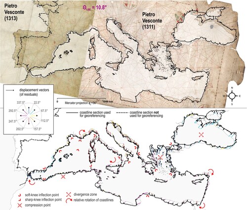
Table 1. Information regarding the portolan chart sample.
Each unit within the sample was cartometrically analysed in such a way that its geometry was compared to a modern map in Mercator projection with the application of a 4-parameter Helmert similarity transformation (Modenov & Parkhomenko, Citation1965, pp. 77–93) in order to keep their original geometry intact in relative terms. In the initial stage of georeferencing, four complete charts and three composites were georeferenced by using control (identical) points located across their Mediterranean and Black Sea areas exclusively.Footnote10 The reason for that is that pre-existing cartometric studies firmly confirmed that the Atlantic coasts on portolan charts are, in general, rendered to a significantly smaller map scale (Wagner, Citation1896/Citation1969, p. 481; Nicolai, Citation2014, pp. 259–262; Marelić, Citation2023, pp. 5, 18), so their inclusion would, therefore, introduce the relatively large subset of extremely erroneous point-displacement residuals, which could significantly affect the estimated average accuracy of the Mediterranean and Black Sea areas as well.
Because the Mediterranean and Black Sea areas on each chart and composite (treated as a whole) show an uneven distribution of displacement vectors of residuals (the lower part of ) – which in certain local areas revealed sudden changes in their coastline renderings (labelled as soft-knee inflection points, hard-knee inflection points, and compression points), and apparent map-scale changes on a regional level (labelled as divergence zones) – in the second stage of the research they were georeferenced piecewise. The extent of each particular chart-piece (labelled as a subsection) was delimited by the emergence of relatively extreme magnitudes of residuals or by the significant differences in their orientation, which means that such areas on a chart belong to another (neighbouring) subsection.
Regardless of whether charts and composites were treated as a single unit (with the exclusion of their Atlantic coasts, see , , , , and Figure 10) or split into subsections (), each unit was, methodology-wise, subjected to the same cartometric analysis. After they were georeferenced to a modern map in selected map projection – a process in which they are optimally scaled and rotated to compute the least-squares estimation (LSE) of their residuals – projected axial displacements of their identical points (dX and dY in kilometres) need to be de-projected to obtain their corresponding angular displacements (dLON, and dLAT in degrees) in order to nullify the distortions induced by the map projection.Footnote11 The angular displacements are, then, converted into geodesic distances on the surface of the WGS84 ellipsoid (dLON, and dLAT arcs in kilometres), after which it is possible to compute their (de-projected) root mean-square error (RMSE) accuracy [km]Footnote12—the estimated chart accuracy represents the greater of its two axial values, whether RMSE dLON or RMSE dLAT (Jenny & Hurni, Citation2011, pp. 403–405; Nicolai, Citation2014, pp. 209–210; Penzkofer, Citation2016, pp. 27–28).
3. The Mediterranean and Black Sea areas as a whole
Because the results of previous extensive and detailed cartometric research – based on a sufficiently large number of identical points to provide adequate redundancy of input data, and, therefore, the reliability of the resultsFootnote13 – demonstrated that portolan charts show the greatest geometric similarities with the modern map in Mercator projection (Loomer, Citation1987, pp. 166–173; Nicolai, Citation2014, pp. 169–270, 401–410), it was used to georeference all charts and composites from the sample across their Mediterranean and Black Sea areas (treated as a single area-unit), and to compute their proprietary metrics. The coastlines on the anonymous Carta Riccardiana show nearly the same appearance as those on Pietro Vesconte’s composite (the upper part of ). Some local exceptions are the Gulf of Sirte, which has been rendered significantly larger on the Carta Riccardiana, and Harkinit Bay (northwest of the Crimean Peninsula), which has been drawn by Vesconte, but not by its unknown author. The most prominent difference between the two charts is the rendering of the entire Atlantic coast, especially its northern part, including the Bay of Biscay and the English Channel, which seem to have been drawn to a significantly larger map scale, truer to reality. Apart from these differences, the stylistic approach to drawing coastline-details on a local level is almost identical between the two charts, suggesting that the Carta Riccardiana may have been drawn by a cartographer who worked in the same workshop as Vesconte, or even that Pietro Vesconte authored the Carta Riccardiana. The accuracy of the Mediterranean and Black Sea on the Carta Riccardiana (28.4 km) is only slightly greater in comparison to Vesconte’s chart (29.8 km, see ), and their LSE-computed clockwise rotations are nearly identical (10.6°, and 10.8°, respectively, compare and ) which additionally supports such reasoning.
Figure 2. The overlay of the Carta Riccardiana (c. 1325) and its vectorized coastline (the upper part) and the overlay of Angelino Dulcert’s 1339 chart and its vectorized coastline (the lower part) with the vectorized coastlines of some of the earlier-made portolan charts. Chart sources: Biblioteca Riccardiana, Ricc. 3827.; Bibliothèque nationale de France, GE B-696 (RES). Basemap shapefile source: marineregions.org (Claus et al., Citation2017).
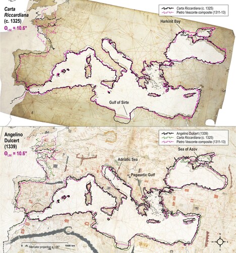
Within the extent of the Mediterranean and Black Sea the most significant differences between Angelino Dulcert’s chart (the lower part of ), Vesconte’s composite, and the Carta Riccardiana are made on a local level as well. Dulcert positioned the Kerch Strait (the entrance to the Sea of Azov) and the surrounding coasts more northwards, which, presumably, led him to put the entire Sea of Azov more to the north. Unlike the previous two charts on which the Adriatic Sea has been mapped to a relatively appropriate scale, Dulcert made it to a significantly smaller scale and tilted it slightly more clockwise. Another more noticeable difference is his rendering of the Pagasetic Gulf in the west Aegean Sea, which he drew less pronouncedly. Dulcert’s rendering of the Gulf of Sirte seems to be nearly identical to that on the Carta Riccardiana, as well as the African part of the Atlantic coastline, while its European part has been drawn to a smaller and, therefore, less appropriate map scale, similarly to Vesconte’s chart. The estimated accuracy of the Mediterranean and Black Sea on Dulcert’s chart is 32.9 km, which is a poorer result in comparison to its two examined predecessors ().
The anonymous Rex Tholomeus portolan chart, presumably made in 1360 (the upper part of ), shows significant differences in comparison to both Dulcert’s chart and the ‘Vesconte-Riccardiana model’. In comparison to them, the Sea of Azov has been rendered to a smaller map scale, as well as the entire Aegean Sea and the Peloponnesus peninsula. Its rendering of the Adriatic Sea, although it has been mapped to a smaller scale (similar to Dulcert’s chart), significantly differs from Dulcert’s rendering appearance-wise and is tilted more anticlockwise. On the Rex Tholomeus chart, there are noticeable differences in the drawing and positioning of large islands; Corsica has been tilted more anticlockwise, Sicily has been shifted northward, while Crete has been tilted clockwise and shifted north-eastward. Also, a large portion of the Central Mediterranean Sea (between the south Tunisian coast and Tobruk in present-day Libya) seems to have been drawn more ‘compressed’ in comparison to earlier-made charts, while the Levant coasts of the East Mediterranean seem to have been drawn to a larger map scale. The map scale of the African part of the Atlantic coast on the Rex Tholomeus chart appears to be nearly identical to both Dulcert’s chart and Carta Riccardiana, while the European coasts of the Atlantic Ocean have been drawn significantly less accurately. Regarding their map scale, they have been rendered similarly to Dulcert’s chart (and, therefore, less true than on the Carta Riccardiana), but its most inaccurate part is the Bay of Biscay, which has been drawn significantly larger, protruding deep into the European mainland. The estimated accuracy of the Mediterranean and Black Sea on the Rex Tholomeus chart is 30.6 km, a slightly greater result in comparison to Dulcert’s chart but poorer in comparison to both Vesconte’s composite and Carta Riccardiana ().
Figure 3. The overlay of the anonymous Rex Tholomeus chart (c. 1360) and its vectorized coastline (the upper part) and the overlay of Francesco Beccari’s 1403 chart and its vectorized coastline (the lower part) with the vectorized coastlines of some of the earlier-made portolan charts. Chart sources: Barry Lawerence Ruderman Antique Maps Inc.; Beinecke Rare Book and Manuscript Library, Art Storage 1980 158. Basemap shapefile source: marineregions.org (Claus et al., Citation2017).
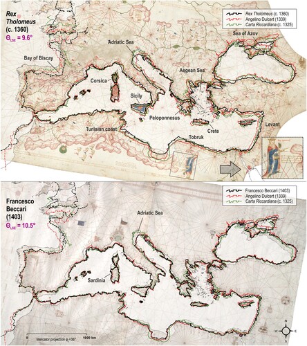
Francesco Beccari’s chart (the lower part of ), made in 1403 – nearly a century after the Carta Riccardiana, and six decades after Dulcert’s chart – does not show any significant progress in terms of its accuracy. In contrast, the Mediterranean and Black Sea appear to be copied directly from Dulcert’s chart or some other portolan chart that followed the same copying-lineage, including the noticeably smaller map scale of the Adriatic Sea, which is less appropriate in comparison to the ‘Vesconte-Riccardiana model’. The overlapping of its vectorized coastlines with the coastlines of its precursors shows that Beccari did not, in fact, improve the positioning of Sardinia; its position (as well as the position of Corsica) remained shifted to the south in absolute terms, while in relative terms, it has been positioned in exactly the same area as on the other (older) portolan charts. Beccari’s claim that he made the map scale of the Atlantic coastlines more realistic is true, but he was not the first person who did it. Namely, he drew the entire area nearly identically to its rendering on the Carta Riccardiana, which casts suspicion on the originality of that feat – it seems more likely that Beccari actually copied that part of the coastline from some older chart than that he made the changes based on the authentic distance-data provided to him by sailors. The estimated accuracy of the Mediterranean and Black Sea on his chart is 32.6 km, which is nearly identical to Dulcert’s chart (whose coastline model he used as a template for copying), but poorer in comparison to Vesconte’s composite, the Carta Riccardiana, and the Rex Tholomeus chart ().
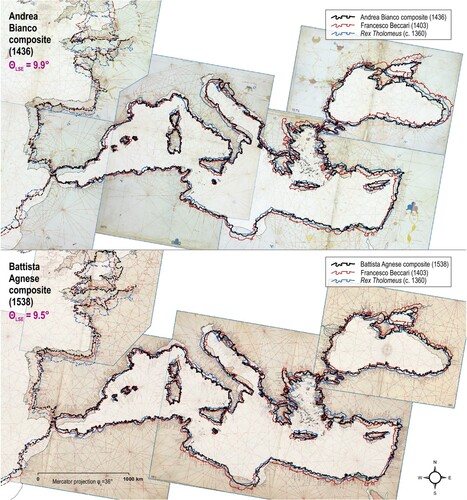
Andrea Bianco, who was an experienced galley officer, made his portolan atlas in 1436 (the upper part of ), but its Atlantic coastlines are similar to those on Beccari’s chart, and the western half of the Mediterranean Sea appears to be largely copied from the ‘Dulcert-Beccari model’, unlike the eastern half of the Mediterranean, the Aegean and Black Seas, and the Sea of Azov, which seem to have been drawn similar to their appearance on Rex Tholomeus chart. Battista Agnese’s portolan atlas (the lower part of ), made in 1538, shows similarities to the ‘Dulcert-Beccari model’ and the Rex Tholomeus chart as well, but the distribution of copied coastline-details somewhat differs from Bianco’s atlas on a local level. For example, the mainland coast of the Tyrrhenian Sea has been drawn more similarly to Beccari’s chart, while the islands of Corsica and Sicily have been rendered more similarly to the Rex Tholomeus chart. Also, the Aegean Sea appears more similar to the Rex Tholomeus chart, while considerable portions of the Central and East Mediterranean appear to follow the ‘Dulcert-Beccari model’. The Mediterranean and Black Sea on Agnese’s atlas are less accurate (32.1 km) in comparison to Bianco’s atlas (26.8 km), which has been made a century earlier () and to a smaller map scale ().
Figure 4. The overlay of the composite of Andrea Bianco’s 1436 atlas and its vectorized coastline (the upper part) and the overlay of the composite of Battista Agnese’s 1538 atlas and its vectorized coastline (the lower part) with the vectorized coastlines of some of the earlier-made portolan charts. Chart sources: Biblioteca Nazionale Marciana, Ms. It. Z, 76 ( = 4783); University of Pennsylvania, Rare Book & Manuscript Library, LJS 28. Basemap shapefile source: marineregions.org (Claus et al., Citation2017).
4. Was there any genuine progress at all?
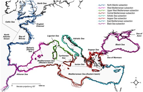
Piecewise georeferencing of selected portolan charts and composites, initiated by the differences in magnitudes and orientation of displacement vectors of their residuals on a local level () reveals that their territorial coverages contain at least eight subsections (). The Black Sea appears to be a separate subsection, while the Mediterranean Sea contains six subsections whose extents do not fit with its traditional sub-basin division (Braudel, Citation1972, pp. 103–167), nor with the division proposed by the International Hydrographic Organization (IHO, Citation1953). The majority of the northern part of the Atlantic Ocean (approximately north of Cabo de São Vicente in Portugal) seems to be a separate subsection (labelled North Atlantic subsection), while its southern part shows somewhat ‘erratic behaviour’. Hypothetically, it could be treated as a separate subsection, but there was no reason for doing so because on three charts (the Carta Riccardiana, Beccari’s chart, and the Rex Tholomeus chart), it fits well with their North Atlantic subsections, while on the remaining four charts (Vesconte’s composite, Dulcert’s chart, and Bianco’s and Agnese’s atlas-composites), it fits better with their West Mediterranean subsections (, , ). These results support the previous similar findings obtained by Wagner (Citation1896/Citation1969), Loomer (Citation1987), and Nicolai (Citation2014)Footnote14 and strongly imply that portolan charts are, most likely, composite charts made by joining together regional charts on which smaller territorial extents were displayed.
Figure 5. Cartometrically determined subsectional division of selected portolan charts and composites, which does not correspond to the International Hydrographic Organisation division of oceans and seas (IHO, Citation1953). Basemap shapefile source: marineregions.org (Claus et al., Citation2017).
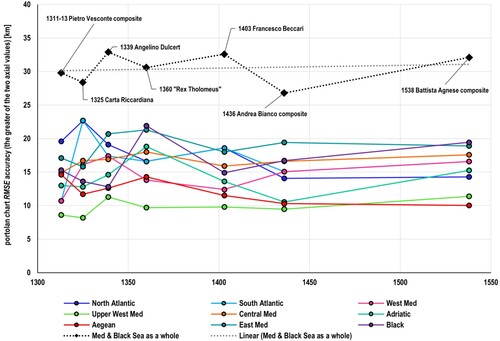
The chronological display of charts’ RMSE values () reveals that during more than two centuries of their production, there was no significant improvement regarding their accuracy. For example, the Mediterranean and Black Sea (treated as a whole) have been drawn more accurately on the composite of Vesconte’s two charts made in 1311 and 1313 than on charts made by Dulcert (1339), Beccari (1403), and the portolan atlas made by Agnese in 1538. They seem to have been drawn most accurately on Bianco’s atlas (1436), but the average subsectional accuracy of his atlas-composite is 14.1 km, which is a slightly poorer result in comparison to Vesconte’s composite, whose subsections show an average accuracy of 13.8 km (the highest accuracy-value in that regard).Footnote15 Also, the average estimated accuracy of chart subsections within the entire sample is 15.2 km – a result that is twice as great in comparison to their Mediterranean and Black Sea area treated as a whole, whose average accuracy is 30.2 km due to two main reasons.
Figure 6. The chronological display of estimated RMSE accuracy values of selected portolan charts and composites computed in comparison to a modern map in Mercator projection (on a subsectional level, and for their Mediterranean and Black Sea area treated as a whole).Footnote16
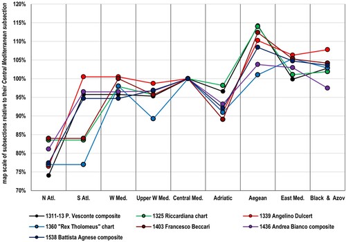
The first reason why portolan charts show considerably greater accuracy values on a subsectional level is because different parts of charts have been drawn to different map scales, the values of which (for each subsection) are mainly similar among the examined charts. In this study, the map scales on a subsectional level are expressed in relative terms; compared to their Central Mediterranean subsection, whose map scale is represented as 100% (). In general, their North Atlantic subsections, located far to the west, have been drawn to a considerably smaller scale (79.1% on average), while the East Mediterranean subsection and Black Sea subsection have been drawn to a larger scale (103.7% and 103.0% on average, respectively). The most extreme example of map-scale exaggeration is the Aegean subsection, whose average value in comparison to the Central Mediterranean subsection is 109.2%, unlike the Adriatic subsection, which is positioned relatively close to it and borders the Central Mediterranean subsection on its northeastern front, but it has been drawn to a significantly smaller scale (93.0% on average) – the exceptions are Vesconte’s composite and the Carta Riccardiana, whose relative map scale of the Adriatic subsection is 96.6%, and 98.2%, respectively.
Figure 7. Map scale differences of selected portolan charts and composites on a subsectional level relative to their Central Mediterranean subsection (displayed as 100%).
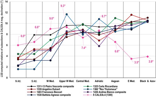
The second reason for substantially greater accuracy of charts’ subsections are the differences in their orientation within charts when treated as single units, or ‘subsection-mosaics’ so to speak, which are (for each subsection) mainly similar among the examined charts as well. Although the average LSE-computed clockwise rotation of the Mediterranean and Black Sea (as a whole) in comparison to a modern map in Mercator projection – which occurs because the coastlines on charts have been drawn as tilted anticlockwise – is 10.2° (compare θLSE values in , , , and ), LSE-computed clockwise rotations of their subsections become incrementally greater when observed from the west to the east ().Footnote17 The most commonly found explanation of this well-known portolan chart feature is that it is an explicit artefact of the uncorrected easterly magnetic declination values during the Late Medieval period. According to that hypothesis – discussed in more detail in the following chapter – late medieval sailors, who supposedly obtained vast quantities of shipborne bearing- and distance-measurements to create portolan charts in the first place, were unaware that their magnetic compasses were affected by magnetic declination, and tracked the bearings as they are.
Figure 8. Rotational values for different subsections of selected portolan charts and composites and their comparison with magnetic declination values for the year 1300 according to CALS3k.4 paleomagnetic model. CALS3k.4 data source: CitationGEOMAGIA50.v3.2, accessed: March 2023.
The results obtained from these analyses clearly demonstrate that through the entire fourteenth, fifteenth, and sixteenth centuries, the ‘matrix’ of portolan charts’ geometry remained nearly identical, while in certain cases, their accuracy was even downgraded. The same chronological trend in comparison to the Mercator projection was determined by Loomer, who also came to similar results regarding the rotation of different sub-basins when observed from the west to the east (Loomer, Citation1987, pp. 154, 163). Loomer analysed Dulcert’s and Beccari’s charts as a whole and also determined that the estimated accuracies of both charts are similar, with Beccari’s chart being slightly more accurate (Loomer, Citation1987, p. 155). The most probable reason for that is the Sea of Azov and the northernmost part of the Black Sea, which have been drawn more accurately on Beccari’s chart (see ). The Carta Riccardiana and Dulcert’s chart were examined by Nicolai as well, but he showed the comparison of their metrics on a sub-chart level exclusively and applied a transformation that allows each of their two axes to be scaled and rotated independently (providing higher estimated accuracy values), because of which his findings cannot be compared directly to the results from this study. However, he computes that, on the sub-chart level, the average estimated accuracy of the Carta Riccardiana is greater than the average accuracy of Dulcert’s chart (Nicolai, Citation2014, p. 235), which was confirmed by this research; both on a subsectional level, and across the entire Mediterranean and Black Sea as well.
The estimated chart-accuracy on a subsectional level reveals that Vesconte’s composite (being the earliest-made unit within the sample) is, in fact, the most accurate one, which is paradoxical from the medieval origins’ viewpoint. Namely, if portolan charts had been created upon authentic, contemporaneously acquired navigational data, newer charts would have been more accurate in comparison to older charts, and there should be no logical reason why any chart would be twice as accurate on a regional (subsectional) level. Furthermore, a newly published cartometric study made by Marelić, shows that Vesconte’s 1311 chart contains segments of coastlines that were copied from the same cartographic source as those on the Carte Pisane and Cortona chart – the oldest known, and allegedly ‘less sophisticated’ portolan charts. Also, the accuracy of Vesconte’s 1311 chart on a subsectional level (13.9 km) is nearly identical to the Cortona chart (13.7 km), while the average subsectional accuracy of his composite (13.8 km) is just a slightly greater in comparison to the Carte Pisane (15.6 km) (Marelić, Citation2023, pp. 10, 18). The subsectional accuracy of the Carte Pisane (with the exclusion of the Atlantic coasts and the Black Sea) was hardly surpassed by any later-made chart examined in this study, which raises additional suspicion about their medieval origin. Some of the charts made by Agnese, as well as Vesconte’s 1321 atlas, and smaller-extent charts allegedly made by him and published in Marino Sanudo’s book Liber Secretorum Fidelium Crucis (c. 1320) were examined in Šima Krtalić’s recent study (Krtalić, Citation2023). Although Krtalić did not discuss the portolan charts’ origins theory, the article provides a detailed and highly valuable insight into various copying-techniques used to transfer the coastline features on a local level from one chart to another, like stencils, picking and pouncing, carbon transfer, and the pantograph, some of which, like the pantograph, were invented relatively late; in the early modern period.
5. Implications of pre-medieval origin
The idea that portolan charts are genuine late medieval products made by plotting a complex network of shipborne measurements directly onto a parchment and graphically connecting their endpoints to generate the coastline contours at the end has existed since the late nineteenth century and was advocated by scholars like Kretschmer (Citation1909), Stevenson (Citation1911), and Eva G. R. Taylor (Citation1951a; Citation1951b). However, none of them built their assumptions on a quantitative approach to the matter. Ramon J. Pujades (Citation2007), who also pursued a purely descriptive approach, is one of the currently active protagonists of such reasoning, as is Joaquim A. Gaspar (Citation2007; Citation2008; Citation2023). In his recent article, for example, Gaspar used only a single bearing-measurement per chart (within the sample of fourteen charts) – the line that connects Cape Gata in Spain and Cape Passero in Sicily – as an argument that there could have been two distinct lineages of portolan charts created upon navigational data obtained on two separate occasions (Gaspar, Citation2023, pp. 11–12). Apart from the fact that there are hundreds of (cross-basin) lines that could be picked and none of them should be used singlehandedly to generate solid conclusions due to the complete lack of redundancy in such an approach, in , it can be seen that coastline-contours on portolan charts deviate from the modern map in an irregular manner, which means that the bearing-accuracy of any such line would be negatively affected by the displacement-vectors of its endpoints. In this research, the LSE-computed rotation values of portolan charts’ subsections were compared to magnetic declination values for the year 1300 (δ1300), provided by the CALS3k.4 paleomagnetic model (Korte & Constable, Citation2011). The comparison shows that rotations of subsections fit the model relatively well only across the charts’ mid-area, while subsections located far to the west and far to the east do not (). It is because the CALS3k.4 values do not follow the incrementally increasing trend of subsection-rotations when observed from the west to the east – yet they show a bell-like curve with a noticeable drop in the areas far east. In his doctoral thesis, Nicolai provided a detailed historical overview in which he demonstrated that dry pivot compass and mariner’s compass (more developed stages of a compass with a floating needle) were not used in a widespread manner before the first half of the fourteenth century, and that with the application of the plane charting method, it is not possible to achieve the Mercator-like geometry of portolan charts’ sub-charts, especially because contemporary sailboats were rarely able to keep the desired course due to oceanographic factors (Nicolai, Citation2014, pp. 143–168, 349–387).
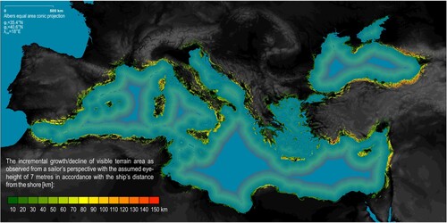
Another reason why it is highly unlikely that portolan charts (regarding their high accuracy levels) were created by late medieval shipborne measurements at all lies in the sailor’s visual perspective of the surrounding area, limited by his eye-height and the Earth’s surface curvature. To demonstrate the limitations of the procedure on a broader scale, a viewshed GIS model in which the terrain landmarks visible to a sailor aboard a ship were simulated (with the assumed eye-height of 7 metres) was generated for the Mediterranean and Black Sea. The model itself contains 23,370 observer locations in total, lined up along 15 distance-buffers, whose distance from the shore incrementally increases from 10 to 150 km ().Footnote18 According to it, the most optimal distance buffer to sight terrain landmarks is 20 km from the shore, along which one can observe an area of 209,206 km2 in total (or 10.3 km2 per one kilometre of its length on average). Sailing farther away from the shore yields a significant decline in the visible terrain-area – along the distance-buffer of 150 km, one can observe an area of only 190 km2 in total (or just 0.03 km2 per kilometre of its length on average).Footnote19 Also, it is completely impossible for a sailor aboard a ship to sight the location of the opposite endpoint for nearly any cross-basin sailing route (from his starting location) due to the Earth’s surface curvature and, therefore, to track its bearing with a magnetic compass in advance.
Figure 9. The viewshed model of terrain landforms that can be observed by a sailor stationed on the deck of a ship (with an assumed eye-height of 7 metres) across the entire Mediterranean and Black Sea areas. Digital Elevation Model (DEM) source: databasin.org (CitationU. S. Geological Survey's Center for Earth Resources Observation and Science).
An alternative viewpoint to explain the incremental rise in the rotation of charts’ sub-pieces (when observed from the west to the east) is the hypothesis that portolan charts are, perhaps, copies of some older cartographic source material – likely a collection of maps or charts – that came into possession of late medieval Italian cartographers, who tried to ‘revive’ it by merging its pieces together (Marelić, Citation2023, pp. 15–19). If such a collection was made of large-scale regional charts (whose territorial extents are similar to the limits of cartometrically determined subsections) in a Mercator or Mercator-like projection, and a small-scale orientational map in a projection on which the convergence of meridians is displayed, it could have been possible that the cartographers of the Late Medieval period tried to graphically create some sort of a cartographic ‘hybrid-solution’ by rotating each neighbouring segment slightly more anticlockwise in succession, because – unlike cartographers from the classical antiquity – they were not familiar with assigning spherical coordinates to locations and methods on how to create different types of map projections from them.Footnote20 The idea was expanded in this research via additional georeferencing of Vesconte’s composite (which proved to be sort of an ‘archetype’ for later-made charts) on modern maps that closely approximate Ptolemy’s first projection (Ptolemy I) and Ptolemy’s second projection (Ptolemy II), both set in a way that the area near Gibraltar (λ = 6°W) is their vertically-plotted central meridian ().
Figure 10. The composite of Pietro Vesconte’s portolan chart (1311) and the western sheet from his 1313 atlas georeferenced to the close approximation of the Ptolemy I projection (the upper part) and on the close approximation of the Ptolemy II projection (the lower part) if λ = 6°W (near Gibraltar) is set as their central meridian. Chart sources: Archivio di Stato di Firenze, CN 01; Bibliothèque nationale de France, CPL GE DD-687 (RES). Basemap shapefile source: marineregions.org (Claus et al., Citation2017).
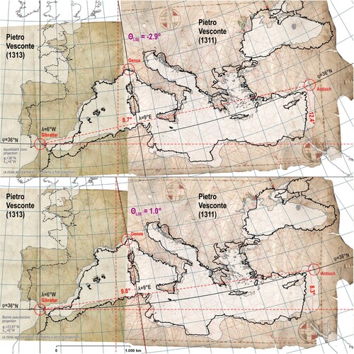
The comparison to a close approximation of the Ptolemy I projection (the upper part of ) reveals that the chart’s LSE-computed rotation turned slightly anticlockwise (−2.9°), and that the meridian that passes through Genoa (λ = 9°E) is tilted similarly to the rotation of its Upper West Mediterranean subsection in comparison to the Mercator projection (9.6°, see ). Also, the straight line that connects Gibraltar and Antioch (the Mediterranean Sea’s endpoints along the parallel φ = 36°N) on such a map is tilted 12.4° anticlockwise, which differs from its anticlockwise tilt in comparison to the Mercator projection (10.8°) by only 1.6°.Footnote21 In comparison to a close approximation of Ptolemy II projection (the lower part of ), Vesconte’s composite becomes rotated (only) 1° clockwise. The meridians on this type of map projection are plotted as curves (except the central one, which is plotted straight), but the secant line that passes through the meridian λ = 9°E near Genoa is tilted even closer to the tilt of that subsection in comparison to the Mercator projection. The line connecting Gibraltar and Antioch on this map is tilted 8.3° anticlockwise, which differs from its anticlockwise tilt in comparison to the Mercator projection by 2.5°. The LSE-computed rotations of the charts’ central subsections fit well with their positioning on both Ptolemy’s projections, which is reliability-wise similar to their comparison to the CALS3k.4 paleomagnetic model. Also, the meridians on both Ptolemy’s projections become incrementally tilted more anticlockwise towards the east – a trend that, unlike the CALS3k.4 model, follows the incremental rise of charts’ subsection tilts to a certain degree. It is because the parallels on maps in both Ptolemy’s projections are plotted with a greater curvature, and therefore, a steeper tilt of meridians on their eastern front occurs, while the geometry of portolan charts (when treated as a whole) is predominantly ‘Mercator-like’. Namely, the estimated accuracy of the Mediterranean and Black Sea areas on Vesconte’s composite in comparison to the Mercator projection is 29.8 km – nearly twice as accurate as in comparison to the approximation of the Ptolemy I projection (49.7 km), and over two times more accurate than in comparison to the approximation of the Ptolemy II projection (68.3 km)Footnote22 – while on a regional level the ‘Mercator-like’ geometry of its subsections becomes even more pronounced. If someone unfamiliar with the basic properties of different map projections never saw the appearance of the entire area on a map in cylindrical projection and tried to tile cylindrical large-scale pieces side by side (and rotate them anticlockwise in succession) by fully respecting the meridian tilts of a conic projection, one would end up in a situation with numerous territorial overlaps between pieces, and excessive (tilted) crossings of their graticules as well, which is graphically not solvable at all. Perhaps, the easiest, and pragmatically more optimal ‘on the fly’ solution for late medieval Italian cartographers was to respect the geometry of the regional maps more by graphically compiling their manuscript copies with less-pronounced anticlockwise tilt, after which they could replace their graticules – for which there was no practical use at the time – with rhumb line networks and linear scale bars.
5.1. Historical records that support the pre-medieval origin hypothesis
In addition, there is a historical argument (or a lack thereof) why there is a low likelihood that portolan charts were initially made upon late medieval shipborne measurements, which is the complete non-existence of supporting historical records on such endeavours. On the other hand, there are at least three contemporary sources that more or less explicitly suggest that their origin could be pre-medieval. The earliest known record was made by Qutb al-Din al-Shirazi, a Persian scholar who, in 1282, gave instructions on how to create a matrix made of 40 (horizontally stacked) by 30 (vertically stacked) square cells. The cell matrix he provided – according to his own words – represents an account of a map of the Mediterranean that was drawn by the sages of Greece (Yūnān) and the ancient geometers. Al-Shirazi also thought that it was easier to provide accurate descriptions of planetary motions than to accurately describe the seas; and he distrusted sailors, travellers, and merchants as valuable sources of spatial information due to their lack of judgement (Savadi & Campbell, Citation2023, pp. 2–9, 28).Footnote23 The second historical record is a detail on the Rex Tholomeus chart, supposedly made in the mid-thirteenth century (see the rectified and enlarged inset in the upper part of ). Next to the figure of Rex Tholomeus is a short paragraph in which its anonymous author states that the ‘records below’ were made according to the works of Rex Tholomeus who measured the world through astrology in length and width and made world maps and cosmographies.Footnote24 Since the figure of Rex Tholomeus was drawn as standing ‘above’ the chart when it is oriented southward, the syntagm ‘records below’ at its beginning seems to refer to the chart itself, implying that it was made according to the pre-medieval cartographic template (or templates). The third contemporary source that explicitly raises doubts about their medieval origin is Benedetto Cotrugli's De Navigatione Liber treatise from 1464,Footnote25 in which he claims that sailors of his era should be grateful to Ptolemy (Ptholomeo), whose maps they used as templates to create nautical chartsFootnote26 (Cotrugli, Citation1464 (2005), pp. 216–217). Although at the current level of knowledge it is hardly more than an educated guess, it is hypothetically possible that Cotrugli's Ptholomeo and the Rex Tholomeus figure drawn on the portolan chart dated to 1360 – apparently coming from a scientific background and closely related to cartography – refer to the same person, perhaps indirectly ‘responsible’ for the existence of portolan charts that were made more than a millennia later.
6. Conclusions
Research results show that during more than two centuries, the geometry of portolan charts and portolan atlases was not improved and that the accuracy of Pietro Vesconte’s charts, made in 1311 and 1313, was not tangibly surpassed by either of his successors. In contrast, some portolan charts and atlases made a century or more later proved to be accuracy-wise poorer in comparison to his work. The cartometric analysis reveals that portolan charts are, in fact, mosaic images composed of at least eight subsections whose map scales and relative tilts vary within each chart or atlas and whose accuracy values (including their North Atlantic subsections) are, on average, twice as great in comparison to their Mediterranean and Black Sea areas treated as a whole. Also, the scale- and tilt-values of particular subsections are very similar among the examined charts and atlases, following nearly the same patterns.
The fundamental conclusion is that it is highly unlikely that portolan charts made between the early fourteenth and mid-sixteenth centuries are genuine late medieval products made upon contemporary shipborne-acquired data, supported by the following arguments. First, the geometry of portolan charts’ individual subsections is most similar to a modern map in Mercator projection, which was, according to known history, invented about three centuries after the appearance of the oldest known portolan charts. Second, if the authentic navigational data had been obtained in the earlier stages of portolan chart mapmaking (say, not long before Vesconte drew his charts), it is logical to assume that later-made charts and atlases would have been made upon the updated spatial information – acquired with more sophisticated technology – and would, therefore, show greater accuracy levels. Third, if charts had been made upon the large body of navigational data, there should be no logical explanation as to why cartographers who compiled them onto a single framework (a chart or an atlas) have not been able to adjust the scale and tilt of their subsections properly. Fourth, if the magnetic compass had been used to acquire bearing-data, areas far west, and especially the areas far east, would have been significantly better aligned with the contemporary regional distribution of magnetic declination. Also, the ‘worm's-eye view’ perspective of a sailor aboard a ship makes it impossible for him to sight the endpoints of longer cross-basin routes and, therefore, to plot their compass-bearings in advance.
The existence of the typical anticlockwise tilt of coastlines on portolan charts fits relatively well with the anticlockwise tilt of a straight line that connects Gibraltar and Antioch on modern maps that closely approximate Ptolemy’s first and second projections centred at the longitude of Gibraltar, and the anticlockwise tilt of meridians that pass through areas around Genoa fits well with the anticlockwise tilts of corresponding chart subsections in comparison to a map in Mercator projection. In theory, the typical geometry of portolan chart, which remained practically unaltered for centuries, could have been achieved if somebody unfamiliar with the properties of map projections tried to graphically compose large-scale maps made in Mercator or Mercator-like cylindrical projection by using a small-scale map in conic or pseudoconic projection (on which the convergence of meridians is displayed) as a model. Since the known historical records pointing directly to their pre-medieval origin (the writings of Qutb al-Din al-Shirazi and Benedetto Cotrugli, and the paragraph on the anonymous Rex Tholomeus portolan chart) are scarce but do exist, and because cartometric analyses are highly dependent on the applied methodology and, therefore, cannot provide definitive answers on their own, this hypothesis should be examined in more detail in future research, preferably within a broader interdisciplinary effort.
Acknowledgements
The author wishes to express his gratitude to Barry Lawrence Ruderman and Alex Clausen of Barry Lawrence Ruderman Antique Maps Inc. for recognizing this article's content as a valuable scientific contribution to the common knowledge of portolan charts and funding its open-access publication.
Disclosure statement
No potential conflict of interest was reported by the author(s).
Additional information
Notes on contributors
Tome Marelić
Tome Marelić is an Assistant Professor at the Department of Geography, University of Zadar. His prime research interest is quantitative (cartometric) analysis of old maps and nautical charts. His current research is focused on the geometric properties of portolan charts and atlases.
Notes
1 Medieval manuscript maps, which represent the religious interpretation of the known world (Woodward, Citation1987, pp. 286–291).
2 Late medieval and early modern reconstructions of the (lost) cartographic content of Claudius Ptolemy’s Geographike Hyphegesis.
3 Both Carte Pisane (Bibliothèque nationale de France, département Cartes et plans, GE B-1118 (RES)) and the Cortona chart (Biblioteca dell'Accademia Etrusca di Cortona, Port. 105) are very likely of Genoese origin, and there is a probability that the Cortona chart has been made even earlier than Carte Pisane (Campbell, Citation1987, p. 402, note 243; Marelić, Citation2023, pp. 9–12).
4 On the right (eastern) margin of its carrier material, the author inscribed: Petrus Vesconte de Janua fecit ista carta ann[o] dni MCCCXI (Pietro Vesconte of Genoa made this chart in 1311) (Nordenskiöld, Citation1897, p. 57).
5 Examples of some of the oldest preserved such documents are Liber de Existencia Riveriarum et Forma Maris nostri Mediterranei, dated to the early thirteenth century and which supposedly contained a nautical chart as well (Gautier Dalché, Citation1995, pp. 20, 22, 103–105), and Lo Compasso de Navegare (Motzo, Citation1947; Debanne, Citation2011).
6 In 1956, Albert Clos-Arceduc applied a simple two-point superimposition of several portolan charts over a modern map. Although some of his predecessors, such as Max Eckert and Leo Bagrow, strongly claimed that portolan charts are ‘unprojected’ or ‘projectionless’, Clos-Arceduc noticed that they show the best visual fit in comparison to the Mercator projection and assumed that their anticlockwise tilt is caused by their alignment with the (contemporary) magnetic north (Clos-Arceduc, Citation1956, pp. 226, 229–231).
7 In 1988, A. John Duken showed that the majority of the area displayed on the reproduction of the portolan chart made by Giovanni da Carignano (c. 1327 but destroyed in World War II) fits visually well with the oblique stereographic projection (a perspective azimuthal projection with conformal properties) centred at φ0 = 33.6°S (the ‘anti-latitude’ of Alexandria), λ0 = 5°E (the longitude of Marseille) (Duken, Citation1988, pp. 88–91). In 1984, he published his initial results, prompting Loomer to select an oblique stereographic projection as one of the reference map projections. However, his analysis revealed poor accuracy in comparison to the oblique stereographic projection and any other map projection that displays the convergence of the meridians (Loomer, Citation1987, pp. 67–68, 133, 144).
8 Plane charting refers to a method of plotting measured bearings and distances sailed directly (as they are), simultaneously neglecting the Earth’s surface curvature and, therefore, the adjustments needed to be made to properly transform (to project) the values that were originally obtained on the surface of a sphere into Euclidean-geometry values for the desired map projection.
9 The cartographer Angelino Dulcert is also known as Angelino Dalorto to whom explicitly a portolan chart dated to 1325 or 1330 is attributed (Campbell, Citation1987, pp. 382, 409).
10 In addition, the Mediterranean and Black Sea area (as a whole) on Vesconte’s composite was georeferenced to modern maps that closely approximate Ptolemy’s first projection (the upper part of ) and Ptolemy’s second projection (the lower part of ).
11 De-projecting the displacements of identical points for charts showing such a large territorial coverage is mandatory because each map projection induces different distortions across different areas shown, which may heavily affect their estimated accuracy values. For example, on a reference map in Mercator projection, areas north and south of its standard parallel (φ0 = 36°N and φ0 = 36°S in this case) become progressively expanded, while those towards the equator become progressively compressed. On the other hand, on a map in normal equidistant conic projection, all meridians and its standard parallel (φ0 = 36° N in this case, see the upper part of ) are plotted true to scale, but areas to the north, and to the south of it (especially those south of the equator) are longitude-wise rendered as incrementally more stretched as the latitude increases.
12 With the application of the 4-parameter Helmert similarity transformation, there are n-2 statistically significant points per axis in the LSE (least squares estimation), so the number of statistically significant points for computing charts’ estimated accuracy (RMSE dLON and RMSE dLAT) is 2n-4.
13 Loomer identified 359 identical points per chart (Loomer, Citation1987, pp. 113–114), while Nicolai’s number of identical points varies between 439 (Carte Pisane) and 1,015 (Carta Riccardiana) (Nicolai, Citation2014, p. 235).
14 The extents of probable chart sub-pieces (subsections) determined in this research slightly differ from those obtained by Loomer and Nicolai. Loomer applied the 4-parameter Helmert transformation as well, but he opted for the (non-cartometrically determined) sub-basin division proposed by the historian Fernand Braudel (Loomer, Citation1987, p. 159). Nicolai came to his sub-division cartometrically, but he applied a 6-parameter affine transformation after the removal of point-residuals’ outliers (Nicolai, Citation2014, pp. 207–210, 240–243). In this research, none of the identical points belonging to the Mediterranean-Black Sea dataset or to a specific subsection dataset were rejected because all of them represent the imprint of medieval cartographers’ freehand approach to chart-making.
15 The average subsectional RMSE accuracy values of portolan charts and composites are as follows: 13.8 km (Vesconte’s composite), 15.6 km (Carta Riccardiana), 15.9 km (Dulcert’s chart), 16.8 km (Rex Tholomeus chart), 14.8 km (Beccari’s chart), 14.1 km (Bianco’s atlas composite), and 15.6 km (Agnese’s atlas composite).
16 The average θLSE values of chart subsections, when observed from the west to the east, are as follows: 3.0° (North Atlantic subsection), 5.6° (West Mediterranean subsection), 8.8° (Upper West Mediterranean and Central Mediterranean subsections), 8.2° (Adriatic Sea subsection), 9.3° (Aegean Sea subsection), 10.0° (East Mediterranean subsection), and 10.3° (Black Sea subsection).
17 Another viewshed model of the same area was made by Gaspar in 2019, but he did not explain its technical parameters in detail (Gaspar, Citation2019, p. 12).
18 According to the viewshed model, the total visible area, representing the sum of the visible terrain area along all 15 distance buffers and with the exclusion of the visible-terrain overlaps, is 375,128 km2.
19 As far as is known, Marinus of Tyre presumably invented the equidistant cylindrical projection (with standard latitude φ0 = 36°; the parallel of Rhodes) in the first century, while his close successor Claudius Ptolemy invented the equidistant conic projection (with the standard latitude φ0 = 36°N), so-called Ptolemy’s first projection, and the pseudoconic projection (with the standard latitude φ0 = 23.83°N; the parallel of Syene), so-called Ptolemy’s second projection (Keuning, Citation1955, pp. 9–10, 13–16; Snyder, Citation1993, pp. 5–8, 10–14).
20 The map projection to which the tilts of the chart’s subsections were compared in Marelić’s article (Marelić, Citation2023, p. 17) does not fully meet all the parameters of Ptolemy’s first projection in strict terms. Although it is a normal equidistant conic projection, it has two standard parallels (φ1 = 17°N; the parallel of Meroe, and φ2 = 36°N; the parallel of Rhodes) instead of just the latter, but the results do not show significant deviations from the results obtained in this research. A correction to the article was subsequently published (Marelić, Citation2024), in which a comparison of its subsection tilts to the geometry of a close approximation of the Ptolemy I projection is shown.
21 The experimental georeferencing of Vesconte’s composite to modern maps in Ptolemy I and Ptolemy II projections (on both of which the convergence of meridians is displayed) reveals that its significantly low accuracy in comparison to them (in both cases) is caused by excessive longitudinal errors (RMSE dLON), while its latitudinal accuracy in comparison to them is 41.7 km and 34.8 km, respectively. In comparison to the Mercator projection, its longitudinal accuracy (the smaller of its two average axial error values) is noticeably greater (21.6 km) and is – intriguingly – greater than its latitudinal accuracy (RMSE dLAT of 29.8 km) as well.
22 Despite al-Shirazi’s explicit claim that his source map was of Greek origin, originally made by the ancient geometers, and that he does not mention the rhumb-line network in its description, the authors firmly believe that his attribution of its origins was incorrect because the place names of locations assigned to particular cells (in his 40×30 instructional grid) are similar to those on the earliest known portolan charts, and their assumption is that his source map was a (genuinely made) Italian marine chart, similar in appearance to the Carte Pisane and Cortona chart (Savadi & Campbell, Citation2023, pp. 2–9).
23 The short paragraph next to the Rex Tholomeus figure reads: In infrascripta monumenta Rex Tholomeus c(on)passav[i]t mundum per astrologia per longum et per latum et fecit mappamundi et cosmologia. English translation according to the instructions of Luca Fois ([email protected]): In the records below, Rex Tholomeus measured the world through astrology in length and width and made world maps and cosmographies.
24 The original of Benedetto Cotrugli’s De Navigatione Liber is the property of Yale University, Beinecke rare book and manuscript library, Call No.: MS 557.
25 The transcript of Cotrugli’s text: … Lo qual Ptholomeo fo nel tempo de divio Antonino et scripse mirabilmente. Fo grande astrologo et geometra, et ordinò et divise le mesure et le proportioni dello mare, cielo et terra, et misurò tucto per lo compasso cieleste et descripse lo mappamundo donne nui havimo la cartha dello navigare, la qual c’insegna lo andar per mare et non ci lassa errare … nulla de mino semo multi obligati ad Ptholomeo perché allo giorno de ogi non erramo. Ançi, quello facievano in prima a casu et zero arbitrio, hora havimo reducto per venti et mesure. English translation: … Ptolemy lived in the age of divine Anthony and wrote a marvellous work. He was a great astronomer and surveyor, who put in order and divided units of measurements and proportions of the seas, skies and lands, surveyed everything with the celestial compass and created a world map according to which we have drawn a navigational chart which teaches us to sail and does not allow us to commit errors. … yet we owe him a lot because we do not wander today. Moreover, what the sailors initially did according to chance and their judgment, we have now arranged according to winds and geographical measures.
26 The RMSE accuracy values for each unit or its subsection plotted on a diagram () represent the greater of the two axial values (whether RMSE dLON or RMSE dLAT), expressed as (de-projected) geodesic distances in kilometres on the surface of the WGS84 ellipsoid.
References
- Astengo, C. (2007). The renaissance chart tradition in the Mediterranean. In D. Woodward (Ed.), The history of cartography, volume 3 (Part 1) – cartography in the European renaissance (pp. 174–262). University of Chicago Press.
- Braudel, F. (1972). The Mediterranean and the Mediterranean world in the age of Philip II (trans. Reynolds S). Harper & Row.
- Brice, W. (1977). Early Muslim sea-charts. Journal of the Royal Asiatic Society of Great Britain & Ireland, 109(1), 53–61. https://doi.org/10.1017/S0035869X00154632
- Campbell, T. (1987). Portolan charts from the late thirteenth century to 1500. In J. B. Harley, & D. Woodward (Eds.), The history of cartography, volume 1 – cartography in prehistoric, ancient and medieval Europe and the Mediterranean (pp. 371–463). University of Chicago Press.
- Claus, S., De Hauwere, N., Vanhoorne, B., Souza Dias, F., Oset García, P., Schepers, L., Hernandez, F., & Mees, J. (Flanders Marine Institute) (2017). MarineRegions.org.
- Clos-Arceduc, A. (1956). L’Énigme des Portulans: Étude sur la Projection et le Mode de Construction des Cartes à Rumbs du XIVe et XVe Siècle. Bulletin du Comité des Travaux Historiques et Scientifiques: Section de Géographie, 69, 215–231.
- Cotrugli, B. (1464). O Plovidbi = De Navigatione / Benedikt Kotruljlević (D. Salopek, Ed. & Trans.). Hrvatska književna baština, posebna izdanja, Ex Libris, Zagreb. (Original work published 2005).
- Crone, G. R. (1953). Maps and their makers: An introduction to the history of cartography. Hutchinson’s University Library, Hutchinson House.
- Debanne, A. (2011). Lo Compasso de navegare: Edizione del codice Hamilton 396 con commento linguistico e glossario. P.I.E-Peter Lang S.A., Éditions Scientifiques Internationales.
- Duken, A. J. (1988). Reconstruction of the portolan chart of G. Carignano (c. 1310). Imago Mundi: The International Journal for the History of Cartography, 40(1), 86–95. https://doi.org/10.1080/03085698808592641
- Edson, E. (2007). The world map 1300–1492. Johns Hopkins University Press.
- Gaspar, J. A. (2007). The myth of the square chart. e-Perimetron, 2(2), 66–79. ISSN: 1790-3769.
- Gaspar, J. A. (2008). Dead reckoning and magnetic declination: Unveiling the mystery of portolan charts. e-Perimetron, 3(4), 191–203. ISSN: 1790-3769.
- Gaspar, J. A. (2019). The Liber de existencia riveriarum (c. 1200) and the birth of nautical cartography. Imago Mundi: The International Journal for the History of Cartography, 71(1), 1–21. https://doi.org/10.1080/03085694.2019.1529898
- Gaspar, J. A. (2023). The origin of nautical cartography: Certitudes, doubts, and perplexities. International Journal of Cartography, 1–30. https://doi.org/10.1080/23729333.2023.2240902
- Gautier Dalché, P. (1995). Carte marine et portulan au XIIe siècle: Le ‘Liber de existencia riveriarum et forma maris nostri mediterranei (Pise, circa 1200). École française de Rome.
- GEOMAGIA50.v3.2 Archeomagnetic and Volcanic Query Form: https://geomagia.gfz-potsdam.de/geomagiav3/AAquery.php
- International Hydrographic Organization (IHO). (1953). Limits of Oceans and Seas. Special publication No 23, 3rd Edition, IMP, Monégasque, Monte-Carlo.
- Jenny, B., & Hurni, L. (2011). Studying cartographic heritage: Analysis and visualization of geometric distortions. Computers & Graphics, 35(2), 402–411. https://doi.org/10.1016/j.cag.2011.01.005
- Keuning, J. (1955). The history of geographical map projections until 1600. Imago Mundi: The International Journal for the History of Cartography, 12(1), 1–24. https://doi.org/10.1080/03085695508592085
- Korte, M., & Constable, C. (2011). Improving geomagnetic field reconstructions for 0–3 ka. Physics of the Earth and Planetary Interiors, 188(3–4), 247–259. https://doi.org/10.1016/j.pepi.2011.06.017
- Kretschmer, K. (1909). Die italienischen Portolane des Mittelalters, Ein Beitrag zur Geschichte der Kartographie und Nautik. Veröffentlichen des Instituts für Meereskunde und des geographischen Instituts an der Universität Berlin.
- Krtalić, Š. (2023). Anchoring the image of the sea: Copying coastlines on manuscript nautical charts from the late middle ages and the early modern period. Imago Mundi: The International Journal for the History of Cartography, 74(1), 1–30. https://doi.org/10.1080/03085694.2022.2042121
- Loomer, S. A. (1987). A cartometric analysis of portolan charts: A search for methodology [Doctoral thesis] University of Wisconsin-Madison.
- Marelić, T. (2023). Traces of the common origin of Carte Pisane, Cortona Chart and Pietro Vesconte’s charts. KN - Journal of Cartography and Geographic Information, 1–20. https://doi.org/10.1007/s42489-023-00154-6
- Marelić, T. (2024). Correction to: Traces of the common origin of Carte Pisane, Cortona Chart and Pietro Vesconte’s charts. KN - Journal of Cartography and Geographic Information, https://doi.org/10.1007/s42489-024-00164-y
- Modenov, P. S., & Parkhomenko, A. S. (1965). Geometric transformations(MB. P. Slater, Trans.). Academic Press.
- Motzo, B. R. (1947). Il Compasso da Navigare, opera italiana della metà del secolo XIII. Annali della Facoltà di Lettere e Filisofia della Università di Cagliari 8.
- Nicolai, R. (2014). A Critical Review of the Hypothesis of a Medieval Origin for Portolan Charts [Doctoral thesis]. Universiteit Utrecht.
- Nordenskiöld, A. E. (1897). Periplus: An essay on the early history of charts and sailing-directions (trans. Bather, F.A.). P.A. Norstedt & Söner.
- Penzkofer, M. (2016). Geoinformatics. Books on Demand.
- Pujades, R. J. (2007). Les Cartes Portolanes: la Representació Medievald’una Mar Solcada. Institut Cartogràfic de Catalunya.
- Ruderman, B., Clausen, A., & Allport, H. (2023). The Rex Tholomeus portolan chart of 1360. Barry Lawrence Ruderman Antique Maps Inc., downloadable for free at: https://www.raremaps.com/gallery/detail/91710/the-rex-tholomeus-portolan-chart-anonymous.
- Savadi, F., & Campbell, T. (2023). Quṭb al-Dīn al-Shīrāzī’s textual map of the Mediterranean Sea (1282) and its evident source in a portolan chart. Imago Mundi: The International Journal for the History of Cartography, 75, 1–33. https://doi.org/10.1080/03085694.2023.2275418
- Snyder, J. P. (1993). Flattening the earth: Two thousand years of map projections. The University of Chicago Press, Chicago and London.
- Soucek, S. (1994). Islamic charting in the Mediterranean. In J. B. Harley & D. Woodward (Eds.), The history of cartography, volume 2 (Book 1) – cartography in the traditional Islamic and South Asian societies (pp. 263–292). University of Chicago Press.
- Stevenson, E. L. (1911). Portolan charts: Their origin and characteristics with a descriptive list of those belonging to the hispanic society of America. The Knickerbocker Press.
- Taylor, E. G. R. (1951a). The oldest Mediterranean pilot. Journal of Navigation, 4(1), 81–85. https://doi.org/10.1017/S0373463300048785
- Taylor, E. G. R. (1951b). Early charts and the origin of the compass rose. Journal of Navigation, 4(4), 351–356. https://doi.org/10.1017/S0373463300034214
- U. S. Geological Survey's Center for Earth Resources Observation and Science (EROS): 30 arc-second Digital elevation model (DEM) of Africa, Asia, and Europe. (https://databasin.org/datasets)
- Wagner, H. (1896). The origin of the mediaeval Italian nautical charts. Report of the Sixth International Geographical Congress London, Royal Geographical Society, 695–705, reprinted in Acta Cartographica 5: 476–485. (Original work published 1969)
- Woodward, D. (1987). Medieval mappaemundi. In J. B. Harley & D. Woodward (Eds.), The history of cartography, volume 1 – cartography in prehistoric, ancient and medieval Europe and the Mediterranean (pp. 286–370). University of Chicago Press.