
Abstract
This paper considers how a color-conscious approach to place might be explored. After focusing on the symbolic and affective qualities, of color, attention shifts to the persistent chromophobia that continues to influence western approaches to designing places and the distribution of the sensible. I investigate how contemporary design is shaped by heritage concerns, increased colored illumination and commodified color. The paper concludes with four innovative color designs that challenge our perceptual, affective and cultural engagements with place. I look at a vernacular creative practice, an architectural example, a playful interior environment and an artistic installation.
本文思考了场所的色彩方法。除了色彩的象征性和情感性, 本文还关注了一直影响西方场所设计和感性分布的色彩恐惧。研究了传统方法、彩色照明和商品化色彩如何影响现代设计。本文创新地提出四种色彩设计, 挑战了我们对场所的认知、情感和文化参与。讨论了民间创作实践、建筑实例、趣味室内环境和艺术设施。
Este escrito estudia cómo podría explorarse un enfoque de lugar que sea consciente del color. Tras concentrarme en las cualidades simbólicas y afectivas del color, la atención se reorienta a la cromofobia persistente que sigue influyendo los enfoques occidentales para designar los lugares y la distribución de lo sensible. Investigo cómo el diseño contemporáneo se configura por las preocupaciones de la heredad, la iluminación cada vez más colorida y el color co-modificado. El artículo concluye con cuatro diseños innovadores a color, que desafían nuestros compromisos perceptivos, afectivos y culturales con el lugar. Analizo una práctica vernácula creativa, un ejemplo arquitectónico, un entorno interior lúdico y una instalación artística.
Key Words:
INTRODUCTION
Drawing upon a range of insightful accounts from diverse perspectives and deploying different examples, this paper explores how more extensive brightly colored designs might enhance the experience and identity of place. A brief consideration of the places we inhabit may immediately solicit recognition of the changing intensities of sunlight that condition how colors appear, particular seasonal colors that shift sensory experiences, the distinctive colors of plants and the distribution of green spaces, local dress and the hues of the built environment. Indeed, all places are characterized by a shifting medley of colors shaped by environment and location, aesthetic and design conventions, and the ways in which power marks meaning and presence on space. Yet the perspective adopted in this paper is that the limited use of color frequently curtails the potential to enrich place identity and everyday aesthetic experience.
Other scholarly debates have substantively explored the peculiarity of color. Physicists identify how surfaces appear to possess different colors because they absorb certain wavelengths of the visible light spectrum while reflecting other wavelengths away. Biological and psychological accounts focus upon whether humans accurately perceive the colors that exist in the material world or whether this is an illusory outcome of our optical and mental capacities. Mediating between these two positions, Beveridge (Citation2000, 312) adjudges that colors are not intrinsic but “are a product of both the electro-magnetic spectrum and visual perception.” Accordingly, we do not see light in itself but rather the varying colors and intensities it produces. Here, however, I sidestep these philosophical and scientific debates to focus on how color is experienced in everyday life, grounded in the particular historical and cultural settings of place. My discussion is guided by Slack and Hristova’s (Citation2017, 453) term, “culture in-color,” which they construe as
the integral connection of the human to the earth, to materiality, to life, to the imagination, to the popular, to the everyday, to relationships of relatedness and difference, and to becoming. In short, color is integral to all that constitutes culture, not separate from and related to it.
The lived cultural experiences of color emphasizes that its effects combine the symbolic and the affective.
The symbolic meanings attributed to particular colors have been used to express social status, identity, sacrality and ideology across space and time. For example, Classen (Citation2002) demonstrates that since medieval times, influential visionaries have associated angels, heavenly bodies and spirits with specific colors. These spiritual associations were magnified by the addition of metal oxides to create the elaborate, luminous, vividly colored stained glass windows in European churches in which “image, space, color, light and materials fused in a visual concord” (Raguin Citation2003, 20), demonstrating divine agency.
In modern times, national and sub-national political entities typically broadcast their identities via symbolically colored flags, daily reminders of national belonging (Billig Citation1995). Commercial concerns seek to grab consumer attention by scattering colored advertising brands across landscapes. Color is also distributed across space on bodies, buildings and signs to mark out identities and claim presence. Sacred orange tones the robes of Hindu saddhus and Protestantism while green symbolizes Islam and Catholicism (Fox Citation2021). The colors of sports teams are adopted by fans to display their allegiance (Xu Citation2019). Yet although groups seek to secure symbolic identities across time and space, such color significations are multivalent, transient, contested and mobile.
Besides these symbolic uses, color also generates powerful emotions and affects, for as Beyes (Citation2017, 1468) contends, “color’s contingent, formless form and aesthetic force (are) irreducible to explanatory frameworks based on physical matter … or linguistic codes.” Batchelor (Citation2000, 79) also asserts that to explore color is to be enveloped by its “extra-linguistic, sensual embrace.” Colors are integral to material and spatial vitality, pulsating, shifting and relational forces that animate sensory and affective experience. In this context, Böhme (Citation1993) suggests that color contributes to the atmospheres of place, suffusing space with affective tensions, repulsion and attraction. I argue that these affective, emotional and sensory impressions intersect with the symbolic meanings of color to generate powerful associations with particular places—and equally, can transform the usual apprehension of place.
In suffusing everyday habits, the experience of color belongs to those sensory and affective experiences through which people come to feel connected to familiar place over time. In carrying out everyday practices, people habitually sense the distinctive sounds, sights and smells of place (Ingold and Kurttila Citation2000): subtleties of weather, sounds of birdsong, traffic and music, tastes and smells of local food, everyday social rhythms, architectural forms and colors. Like these other qualities, color is often apprehended unreflexively, and perhaps becomes most apparent when we enter unfamiliar spaces where colors seem peculiar. For example, author Mundell (Citation2020, 71) relates the startling contrast with the colors of her Melbourne home when she returns to her homeland in North Island, New Zealand:
I’m struck by the lushness of the place, almost preternaturally green, the saturation cranked up to 11. The grass so bright it hurts your eyes, the landscape bursting with chlorophyll: shades of emerald, viridian, jade, moss green. So different from Australia’s color palette, a combustible mix of ochres and umbers, saltbush and terracotta.
This paper is divided into three sections that examine the relationship between color, design and place. First, I discuss how a pervasive chromophobia (Batchelor Citation2000) endures in many modern Western settings, with designers preferring muted colors to bright and intense hues, arguing that this lingering chromophobia is usefully explored through the ideas of Rancière (Citation2009). Second, despite this, I discuss how color has an enriching potential in certain places that are characterized by their distinctive colors. I examine how chromophobia is also being dispelled by desires to reconnect with heritage colors, by colorful illumination, and by commercial interests. The third section shifts attention to four different creative interventions that generate visceral encounters with color that interrogate cultural norms, reconfigure sensory and affective experience, and possess the potential to shift the perceptual habits through which we make sense of place.
CHROMOPHOBIA
Rancière (Citation2009) elaborates upon how the distribution of the sensible is shaped by those who have the authority to impose designs on space, articulate their suitability and normalize their use. Rancière considers that aesthetics is integral to politics, mobilizing normative, sanctioned ways of managing, talking about and designing space. Consequently, a widespread common sensing emerges from a prevalent material reality, purveying an experiential force that resists critical interrogation. This common sensing has informed the Western ways in which color has been deployed in designing place.
In devising his highly influential, early 20th century American color system, Albert Henry Munsell (1858–1918) pronounced that the careful arrangement of moderate colors was beneficial to individual and social health. Munsell’s categorizations of color led to extensive standardization and reaffirmed pre-existing notions that “traditional” and “natural” colors were to be preferred over synthetic colors; he declared that such “middle colors” promoted “natural subtlety against gaudy excess” and fostered “neutrality, nuance, and harmony” (Rose-Greenland Citation2016, 94). In contrast, Munsell claimed, “extreme red, yellow and red are discordant,” they “shriek and swear”! While he acknowledges their capacity to thrill children, he draws a parallel with other untrammeled childish desires to “crave candies, matches and the carving knife” (Rossi Citation2005, 331). To control such yearnings, Munsell campaigned for his ideas to be deployed in children’s education. His color orthodoxies became profoundly influential in informing bureaucratic strictures toward architectural design, notably in the design of institutional spaces, such as schools, prisons, hospitals and workplaces. Munsell’s ideas continue to influence the design of places (see Yamamoto Citation2015, for a contemporary Japanese example).
Critically, Rossi (Citation2019, 2) claims that the absorption of Munsell’s ideas by a host of scientific, psychological, artistic and commercial approaches contributed to the emergence of a “republic of color: an ideological, administrative and political apparatus” that aligned the experience of color “with the moral and aesthetic cohesion required of a rapidly expanding and self-consciously modernizing American nation.” Such classificatory color regimes, Rossi argues, “encoded, supported and reflected different ideas about what humans were like and how they should relate to each other” (Citation2019, 21), strikingly resonating with Rancière’s conception of aesthetic consensus.
The exclusion of bright and saturated colors also informs the design approach of highly influential French color theorist, Jean-Phillipe Lenclos. Lenclos devises a “color card” comprising a “general palette” that identifies prevalent masses of colors, and a “specific palette” that focuses on smaller consistencies. The general palette, he argues, should predominate, while the typically brighter colors of the specific palette ought to be only minimally used to adorn doors, windows and other minor features. In the French town of Viviers, for example, Lenclos, Lenclos, and Philippe (Citation2004, 62) identifies a “general palette” of pink-grey tiles, sandstone and grey tints on facades, complemented by a “specific palette” of windows, shutters and doors that “punctuate the whole with their tinted markings.” Such systematic analyses are concerned with the recovery and “conservation of the historical chromatic image, original or traditional, of the city” (Boeri Citation2017, 641). Lenclos’s parameters broadly chime with how the color of western cities tends toward muted, monochromatic designs wherein “colors are reserved for special application in measured doses” (Young Citation2018, 6).
These dominant design approaches resonate with colonialist, racist conceptions that inhere in Goethe’s assertion that “uncivilized nations and children have a great fondness for colors in their utmost brightness” (Citation[1810] 2006, 179). Le Corbusier (Citation1927, 143), doyen of modernist architecture similarly opined that “color is suited to simple races, peasants and savages.” His crusade to cover all surfaces in white paint, he considered, would purge the built environment of other colors and thereby clarify thought. Though color found its way back into his architecture, for instance at his celebrated Unit d’Habitation in Marseille, it stands out against the dominant white of the building. Later, Barthes’ (Citation1981, 81) offered a perspective that color is trivial, stating “I am not fond of color… color is an artifice, a cosmetic.”
Batchelor (Citation2014, 22–23) argues that this western chromophobia has been informed by two central notions. First, color is construed as “other,” “usually the feminine, the oriental, the primitive, the infantile, the vulgar, the queer or the pathological,” associations that persist; consider how women commonly serve as the bearers of “national dress,” colorful vernacular working-class resort spaces are frequently represented as “tacky” and “tasteless,” and the color schemes of the west contrast with those cultures in which decorative brightness is deemed primitive. Second, color is regarded as superficial, deployed as a cosmetic adornment that might conceal and disguise. This persistent Western disdain toward bright colors is manifest in the veneration of the smooth, white textures of the marble sculptures and buildings of Ancient Greece and Rome, which Rose-Greenland (Citation2016, 94) contends, embodies a “humanism, civilizational progress, and moral purity” that is central to Western cultural aesthetics. Yet such structures were originally adorned in bright blues, reds and golds.
These dominant conventions that seek to retain “middle colors” and the muted general palette of place constrain aesthetic innovations in urban design (Boeri Citation2017). They are consolidated by urban zoning and planning laws and the dictates of neighborhood associations about which colors homeowners are permitted in decorating their houses. As Burdett and Kaasa (Citation2010) observe, this underpins how the distribution of color is also shaped by the micropolitics of smaller residential realms, which is thus also part of a regime of the sensible that foregrounds the monochromatic and the subdued.
LOCAL DESIGNS AND NEW COLORS
Though powerful chromophobic tendencies are never all-pervasive. I now discuss how divergent politics of color resist monochromatic designs, investigating the lasting associations of certain cities and towns with distinctive colors, color designs triggered by a concern with heritage and the refutation of past historical associations, the proliferation of colorful illumination, and by the advent of commercial intrusions and the expansion of the commodification of color as product.
Swirnoff (Citation2000) foregrounds the intensity or weakness of sunlight, latitude, prevailing weather conditions and available local building materials as factors shaping the colors of place. However, she avoids environmental determinism by acknowledging that unique vernacular cultures of deploying color emerge from certain historical and aesthetic predilections. For instance, she identifies the popular use of intense greens, blues, yellows and reds to generate powerful contrasts across vernacular urban Mexican facades. Such designs, she contends, are inspired by abundantly brilliantly colored tropical plants and birds, and by a historical blend of pre-colonial and Spanish approaches to design. In contrast, Venice, with its peeling and patina encrusted walls, painted facades, subtle mosaics and expansive shadows is characterized by variegated but muted color tones.
A more limited yet distinctive color palette is apparent in Aberdeen, where 50% of the buildings in the aptly named “Granite City” are clad in the light grey granite quarried at the massive but now disused Rubislaw Quarry. Especially in winter, the silvery stone matches the often gloomy skies above this Scottish city to generate a pervasive greyness. Another British city, Bath, is also largely fabricated from the local Jurassic oolitic limestone that bequeaths a ubiquitous yellowish honey tone to Roman baths, medieval walls, the 16th century abbey, Palladian crescents, Georgian bridges and squares. This glowing, mellow tint produces a color consistency that contrasts with the multi-hued appearance of most other British cities and underpins UNESCO’s awarding the city World Heritage status due to its “integration of architecture, urban design, landscape setting, and the deliberate creation of a beautiful city.” In securing this historic reputation, the local council specifies that new buildings should be created from Bath Stone to maintain aesthetic and sensory continuity. Similarly, for centuries the buildings of Paris have been supplied by a few limestone quarries in the Oise, 25 miles north of the city, creating an exceptionally monotone appearance as Solnit (Citation2000, 196) describes: “Everything – houses, churches, bridges, walls – is the same sandy grey so that the city seems like a single construction of inconceivable complexity, a sort of coral reef of high culture.”
The reddish-brown pigment that dominates the built environment of Siena has been named after the city. Other towns and cities are also renowned for their particular colors, including the dominantly pink Indian city of Jaipur, the overwhelmingly blue city of Chefchaouen in Morocco, and the dazzling white and effervescent splashes of blue of Santorini in Greece. At smaller scale, certain iconic urban sites are associated with distinctive colors, such as Istanbul’s Blue Mosque, Delhi’s Red Fort, and the vibrantly multi-colored onion domes of Moscow’s St Basil’s Cathedral. And not only have renowned buildings become inescapably linked to their colors but so have the ordinary fixtures of particular places. Bille’s (Citation2017) discusses the green-colored windows that Jordanian Bedouins install, producing a green glow that permeates everyday domestic experience, mediating mood, expressing religious sentiments, affirming social norms of hospitality and reinforcing affective belonging. More prosaically, London’s red buses, telephone boxes and post boxes feature on many tourist postcards and the yellow taxi has become a visual cliché of New York’s streets. Equally mundanely, the colors of emergency vehicles, police uniforms and traffic signage are specific to particular local and national settings, as are distinctively colored institutional and commercial logos, fire hydrants and bus stops. These distinctive colorful qualities, while not necessarily bright, confer a distinctive identity on place while militating against tendencies toward global homogeneity in design.
Yet, contemporary color distribution is also more widely changing, as certain urban design schemes are becoming augmented with brighter hues, redistributing color and shifting habits of perception and sensation.
One impetus for redesign has been a focus on how color expresses particular aspects of the heritage of place. For instance, the 1978 color plan for Torino sought to apply a 19th century hue labelled Turin Yellow to decorate the city’s bus stops, public bicycles and trams (Boeri Citation2010). At a smaller scale, a regeneration scheme recolored central parts of the somewhat dowdy southern English town of Barking by referencing place-specific memories of the brightly hued industrial products and workplaces that once provided local employment (Peacock Citation2017). More controversial was the 2012 refurbishment of the huge Główny railway station in Wrocław, Poland. Halauniova (Citation2021) discusses how the long-established light beige of the station’s exterior was replaced with a new ochre scheme, identified by extensive scientific research as the original color of the building in 1855. Subsequently, two notions of historicity were contested through color, one based on historical authenticity and origins that favored ochre, the other on a shared, affective, living sense of heritage grounded in everyday inhabitation that championed beige. Though 19th century European cities were more polychromatic than at present, and opponents of the scheme argued that the presence of bright ochre hues in contemporary Wrocław could not be aesthetically accommodated within the more muted contemporary urban palette.
Conversely, certain color designs have been mobilized to challenge prevalent and historically dominant designs, often inspired by political changes. A celebrated example of urban color redesign is that devised for Tirana, Albania, in which since the 1990s, many of the grey concrete structures that dominated much of the city have been repainted in bright colors, a radical transformation that dramatically symbolizes the shift away from an achromatic, stultifying, communist past toward a mooted, colorful, democratic cosmopolitan dynamism (Boeri Citation2017). More complex associations between colors and politics are detailed in Kristina Fehéváry’s account of the shifting uses of color in Hungary. Since the 1950s, she explains (Citation2013, 17), an all-pervasive grey stimulated a “multitude of meanings and affective powers embedded in the qualities of lived space” through different historical phases. For instance, grey initially chimed with modern, socialist rational values and egalitarianism but 1960s socialist consumer culture veered from this outlook in championing ostensibly internationalist colorful domestic furnishings. This perspective was superseded in turn by 1980s desires for more lasting, organically inflected products that resonated with greater ecological awareness in response to environmental degradation and pollution. The ground floors of city buildings, blackened by pollution, were painted in bright colors to showcase small shops, restaurants and boutiques and in the post-communist 1990s, this expanded to include larger commercial enterprises.
One significant recent design transformation has seen the nocturnal use of colored illumination to reshape the experience of place after dark. An emergent, expanding array of lighting technologies offer opportunities to captivate attention with color more acutely in the pared down nightscape. Ever changing LEDs, along with neon, fluorescent tubing and illuminated plastic paneling, are vividly transforming the color palette of nocturnal environments. This augmentation of night-time experience includes the installation of luminous screens, that with their glowing, animated intensities of color, are becoming ubiquitous in malls, gyms, stations and airports (Rose and Willis Citation2019). Vibrant night-time color also temporarily adorns streets during the light festivals of diverse scale staged in cities and towns across the world (Edensor Citation2017). Abstract screen displays, digital mapping and projection techniques, lantern parades, light sculptures and lasers constitute a riot of illuminated color that temporarily alters the apprehension of place.
These intrusions of color into the nightscape also include the intensification of commercial possibilities for marking presence on space. Entertainment districts and shopping areas are increasingly emblazoned with bright neon, LEDs, and advertising screens and hoardings that are splintered in multi-hued reflections cast across windows and shiny surfaces. For instance, in the ION Orchard Shopping Mall in Singapore, lighting is used in the design of an entrance that takes the form of a huge glass cocoon. The passage from street to mall engulfs pedestrians radiant LED walls programmed to produce ever-changing colors and is followed by bright colors transmitted on media screens (Hudson Citation2015). More generally, Cronin (Citation2006) discusses how advertisements are typically situated at busy urban intersections where traffic temporarily slows or stops, exploiting the rhythms with which people are aligned as they move across the city. Here, the motorist shifts concentration from driving to the glaring hoarding or screen, an experience intensified at night with the advent of illuminated billboards, screens and bus shelters.
This expansion of commercial designs exemplifies the larger process through which color is deployed to imprint power and meaning on space, as certain powerful corporate interests seem to bypass official aesthetic strictures, daubing cities with brightly hued advertisements and facades that stand out against more subdued structures. McDonald’s ubiquitous Golden Arches emblem is splashed across over 30,000 restaurants in 119 countries, punctuate space with an instantly recognizable yellow sign. The giant bright blue boxes and yellow lettering of IKEA furniture stores similarly create instantly recognizable elements in global retail landscapes. These developments seem to support Beyes (Citation2017, 1478) contention that “Without color, commodity culture and contemporary capitalism seem unthinkable.” However, the relational chromacity of the backdrop is critical here. Though Abbas and Osseo-Asare (Citation2010) detail how telecom companies in Ghanaian cities have painted their outlets in bright colors, the wealth of polychromatic hues that saturate these urban environments ensure that their impact is more minimal that it would be in more monochromatic settings.
A further commodification of color emerges from the vast array of colors now available to designers and customers, an increasing range that further undermines lingering chromophobic impulses. Until the introduction of 19th industrial processes, color was restricted to a small range of pigments and dyes from limited sources. Red derived from cochineal insects from Mexico and indigo from India were supplemented by colors obtained from locally available plants, animals and minerals. The industrial development of abundant synthetic colors has detached color from local production and hastened the expansion of global color commodification. Today, the thousands of colors variously tailored for printing, dyeing and painting marketed by the global corporation Pantone are not attached to person, origin, custom or geography but distinguished by a standardized numbering system: “reliably identifiable, easily matchable and combinable, they become both autonomous exchange values and managerial tools” (Beyes Citation2017, 1475). As part of the strategy to shape fashion and taste, Pantone (Citation2021) also selects a “color of the year” as a marketing tool. In 2018, Ultra Violet, it was claimed, “communicates originality, ingenuity, and visionary thinking that points us toward the future” (cited in Moon Citation2018, 369); in 2021, two colors, Ultimate Grey and a yellow hue named Illuminating were selected, depicted as a union that was “practical and rock solid… (encapsulating) deeper feelings of thoughtfulness with the promise of something sunny and friendly.”
An almost infinite, globally available palette of color supplies and a plethora of divergently colored building materials, such as plastics, polychromatic and dichroic glass, colored concrete and artificial stone means that places are less economically, practically and aesthetically tethered to a limited range of colors. An increasing abundance of glossy, metallic, iridescent, fluorescent and luminous colors derived from coal and petrochemical sources, reflective surfaces through which color “seeps, spills, bleeds and stains” (Batchelor Citation2014, 59), is potentially dissipating possibilities to for places to express an enduring association with distinctive colors.
This commodification of color is furthered by the marketing of products intended for domestic use. The growth of lifestyle advice and practical manuals that counsel on color combinations and schemes for homes, gardens and clothing, reinforce the amplified role of color in the quest to acquire cultural capital (Young Citation2018). As with counselling about clothing, body shape and diet, influential cultural intermediaries and media experts (Bell and Hollows Citation2005) pronounce on the virtues and failings of home décor, reinforcing ideas about which hues manifest “good taste,” and which conversely are regarded as excessive and gaudy testify to the ongoing relationship between color, capital and power.
Accordingly, while they may challenge chromophobic tendencies, this expansion of color possibilities does not necessarily eventuate in more diverse, place-specific color identities but conversely, greater homogeneity. However, to extend the discussion, I now explore how more inventive, creative, playful interventions can more progressively demonstrate how color might enchant the experience and identity of place.
FROM CHROMOPHOBIA TO CHROMOPHILIA
The four progressive, contemporary examples discussed below are very different, but all underpin how bright, unexpected colors can be deployed to radically enhance the sensory, social and material qualities of the city. They promote encounters that suddenly, and quite dramatically, transform the everyday experience of place at diverse scales, permanently or transiently, and at different times of the day. Moreover, their relationships with the distinctive settings in which they are located illustrates the different spatial contexts in which color might transform place. In so doing, they do not merely propose that more diverse uses of color can challenge chromophobia by adding to the aesthetic experience of the city as expressions of stylish design; they also possess the potential to shift sensory and perceptual experience, undercutting normative ways of seeing the world, expanding the sensorium and offering critical perspectives from which to undercut the normative distribution of the sensible as wrought through color.
My first example exemplifies how unorthodox color design might be deployed in prestigious architectural design. This exemplar consists of two interconnected mixed-use buildings at Central St Giles in London’s west end that were designed by celebrated “starchitect” Renzo Piano and completed in 2010. While the ground floors are clad in transparent glass, 13 large exterior panels of the floors above are covered in arresting—though not glaring—orange, red, yellow, lime green and light grey glazed terracotta tiles, affording a sharp divergence from the grey concrete, creamy Portland Stone and uniform brown bricks of surrounding buildings. This ceramic cladding constitutes a novel iteration of the historical use of colorful tiles for decorative interiors, extensive flooring and elaborate facades (as shown in , “Central St Giles, London”).
FIGURE 1 “Central St Giles, London.”
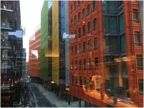
Piano is explicit that his decision to deploy such bright hues was to generate such a contrast with the tones of neighboring structures. He contends that cities “should not be boring or repetitive. One of the reasons cities are so beautiful and a great idea, is that they are full of surprises, the idea of color represents a joyful surprise” (World Architecture News Citation2011).
While some critics complained about the luridity of the buildings and the disruption to a “traditional” urban landscape, others commended its warmth. Ijeh (Citation2010) opined that the striking colors of Central Saint Giles have “cheered up an obscure corner of London with a riot of reds, yellows, greens and oranges – making the rest of the capital look a tad grey,” notably contrasting with “the tepid monochrome monoliths of so much of London’s contemporary commercial architecture” besides producing a structure that is “both surreal and cinematic.” The striking colors here thus claim attention and suggest how other monochrome places might be animated. The reputation of this building is sure to rise since the entire complex has recently been purchased by giant American tech company Google in a billion-dollar deal.
A profound contrast with the drab surrounding colors emphasizes the affective and sensory power of these buildings, diverting attention toward the textural, colorful pleasures of their facades. They resonate with the artist Cruz-Diez (Citation2010) series of diverse pedestrian road crossings designed in brightly colored stripes and installed in different cities, producing what the artist calls “chromatic events” that disrupted the gaze of inhabitants upon approach and underfoot.
The second example is an interior play space in which the encounter with color subsumes experience: the popular luminaria, giant inflatable, single skin PVC structures devised by Architects of the Air, a Nottingham-based company founded by designer Parkinson (Citation2013). The ever-evolving luminaria have been variously influenced by 1960s psychedelia, the geodesic domes of Buckminster Fuller, the vaulted ceilings and columns of gothic structures, stained glass windows, Islamic architecture, and in the case of Arboria, the installation I visited in 2017 in Melbourne and in 2019 at Salford, by the spreading branches and colors of trees.
Described by Parkinson as “somewhere between a womb and a cathedral,” luminaria entreat visitors to wander through a space shaped by curvilinear, multichambered tunnels, alcoves and domes formed from highly saturated colors that are solely illuminated by the daylight outside. To enter a luminarium is to encounter an extra-ordinary luminous realm that offers an intense engagement with radiant hues, in which color itself is the primary object of attention, with only other (tinted) human bodies supplementing the experience (as exemplified in , “Arboria, mixed colors, 2019,” and , “Playing in Arboria, 2019”).
FIGURE 2 Arboria, 2019: (A) mixed colors; (B) playing.
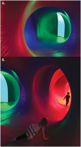
These vibrant tones form effervescent combinations in three dimensions that shift as you walk through the structure while contrastingly, to stop in an enclosed micro-space is to be engulfed by a single saturated color with no distinguishing features: a Ganzfeld effect of depthless color.
Parkinson intends that a luminarium “gently cuts through everyday conditioned perceptions and awakens a sense of wonder in people,” and during both visits, it was evident that visitors’ responses ranges from rhapsodic and excitable to energized or becalmed, with different emotional reactions prompted by different hues. In Salford, a 10-year-old girl said that the red made her “hot and angry,” while a young mother and child were suffused in green as they rested in an alcove, the mother relating that the color was restful for them both. People were drawn toward particular parts of the interior as they seek intimacy or contemplation in particular color-saturated alcoves, lie across floors, gather in groups, stand bedazzled, and thereby collectively become part of a living, inhabited temporary sculpture, a place all of its own.
The affective and sensory potential that inheres in a radical encounter with vivid color is conjured by Carlota de La Herrán Iriarte in her exploration of how the color saturated art works of Katherina Gross art can stimulate “a precursive disposition toward immanence, sensation, and becoming,” a “spiritual” experience that is immanent rather than transcendent (Citation2023, 2). In confounding our psychic and somatic capacities, de La Herrán Iriarte maintains that Gross’s art can perpetrate a “rewiring” of “the functioning of your eyes, mind, and body, in a way that feels a bit more spiritually sensitized than before” (Citation2023, 6). Such ideas are echoed by Hawkins’ (Citation2015, 172) exposition of the immersive light projections of Pipilotti Rist that wash over spectating bodies, exemplifying “color’s refusal to submit to systems, codes, and intellectual forms of analysis” and to blur distinctions between objects. The effects of the luminaria, rooted in 1960s psychedelia, also chime with Keith Albarn’s 1969 psychedelic fun palace, the Fifth Dimension, avowedly created to sharpen senses and thereby stimulate a critical awareness of built environments (Dickens and Edensor Citation2021).
Third, is an artwork installed in 2021 at London’s Canary Wharf, an urban complex in which the dominant colors are beige, grey, black and chrome. Shine Your Colors, by the Tine Bech Studio (Citation2021), is situated on the Thames riverbank and looks out toward Greenwich on the opposite bank and back to the lofty towers. The six separate colored glass panels installed at different angles frame views of London, offering a set of colored lenses through which both riverside and towering glass and steel buildings are defamiliarized and re-enchanted (as shown in , “Shine Your Colors, blue, pink, yellow, 2021;” and , “Shine Your Colors, red vision, 2021”).
FIGURE 3 Shine Your Colors, 2021: (A) blue, pink, yellow; (B) red vision.
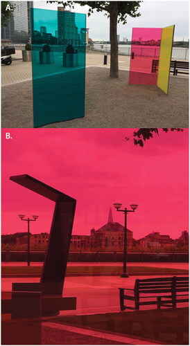
The expansive vistas of grey cloudy sky and the silvery sheen of the river are newly charged by vibrant colors while the forbidding corporate structures of Canary Wharf are similarly tinted, reconfiguring visual apprehension. As with the luminaria, Shine Your Colors produces a site of relaxation and gathering in which the augmented environment solicits both a meditative stillness and a circulating wandering wherein visitors can re-envisage a range of scenes framed by overlapping, mixing and single colors. Critical to Bech’s approach is a foregrounding of play as a collaborative and collective experience. As such, the work inspires visitors to take photographs of these scenes but also of themselves and their companions as colored bodies, light-hearted images that can be shared on social media. As the artist states, “the installation invites people to discover how colors mix and transform as they move through the space” (pers comms, 4/1/2022). Accordingly, Bech’s installation simultaneous defamiliarizes these urban vistas while interrogating the reductive, muted color palette that predominates in this place, suggesting that a more polychromatic approach to urban design would enrich experience, stimulating movement and fostering ludic engagement.
Fourth, I have mentioned the capacity of light festivals to temporarily transform place with color, and there is no doubt that the skillful installations, projections and environments produced by professional light designers and artists can defamiliarize but also deepen the experience of place (Edensor and Sumartojo Citation2018). However, also salient here are the festive, bright, vernacular designs of Christmas lights arranged on the facades of modest, usually working-class houses that add intense splashes of color to seasonal gloom (Edensor and Millington Citation2009). The practice is characterized by an improvisational, unplanned approach to deploying color that contrasts with the studious, carefully planned schemes of professional artists and designers (see , “Christmas lights, Manchester”). This excessive, dramatic injection of color transforms the nocturnal apprehension of place by mobilizing an alternative aesthetics unconditioned by judicious consideration about color distribution and complementarity. This bypassing of aesthetic conventions about what constitutes “good taste” is marked by the deployment of color to mark out festive time in place.
FIGURE 4 “Christmas lights, Manchester.”
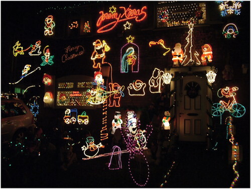
The householders who garb their houses with such effusive displays of multi-colored, often animated lights rarely seek to produce careful arrangements but position numerous lights in an unplanned, ad hoc fashion, creating an anarchic appearance. It is this very effect of superfluity that compels attention and conveys a festive impression. Indeed, many householders claim that contemporary Christmas lighting schemes arranged by local councils and businesses to encourage seasonal town center shopping are inappropriately dominated by neatly arranged blue and white illuminations which, they argue, delivers a cold and over-designed impression. By contrast, the householders deploy what they regard as the traditional seasonal colors of green, red and gold, colors that convey joy and celebration in place. The misconceived, condescending critiques that label these amateur, neighborly festive illuminations as “tasteless,” “excessive,” and “tacky” testify to a lingering chromophobia that underlines how colors remain symbolically suffused with status-oriented, class-specific cultural values. The capacity of light to radiate across space and color surroundings gives these displays extra potency, for there seems no alternative practice by which these householders of limited means could transmit their presence across space and thereby assert their right to co-produce the built environment.
Other vernacular practices introduce color into place. The ancient annual Hindu festival of Holi involves the throwing of copious quantities of bright powder pigment across bodies to produce a ludic, egalitarian, sensual and vibrant occasion that temporarily transforms the meaning and feeling of place (Peacock Citation2017). More enduringly, over the past few decades, householders in small towns and villages across the West of Ireland have painted their houses in a medley of strikingly bright colors to transform what were previously cream and grey realms (Doherty Citation2010). These examples underline that the creative, ludic use of color is not merely confined to professional designers, artists and architects.
REDISTRIBUTING COLOR: EXPANDING SENSIBILITIES IN PLACE
In seeking to supplement and extend scholarly thinking about color and space, this paper contends that in the face of persistent, widespread chromophobia, the adoption of a brighter range of colors has great potential to enhance the experience of place. Chromophobia is contemporaneously expressed through design ideas that continue to stem from the strictures of Munsell and Lenclos, and is articulated in persistent taste-making assertions that bright color is excessive, infantile and trivial, and that muted color is preferable. I have also contended that where bright colors often intrude into the urban landscape through lurid advertisements, glaring commercial designs and emergent forms of illumination, and is further fueled by the peddling of a gigantic range of colors to designers and homeowners. These effects are, however, ameliorated by inventive light designs, heritage strategies that reintroduce traditional colors and continuing endeavors to retain the historic identities of particular places with distinctive colors.
The distribution of color in places eventuates from multiple decisions in which most people have little say. Colors are chosen by designers and architects, marketed to businesses and the public, and manufactured by corporations specializing in paint, building materials and street fixtures, and standardized by professional bodies and local authorities. These agents act to instantiate procedures, codes and habits that bestow regular color schemes on places and foster the illusion that this is the way things are and should appear. They are part of a collectively forged regime that produces common sense meanings, perceptions and sensory apprehensions. This power is captured in Jacques Rancière’s conception of the distribution of the sensible. Rancière claims that politics “revolves around what is seen and what can be said about it, around who has the ability to see and the talent to speak, around the properties of spaces and the possibilities of time” (Citation2009, 13). This produces “the configuration of a specific space, the framing of a particular sphere of experience, of objects posited as common and as pertaining to a common decision” (Citation2009, 24). Accordingly, the orchestration of space forges a sensual, material realm that demarcates what is seen, smelled, heard and touched, producing “spatio-temporal-perceptual complexes that invite and encourage some attentional engagements and inhibit others, that shape our attentional performativity” (Hannah Citation2013, 242) and activate particular affective and sensory responses.
The capacity to attune us to the distribution of color across space as a normative reality, is allied to tenacious cultural meanings and values that limits the potential for expressive design. Yet as I have emphasized, these meanings, uses and effects of color remain almost impossible to entrench over time and space. As Rossi claims, despite Munsell’s endeavors to delineate and capture color, to establish common sense and scientific laws, “this infinitely protean object of desire… continually slipped from the grasp of it pursuers” (Citation2019, 3). Similarly, Slack and Hristova (Citation2017, 467) insist that color defies “fixity and concreteness, and instead evoke transient shades, gradations, tones, and tint.” Critically, color can bypass the discursive in favor of the affective and sensory. The dynamism of light and its capacity to inflect surfaces and objects with changing shades and hues, and the changing panoply of surrounding colors within which objects and surfaces are located ceaselessly shift perception, meaning and feeling. Moreover, contemporary digital processes have democratized access to color production. As Beyes (Citation2017, 1477) contends, the “potential of chromaticity is not exhausted in technologies of mechanical or digital engineering; they, too, enable the sheer presence, intensity and openness of color relations.” Indeed, the contemporary proliferation of available colors and the multiplicity of uses they offer threatens the force of chromophobia by ceaselessly shifting the color palettes of the everyday.
While these developments indicate the ongoing redistribution of color across space and place, I have especially focused upon how more radical encounters with color have a more profound power to shift affectual experience, reattune sensibilities and open up possibilities for sensing, creating and thinking otherwise. Though very different in color intensity, setting, relationality to surroundings and intentionality, these four creative designs exemplify how color might be redistributed across space to foreground playfulness and delight. Furthermore, their dramatic contrast with the rather monotone urban settings in which they are situated bestows them with the potential to induce a greater attentional performativity (Hannah Citation2013) to color. These alternative encounters make it “possible to think ourselves in relation to color(s) differently, to live color(s) differently, and, therefore, to live differently” (Slack and Hristova Citation2017, 451) and to admit “new possibilities for living relationships of difference in-color” (Slack and Hristova Citation2017, 463). Such colorful disruptions can intervene to provoke dissensus, inverting regimes of the sensible through which a certain chromophobia persists, the marking of social distinction through color is mobilized, and tenacious norms dictate what colors should be deployed and where. These injections of color can challenge the use of color in corporate branding, class-oriented taste-making strategies, and persistent chromophobic impulses, by the “exposing and potential deposing of imperial paradigms and their palette of sensibilities” (Tolia-Kelly Citation2019, 125). Banal, repetitive, often consensual design hegemonies are thus revealed; the habitual exclusion of bright color becomes evident.
Rancière’s ideas about the distribution of the sensible allow us to identify the often overlooked normative regimes of making place, shaping sensation and directing attention. As one key element in the forging of the aesthetics of place, color is entwined with the more overt economic, political, bureaucratic and regulatory modes of power that shape spatial production; it is not a separate abstract quality confined to its own aesthetic silo. I have sought to demonstrate that the radical introduction of color can foster new modes of attunement (Brigstocke and Noorani Citation2016) that can redistribute the aesthetic possibilities of place, encouraging us to sense, interpret and feel color differently, and provoke critical approaches to normative ways of seeing, making and being. Such effects call for more extensive geographical research, including ethnographic explorations into the meanings and feelings attributed by local residents to the colors they live amidst.
ACKNOWLEDGMENTS
Thanks to Tine Bech, Alan Parkinson, Kaya Barry, Diti Bhattacharya, and Daryl Martin.
Additional information
Notes on contributors
Tim Edensor
TIM EDENSOR is a Professor of Social and Cultural Geography at the Institute of Place Management, Manchester Metropolitan University, Oxford Road, Manchester, M15 6BH, UK. E-mail: [email protected]. He is the author of Tourists at the Taj (1998), National Identity, Popular Culture and Everyday Life (2002), Industrial Ruins: Space, Aesthetics and Materiality (2005), From Light to Dark: Daylight, Illumination and Gloom (2017), Stone: Stories of Urban Materiality (2020), and Landscape, Materiality and Heritage: An Object Biography (2022).
REFERENCES
- Abbas, Y., and D. Osseo-Asare. 2010. Color coating/coding in Ghana’s mobility marketplace. In New geographies 3: Urbanisms of color, ed. G. Doherty, 8–11. Cambridge, MA: Harvard University Press.
- Barthes, R. 1981. Camera Lucida: Reflections on photography. London: Macmillan.
- Batchelor, D. 2000. Chromophobia. London: Reaktion.
- Batchelor, D. 2014. The luminous and the grey. London: Reaktion.
- Bell, D., and J. Hollows, eds. 2005. Ordinary lifestyles: Popular media, consumption and taste. Maidenhead: Open University Press.
- Beveridge, P. 2000. Color perception and the art of James Turrell. Leonardo 33 (4):305–13.
- Beyes, T. 2017. Colour and organization studies. Organization Studies 38 (10):1467–82.
- Bille, M. 2017. Ecstatic things. Home Cultures 14 (1):25–49.
- Billig, M. 1995. Banal nationalism. London: Sage.
- Boeri, C. 2017. Color loci placemaking: The urban color between needs of continuity and renewal. Color Research and Application 42 (5):641–9.
- Boeri, C. 2010. A perceptual approach to the urban colour reading. In Colour and light in architecture. Conference proceedings, ed. P. Zennaro, 459–63.
- Böhme, G. 1993. Atmosphere as the fundamental concept of a new aesthetics. Thesis Eleven 36:113–26.
- Brigstocke, J., and T. Noorani. 2016. Posthuman attunements: Aesthetics, authority and the arts of creative listening. GeoHumanities 2 (1):1–7.
- Burdett, R., and A. Kaasa. 2010. Color and the city. In New geographies 3: Urbanisms of color, ed. G. Doherty, 54–63. Cambridge, MA: Harvard University Press.
- Classen, C. 2002. The colour of angels: Cosmology, gender and the aesthetic imagination. London: Routledge.
- Cronin, A. 2006. Advertising and the metabolism of the city: Urban space, commodity rhythms. Environment and Planning D: Society and Space 24:615–32.
- Cruz-Diez, C. 2010. The street as venue for chromatic events. In New geographies 3: Urbanisms of color, ed. G. Doherty, 76–9. Cambridge, MA: Harvard University Press.
- de La Herrán Iriarte, C. 2023. Sensation, spirituality and Deleuze: Becoming‐colour through Katharina Grosse’s explosive artworks. Area 55 (1):142–9. doi:10.1111/area.12827.
- Dickens, L., and T. Edensor. 2021. Entering the fifth dimension: Modular modernities, psychedelic sensibilities and the architectures of lived experience. Transactions of the Institute of British Geographers 46:659–74.
- Doherty, G. 2010. The pink and red diamond. In New geographies 3: Urbanisms of color, ed. G. Doherty, 92–5. Cambridge, MA: Harvard University Press.
- Edensor, T. 2017. From light to dark: Daylight, illumination and gloom. Minneapolis, MN: Minnesota University Press.
- Edensor, T. and S. Millington. 2009. Illuminations, class identities and the contested landscapes of Christmas. Sociology 43 (1):103–21.
- Edensor, T. Sumartojo T.. 2018. Reconfiguring familiar worlds with light projection: The Gertrude Street Projection Festival, 2017. GeoHumanities 4 (1):112–31.
- Fehéváry, K. 2013. Politics in color and concrete: Socialist materialities and the middle class in Hungary. Bloomington, IN: Indiana University Press.
- Fox, J. 2021. The world according to colour. London: Penguin.
- Goethe, J. 2006 [1810]. Theory of colours. Mineola, NY: Dover.
- Halauniova, A. 2021. Getting the right shade of ochre: Valuation of a building’s historicity. Space and Culture 24 (3):421–36. doi:10.1177/1206331221997656.
- Hannah, M. 2013. Attention and the phenomenological politics of landscape. Geografiska Annaler: Series B, Human Geography 95 (3):235–50.
- Hawkins, H. 2015. “All it is light”: Projections and volumes, artistic light, and Pipilotti Rist’s feminist languages and logics of light. The Senses and Society 10 (2):158–78.
- Hudson, C. 2015. ION Orchard: atmosphere and consumption in Singapore. Visual Communication 14 (3):289–308.
- Ijeh, I. 2010. Beyond the pale: Renzo Piano’s Central St Giles. Building. Accessed January 17, 2022. https://www.building.co.uk/focus/beyond-the-pale-renzo-pianos-central-st-giles/3163735.article
- Ingold, T., and T. Kurttila. 2000. Perceiving the environment in Finnish Lapland. Body and Society 6 (3–4):183–96.
- Le Corbusier , 1927. Towards a new architecture. London: Architectural Press.
- Lenclos, J. P., D. Lenclos, and J. Philippe. 2004. Colors of the world: The geography of color. New York, NY: WW Norton and Company.
- Moon, G. 2018. Conflict colors. Design and Culture 10 (3):369–77.
- Mundell, M. 2020. The burning world. In Living with the climate crisis: Voices from Aotearoa, ed. T. Doig, 68–82. Wellington: Bridget Williams Books.
- Pantone. 2021. Colour of the year. Accessed August 4, 2021. https://www.pantone.com/uk/en/color-of-the-year-2021
- Parkinson, A. 2013. The most beautiful. Nottingham: Architects of the Air.
- Peacock, H. 2017. Geographies of colour: Practices and performances of repair. Doctoral diss., Queen Mary University of London.
- Raguin, V. 2003. Stained glass: From its origins to the present. New York, NY: Harry N. Abrams.
- Rancière, J. 2009. Aesthetics and its discontents. Cambridge: Polity Press.
- Rose, G., and A. Willis. 2019. Seeing the smart city on Twitter: Colour and the affective territories of becoming smart. Environment and Planning D: Society and Space 3 (3):411–27.
- Rose-Greenland, F. 2016. Color perception in sociology: Materiality and authenticity at the gods in color show. Sociological Theory 34 (2):81–105.
- Rossi, M. 2005. The rules of perception: American color science, 1831–1931. Thesis, Columbia University.
- Rossi, M. 2019. Republic of color: Science, perception and the making of Modern America. Chicago, IL: University of Chicago Press.
- Slack, J., and S. Hristova. 2017. Culture in-colour. Cultural Studies 31 (4):449–69.
- Solnit, R. 2000. Wanderlust: A history of walking. London: Verso.
- Swirnoff, L. 2000. The color of cities: An international perspective. New York, NY: McGraw Hill.
- Tina Bech Studio. 2021. Shine your colours. Accessed August 4, 2021. https://tinebech.com/portfolio-item/shine-your-colours/
- Tolia-Kelly, D. 2019. Rancière and the re-distribution of the sensible: The artist Rosanna Raymond, dissensus and postcolonial sensibilities within the spaces of the museum. Progress in Human Geography 43 (1):123–40.
- World Architecture News. 2011. Renzo’s “joyous vibrancy” comes to UK capital. Accessed January 17, 2011. https://web.archive.org/web/20110722041558/http://www.worldarchitecturenews.com/index.php?fuseaction=wanappln.projectview&upload_id=12035
- Xu, J. 2019. Colour in urban places: A case study of Leicester City Football Club blue. Color Research and Application 44 (4):613–21.
- Yamamoto, S. 2015. Case studies of color planning for urban renewal. In Proceedings of the Midterm Meeting of International Colour Association, 113–8. Tokyo.
- Young, D. 2018. Introduction. In Rematerializing colour: From concept to substance Canon Pyon, ed. D. Young, 1–21. Herts: Sean Kingston.