
Abstract
Maps are a key way through which the science of climate change is communicated, but as partisan divides lead to new ideologically driven consumption patterns of news sources, it is important to understand how the media uses maps across the political spectrum. In this study, we investigate how maps have been incorporated into climate change communication in conservative media. Our research has two major findings. First, compared to mainstream media, conservative media is far less likely to use maps in reporting on climate change. We call this lack of maps a “cartographic silence,” borrowing and expanding on Harley’s term. Second, when conservative media uses maps, never do they create their own maps to accompany false arguments. Instead, these maps are republished from other media or peer-reviewed science, and reframed by logical fallacies. We conclude by offering suggestions about how scientists can improve their maps in hopes that they will be less susceptible to use in conservative disinformation efforts.
地图是气候变化科学的主要沟通方式。然而, 党派分歧带来了基于意识形态的新闻消费新模式。了解媒体如何在政治领域中使用地图, 具有非常重要的意义。我们研究了保守派媒体在气候变化沟通中如何采用地图。研究有两个主要发现。首先, 与主流媒体相比, 保守派媒体在气候变化报道中很少使用地图。借用并扩展哈雷的术语, 我们将这种地图的缺失称为“地图沉默”。其次, 当保守派媒体使用地图时, 不会制作自己的地图来附和虚假论点。相反, 这些地图来自于其它媒体或同行评审科学, 保守派媒体根据错误逻辑来进行重新解读。最后, 我们对科学家如何改进地图提出了建议, 希望这些地图不太容易被用于保守的虚假信息工作。
Los mapas son una manera clave para comunicar la ciencia del cambio climático, pero, a medida que las divisiones partidarias llevan a nuevos patrones de ingesta ideológica de las nuevas fuentes, es importante entender el modo como los medios de comunicación usan los mapas a través del espectro político. En este estudio investigamos cómo se han incorporado los mapas a la comunicación relacionada con cambio climático en los medios conservadores. Nuestra investigación ha producido dos hallazgos principales. Primero, en comparación con los medios principales de comunicación, los medios de orientación conservadora son menos propensos a usar mapas al informar sobre cambio climático, tendencia a la cual denominamos “silencio cartográfico”, tomando y ampliando la expresión de Harley. En segundo lugar, en los casos en los que los medios conservadores utilizan mapas para aquel propósito, nunca lo hacen diseñando mapas propios para acompañar falsas argumentaciones. En vez de eso, los mapas pertinentes se republican desde otras fuentes, o desde la ciencia que ha sido revisada por pares académicos, reformulados por falacias lógicas. Concluimos formulando sugerencias sobre cómo los científicos pueden mejorar sus mapas, con la esperanza de que sean menos susceptibles de utilizar en los esfuerzos conservadores de desinformación.
Maps are inherently political, both as a consequence of the mapmaker’s choice in finding, interpreting, including, and representing data, and because of how maps themselves are used, reused, and republished across different media and alongside varying arguments. Science—particularly the science of climate change—is also political and has become a central topic of political debate in the United States. Given that maps are one of the key tools through which the science of climate change is conveyed to the public (Fish Citation2020a), it is important to understand how those across the political spectrum use maps in their climate change discourse. Specifically, in this study, we investigate how maps have been incorporated into climate change communication in conservative media. Using content and discourse map analysis we provide insights into how, when, and why maps are used in conservative media reporting on climate change.
Our research reveals two major conclusions about conservative rhetoric and discourse on climate change, especially in relation to the integration of visually represented spatial data. First, in comparison to mainstream media (Fish Citation2020a), there was a general lack of maps. We located twenty-nine maps in eighteen sources across seven years compared to Fish’s more than 200 maps over a shorter time span in mainstream media sources. We describe this lack of maps using Harley’s (Citation1988) term cartographic silence, which he used to describe the power maps exert as a result of what is left off the map. In our case, we argue that this silence—or lack—gives conservative media power by allowing them to avoid proving their point through verifiable visual data (i.e., maps), and instead to make their arguments using only written discourse. We argue that the lack of maps in conservative media is due to the fact that maps often are not helpful in disseminating disinformation on climate change. Because political identity drives the types of media we consume, the media—across the spectrum—can play into the confirmation biases of their readers. As such, maps are not necessary to make arguments to their readers, even if the ability to create fake maps with fake data is now quick and easy.
Second, in all but one of the cases where a map did accompany an article in a conservative news source, the maps were not originally designed by the conservative media source (n = 28). In most of those cases, the maps were often originally produced by publicly funded and peer-reviewed scientists (n = 22). Not all of the articles we found denied climate change, which illustrated to us that there were inconsistencies across media sources in their reporting on climate change. Never did conservative media sources create their own maps to support false information. In articles that did deny climate change, the maps were republished and reframed in conservative media to bolster false information. Primarily these maps stamped the conservative article with authority from valid scientific studies. In addition, these maps were used alongside logical fallacies, including equating singular weather events with climatic change or presenting incomplete evidence through cherry-picking studies designed to sow doubt in climate change science.
The study of climate change representation through maps in conservative media expands the fields of geography and cartography. Primarily within the discipline of geography, physical geographers have contributed to a better understanding of the physical science of climate change while human–environment and nature–society geographers have focused on impacts, adaptation, and vulnerability due to climatic change. Cartography has recently focused on data journalism, the leveraging of the scale and range of digital data to create information that is disseminated across the media. Additionally, research outside geography has shown how the combination of visuals and false information is viewed as more credible than text alone (Hameleers et al. Citation2020; Brennen, Simon, and Nielsen Citation2021). Thus, as an extension of that line of research, this research aims to fill necessary gaps by asking the following research questions:
How do maps become part of conservative media reporting on climate change?
What is the content and design of the articles and maps on climate change in conservative media?
What is the role of maps about climate change in conservative media and how are they used to bolster climate change denial claims?
The rest of the article is organized in the following way. First, we review the literature related to (1) disinformation and the role of visuals, (2) climate change denial and disinformation campaigns, and (3) the power of maps for disinformation. We then provide an overview of our content and discourse analysis methods. After that, we share our data and present how the maps become part of conservative rhetoric and the content and design of the articles and maps. We explore the role the maps play in conservative media, and how fallacies of logical argumentation are intertwined with the use of maps. We follow these results with one case where we illustrate how logical fallacies are used to deny human-caused climate change, and how the inclusion of a map boosts the perceived credibility of the article and the author. We then discuss potential reasons for why we have observed a cartographic silence. Finally, we conclude with an overview of our findings and present suggestions for scientists to avoid misuse of their climate change maps.
Literature Review
In this literature review we explore three topics: (1) disinformation and the role of visuals, (2) climate change denial and disinformation, and (3) rhetorical cartography. Through this review of related scholarship, we illustrate our reasoning for our empirical research on the conservative use of maps about climate change.
Disinformation and the Role of Visuals
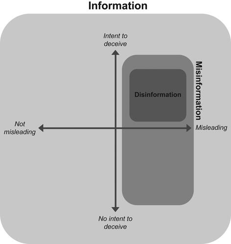
The terms disinformation and misinformation are commonplace in U.S. English, and although often used interchangeably, they connote distinct meanings. Both misinformation and disinformation are subclasses of “information” (). Misinformation is defined as “misleading information that is created and spread, regardless of whether there is intent to deceive” (Treen, Williams, and O’Neill Citation2020, 3). Misleading information does not need to be wholly incorrect or fabricated evidence, and in fact, often revolves around a “rational core” of facts and knowledge, but is often presented without proper context. Disinformation, on the other hand, is defined as “misleading information created and spread with intent to deceive.” Misinformation might be shared unwittingly by individuals, but it is the systematic disinformation that is more concerning (Wardle Citation2018) because there is intent behind spreading this information known to be false (Fallis n.d.). For example, someone at the Department of Transportation (DOT) might share with their social media followers that Interstate 95 through Philadelphia will only have one lane open from 8 a.m. until 5 p.m. (during the day) for construction on a particular day. In actuality, there will be construction on Interstate 95 from 8 p.m. through 5 a.m. (overnight). As long as the person sharing this information did not intend to present false information, this is misinformation. If the individual at the DOT wanted to cause anxiety and disruption to the traffic flows in Philadelphia during the day, however, this would be categorized as disinformation.
Figure 1. Hierarchy of information. Disinformation is a type of misinformation. Both disinformation and misinformation are types of information. Based on graphics by Brennen, Simon, and Nielsen (Citation2021).
There are many worries that visuals can and will be used for disinformation because technology allows for the creation of doctored images or even “deepfakes.” Doctored images are static images that have been altered, whereas deepfakes are videos that have been altered to spread disinformation. Indeed, Brennen, Simon, and Nielsen (Citation2021) found that visuals serving as direct evidence for a false claim have the weightiest implications for disinformation. They identified three ways that visuals support false information by (1) selectively emphasizing parts of the claim(s) contained in text accompanying the visual, the visual equivalent of a “hasty generalization,” (2) serving as direct evidence for the false claim(s), or (3) boosting the credibility of a false claim by appearing to “stamp” the claim with a visual implying the claim was made by an authority (i.e., with a government logo), what is often called an “appeal to authority.” When an image purports to display a phenomenon, the image “establishes” the claim “as an object”; the false claim is depicted as something tangible, material, and grounded in reality. Brennen and colleagues (2020), however, found that most often the visuals that performed this evidentiary function were not deepfakes or sophisticated productions. Instead, these images were simply deprived of context or manipulated using basic, easily accessible software.
Hameleers et al. (Citation2020) similarly showed that when visuals are paired with text (i.e., “multimodal” disinformation), the entire message is viewed as more credible than text alone. They illustrated the ways in which visuals can be used alongside misleading text by (1) pairing real images with misleading text, (2) cropping or decontextualizing visuals to make certain aspects of the issues more salient, (3) visually doctoring images, or (4) visually doctoring images and pairing them with misleading text. It is clear from this recent research (Hameleers et al. Citation2020; Brennen, Simon, and Nielsen Citation2021) that when visuals are used alongside text, the misleading information becomes more powerful by appearing to be more credible.
Climate Change Denial and Disinformation Campaigns
Despite scientific consensus around the human causes of climate change, disinformation has proliferated in recent years. As is often repeated, the basic science of human-caused climate change is not a debate. A recent review quantifies the consensus among scientists at over 99 percent (Lynas, Houlton, and Perry Citation2021). Thus, when information spreads questioning the basic science of climate change, there is no doubt that this information is either misinformation or disinformation.
Climate-change-based disinformation aims to confuse the public and leads to political polarization that first hinders meaningful political debate, and then stalls the political action needed to address anthropogenic climate change. Through intentional disinformation campaigns, media, politicians, and prominent pundits and bloggers create and spread disinformation in an “influencer echo chamber” that is amplified in and sustained by a feedback loop through sharing behaviors online (Treen, Williams, and O’Neill Citation2020). Scholars have identified that climate change deniers disinform by suggesting that (1) scientists do not agree, (2) it is not real, (3) it is not human caused, (4) it is not that bad, and (5) there is no hope; or by suggesting that (1) the science is not settled, (2) it is too costly to prevent, (3) it is good for us, (4) we cannot take action because other countries are not taking action, and (5) we should deny the crisis (Maslin Citation2019).
The doubt created through systematic disinformation campaigns on climate change has been linked to a small group of scientists who are not experts in the field (Oreskes and Conway Citation2010). These scientists trace their history from disinforming about the risks of tobacco smoke, to acid rain, to nearly every environmental regulatory move by the Environmental Protection Agency in the past forty years (Oreskes and Conway Citation2010). Using the power of their positions, these scientists denounce the rest of the scientific community as “political” and position themselves as “apolitical.” They claim to provide true objectivity to the masses while portraying the rest of the scientific community as “hacks” (Oreskes and Conway Citation2010). These scientists appeal to the public’s view of them as “experts,” even while their expertise falls in distant scientific fields, by (1) cherry-picking data, (2) accusing government reports of omitting data, (3) repeating obviously bunk science, and (4) using conservative news outlets to spread their message.
Today, much of the climate change denial discourse proliferates online. Misinformation and disinformation are increasingly difficult to combat as the media has become more decentralized. In addition, mainstream media often reports on conservative media and social media posts of conservative figures, further spreading disinformation and potentially increasing partisan divides. This was prevalent during the Trump administration when major news sources reported on Trump’s Twitter posts. Given the online nature of these media, opportunities to pair disinformation with graphics, images, and maps have increased, as has the ease of creating these visual products.
Rhetorical Cartography
As a form of visual representation, maps create subjective and relative knowledge no matter how much the cartographer might want to create an objective representation. Maps, therefore, are rhetorical in that they reflect the priorities and values of those who craft them (Harley Citation1989). What the cartographer chooses to include or exclude, so-called “map silences,” shape this knowledge transfer (Harley Citation1988, Citation1989). Further, maps are rhetorical because they persuade their readers, even if that persuasion is unnoticed, through their design and how they are used. This underlying understanding applies not only to maps that serve to uphold notions of state power, such as propagandist maps, but to all maps because they convey a particular truth (Monmonier Citation2018).
A map’s rhetorical nature can be outwardly visible to the map reader (e.g., Muehlenhaus Citation2014); it can be traced from the contexts of who, how, and when it was produced (Harley Citation1989); or by evaluating the context around the map (e.g., McNeil and Culcasi Citation2015). Thus, maps have their own rhetoric, but also can be used to support verbal rhetoric. To codify how map designs are persuasive, and thereby rhetorical, Muehlenhaus (Citation2014) designated four categories of persuasive maps: sensationalist, propagandist, understated, and authoritative. The first three of these categories are easy to identify through both the data that they use and the designs they employ. Authoritative style maps, on the other hand, adhere to the stylistic norms of typical scientific map productions to appear objective by using subtle data model and graphical manipulations—fake sources—to push an agenda (Muehlenhaus Citation2014).
The authoritative rhetorical style can inform the epistemology of the map. As McNeil and Culcasi (Citation2015) demonstrated, in the 1970s and 1980s, environmental groups made maps to illustrate how coal burning led to acid rain. The coal industry created its own maps that cited the same data sources as the environmentalists and used the authoritative rhetorical style to tell an opposing story. The objective-appearing rhetorical style weaponized these maps to halt federal legislation addressing the coal industry’s role in the acid rain crisis (McNeil and Culcasi Citation2015).
The rhetoric of a map is also shaped by changing dominant geopolitical views of the media and government. For example, Culcasi (Citation2006) found that journalistic cartography supported the politics of the U.S. government regarding changing views about Kurdistan over a sixty-year period. She argued that although we know that maps are subjective representations, their seeming objectivity allows them to go unquestioned, which allows them to be both persuasive and powerful. “Given the pervasiveness of media maps and the ability of maps to influence our geographical imaginations, the subtleties of maps and the discourses embedded in them become an important avenue to explore” (Culcasi Citation2006, 703).
It is clear that tracing maps is key to understanding their rhetoric; and in our modern digital world, we must include how the publishing format of the map affects its rhetoric. The ease of mapping, made possible through online platforms, has given nonexperts and nonacademics access to map knowledge production (Crampton and Krygier Citation2006). Much of this has positively shifted cartography as a field, but it has posed potential negative implications as well. Robinson (Citation2019), for example, explored the potential for disinformation in how maps are disseminated across social media. The online forum of map publication means that maps are increasingly placed alongside reporting on politically contentious topics within the media. In the case of climate change mapping, Fish (Citation2020a) found, through her tracing of the production of climate change media maps, that not only are maps a primary visual of climate change reporting, but also when stories about climate change used maps, the media outlet rarely produced these maps itself. Often the maps that accompanied stories about climate change were produced by government agencies or were originally from peer-reviewed scientific articles.
Griffin (Citation2020) noted that map readers’ ability to critically evaluate the truth of geocommunication is more important than ever given the potential for map misuse. Yet, despite scholarship on rhetoric, persuasion, and even disinformation in maps, there is little research that explicitly draws connections between cartography and fallacies in logic. Logical fallacies are errors in reasoning that undermine arguments. These errors in reasoning often are a result of a lack of evidence to make a claim (Almossawi Citation2013). Logical fallacies are one way in which conservative movements in the United States present arguments, often about climate change. As conservative media moves into a more central place in our political discourse, and as climate change disinformation campaigns are successful in stalling the passage of legislation—all while the science of climate change becomes more concrete—it is increasingly vital to understand how conservative movements uses these flawed arguments while relying on the power of maps to disinform about science.
Methods
Given the need to understand the role maps play in climate change disinformation, we conducted a content and discourse analysis study to examine how conservative media uses maps.
Developing List of Sources and Maps
We first needed to create a list of media sources to search for maps. We selected a set of sample online publications that (1) self-identified as conservative or right-leaning, and (2) as a set, attempted to represent the ideological spectrum of the right (from right-of-center to so-called alt-right; ). Rather than using existing classifications of news outlets’ media biases (e.g., AllSides), we classified conservative media as those outlets that self-identified as being conservative (see also Boberg et al. Citation2020). The study of conservative news outlets is an area of scholarship in need of development, and even in existing scholarship, what media should be considered conservative is loosely defined. Bauer and Nadler (Citation2020) suggested that a news culture is conservative insofar as it “involves forms of media production, circulation, consumption, or identification by institutions or actors who are associated with … the discourse produced by the modern conservative movement of the U.S.” (Bauer and Nadler Citation2020, 6). To identify whether a source was conservative, the Home or About page needed to use any of the following terms: conservative, right-leaning, republican, far-right, or alt-right,. Alternatively, the senior editorial teams needed to explicitly and publicly identify their ideologies as conservative or right-leaning. We narrowed our set by choosing sources that represented the ideological spectrum of conservative media and had published articles relating to our research questions (i.e., included articles about climate change).
Table 1. List of media sources and date range of articles we were able to find given limitations of site-specific search engines and the challenge of searching for articles containing maps
There is no easily automated way in which to find articles in conservative media that includes maps. Thus, how we gathered the maps varied by media source depending on the individual sites’ search engine capabilities. We did explore Web scraping options, but found these to be unhelpful because finding maps was not something the Web scraper was able to automate effectively. Additionally, using a broad-based search engine (e.g., Google) did not return the articles we expected (and eventually found) within each source, and also did not identify articles that contained maps. Given this, whenever possible, we used the individual media source’s search engine and filtered those results by date. We wanted to identify articles back to January 2012 because this was the same beginning date used in a similar study that looked at the mainstream media (Fish Citation2020a). We used the following search terms: climate change; global warming; sea ice; glacier or glacial melt; ice caps; carbon dioxide; emissions; climate change map, scam, or hoax; and global warming map, scam, or hoax. To be included in the analysis, there needed to be at least one map in the article. The map or article needed to reference climate change directly or a secondary effect of climate change in the map title, legend, or notes. We only included satellite or aerial photos if the photo included annotation to the image; that is, it had points, lines, polygons, or text overlaid on the image.
A few media sources did not have fully functioning search engines, with searches only returning a few recent articles. In those cases, if a media source archived articles using tags, we searched the following tags for articles with maps: climate change, global warming, energy, or environment. If the source did not archive articles by tags, we performed a Google search with the news source name and the search terms previously listed. Some of the media sources did not archive their articles beyond certain dates (e.g., Red State’s search engine could only produce articles that were published after mid-2016). The full list of publications and the date ranges available for each media source are listed in .
Content and Discourse Analysis Procedures
Once we deemed an article part of the set of maps to analyze, we added it to a spreadsheet and gave it a unique identifier. After we had collected all the articles and maps, together we created an initial set of codes based on the research questions. Specifically, we wanted to evaluate the maps and the articles for the following: (1) dissemination of the maps to identify who produced the maps and how they became part of conservative climate change discourse, (2) the content of the maps and the articles, (3) the types of maps and their designs, and (4) the role the maps played in conservative media articles.
The process of coding the maps was iterative. Initially each of the authors coded each map with specific qualitative codes, for example, whether a map was of a singular weather event or when a map or science was cherry-picked. A third coder double-checked our work and noted any inconsistencies. After the third coder reviews, it became clear that many of the codes were not mutually exclusive. We then iterated on the codes through rereading the articles as we coded (and recoded) the maps. Over time, we adjusted from qualitative codes to Boolean coding to allow for easy arithmetic. The final maps, codes, and codings are available through the University of Oregon Scholars’ Bank (Fish and Kreitzberg Citation2023).
Results and Discussion
Across the sources, we identified twenty-five articles with maps that fit our criteria, with four of those articles containing two maps for a total of twenty-nine maps to analyze. Most surprising of the findings is the lack of maps used by conservative media when discussing climate change. In contrast, Fish (Citation2020a) found more than 240 maps of climate change across thirty-three mainstream media sources (e.g., The New York Times, Vox, National Geographic). In this study, we found only twenty-five articles containing maps across eighteen conservative media sources. Only two of the maps, both of which were contained in the same article, were produced by the final publication outlet. This meant that the other twenty-seven maps found in twenty-four articles were not produced by the media outlet itself. This was similar to Fish’s (Citation2020a) findings. The content of the maps, and how they were used, did differ across the articles. In the next four sections we elaborate on (1) the dissemination of these maps from their original source to conservative media, (2) the content of the articles and maps in terms of climate change effect, as well as whether each article or map denied climate change or was an opinion piece, (3) the cartography of the maps we found and whether the maps themselves were misleading or not, and (4) the role of the map in each of the articles.
Dissemination of the Maps
In all but one of the twenty-nine articles, the maps were produced by a different organization than the final media outlet (twenty-four of twenty-five articles). The one exception was an article in the Wall Street Journal that included two maps. This article did not deny climate change and thus we are confident in saying that none of the maps in our study were designed by conservative media to be used to deny climate change. In most cases, the maps came from reputable scientific sources (n = 22) such as high-impact academic outlets (e.g., Nature, Social Science Research Network) and government agencies (e.g., National Aeronautics and Space Administration [NASA], National Oceanic and Atmospheric Administration [NOAA], Centers for Disease Control and Prevention [CDC], Federal Emergency Management Agency [FEMA], and the U.S. Geological Survey [USGS]). Another subset of maps came from other media (n = 6) including The New York Times, ABC News, The Weather Channel, E-News United Kingdom, and Realtor.com. The maps in conservative media were surprising because most of the articles focused on denying climate change, whereas the producers of the original maps did not.
In a few cases, the maps were disseminated through an intermediary source before being used in an article in conservative media (n = 6). Sometimes this happened when a map was first republished in another media source, regardless of ideology, and was republished in a conservative media source where we found it (n = 5). Of these five maps, four were first republished in more mainstream media. For instance, a map from a Nature Communications article (Kench, Ford, and Owen Citation2018) was featured on Phys.org (“‘Sinking’ Pacific nation is getting bigger: Study” Citation2018), a media site that promotes recently published science, and then was picked up by conservative source, The Daily Wire (Bickley Citation2018). In one case, a conservative media site shared a story from another conservative media site.
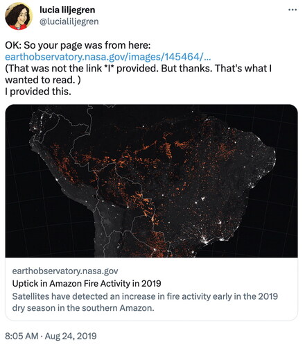
Sometimes maps found their way into conservative media via social media (n = 4). This happened in two primary ways: either a major personality or politician tweeted the map (e.g., Donald Trump, Jr. in Prestigiacomo Citation2019) or in the case of Breitbart, many of their articles often focused on conservative Twitter responses by people who had surprisingly few followers. , for instance, is a tweet by a user who has less than 1,000 followers but their tweet was posted within a story on Breitbart titled “Amazon Fires—A Big, Fat Nothingburger of a #FakeNews Scare Story.” Social media served as a source of some maps in part because maps and other graphics are easily retweeted or shared on these platforms.
Figure 2. Tweet of NASA map included in Breitbart article (Delingpole Citation2019).
Article and Map Content
In this section we elaborate on the content of both the maps and the articles. Specifically, we report on the types of climate change issues covered in the articles and maps, as well as whether the articles denied climate change, and whether they were opinion pieces.
The specific climate change content of these articles and maps was wide ranging and included wildfires (n = 5), hurricanes or cyclones (n = 4), temperature (n = 4), rising sea levels (n = 4), water resources (n = 3), cryosphere (n = 2), precipitation (n = 2), public health and population (n = 2), emissions (n = 1), and vegetation (n = 1). One map did not depict climate change but bolstered an anti-climate-change argument—we elaborate on that particular map in the section “‘Not a Cause for a Cause’: Using Maps That Have Nothing to Do with Climate Change” later in this article. The content of the maps was similar to Fish’s (Citation2020a) findings in the mainstream media with few maps representing climate change causes, and the majority of articles focusing on a wide range of effects. In conservative media, there was far more focus on third-order climate change effects like wildfires and hurricanes, as opposed to first-order effects like temperature change.
As expected, the majority of the articles denied climate change (eighteen of twenty-five); however, there were a few anomalies, the most surprising of all being Fox News. In all of the articles we found published in this conservative news centerpiece (n = 5), they reported on accurate scientific evidence for climate change. For instance, one of the articles, titled “Stunning NASA Study Shows Humans Are Responsible for Major Changes to Earth’s Water Availability,” featured a map of change in terrestrial water storage (Ciaccia Citation2018). The study, originally published in Nature (Rodell et al. Citation2018), was funded by NASA and illustrates how natural variability and climate change due to human activity have changed freshwater storage globally. The maps in the article feature some of NASA’s Data Visualization Studio graphics, which are famous for using bright colors, 3D effects, and animation. The Fox News article explains the study through clear reporting of the facts while also adequately citing the original article and avoiding rhetoric that questions the science. Additionally, InfoWars, conspiracy theorist Alex Jones’s far-right Web site, (which accounted for four of twenty-five articles) also did not outright deny climate change in every article. Two of the four InfoWars articles reported on climate change accurately based on peer-reviewed science promoted by NASA and the CDC. Finally, our one Wall Street Journal article did report on accurate science; however, the Wall Street Journal is known for reporting accurately on science but having commentaries in the Opinion section written by politically conservative personalities (see “AllSides media bias chart” Citation2019).
Overwhelmingly, in our observations, much of conservative media is made up of opinion pieces rather than news, which explains several inconsistencies we saw. News shows and articles must follow journalistic standards for presenting information, whereas opinion shows and articles do not need to adhere to the same reporting guidelines as other journalism. This helps explain the use of maps by Fox News in their coverage of climate change. Their articles containing maps were not opinion pieces so they did not deny climate change. Much of the discourse about Fox News, however, focuses on what is said on the opinion shows, such as Tucker Carlson Tonight. Indeed, Carlson and other prominent conservative personalities feature on some of the most watched shows on the cable channel. Labeling these shows as “opinion” allows them flexibility and the ability to deny climate change without question. This could change, though, given that Fox News recently settled a defamation lawsuit and Tucker Carlson was fired in the process. If we had looked at all articles about climate change (not just those with maps), we might have found a different pattern; however, when maps are used, they are being used in the “news” sections of the Web site to report on climate science, not opinions about climate change.
Although we did not focus our study on the written rhetoric of the articles alone, we did code articles as “clearly opinion” or not, and by the type of logical fallacy that was used. Fifteen of the twenty-five articles were clearly opinion. We noticed several words and phrases that were used consistently in the articles, including so-called, “fake news,” and “conspiracy,” and the use of the term “global warming” instead of climate change. More extreme words were nitwits, closet communists, scam, and panic mongering. Over a third of the articles we assessed focused their rhetoric on particular individuals (n = 11) who are known for their climate activism. This is the use of the logical fallacy “ad hominem” (Almossawi Citation2013), which is where the argument hinges on attacking the person making the argument rather than the argument itself. We explore some of the other common logical fallacies used in the later section “Map Role.”
Map Type and Design
The types of maps in our set were wide-ranging and included both thematic and reference maps. These maps were: raster/isoline (n = 17), point symbol (n = 3; e.g., wildfire hot spots), choropleth (n = 3), cones of uncertainty (n = 1), polygon overlay on imagery (n = 1), cartograms (n = 1), and reference (n = 3). We were surprised by the simplicity of the design of the maps in conservative media compared to wider media (e.g., Fish Citation2020a). This finding is supported by recent literature on disinformation that found that graphics bolstering arguments and providing the most evidentiary support were not deepfakes, but were simple graphics that were highly effective in disinforming when deprived of context (e.g., Brennen, Simon, and Nielsen Citation2021).
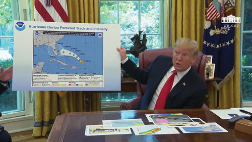
Across the set of maps, we coded for when a map was misleading or not. Only two maps were coded as misleading. The most notable of these was the famous “Sharpie-gate” map. Sharpie-gate occurred when President Trump allegedly used a Sharpie marker to add to the cone of uncertainty for Hurricane Dorian in fall 2019 (). Many speculated that he did this because he wanted to include the state of Alabama in the cone because his earlier tweet included it in the potential danger zone of the impending hurricane. The tweet stated “In addition to Florida - South Carolina, North Carolina, Georgia, and Alabama, will most likely be hit (much) harder than anticipated. Looking like one of the largest hurricanes ever. Already category 5. BE CAREFUL! GOD BLESS EVERYONE!” It is presumed that Trump created the map to save face for this tweet. Despite extensive forms of technology that can be used to make maps, this misleading map was simply altered with a black line, with what appears to be a black permanent marker.
Figure 3. President Trump’s famous “Sharpie-gate” map where it appears that he used a black Sharpie marker to extend the cone of uncertainty to include Alabama to avoid contradicting his earlier tweet, which included the state in the potential danger zone (Stewart Citation2019).
Map Role
We identified five roles the maps served in the articles: (1) maps representing singular events not directly attributed to climate change, (2) maps illustrating cherry-picked science that aligns with conservative agendas, (3) maps that had nothing to do with climate change but were used to bolster the arguments of conservative media about climate change, (4) maps representing accurate science that were featured in accurate reporting, and (5) maps used by conservative media to question the validity of anthropogenic climate change through valid map critique. These roles are not necessarily mutually exclusive; thus, some maps fall into multiple roles.
“False Equivalence”: Singular Events Not Directly Attributed to Climate Change
Conservative media takes advantage of the difficulty in deciphering between weather and climate through using the logical fallacy of “false equivalence.” Maps are used frequently to communicate weather events to the public, and because conservative media rarely makes their own maps, the availability of these maps makes them easy to use to make denial arguments. We found this to be the case in ten of the twenty-nine maps. One example of this was in an article titled “Senate Democrats Schedule Global Warming Hearing Right Before Expected DC Blizzard” (Davis Citation2014). The maps from this article were produced by The Weather Channel and illustrated expected snowfall amounts in the Washington, DC, area ahead of a hearing about climate change in February 2014. The authors of the article mocked the cold weather amidst the climate change hearing, despite that even though global temperatures generally warm, snow will presumably still occur in the northeastern United States in February.
“Incomplete Evidence”: Cherry-Picking
In several cases, it was clear that conservative media had cherry-picked science to align with their agenda (n = 9). Through using the fallacy of “incomplete evidence,” conservative media takes advantage of not supplying all information about climate change and thus can make denial arguments. In one example, a Nature Communications study (Kench, Ford, and Owen Citation2018) indicated that some of the larger atolls in the South Pacific are actually gaining land area despite sea-level rise. Kench, Ford, and Owen (Citation2018) argued that small island nations should consider alternative adaptation beyond relocation because even as small atolls are losing land, some of the larger islands are gaining area. This research was featured in The Daily Wire and generally clearly presented the science; however, it appeared in The Daily Wire because it illustrated a case where the effects of climate change are opposite of what we might expect. The Daily Wire article, however, fails to mention that there is variation in how sea-level rise affects coastal areas. This cherry-picking, depending on how it is framed, also can add to the common claim of conservatives that “climate change is good for us” (Maslin Citation2019).
“Not a Cause for a Cause”: Using Maps That Have Nothing to Do with Climate Change
Although it makes sense for conservatives to purposefully conflate weather with climate change, other maps had nothing to do with anything related to weather or climate. These maps (n = 6) relied on the logical fallacy often referred to as “not a cause for a cause.” This assumes that because two events happen in succession or simultaneously that one must be the cause of the other when, in fact, there is no evidence that a causal relationship exists. For instance, an American Thinker article (Zubrin Citation2016) titled “Where Are America’s Drowned Cities” draws on an article in Gizmodo (Campbell-Dollaghan Citation2013), a centrist media site, titled “Watch Manhattan’s Boundaries Expand Over 250 Years.” The Gizmodo article featured an animated GIF of historic maps of New York City that showed how the size of Manhattan has grown from pre–Revolutionary War size to its current area due to landfill. In the Gizmodo article, there is no mention of climate change. The American Thinker article uses the argument that the size of Manhattan has grown rather than shrunk over the past two centuries. This appears to be opposite of the effect we might witness given sea-level rise. To a scientist, these concepts are far from intertwined. In this American Thinker example, however, because some parts of the shoreline of Manhattan are growing, the author argued, this must stand as evidence that sea levels are not rising.
In addition to that example, two reference maps were used in articles that denied climate change, although the original article containing the map had nothing to do with climate change. In one, a map of the location of the island of Tuvalu originally produced by the Encyclopedia Britannica was used in a Daily Wire article. The article claimed that Tuvalu is growing in size and not shrinking from to sea-level rise. The map, however, did not show a change in size of the island state. The other example from InfoWars included a reference map to show the location of the Atlantic Ocean in an article that stated that there was not an increase in the number and intensity of hurricanes. The map only showed the location of the Atlantic Ocean and illustrated nothing about the number and intensity of hurricanes.
Accurate Maps of Climate Science Used to Accurately Report on Climate Change
Most of the articles denied climate change, but, as we mentioned earlier, there were a few exceptions, including Fox News, The Wall Street Journal, and two InfoWars articles. We classified these maps as bolstering the argument of the article but they did not include any logical fallacies.
Valid Map Critiques from Conservative Media
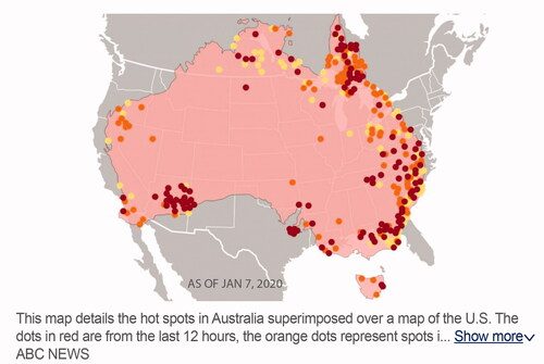
Finally, in one article, conservative media offered a valid map critique to bolster their anti-climate-change argument (Widburg Citation2020). In this example, the original map was created by and featured on ABCNews.com (Zarrell Citation2020) and critiqued on both TownHall (Vespa Citation2020) and American Thinker (Widburg Citation2020; we accounted for this map just once in the data set as being featured in American Thinker with the TownHall article as the intermediary source). The map depicted Australia with points representing locations of fires in early 2020 superimposed over a map of the United States (). The ABCNews.com map aimed to illustrate how extensive the wildfires in Australia were to a U.S. audience. This is problematic, however, because the map used large points, and whether intentional or not, gave the impression that a huge portion of Australia (and, thus for comparison, the United States) was burning. Rather, the points on this map simply denote location and not area; points have no geometrical dimension. Without this clarification, the map is misleading in that it not only shows the locations of wildfires, but also implies that these points represent the area burned in these wildfire events. The American Thinker article claimed the map illustrated fires covering about 25 percent of the U.S. land area, whereas the burned area was actually about the size of Maryland (0.2 percent of the U.S. land area; U.S. Census Bureau n.d.), not 25 percent of the U.S. land area. The conservative articles focused on critiquing ABC News for being “fake news” by saying, “And once again, we have another reason to doubt the talking points about global warming peddled by closet communists masquerading as environmentalists: they make stuff up—like this map.” In some ways, this was justified: The conservative media was correct in their criticism of the cartographic design for being misleading. The cartographer of the original map would have been more successful and less open to critique and criticism from both cartographers and conservatives had they not also included the area of the United States, which thus falsely implied that the sizes of the points were representations of an area.
Figure 4. Map of wildfire hot spots in Australia in early 2020 overlaid on a polygon of North America. The map is confusing because it implies that the fires account for a large portion of land area by using large points to locate fires and conflating them with the areas of the two countries (Zarrell Citation2020).
A Case of Logical Fallacies and Maps Used (Incorrectly) to Deny Climate Change
In this section, we highlight one example to illustrate how conservative media combines the use of a map with logical fallacies to make denial arguments about climate change. In this example, the article uses two logical fallacies to deny climate change. The inclusion of a map bolsters the credibility of both the author and the article through an “appeal to authority,” even as the original map they used presented a scientific representation of wildfire changes over time.
In 2019, Red State published an article by Brandon Morse titled “AOC Blames the California Wildfires on ‘Climate Change,’ but the Internet Isn’t Having It” (Morse Citation2019). Morse’s article was in response to a tweet made by U.S. Representative Alexandria Ocasio-Cortez (AOC) in which Ocasio-Cortez reacted to a picture of California wildfires, stating in a tweet: “This is what climate change looks like. The GOP like to mock scientific warnings about climate change as exaggeration. But just look around: it’s already starting. We have 10 years to cut carbon emissions in half. If we don’t, scenes like this can get much worse. #GreenNewDeal.”
To deny Ocasio-Cortez’s implicit assertion that California wildfires are made worse by the impacts of climate change, Morse first attacked Ocasio-Cortez and then included a screenshot of an interactive map of historic California wildfire locations.
The map was originally made by Hagan and Zentner for California Public Radio (A History of California Wildfires, n.d., ) with data from California Department of Forestry and Fire Protection (CAL FIRE) and the USGS. Morse (Citation2019) framed the map by stating: “This picture … shows an accumulated map of wildfires that date back to 1878 all the way up to 1950. The idea that humans are causing wildfires due to their effect on the planet is incredibly shaky.” Interestingly, the screenshot he chose to include does not actually show what he claimed. In the map, there is a slider bar that allows the map user to filter which fire perimeters are shown on the map based on the year they started. In the screenshot Morse chose to include, the slider indicates that it is showing pre-1950 fires, yet the actual map shows all of the fires recorded in the two data sets (1878–2018). This is evident because the symbolization of the fire perimeters indicates that there are fires from early in the data set (yellow) to the most recent fires in the data set (dark red).
Figure 5. Map of historic wildfire perimeters in California from 1878 to 2018 (“A history of California wildfires” n.d.).
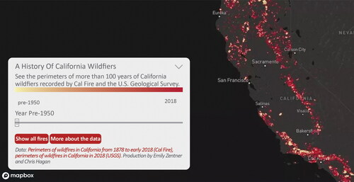
The biggest issue with the inclusion of this map is that it is a screenshot of an interactive map, meaning that map readers cannot interact with it. The lack of interactivity that the original cartographers afforded their users prevents map readers from (1) evaluating change, which is key to seeing the increase in fire size over time, and (2) the ability to click the “More About the Data” button, which offers the users a disclaimer about the limitation of the pre-1950 data.
Beyond the issues with the inclusion of a single screenshot of an interactive map, Morse’s framing of the map reveals a rhetorical strategy that hinges on two logical fallacies: ad hominem and false equivalence. First, Morse used ad hominem to pivot from a data-based argument to the conservative distaste for Ocasio-Cortez. One does not need to critically evaluate the map because the focus is on Ocasio-Cortez, not the spatiotemporal fire data. Second, Morse used false equivalence. Rather than create a map that makes his claim with real (or fabricated) scientific data, he lifted the map out of context, removed the ability for a map user to interact, and falsely claimed that it supported his argument.
The role of the map is not to highlight rebuttal data, for the map does not actually display any. Rather, Morse’s purpose is to boost his credibility by using a graphic that displays data from a reputable source, while criticizing Ocasio-Cortez. In this way, he can focus on Ocasio-Cortez instead of the broader argument that climate change can create conditions for fire disasters. Her tweet can be painted as out of touch and “disgusting” to an audience that considers Ocasio-Cortez to be emblematic of the left, and she can be torn down as an element of that war of figures. It is because Morse knew his audience, and played into their confirmation bias, that he could get away with failing to provide data to prove his point. The map itself serves a marginal, but important, purpose in boosting Morse’s credibility against the “enemy figure” and by providing a visual that actually, when critically analyzed, refutes his point.
Cartographic Silence
Although the previous example illustrates how maps are used alongside logical fallacies, we want to return to the cartographic silence we first identified. Between 2012 and 2020, we found just twenty-nine maps across eighteen sources in contrast to the numerous maps found in previous research on the mainstream media (Fish Citation2020a). We describe this lack of maps produced by conservative media as a cartographic silence. This term has traditionally been used to describe the power the maps have by excluding elements or data (Harley Citation1989). Here we expand the term to describe the absence of maps and the power exerted by failing to include maps. Rather than use visualizations of geographic climate data, conservative media relies on written rhetoric that primarily uses logical fallacies to make arguments engaging confirmation biases of their readers. We expect that televised conservative media would follow these same patterns because they make the same distinctions between opinion and news, although it would be interesting to explicitly evaluate how maps are used in these media to identify whether the same patterns hold true.
This silence is puzzling because amidst the current geospatial revolution, data manipulation and basic mapping are arguably easier than ever. Maps can be produced in a matter of minutes. This feasibility is due, in part, to the increasing free availability of geospatial data, mapping tools and programs, and tutorials. There is potential to create and manipulate data quickly, easily, and without oversight (although there is a wide range of usability of these tools). In addition, data journalism is increasing in popularity (Kohnstamm n.d.) whereby the media creates often visual depictions of data to make its arguments. Despite the ability to quickly produce persuasive maps that could be used to refute claims from climate scientists, environmentalists, and the left, conservative media has largely disregarded the opportunity to produce its own persuasive “counter-maps” (Louis, Johnson, and Pramono Citation2012; Dalton and Stallmann Citation2018).
This cartographic silence poses the question: Why would conservative media choose not to produce maps to align with their arguments? We argue here because identification with a particular political party accounts more than any other variable for acceptance or denial of climate change science (e.g., Hornsey et al. Citation2016; Wong-Parodi and Feygina Citation2020), conservative media does not need to make sound arguments that rely on real (or even fake) data and visualizations. The media, conservative or otherwise, instead can rely on the confirmation bias of their readers.
The map silence we observed across conservative media illustrates the power these media sources exert on their readers in two ways: First, the polarization of the U.S. public is reflected in those of different political ideologies consuming vastly different news sources (Mitchell et al. Citation2014), which allows media sources the opportunity to be trusted by their readership even while failing to provide evidence. Second, the larger false equivalence across all media of “two sides” results in the mainstream media reporting on conservative media, social media posts by conservative personalities, and even conservative blogs that give power to these opinions. This is evident in our study, where most of the articles we evaluated did not report on news, but instead presented opinions about the news. Although data can be manipulated and maps can be fabricated, there is little purpose in using these visualizations because writing is effective enough through relying on the confirmation bias of their audience.
As a growing number of Americans not only acknowledge that climate change is happening but also that it is a result of human fossil fuel burning (Goldberg et al. Citation2021; Leiserowitz et al. Citation2022), it will be interesting to watch how different media change how they use data and visuals in reporting on climate change. Nonconservative media currently use data science, maps, and other visualizations to legitimize their arguments, which are fundamentally supported by science and the overwhelming agreement by climate change scientists about the fundamentals of that science. As Americans’ beliefs, attitudes, and discourse change over time, how maps are used might also morph. Currently the Republican Party is grappling with how to deal with the topic of climate change on a broader scale (Friedman Citation2021). It is clear from our study that conservatives are disorganized in how they talk about and engage with climate change, especially when their reporting contains maps. Their beliefs do not align with the data and thus different sources and authors report on it differently. This is evident in the diversity of roles the map serves in conservative reporting, from the use of maps for valid reporting to the use of maps alongside logical fallacies. This disorganization adds to the power conservative media has in presenting opinions about climate change as opposed to news about science. How data science, maps, and other visualizations are used across the ideological spectrum of media might, as Culcasi (Citation2006) showed in her study, change as discourse changes.
Conclusion
In this article we used content and discourse analysis to understand how conservative media uses maps in their discourse on climate change. Maps are typically a common visual used in mainstream media on climate change; however, our study revealed that conservative media does not use maps to the same extent or in the same ways. First, we found far fewer maps in conservative media compared to what previous studies have found in mainstream media (e.g., Fish Citation2020a). We extended Harley’s (Citation1988) term “cartographic silence” to describe this absence of maps as an illustration of the power these media exert on their readers. Conservative media sources are able to garner support for their arguments even while failing to use valid science or scientific map visualizations. Second, the maps we did find in conservative media were reframed from a purely scientific display of data to a persuasive counterargument against valid climate change science by pairing maps with logical fallacies. Sometimes this happened in the form of cherry-picking or focusing on singular weather events to create a persuasive argument without relying on data. Finally, we also observed that some sources (e.g., Fox News, the Wall Street Journal, and occasionally InfoWars) used valid maps to accompany valid peer-reviewed science.
Our findings are surprising, especially given the fear that technology-driven disinformation can be so easily created to confuse and misinform. Our research shows that even though the technology exists to doctor geographic information systems (GIS) data, conservative media does not use maps in this way. Instead, relying on confirmation biases of their readers, they often use logical fallacies and rarely need to use maps to convey their messages. In addition, when maps are used, they become a way to boost the credibility of the author through their “appeal to authority,” even though the original maps they used often are reproduced from valid peer-reviewed articles or government-produced science. This then begs the question of how scholars can avoid having their maps misused to bolster denialist claims. Here we provide six key takeaways for those creating maps of climate change effects.
1. Create maps that can stand alone without the article or caption. We observed that often graphics are taken out of context to be used alongside false information. Graphics from peer-reviewed articles are now easily separated from the original article. Not only are articles published as they become available and journal issues serve less purpose, but images are indexed separately from article text. You need to assume when creating a graphic that a reader might not read the article, caption, and map at the same time. Thus, you should provide a clear legend on the map that does not force the map reader to read the caption or article text. Acronyms need to be defined within maps (as well as in the text and caption) and connections need to be made explicit on the graphic. This might feel redundant, but if maps can stand on their own without being misinterpreted, there is less potential for a graphic to be misused.
2. Check to make sure your map does not suggest relationships with your representation that do not exist. One of the first maps we encountered in this project was , which suggested that fires in Australia accounted for a very large area that was then superimposed on a polygon of the United States. This map was critiqued and criticized in two conservative media outlets for valid cartographic reasons, but it allowed conservative media and climate change deniers an opportunity to also criticize the science of climate change due to a misrepresentation within the map. Seeking out research on cartographic best practices (Tip 5) can help, but also getting feedback from colleagues, friends, and family throughout the map-making process can help avoid illustrating relationships that do not exist.
3. Make clear within a map that something is a singular weather event or a climatic change. It was clear from this study that depictions of weather events are often used for climate change denial. Although this is hard to prevent, it is important to avoid implying that singular weather events are attributed to climate change without the associated attribution science to support these claims.
4. Be careful when creating maps of surprising climate change effects. In a few cases we saw that conservative media cherry-picked science to fit their agenda. This happened when a map illustrated a climate change effect that either was positive for society or opposite of what is expected. When individual research studies have these types of findings, it should be made clear in the map that a particular event is related to larger global climate change. There are many effects of climate change that could be viewed as positive for society, but it is important for researchers to be ethical in how they are portraying these impacts in the larger context of far more numerous negative impacts.
5. Seek out cartographic research and integrate cartographic best practices. There are numerous texts on cartographic research and best practices for design, as well as individual blogs and conferences. Both the North American Cartographic Information Society Conference and the International Cartographic Association’s Conferences are great places to get started. These organizations also sponsor academic journals: Cartographic Perspectives, Cartography & Geographic Information Science, the International Journal of Cartography, Cartographica, and The Cartographic Journal. In addition, the Web sites for these organizations also provide links to other sources for individuals to expand their cartographic knowledge.
6. Focus your map around just one story or concept. Disinformation creators can create a new story if your story is not clear in your map. Do not feel the need to put everything in your map, and instead focus your map around one story in your data. This is how the best cartographers at mainstream media outlets create their maps (Fish Citation2020b) and it is good practice for everyone. For instance, the ABC News map () was criticized in conservative media because it tried to tell too many stories.
There are ways to avoid maps being misused, but many of the maps we found were well designed and did not imply relationships where they did not exist. In a world where digital content can be republished and shared across the Web with ease, there will always be a misuse of maps. The general lack of maps we found in conservative media presents some hope, however. Although there are hundreds of maps of climate change that do illustrate climate change, very few are misused as a part of conservative rhetoric. Larger issues remain, such as the U.S. public consuming vastly different news sources, which allows media sources of particular ideologies to get away with presenting inaccurate climate change information alongside scientific visualizations.
We hope that illustrating how conservative media uses maps in their arguments will shed light on the ways we can counter disinformation in maps about climate change. Drawing attention to the logical fallacies conservative media uses amidst credible critiques and accurate reporting of science is an important step toward understanding and thus combating disinformation on climate change that relies, in part, on maps designed with truthful intentions.
Additional information
Notes on contributors
Carolyn S. Fish
CAROLYN S. FISH is an Assistant Professor in the Department of Geography, University of Oregon, Eugene, OR 97403. E-mail: [email protected]. Her research interests include how maps are used in the communication of climate change, and how to improve climate change communication through map design.
Katie Quines Kreitzberg
KATIE QUINES KREITZBERG is a Law Student at Stanford Law School, Stanford University, Stanford, CA 94305. E-mail: [email protected]. Her research interests lie at the intersection of geography, technology, speech, and the law. She holds bachelor’s degrees in spatial data science and geography from the University of Oregon.
References
- A history of California wildfires. n.d. Capradio.org. Accessed September 16, 2021. http://projects.capradio.org/california-fire-history.
- AllSides media bias chart. 2019. AllSides. Accessed February 21, 2019. https://www.allsides.com/media-bias/media-bias-chart.
- Almossawi, A. 2013. An illustrated book of bad arguments. New York: The Experiment.
- Bauer, A. J., and A. Nadler. 2020. Taking conservative news seriously. In News on the right: Studying conservative news cultures, ed. A. Nadler and A. J. Bauer, 1–16. New York: Oxford University Press.
- Bickley, J. 2018. Study: These islands “sinking” from global warming are actually growing in size. Daily Wire, February 9. Accessed July 10, 2023. https://www.dailywire.com/news/study-these-islands-sinking-global-warming-are-james-barrett.
- Boberg, S., T. Schatto-Eckrodt, T. Quandt, and L. Frischlich. 2020. Pandemic populism: Facebook pages of alternative news media and the corona crisis—A Computational Content Analysis. Muenster Online Research Working Paper 1/2020, Munster, Germany.
- Brennen, J. S., F. M. Simon, and R. K. Nielsen. 2021. Beyond (mis) representation: Visuals in COVID-19 misinformation. The International Journal of Press/Politics 26 (1):277–99. doi: 10.1177/1940161220964780.
- Campbell-Dollaghan, K. 2013. Watch Manhattan’s boundaries expand over 250 years. Gizmodo, May 9. Accessed July 10, 2023. https://gizmodo.com/watch-new-york-city-s-boundaries-expand-over-250-years-496440467.
- Ciaccia, C. 2018. Stunning NASA study shows humans are responsible for major changes to Earth’s water availability.. Fox News, May 18. Accessed July 10, 2023. https://www.foxnews.com/science/stunning-nasa-study-shows-humans-are-responsible-for-major-changes-to-earths-water-availability.
- Crampton, J. W., and J. Krygier. 2006. An introduction to critical cartography. ACME: An International E-Journal for Critical Geographies 4(1):11–33.
- Culcasi, K. L. 2006. Cartographically constructing Kurdistan within geopolitical and orientalist discourses. Political Geography 25 (6):680–706. doi: 10.1016/j.polgeo.2006.05.008.
- Dalton, C. M., and T. Stallmann. 2018. Counter-mapping data science. The Canadian Geographer/Le Géographe Canadien 62 (1):93–101. doi: 10.1111/cag.12398.
- Davis, S. 2014. Global warming hearing scheduled right before expected D.C. blizzard. The Federalist, February 11. Accessed July 10, 2023. https://thefederalist.com/2014/02/11/senate-democrats-schedule-global-warming-hearing-right-before-expected-d-c-blizzard/.
- Delingpole, J. 2019. Delingpole: Amazon fires—A big, fat, nothingburger of a #FakeNews scare story. Breitbart, August 26. Accessed July 10, 2023. https://www.breitbart.com/europe/2019/08/26/delingpole-amazon-fires-big-fat-nothingburger-fakenews-scare-story/.
- Fallis, D. n.d. A conceptual analysis of disinformation, 8. Accessed July 10, 2023. https://core.ac.uk/download/pdf/4824096.pdf.
- Fish, C. S. 2020a. Cartographic content analysis of compelling climate change communication. Cartography and Geographic Information Science 47 (6):492–507. doi: 10.1080/15230406.2020.1774421.
- Fish, C. 2020b. Storytelling for making cartographic design decisions for climate change communication in the United States. Cartographica: The International Journal for Geographic Information and Geovisualization 55 (2):69–84. doi: 10.3138/cart-2019-0019.
- Fish, C. S., and K. Q. Kreitzberg. 2023. Climate change maps in the conservative media 2012–2020 & content analysis. University of Oregon Scholars’ Bank. doi: 10.7264/jkfy-2s09.
- Friedman, L. 2021. Some republicans find failure to grapple with climate change a “political liability.” The New York Times, June 23. Accessed July 10, 2023. https://www.nytimes.com/2021/06/23/climate/climate-change-republicans.html.
- Goldberg, M. H., S. A. Gustafson, A. Rosenthal, and A. Leiserowitz. 2021. Shifting Republican views on climate change through targeted advertising. Nature Climate Change 11 (7):573–77. doi: 10.1038/s41558-021-01070-1.
- Griffin, A. L. 2020. Trustworthy maps. Journal of Spatial Information Science 2020 (20):5–19. doi: 10.5311/JOSIS.2020.20.654.
- Hameleers, M., T. G. Powell, L. Van Der Meer, and T. E. Bos. 2020. A picture paints a thousand lies? The effects and mechanisms of multimodal disinformation and rebuttals disseminated via social media. Political Communication 37 (2):281–301. doi: 10.1080/10584609.2019.1674979.
- Harley, J. B. 1988. Silences and secrecy: The hidden agenda of cartography in early modern Europe. Imago Mundi 40 (1):57–76. doi: 10.1080/03085698808592639.
- Harley, J. B. 1989. Deconstructing the map. Cartographica: The International Journal for Geographic Information and Geovisualization 26 (2):1–20. doi: 10.3138/E635-7827-1757-9T53.
- Hornsey, M. J., P. G. Harris, K. S. Bain, and E. A. Fielding. 2016. Meta-analyses of the determinants and outcomes of belief in climate change. Nature Climate Change 6 (6):622–26. doi: 10.1038/nclimate2943.
- Kench, P. S., S. D. Ford, and M. R. Owen. 2018. Patterns of island change and persistence offer alternate adaptation pathways for atoll nations. Nature Communications 9 (1):605. doi: 10.1038/s41467-018-02954-1.
- Kohnstamm, T. n.d. Show, don’t tell. Microsoft Stories. Accessed September 16, 2021. https://news.microsoft.com/stories/data/.
- Leiserowitz, A., E. Maibach, S. Rosenthal, J. Kotcher, L. Neyens, J. Marlon, J. Carman, K. Lacroix, and M. Goldberg. 2022. Global warming’s six Americas, September 2021. Yale Program on Climate Change Communication. New Haven, CT: Yale University and George Mason University.
- Louis, R. P., A. H. Johnson, and J. T. Pramono. 2012. Introduction: Indigenous cartographies and counter-mapping. Cartographica: The International Journal for Geographic Information and Geovisualization 47 (2):77–79. doi: 10.3138/carto.47.2.77.
- Lynas, M., S. Houlton, and B. Z. Perry. 2021. Greater than 99% consensus on human caused climate change in the peer-reviewed scientific literature. Environmental Research Letters 16 (11):114005. doi: 10.1088/1748-9326/ac2966.
- Maslin, M. 2019. The five corrupt pillars of climate change denial. The Conversation, November 28. Accessed July 10, 2023. http://theconversation.com/the-five-corrupt-pillars-of-climate-change-denial-122893.
- McNeil, B. E., and K. L. Culcasi. 2015. Maps on acid: Cartographically constructing the acid rain environmental issue, 1972–1980. The Professional Geographer 67 (2):242–54. doi: 10.1080/00330124.2014.922016.
- Mitchell, A., J. Gottfried, J. Kiley, and K. E. Matsa. 2014. Political polarization & media habits. Washington, DC: Pew Research Center. Accessed July 10, 2023. https://www.pewresearch.org/journalism/2014/10/21/political-polarization-media-habits/.
- Monmonier, M. 2018. How to lie with maps. Chicago: University of Chicago Press.
- Morse, B. 2019. AOC blames the California wildfires on “climate change” but the Internet isn’t having it. Redstate.com. Accessed August 1, 2022. https://redstate.com/brandon_morse/2019/10/28/aoc-blames-california-wildfires-climate-change-internet-isnt-n118705.
- Muehlenhaus, I. 2014. Going viral: The look of online persuasive maps. Cartographica: The International Journal for Geographic Information and Geovisualization 49 (1):18–34. doi: 10.3138/carto.49.1.1830.
- Oreskes, N., and E. M. Conway. 2010. Merchants of doubt. New York: Bloomsbury.
- Prestigiacomo, A. 2019. Don Jr. posts Greta Thunberg gif in reaction to Thanksgiving travel report. Daily Wire, November 28. Accessed July 10, 2023. https://www.dailywire.com/news/don-jr-posts-greta-thunberg-gif-in-reaction-to-thanksgiving-travel-report.
- Robinson, A. C. 2019. Design, dissemination, and disinformation in viral maps. In Abstracts of the International Cartographic Conference, Vol 1. Tokyo, Japan: International Cartographic Association. Accessed August 7, 2022. doi: 10.5194/ica-abs-1-314-2019.
- Rodell, M., D. N. Famiglietti, J. T. Wiese, H. K. Reager, F. W. Beaudoing, M.-H. Landerer, and J. S. Lo. 2018. Emerging trends in global freshwater availability. Nature 557 (7707):651–59. doi: 10.1038/s41586-018-0123-1.
- “Sinking” Pacific nation is getting bigger: Study. 2018. Phys.org, February 9. Accessed July 10, 2023. https://phys.org/news/2018-02-pacific-nation-bigger.html.
- Stewart, E. 2019. The incredibly absurd Trump/CNN Sharpiegate feud, explained. Vox, September 6. Accessed July 10, 2023. https://www.vox.com/policy-and-politics/2019/9/6/20851971/trump-hurricane-dorian-alabama-sharpie-cnn-media.
- Treen, K. M d.’I., S. J. Williams, and H. T. O’Neill. 2020. Online misinformation about climate change. Wiley Interdisciplinary Reviews: Climate Change 11 (5):e665.
- U.S. Census Bureau. n.d. Census.gov. Accessed September 27, 2022. https://www.census.gov/en.html.
- Vespa, M. 2020. The funny part about ABC News “Absurd” Australia wildfire map that was dragged for its stunning inaccuracy. Townhall, January 7. Accessed September 1, 2021. https://townhall.com/tipsheet/mattvespa/2020/01/07/abc-news-fire-map-n2559060.
- Wardle, C. 2018. Fake news: It’s complicated. First Draft Footnotes, December 10. Accessed July 10, 2023. https://medium.com/1st-draft/fake-news-its-complicated-d0f773766c79.
- Widburg, A. 2020. The disastrous fires in Australia are man-caused, but they’re not climate change. American Thinker, January 8. Accessed September 1, 2021. https://www.americanthinker.com/blog/2020/01/the_disastrous_fires_in_australia_are_man_caused_but_theyre_not_climate_change.html.
- Wong-Parodi, G., and I. Feygina. 2020. Understanding and countering the motivated roots of climate change denial. Current Opinion in Environmental Sustainability 42 (February):60–64. doi: 10.1016/j.cosust.2019.11.008.
- Zarrell, M. 2020. Using U.S. map to examine scale of massive Australia wildfires. ABC News, January 7. Accessed July 10, 2023. https://abcnews.go.com/International/us-map-examine-scale-massive-australia-wildfires/story?id=68102703.
- Zubrin, R. 2016. Where are America’s drowned cities. American Thinker, April 20. Accessed September 1, 2021. https://www.americanthinker.com/articles/2016/04/where_are_americas_drowned_cities.html.