 https://orcid.org/0000-0002-2280-3539
Abstract
Cascading Style Sheets (CSS) express the visual design of a website through code and remain an understudied area of web history. Although CSS was proposed as a method of adding a design layer to HTML documents early on in the development of the web, they only crossed from a marginal position to mainstream usage after a long period of proselytising by web designers working towards “web standards”. The CSS Zen Garden grassroots initiative aimed at negotiating, mainstreaming and archiving possible methods of CSS web design, while dealing with varying levels of browser support for the technology. Using the source code of the CSS Zen Garden and the accompanying book, this paper demonstrates that while the visual designs were complex and sophisticated, the CSS lived within an ecosystem of related platforms, i.e., web browsers, screen sizes and design software, which constrained its use and required enormous sensitivity to the possibilities browser ecosystems could reliably provide. As the CSS Zen Garden was maintained for over ten years, it also acts as a unique site to trace the continuing development of web design, and the imaginaries expressed in the Zen Garden can also be related to ethical dimensions that influence the process of web design. Compared to Flash-based web design, work implemented using CSS required a greater willingness to negotiate source code configurations between browser platforms. Following the history of the individuals responsible for creating and contributing to the CSS Zen Garden shows the continuing influence of layer-based metaphors of design separated from content within web source code.
1. Introduction
The definitions of ‘web design’ form part of the nascent history of the web and so exploring these further offers unique insights and understanding into this emerging field. The case of Cascading Style Sheets (CSS), and in particular, the way an emerging community of web designers succeeded in defining, negotiating, and mainstreaming the practical use of CSS attests to that. CSS was one of several early approaches to solving the problem of specifying the visual design of HTML pages on the web. The early implementations of CSS in browser software offered only limited control over the visual design of a web page. In addition, it was established that the same code might be displayed in very different ways by various web browsers. In the early 2000s, a comparison of the possible interactions and designs in websites built using Macromedia (later Adobe) Flash (Ankerson, Citation2018) and those built with HTML and CSS demonstrated clear variations in the possibilities offered through software for user interaction and page design. Other sources pointed to the need for exhaustive testing to ensure that websites built with HTML and CSS displayed as desired by the designer in all web browsers available at that time (Zeldman, Citation2001).
In the web ecosystem, the three web site design languages: Hypertext Markup Language (HTML) for content, CSS for layout, and JavaScript for interaction, have outlived Flash (Maemura et al., Citation2018). Indeed, as this paper suggests, as we continue to seek to contextualize and conceptualize “web design” and “web history”, CSS offers unique cues about it. Specifically, the antecedents of CSS, the formulation of the language, implementations in browsers, the web designs created with it, the imaginaries that still guide its development, and the community of practice that consolidated around it, mirror and evidence an important part of the emergence and evolution of web history. With this in mind, the objective of this paper is to examine specific aspects of CSS, once viewed as a marginal technology, but today the mainstream method to describe web pages’ visual design. To this end, the evolution of CSS, the ecosystems and constraints to its development, seen as an important part of the emerging history of the web, are examined through the lens of the CSS Zen Garden. The latter began as a spontaneously established online community of web designers, an essentially grassroots initiative aimed at negotiating, mainstreaming and archiving CSS practices.
A number of insights into the the visual design of websites has been published over the past decade (Engholm, Citation2007). This paper focuses on CSS and its evolution, recognizing of course that in the past discussions on web history have tended to centre on HTML as the container for the content of the site (Brügger, Citation2018; Zeldman, Citation2001, p. 127)). The practices of writing CSS and Java Script have received less attention, not only due to the challenges relating to archiving them.
Research into CSSZG and the investigation of changes to its website and source code over its unusually long time online – from 2003 onwards to date – reveal practices in both the source code and discourse surrounding the construction of the website. These relate to the history of web design, the processes of website creation and the consolidation of the specific role of “web designer”. The reminder of this paper will address the following questions:
What aspects of CSS-based web design relate to the values and ethics of a community of web designers?
How does the CSSZG reveal the challenges that web designers faced in making it a mainstream practice to use CSS in web design? Where did these difficulties originate, and how were they solved?
Can the source code of contributions to CSSZG be “read”? What can a close reading of CSS code reveal about web design process and practices?
Did CSSZG contribute to or define a particular form of web design and designer?
The discussion shall be structured as follows. A brief literature review is outlined in the next section. Subsequently the materials used, and methods of investigation employed are highlighted. The results, discussion and concluding sections follow.
2. Literature review
2.1. Web design, web designers and the history of the web: an outline of the debate
The profession of web design has only existed for two decades. Earlier work shows how the role of “web designer” was created and defined, while later work shows the tensions of being a web designer: too much work and the need to “keep up” as technologies and practices change. More recently, Kennedy (Citation2012) documents the values and ethical frameworks that govern web designer practices and processes, including those values that led to the creation of the CSSZG. In this context web workers’ blogs and campaigns are conceived as negotiations with platforms and corporations (for example, browser manufacturers like Netscape or Microsoft), from which their work is inseparable. Others have looked at the discussions and definitions of accessibility and how it relates to web designers’ practice and discourse (Ellcessor, Citation2014). “Inspirational” sites following the case of CSSZG, built by web designers to collect design ideas (e.g. Dribbble.com), have been explored: the finding is that such sites function as viral spreaders of design elements (Hemsley & Kelly, Citation2019).
More widely, relevant to this topic is the work on (creative) communities. Wenger describes the “communities of practice” that form spontaneously as a way of discussing and solving problems (Wenger, Citation2008). Kelty’s (Citation2008) work on open source software develops the idea of a “recursive public”, involved in building concrete solutions in code to perceived problems, and the usefulness of being a polymath – able to call on a wide range of solutions – when working on software problems. Becker’s (2008) work on “art worlds” also sets out and examines the relationships between creators and the social world that defines them.
What web designers create has less often been the subject of academic study. Engholm (Citation2002, Citation2007, Citation2010) has pointed out shifting styles that have been adopted and abandoned by web designers during the last two decades. Ankerson’s work (Ankerson, Citation2009, Citation2018) looks more deeply into the professionalisation of web design, the contexts of web design and the affordances of web design software (particularly Macromedia/Adobe Flash). Specific features of web design for user-generated content (or “Web 2.0”) have been identified that relate to the complexity of designing for unknown content, the split between content and design, and the rise of templated designs that offer the user little control (Arola, Citation2010; Gallagher, Citation2015).
While there has been work on defining web designers and web design, much less has been written – outside of industry publications, where there is an enormous body of practical explanation – on the development, history and adoption of CSS by the web. Most closely related is the work on examining source code and the ecosystems in which it is configured. For example, Helmond’s work finds HTML tags to be ever-more closely connected with the rise of commerce (Helmond, Citation2019), and that JavaScript tracking code is allowing platforms such as Facebook to “capture” and surveil more and more of the web (Helmond et al., Citation2019).
Related to this work on source code is a growing body of work that looks at source code as a language, like any other, and how code can act as rhetorical speech, arguing persuasively for methods and styles of defining and implementing actions for a computer to perform (Brock, Citation2019). ‘Critical code studies’ seeks to trace the meaning of code, performing critical readings of source code and its wider meanings in society (Marino, Citation2020). Source code must – at some point – be readable by humans and be as responsive to any other form of speech as a way of encoding values and ideas. Couture looks at how a computer language such as PHP “encodes” the beliefs and values of its creators into a socio-technical assemblage (Couture, Citation2019). This work is linked to Brock’s (Citation2019) and Couture’s (Citation2019) definition of source code and code as rhetorical speech, alongside the specifically web-design related work by Kennedy (2011) on the ethical values of web professionals and that of Ankerson (Citation2018: particularly chapters 3 & 5) on processes and software related to web design.
3. Materials and methods
In this section the case of the CSS Zen Garden is introduced in more detail to eventually justify the materials collected and used for the analysis in the paper. Then, the research methods employed for the investigation are discussed.
3.1. The CSS Zen Garden: consolidating a community of practice
Investigating the history of the Zen Garden reveals that a “website” needs to be considered as a series of live and archival sources, each requiring evaluation and preparation prior to study. This section recounts the development and formation of the current state of the CSSZG available for analysis in this article, together with the computational processes to analyse it.
By the early 2000s, code that could interpret CSS had been incorporated into most web browsers. CSS had gained a reputation for being difficult to use and lacking important features (Zeldman, Citation2001). However, it did have promise, considered to be a language that could give web pages “the widest content accessibility, while allowing for precise visual control” (Shea & Holzschlag, Citation2005, p. 12). This dual focus on a visual design layer connected to access to the underlying HTML shows the evaluation of potential web technologies in Kennedy’s conception of the values and ethics of “standards-based” web designers (Kennedy, Citation2012).
Based on this promise, Dave Shea, a blogger with a “background in both coding and visual arts” (Shea & Holzschlag, Citation2005, p. 13), created the CSSZG as a side or hobby project (unpaid ‘side projects’ could be said to reflect the values of web designers: see Gill (Citation2010)). He was inspired by previous demonstrations of the value of CSS with the aim of creating “a central repository of great CSS design work” (ibid.Shea & Holzschlag, Citation2005: p. 13). Shea’s idea was to create a single, immutable HTML web page, then invite designers to send him a CSS file (and related assets) to style this page to show the “potential of CSS as a design language” (ibid.).
Shea’s first version of the CSSZG was launched on 7 May 2003, with five designs by him, and it immediately gained traction in the web design community of practice. Importantly, Shea retained the final say over which designs were “official submissions”. While there was no specific definition of what counted as “worthy”, Shea wrote: “[g]ood submissions are designs that feature creative and refined visuals, interesting […] themes, great use of layout and typography principles, or a number of other indescribable factors” (Shea & Holzschlag, Citation2005, p. 282). This meant that Shea kept control over which submissions were seen – both in terms of visual design and the code that implemented them – by the vast majority of visitors to the site. From the initial five “official” designs, the success and importance of the Zen Garden can be seen by counting the number of voluntarily submitted designs added to the site by year ().
Table 1. “Official designs” added to the CSS Zen Garden.
Though the site remained online, no new designs were added to the CSSZG between 2007 and 2013. Web designers had moved onto solving new problems: the CSSZG had fulfilled its function of advocating for and educating designers in the processes and code to create single webpage designs with CSS. In 2013, to celebrate the CSSZG’s tenth anniversary, the HTML code was updated and a small number of invited designs were added. This leads us to consider the CSSZG source code in two phases: Phase 1, 2003–2007; and Phase 2, the final upload of eight designs in 2013.
3.2. Materials and the research model
Nearly two decades after its launch the CSSZG website is still online, and over this time it has created a complex assemblage. For our purposes, this includes:
The current live CSSZG website, with 218 official submissions between 2003 and 2013.
Archived versions of the CSSZG website, with varying numbers of submissions and different versions of the underlying HTML file.
Archived versions of the blog kept by Shea, mezzoblue.com, which went offline early in 2020. This lists unofficial submissions and relevant data on official submissions that can be retrieved only from web archives.
The live GitHub repository created by Shea, https://github.com/mezzoblue/csszengarden.com. This holds the website’s source code and that of the 218 official submissions.
Any archived versions of the CSS and related files for the 1037 unofficial submissions which never became part of the CSSZG website or GitHub repository.
The book, The Zen of CSS Design (Shea & Holzschlag, Citation2005), which describes how some official submissions were designed and built. This was published by New Riders, a popular destination for professional web design authors in the early 2000s.
Each of these contributes towards the corpus of files and folders that are part of this study. One possible option is to write code to iterate over each submission and download all the files that make up the live CSSZG website. However, an investigation of the current public GitHub repository in detail reveals that some extra files cannot be retrieved using this method. As the browser versions and hacks required when the website was launched are now considered obsolete, the book provides useful background on the ecosystem and thought processes of the designers at that time.
3.3. Methods used to study the source code
Analysis of the source code began by downloading the GitHub repository content and running a series of PHP scripts on the code as proof of concept, for example to establish the number and type of images or to compare historical changes to Shea’s HTML page to be styled by designers. To find examples of specific CSS practice, the entire repository was loaded into Visual Studio Code, a text editor, to use “search in files”.
Inspired by Gerlitz and Helmond’s work on Facebook’s use of tracking technology (Gerlitz & Helmond, Citation2013), a “modern” open-source CSS analyser built by Project Wallace (CSS-Analyzer, 2017/2021) was employed for in-depth analysis of the official submissions’ CSS files. The analyser produces JSON output, which contains a wealth of data on the CSS file, including its use of selectors, its properties and its overall complexity.
The first step in the analysis was to separate the files by year: 2003, 2004, 2005, 2006 and 2007 for the first phase; and the final 2013 upload for the second phase. In some situations multiple CSS files were imported together to create an overall design: these were collected into a single CSS file. Project Wallace software analysed one file for each entry in the GitHub repository and created a JSON file of results data. All results files were then analysed and aggregated, where necessary, using custom PHP scripts. This formed the basis of the analysis of the “official” Zen Garden submissions.
3.4. Retrieving the unofficial entries
Apart from the official submissions comprising the focus of the CSSZG, a list of at least 1037 unofficial submissions was created by reviewing the archived mezzoblue blog. While the mezzoblue blog gave public recognition of these rejected entries, their images and CSS files were not archived by Shea as part of the CSSZG source code. The CSSZG code retrieved assets from the original designer’s web hosting to display the design, meaning that many of these files are no longer online. To attempt to retrieve them, this study wrote code to assemble a final list of rejected entries from the mezzoblue website, then queried the Internet Archive API to see if the CSS file had been archived, retrieving it if it had. While some CSS files were successfully retrieved, fetching the images referenced in the archived CSS proved more complex, meaning that the complete intended visual design cannot currently be reconstructed.
4. Analysis and results
The collection of all source code available for the CSSZG, in particular the results of analysis of the CSS files, allows us to begin considering the site’s contribution to web design history.
4.1. Analysis of the HTML styled by the CSS
After Shea made his inaugural contribution to the CSSZG of the HTML file, which all designers used as the basis of their design, there were 123 changes. These date from the first version of the code archived at the csszengarden.com address in Phase 1 to the current live version in Phase 2. They include:
Shifts that relate to infrastructure and specifications. For example, the HTML doctype changes from XHTML 1.0 Strict to HTML5, while the character set changes from ISO-8859-1 to UTF-8, reflecting the use of more universal encoding for international writing systems within web browsers. JavaScript code was added to encourage older browsers to render HTML5 elements correctly. The CSS files are now linked to the HTML by a < link > tag instead of a < style > and @import rule. The earlier form ensured that very old browsers would not attempt to display “complex” CSS.
Shifts that relate to devices and platforms. A meta viewport tag – created by Apple Computer – was added, allowing mobile devices such as the iPhone to recalculate the visual layout of the page to suit their smaller screens (Hockenberry, Citation2007). JavaScript code is used to import typefaces from Typekit, a third-party webfont platform (now owned by Adobe).
Shifts that relate to the intended audience of the website in the text content and both the HTML and CSS source code. HTML comments in the source code change, and the copy presented to the site’s visitors alters in view of standardisation of roles and terms in the web design process.
These source code changes reflect wider movements in the development of web technologies between 2003 and 2013. Changes in the HTML tend to dictate changes in the related CSS, and this is discussed in a later section.
4.2. Analysis of the CSS files of the CSSZG
The JSON files created by Project Wallace are summarised in the following tables ().
Table 2. Use of CSS properties and hacks in official submissions, by year.
4.2.1. Use of CSS properties
CSS is written by assigning “values” to “properties” for particular “selectors”: for example, p {color: red;} will select the text in all HTML paragraphs on a web page and set the property of colour to the value ‘red’. The table shows that the properties most used are consistently are background, width, color (to change the text colour), margin and padding (to create white space). In Phase 1 an average of 69 properties were used in official stylesheets; in Phase 2 the number doubled, from 99 to 184 ().
Table 3. Top 40 properties in official submissions in Phase 1 and 2.
4.2.2. Use of pixel dimensions
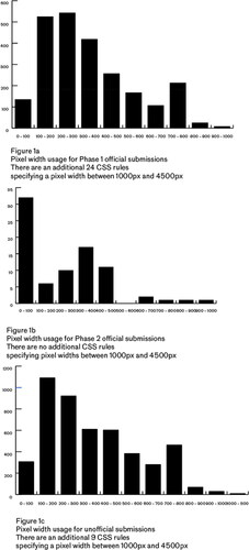
In Phase 1 it is common to see dimensions specified in pixels (e.g. div {width: 500px;}). PHP code, using regular expressions, can be used to retrieve all widths specified by designers. For Phase 1 (see ), the graph’s peak is for dimensions of around 300 to 400 pixels, followed by a lesser spike between 700 to 800 pixels. In Phase 2, there are very few pixel dimensions (see ) that specify widths of greater than 500px (from a smaller sample size).
Figure 1. a, b and c. Pixel-width dimensions specified in CSS files.
4.2.3. Browser “hacks” and browser negotiations in the code
In both phases the Project Wallace software reports “hacks”, or code used intentionally to hide or show CSS instructions to particular web browsers. It is worth investigating these further, as they have been employed in CSSZG source code in many ways to negotiate how very specific browser software (e.g. Macintosh OS Internet Explorer 5.1) interpret parts of CSS. Hacks are also carefully defined and described in the accompanying CSSZG book. Their use to show or hide code to the “target” browser is very different from that in web designs created with Macromedia Flash, where the browser becomes little more than a host for the Flash plug-in. In Phase 2 the use of “browser prefixes”, a method of implementing competing versions of new CSS specifications, is seen. An example is the “transform” property, found in CSS as “-webkit-transform”, “-moz-transform”, “-ms-transform” and “-o-transform”. The prefixes denote attempts by the designer to implement a behaviour in browsers that use, respectively, Webkit (Safari and later Chrome), Mozilla, Microsoft and Opera rendering engines.
3.3. Modifications by Dave Shea to submitted code
Analysis of the GitHub folder for each official submission shows that two CSS files are available to download (e.g. https://github.com/mezzoblue/csszengarden.com/tree/master/019): a file with the entry number, e.g. 019.css; and a file called legacy.css. Most of the content of these files is the same, but Shea made specific changes. Where the original submitted code used display:none; to hide textual content, Shea rewrote it, and the live, currently visible code uses another, more accessible, method. More often, Shea changed selectors that used IDs to use “classes” or “element selectors”. Therefore, #pageheader became header, and #quickSummary became .summary. These diachronic changes are unexpected and wide-ranging, occurring throughout the site’s source code.
3.4. Analysis of the images in the official CSSZG corpus
It is relatively straightforward to audit the contents of the GitHub repository for data on image usage ().
Table 4. Images found in the CSSZG GitHub repository.
The table shows that in the first phase there are many more images per design, yet in the second phase the file sizes are larger. There is also a shift in the types of images and formats used.
Using a forensic approach to analysing file formats (Hodges, Citation2021) lets us see which programs were used to make or output the images in a design. While GIF files from this period do not seem to hold any readable information, the JPG and PNG files reveal that the vast majority of images were created with Adobe products, including ImageReady, PhotoShop and the PhotoShop “save for web” option. Fewer than 1% were created with a competing product, Macromedia Fireworks ().
Table 5. Forensic examination of image file information in the GitHub repository.
3.5. Analysis of the CSS files retrieved from the internet archive
An extraction of the final listing available in the Internet Archive of entries at mezzoblue.com revealed a total of 1039 unofficial submissions. Using custom PHP code to search this Internet Archive retrieved 499 files, some of which were 404 pages or HTML code other than CSS files. Some 435 could be parsed to form the corpus of JSON files to analyse the make-up of the non-canonical entries (42% of the original 1037). As non-canonical entries were simply listed by order of submission on the mezzoblue blog, it was not possible to group these CSS files by year. Analysis of the corpus by Project Wallace found a similar use of selectors in the source code (), and a similar breakdown of the widths employed to create page layouts ().
Table 6. Use of CSS properties and hacks in all unofficial submissions.
5. Discussion
The mass of statistics obtained from analysing the source code, while interesting in itself, becomes really useful only when considered alongside the discourse and context of the CSSZG over its lifetime. The objective of this section is to do that.
5.1. Demonstrating ethics and values
As a demonstration of the ethics and values of web designers, the CSSZG shows Shea’s and the contributors’ commitment to a web standards-based method of designing and implementing web pages. The number of designs submitted – around 1200, in all – represents a massive investment of time for little financial gain, if any. Shea’s keeping the site online, deciding on contributions, updating the site and documenting it through a book, then rewriting parts of the submitted code for the tenth anniversary of the site, underlines this commitment. At the same time, there were limits: not all designs were archived by Shea and many contributors seemed content to have their designs vanish once they stopped paying their web hosting bill. Shea’s rewriting of the code illustrates how the conception of the site as a learning tool required the revision of the source code over time, so that the “rhetorical speech” of the source code did not equate to poor practice.
5.2. A recursive public negotiating and agitating for future possibilities?
We can see this work of revision also as the action of a “recursive public” of polymaths: those who not only can understand the sometimes arcane rules of CSS but can visualise and create polished designs, implement them in software and bring the two together. During Phase 1 they possessed the patience to create hundreds of tiny images, employ complex hacks and test their work in multiple web browsers to ensure that their design was correctly rendered in the browser. During Phase 2 the increase in both the number of properties and the complexity of the code seems to point to a negotiation between this “recursive public” and the browser manufacturers who create the software that interprets and displays its CSS. While the CSSZG was an important part of this process, it was only one of group of interventions during the early 2000s – the Web Standards Project (see Johnson, Citation2014), presentations at industry events – which bought CSS into the mainstream for web designers and educators. Apart from making code more readable for designers, using CSS tended to reduce the length of source code, which then reduced the cost of hosting websites (Bowman, Citation2004).
The long period (in internet years) between the last of the Phase 1 designs and the Phase 2 designs, and the changes in the source code made live in 2013, allows us to reflect further on the interactions between designers, browser manufacturers and device creators. Though some of the Zen Garden’s rhetorical power relates to the permanence and immutability of HTML code styled by CSS, it proved impossible to keep the HTML the same throughout the site’s lifetime.
5.2.1. Effect of platforms on web design source code
In Phase 1 we see the need for designers to generate small GIF images to create custom typography through CSS: Shea says that "designers’ ability to implement their own typeface through image replacement was a ‘fundamental technique for maximum CSS design flexibility’” (Shea & Holzschlag, Citation2005, p. 132). In Phase 2 this requirement was removed, as newer versions of CSS allowed designers to download and specify their own typefaces through the browser (Hoffmann, Citation2017). Imaginaries influenced by print design – the ability to choose just the right typeface for a design – had now produced an important advance in CSS-based web design, but it brought new challenges. Professional typefaces can be distributed only under the terms of their legal licence, and publishing them to a web page was not always possible. This meant that platforms such as TypeKit appeared, offering typefaces that could be used legally. Again, comparing the current tools available to designers with the source code of the Zen Garden and the context provided by its related book serves as a record of imaginaries changing ‘around’ this website: Microsoft re-started development of Internet Explorer 7 as a result of perceived ‘stagnation’ of the web (Keith, Citation2008); ‘Firebug’ and other code inspection tools were added to web browsers to explain how CSS code was being rendered (Hoffmann, Citation2021); work began on more sophisticated layout mechanisms for web pages (Gustafson, Citation2017).
TypeKit was not the only platform to appear between 2007 and 2013: GitHub, and the vocabulary of collaborative work and version control around it, was chosen by Shea to manage and allow the inspection of the source code on the CSSZG. From a single individual creating their code and image files on their own machine, web design now required platforms and external resources to meet “best practice” configurations.
The addition of the viewport metatag (an Apple Computer rather than a W3C invention) reflects the introduction of touchscreen devices and the new configurations of source code – the so-called “Responsive Web Design” (Marcotte, Citation2011) – required to deal with them. For Phase 2 designs, this small change to CSSZG HTML was dwarfed by the extra complexity that it added to CSS source code, shown in the phases of the Zen Garden. Interestingly, one of the main practices of Responsive Web Design, “media queries”, were used in the very early submissions to the Zen Garden as a hack to work around issues with particular web browsers. See, for example, Design 090 (https://github.com/mezzoblue/csszengarden.com/blob/master/090/legacy.css) from 2004, which has this code:
/* Ugly Opera 7 Hacks Section */@media all and (min-width: 0px){/* CSS code */}while Design 220 from 2013, making no comment, uses this code:@media screen and (min-width: 1130px) {/* CSS code */} .
Both seek to hide code, yet the former works on any size “viewport”. By contrast, the latter is valid, and the CSS contained ‘run’, only when the viewport is greater than 1130 pixels wide. This allowed web designers in 2013 to create multiple versions of a site’s layout according to the dimensions of the device that downloaded the code. Only after the formulation of RWD was this redefined by the community from a ‘hack’ to a mainstream ‘technique’.
In this way we could interpret the implementation of web design through CSS as Suchman’s “situated action” (Suchman, Citation2007), in response to a plan (or design). Hacks and complex CSS negotiate between what the designer wants to create and what the web browser is though to be able to potentially support. Related to this are the spikes in the graph of the widths used in the Phase 1 designs: most computer screens would be at least 700 or 800 pixels wide, and this was true until the invention of hand-held devices, upon which screen sizes shrank dramatically.
5.2.2. Source code and Web 2.0
Shea’s rewriting of code can also be interpreted as a reaction to a movement towards user-generated content and Web 2.0. His initial choice of ID attributes as “hooks” to style the HTML was syntactically correct but, as web designers quickly discovered (coached by community developed software such as the HTML validator), any content styled with IDs could appear only once on a page. Designers quickly settled on preferring class attributes in HTML, which can be repeated an infinite number of times, for the source code of blogs or other Web 2.0 related designs that rely on an unknown number or possibly duplicated components of user generated content. Shea’s painstaking change of the HTML and stylesheet code from IDs to classes, between Phase 1 and 2, reflects this new knowledge, discovered through increasing use of Content Management Systems (CMS) and the resulting separation of content and design. Shea’s reconfiguration of the source code reflects its growing and continuing use as an educational tool (Shea, Citation2019). Using their command of CSS, contributors to the CSSZG went on to design the standard blogging templates for the Blogger platform, while Shea himself wrote the CSS file for the first blogging template for WordPress.
5.2.3. CSS and/or flash web designers
A comparison of the CSS approach to web design and the Flash processes covered in Ankerson’s work points up some specifics about the experience of this type of web design. As mentioned above, the Flash plug-in (as long as it could be installed in a web browser) meant that Flash-based web designers did not need to consider to the same extent as web designers using CSS the differences between environments in which their design would operate. The CSSZG’s companion book (Shea & Holzschlag, Citation2005) has long passages discussing the hacks and approaches to working around problems caused by web browsers in order to achieve the featured designs; browser manufacturer’s products are characterised by their support for CSS features (or lack of it).
While Flash web designers had a single environment for which to design and build their websites (Ankerson, Citation2018, Chapter 5), CSS-based web designers began with text, added code and could use any combination of image design software, code editor and web browser to realise their designs. Few, if any, used WYSIWIG off-the-shelf products such as Macromedia Dreamweaver to create their designs, preferring to design and code directly in tools that they were familiar with. Professionals and educators made a point of dropping these programmes – which focussed on the visual layer like desktop publishing software – and encouraged those new to the field to become familiar with the source code itself (Gustafson, Citation2018). Techniques such as image replacement worked around the limitations to browsers’ software rather than the limitations to the platform on which the designers were creating their designs. These CSS techniques were specific and unexpected configurations of the original intent of the language that would produce the desired visual effect yet maintain access to HTML ‘content’ below the CSS layer. Scrupulously credited by the community to their creators, these techniques made it increasingly feasible to use CSS for page design. In Shea’s words, the CSSZG was a “method to learn how to solve layout problems” (Shea & Holzschlag, Citation2005, p. 17).
6. Conclusions
The source code of the CSSZG has values and ethics encoded within it (Kennedy, Citation2012). This paper’s analysis of the corpus of files and aspects of their creation points to Kelty’s polymathic conception of open source contributors (Kelty, Citation2008), like our “web designers”. Nonetheless, under the weight of the increasing complexity of creating websites, this conception finally broke. CSS forms a bridge between design and code on the web, reducing the aesthetic appearance of websites to a series of ‘properties’ and ‘values’; encouraging those with design skills to consider approaching web design through a text editor rather than a ‘WYSIWYG’ interface. The initial conception of a ‘web designer’ in the industry has gradually split into two functions, i.e. a designer, controlling the aesthetic layer, and the new role of “front-end developer”. The latter’s role is defined as a person who takes a design layer to create the CSS and (increasingly) the JavaScript, to bring a design to life in a web browser.
Sites that demonstrate new web technologies continue to be launched. A site called StyleStage (https://stylestage.dev/) promotes itself as a continuation of the CSSZG’s “legendary project”. It does so however, without distinguishing between official and unofficial submissions. It is also fully mediated by the affordances of the GitHub platform (https://stylestage.dev/#contribute). In the web design industry, it is still possible to trace the community of practice that coalesced around the CSSZG. A simple comparison of the names of CSSZG contributors and the first five thousand people to have joined the web designer showcase site, Dribbble (Tucker, Citation2013), in 2010, matched around 17 names to the 800 known non-official contributors (2.125%) match, and 25 of the 210 official contributors (11.9%). This suggests not only the persistence of unofficial social networks of web professionals long after the CSSZG had lost its original value but also a close match between the ethics and values expected of web designers and perceived web-design ability.
The Zen Garden started out as a rhetorical device, a grassroots project, to encourage designers to use CSS to create web design, and it returned as a rhetorical device to encourage them to use CSS to create responsive web design. The choice of designers for the second phase reflects, what seems to be, the community of practice’s “power law” regarding individuals with “proven” ability to design websites “correctly”, using “best practices”.
In 2021 browser manufacturers are more willing to consult and consider the reaction of a web design community. The web browsers built by Google, Mozilla and others have a complex series of web developer tools hidden behind a right-click on a web page. These explain in great detail how CSS is interpreted and calculated to create layouts. This is a very different state of affairs from the deductions that web designers in the early 2000s had to draw to reconstruct why layouts created in CSS failed to display correctly (see the convoluted explanations on how browsers create layouts at “Position is Everything”, https://web.archive.org/web/20051126145939/http://www.positioniseverything.net/index.php).
The separation of content from presentation that CSS makes possible has had substantial influence on web design. There are nostalgic discourses on the deployment of CSS on platforms like MySpace, where designers recall trying to control the visual design of a webpage for the first time (Miltner & Gerrard, Citation2021). Cutting and pasting code from sites like the CSSZG, and the growing number of visual effects possible through CSS, seems to have developed into ready-made toolkits such as Bootstrap and Tailwind, which focus almost completely on implementing standard-design components through writing code, and many people suggest that all websites now “look the same” (Goree et al., Citation2021). It remains to be seen whether this is a phase or an inherent quality of modern professional web design. Since the CSSZG was launched, web design seems to have moved from an individual’s expression to that of a corporate team, where all websites look the same and each member has an industry-dictated and -defined set of skills, allowing them to slot in or move to a new, similar role. As CSS has become a mainstream technology, has the mediation of design through code reduced the visibility of the extent to which individual expression on the web is possible?
Acknowledgements
Gratitude is expressed to Dave Shea, Molly E. Holzschlag and all contributors to the Zen Garden for their hard work, without which this study would not be possible. Authors would like to thank Dr Anne Helmond for her advice on sources and the anonymous reviewers for their suggestions.
Disclosure statement
No potential conflict of interest was reported by the authors.
Additional information
Notes on contributors
Derren Wilson
Derren Wilson is a Senior Lecturer at Manchester Metropolitan University. Derren gained a BA at the University of Adelaide, studying the classical world, music, anthropology, media studies and history. Derren then continued studying archaeology at Adelaide and Flinders Universities, graduating with a Graduate Diploma in Archaeology. This was all before there was such a thing as the internet.
Saeed-Ul Hassan
Saeed-Ul Hassan is an Associate Professor in AI/Data Science in the Department of Computing and Mathematics at Manchester Metropolitan University, a former Post-Doctorate Fellow at the United Nations University – with more than 15 years of hands-on experience of advanced statistical techniques, artificial intelligence, and software development client work. Dr. Saeed earned his Ph.D. in the field Information Management from Asian Institute of Technology - AIT. He has also served as a Research Fellow at National Institute of Informatics in Japan. Dr. Saeed is also the recipient of James A. Linen III Memorial Award. More recently, he has been awarded Eugene Garfield Honorable Mention Award for Innovation in Citation Analysis by Clarivate Analytics, Thomson Reuters.
Naif Radi Aljohani
Naif Radi Aljohani is the Director of Web Observatory Lab and Associate Professor at the Faculty of Computing and Information Technology in King Abdul Aziz University, Jeddah, Saudi Arabia. Dr. Naif holds a PhD in Computer Science from the University of Southampton, UK. He received the Bachelor’s degree in Computer Education from King Abdul Aziz University, 2005. In 2009, he received the master’s degree in computer networks from La Trobe University, Australia. His research interests are in the areas of Learning and Knowledge Analytic, Semantic Web, Web Science, Big Data Analytics, Bibliometrics, Scientometrics and Evidence-based Policy Formulation. Ahmed S. Alfakeeh is Vice Dean at King Abulaziz University. Earlier, Dr. Ahmed did his PhD at De Montfort University in research areas related to features interaction in context-aware systems. Dr. Ahmed also secured his MS in Information Technology from De Montfort University (United Kingdom). He has published several papers in areas related to the Application of AI and Machine Learning.
Anna Visvizi
Anna Visvizi is a political scientist and economist, editor, and research consultant with extensive experience in academia and the think-tank sector in Europe and the U.S. Her expertise covers issues pertinent to the intersection of politics, economics, ICT and applications of AI and Educational Data Science. The geographical focus of her research is directed at the European Union, Central Europe and the Belt and Road Initiative. Professor Visvizi presented her work across Europe and the U.S., including on Capitol Hill. Her work was published in a number of prestigious journals. She authored/co-edited several books with such publishing houses as Routledge, Emerald Publishing, Springer and other. At Deree – The American College of Greece, Professor Visvizi has taught across the curriculum.
Raheel Nawaz
Raheel Nawaz has served in various senior leadership positions in the private Higher and Further Education sector; and was an Army Officer before that. Dr. Raheel is currently the Director of the Digital Technology Solutions and a Professor in Applied AI at Manchester Metropolitan University (MMU). He has founded and/or headed several research units specializing in artificial intelligence, digital transformations, data science, digital education, and apprenticeships in higher education. Dr. Raheel has led on numerous funded research projects in the U.K., EU, South Asia, and Middle East. He also holds adjunct or honorary positions with several research, higher education, and policy organizations, both in the U.K. and overseas.
References
- Ankerson, M. S. (2009). Historicizing web design: Software. style, and the look of the Web. In J. Staiger & S. Hake (Eds.), Convergence, media, history (p. 192). Routledge.
- Ankerson, M. S. (2018). Dot-com design: The rise of a usable, social, commercial web. New York University Press.
- Arola, K. L. (2010). The design of Web 2.0: The rise of the template, the fall of design. Computers and Composition, 27(1), 4–14. https://doi.org/10.1016/j.compcom.2009.11.004
- Bowman, D. (2004, July 27). Throwing tables out the window. Stopdesign. https://stopdesign.com/archive/2004/07/27/throwing-tables.html
- Brock, K. (2019). Rhetorical code studies: Discovering arguments in and around code. University of Michigan Press.
- Brügger, N. (2018). The archived Web: Doing history in the digital age. MIT Press.
- Couture, S. (2019). The ambiguous boundaries of computer source code and some of its political consequences. In J. Vertesi, D. Ribes, C. DiSalvo, Y. Loukissas, L. Forlano, D. K. Rosner, S. J. Jackson, & H. R. Shell (Eds.), DigitalSTS (pp. 136–156). Princeton University Press. https://doi.org/10.2307/j.ctvc77mp9.14
- CSS-analyzer. (2021). [JavaScript]. Project Wallace. https://github.com/projectwallace/css-analyzer (Original work published 2017)
- Ellcessor, E. (2014). <ALT=“Textbooks”>: Web accessibility myths as negotiated industrial lore. Critical Studies in Media Communication, 31(5), 448–463. https://doi.org/10.1080/15295036.2014.919660
- Engholm, I. (2002). Digital style history: The development of graphic design on the Internet. Digital Creativity, 13(4), 193–211. https://doi.org/10.1076/digc.13.4.193.8672
- Engholm, I. (2007). Design history of the WWW.: Website development from the perspective of genre and style theory. Artifact, 1(4), 217–231. https://doi.org/10.1080/17493460802127757
- Engholm, I. (2010). The good enough revolution—The role of aesthetics in user experiences with digital artefacts. Digital Creativity, 21(3), 141–154. https://doi.org/10.1080/14626268.2010.488809
- Gallagher, J. R. (2015). The rhetorical template. Computers and Composition, 35, 1–11. https://doi.org/10.1016/j.compcom.2014.12.003
- Gerlitz, C., & Helmond, A. (2013). The like economy: Social buttons and the data-intensive web. New Media & Society, 15(8), 1348–1365. https://doi.org/10.1177/1461444812472322
- Gill, R. (2010). Life is a pitch: Managing the self in new media work. In Mark Deuze (Ed.), Managing media work (pp. 249–262). London: Sage.
- Goree, S., Doosti, B., Crandall, D. J., & Su, N. M. (2021). Investigating the homogenization of web design: A mixed-methods approach. In Proceedings of the 2021 CHI Conference on Human Factors in Computing Systems (pp. 1–14). https://doi.org/10.1145/3411764.3445156
- Gustafson, A. (2017, October 19). The story of CSS grid, from its creators. A List Apart. https://alistapart.com/article/the-story-of-css-grid-from-its-creators/
- Gustafson, A. (2018, October 25). From URL to interactive. A List Apart. https://alistapart.com/article/from-url-to-interactive/
- Helmond, A. (2019). A Historiography of the Hyperlink: Periodizing the Web through the Changing Role of the Hyperlink. In N. Brügger & I. Milligan, The SAGE handbook of Web history (pp. 227–241). SAGE Publications Ltd. https://doi.org/10.4135/9781526470546.n16
- Helmond, A., Nieborg, D. B., & van der Vlist, F. N. (2019). Facebook’s evolution: Development of a platform-as-infrastructure. Internet Histories, 3(2), 123–146. https://doi.org/10.1080/24701475.2019.1593667
- Hemsley, J., & Kelly, R. D. (2019). Scratching a Niche: How smaller social media players such as dribbble reflect the viral phenomenon. Social Media + Society, 5(4), 205630511989005. https://doi.org/10.1177/2056305119890051
- Hockenberry, C. (2007, September 10). Put your content in my pocket. A List Apart. https://alistapart.com/article/putyourcontentinmypocket/
- Hodges, J. A. (2021). Forensic approaches to evaluating primary sources in internet history research: Reconstructing early Web-based archival work (1989–1996). Internet Histories, 5(2), 119–116. https://doi.org/10.1080/24701475.2020.1784539
- Hoffmann, J. (2017, September 19). The decade-long path to Web fonts. The History of the Web. https://thehistoryoftheweb.com/web-fonts/
- Hoffmann, J. (2021). A history of debugging on the Web. The History of the Web. https://thehistoryoftheweb.com/checking-under-the-hood-of-code/
- Johnson, N. (2014). Enhancing the epistemological project in the rhetoric of science: Information infrastructure as tool for identifying epistemological commitments in scientific and technical communities. Poroi, 10(2), 1–18. https://doi.org/10.13008/2151-2957.1202
- Keith, J. (2008, February 21). They shoot browsers, don’t they? A List Apart. https://alistapart.com/article/theyshootbrowsers/
- Kelty, C. M. (2008). Two bits: The cultural significance of free software. Duke University Press.
- Kennedy, H. (2012). Net work: Ethics and values in web design. Palgrave Macmillan.
- Maemura, E., Worby, N., Milligan, I., & Becker, C. (2018). If these crawls could talk: Studying and documenting web archives provenance. Journal of the Association for Information Science and Technology, 69(10), 1223–1233. https://doi.org/10.1002/asi.24048
- Marcotte, E. (2011). Responsive web design (1st ed.). A book apart.
- Marino, M. C. (2020). Critical code studies: Initial methods. The MIT Press.
- Miltner, K. M., & Gerrard, Y. (2021). Tom had us all doing front-end web development”: A nostalgic (re)imagining of Myspace. Internet Histories, 1–20. https://doi.org/10.1080/24701475.2021.1985836
- Shea, D. (2019). CSS Zen Garden. http://www.daveshea.com/projects/zen/
- Shea, D., & Holzschlag, M. E. (2005). The Zen of CSS design: Visual enlightenment for the web. Peachpit Press.
- Suchman, L. A. (2007). Human-machine reconfigurations: Plans and situated actions (2nd ed). Cambridge University Press.
- Tucker, J. L. (2013). Dribbble first 5k users. GitHub Gist. https://gist.github.com/tuckerwales/9281226
- Wenger, E. (2008). Communities of practice: Learning, meaning, and identity. Cambridge University Press.
- Zeldman, J. (2001). Taking your talent to the Web: A guide for the transitioning designer. New Riders.