
 ?Mathematical formulae have been encoded as MathML and are displayed in this HTML version using MathJax in order to improve their display. Uncheck the box to turn MathJax off. This feature requires Javascript. Click on a formula to zoom.
Abstract
Reluctance or refusal to get vaccinated, commonly known as Vaccine Hesitancy (VH), poses a significant challenge to COVID-19 vaccination campaigns. Understanding the factors contributing to VH is essential for shaping effective public health strategies. This study proposes a novel framework for combining machine learning with publicly available data to generate a proxy metric that evaluates the dynamics of VH faster than the currently used survey methods. The metric is input to descriptive classification models that analyze a wide array of data, aiming to identify key factors associated with VH at the county level in the U.S. during the COVID-19 pandemic (i.e., January to October 2021). Both static and dynamic factors are considered. We use a Random Forest classifier that identifies political affiliation and Google search trends as the most significant factors influencing VH behavior. The model categorizes U.S. counties into five distinct clusters based on VH behavior. Cluster 1, with low VH, consists mainly of Democratic-leaning residents who, have the longest life expectancy, have a college degree, have the highest income per capita, and live in metropolitan areas. Cluster 5, with high VH, is predominantly Republican-leaning individuals in non-metropolitan areas. Individuals in Cluster 1 is more responsive to vaccination policies.
1. Introduction
Millions continue to be affected by the COVID-19 pandemic. Although vaccines are effective in reducing hospitalizations and deaths, reluctance or refusal to get vaccinated, referred to as Vaccine Hesitancy (VH), remains a significant barrier to achieving widespread immunity (MacDonald, the SAGE Working Group on Vaccine Hesitancy, Citation2015). The World Health Organization (WHO) has identified VH as a global health threat, affecting both disease spread and vaccine demand forecasting (WHO, Citation2019).
Surveys, polls, and questionnaires are commonly used to assess attitudes toward vaccination. Although these methods offer valuable insights into VH, they come with limitations such as high cost, time consumption, and a snapshot-like nature that fails to capture dynamic changes (Khubchandani et al., Citation2021). Furthermore, inconsistencies in the survey design and VH definitions can skew results (Dubé et al., Citation2013). Nevertheless, the CDC and various state health departments have collected county-level data on vaccine uptake. This data can be used to develop measures of VH to enable decision makers to evaluate changes in its behavior over time and compare it across different population groups. In our proposed research, we develop a new metric of VH behavior and analyze it using several sources of publicly available data. This metric fills the need to quantify VH rather quickly. We validate its performance against traditional survey-based estimates.
Numerous studies aim to identify the factors influencing VH, ranging from the impact of social media to demographic and socioeconomic variables. Our research categorizes these factors into two main types: static and dynamic. Static factors like gender, race, and political affiliation provide a baseline understanding but are insufficient for capturing the rapid changes in VH over short periods. On the other hand, dynamic factors, such as public policy and social media influence, can significantly alter VH rates in real time. For instance, the Internet and social media are increasingly used to share real time opinions about health topics, including COVID-19 vaccines. Individuals can be exposed to misinformation and negative comments contributing to VH (Garett and Young, Citation2021). It is of interest to understand the impact that the dynamic factors have on amplifying the effect of static factors on VH rates. This observation motivates the following research question, which we study: What are the main factors associated with VH behavior? Under what conditions are some factors more predominant than others?
High-quality COVID-19 data is readily available at broader levels of aggregation, such as state and national levels. However, there is a noticeable gap in data at more granular levels, such as counties and ZIP codes. Much of the existing data, whether from Twitter or surveys, originates from large urban areas. As a result, national-level projections of VH can be skewed by the high volume of data from these densely populated regions. The absence of granular data often results in missed opportunities to explore VH further. Our proposed analysis allows for a more nuanced understanding of VH at the county level, enabling the identification of associated factors critical for targeted public health interventions. Such detailed analysis is often absent in state- or national-level assessments, underscoring its potential to offer actionable insights for local health departments. By clustering counties according to their VH behaviors, we provide a basis for policymakers to allocate resources judiciously and customize policies to tackle the distinct needs and hurdles of each cluster. Consequently, this observation motivated our research question: What are the VH-based clusters of counties, and what are their characteristics? Our county-level findings could inform strategies to address specific challenges contributing to VH in these clusters.
With guidance from the CDC, both Federal and State public health authorities have implemented various strategies to mitigate the spread of COVID-19 and boost vaccination rates across the U.S. These strategies include measures such as closing schools and workplaces, canceling public events, and restricting international travel. Public information campaigns have also been a significant part of these efforts (Williams et al., Citation2023). Given the importance of these strategies, it is crucial to assess their effectiveness, especially in reducing VH. Therefore, our research question aims to investigate: How did COVID-19 restrictions, as measured by the Stringency Index, influence VH in the U.S., and is this influence consistent across different counties?
We present a systematic, data-driven framework to help us understand VH and provide answers to the aforementioned research questions. Our framework employs machine learning algorithms that draw from multiple data sources to identify key factors influencing VH. We apply the Goodness of Variance Fit method to identify distinct clusters and employ various classification models to categorize U.S. counties into these clusters. The model serves to estimate variations in VH behavior across different clusters over time and space. These estimates can be used to complement the existing survey results. The model’s outcomes are validated against established survey data from the U.S. Assistant Secretary for Planning and Evaluation (ASPE, Citation2021) and the Delphi project (Salomon et al., Citation2021).
The remainder of this article is organized as follows. Section 2 provides a summary of the existing literature. Section 3 summarizes the modeling framework proposed and model validation. Section 4 presents a discussion of the results. Finally, Section 5 provides a summary and conclusions of the proposed study.
2. Literature review
Several studies have explored the factors associated with VH. Some of the studies evaluate a number of putative predictors of vaccination willingness and hesitancy. Depending on the field of study, these factors range from psychological to sociological. The WHO’s Strategic Advisory Group of Experts on Immunization (SAGE) and several researchers have proposed models to understand what factors impact vaccination behavior (Betsch et al., Citation2018; Razai et al., Citation2021). The factors considered are confidence, convenience, complacency, collective responsibility, and the influence of communication and context, particularly from social media platforms. Our proposed model aims to evaluate associations with these factors, specifically confidence, convenience, complacency, and communication. However, due to the lack of comprehensive and accurate county-level data, our research does not explore these factors exhaustively.
Empirical surveys are key in evaluating VH, assessing public intention and willingness to vaccinate against COVID-19. For example, Callaghan et al. (Citation2020) reported that 31.1% of American adults were hesitant due to safety concerns. The Kaiser Family Foundation (KFF) found 62% hesitancy linked to socio-political factors (KFF, Citation2021). Khubchandani et al. (Citation2021) highlighted multiple influencing factors, including vaccine development speed, side effects, sociopolitical pressures, and demographic variations. They noted higher hesitancy among minorities and lower among those with higher income and education levels, suggesting targeted communication strategies to address VH. Trust in vaccines, healthcare, and science is crucial; misinformation contributes to mistrust, underlining the importance of accurate information dissemination (Larson et al., Citation2015; Wang et al., Citation2022)
Large-scale monitoring of VH has involved several initiatives. The U.S. ASPE developed a VH predictive model using Household Pulse Survey data, focusing on vaccination intention (ASPE, Citation2021). In addition, the Delphi Research Group at Carnegie Mellon University, in partnership with Facebook, launched a survey tool to track COVID-19 spread and vaccination intentions. This collaboration allowed for a comprehensive assessment of VH across various U.S. demographics (Salomon et al., Citation2021). Although surveys offer valuable insights into the reasons behind VH, they come with inherent limitations. For example, altering the questions in a survey can complicate the comparison of results across different time periods, making it challenging to track VH trends. Surveys are also costly and time-consuming to administer and provide only a snapshot of VH unless conducted continuously. To address these limitations, our research introduces a new metric to assess VH behavior that uses publicly available data on vaccination uptake.
Research on COVID-19 VH at the county and ZIP code levels is limited. CDC’s MMWR reports since 2020 show disparities in U.S. vaccination rates, influenced by factors such as the Social Vulnerability Index (SVI), education levels, and urban-rural divides. High SVI counties, less educated areas, and rural counties (38.9% vaccination rate) generally show lower vaccination rates than urban counties (45.7%) (Murthy et al., Citation2021). Studies by Mollalo and Tatar (Citation2021) and Lee and Huang (Citation2022) further highlight the impact of socioeconomic and demographic factors on VH at the county level, these factors include as income, minority population percentages, age distribution, and housing types. These findings emphasize the need for more focused research to understand VH in specific geographic contexts.
Recent advancements in Machine Learning (ML) have led researchers to analyze both traditional vaccination data and social media trends. Chandir et al. (Citation2018) and Bell et al. (Citation2019) employed various ML techniques to predict immunization defaults and identify children at risk of missing vaccines. Similarly, Lange and Lange (Citation2022) used regression and Random Forest (RF) algorithms to study the impact of race, poverty, age, and political affiliation on vaccination rates, highlighting demographic disparities
The use of ML algorithms on social media platforms such as Twitter and Facebook has provided deeper insights into public health discourse and VH. Studies such as Blankenship et al. (Citation2018) noted a significant disparity in the spread of anti-vaccine versus pro-vaccine messages, with the former receiving notably more engagement. Wilson and Wiysonge (Citation2020) established a link between social media disinformation campaigns and VH in pediatric vaccines. The work of To et al. (Citation2021) and Yousefinaghani et al. (Citation2021) involved analyzing millions of tweets to assess public sentiment, finding a dominance of negative discussions about COVID-19 vaccines. This trend was found to vary between different countries, suggesting a global diversity in vaccine perceptions. Analysis of an extensive tweet data set from Chandrasekaran et al. (Citation2020) further revealed a range of topics that influence public opinion on VH. This exploration of social media content, combined with traditional data analysis, provides a more detailed understanding of VH and its influencers, showcasing the power of ML in public health research.
Building on existing literature, we propose an ML model that uses publicly available data from social media, the Internet, etc., to understand VH behavior. Unlike previous studies, the proposed model incorporates both static and dynamic features at the county level. Such a model, by evaluating the impact of (i) economic, social, and political factors and (ii) public opinion on VH at the county level, can help public health authorities develop tailored strategies focused on increasing the uptake of COVID-19 vaccines.
3. Method
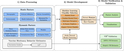
An overview of the proposed modeling framework is presented in . This framework consists of three main components: (i) data acquisition and processing, (ii) model development, and (iii) model verification & validation. In the first phase, data is assessed and cleaned to address inconsistencies. The model development phase involves evaluating multiple classification models to select the best performer, from which we then extract feature importance. Finally, the third phase focuses on validating and verifying the model’s outcomes to ensure their accuracy and reliability.
Figure 1. Flowchart of the proposed research.
3.1. Data acquisition and data processing
3.1.1. Data acquisition
We leverage various open-access datasets to compile county-level data for the period January 25, 2021, to October 31, 2021. Our objective is to capture the different factors that could potentially influence VH. Specifically, we selectively utilize datasets that offer county-specific Federal Information Processing Standards (FIPS) codes for individual records. This strategic approach enables us to seamlessly integrate multiple data sources, which supports our model development efforts. Our extensive data collection covers all 48 contiguous states and the District of Columbia. We have categorized the factors in our analysis into static and dynamic categories (see for details).
Table 1. Features included in the analysis.
3.1.2. Static factors
These features remain constant throughout the duration of the study, maintaining consistent values each week. These features provide valuable insights into the fundamental factors influencing VH patterns. Static factors include population demographics, health indicators, and vaccine accessibility provided by the “COVID-19 Open-Data” dataset of Wahltinez et al. (Citation2020). Data related to internet subscription rates and poverty status at the county level are obtained from U.S. Census Bureau (Citation2019, Citation2021). The U.S. Bureau of Labor Statistics (Citation2021) provides data about the labor force and unemployment rates. County-level 2020 presidential voting results were obtained from the Harvard Dataverse (MIT Election Data and Science Lab, Citation2021). Influenza vaccination coverage for the 2018-2019 and 2019-2020 seasons came from the CDC’s data repository (CDC, Citation2021a).
3.1.3. Dynamic factors
These features demonstrate varying patterns throughout the study. Integrating dynamic features into our model allows us to capture both temporal dynamics and contextual elements that may impact VH patterns. We used the “COVID-19 Open-Data” to gather data about dynamic features, such as Google COVID-19 search trends, weather conditions, and stringency index. The weather condition is a dynamic factor since weather changes over time. These changes impact the survival and spread of the virus, mobility levels, social distancing, and location of social gatherings, which in turn affect the spread of the disease (Franch-Pardo et al., Citation2020; Poirier et al., Citation2020; Paraskevis et al., Citation2021). Weather conditions also impact vaccine distribution and accessibility (Childs, Citation2021).
Google COVID-19 search trends mirror the public’s interest in seeking information about COVID-19 vaccines. The stringency index quantifies the rigor of government policies enforced during the COVID-19 pandemic. We use this feature because it is vital to comprehend how government actions and policies impact public perceptions and behaviors concerning vaccination. To gain insights into public sentiment on social media and the internet, we gathered tweets using a tailored scraper designed to focus on specific keywords (e.g., corona, vaccine, Pfizer) and relevant hashtags (e.g., #covid19, #vaccinated, #delta) associated with COVID-19. The full list of these keywords and hashtags can be found in the Supplementary Materials S1. We excluded retweets due to their lack of geographical metadata and to minimize potential biases from automated bots, focusing exclusively on tweets with geographical information. We utilized the GDELT Project’s database, which encompasses online news articles regarding COVID-19 vaccinations, complete with article content and the average tone per county (GDELT, Citation2021). Our dataset consists of articles from U.S. sources that mention COVID-19 vaccines.
3.1.4. Other datasets
To assess VH behavior, we accessed vaccine uptake data from the CDC’s repository (CDC, Citation2021b). VH estimates were also sourced from ASPE, which leveraged HPS data to derive metrics at both county and state levels (CDC, Citation2021c). This dataset contains data for 3142 counties for Week 23 of our study. Additionally, we incorporated the Delphi VH dataset, which provides VH estimates for 32,963 ZIP codes and 3141 counties in the U.S. This dataset originated from a collaborative survey by Carnegie Mellon University and Facebook, henceforth referred to as Delphi (Reinhart et al., Citation2021).
3.1.5. Data processing
Two datasets in our study—weather-related data and Google symptom search trends—contain a large number of fields, making them complex to analyze. For example, the weather dataset includes fields such as minimum and maximum temperatures, precipitation, and wind speed, some of which are highly correlated. To simplify these datasets, we employed Principal Component Analysis (PCA), a technique aimed at reducing dimensionality while retaining valuable information (Abdi and Williams, Citation2010). PCA generates new fields, known as Principal Components (PCs), which are linear combinations of the original fields. The weather-related dataset contains seven fields, and the “Google symptom search trends” contains 22 fields. Our PCA provided three PCs for weather-related data and five PCs for Google symptom search trends. These PCs provide an explained variance of at least 95%.
The GDELT dataset comprises online news articles related to COVID-19 vaccinations; each assigned a sentiment score ranging from -100 to 100. A 100 corresponds to a highly positive tone, a -100 corresponds to an extremely negative tone, and a 0 corresponds to a neutral tone. These values are determined based on a count of the words that have a positive/negative emotional connotation in the article. Each record of the GDELT dataset corresponds to a location mentioned in each news article. Thus, the dataset contains duplicate entries of the same news article, especially in sites that have continuously tracked events since the onset of the pandemic. Hence, we processed this data to eliminate duplicates. The processed dataset contains 1,059,758 online articles. We used this data to calculate an average sentiment tone for each county, with counties not covered in the news assigned a neutral tone.
In preparing our Twitter data, we concentrated on tweets with location information to align with our other datasets. We used the FCC Census Block Conversion API to map each tweet’s coordinates to its county of origin (FCC, Citation2021) and employed Twitter Places and alias name lookup for tweets without precise coordinates (Grammakov et al., Citation2020). This resulted in a dataset of 588,686 COVID-19-related tweets with identified county locations. Our analysis revealed a notable correlation between internet access and tweet frequency per county (see Figure S3). Upon collecting these tweets, we conducted sentiment analysis and topic modeling to evaluate the sentiment of each tweet and to categorize them into relevant topics. For a detailed account of our methods and findings in sentiment analysis and topic modeling, please refer to the Supplementary Materials S1.
3.1.6. Challenges with data acquisition
Gathering COVID-19 vaccination data involves complexities due to varying reporting methods and timelines across different sources. These inconsistencies can lead to gaps in the overall data quality and reliability. For further details on these challenges, please refer to the Supplementary Materials S2.
3.2. Model development
3.2.1. An estimate of VH behavior
VH is defined as the delay in acceptance or refusal of vaccines. We noticed the difference between VH attitude and VH behavior. Although surveys measure the attitudes towards vaccines, vaccine uptake is a measure of vaccination behavior. The data collected by HPS is a single data point that might not help explain changes in behavior and attitude over time, especially at the county level, due to vaccination-related policies and mandates or due to fear of infection from new variants of the COVID-19 virus. Changes in vaccination uptake over time indicate changes in VH behavior. This is why we use the data about vaccine uptake to develop an estimate of VH behavior.
Let represent the percentage of the unvaccinated population at county i in week
that was vaccinated during weeks
to t (
). We use Equation(1)
(1)
(1) to calculate
In this equation,
represents the cumulative percentage of residents fully vaccinated in county i by week t. During the timeframe of this study, a fully vaccinated individual received a second dose of a two-dose vaccine or one dose of a single-dose vaccine. The numerator of Equation(1)
(1)
(1) represents the percentage of the population vaccinated during the last
weeks. The denominator represents the percentage of unvaccinated in county i in week
(1)
(1)
Note that measures the rate of change in vaccine uptake among the unvaccinated. Thus,
represents the proportion of unvaccinated individuals who remain unimmunized during the time interval from
to t, under conditions where vaccine supply is available and vaccine coverage has not reached herd immunity levels. It is worth noting that initial estimates for achieving herd immunity against COVID-19 were set at above 90%. We used
as a comparative measure of VH behavior. This metric allows us to compare VH behavior among different counties at a particular point in time.
We calculated VH from January 25, 2021 (Week 4) to October 31, 2021 (Week 43). While the FDA issued emergency use authorizations (EUAs) for the Pfizer-BioNTech and Moderna vaccines, and initial vaccine deliveries began in December 2020 (U.S. Department of Health and Human Services, Citation2022), we did not calculate VH
for the weeks prior to the last week of January 2021. This decision was based on two observations. First, we observed variations in vaccination uptake due to differences in state-based vaccine rollout decisions. Second, we observed initial vaccination delays caused by supply chain limitations rather than VH. Noteworthy events during the study period include the FDA issuing of an EUA for Johnson & Johnson’s single-dose vaccine on February 27; expanding vaccination eligibility to all adults ages 16 and older on April 19; intensifying vaccination campaigns to combat the Delta variant during summer; authorizing booster shots for immunocompromised individuals on September 22; and witnessing vaccine mandates gaining traction in various sectors, including schools, universities, and workplaces during October. It is important to note that over time, as the population is nearly fully vaccinated, the VHb metric, being based on vaccine uptake, may become less effective.
Finally, let us highlight the differences between our proposed VHb and the estimates of VH attitude provided by the ASPE.
Our proposed VHb is a measure of VH behavior, whereas ASPE’s metric is a measure of VH attitude. ASPE’s VH measures unwillingness to vaccinate, whereas our proposed VHb measures the change in the uptake rate in the last
time periods. Thus, VHb and ASPE’s VH complement one-another and help us evaluate different aspects of vaccine hesitancy (i.e., attitude and behavior).
ASPE uses state-level data to derive the VH estimate at the county level. Specifically, state-level VH estimates derived from surveys are converted to Public Use Microdata Areas (PUMA) level estimates. Next, the PUMA-to-County crosswalk is used to generate county-level estimates of VH. These conversions may impact the accuracy of the estimates at the county level. Different from ASPE, our metric uses county-level data.
ASPE uses VH focused-surveys. Our proposed VHb uses vaccination uptake data, which was easier to obtain and available weekly (even daily) during the COVID-19 pandemic. ASPE and Delphi surveys are expensive and have lengthier lead times. Their results were published weeks after the surveys were conducted. Due to their cost and processing times, survey results were available for a limited number of weeks. Thus,
Table 2. A comparison of VH metrics.
3.2.2. Multicollinearity effects
Addressing multicollinearity is essential for the accuracy and interpretability of ML models, as it helps prevent distortion in feature importance and overfitting. We observed notable correlations between several key features in our analysis. For an additional discussion of multicollinearity effects, read Supplementary Materials S6.
3.2.3. Clustering
We used the Fisher–Jenks algorithm, also known as the Goodness of Variance Fit (GVF), to cluster counties based on VHb (Fisher, Citation1958; Jenks and Caspall, Citation1971; Jenks, Citation1977). The algorithm minimizes the squared deviations of the cluster means. The results are shown in for Week 23. A sensitivity analysis confirmed that using five clusters (k = 5) achieved a GVF of 95%. Increasing the number of clusters beyond this did not significantly improve the GVF. The histogram in presents the distribution of VHb at the county level. For each cluster, we present a lower and upper bound of VHb (as shown via the red lines). Notice that traditional clustering methods, which use equal interval and quantile, would not provide a good classification, due to the skewness of the VHb values. The choropleth map in shows that the distribution of clusters across the U.S. is not even. About 71% of the counties belong to clusters 4 and 5.
Figure 2. Clustering counties using VHb during Week 23 for every county in the CONUS: (a) GVF the number of clusters, (b) distribution of VHb with natural breaks when k = 5, and (c) classified choropleth map of the clusters.
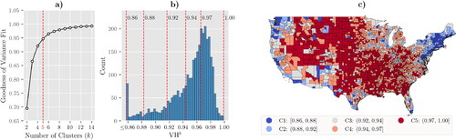
Large parts of the U.S., particularly in the northern, central, and southern regions, have high VHb, which essentially means it was hard for these counties to reduce the unvaccinated levels between and t. However, counties in coastal regions have lower overall VHb. Most counties containing highly populated cities belong to C1 or C2. presents a few statistics for each cluster. C1 has the lowest VHb and only 3% of the residents of C1 living in non-metro counties. It also has the highest overall cumulative percentage of fully vaccinated residents (i.e., 54%). Thus, counties in C1 have progressed well in the race to vaccinate against COVID-19. On the other hand, C5 has the highest VHb, and roughly half of its residents live in non-metro counties.
Table 3. Cluster profile of the map shown in (data of Week 23).
3.2.4. Classification models
We evaluated five classification algorithms to identify the most suitable approach for our research objectives. Our performance metrics included accuracy, the Area Under the ROC Curve (AUC), F1-score, and the Kappa score. Due to the data’s imbalance (particularly in C5, where county numbers greatly exceed other clusters), we prioritized the F1-score as our primary evaluation metric, as it harmonizes precision and recall. For the RF and Gradient Boosted Trees models, we used scikit-learn’s RandomForestClassifier and Python’s LightGBM framework, respectively (Pedregosa et al., Citation2011; Ke et al., Citation2017). We also employed scikit-learn’s MLPClassifier, KNeighborsClassifier, and SVC for implementing the Multi-layer Perceptron (MLP), K-nearest Neighbor (k-NN), and Support Vector Classifier (SVC) algorithms. In all models, static and dynamic features were used as the independent variables X, and cluster labels served as the dependent variable y. A brief summary of the algorithms is available in Supplementary Materials S3.
3.2.5. Classifier tuning
We used the Optuna framework for hyperparameter optimization to fine-tune each classifier’s performance (Akiba et al., Citation2019). We configured Optuna to identify the best hyperparameter configuration by maximizing the average F1-score over 5-fold cross-validation. Additional details on hyperparameter tuning for each classifier are available in Supplementary Materials S5.
3.2.6. Feature importance extraction
Feature importance quantifies the impact of input features on a model’s output. Classifiers such as RF and LightGBM offer built-in feature importance measures based on mean decrease in impurity. However, we used permutation-based importance and Shapley Additive Explanations (SHAP) to ensure a more comprehensive and model-agnostic understanding of feature importance. Permutation-based importance assesses a feature’s significance by measuring the increase in model error after shuffling the feature, offering a global view of the model’s behavior. Conversely, SHAP provides local explanations for individual predictions (Lundberg et al., Citation2020). As a model-agnostic method, SHAP calculates Shapley values from cooperative game theory to quantify each feature’s contribution to the model’s output. In our study, this output is the predicted probability of a county belonging to a specific cluster.
3.3. Model validation and verification
3.3.1. VHb
To assess the relevance of VHb as a measure of VH behavior, we compared it with VH estimates from two large-scale surveys: (i) ASPE and (ii) Delphi.
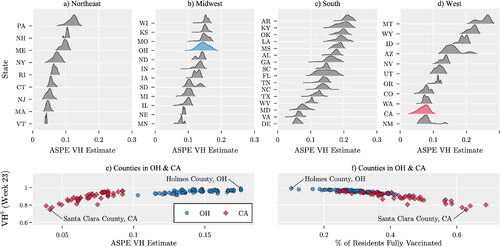
The ASPE used the HPS survey from May 26 to June 7, 2021 (Weeks 21-23). present county-level VH estimates across various U.S. states, as reported by ASPE (CDC, Citation2021c). Lower VH indices were observed in the Northeast, whereas some states in the South and West had VH estimates exceeding 0.2, indicating higher hesitancy. illustrates a positive correlation between ASPE’s VH index and VHb in counties of California and Ohio. reveals a negative correlation between the percentage of fully vaccinated residents and VHb, suggesting that higher vaccination rates are associated with lower VHb.
Figure 3. (a)-(d) Distributions of VH estimates across counties within each U.S. state, based on data from the ASPE (CDC, Citation2021c). (e) Relationship between VHb and ASPE’s VH estimate during Week 23; (f) Relationship between the percentage of fully vaccinated residents and VHb in counties of Ohio and California. Each marker represents a county.
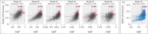
shows the correlation between VHb and Delphi’s weekly VH estimates, starting from January 2021. We focus on weeks 15, 20, …, and 40 for this analysis. illustrates the relationship between VHb and ASPE’s VH estimate for Week 23. Each dot represents a county, and the red dashed line marks the mean of the observations. The correlation coefficients between VHb and Delphi’s VH range from 0.34 to 0.75, whereas the coefficient with ASPE’s VH is 0.6. Notably, the average Delphi VH estimate decreased from 0.30 to 0.25 between weeks 15 and 40. This shift may be attributed to state-level vaccination mandates, community outreach, or other factors. These positive correlations suggest that VHb can quickly predict trends of VH behavior at the county level. This metric complements what we learn about VH attitude from surveys. Collectively, these tools help decision makers evaluate different aspects of vaccine hesitancy.
Figure 4. (a) Relationship between VHb and VH estimate by Delphi group and Facebook, for various weeks. (b) Relationship between ASPE’s VH and VHb estimates in Week 23.
3.3.2. ML classifier selection
We evaluated various classifiers on a consistent dataset to identify the most effective one for our study. The hyperparameters for each classifier were fine-tuned using Optuna’s Bayesian optimization technique. The performance was measured using the average F1 score, obtained through 5-fold cross-validation. The monthly average F1 scores for each classifier are presented in .
Table 4. The monthly average F1 score of the proposed classifiers.
Interestingly, no classifier consistently outperformed the others across all weeks. To statistically validate these observations, we conducted a Pairwise Wilcoxon test at a 5% significance level. The test results are summarized in the Supplementary Materials S4. They indicate that the RF classifier generally performed better, especially during weeks 18–43. Significant differences in median F1 scores were observed between RF and LightGBM (p-value = ), MLP (p-value =
), and SVC (p-value =
). However, no significant differences were found when comparing RF with k-NN (p-value = 0.055). Please refer to Supplementary Materials S4 for additional, detailed analysis of classifier performance, focusing on metrics accuracy, AUC, and Kappa score.
Considering both performance and computational efficiency, we chose the RF classifier for further analysis. It not only showed strong performance but also had a shorter run time. The subsequent analysis using the RF classifier is detailed in Section 4.
We observe that the prediction quality during the initial weeks of the study is notably lower compared with subsequent weeks. Several factors contribute to this discrepancy. First, measurement errors were more prevalent in the early stages of data collection, affecting the reliability of the dataset. Second, the CDC made changes to their data collection tools in late February 2021, which could have introduced inconsistencies in the data (CDC, Citation2022a). Lastly, the staggered and varied vaccine rollout plans implemented at the state level led to delays that could have impacted the early predictions. These factors collectively suggest that the early data may be less reliable for predictive modeling.
4. Discussion of results
Via our discussion of results, we address the research questions identified in Section 1.
What factors influence VHb for COVID-19 vaccine? presents the permutation importance value of the top 15 relevant features of the RF model during Week 23. presents the SHAP values of the top 15 features that have the most impact on the model output across five different clusters. The varying heights of the bars for each feature indicate that the impact of each feature differs across clusters. Bars with hashed patterns represent dynamic factors. We focus on the findings for Week 23 because the RF classification model’s predictions for this week achieved the highest F1 score.
Figure 5. (a) Top 15 features by permutation importance, (b) top 15 by SHAP importance. Hashed bars and bold labels indicate dynamic factors. Results are based on Week 23 data.
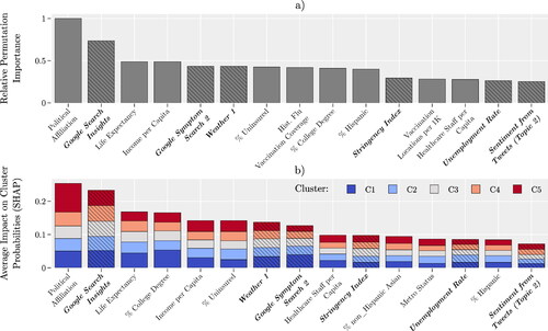
Political affiliation emerges as the most influential factor in predicting county-level VH behavior in both of our analytical approaches. Specifically, political affiliation is defined as the percentage of individuals in a given county who voted for the Democratic candidate in the 2020 presidential election. Our results align with existing research, such as a KFF report showing disparities in vaccination rates among Democrats (91%), Independents (76%), and Republicans (63%) (Hamel et al., Citation2022). A cross-sectional study among college students and a New York Times article further substantiate this correlation (Ivory et al., Citation2021; Sharma et al., Citation2021).
Google search insights, also known as Google search trends, ranks as the second most important feature in our study. This term refers to the aggregated and anonymized trends in Google searches related to COVID-19 vaccination (Bavadekar et al., Citation2021). Our findings align with a study by Berning et al. (Citation2022), which found that online search trends strongly correlate with actual vaccination rates. In most states, online searches even preceded increases in vaccination rates. Additionally, research by Merrick et al. (Citation2022) further validates the utility of Google trends as a public health tool, emphasizing its role in understanding VH and guiding public health messaging. This suggests that Google search trends can serve as a predictor for vaccination uptake, thereby reinforcing the importance of this feature in our model.
ranks the importance of political affiliation and Google search insights in determining VHb over time for clusters C1 and C5. The results of indicate that, for C5, political affiliation was the most relevant factor during 21 weeks, and the second most relevant factor during seven weeks. Political affiliation was more important to C5 (as compared to C1) during 31 weeks, and it was of the same importance during nine weeks (out of 41 weeks of study). These results suggest that political affiliation is a dominant factor in influencing the vaccination behavior of individuals in C5.
Figure 6. Ranking of political affiliation and Google search insights over time for counties in C1 and C5.
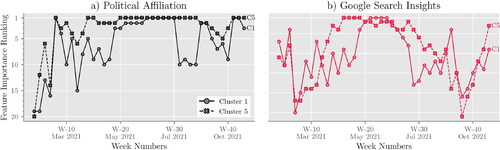
Based on , Google search insights were more relevant in determining VHb for C5 than C1 over 22 weeks and equally relevant for five weeks. Conversely, they were more relevant for C1 than C5 during 14 weeks. The SHAP values for Week 23 (see later in this section) indicate that counties with the highest Google searches likely belong to C1, while those with the fewest searches likely belong to C5. In summary, counties in C5 showed less online interest in COVID-19 vaccine eligibility and accessibility than those in C1, potentially explaining C5’s lower vaccination rates and higher VHb
The healthcare staff per capita, unemployment rate, and metro status are among the least relevant features in determining the VHb of a county. Our analysis shows that age is not important in determining VH, although the CDC indicates that unvaccinated older adults are more likely to be hospitalized and die from COVID-19 (CDC, Citation2022b). However, since the vaccination of older adults was prioritized, many were vaccinated as soon as COVID-19 vaccines were made publicly available (December 2020 to January 2021). Our dataset does not include this time period, which may explain this observation.
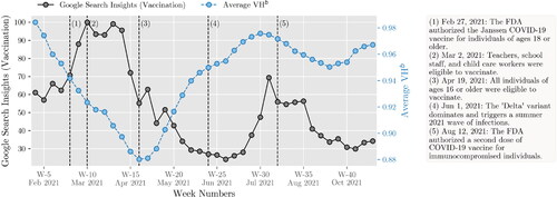
While static factors such as political affiliation and income are key to understanding VH behavior, dynamic factors also play a significant role in explaining its temporal variations. presents the U.S. average of VHb alongside Google’s vaccine search data. This is because it takes time to observe the behavior change induced by the news spread via the internet and social media. For example, the initial surge in search interest during Weeks 1 to 14 likely corresponds to the vaccine’s initial rollout and the subsequent expansion of eligibility to all adults. This period also saw a decrease in the overall VHb, possibly due to growing vaccine confidence as more people were vaccinated. After Week 15, search interest significantly declined, and VHb began to rise, potentially due to vaccine fatigue and the saturation of the willing population to be vaccinated. The resurgence of search interest in late June, coinciding with concerns about the Delta variant, appears to have lowered the average VHb.
Figure 7. Overall VHb and Google search trends over time in the U.S.
Another relevant dynamic factor is the sentiment of Topic 2. This topic contains tweets related to people’s emotions about COVID-19. The top-10 keywords included in this topic are “year”, “family”, “miss”, “pray”, “friend”, “thank”, “love”, “old”, “lose”, “wish”. For keywords related to other topics, please refer to Supplementary Materials S1. These keywords reflect public sentiment about the perceived risks of COVID-19 and can offer insights into VH behavior. The irrelevance of sentiments from other topics could be attributed to two factors. First, the limited number of tweets with geographical metadata might have restricted our opportunity to capture sentiments about other topics. Second, the presence of noise and viral tweets or memes in the data could dilute the impact of other topics.
What are VH-based clusters of counties and their characteristics? Our trained RF classification model sorted U.S. counties into five clusters, labeled as C1 through C5. displays the SHAP values for the most significant features in these clusters for Week 23. In this figure, the features for each cluster are arranged in descending order based on their total SHAP value magnitudes across all counties. provides a summary of the data shown in , listing the average values of the top-15 features for each cluster.
Figure 8. SHAP values of the top-15 important features for each cluster.
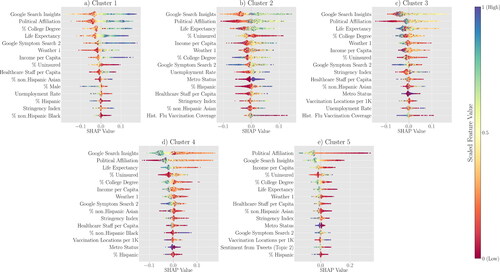
Table 5. The average feature value per predicted cluster of the top-15 important features for Week 23.
In our model for Week 23, counties classified under C1 and C5 represent opposite ends of the VH spectrum. With the lowest average VHb score of 0.829, C1 counties exhibit the least resistance to vaccination. In contrast, C5 counties show the highest hesitancy, with an average VHb score of 0.972. Politically, C1 leans Democrat, with an average score of 0.60 (i.e., 60% voted for the Democratic candidate in the 2020 presidential election), whereas C5 leans Republican at 0.24. In terms of internet inquisitiveness, C1 leads with a Google Search Insights score of 33.71, compared with C5’s 15.45. Life expectancy in C1 averages at 80.45 years, higher than C5’s 77.06 years. Educational attainment also varies; 45% of C1 residents hold a college degree, as opposed to 27% in C5. Income disparities are evident, with C1 boasting an average income per capita of $78,184, significantly higher than C5’s $47,630. Uninsured rates are lower in C1 at 7%, compared with 14% in C5. Lastly, C1 counties are predominantly metropolitan, and have stricter COVID-19 measures, reflected by a Stringency Index of 41.23. In contrast, C5 is largely non-metropolitan, with a Stringency Index of 36.71. This side-by-side comparison underscores the differences between the two clusters, providing a clearer picture of the top factors contributing to VHb. We leave it to the reader to discern the remaining clusters and features.
How did COVID-19 restrictions, as measured by the Stringency Index, influence VH in the U.S., and is this influence consistent across different counties?
Our model identifies the Stringency Index as another important dynamic factor. This index measures the strictness of lockdown policies, such as school closures that aim to restrict people’s behavior and public information campaigns (Hale et al., Citation2021). While the index is relevant, it is challenging to directly link it to changes in vaccination rates. This is because there is a time lag between when a policy is enacted and when its effects are noticeable. Additionally, these policies are usually set at the State or Federal level, but we are looking at vaccine uptake and VHb at the county level. Therefore, the impact of these policies at the county level is influenced by other factors.
Based on the results of Stringency Index was the most relevant feature for C1 during two weeks. Stringency Index was never found to be the most relevant feature for C5. The Stringency Index was more important to C1 (as compared with C5) during 25 weeks and was of the same importance during four weeks. Stringency Index has the greatest impact on VHb during the week of May 3rd (week 18), August 16th (week 33), August 23rd (week 34), September 27th (week 39), and October 4th (week 40). We further investigate the role of the Stringency Index on VHb. Recall that on July 27th, 2021, CDC announced an upswing in cases due to the Delta variant. As a result, several States recommended that people avoid travel to reduce the spread of the virus. Due to the Delta variant outbreak and the quick spread of the disease during the first weeks of the Fall semester, several school districts shut down in-person classes. The disease outbreak affected State policies and interventions, which encouraged people to vaccinate. This stream of events seems to have had a more significant impact on increasing vaccination uptake in C1 rather than C5. Notice the changes in the average (± one standard deviation) of the percentage of fully vaccinated and VHb of C1 and C5 during weeks 31 to 41 in . The value of VHb for C5 does not change much during these weeks. As a result, the average percentage of fully vaccinated increases steadily, but at a lower rate than in C1. However, the values of VHb for C1 change drastically. We also observe changes in the average percentage of fully vaccinated during weeks 31 to 41.
Figure 9. Ranking of Stringency Index over time for counties in C1 and C5.
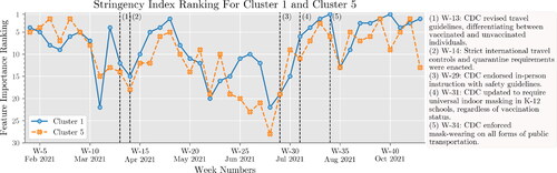
Figure 10. The average ± one standard deviation of the percentage of fully vaccinated and VHb over time in C1 and C5.
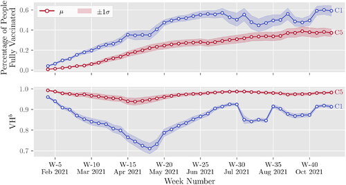
In , we observe a decreasing trend of VHb and an increasing trend of vaccination uptake of C1 during weeks 4 to 18. During this period, the supply chain of COVID-19 vaccines faced several challenges (Bollyky, Citation2021). Thus, people were vaccinated gradually as vaccines became available. By the end of April 2021 (week 18), vaccines were available to everyone. Therefore, the changes observed in VHb are partly due to VH. We observe an increase of VHb of C1 during weeks 19 to 30. This does not necessarily mean that people are becoming resistant to vaccination. Since most people are already vaccinated, the rate at which people are vaccinated is reduced. In summary, VHb presents relative changes in VH behavior over time. One can use VHb to compare the VH behavior of different populations over time to measure relative resistance to immunization. The results of align with the findings from a study by Siegler et al. (Citation2021), who used survey data for the periods Aug. to Dec. 2020 and Mar. to Apr. 2021 to evaluate COVID-19 VH. They note “…VH is not a stable trait precluding vaccination but, instead, is labile…” Our analysis sheds light on the impact of certain factors on VH among different population groups. However, more research is needed in this area.
5. Summary of results and conclusions
Summary of the Proposed Research: This study presents a modeling framework that combines static and dynamic data, utilizing ML techniques to uncover the key factors influencing VH at the county level in the U.S. We collected a vast amount of data from different sources during the period of January to October 2021. We introduce a simple metric of VH behavior, VHb, which characterizes hesitancy as marginal gain in immunization over time. Using the Goodness of Variance Fit method, we discern five distinct county clusters based on their VHb. These VHb metrics are then compared with VH estimates obtained from survey data. Among several classification models tested, the RF model emerged as the most effective in predicting VHb patterns. We utilize SHAP values to assess the influence of each feature on the model’s predictions, shedding light on the most pertinent factors associated with each cluster.
Research Contributions: We propose a novel framework for blending ML with available data to generate a proxy metric to assess VH dynamics faster than currently used survey methods. This methodological enhancement can improve a current practice that limited the ability of public-health decision makers who needed to know how their recommendations would be affected by changing hesitancy attitudes. We are proposing a solution to resolve one of the key limitations that the Centers for Disease Control and Prevention and other public health officials had during the COVID pandemic to monitor VH changes rapidly. Current methods used during the pandemic relied on periodic surveys whose results were unavailable immediately. Our proposed approach could be useful in future disease outbreaks, whether or not they result in epidemics or pandemics. The data type available in future events may require different ML methods to improve accuracy and sensitivity, yet our framework could still be valid.
Research Findings: Our key observations are as follows:
We propose VHb as a comparative measure to track changes in VH behavior over time, allowing for comparisons between different groups.
Google search trends and political affiliation were the most relevant features in determining VH behavior at the county level.
Dynamic features, including Google search trends related to COVID-19, the Stringency Index, weather conditions, unemployment rates, and sentiments from Tweets, were useful in explaining fluctuations in VH over time.
In counties with the least resistance to vaccination (cluster C1), the majority of the population lean Democrat, are more internet-inquisitive (i.e., are more prone to seek information from multiple sources on the Internet), have longer life expectancies, hold college degrees, earn higher incomes, are less likely to be uninsured, live in metropolitan areas, and are subject to stricter COVID-19 measures (i.e., higher average Stringency Index).
Conversely, in counties with the most resistance to vaccination (cluster C5), the majority lean Republican, are less internet-inquisitive, have shorter life expectancies, lack college degrees, earn lower incomes, are more likely to be uninsured, live in non-metropolitan areas, and are subject to less strict COVID-19 measures.
Policies and restrictions, as measured by the Stringency Index, were effective in increasing vaccination rates in cluster C1 but were less effective in cluster C5.
Managerial Implications: In the early stages of a pandemic, the county-based VHb, calculated using data about vaccination uptake, provides quick and inexpensive information about VH behavior. The proposed VHb can be used for existing/future vaccines. The reliability and effectiveness of this metric depend on the thoroughness and accuracy of the available data concerning vaccination uptake.
During the pandemic, the classification model we propose and the corresponding analysis can be used to determine how effective the interventions were in reducing VH. This analysis can inform and aid decision makers in customizing policies to tackle the distinct needs and hurdles of each cluster. This metric informs and aids decisions about resource allocation and interventions (i.e., educational programs) that address the concerns of the population.
Reproducibility Report
Download PDF (256.5 KB)Supplemental_Material.pdf
Download PDF (1.3 MB)Additional information
Funding
Notes on contributors
Hieu Bui
Hieu Bui is currently pursuing his PhD in Industrial Engineering at the University of Arkansas, where he also completed his BS and MS degrees in the same field. He comes from Ho Chi Minh City, Vietnam. Hieu’s research focuses on the development of data-driven optimization models that aid decision-making in supply chain and healthcare logistics. He is passionate about discovering new and advanced methods to solve real-world problems.
Sandra Ekşioğlu
Dr. Sandra D. Ek,sio˘glu is the Jim M. and Marie G. Hefley Professor in Logistics and Entrepreneurship of the Industrial Engineering Department at the University of Arkansas. Dr. Ek,sio˘glu’s expertise is in the areas of operations research, network optimization, and algorithmic development with applications in healthcare systems, energy systems and supply chain. She is an active member and a Fellow of IISE.
Rubén Proano
Dr. Rubén Proaňo is an Associate professor and Graduate Director at the Department of Industrial and Systems Engineering at the Rochester Institute of Technology. Dr. Proaňo is interested in Operations Research applications in healthcare and global health issues. He has worked on vaccine supply chain problems and hypothetically coordinated vaccine market frameworks to enhance affordability.
Sarah Nurre Pinkley
Dr. Sarah Nurre Pinkley is an Adjunct Faculty of the Industrial Engineering Department at the University of Arkansas. Dr. Nurre Pinkley’s research focuses on operations research, infrastructure restoration, network design and scheduling.
References
- Abdi, H. and Williams, L.J. (2010) Principal component analysis. Wiley Interdisciplinary Reviews: Computational Statistics, 2, 433–459.
- Akiba, T., Sano, S., Yanase, T., Ohta, T. and Koyama, M. (2019) Optuna: A next-generation hyperparameter optimization framework, in Proceedings of the 25th ACM SIGKDD International Conference on Knowledge Discovery and Data Mining, Association for Computing Machinery, Anchorage, AK, USA, pp. 2623–2631.
- ASPE. (2021) Vaccine hesitancy for COVID-19: State, county, and local estimates. Technical report, U.S. Department of Health and Human Services. https://aspe.hhs.gov/reports/vaccine-hesitancy-covid-19-state-county-local-estimates (accessed on June 06, 2020).
- Bavadekar, S., Boulanger, A., Davis, J., Desfontaines, D., Gabrilovich, E., Gadepalli, K., Ghazi, B., Griffith, T., Gupta, J., Kamath, C., Kraft, D., Kumar, R., Kumok, A., Mayer, Y., Manurangsi, P., Patankar, A., Perera, I.M., Scott, C., Shekel, T., Miller, B., Smith, K., Stanton, C., Sun, M., Young, M. and Wellenius, G. (2021) Google COVID-19 vaccination search insights: Anonymization process description. CoRR, arXiv preprint arXiv:2107.01179.
- Bell, A., Rich, A., Teng, M., Orešković, T., Bras, N.B., Mestrinho, L., Golubovic, S., Pristas, I. and Zejnilovic, L. (2019) Proactive advising: A machine learning driven approach to vaccine hesitancy. 2019 IEEE International Conference on Healthcare Informatics, IEEE Press, Piscataway, NJ, pp. 1–6.
- Berning, P., Huang, L., Razavi, A.C., Boakye, E., Osuji, N., Stokes, A.C., Martin, S.S., Ayers, J.W., Blaha, M.J. and Dzaye, O. (2022) Association of online search trends with vaccination in the United States: June 2020 through May 2021. Frontiers in Immunology, 13, 884211–884220.
- Betsch, C., Schmid, P., Heinemeier, D., Korn, L., Holtmann, C. and Böhm, R. (2018) Beyond confidence: Development of a measure assessing the 5C psychological antecedents of vaccination. PLOS ONE, 13, e0208601.
- Blankenship, E.B., Goff, M.E., Yin, J., Tse, Z.T.H., Fu, K.-W., Liang, H., Saroha, N. and Fung, I.C.-H. (2018) Sentiment, contents, and retweets: A study of two vaccine-related twitter datasets. The Permanente Journal, 22, 17–138.
- Bollyky, T.J. (2021) US COVID-19 vaccination challenges go beyond supply. Annals of Internal Medicine, 174(4), 558–559.
- Callaghan, T., Moghtaderi, A., Lueck, J.A., Hotez, P.J., Strych, U., Dor, A., Fowler, E.F. and Motta, M. (2020) Correlates and disparities of COVID-19 vaccine hesitancy. SSRN Electronic Journal, 272, 113638–113642.
- CDC. (2021a) Influenza vaccination coverage for all ages. https://data.cdc.gov/Flu-Vaccinations/Influenza-Vaccination-Coverage-for-All-Ages-6-Mont/vh55-3he6 (accessed on November 13, 2021).
- CDC. (2021b) COVID-19 vaccinations in the United States, county. https://data.cdc.gov/Vaccinations/COVID-19-Vaccinations-in-the-United-States-County/8xkx-amqh (accessed on December 25, 2021).
- CDC. (2021c) Vaccine hesitancy for COVID-19: County and local estimates. https://data.cdc.gov/Vaccinations/Vaccine-Hesitancy-for-COVID-19-County-and-local-es/q9mh-h2tw (accessed on November 20, 2021).
- CDC. (2022a) Archive of COVID-19 vaccination data updates. https://www.cdc.gov/coronavirus/2019-ncov/vaccines/distributing/vaccination-data-archived-updates.html (accessed on June 12, 2022).
- CDC. (2022b) COVID-19 risks and vaccine information for older adults. https://www.cdc.gov/aging/covid19/covid19-older-adults.html (accessed on April 21, 2022).
- Chandir, S., Siddiqi, D.A., Hussain, O.A., Niazi, T., Shah, M.T., Dharma, V.K., Habib, A. and Khan, A.J. (2018) Using predictive analytics to identify children at high risk of defaulting from a routine immunization program: Feasibility study. JMIR Public Health Surveillance, 4, e9681.
- Chandrasekaran, R., Mehta, V., Valkunde, T. and Moustakas, E. (2020) Topics, trends, and sentiments of Tweets about the COVID-19 pandemic: Temporal infoveillance study. Journal of Medical Internet Research, 22(10), e22624.
- Childs, J.W. (2021) Winter storms delayed millions of COVID-19 vaccine doses. https://weather.com/health/coronavirus/news/2021-02-17-covid-19-vaccines-delayed-weather (accessed February 2024).
- Dubé, E., Laberge, C., Guay, M., Bramadat, P., Roy, R. and Bettinger, J.A. (2013) Vaccine hesitancy. Human Vaccines & Immunotherapeutics, 9, 1763–1773.
- FCC. (2021) Area and census block. https://geo.fcc.gov/api/census/ (accessed February 2024).
- Fisher, W.D. (1958) On grouping for maximum homogeneity. Journal of the American Statistical Association, 53, 789–798.
- Franch-Pardo, I., Napoletano, B.M., Rosete-Verges, F. and Billa, L. (2020) Spatial analysis and GIS in the study of COVID-19. A review. Science of the Total Environment, 739, 140033.
- Garett, R. and Young, S.D. (2021) Online misinformation and vaccine hesitancy. Translational Behavioral Medicine, 11(12), 2194–2199.
- GDELT. (2021) GDELT online news coverage of COVID-19 with locations. https://console.cloud.google.com/bigquery?p=gdelt-bq&d=covid19&t=onlinenewsgeo&page=table (accessed on November 25, 2021).
- Grammakov, D., Jurkov, R., Hsiao, Y.-C. and Prescott, R. (2020) Full list of US states and cities. GitHub.
- Hale, T., Angrist, N., Goldszmidt, R., Kira, B., Petherick, A., Phillips, T., Webster, S., Cameron-Blake, E., Hallas, L., Majumdar, S. and Tatlow, H. (2021) A global panel database of pandemic policies (Oxford COVID-19 government response tracker). Nature Human Behaviour, 5, 529–538.
- Hamel, L., Lopes, L., Sparks, G., Kirzinger, A., Kearney, A., Stokes, M. and Brodie, M. (2022) KFF COVID-19 vaccine monitor: January 2022. https://www.kff.org/coronavirus-covid-19/poll-finding/kff-covid-19-vaccine-monitor-january-2022/ (accessed on April 10, 2023).
- Ivory, D., Leatherby, L. and Gebeloff, R. (2021) Least vaccinated U.S. counties have something in common: Trump voters. https://www.nytimes.com/interactive/2021/04/17/us/vaccine-hesitancy-politics.html (accessed on June 14, 2021).
- Jenks, G.F. (1977) Optimal data classification for choropleth maps. Department of Geography, University of Kansas Occasional Paper.
- Jenks, G.F. and Caspall, F.C. (1971) Error on choroplethic maps: Definition, measurement, reduction. Annals of the Association of American Geographers, 61(2), 217–244.
- KFF. (2021) Poll: Most Americans worry political pressure will lead to premature approval of a COVID-19 vaccine; half say they would not get a free vaccine approved before election day. https://www.kff.org/coronavirus-covid-19/press-release/poll-most-americans-worry-political-pressure-will-lead-to-premature-approval-of-a-covid-19-vaccine-half-say-they-would-not-get-a-free-vaccine-approved-before-election-day/ (accessed on July 7, 2021).
- Ke, G., Meng, Q., Finley, T., Wang, T., Chen, W., Ma, W., Ye, Q. and Liu, T.-Y. (2017) Lightgbm: A highly efficient gradient boosting decision tree. Advances in Neural Information Processing Systems, 30, 3146–3154.
- Khubchandani, J., Sharma, S., Price, J.H., Wiblishauser, M.J., Sharma, M. and Webb, F.J. (2021) COVID-19 vaccination hesitancy in the United States: A rapid national assessment. Journal of Community Health, 46, 270–277.
- Lange, J. and Lange, C. (2022) Applying machine learning and AI explanations to analyze vaccine hesitancy. medRxiv, page 2022.01.06.22268845.
- Larson, H.J., Jarrett, C., Schulz, W.S., Chaudhuri, M., Zhou, Y., Dube, E., Schuster, M., MacDonald, N.E. and Wilson, R. (2015) Measuring vaccine hesitancy: The development of a survey tool. Vaccine, 33(34), 4165–4175.
- Lee, J. and Huang, Y. (2022) COVID-19 vaccine hesitancy: The role of socioeconomic factors and spatial effects. Vaccines, 10, 352.
- Lundberg, S.M., Erion, G., Chen, H., DeGrave, A., Prutkin, J.M., Nair, B., Katz, R., Himmelfarb, J., Bansal, N. and Lee, S.-I. (2020) From local explanations to global understanding with explainable AI for trees. Nature Machine Intelligence, 2(1), 2522–5839.
- MacDonald, N.E., the SAGE Working Group on Vaccine Hesitancy. (2015) Vaccine hesitancy: Definition, scope and determinants. Vaccine, 33(34), 4161–4164.
- Merrick, E., Weissman, J.P. and Patel, S.J. (2022) Utilizing Google trends to monitor coronavirus vaccine interest and hesitancies. Vaccine, 40, 4057–4063.
- MIT Election Data and Science Lab. (2021) County presidential election returns 2000-2020. https://dataverse.harvard.edu/dataset.xhtml?persistentId= doi:10.7910/DVN/VOQCHQ (accessed on May 10, 2021).
- Mollalo, A. and Tatar, M. (2021) Spatial modeling of COVID-19 vaccine hesitancy in the United States. International Journal of Environmental Research and Public Health, 18, 9488.
- Murthy, B.P., Sterrett, N., Weller, D., Zell, E., Reynolds, L., Toblin, R.L., Murthy, N., Kriss, J., Rose, C., Cadwell, B., et al. (2021) Disparities in COVID-19 vaccination coverage between urban and rural counties—United States, December 14, 2020–April 10, 2021. MMWR. Morbidity and Mortality Weekly Report, 70, 759–764.
- Paraskevis, D., Kostaki, E.G., Alygizakis, N., Thomaidis, N.S., Cartalis, C., Tsiodras, S., and Dimopoulos, M.A. (2021) A review of the impact of weather and climate variables to COVID-19: In the absence of public health measures high temperatures cannot probably mitigate outbreaks. Science of the Total Environment, 768, 144578.
- Pedregosa, F., Varoquaux, G., Gramfort, A., Michel, V., Thirion, B., Grisel, O., Blondel, M., Prettenhofer, P., Weiss, R., Dubourg, V., Vanderplas, J., Passos, A., Cournapeau, D., Brucher, M., Perrot, M. and Duchesnay, E. (2011) Scikit-learn: Machine learning in Python. Journal of Machine Learning Research, 12, 2825–2830.
- Poirier, C., Luo, W., Majumder, M.S., Liu, D., Mandl, K.D., Mooring, T.A. and Santillana, M. (2020) The role of environmental factors on transmission rates of the COVID-19 outbreak: An initial assessment in two spatial scales. Scientific Reports, 10(1), 17002.
- Razai, M.S., Oakeshott, P., Esmail, A., Wiysonge, C.S., Viswanath, K. and Mills, M.C. (2021) COVID-19 vaccine hesitancy: The five Cs to tackle behavioural and sociodemographic factors. Journal of the Royal Society of Medicine, 114, 295–298.
- Reinhart A., Brooks, L., Jahja, M., Rumack, A., Tang, J., Agrawal, S., Al Saeed, W., Arnold, T., Basu, A., Bien, J., et al. (2021) An open repository of real-time COVID-19 indicators. Proceedings of the National Academy of Sciences, 118(51), e2111452118.
- Salomon, J.A., Reinhart, A. and Bilinski, E.A. (2021) The US COVID-19 trends and impact survey: Continuous real-time measurement of COVID-19 symptoms, risks, protective behaviors, testing, and vaccination. Proceedings of the National Academy of Sciences, 118(51), e2111454118.
- Sharma, M., Davis, R.E. and Wilkerson, A.H. (2021) COVID-19 vaccine acceptance among college students: A theory-based analysis. International Journal of Environmental Research and Public Health, 18, 4617–4629.
- Siegler, A.J., Luisi, N., Hall, E.W., Bradley, H., Sanchez, T., Lopman, B.A. and Sullivan, P.S. (2021) Trajectory of COVID-19 vaccine hesitancy over time and association of initial vaccine hesitancy with subsequent vaccination. JAMA Network Open, 4(9), e2126882–e2126882.
- To, Q.G., To, K.G., Huynh, V.N., Nguyen, N.T.Q., Ngo, D.T.N., Alley, S.J., Tran, A.N.Q., Tran, A.N.P., Pham, N.T.T., Bui, T.X., et al. (2021) Applying machine learning to identify anti-vaccination tweets during the COVID-19 pandemic. International Journal of Environmental Research and Public Health, 18, 4069.
- U.S. Bureau of Labor Statistics. (2021) Local area unemployment statistics. https://www.bls.gov/lau//#cntyaa (accessed on December 13, 2021).
- U.S. Census Bureau. (2019) Dataset for poverty status. {https://data.census.gov/cedsci/table?t=Income/%20and/%20Poverty&g=0100000US/%240500000&tid=ACSST1Y2019.S1701} (accessed on December 13, 2021).
- U.S. Census Bureau. (2021) Dataset for types of computers and internet subcriptions. https://data.census.gov/cedsci/table?q=S2801&g=0100000US/%240500000&tid=ACSST1Y2019.S2801 (accessed on December 13, 2021).
- U.S. Department of Health & Human Services. (2022) COVID-19 vaccines. https://www.hhs.gov/coronavirus/covid-19-vaccines/index.html (accessed on May 28,2023).
- Wahltinez, O., Murphy, K., Brenner, M., Lee, M., Erlinger, A. and Daswani, M. (2020) COVID-19 open-data: Curating a fine-grained, global-scale data repository for SARS-CoV-2. Github. Work in progress.
- Wang, C.-W., de Jong, E.P., Faure, J.A., Ellington, J.L., Chen, C.-H.S. and Chan, C.-C. (2022) A matter of trust: A qualitative comparison of the determinants of COVID-19 vaccine hesitancy in Taiwan, the United States, the Netherlands, and Haiti. Human Vaccines & Immunotherapeutics, 18(5), 2050121.
- WHO. (2019) Ten threats to global health in 2019. https://www.who.int/news-room/spotlight/ten-threats-to-global-health-in-2019 (accessed on June 14, 2021).
- Williams, C.J., Kranzler, E.C., Luchman, J.N., Denison, B., Fischer, S., Wonder, T., Ostby, R., Vines, M., Weinberg, J., Petrun Sayers, E.L., et al. (2023) The initial relationship between the United States Department of Health and Human Services’ digital COVID-19 public education campaign and vaccine uptake: Campaign effectiveness evaluation. Journal of Medical Internet Research, 25:e43873.
- Wilson, S.L. and Wiysonge, C. (2020) Social media and vaccine hesitancy. BMJ Global Health, 5(10), e004206.
- Yousefinaghani, S., Dara, R., Mubareka, S., Papadopoulos, A. and Sharif, S. (2021) An analysis of COVID-19 vaccine sentiments and opinions on Twitter. International Journal of Infectious Diseases, 108, 256–262.