
Abstract
This paper describes a research project in which information design, human factors, architecture and pharmacy academics worked with pharmacy professionals and pharmacy users to consider how to present information about antimicrobial resistance (AMR) in a community pharmacy setting. Project outcomes – as a result of an innovative design competition – included five different design solutions that explain aspects of AMR within the context of a community pharmacy. The project raised awareness in pharmacy professionals of how design can be used to challenge ideas and encourage new ways of thinking to communicate public health messages. Two winning prototype solutions were installed in a Day Lewis pharmacy in Reading and evaluated by pharmacists and pharmacy users. We make preliminary recommendations for effective health communication in community pharmacies.
This paper introduces a cross-disciplinary health communication research project funded by the UK’s Arts and Humanities Research Council. The ‘Information Design and Architecture in Persuasive Pharmacy Space: combating antimicrobial resistance’ (IDAPPS) project explores ‘persuasive space’ in the presentation of information, and how users interact with it in the context of a community pharmacy. The project supports one of the strategic aims of the UK 5-Year Antimicrobial Resistance strategy 2013–18, to ‘improve the knowledge and understanding of antimicrobial resistance’. The project brought together academics and practitioners in information design, architecture, human factors/ergonomics, pharmacy and biological science, drawing together widely divergent methodologies and approaches.
In this paper, we summarize our IDAPPS working methods highlighting the value of a carefully organised competition as a productive method of research collaboration that resulted in five innovative approaches to communicating information about antimicrobial resistance (AMR). The competition winners are currently at ‘prototype’ stage and were installed in a pharmacy for four weeks and displayed at a national pharmacy conference. We present a summary of reactions to these. Finally, we offer a few (albeit preliminary) recommendations about using space in pharmacies to communicate information about AMR, and about the benefits of cross-disciplinary engagement.
Community pharmacies
One of the objectives of the IDAPPS project was to consider ways of presenting and displaying information about AMR in different formats and modes in community pharmacies. Community pharmacies are socially inclusive and convenient. They are places where people wait for prescriptions to be filled or to see a pharmacist and offer a persuasive space to raise awareness of the dangers of AMR. We are using the term ‘persuasive space’ in this context to refer to the space in which people move around pharmacies and where information can be presented in ways to encourage people to engage with it. In the UK, community pharmacies play a key role in delivering public health: in March 2015 there were 11,674 community pharmacies in England; 1.6 million people visit a pharmacy each day, 1.2 million of those for health related reasons (433 million in 1 year); 79 per cent of people have visited a pharmacy at least once in the last 12 months, 37 per cent visit at least once a month; over 75 per cent of adults use the same pharmacy all the time (Local Government Association Citation2016). Community pharmacies are spaces in which there are complex interactions and functions, and there are a number of issues that pharmacists consider relevant to AMR, including those that relate to environmental space such as over-the-counter consultations and receiving of prescriptions where, for example, desk/table-top surface areas and pens which customers use to sign prescriptions are high-risk areas for cross-infection; and building-related issues such as use of carpets (to counter risk of slips, trips and falls), and door handles both of which are areas of high risk of spreading germs. We wanted to maximise the efficiency of use of space in community pharmacies, which is often small and restricted, to encourage engaged and creative interaction with information about AMR in different formats and modes.
Our intended audiences for the IDAPPS project, therefore, were community pharmacists and members of the public who use pharmacies as patients, or who visit them to buy toiletries and other health and beauty products. The IDAPPS project partner was the UK pharmacy group, Day Lewis, one of the largest independent pharmacy chains in the UK and Europe and whose central purpose is ‘to help people in the community stay healthy and feel better’. One of their core values, ‘to be different through innovation’ linked with our project ambition. Day Lewis provided a pharmacy in Woodley, Reading that enabled ‘real world’ consideration of design options, as well as expertise from pharmacists, pharmacy workers and pharmacy customers/patients.
Working methods
Our research methods drew on an architecture design studio approach (Samuel Citation2018) and human factors/ergonomics underpinned by our intention to engage people involved in delivering and receiving information about AMR. Following good practice in information design, our approach included:
Considering the selection and presentation of the information provider’s message in relation to the purposes, skills, experience, preferences and circumstances of those receiving it;
Making prototypes – through co-design with information providers and intended audiences;
Finding out whether our prototypes – either in development, or when completed – work for their intended audience and circumstances of use (in this case through qualitative methods);
Offering creative solutions to the visual organisation of information.
Involving stakeholders and users through co-design and collaborative review is not new in health care settings and in particular has been tried and tested in information design research, the benefits of which are summarized by Zender et al. Citation2017; and exemplified in a recent study by Noël et al. Citation2018. Within the pharmacy context, design research has contributed to recommendations for the formatting of regulation-driven patient information leaflets (PILs) that are inserted in medicine packets (see for example work by Karel van der Waarde summarized here: http://www.graphicdesign-research.com/Karel/Comments.html; and Dickinson and Gallina Citation2017).
There are many experimental formats for developing interdisciplinary creativity. IDAPPS followed that used by the AHRC Creative Exchange Knowledge Economy Project ‘Home Improvements’ which aimed to bring together architecture academia, practice and the housebuilding industry to develop interdisciplinary design research solutions to some of the problems endemic to UK housing (Samuel Citation2018, 193). Design exploration is carried out in the kind of architectural studio environment celebrated in the work of Donald Schön (Citation1984) and used in other contexts such as by sociologist Kate Pahl (Citation2014) who has described the studio as a conceptual space where groups form and grow things which emerge from something we recognise as working already. It involves a group of people who operate beyond the structures of the university and recognises different types of expertise – all participants can emerge as ‘experts’. It is adaptable and responsive to particular situations and is a space of action, process, and practice.
The ‘Home Improvements’ project introduced a competition as a way of attracting cross-disciplinary teams to engage with their project (University of Sheffield Citation2012–2014). This approach was adapted in the IDAPPS project format to reinforce practitioner and cross-disciplinary engagement.
The IDAPPS competition: enabling a creative approach to problem solving and user-centred design
The IDAPPS competition was designed to exemplify collaboration between academics and practitioners in information design, architecture/indoor built environment, human factors and pharmacy in communicating about AMR. We asked for expressions of interest for teams of at least three members that brought together different disciplines including from architecture/built environment, information design, human factors/ergonomics, behavioural science, psychology, linguistics, biological science, and pharmacy. Teams had to address: How can we use space within a pharmacy to encourage people to engage with information about AMR and self-care? How can we design information through effective use of space so it is accessible, whether on paper or in digital form? Prospective teams were asked to explain why they wanted to take part, and why their team was thought to have the right ingredients for success in considering how to use ‘persuasive space’ to encourage pharmacy users to think about AMR and to get involved in the fight against it.
The call for expressions of interest was posted on Twitter and via the research team members’ disciplinary networks and resulted in 12 expressions of interest. These were reviewed by the research team taking account of the extent to which the application demonstrated commitment to research project, design profile, commitment to collaboration, relevant skills and interest in/understanding of AMR/pharmacy context. Five teams were selected. Each team was awarded £6k with the expectation that they would attend a two-day Ideas Lab that provided context for the work and would submit proposals in an agreed format by the due date. The winning team would receive further funding to develop their idea and produce a prototype for installation and evaluation in a Day Lewis pharmacy in Woodley, Reading.
The competition format and call for expressions of interest resulted in access to a wide range of disciplinary expertise. This diversity was an unanticipated outcome, but the benefit of this to discussion within and across the five competition teams in the Ideas Labs meant that the underpinning rationale for the project was richly informed. Team membership was:
Dr Cliodna McNulty, Head of Primary Care Unit, Public Health England; Philip Howard, Consultant Antimicrobial Pharmacist, Leeds Teaching Hospitals NHS Trust; Leah Jones, Health Psychologist; Sara Chapman, Information designer at letter g.
Daniel Simmons, Principal Human Factors consultant at CCD; Suzanne O’Connor experience working for a technology and innovation consultancy, specialising in healthcare; Lili Laratea, information designer at CCD; Ciara Little, design researcher at CCD; Karman Chung, community pharmacist.
Dr Jessica Blair, Institute of Microbiology and Infection at the University of Birmingham; Dr Nicole Porter, Department of Architecture and Built Environment at the University of Nottingham; Dr Karen Neil, UK Registered Mindfulness Teacher and Member of Institute for Health Promotion and Education, Dr Holger Schnådelbach, Senior Research Fellow at the Mixed Reality Lab, School of Computer Science, University of Nottingham.
Nikoletta Karastathi, architect at Napper Architects, RIBA North East Research and Innovation chair; Dr Zafer Tandogdu, clinical academic, international expert in AMR and board member of the European Society of Infections in Urology (ESIU); Dr Eugenios Kakariadis, mathematical analyst.
Manjula Halai, pharmacist and strategist at Spoonful of Sugar; Anne Odling-Smee, Michael Gibb, Caroline Teng, designers at Design Science; Sarah Akland, Susanne Tutsch, architects at Erect Architecture.
The Ideas Lab: finding out about our intended users and circumstances of use
The aim of the Ideas Lab was to encourage collaborative working within and across teams and to provide contextual information to support the design process including understanding of:
Public perception of AMR and antibiotic misuse
How people use community pharmacies
Ways that pharmacies can support engagement and public interaction with information, however it may be presented
As well as members of the competition teams and the IDAPPS researchers, the Ideas Lab was attended by the pharmacist and a pharmacy worker from the Day Lewis pharmacy we were working with, and by pharmacy users who took part in a preliminary online survey and who had expressed interest in continuing to be involved in the project.
The design of the Ideas Lab was underpinned by approaches taken in user-centred information design projects where patients, families, carers, health professionals and designers work together (e.g., Black et al. Citation2013; Cerne Oven and Predan Citation2013), and by the integrating and participatory principles of human factors/ergonomics (Taylor and Hignett Citation2014). Other research strands of the IDAPPS project provided the intellectual content presented in the Ideas Lab.
Online survey
We explored and discussed the community pharmacy context in the Reading area. This included findings from an online survey of local pharmacy users (n = 19) to provide baseline information about their understanding of antibiotics and AMR, and their experiences of visiting their local pharmacies. The survey found pharmacy users had very good knowledge about antibiotic use and resistance but there were some misconceptions about AMR suggesting clearer messages about antibiotic resistance were needed. Pharmacy users were interested to receive health information about AMR and suggested pharmacists and GPs could offer such information. However, limited space and the lack of privacy within the community pharmacies were key barriers to opportunities for such conversations.
Review of pharmacy space
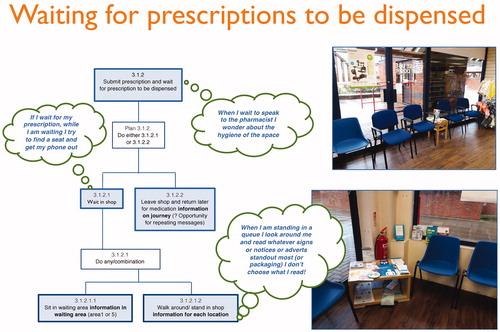
Our project partner, Day Lewis, introduced one of their pharmacies in Woodley, Reading to provide the ‘pharmacy space’ for the project. The Woodley pharmacy was relatively large in size and comprising an area for dispensing and collecting prescriptions and for displaying toiletries, non-prescription health-related products and other goods. To find out how people used the Day Lewis pharmacy we were working with, we collected observational data for a Hierarchical Task Analysis (HTA) to map possible customer and patient pathways in the community pharmacy. HTA is a core human factors/ergonomics method for understanding interactions among humans and other elements of a system. It is used to map systems by describing a task as a higher-level goal with a hierarchy of superordinate and subordinate tasks. At each level of the subtasks, a plan directs the sequence and possible variance of task steps (Shepherd Citation1998). Our researchers spent time in the pharmacy watching how people moved around the space, where they stopped, where they re-traced their steps and so on. The interactions within the space were described as four stages: (1) approach to the pharmacy entrance and entry through the door; (2) journey from inside the door towards the shop/pharmacy counter; (3) arrival and interactions at the counter; (4) departure, leaving the pharmacy. The use of floor plans allowed mapping of a variety of pathways, including purchasing medicines (over-the-counter and prescriptions) and other health and wellbeing shopping; seeking information for advice on medical conditions (especially when the GP surgery is closed or in an emergency when out of medication), getting rid of waste medicines, and using advanced NHS services including medicines review, flu vaccines, morning-after pill, stop smoking service, travel advice and NHS Health checks. For the Ideas Lab the pathways were presented on boards that also included quotations from pharmacy users (see ).
Figure 1. Example of interactions in the pharmacy, with comments from pharmacy users.
Archive material review
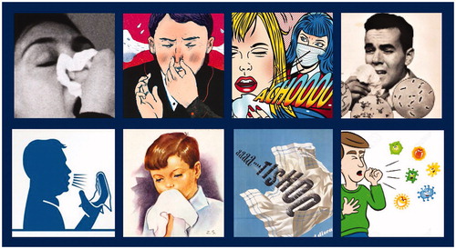
One research strand was an historical review of printed ephemera to explore the kinds of graphic and verbal conventions used in the past to draw attention to issues such as personal hygiene, infection control and the dangers of particular diseases such as tuberculosis (TB), malaria and diphtheria that were once considered major public health threats but are now becoming increasingly resistant to antimicrobials. This aspect of the research recorded the graphic, linguistic and material attributes of around 200 health-related posters, leaflets and notices produced between the end of the nineteenth century and the present day. The analysis took account of:
The user: how have the producers of the information taken account of the needs of their likely target group (text-based and visual means)?
Production/materiality: what use has been made of the production resources available; how does this relate to the likely methods of distribution/dissemination?
Content and modality: how have pictures and text been used to convey the information; does one mode dominate the other? How has information been presented, verbally, visually and spatially so that it is clearly understood?
At the Ideas Lab, a presentation, ‘What can we learn?’, showed examples from this work including from campaigns about prevention of malaria and Ebola, and examples of graphic depictions of sneezes and germs (see ). We considered how techniques used in them might be transferable to presenting information about drug-resistant infections today and in particular how words and images worked together (Walker Citation2017). The presentation included examples of work by Otto and Marie Neurath to raise awareness of, and support prevention of, diseases such as TB and malaria in the 1930s and 1950s. Their approach, known as Isotype, prioritised pictorial and schematic communication over words; their use of striking and effective images was based on consistent and carefully considered principles. They worked with their intended target audiences to find out how they might receive and use the information they encountered, including heath educators, health departments and schools (Burke, Kindel, and Walker Citation2013, 342–53; Walker Citation2019). In the case of a series of charts explaining about TB, and particularly relevant to our notion of ‘persuasive space’, the Neuraths included instructions about how the display could be arranged in a church hall or similar public space, thus linking the information content with the space in which it was displayed. Team members at the Ideas Lab reacted positively to the presentation and following discussion. A Day Lewis participant remarked ‘… looking back in time sometimes [can] give a good steer on what you can do in the future. If something was successful before, it can be reused and done again, so lots of interesting things came out of it… . I am storing them all up waiting for their moment’. Some of the Isotype images influenced one of the teams particularly two of the TB charts where photographs of people who may or not have the disease catch people’s attention. A team member, with design experience said that this reminded her that images of people can be compelling and inclusive and this line of thought contributed to the development of the Beat Bad Bugs proposal (see https://amrpharmacy.org/exhibition/spaces/ , along with examples of Isotype health-related charts).
Figure 2. Illustrations of a sneeze extracted from examples of twentieth-century leaflets and posters.
Interaction and development of ideas
At the Ideas Lab a key component was ‘team time’ where the teams spent time sharing ideas and learning from each other’s disciplinary perspectives. Comments included: ‘Part of the nature of something like this is that it is not easy to work in interdisciplinary groups, and you are finding a language together as much as anything else’. And ‘… one of the best things that has come out of today is that we are all trying to understand each other, and that makes for really interesting conversations’. The team sessions were interrupted by ‘show and tell’ presentations where ideas were shared and discussed with the whole group. The competition teams had access to the expertise of our pharmacy partner, Day Lewis, and pharmacy users joined the Ideas Lab on the second day to respond to emerging ideas and to offer suggestions. Each team visited the particular pharmacy we are working with in Woodley, Reading.
The Ideas Lab worked well for this particular project enabling collaboration raising the profile of the value of design resulting in a change in the perception of the pharmacists involved about ‘design’. As put by a member of the team from Public Health England: ‘I think the way the Ideas Lab would probably influence us is having a designer involved from the outset. The way we have always developed interventions before is we have either not involved a designer at all and we have done it all in house, or we have involved a designer right at the end’. And at a more local level, the lead pharmacist in our pilot pharmacy commented positively on his involvement in the Ideas Lab: ‘It just been so informing to go to the Ideas lab, because previously I didn’t see it from that perspective [pharmacy user], because I am not really a regular pharmacy user myself. But to have all these ideas about what people think, what they look at, how confused they get, or how worried they get, so that has really impacted into the way I work’.
After the Ideas Lab, the competition teams had four weeks to work up a design proposal – which they were asked to present as two A2 boards, with a written (or spoken) rationale and any models or artefacts that might be relevant (see summaries here: https://amrpharmacy.org/five-ideas-for-talking-about-drug-resistant-infections/). The IDAPPS project team, the manager of the Woodley Day Lewis Pharmacy and members of the project advisory board acted as judges using as criteria, accessibility and relevance of the information presented to pharmacy users, effective and creative use of pharmacy space, and transferability of the ideas to other pharmacies. Due to the high standard of the proposals, two were awarded funding for prototype development: ‘Good Bugs, Bad Bugs’ (GBBB) and ‘Beat Bad Bugs’ (BBB).
‘Good Bugs, Bad Bugs’ (see ) comprised:
Figure 3. Some of the components of the Good Bugs Bad Bugs proposal.
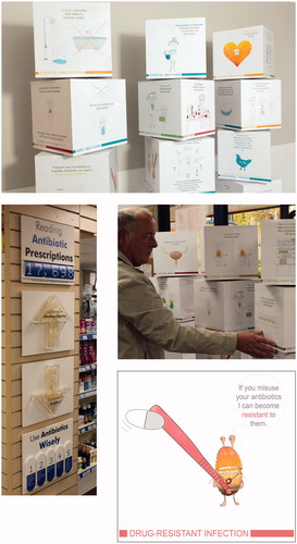
A set of rotating cubes comprising AMR stories, including hand washing, use of antibiotics in farming, self-care for colds and flu and ways to manage cystitis.
An antibiotic prescription ‘barometer’
Knitted bugs and patterns for knitting (in response to the ‘wool counter’ in this particular pharmacy)
An under counter banner drawing attention to the campaign
Beat Bad Bugs’ (see ) comprised;
Figure 4. Some of the components of the Beat Bad Bugs proposal.
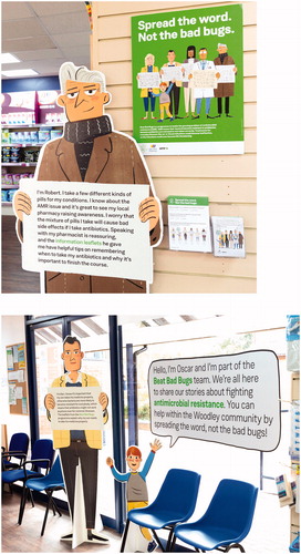
5 life-size, cut-out characters, each with a different antibiotic ‘story’
A leaflet explaining the campaign
A series of leaflets for including in prescription bags at the discretion of the dispensing pharmacist on topics such as: taking antibiotics with or without food, what to do if you miss a dose, and making sure you complete the course.
A window display
Review of prototypes
These winning proposals were installed in the Day Lewis pharmacy in Woodley, Reading during summer 2018, each for 3 weeks. Members of the research team carried out informal, semi-structured interviews with visitors to the pharmacy (N = 67 [27 for BBB and 37 for GBBB]). Our questions were open-ended and intended to open up conversations about the content of the material as well as its visual characteristics. Positioning themselves next to the displayed items the researchers asked:
You started looking at these things. What attracted your attention? Why did you stop to look at them?
What are they all about? What are they telling you?
What did you notice first?
Will you do anything differently as a result of looking at these things?
What doesn’t work? And why do you think so?
The interviews were recorded, transcribed and analysed into themes:
Factors that attracted participants to the display
General views about the display
Engagement with the display
Understanding of antimicrobial resistance
Prior experience of similar displays
Areas for improvement
Future behaviour
Transferability of design/display
In addition, informal conversations took place between the researchers, pharmacists and pharmacy workers in the Woodley branch to elicit their thoughts about people’s interactions with the materials.
Results of the evaluation of prototypes installed in day Lewis community pharmacy
Pharmacies are busy spaces exemplifying tension between health care and retail space (see Rapport et al. Citation2009). In the Woodley pharmacy, for example, there were many products on display, and other health advice promotions, such as for flu jabs, were displayed when the IDAPPS installations were in place. Both the prototype interventions trialled in the Woodley pharmacy were commended for their non-standard way of presenting information and attracting attention to it. Both the stand-up figures (part of BBB), and rotating cubes (part of GBBB) – whilst not new ideas in themselves – were perceived as innovative solutions for presenting information about AMR in community pharmacies.
Design and functionality
In the Woodley pharmacy the larger scale IDAPPS interventions – the cubes and the life size characters – aligned well with the waiting area as the design teams had taken this into account in their proposals. A number of participants interviewed agreed that the area where people wait after handing in their prescription was a useful ‘touch point’ for information presentation. Some interacted with the display for practical reasons such as filling time whilst waiting for their prescriptions to be filled. There were positive remarks about the 3 D format and size of the GBBB rotating cubes. However, some people were concerned about whether or not they were allowed to interact with it.
Yes, I think it’s a good idea, I do because it’s big enough to attract your attention isn’t it. Participant 22
Yeah, I think it’s good. I think it draws attention rather than a poster. It is better than just a poster, yeah. Participant 26
I didn’t realise it actually rotated. I didn’t want to move it. Now I realise it rotates its more useful, you know, Otherwise I thought that’s funny because you can’t see the back of it but I didn’t realise it rotated. Which I think that’s good. Participant 34
On the rotating cubes, keywords or phrases such as cystitis, antibiotics, humans versus animals consumption of antibiotics, bugs, spread of germs, hand hygiene attracted participants’ attention and also acted as cues that prompted participants to recall and reflect on past personal/family health experiences including the use of antibiotics.
And then the antibiotics thing caught my eye. Thinking about how often I have been prescribed antibiotics over the last few months. Participant 11
Because I first saw the word cystitis which is something I have suffered from many times. Participant 13
No, it is just that my son is not very well at the moment and he is on antibiotics and they are not working and they think it could be some bacterial bug but they’re not really very sure and that’s why I was just reading it. Participant 16
Participants thought that the GBBB stories were informative, interesting and generally pitched at the right level for the general public. The messages were considered to be short, concise and easy to understand; there was a general liking for the drawings and speech bubbles used to present information.
It’s small bite-size bits … it’s not like a whole sheet that you have to sit and read. Participant 27
It’s colourful and there is something there… like these speech bubbles made me think, oh I will have a look at that. Participant 30
Of the other components of GBBB, the antibiotic use gauge was also commented on and attracted interest because of the local relevance of its message: the number of antibiotic prescriptions in Reading. However, a banner positioned under the pharmacy counter was hardly noticed suggesting that the relationship between the components of GBBB was not clear.
The life-like characters in the BBB display encouraged participants to engage with it. Participants said the characters were eye-catching and different. Each character had a name and some participants identified with a particular character. According to some participants; there was little effort needed to engage with the figures placed around the pharmacy in areas where pharmacy visitors waited or passed through.
I think the thing about these is you don’t need to interact with them you can just read them, whilst you are stood in the queue waiting, and I like that. For everyone else they are going to be looking around for something to do anyway so having something just there to read easily, is quite good. Participant 7
Well, because they are eye-catching, and they are straight in your face: no messing about and you read it. Participant 28
Some participants said the messages on the characters were clear, informative and useful. For some participants, these messages were new to them; they had not heard about AMR. One participant explained that the messages on the characters had dual functions/qualities: to reinforce the AMR and antibiotic resistance message and to inform the uninitiated.
I think that those people that are aware of it and read it then basically they are reinforcing what they knew already, or giving them information that they weren’t totally aware of or haven’t given much thought to. Participant 26
Some participants said there was too much text on the boards carried by the characters and suggested shorter sentences, use of bullet points or use of bold type to draw attention to certain messages.
It’s a lot of stuff to stop and read, it just needs to be a bit more concise, in little bite-size chunks. You are trying to get through to all sorts of people, and some have more intelligence or less intelligence than others. You need something they can just quickly get. Participant 18
I think there is a lot of words altogether, it would be better if it was just bullet points. Participant 27
I think there needs to be something that says antibiotics in bold so that it draws the link because somebody might read that bit of it…if I walks past [sic] the only bit I would read is beat bad bugs, and it wouldn’t necessarily show me what the problem was. Participant 7
Extent to which participants were aware of AMR
Comments about AMR and antibiotic resistance aligned with the initial online survey undertaken at the start of the IDAPPS project and affirmed the outcomes of previous, much larger studies (see McNulty et al. Citation2007a; Citation2007b). Most of the participants were aware that antibiotics should not be used unless necessary. However, there were some misconceptions that people (rather than bugs) are resistant to antibiotics and can become immune to them if they are used too often, or that they should avoid using antibiotics altogether. Only a few participants had not heard about AMR, but some did not connect their existing knowledge about antimicrobial resistance to the term ‘AMR’ affirming findings by Wellcome (Citation2015).
I do know there is a problem with certain things that are becoming resistant to standard antibiotics. Participant 17
It’s about taking antibiotics. Having had them available all your life, then one day you might be immune, or the bacteria will be immune to the antibiotics. Participant 19
Yes, it’s all about having to take antibiotics to the end of the course… I think it’s because people are stopping and then the bacteria start multiplying again … I didn’t know it was called that though: AMR. Participant 3
However, many of the participants said that they had learnt something new about antibiotics, in particular from the GBBB material which included different kinds of messages in their ‘AMR stories’ approach. The use of the phrase ‘Reading antibiotic prescriptions’ on the GBBB barometer encouraged one participant to remark that it made them think the messages were relevant to them, and the use of names on the BBB characters were thought by one person to be ‘a nice personal touch’.
I think probably most of it I already knew. Erm but … probably the antibiotics being used in farming I didn’t know. Participant 3
Yes, definitely. It opens people’s eyes to it. I would never have thought that number [of antibiotics prescribed] would have been as high as it was. Participant 6
The feedback suggested that interventions are likely to work best when there is no ambiguity about how people should engage with them. While the larger-scale interventions were noticed and commented on, supporting information, such as leaflets and badges, tended not to be noticed by people and there was reluctance to pick up items. At busy times pharmacy workers did not have time to draw attention to such artefacts. Pharmacists and pharmacy workers we consulted were conscious that they would like to have more time to talk with patients about AMR and particularly about taking antibiotics correctly. Perhaps because of this, there was considerable support for BBB’s set of information cards that could be handed to patients as required. The topics (which we identified and discussed at the Ideas Lab) were taking antibiotics with or without food; information about side effects; and make sure you complete the course. Pharmacists suggested copies of these leaflets at the point of dispensing so that one or more, as relevant, could be put in the prescription bag.
Informal review of prototypes at the Day Lewis national conference
The prototypes were also displayed at the Day Lewis National Conference in November 2018, where pharmacists and pharmacy workers attending the conference were asked for their views about the prototypes, and which of the interventions would be suitable for use in their pharmacy. Delegates from 88 Day Lewis pharmacies attending their national conference responded with enthusiasm and saw both installations as useful in starting conversations with patients. When asked for their preference for GBBB or BBB in their pharmacies, 48 expressed a preference for the GBBB rotating cubes and 40 for the life-size characters from BBB. GBBB was commented on as being family friendly with accessible, easy-to-read text and some delegates suggested a smaller table-top version would suit smaller pharmacies. BBB was thought to be eye-catching and engaging and those from smaller pharmacies said that just one of the characters, which locally-relevant text would work well. However there was a widely-held view that there was too much information on the boards being carried by the characters. Responses suggested that both installations would attract attention in their pharmacies and be likely to encourage engagement from people of all ages, including families and children. Delegates commented the benefits of brief, patient-friendly messages on the GBBB cubes. There was positive reaction to the cards with information about using antibiotics to go into prescription bags.
Preliminary recommendations for using space in pharmacies effectively for health communication
Our evaluation in one pharmacy suggested that the following may be useful considerations when for designing and locating health communication materials in community pharmacies:
Consider carefully how to position related materials in any one campaign (rather than merely filling available space). Think about how people move around the pharmacy; think about using ‘touch points’ that could include waiting spaces or over-the-counter interactions for display and dissemination of information. This may seem obvious, but the pharmacists and pharmacy workers we worked with had not considered such issues and said they would be very helpful to take into account.
Do not expect the pharmacy workers to tell customers and patients what they can do. Consider using notices inviting people to pick up, take home, or touch, or to direct them to another part of the same campaign.
Consider using information cards that explain how to use antibiotics correctly. The pharmacists we worked with suggested as topics, ‘taking antibiotics with or without food’, ‘side effects’ and ‘make sure you complete the course’. These topics were identified as those pharmacists spent most time answering questions about, so clearly presented information (that could perhaps be placed inside a prescription bag at point of medicine handover) would save time and help patients.
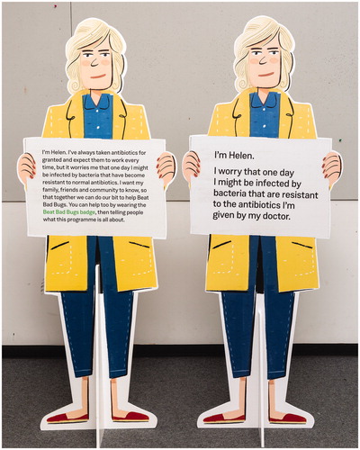
Do not expect people to read or engage with large amounts of continuous text. Keep messages short (or ‘bite-sized’ as remarked by one participant), perhaps presented as a list. Use simple, straightforward and patient-friendly language. This is standard good practice as recommended in health communication guidelines (such as in Kools Citation2012) but at the Ideas Lab, discussion about the amount of detail that should be included in a text was a controversial issue. Feedback in relation to text on the boards held by the stand-up BBB figures was that there was too much text (even though this had been carefully edited by the team). A second prototype version with further reduced text is under review (see ).
Test colours in a pharmacy setting. Strong colours maybe more appropriate than soft ones in many situations not least due to the range of colours from the products on the pharmacy shelves. To be effective campaign messages have to stand out against this. Using the same colour to relate items may be helpful.
Consider engaging interest by referring to the locality or characters that people may relate to.
Figure 5. Example of amended text (right) in response to user feedback about the amount of text used on the Beat Bad Bugs characters.
Concluding remarks
IDAPPS was a small study intended to consider how information about AMR could be effectively displayed in community pharmacies, and the project succeeded in producing five creative, research-informed solutions that communicated information about AMR and antibiotic resistance. The competition format with a two-day ‘Ideas Lab’ that had to be attended by our selected teams was a focussed and cost-efficient way to produce a range of solutions. It reinforced the value of drawing on expertise across disciplines, and the competition entries demonstrated this well – bringing together microbiology, mindfulness, creative practice in illustration, behavioural science alongside our core disciplines of architecture, pharmacy, human factors/ergonomics and information design. The planning for the ‘Ideas Lab’ enabled the research team to prepare contextual material relevant to users and circumstances of use which in turn stimulated thinking, including of circumstances of use in community pharmacies. Each of the proposed competition outcomes was co-designed with pharmacists and pharmacy users who attended the Ideas Lab and who were able to identify the challenges they faced when they visited a pharmacy and their perceptions about barriers to effectiveness. Their knowledge of their community pharmacy and the needs of their customers and patients helped shape the design proposals, and through this we hope to better educate and persuade people to take note and action. IDAPPS has affirmed the potential of community pharmacies as places to disseminate information about AMR and antibiotic resistance. There is a natural alignment with the notion of a ‘healthy living pharmacy’ which project partner Day Lewis is committed to and that fed into discussions at our Ideas Lab, and with the expanding role of pharmacists to deliver health care as well as drug dispensing including as independent prescribers (RPS Citation2016), in public health (RPS Citation2014), and in general practice (NHS England Citation2016).
For pharmacists involved in the Ideas Lab there was little prior awareness of the value of the contribution that design research and practice, including ways of thinking, could add if introduced at the start of a project, particularly one concerned with the effective communication of information. Most thought that design was visual styling, usually undertaken towards the end of a project. None were aware that design could be collaborative, and could introduce methods to encourage different ways of approaching and solving particular problems. In the IDAPPS project our work with groups unfamiliar to collaborative working involving co-design and prototype evaluation helped to affirm that designing can disrupt pre-conceived ideas and lead to new ways (in this case) of presenting information. Even though co-design is a well-established process in the health sector (see Macdonald Citation2017), for many of the non-designers in this project it was an entirely new way of working. Philip Howard, Consultant Antimicrobial Pharmacist at Leeds Teaching Hospitals NHS Trust, who attended the Ideas Lab, remarked
IDDAPS has made me totally rethink how we communicate messages around AMR to the public and healthcare professionals. Inclusion of a designer on project will become the norm where budgetary constraints allow. Where funds are tight, I will apply the principles I have learned.
We agree with Tsekleves and Cooper (Citation2017, 396) that effective communication in supporting health is a ‘key opportunity’ for design researchers and practitioners. IDAPPS brought together health communicators unfamiliar with ways in which designers work to identify solutions that take account of stakeholder and user experience. It demonstrated how information design and architecture research and practice can enhance the interior built environment of a community pharmacy and the presentation of information about AMR within it, with the needs of users in mind.
Postscript
Work from the two winning IDAPPS entries is now informing a project with pharmacies in Rwanda (https://amrpharmacy.org/beat-bad-microbes-materials-reach-kigali-for-pilot-study-2/), funded by the Global Challenges Research Fund for equitable partnerships. The entry from a team put together by Public Health England has been taken forward with additional funding to produce an ‘antibiotic checklist’ in association with the Antibiotic Guardian Campaign, and this is currently being trialled in pharmacies in Gloucestershire. A pharmacy in Kennington, London installed a proposal ‘Be AMR aware’ conceived by a team from CCD Design and after review of 156 respondents, 77% said they learnt something new about AMR as a result of engaging with the intervention; 76% said they would ask the pharmacist for advice.
Acknowledgements
We thank the Arts and Humanities Research Council for funding this work [Grant AH/R002053/1], the project teams working with us, the pharmacy users who contributed to the work, and Laura Bennetto, Polly Harte and Miranda Mole for working with us.
Data access statement
Transcripts from the interviews with participants in the study can be obtained from [email protected]
Disclosure statement
No potential conflict of interest was reported by the author(s).
Additional information
Funding
Notes on contributors
Sue Walker
Sue Walker is Professor of Typography at the University of Reading where she researches the history, theory and practice of information design, and design for children’s reading. Her recent and current research is in the area of health communication involving funded projects about anti-microbial resistance, and adolescent mental health.
Sue Hignett
Sue Hignett is Professor of Healthcare Ergonomics and Patient Safety in the School of Design & Creative Arts, Loughborough University. She is a Fellow of the Chartered Institute of Ergonomics and Human Factors (FCIEHF), Certified European Ergonomist (Eur.Erg) and Chartered Physiotherapist (MCSP). Her research focuses on optimising human wellbeing and overall system performance by understanding and designing interactions in health and social care systems.
Rosemary Lim
Dr Rosemary Lim is a qualified pharmacist and an Associate Professor in Medication Use and Safety. Her research focuses on healthcare improvement specifically medication safety. Informed by her experience and training in pharmacy and human factors, she leads and collaborates on research around medication management in dementia, insulin infusions and antimicrobial resistance. Her work embeds a user-led co-design approach and is interdisciplinary.
Caroline Parkhurst
Caroline Parkhurst is a community pharmacist, working for the pharmacy company Day Lewis. She is one of the superintendent pharmacist team and works predominantly at the Day Lewis support office in Croydon, UK, dealing with governance issues and regulatory matters for their 300 pharmacies. She is also a Teacher Practitioner at the University of Reading School of Pharmacy.
Flora Samuel
Flora Samuel is Professor of Architecture in the Built Environment at the University of Reading and was until recently the first Vice President for Research at the Royal Institute of British Architects. A renowned historian of modernist architecture, she has over the last ten years focussed on supporting the development of research in architectural practice.
References
- Black, A., A. Gibb, C. Carey, S. Barker, C. Leake, and L. Solomons. 2013. “Designing a Questionnaire to Gather Carer Input to Pain Assessment for Hospitalized People with Dementia.” Visible Language 47 (2): 37–60.
- Burke, C., E. Kindel, and S. Walker (eds). 2013. Isotype: Design and Contexts 1925–1971. London: Hyphen Press, 342–353.
- Cerne Oven, P., and B. Predan. 2013. Designing an Agenda, or, How to Avoid Solving Problems That Aren’t. Focus: Service and Information Design. Ljubljana: The Pekinpah Association.
- Dickinson, D., and S. Gallina, 2017. “Information Design in Medicine Package Leaflets.” In Information Design: Research and Practice, edited by A. Black, P. Luna, O. Lund, and, S. Walker. 685–700. Abingdon: Routledge.
- Kools, M. 2012. “Making Written Materials Easy to Understand.” In Writing Health Communication: An Evidence-Based Guide, edited by C. Abraham and M. Kools, London: Sage.
- Local Government Association. 2016. The Community Pharmacy Offer for Improving the Public’s Health: A Briefing for Local Government and Health and Wellbeing Boards. London: LGA.
- Macdonald, A. 2017. “Negotiating Design within Sceptical Territory: lessons from Healthcare.” In Design for Health, edited by E. Tsekleves, and R. Cooper, 311–327. Abingdon: Routledge.
- McNulty, C., P. Boyle, T. Nichols, P. Clappison, and P. Davey. 2007a. “Don’t Wear Me out—the Public’s Knowledge of and Attitudes to Antibiotic Use.” Journal of Antimicrobial Chemotherapy 59 (4): 727–738. doi:10.1093/jac/dkl558.
- McNulty, C., P. Boyle, T. Nichols, P. Clappison, and P. Davey. 2007b. “The Public’s Attitudes to and Compliance with Antibiotics.” Journal of Antimicrobial Chemotherapy 60 (suppl_1): i63–i68. doi:10.1093/jac/dkm161.
- NHS England. 2016. General Practice Forward View. Accessed 5 September 2019. https://www.england.nhs.uk/wp-content/uploads/2016/04/gpfv.pdf.
- Noël, G., T. Luig, M. Heatherington, and D. Campbell-Scherer. 2018. “Developing Tools to Support Patients and Healthcare Providers When in Conversation about Obesity: The 5As Team Program.” Information Design Journal 24 (2): 131–115. doi:10.1075/idj.00004.noe.
- Pahl, K. 2014. ‘Co-producing Legacy: What is the Role of Artists within Connected Communities Projects’ http://gtr.rcuk.ac.uk/projects?ref=AH/L013185/1.
- Rapport, F., M. A. Doel, and G. S. Jerzembek. 2009. “Convenient Space” or “A Tight Squeeze”: Insider views on the Community Pharmacy.” Health & Place 15 (1): 315–322. doi:10.1016/j.healthplace.2008.06.002.
- Royal Pharmaceutical Society. 2014. “Professional Standards for Public Health Practice for Pharmacy.” Accessed on 5 September 2019. https://www.rpharms.com/Portals/0/RPS%20document%20library/Open%20access/Professional%20standards/Professional%20standards%20for%20public%20health/professional-standards-for-public-health.pdf, general practice (https://www.england.nhs.uk/wp-content/uploads/2016/04/gpfv.pdf.
- Royal Pharmaceutical Society [RPS]. 2016. “A Competency Framework for All Prescribers.” Accessed 5 September 2019. https://www.rpharms.com/Portals/0/RPS%20document%20library/Open%20access/Professional%20standards/Prescribing%20competency%20framework/prescribing-competency-framework.pdf?ver=2019-02-13-163215-030.
- Samuel, F. 2018. Why Architects Matter: Evidencing and Communicating the Value of Architects. London: Routledge.
- Schön, D. A. 1984. “The Architectural Studio as an Exemplar of Education for Reflection-in-Action.” Journal of Architectural Education 38 (1): 2–9.
- Shepherd, A. 1998. “HTA as a Framework for Task Analysis.” Ergonomics 41 (11): 1537–1552. doi:10.1080/001401398186063.
- Taylor, E., and S. Hignett. 2014. “The Environment of Safe Care: Considering Building Design as One Facet of Safety.” Paper presented at Proceedings of the HFES 2014 International Symposium on Human Factors and Ergonomics in Health Care, Chicago, USA. 9–11 March 2014.
- Tsekleves, E., and R. Cooper (eds.). 2017. Design for Health. Abingdon: Routledge.
- University of Sheffield. 2012–2014. Accessed on 30 September 2019. https://www.sheffield.ac.uk/polopoly_fs/1.359438!/file/FinalReport4.pdf
- Walker, S. 2017. “The Contribution of Typography and Information Design to Health Communication.” In Design for Health, edited by E. Tsekleves and R. Cooper, 92–109. Abingdon: Routledge.
- Walker, S. 2019. “Effective Antimicrobial Resistance Communication: The Role of Information Design.” Palgrave Communications 5 (1). doi:10.1057/s41599-019-0231-z.
- Wellcome. 2015. “Antibiotic Resistance Poorly Communicated and Widely Misunderstood by UK Public.” Accessed 5 September 2019. https://wellcome.ac.uk/press-release/antibiotic-resistance-poorly-communicated-and-widely-misunderstood-uk-public.
- Zender, M., W. B. Brinkman, and L. E. Widdice, 2017. “Design + Medical Collaboration.” In Information Design: Research and Practice, edited by A. Black, P. Luna, O. Lund and S. Walker, 655–668. Abingdon: Routledge.