 ?Mathematical formulae have been encoded as MathML and are displayed in this HTML version using MathJax in order to improve their display. Uncheck the box to turn MathJax off. This feature requires Javascript. Click on a formula to zoom.
Abstract
This article describes a suite of student-created Shiny apps for teaching statistics and a field test of their short-term effectiveness. To date, more than 50 Shiny apps and a growing collection of associated lesson plans, designed to enrich the teaching of both introductory and upper division statistics courses, have been developed. The apps are available for free use and their open source code can be adapted as desired. We report on the experimental testing of four of these Shiny apps to examine short-term learning outcomes in an introductory statistical concepts course.
1 Introduction/Background
As the Internet has developed into a world-wide communication medium, teachers have come to use a wide range of interactive web applications for educational purposes including web apps that replaced some functions of stand-alone computer software. They provide the potential for enhancing teaching and learning strategies and challenging traditional modes of teaching (Klobas and Renzi Citation2000), especially through an emphasis on simulation. It has long been recognized that the outcome and quality of statistical education can be greatly enhanced by the use of simulation to help students comprehend difficult concepts, whether at the introductory or upper division level (Chance and Rossman Citation2006; Zieffler and Garfield Citation2007). Additionally, simulations appear to be more effective on low-achieving students since the computer software offers them opportunities to review a concept multiple times (Jamie Citation2002). Online resources for teaching statistics courses provide great advantages over more traditional teaching methods because such resources can more readily deliver an active learning pedagogy through up-to-date datasets, interactive web apps, expository materials with links to deeper content, assessment items, and fun activities. Resources like web apps that require only a browser are also more accessible to a broader student population than stand-alone proprietary computer software. Further, web apps can be made dynamic to supplement and enrich other teaching materials (Tishkovskaya and Lancaster Citation2012). Giving students opportunities to explore different statistical models, manipulate assumptions and parameters of these models, and even generate data from the model, can improve student understanding of probability and statistics (Garfield and Ben-Zvi Citation2007).
We believe that the Shiny package in R (Chang et al. Citation2015) provides an excellent software development platform for creating web-based applications that implement Garfield and Ben-Zvi’s vision. This is because the Shiny package is designed from the ground up to facilitate interactivity and visualizations that are at the heart of good pedagogy. Shiny apps work simply through a browser and can replace the functionality of apps created in traditional platforms that are no longer fully supported such as Java and Flash. The Shiny package builds interactive web apps using the R programming language that can be extended with CSS themes, HTML widgets, JavaScript actions, etc. Shiny apps are also amenable for use in teaching and learning because they involve only regular browser skills rather than students’ knowledge of programming or access to specialized software. Shiny apps are also very versatile; developers can even incorporate demonstrations of their research topics or learning objectives into both new and existing apps with ease.
Shiny apps are valuable both to understand a context and to explore a concept. A context is required to make knowledge useful and it is important to model that in teaching statistical concepts (Cobb and Moore Citation1997; Lovett and Lee Citation2016; Pfannkuch Citation2011). Thus, a majority of the apps in our collection feature contextual content. For example, highly interactive Shiny apps can offer students a means to explore how different assumptions or different levels of variability might change a contextual conclusion (an app on Simpson’s Paradox in our collection is an example). At the same time a better understanding of statistical concepts results when the context is paired with simulation-based explorations. These explorations provide fluid and dynamic presentation of statistical concepts that are displayed as students move sliders or click on buttons (Doi, Potter, and Wong Citation2016). Implementation of Shiny apps in or outside of class has the potential to increase a student’s ability to understand and use advanced techniques and data from applied research, and also to enhance their satisfaction with the course (Fawcett Citation2018).
Other than enhancing the learning experience on the student’s end, Shiny apps also elevate the teaching experience. Instructors may encounter difficulty finding applications that sufficiently address all of their pedagogical objectives, needs, and values, but it is now possible for instructors to use R scripts to build their own teaching tools tailor-made to their style. Converting existing R scripts to Shiny apps is not difficult (Doi, Potter, and Wong Citation2016). Unlike other existing applications that usually require background knowledge in JAVA, JavaScript, HTML, CSS, etc., Shiny apps are more satisfying and accessible to statistics educators for their work in implementing educational activities (González, López, and Cobo Citation2018). With the Shiny package, instructors can create educational applications that are interactive, dynamic, user-friendly, and have good esthetic value (Doi, Potter, and Wong Citation2016). Customization of existing applications requires fluency in the language originally used and, in many cases, the source code may not be readily available (Doi, Potter, and Wong Citation2016). One advantage of Shiny apps is the more widespread fluency statistics instructors have in R over other languages. An instructor can easily create new applications and adjust existing Shiny apps to accommodate his or her teaching objectives. Our program illustrates another possibility for instructors without the time or acumen: providing valuable experience to undergraduate students to help with the app development process, which is an important marketable skill.
There are several fine app collections that are both widely used and freely available (see Section 5). However, integrating the above ideas led to the creation of the Shiny app development program whose end product is described in this article, making it distinctive in that:
The Shiny apps are all developed by Penn State undergraduates for their peer students, and those undergraduate researchers have a good understanding of the intended app users’ needs and expectations.
The student-developers put a good deal of their effort into designing a more visually appealing interface targeting undergraduate students following a style guide both in the interface and in the backend coding. (e.g., colors used in the graphical presentations follow palettes distinguishable by nearly all color-blind individuals.)
All of the apps have been given ratings of mobile friendliness (The score is the median reported by at least 5 users on a 1 to 5 rating scale).
The full Book Of Apps for Statistics Teaching (BOAST) has a broad coverage of undergraduate statistics topics at both the introductory and upper division levels that results from the teamwork of many developers rather than relying on a single talented individual.
The Shiny apps have been field-tested in a real classroom experimental setting (Sections 3 and 4) to demonstrate the efficacy of the teaching applications developed.
Our Shiny app development team also works to create and incorporate supplemental materials like lesson plans and assessment questions on the key learning goals of each app (Appendix B).
This collection includes apps that give students an opportunity to explore through simulation, to analyze in context, and to play with game-based quizzing.
These attributes, integrated into a system of continual data collection on user experiences, make the BOAST collection of Shiny apps a unique and continually improving resource for statistics instruction across the curriculum.
In Section 2 we provide representative examples of the Shiny apps developed, ranging from theoretical background to simulations, challenges, and game modules. Section 3 further elaborates on the methodology for the field experiment conducted. Section 4 gives the results of the experimental trial and Section 5 provides some discussion of the lessons learned.
2 Examples
The current collection of apps produced in this on-going program include 56 Shiny apps (50 deployed; 6 in final testing) covering 13 chapters that span the undergraduate statistics curriculum. Four chapters are at the introductory-level covering topics in Data Gathering, Data Description, Basic Probability, and Statistical Inference; eight chapters are at the upper-division level covering Probability, Regression, Analysis of Variance, Time Series, Sampling, Categorical Data, Data Science, and Stochastic Processes; and one chapter addresses statistical issues in Biology (development of the apps in this final chapter was funded by the Department of Biology for use in their courses). A list with links to the 50 deployed Shiny apps developed over the first four summers (2017–2020) of the program appears in Appendix A.
Our BOAST team developed the apps in a reproducible team-based manner in Github and periodically pushed new code into the Github repository (https://github.com/EducationShinyAppTeam/BOAST) and posted to the project website at https://shinyapps.science.psu.edu. While multiple users have tested all of the apps under different amounts of user traffic, only 20 have been field-tested in large classes of more than 60 students (including those described in Sections 3 and 4). As part of our larger field-testing program, we gathered survey data from students and about 2/3 of users found the apps to be helpful in their learning and to have a well-designed interface (Appendix C). The preponderance of the negative open-ended responses referred to server performance. As a result of this feedback, we moved the collection to shinyapps.io to allow the apps to run smoothly at no cost for end users even in large classes with sizeable numbers of simultaneous users. For, instructors who wish to modify the apps and host them on their own local server, the current open-source code is available at https://github.com/EducationShinyAppTeam/BOAST.
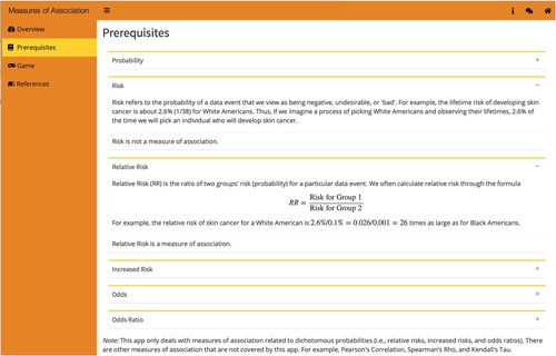
Apps in BOAST use a combination of free exploration, exploration with challenges, simulation, and game modules. Each section is indicated by a different logo on the sidebar. The “Measures of Association” app in Chapter Two shows a typical layout of the sidebar menu of the BOAST Shiny apps (). The Prerequisites section provides background information and statistical knowledge the Shiny app is based on (in this case, comparing and contrasting probability, risk, relative risk, odds, and odds ratio). The Overview section gives a general introduction to the specific app and includes a list of instructions to navigate through it. The free exploration, challenge-based explorations, and game modules are the user-interactive parts where users can change parameters of some tests or plots, create their own plots, work on challenges, or play quizzing games. Finally, a references section provides sources for packages, contextual readings, or datasets used.
Fig. 1 The Measures of Association app showing an example of a Prerequisites section.
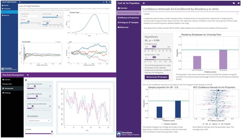
Plots displayed in the simulation sections are designed to help the user visualize statistical concepts that are often hard to grasp without visual aid, such as interpreting confidence intervals ( right panel), understanding the law of large numbers ( upper left), or trend, seasonality, and randomness in time series ( lower left). By dragging the slider bar on the sidebar menu or inputting different numbers, users are able to see how the plots change based on different parameters.
Fig. 2 Examples of simulation-based exploration modules showing the Law of Large Numbers, Confidence Intervals for Proportions, and Time Series Decompositions apps.
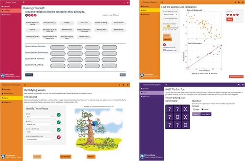
Examples of creative game modules from the BOAST Shiny apps include Tic-Tac-Toe ( bottom right), a multilevel matching game (, upper left), machine-graded guessing games (, upper right), and a “Hangman” style game (, lower left). These game modules are designed to help review the statistical knowledge learned from the simulation section and enhance the user experience. Some game modules are scored and the course instructor can use these modules as an in-class quiz or homework assignment. Often, users are given hints or feedback after each incorrect answer and can only access the next level by completing the previous level. We recommend instructors facilitate guided lessons of the exploration components of the apps with students comparing results in teams where appropriate. Assigning the game-based portions of the apps for individual work where the student must upload a screenshot showing they “won” the game is an effective way for students to demonstrate proficiencies and encourage more time on task. In particular, log files of app usage show that most students spend more time playing the games than is required to complete the assignment.
Fig. 3 Examples of game-based quizzing styles in the Shiny app collection showing Variable Types, Correlation Guessing, Measures of Association, and Hypothesis Testing apps.
3 Methodology: A Field-Test
We tested the short-term effectiveness of teaching using the Shiny applications from the Book of Apps for Statistics Teaching using a design blocked by course section. We then recruited the students in the study from those who enrolled in an introductory statistical concepts and reasoning course taught primarily to arts and humanities majors at the University Park campus of Penn State. Notes for the online version of the course (https://newonlinecourses.science.psu.edu/stat100/) are used as a reference for students taking the in-class version. The course does not use a simulation-based inference curriculum but does make use of computer simulations to illustrate concepts. The CANVAS learning management system is used for assignments, quizzes, lecture notes, and discussions. The full class meets together in two lecture sessions per week while each half of the class meets once a week in one of two lab sections. The planned experiment was to alternate the two lab sections so that one used the Shiny apps for teaching while the other section had the instructor presenting information with occasional use of clickers to respond to questions (then the following week the two classes reversed the pedagogical style). The response variable of interest was students’ scores on two questions embedded in an end-of-lab quiz related to the learning objective of the app and presentation. Appendix B gives the four example lesson plan outlines for the apps used by the instructor for the field-test and the associated assessment items for the quizzes. The lab sessions are 50 min long with the Shiny app usage (or regular presentations) taking about 10 min, the quiz taking about 10–15 min, and the remaining 25–30 min being taught the same in both sections. Unfortunately, two labs we planned to be part of the experiment were canceled due to the University closing for inclement weather. In one of the remaining labs, a typographical error in one of the quiz questions removed that question from the quiz grade and from this study. This left four labs (topics) with scores on the quizzes being compared on a topic-by-topic basis between the experimental and control groups using ordinal logistic regression (to examine whether students answered 0, 1, or 2 questions normatively correctly) or logistic regression (for the lab where only a single question was asked). The research question examined was to what degree the use of the Shiny apps would lead to an improved odds of getting a question correct. This was evaluated both on a topic-by-topic basis and for the totality of the four labs taken together. The topic-by-topic analyses used the following proportional odds model:
So that the intercept gives the overall log odds for a student getting no more than k questions correct (k
0, 1, or 2), and
is the log odds ratio of getting a question correct for students using an app versus students not using an app. Thus, we assume the log odds increases linearly so the change from 0 to 1 questions correct is the same as the change from answering 1 question correctly to answering both questions correctly.
A generalized linear mixed model was used to examine the data for the entire class
Here is the overall log odds of getting a question correct,
gives the change in log odds based on question difficulty,
is the log of the odds ratio for using an app versus not using an app for that material, and
is the random effect of students.
The study was given an exemption by the institution review board. Written consent forms were gathered by undergraduate researchers, while the course instructor was not in the room, and securely stored until after grades were submitted at the end of the semester. At that time, we collected, de-identified, and analyzed only the data from students who had given consent at the beginning of the semester. A total of 51 students from the first lab section and 46 students from the second lab section gave consent to participate in the study.
4 Field-Test Results
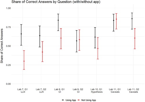
shows the proportion of students getting each of the seven quiz questions correct for the section using the Shiny app (in black) and for the section getting standard instruction (in red) across the four labs where the four apps were tested. Performance from the students who used a Shiny app in their learning was roughly the same on two of the questions, was moderately better on one of the questions and a good deal better on the four remaining questions. The lab sections using an app did not fare even moderately worse in any case.
Fig. 4 The proportion of correct answers to multiple choice assessment questions for sections using an app (in black) and sections not using an app (in red). Lines indicate 95% confidence intervals based on the logistic model.
gives the results of the logistic and ordinal logistic regression analyses by topic and for all four topics combined. Here, we see that the overall estimated odds of getting one of the seven assessment questions correct was about 2.4 times higher for students who used the app for that lesson compared to students who did not (CI: 1.62 to 3.56). These results seem to indicate that the RShiny applications do have educational value, in the sense of being associated with increasing the odds of students correctly answering assessment questions at the end of the lab period in which they were used. Here, the Law of Large Numbers app seemed to perform particularly well by that measure.
Table 1 Confidence Intervals and p-values for increased odds of correct responses with use of Shiny apps.
5 Conclusion and Discussion
While it is comforting that students using the apps appeared to have done better in the lab quizzes, those quizzes were assessing only very short-term retention of the concepts at play. Given the fact that these were only 10-min activities, it may be unreasonable to expect more than the modest long-term learning gains. However, there is research suggesting that timely completion of quizzes immediately after class activities have shown a positive association with better exam performance later in the course (Hadsell Citation2009). Further, students acquire learning benefits from taking quizzes because of the retrieval practice (McDaniel et al. Citation2011). Another strength of using these kind of Shiny app resources is that students can return to them on their own at any time, even after the class is over. Indeed, we hope the breadth of the collection created as a part of project BOAST will prove very helpful as a review tool not only for introductory and upper-level undergraduate courses, but also for service courses at the graduate level. These apps are designed to offer a reliable resource for students to practice and refresh important concepts they have previously studied but may have forgotten.
In our experiment, the lab sessions not using the apps faced a more traditional presentation style with occasional use of clickers as the only active component. Hence, we expect that the control pedagogy in our experiment is likely to underperform almost any pedagogy that includes a greater level of active learning. Since many Shiny apps can be tailored to take just 10 min to use, it would seem to be worthwhile to pair them with complementary activities within a class period to achieve an optimal lesson plan. For example, since web-apps are often used individually, future research might examine if they are best paired with a short team-based activity. Alternatively, educators can readily use Shiny apps in eBooks or online courses where the ability to see concepts in action can enhance text-based presentations of material.
Shiny apps as a teaching tool also have their technical limitations. R packages are not currently available for some dynamic animation features that can make Shiny apps less visually attractive than some Flash-based applications. Secondly, some solely JavaScript applets run faster and more efficiently than Shiny apps (Doi, Potter, and Wong Citation2016). Maintaining an efficient Shiny server is a nontrivial task and requires a bit more specialized expertise than is available at some schools. At the time of the experiment described here, the number of people who could access our server simultaneously was limited to roughly 60–80 students and this did cause some negative feedback as mentioned above. We resolved this by moving all of the BOAST project apps to a much stronger server, which has greatly improved the student experience. Survey data taken on the original server configuration found 69% strongly agreeing or agreeing with a statement that an app was an effective way to learn the material and 64% with a statement that the web-based interface for an app was well-designed. More recent cohorts of BOAST students have seen those ratings improve with the server improvements and the continual improvement of the collection based on systematically gathered feedback.
With each summer’s cohort comes a new student with different statistical, computational, real-world contextual, and research interests. We believe the associated diversity is a strength of the project allowing us to refresh the collection and add new modules in interesting ways that collections managed by a single person might not contemplate. Depending on their specific interests, future educational research work for the student investigators in project BOAST might include such topics as examining longer term learning with app usage, qualitative education studies such as over-the-shoulder interviews while students use the apps to better understand how they take in the visuals presented, or studies of the effectiveness of feedback offered within the apps.
The integration of Shiny apps into undergraduate statistics courses often complements, instead of substituting for, other expository material and activities that instructors build into their syllabi. The graphical features and user-interactive design of Shiny apps can help students to visualize abstract statistical concepts and reinforce their understanding through simulations and concept challenges. Of course, other collections of web apps for teaching statistics are available to the statistics education community. Perhaps the most widely used is the Rossman-Chance applet collection at www.rossmanchance.com/applets/ which are programmed primarily in JavaScript and are well-designed for educational purposes with associated instructor notes, though they lack the open source nature of the BOAST collection. Collections of Shiny apps for teaching have been created by a number of instructors, for example, for introductory statistics by Daniel Adrian at the Grand Valley State University (http://facweb.gvsu.edu/adriand1/215apps.html) for a simulation-based inference curriculum by Scott Manski at the Michigan State University (https://msu.edu/∼fairbour/Applets.html), and for both undergraduate and the master’s level courses by Justin Post at the North Carolina State University (www4.stat.ncsu.edu/post/teaching.html). A well-designed collection of Shiny apps available for free use and with good technical support, but without the advantages of open source code, is associated with the Statistics: The Art and Science of Learning from Data textbook (Agresti, Franklin, and Klingenberg Citation2017). An open-source Shiny app collection with more instructional resources taking a data-centric focus is used by “Little Apps for teaching stats” developed as a part of Danny Kaplan’s StatPREP program. Shiny app development has also been extensive at the Duke University (see, e.g., http://www2.stat.duke.edu/∼mc301/shinyed/) including a project run by Maria Tackett that, like the BOAST program, trains students in creating apps (https://muser.duke.edu/projects/interactive-learning-apps-using-r-shiny). Taken together these collections provide a wide-ranging group of active learning resources for statistics educators, and we hope that the distinctive nature of our collection adds value to this developing infrastructure.
References
- Agresti, A., Franklin, C.A., and Klingenberg, B. (2017), Statistics: The Art and Science of Learning from Data (4th ed.), Boston, MA: Pearson.
- Chance, B., and Rossman, A. (2006), “Using Simulation to Teach and Learn Statistics,” in Proceedings of the Seventh International Conference on Teaching Statistics, eds. A. Rossman and B. Chance, Voorburg, The Netherlands: International Statistical Institute.
- Chang, W., Cheng, J., Allaire, J. J., Xie, Y., and McPherson, J. (2015), “Shiny: Web Application Framework for R. R package version 0.11.1,” Retrieved February 23, 2016. Available at https://www.CRAN.R-project.org/package=shinywww.CRAN.R-project.org/package=shiny.
- Cobb, G. W., and Moore, D. S. (1997), “Mathematics, Statistics, and Teaching,” The American Mathematical Monthly, 104, 801–823. DOI: https://doi.org/10.1080/00029890.1997.11990723.
- Doi, J., Potter, G., and Wong, J. (2016), “Web Application Teaching Tools for Statistics Using R and Shiny,” Technology Innovations in Statistics Education, 9. DOI: https://doi.org/10.5070/T591027492.
- Fawcett, L. (2018), “Using Interactive Shiny Applications to Facilitate Research-Informed Learning and Teaching,” Journal of Statistics Education, 26, 2–16. DOI: https://doi.org/10.1080/10691898.2018.1436999.
- Garfield, J., and Ben-Zvi, D. (2007), “How Students Learn Statistics Revisited: A Current Review of Research on Teaching and Learning Statistics,” International Statistical Review, 75, 372–396. DOI: https://doi.org/10.1111/j.1751-5823.2007.00029.x.
- González, J. A., López, M., and Cobo E. (2018), “Assessing Shiny Apps Through Student Feedback: Recommendations From a Qualitative Study,” Computer Applications in Engineering Education, 26, 1813–1824. DOI: https://doi.org/10.1002/cae.21932.
- Hadsell, L. (2009), “The Effect of Quiz Timing on Exam Performance,” Journal of Education for Business, 84, 135–140. DOI: https://doi.org/10.3200/JOEB.84.3.135-141.
- Jamie, D. M. (2002), “Using Computer Simulation Methods to Teach Statistics: A Review of the Literature,” Journal of Statistics Education, 10, 1.
- Klobas, J., and Renzi, S. (2000), “Selecting Software And Services For Web-Based Teaching And Learning,” Web-Based Learning And Teaching Technologies, Hershey, PA: IGI Publishing.
- Lovett, J. N., and Lee, H. S. (2016), “Making Sense of Data: Context Matters,” Mathematics Teaching in the Middle School, 21. DOI: https://doi.org/10.5951/mathteacmiddscho.21.6.0338.
- McDaniel, M. A., Agarwal, P. K., Huelser, B. J., McDermott, K. B., and Roediger, H. L. (2011), “Test-Enhanced Learning in a Middle School Science Classroom: The Effects of Quiz Frequency and Placement,” Journal of Educational Psychology, 103, 399–414. DOI: https://doi.org/10.1037/a0021782.
- Pfannkuch, M. (2011), “The Role of Context in Developing Informal Statistical Inferential Reasoning: A Classroom Study,” Journal of Mathematical Thinking and Learning, 13, 27–46. DOI: https://doi.org/10.1080/10986065.2011.538302.
- Tishkovskaya, S., and Lancaster G. A. (2012), “Statistical Education in the 21st Century: A Review of Challenges, Teaching Innovations and Strategies for Reform,” Journal of Statistics Education, 20. DOI: https://doi.org/10.1080/10691898.2012.11889641.
- Zieffler, A., and Garfield, J. B. (2007), “Studying the Role of Simulation in Developing Students’ Statistical Reasoning,” in Proceedings of the 56th Session of the International Statistical Institute, Lisboa, 22–29 August 2007. Voorburg, The Netherlands: International Statistical Institute.
Appendix A
The 50 Shiny Apps Deployed.
The table below lists the 50 Shiny applications developed during the summers of 2017 to 2020. All apps can be launched from the project website at https://shinyapps.science.psu.edu
Appendix B
Example of the lesson outlines and assessment items provided to the instructor for the 10-minute labs experimentally evaluated.
Law of Large Numbers 10-Minute Lab
url: https://psu-eberly.shinyapps.io/Law_of_Large_Numbers
App Overview: In the app the student can choose the population that the sample is drawn from as well a the sample size and then view three plots: 1) shows the histogram of the population, 2) shows the how the average depends on the number of trails as data are sequentially taken, and 3) shows how the sum of the observations depends on the number of trials as data are sequentially taken.
Learning Goals: Students should come away from playing with the app to see that
the averages converge to what is expected while the sums diverge from what is expected, and
this behavior is true pretty much no matter what population you are drawing samples from
Lab instructions:
You can pick a type of population (skewed left, skewed right, bimodal, symmetric) using the “population type” dropdown menu and can adjust the parameters of their population (e.g., adjust the degree of skewness for one of the skewed populations)
Decide on the population you want to use and then move the slider to use the largest sample size (n
1000).
Look at the graph of how the average behaves - does it start below the line for the expectation or above? Does it converge (move toward) the expectation as you get more trials or diverge (move away) from the expectation? Does your neighbor in class see the same pattern?
Look at the graph of how the sum behaves - does it start below the line for the expectation or above? Does it converge (move toward) the expectation as you get more trials or diverge (move away) from the expectation? Does your neighbor in class see the same pattern?
Next try this for more “paths” by moving the slider for “# of paths” to 5. This just means that the whole process of watching how the averages and sums behave will be repeated for 5 new samples - each taken sequentially like before.
Look at the graph for the averages. Do all 5 graphs start at the same place? Do all 5 graphs behave the same in terms of whether they move toward the expectation or move away?
Look at the graph for the sums. Do all 5 graphs start at the same place? Do all 5 graphs behave the same in terms of whether they move toward the expectation or move away? Does your neighbor in class see the same pattern?
Try a different population to work with and do parts 3, 4, and 5 again for your new population. Which answers come out different? Which answers come out the same?
Multiple Choice formatted assessment questions:
Customers at a grocery store spend an average of $30. Which is most likely?
A random sample of 200 customers spend an average of between $20 and $40.
A random sample of 400 customers spend an average of between $20 and $40.
Both are equally likely.
It’s impossible to tell unless you know if the population was skewed or not.
Customers at a grocery store spend an average of $30. Thus, 200 customers would be expected to pay a total of 200x30
A random sample of 200 customers spend a total within $1000 of $6,000 (i.e., between $5000 and $7000).
A random sample of 400 customers spend a total within $1000 of $12,000 (i.e., between $11,000 and $13,000).
Both are equally likely.
It’s impossible to tell unless you know if the population was skewed or not.
Confidence Interval 10-min Lab
url: https://psu-eberly.shinyapps.io/Inference_for_Proportions
App Overview: The context of the app involves estimating the percentage of University Park students who are from Pennsylvania. In the app, you can adjust the population value of p, the confidence level, and the sample size. The main graphical output shows a total of 50 confidence intervals based on 50 different samples. The population value of p set by the student is shown as a gray line. Intervals that don’t cover that value of p are colored red and the proportion of intervals that do cover p is given in a summary at the bottom of the page. If you click on any one of the 50 intervals, you can see the sample data for that interval in the bottom left corner of the screen. The population proportion set by the student is shown at the top and compared to information from a 2016 census of Penn State students when p 0.595.
Learning Goals: Students should come away from the lab understanding
that the higher the confidence level, the wider the intervals will be and more samples will capture the true population proportion,
that the higher the sample size, the narrower the intervals will be but the percentage of intervals covering the population proportion won’t change (that depends on the confidence level), and
that whether or not a particular confidence interval covers the population proportion is itself random (but the confidence level gives the expected percentage of intervals that capture the population value amongst all possible samples).
Lab instructions:
After reading the context of the problem, you can uncheck the box to remove that information and allow for more room on the screen to view results.
Using the slider bar for confidence level, observe the number of red intervals (the ones failing to capture the true proportion) and the length of each interval. Do the confidence intervals get wider or narrower while the confidence level goes up? How about the percentage of intervals that cover the population value?
Using the slider bar for sample size, observe the number of red intervals (the ones failing to capture the true proportion) and the length of each interval. Do the confidence intervals get wider or narrower while the sample size goes up? How about the percentage of intervals that cover the population value?
Click the button to generate another group of 50 different samples. How do the results from part 2 and 3 change? How do they stay the same?
Multiple Choice formatted assessment questions:
Under what conditions will a confidence interval get wider (check all that apply)?
Increasing the sample size
Decreasing the sample size
Increasing the confidence level
Decreasing the confidence level
A poll is taken to estimate the percentage of California voters who favor a bond initiative to build high-speed rail lines. A 90% confidence interval is constructed using the appropriate formula and it produces an interval from 53% to 62%. From this we know that
If this same pollster made 10 confidence intervals using the same technique then exactly 9 of them would capture the true population proportion of voters favoring the bond initiative.
For 90% of all possible samples, using the pollster’s technique will produce confidence intervals that capture the true population proportion but whether or not this interval does is unknown.
Since this interval was created using the correct formula, the true population proportion must be between 53% and 62%.
If the pollster had used a 95% interval instead, then the interval would have been shorter
Hypothesis Testing Game 10-Minute Lab
url: https://psu-eberly.shinyapps.io/Hypothesis_Testing_Game
App overview: students will test their own knowledge of hypothesis testing concepts using a tic-tac-toe game.
Learning Goals: Students are expected to demonstrate the following competencies coming away from playing with the app:
forming null and alternative hypotheses,
understanding the reasoning behind hypothesis testing, and
interpreting the results of a hypothesis test.
Lab Instructions:
Play the Tic-Tac-Toe game until you win several games.
Click the tic-tac-toe image to begin and select the square where you want to place an X
You are playing as the X’s, and the object of the game is to get 3 X’s in a row.
When you answer a question - If you get it right, an X will go in the square you selected; if not, an O will go in that spot.
Select another square and answer the next question and repeat until you win - or lose.
Remember to pay special attention to understanding the questions you did not answer correctly on the first try (confer with the person sitting next to you or your instructor if you don’t understand why you missed a question).
Multiple Choice Formatted Assessment Questions:
Which of the following statements is FALSE regarding hypothesis testing?
A test statistic measures the difference between the sample data and what is expected under the null hypothesis.
When a confidence interval is constructed and includes the null mean, that indicates the null hypothesis is a poor explanation of the data.
A hypothesis test may still give a small
The
A researcher is interested in studying if the wild birds of Central Pennsylvania prefer either of two blends of birdseed. Pairs of bird feeders are placed in multiple locations (one with each blend at each of ten locations). After a week, at each location, the researcher computes the difference between the amount of food eaten (blend one minus blend two). In this situation the null and alternative hypotheses would be:
null: the expected difference is greater than zero
alternative: the expected difference equals zero.
null: the expected difference equals zero
alternative: the expected difference does not equal zero.
null: the expected difference is less than zero
alternative: the expected difference is greater than zero.
null: the difference in the sample means equal zero
alternative: the difference in the sample means does not equal zero.
Hypothesis Testing Caveats 10-Minute Lab
url: https://psu-eberly.shinyapps.io/SignificanceTestingCaveats
App overview: students investigate the multiple testing caution, the large sample caution, and the small sample caution by controlling the number of tests, and the sample size to see how p-values behave.
Learning goals: students should learn that
if you look at a lot of significant tests, finding one that has a low p-value is to be expected,
even unimportant effect sizes will be significant when the sample size is big enough, and
even important effects can be missed if the sample size is too small.
Lab instructions:
Start with the multiple testing caution. The plot shows
Now click on the large sample caution. In this case the app is generating samples with a very small difference between groups and carrying out a significance test. You have control over the sample size and the plot shows what happens when it does this 100 times. Set the sample size to around n
Now click on the small sample caution. In this case the app is generating samples with a very large difference between groups and carrying out a significance test. You have control over the sample size and the plot again shows what happens when it does this 100 times. Set the sample size to a small number like n
Fifteen randomly selected subjects took part in a study of how diet affects memory. They kept diaries of all of the foods they ate for a month and these were compared using the scores they got on a memory test. The researchers then examined 500 different foods and found that five of them: eating apples, broccoli, carrots, green beans, and raspberries, were highly significantly associated with improved memory (
With so many things being tested, finding some significant ones is expected, even if none are important in memory.
With such a large sample size, you would expect to get small
The subjects might have started the study with good memories.
All of the above are clearly problems with this study.
A randomized experiment is conducted to compare the consumption of desserts ordered at a restaurant when the waiter asks about dessert orders at the same time as when they take the dinner order versus when they ask about dessert after dinner. It turned out that the 10 tables who were asked about dessert before dinner spent an average of $3 more on their dessert bills than the 10 tables who were asked about dessert after dinner. While the owner of the restaurant felt that the additional $3 per table was a good amount, the results gave a
Since the
Since this was a randomized experiment, there is good evidence that $3 in additional dessert orders result from asking about dessert before dinner.
There might be a problem with the multiple testing caution. By only testing about dessert, we are less likely to see small
There might be a problem with the small sample caution. Even if taking dessert orders before dinner would add a lot to the amount ordered, we can’t tell with this sized sample.
Appendix C
Survey questions asked of BOAST Shiny app users:
Please indicate to what extent you agree or disagree with the following two statements.
The [name of app here] app was an effective way to learn the material
The web-based interface for the [name of app here] app was well designed
Choices for above: Strongly Agree, Agree, Neutral, Disagree, Strongly Disagree, Not Applicable
Do you have anything to add about the [name of app here] app? (e.g., explain your ratings above; provide suggestions for improvement; or let us know if you encountered an error in using the app)