 ?Mathematical formulae have been encoded as MathML and are displayed in this HTML version using MathJax in order to improve their display. Uncheck the box to turn MathJax off. This feature requires Javascript. Click on a formula to zoom.
ABSTRACT
R and Python are commonly used software languages for data analytics. Using these languages as the course software for the introductory course gives students practical skills for applying statistical concepts to data analysis. However, the reliance upon the command line is perceived by the typical nontechnical introductory student as sufficiently esoteric that its use detracts from the teaching of statistical concepts and data analysis. An R package was developed based on the successive feedback of hundreds of introductory statistics students over multiple years to provide a set of functions that apply basic statistical principles with command-line R. The package offers gentler error checking and many visualizations and analytics, successfully serving as the course software for teaching and homework. This software includes pedagogical functions, data analytic functions for a variety of analyses, and the foundation for access to the entire R ecosystem and, by extension, any command-line environment.
KEYWORDS:
Consistent with the renaming of this journal from Journal of Statistics Education to Journal of Statistics and Data Science Education, the contemporary introductory statistics course imparts two general complementary skills (Nolan and Lang, Citation2010):
Statistical concepts.
Data analysis skills that implement those concepts.
This presentation seeks to introduce a framework that simultaneously satisfies two seemingly contradictory goals: Teach practical data science skills of sufficient complexity to apply beyond the introductory course but sufficiently straightforward to enhance the teaching of statistical concepts throughout the course, “teaching students to think both statistically and computationally.” (Horton and Hardin, Citation2021, p. S2).
Many students enter the introductory class with worksheet experience, such as with MS Excel. From the perspective of storing data in small- to medium-sized files, Excel or a similar worksheet app is a frequently adopted instructional choice. Students use Excel to enter their data into a computer file, name the variables, and then organize and view their data. Viewing and interacting with the data are always encouraged and a worksheet is an excellent choice for this pursuit.
Why not continue with Excel for the analysis of that data? The answer follows from a related question: Why did data scientists instead develop command-line environments such as R as developed by the R Core Team (Citation2021) and Python pandas development team (Citation2021) as the computational foundation of data science rather than using a worksheet such as Excel? From the perspective of data science, Excel worksheets exhibit a fundamental flaw, the confounding of the data with the instructions to process that data. Both data and data processing instructions are entered into adjacent cells stored within the same worksheet. On the contrary, R and Python separately store data and data processing instructions into different files.
Data science requirements, however, do not necessarily imply ease of use. Can analyzing data in an environment optimized for data science and ease of use be simultaneously satisfied? Can the advantages of the R data science computational environment be realized in even the introductory course?
Students could presumably transition into the R data science command-line environment at the beginning of their statistical education with access to a more straightforward, more accessible, and smaller set of function calls than needed when using Base R functions. Once a few concepts of the command-line environment are understood, the goal is for analysis to become more accessible, less burdensome, and appreciably more statistically comprehensive than can be accomplished with the repeated and non-reproducible mouse-clicking intrinsic to Excel analysis. The data analysis software should be sufficiently straightforward as the computational tool for homework with only minimal distraction from learning the statistical concepts, and yet be sufficiently comprehensive and powerful to continue through more advanced classes and into real-world applications.
Of course, many tools other than the command-line R proposed here exist to provide the computations needed for data analysis for the classroom and for student use. Burckhardt, Nugent, and Genovese (Citation2021) developed the Integrated Statistics Learning Environment (ISLE), a web-based, e-learning platform that provides for data analysis, simulation, integrated chat, audio, and video, and lesson creation. Simulations based on specialized simulation packages can also serve as useful tools for teaching statistical concepts (Sigal and Chalmers, Citation2016; Ross and Sun, Citation2019). Specialized Python packages also offer data manipulation and statistical computations and have been successfully integrated into teaching data science and statistics (Donoghue, Voytek, and Ellis, Citation2021), including in the cloud (Kim and Henke, Citation2021). An established command-line R tool for teaching statistics is the mosaic package (Pruim, Kaplan, and Horton, Citation2017) with its updated interface provided by the ggformula package provided by Kaplan and Pruim (Citation2021), both of which are discussed in more detail later and in relation to the currently proposed package.
1 Required Skills for Command-Line Environments
Undertaking data analysis in the command-line context, however, does require understanding a core set of concepts, which may be unfamiliar to nontechnical students, such as those from the behavioral sciences and business who incentivized the motivation for developing the system described here. As Pruim, Kaplan, and Horton (Citation2017, p. 77) wrote, students often perceive the R environment as “off-putting and inaccessible.”
For students with only Excel data analysis experience, the concept of separating the data from the instructions to process that data likely is not apparent. As with a fish in water, the idea of an alternative environment does not exist. Experience has demonstrated that the following concepts—data, functions, and the command-line—should be explained without assuming their prior knowledge. Understanding these fundamental principles, so familiar and comfortable to those with data science experience, can become a hurdle for many students who have never encountered such an environment. For the implementation of the command-line to be understood, the student must understand all three interrelated concepts. The pedagogy proposed here begins with the explanation of data, then the concept of a function, and then the command-line itself, emphasizing the interrelation of these ideas as they are explained.
1. Data and its Organization
Excel does display the data by default. Viewing data within a worksheet is less abstract than storing structured data in a computer file to be separately read into the data analytic system for processing. Fortunately, viewing data within the command-line environment is also straightforward, but students need to know how to work with and display data in that environment, which requires understanding the following concepts.
Tidy data: Organize data into a tidy data table (Wickham, Citation2014), variables in columns and cases in rows, usually with variable names in the first row, and consistency of data within each column. Other data formats do exist, but the understanding of those formats is well beyond the introductory course.
File format and location on a computer system: Store data indefinitely in different file formats, not just as an Excel file, but many other formats including comma-separated values text files, csv. These files are stored on one’s computer or a network, perhaps the web for data files accessible to all students in the class.
Read data: From a data file read data into the R structured data container, the named data frame, which exists only as long as the app is running.
Display data: Once the data are read, display all or some of the data, including the variable names, such as with the Base R function head().
One way to demonstrate the nature of data and its organization is with a small Excel data table containing both continuous and categorical variables. Show the data as an Excel file on a computer’s file system independent of R or related data analysis application. Open the data file in Excel to explore the organization of a structured data table, then read that data into R and display the same data from within R. Then do the same with the data in an alternative format such as csv.
2. Functions
Although Excel processes data with function calls as does any data processing environment, students familiar with a worksheet application such as Excel are not necessarily familiar with the concept of a data processing function. Some students have used Excel functions but may conceptualize them more concretely as “Excel commands.” Other students have Excel experience limited to data entry and possibly operations such as fill-down. Concepts that may need to be made explicit include the following.
Data input: A data analysis function processes data passed to the function, data values coded as variables typically found within a data table. Understand the references to the data table and the input variables in the function call.
Parameters. Presumably in the introductory course most analyses can rely upon default parameter values, but it is beneficial to know how to override a default parameter value in a function call with a paired parameter name and value.
Function output. Output may include text as numbers, often in tabular format, data visualizations, typically in a standard format such pdf or png, and modified data such as data transformations.
Likely, the most effective way to illustrate these concepts is with demonstrative examples.
3. Command line and command prompt
That function calls entered at the command prompt can process data and then store the results into an object with no apparent output displayed on the computer screen is at first a perplexing experience. Students should learn early in their command-line experience that R output by default is directed to the console. Assigning the output to an R object then requires entering the name of the object to view its entirety or use of the head() function to view only the beginning content of the object.
2 The mosaic and ggformula Packages
As previously indicated, the current presentation of R command line data analysis is not the first instance of such use in teaching statistics. To “reduce the cognitive load” of R, to help the student “think with data,” Pruim, Kaplan, and Horton (Citation2017) developed the R package mosaic. Originally relying upon the lattice visualization functions (Sarkar, Citation2008), Kaplan and Pruim (Citation2021) updated the function calls to those provided by the ggformula package. These functions offer a standard, simplified formula interface to the standard R visualization package ggplot2 (Wickham, Citation2016). The streamlining extends to both mosaic data analytic functions as well as to pedagogical functions that illustrate statistical concepts via simulation and probability distributions.
The formula interface implements the relation:
response variable ∼ explanatory variable(s)
The mosaic package maintains this formula specification across its data analysis functions, which presents a consistent, standardized interface to students. If there is only a single variable, such as for a histogram, then retain the tilde, , in the formula, but do not specify a response variable. For example, the following straightforward call to gf_histogram() generates a histogram for the variable Salary in the d data frame with the specified binwidth.
gf_histogram(∼Salary, binwidth = 10000, data = d)
To extend to the multivariate case in which the relation is analyzed at different levels of a categorical variable, delimit with a vertical bar, .
gf_histogram(∼Salary | Gender, data = d)
For functions that plot two variables, specify a variable in front of the tilde, such as the function gf_point() to plot a scatterplot.
gf_point(Salary ∼ Years, data = d)
The available mosaic functions for data analysis include statistical functions such as mean(), median(), sd(), and IQR(). A wide variety of data visualization functions in addition to the two referenced above provide direct access to many ggplot2 capabilities. As the authors demonstrate, the standardization of function calls removes some of the complexity of data analysis with R, which results in more time available to focus on learning the underlying statistical concepts.
To facilitate the explanation of these concepts, mosaic also provides randomization and resampling functions. An example is rflip() to simulate coin flipping. The output of the function is then analyzed to process and display the number of heads and tails. Other functions provide for resampling and bootstrapping.
Loy, Kuiper, and Chihara (Citation2019) illustrated the use of ggformula with supplied datasets and case studies. The utility of the analyses for these case studies extends beyond the choice of tool used for the data analysis. As part of doing the data analysis for these datasets, the authors also show how to connect R to relational data bases, merge data bases, and wrangle data with the Wickham et al. (Citation2021) tidyverse dplyr package.
The data analysis tool introduced here provides the same utility as does ggformula, with an emphasis on bar charts, histograms, and various forms of violin, box, and scatter plots. However, the functions proposed here extend beyond the visualizations per se to also include statistical analyses. In addition, the syntaxes of the functions introduced here are somewhat simpler. For example, aggregate data with a single call to the introduced pivot() function. The alternative requires three separate functions – group_by(), summarize(), and sum() – to do the aggregation, perhaps in conjunction with the pipe operator %¿% (Loy, Kuiper, and Chihara, Citation2019).
3 The lessR Package
Users of mosaic/ggformula or the package introduced here, lessR Gerbing (Citation2021), obtain basic proficiency to work within the R data analytic environment, how to use the R command-line, how to prepare and analyze data, and how to use functions to process the data. The lessR package attempts an even simpler R experience with fewer function calls than from mosaic. To reduce the cognitive overhead required for data analysis, as few functions as possible are provided to support the teaching of statistical concepts. Pedagogical functions for probabilities, simulations, and interactive visualizations are also included in lessR to facilitate understanding of the core statistical concepts. See the appendix for installation instructions.
Analyses with lessR functions generally result from internal function calls from Base R or from contributed R packages including lattice Sarkar (Citation2008) for multi-panel visualizations. For example, lessR relies upon Base R t.test() to analyze a mean difference, and Base R barplot() for the visualization of a bar chart. A comprehensive least-squares regression analysis requires the integration of 21 Base R functions such as lm(), summary(), fitted(), cooks.distance(), and pairs() as well as the leaps() function from the leaps package from Lumley (Citation2020) for the subset analysis.
3.1 Read and Write Data
One principle that students should learn early in their data analytics studies is that data flows easily into and out of R. Working with R does not imply a commitment to R. Data, including the results of data wrangling and data transformations, easily transfers between R, Python, and Excel. As with all analyses, lessR attempts to simplify this transfer of information, with one function for input, Read(), and one function for output, Write().
The same function call to Read() reads Excel files (relying upon Schauberger and Walker’s (Citation2021) openxlsx package), comma or tab-delimited text files, native R data files, and SPSS and SAS data files. When reading a data file from the web or with a pathname, insert the file reference between the quotation marks in the call to Read(). To avoid the complexity of needing to precisely enter the full path name of a data file when first referencing a file, Read() with no file reference allows the user to browse for and select the data file for analysis. Once selected, the function displays the full pathname at the console so that it may be copied and inserted into future Read() calls. Examples follow.
d <- Read("") d <- Read("https://raw.githubusercontent .com/dgerbing/data/master/ employee.csv")
These function calls read the data table into the standard R data container, a data frame, here named d, chosen for its simplicity and because it is the default data frame name for the lessR data analytic functions. Other names for the data frame require the use of the data parameter in the lessR analysis functions. The instructor can teach either using the default data frame name or follow the more traditional R practice and include the data parameter for all analyses.
Read with the same Read() function one of the lessR built-in data files by specifying just the name of the dataset. Or, use the traditional R function data() but reference the full name of the data file by prefixing the names listed below with data, such as dataEmployee.
d <- Read("Employee")
Variables in this data table for 37 fictitious employees include Salary, Gender, and Years employed, referred to in the following examples. Other built-in datasets include” BodyMeas” for body measurements,” Mach4” for Likert-scale responses to the 20-item Machiavellianism Mach IV attitude items for survey data analysis, and” StockPrice” for stock prices of three technology companies across time for time series visualizations.
To write the contents of an R data frame, Write() defaults to a.csv file. The function also uses the format parameter to specify either the” Excel” format or the native” R” format, useful for very large files. Or, use the abbreviations wrt_x() and wrt_r() to indicate the format and drop the format parameter. The first parameter value specifies the name of the output file, and, if needed, the data parameter to specify the name of the R data frame for which to output the contents.
3.2 Statistical Output and Visualizations
A primary theme of this presentation is that analyses in the era of modern computer usage should routinely provide both text and visualizations, ideally both from the same function call because both forms of output are typically helpful and easy for modern computers to generate. The lessR data analysis functions generally include both forms of output. The following discussion introduces a single function for computing univariate descriptive statistics, potentially aggregated, followed by the analysis of categorical and continuous variables and their relations, analyzing group differences, regression analysis, visualizing multivariate relations, and data wrangling.
3.2.1 Univariate Descriptive Statistics
The analysis of descriptive statistics occupies a substantial component of the introductory course and data analysis in general. MS Excel refers to the resulting table of statistics from aggregation over groups as a pivot table. The word “pivot” generalizes beyond Excel. For example, given multiple data values in each cell of the aggregation, the tidyverse function pivot_wider() Wickham (Citation2021) names the statistic to compute over aggregated data with the parameter values_fn, defines the groups with parameter names_from, and names the variable for which to compute the statistics with values_from.
The lessR function pivot() provides a single interface for the computation of any univariate descriptive statistic defined by an R function that converts a vector of data values into a single number, a statistic. Apply one or more of these functions across all the data for a variable, or aggregate by levels of one or more categorical variables, for the analysis of continuous or categorical data. Compatible R functions include the many available Base R descriptive statistics functions plus lessR defined skew and kurtosis functions, as well as any instructor-defined functions made available in a customized package or available for direct download to students. Function pivot() also processes the multiple statistics computed by the R functions table() for frequency tables and quantile() for the specified number of quantiles of a distribution.
As shown in , call pivot() with parameter values specified according to the illustrated descriptive English sentence. If entered in this stated order, then the function call does not require the corresponding parameter names.
Fig. 1 The pivot() function call to generate a data frame of aggregated data.
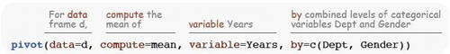
To specify more than one statistic to compute, or more than one variable for which to compute statistics, or more than one variable for which to aggregate, specify the relevant values as a vector in the function call. As illustrated for the by parameter shown in that defines aggregation with two categorical variables, define the vector with the R combine function, c(). The default output data structure of this call to pivot() is the data frame, amenable to input into other data analytic functions. Customize the output names of the computed variables with the out_names parameter.
The following example calculates two statistics, the mean and median of the variable Years employed from the internal lessR Employee dataset, for each combination of levels for Dept and Gender. The description of this function call is considerably more concise than the pages of illustrated text with multiple screen pics required to demonstrate the proper sequence of mouse clicks and dialogue boxes to achieve a similar result with MS Excel. If the parameter values are entered in this order, then the parameter names are not needed in the following function call, included here for clarity.
> pivot(data = d, compute = c(mean, median), variable = Years, by = c(Dept, Gender)) Dept Gender Years_n Years_na Years_mean Years_md
A critical mistake when aggregating data is to interpret a statistic computed on a small number of data values, implicitly assigning the same importance to its value as for a statistic computed over a much larger sample size. The sample size and number of missing data values for each cell should always be known, which pivot() shows by default for each summarized variable. Turn off the sample size information in the call to pivot() by setting the show_n parameter to FALSE.
To compute the descriptive statistics for one or more variables for all the data values, omit the by parameter. In this example, for the distribution of Years employed, compute versions of the first three moments, the interquartile range, and the quartiles.
> pivot(d, c(mean, sd, skew, IQR, quantile), Years)
Specify any set of quantiles by changing the default value of 4 for the parameter q_num.
For a categorical variable the relevant statistics are frequencies or proportions. To calculate the corresponding frequencies, specify table as the statistic to compute, again either computed across the full dataset or aggregated. This example calculates the cross-tabulation table of joint frequencies for the variable Dept aggregated across the two levels of Gender, though many more by variables could be specified.
> pivot(d, table, Dept, Gender)
Set the value of parameter table_prop to” all”,” row”, or” col”, respectively, to report cell proportions based on the entire sample, or row or column sample sizes.
A fifth parameter, by_cols, specifies one or two categorical variables to aggregate with values shifted to appear in the columns instead of the rows. This example contains a single by parameter and a single by_cols parameter, the later of which is explicitly named for clarity, though not necessary as it is the fifth parameter value listed.
> pivot(d, mean, Salary, Dept, by_cols = Gender) Table: mean of Salary
The result is perhaps more amenable to viewing than for input into another function.
3.2.2 Categorical Variables
Obtain a bar chart with lessR function BarChart(). For one categorical variable specify parameter x, the first parameter. BarChart() displays the bar chart and the distribution of counts and proportions with the chi-squared test for the equality of proportions. The two variable bar chart compares the frequencies of a categorical variable, x, distributed across the values of a second categorical variable, by. For two categorical variables BarChart() displays the cross-tabulation table and corresponding chi-squared test of independence. The number for each cell in the cross-tabulation table of frequencies or proportions, or corresponding region in the bar chart, represents the cell frequency or proportion across the entire sample. For the default bar chart in , a total of 28% of all employees are men in the sales department, compared to the women in sales, 14% of all employees.
Fig. 2 Default (left) and 100% stacked (right) bar charts.
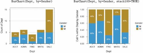
To display the proportion of men and women within each department, adjust for the different numbers of employees in each department. As shown in , the 100% stacked bar chart addresses the differential frequency issue by displaying the proportion of each level of the second variable within each level of the first variable. The result is that all bars are of the same height of 100%. One-third of the sales employees are women, versus two-third men. Set parameter stack100 to TRUE to instruct BarChart() to generate the 100% stacked bar chart and to display the corresponding cross-tabulation table with each column sum of proportions at 1.00.
Cooper (Citation2018) delineated another two different types of bar charts. The first type, as in , displays the numerical value, here the frequency or proportion, computed from the original data. For the second type, the value bar chart, the height of each bar corresponds to the magnitude of a corresponding single entered data value. For the value bar chart, BarChart() processes the table of categories, each with an associated numeric value, pairing values of categorical variable x with the corresponding numerical variable indicated by parameter y, the second parameter in the function definition. Extend this visualization to a second categorical variable with the by parameter. Another possibility invokes a statistical transformation of the original data beyond counts with the stats parameter from which BarChart() computes the data value for each category as it does with the default value of” count” that yields the distribution plot.
3.2.2 Continuous Variables
One variable. For the analysis of the distribution of a continuous variable, the lessR function Histogram() creates a presentation-ready histogram, with an option for a superimposed density plot, shown in , setting parameter density to TRUE.
Fig. 3 Default histogram (left) and with a superimposed density plot (right).
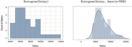
An exploration of a distribution of a continuous variable includes an analysis of outliers, which can substantially impact the analysis. The general advice is to understand how one or more outliers impact the analysis, and to understand, to the extent possible, the reason for the existence of an outlier (Kasprowicz and Musumeci, Citation2015). Is it an error in data entry or processing? Is it a quirk of random sampling? Or does the outlier result from inadvertent sampling from another population apart from the population from where most data values were sampled? Because an outlier analysis is a necessary component of data analysis, included in the output is the standard Tukey outlier analysis Tukey (Citation1977) that identifies values larger than 1.5 IQR’s and 3 IQR’s from the approximate 1st and 3rd quartiles. When obtaining a histogram, information regarding outliers is always available.
Two variables. The scatterplot and correlation coefficient are standard expressions for the relation of two continuous variables, both obtained with the lessR function Plot(). By setting the parameter fit to” lm”, the first scatterplot in shows the least-squares line of best fit and the associated 95% confidence intervals across the values of the variable on the horizontal axis. In addition, the second scatterplot labels potential multivariate outliers, and a dashed least-squares line computed without the outliers. The 95% confidence ellipse assumes multivariate normality, computed by function ellipse() from the package of the same name (Murdoch and Chow, Citation2020). To obtain this additional information beyond the basic scatterplot, set the enhance parameter to TRUE.
Fig. 4 Scatterplots of two continuous variables, with the least-squares line and 95% confidence intervals (left) and a more enhanced version (right).
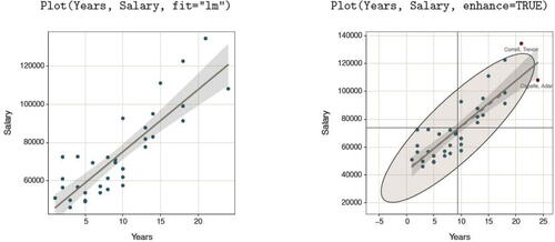
Using Base R graphics or the ggplot2 Wickham (Citation2016) visualization system to obtain the information in requires many lines of specialized code. The result is that in the classroom, the instructor can discuss the differential impact of outliers on the computed estimates from an abstract perspective, provide examples, and then assign homework problems in which the student can pursue similar analyses on different data.
3.3 Continuous and Categorical Variables
Specify the continuous variable in the call to Plot() with the x parameter, which, if listed first, can be unnamed. One possibility specifies the categorical variable as the y parameter value, which, if listed second, can be unnamed. This configuration generates a scatterplot with a default level of jitter to minimize over-plotting given the limited number of levels of the categorical variable, and also plots the mean of the continuous variable at each level, shown ahead in in the context of ANOVA.
Another possibility, from internal calls to Deepayan Sarkar’s (Sarkar, Citation2008) lattice package, specifies the categorical variable with the by1 parameter. Shown in , the result is a Trellis (facet) plot from Chambers et al. (Citation1983), such as the boxplots or the enhanced boxplots each with a superimposed violin plot and scatterplot.
Fig. 5 Trellis boxplots (left) and superimposed Trellis violin, box, and scatterplots (right).
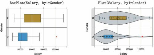
The lessR boxplot by default identifies outliers in two shades of red: a darker red for points more 1.5 IQR’s from the lower and upper quartiles but less than 3 IQR’s, and a brighter red for points more than 3 IQR’s from those quartiles. Or, if plotting in grayscale, outliers are plotted with a deeper shade of gray and a diamond for the plotting symbol.
For each level of the categorical variable, Plot() displays the sample size and summary statistics for the distribution of the continuous variable. Many different parameters permit customization beyond the default visualizations shown in . To specify two categorical variables, specify the second categorical variable with the by2 parameter to view a Trellis plot of all possible combinations of levels of the two categorical variables.
3.4 Differences Across Groups
3.4.1 Mean Difference for Two Groups
For the analysis of the difference in the mean of a response variable between two groups, the corresponding visualization and some of the text output from the lessR function ttest() appears in .
Fig. 6 Data visualization and text output for t-test of the mean difference.
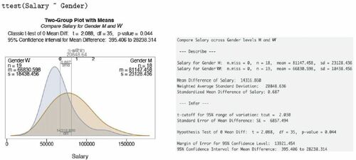
The visualization summarizes the descriptive and inferential analyses, a visualization that portrays the mean difference relative to the overlap of the two distributions. The visualization also shows the original sample mean difference expressed in the measured units of the response variable and this difference standardized by the pooled standard deviation to estimate effect size as defined by Cohen (Citation1988).
3.4.2 Two Dependent Groups Comparison
shows the two visualizations from the lessR paired t-test, again from function ttest(), with parameter paired set to TRUE: The single density curve of the differences visualizes the distribution and the two-variable Cleveland dot-plot illustrates the difference for each block in the analysis.
Fig. 7 Data visualizations for t-test of paired differences, dependent groups.
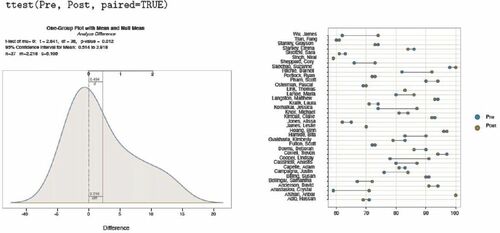
A brief version, tt_brief(), displays a subset of those analyses for either the independent-groups or the dependent-groups analysis. The simpler output allows the student to focus on the meaning of the inferential analysis for the potential distinction between the groups. The full analysis presents the contextual technical details needed for a more complete interpretation and a full evaluation of the validity of the test.
3.4.3 ANOVA
The lessR function ANOVA() analyzes possible differences of means across groups for a one-way ANOVA, a two-way factorial ANOVA, and a one-way randomized blocks ANOVA. Specify the model according to the standard R formula, with an asterisk, *, separating the two factors for a two-way ANOVA, and a plus, +, separating the factors for a randomized blocks ANOVA with the blocking factor listed second. Included default visualizations are shown in for response variable “breaks” and the categorical variable, or factor, “tension,” for a one-way analysis, and then with the additional categorical variable “wool” for a two-way factorial design. The analysis is of variables from the Base R data table warbreaks, so the function calls that generate those plots invoke the data parameter to refer to that data frame instead of the default d data frame.
Fig. 8 A scatterplot of factor and response variable from the one-way ANOVA (left) and interaction plot of two factors from the two-way ANOVA (right).
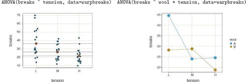
Text output includes descriptive statistics for each group, summary table, effect size, Tukey’s multiple comparison of means, and residuals from the linear model. In addition to the scatterplot in , the one-way analysis also includes the plot of the 95% confidence interval for each group. The function for either of the two-factor analyses provides the same statistics as for the one-way ANOVA plus the cell and marginal means. The brief form of the function, av_brief(), generates considerably less output for introducing ANOVA without overwhelming students.
3.4.4 Proportions
For the analysis of one or more proportions, either from data or frequencies previously calculated from the data, the lessR function Prop_test(), abbreviated prop(), includes a variety of tests from a small number of parameters. If the analysis is of the data directly, then the first parameter value is x, the categorical variable of interest. If testing a proportion of successes for a value of interest, then specify that value of x with the success parameter. If testing a proportion of successes across groups, then add the name of the grouping variable with the by parameter. If testing uniform goodness of fit, then include only the name of the x variable in the function call. If testing independence of two categorical variables, then specify the name of the second variable with the by parameter.
Obtain corresponding analyses only from entered frequencies with the parameters n_succ and n_tot. These values are either scalars, for testing a single proportion against a specific hypothesize population value, or vectors to test the proportion across groups. If testing independence from an entered cross-tabulation table, use the n_table parameter to locate the table according to its the file name.
3.4.5 Regression Analysis
The mosaic package (Pruim, Kaplan, and Horton, Citation2017) simplifies the regression analysis experience compared to Base R, but still requires more functions than does lessR, such as extractor functions to extract confidence intervals. The lessR function Regression(), abbreviated reg(), implements a comprehensive analysis with a single function call. In addition to the table of estimates, t-test of each estimate, and associated 95% confidence interval, Regression() provides a residual and outlier analysis (Kasprowicz and Musumeci, Citation2015) with the cases sorted by Cook’s distance to identify outliers, the prediction, and confidence intervals, prediction from specified data values not necessarily in the data, and a multicollinearity analysis for multiple regression models. To obtain k-fold cross-validation of the model, specify the number of folds with parameter kfold.
The default visual output for a single predictor model is a scatterplot of predictor and response variables with regression line and confidence and prediction intervals. Multiple regression analysis includes a scatterplot matrix with regression lines and confidence intervals, and correlation coefficients. Also included are normal and general density plots of the residuals with a histogram and a plot of residuals versus fitted values. displays the scatterplot matrix and residual distribution visualizations.
Fig. 9 Default scatterplot matrix (left) and density plots of the distribution of residuals (right) from a regression analysis.
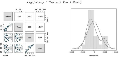
The first column or row, which displays the correlation of each predictor variable with the response variable, should exhibit high correlations for good model fit. The remaining correlations, those between predictor variables, should be low to avoid collinearity of predictors. Various statistical indices are reported for model fit and collinearity. Still, the congruence of these indices with the visualization helps students build intuition regarding these indices, the adequacy of the model, and model selection.
A brief version, reg_brief(), presents a subset of those analyses. This output matches an Excel regression analysis plus the plot of either a single predictor variable with the response variable or the scatterplot matrix of all variables in the model for multiple regression. When teaching least-squares regression analysis, students do homework only with reg_brief() the first week, with the full version of Regression() in later weeks.
To complement the visualizations from the Regression() function, the lessR scatterplot function, Plot(), offers more flexibility for creating scatterplots. shows the same scatterplot data, with the least-squares line and then with the null model line. Comparing these two plots encourages the student to develop intuition regarding the size of R2. Plot() also provides a descriptive and inferential correlational analysis for further assessment of the relationship of two variables.
Fig. 10 Fit the same data with residuals about the least-squares line (left) and the null-model line (right) in the respective scatterplots.
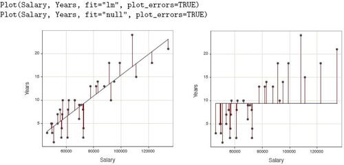
Specify the type of line through the plot with the fit parameter, in either for the best-fitting linear model according to least-squares,” lm,” or the null model line” null.” Other possibilities include the general loess nonlinear fit, exponential, square root, and reciprocal curves, respectively, obtained with fit values of” loess,”“exp,”“sqrt,” and” reciprocal.” Visualize the residuals with the plot_errors parameter set to TRUE, also illustrated in .
3.4.6 Visualize Multivariate Relations
Following the recommendations of the revised GAISE report (Carver et al., Citation2016) from the American Statistical Association, Adams et al. (Citation2021) noted, “Multivariable thinking is greatly assisted by the ability to visualize three or more variables at one time” (p. S124). One type of multivariate visualization consists of a plot of two variables stratified by a third, categorical variable. The lessR package illustrates this stratification with the by, by1, and by2 parameters for the Plot() function. The by parameter plots different groups on the same panel, with the groups differentiated by color or symbol. Alternatively, specify a value for the by1 parameter to create a Trellis (facet) chart Chambers et al. (Citation1983). The Trellis plots follow from internal calls to functions in Sakar’s (2008) lattice package, so noted on the output when these functions are accessed.
Find examples of same panel and different panel multivariable plots in . Add the fit parameter to plot the corresponding least-squares fit lines. By default, to improve readability, when multiple fit lines are displayed on the same panel the confidence intervals of the fit line display are turned off. Explicitly, turn on or turn off the confidence intervals with the fit_se parameter by specifying one confidence level or a vector of confidence levels to plot multiple superimposed intervals, or set to 0 to turn off the display.
Fig. 11 Scatterplots of two continuous variables at two levels of a third, categorical variable, on the same panel (left) and a Trellis plot (right).
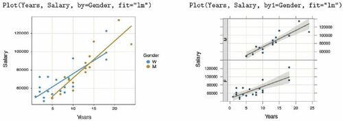
The by2 parameter indicates a second conditioned variable to display a Trellis plot of a continuous variable with all combinations of levels for the two categorical variables. To visualize the relation between a continuous variable and three categorical variables, simultaneously invoke the by, by1, and by2 parameters, combining the same panel and multiple panels into the same visualization.
3.4.7 Data Wrangling
Base R and lessR straightforwardly provide two common data wrangling tasks: data transformations and data filtering. Data transformations are most easily accomplished in R by simply entering the transformation formula at the command line, no specialized transformation functions needed. Identify a variable with the name of its data frame, a $, and then the variable name. A small data frame name, such as d, facilitates this approach. In this example, create the variable named Xsq in the d data frame as the square of X. Students need to be aware of using the asterisk, *, for multiplication, and the caret, ^, for raising a value to a power, in either R or Excel.
D$Xsq <- d$X^2
Base R and other packages provide specific transformation functions, but entering only the formula requires fewer functions to be learned and no additional packages referenced.
A common data manipulation subsets the data frame by rows to satisfy a logical criterion, and both Base R and other packages include subsetting functions. To minimize the cognitive overhead of introducing additional functions into the course, the lessR data analysis functions subset by referencing the parameter rows. Specify a standard R logical condition. The following example adds the parameter to the Histogram() function call to restrict the analysis to rows of data in the default d data frame to men.
Histogram(Salary, rows=(Gender=="M"))
The optional parentheses about the logical expression render the expression more readable, helping to distinguish the double equal sign of logical equality from the single equal sign that indicates the parameter value.
3.5 Other R Enhancements
3.5.1 Error Trapping
When early versions of lessR were first made available to students, it became apparent that R error messages are typically too cryptic for meaningful guidance. Such messages often frustrate beginning students who have never experienced the command-line. Tens of more verbose explanatory error messages were written into lessR to trap many errors before the R system detects the error. Each enhanced message was developed in response to errors encountered by students, often undergoing multiple revisions across successive classes until sufficient explanation was provided, indicated by a lack of further questions from students in subsequent classes as they pursued their homework assignments.
For example, consider the lessR error message to one of the more common errors, misspelling a variable name in a function call, here copied directly from the R console.
> Histogram(Salry) Error: ––– You are attempting to analyze the variable Salry in the data table called d, which is the default data table name Unfortunately, variable Salry does not exist in d The following variables are currently in the d data table, available for analysis: Years Gender Dept Salary JobSat Plan Pre Post
There are versions of this message for situations where there are no data frames, that is, no data has been read, when there are multiple data frames, or the name of the data frame has been misspelled. Many other versions exist for a variety of error types.
3.5.2 Suggestions
Suggestions are presented as part of the output of each function, tailored to the details of the function call. The suggestions that appear from a bar chart of the variable Dept are shown in the following example.
> BarChart(Dept) ⋙ Suggestions BarChart(Dept, horiz = TRUE) # horizontal bar chart BarChart(Dept, fill="reds") # red bars of varying lightness PieChart(Dept) # doughnut chart Plot(Dept) # bubble plot Plot(Dept, topic="count") # lollipop plot
Each suggestion can be copied and pasted into the R console to generate the suggested analysis. Students can extend their knowledge of data analysis by exploring different analyses and presentations of the same data.
3.5.3 Shiny Interactive Visualizations
The Shiny R environment for interactive visualizations offers a “much more fluid and dynamic presentation” of visualizations as noted by Doi, Potter, Wong, Alcaraz, and Chi’s Doi et al. (Citation2016) review of Shiny apps for teaching statistics. Fawcett (Citation2018) also discusses the advantages of students working directly with Shiny apps. To facilitate teaching with lessR, Version 4.0.6 of the package contains five Shiny interactive visualizations:” BarChart1” and” BarChart2” for one- and two-variable bar charts,” Histogram” for a histogram,” ScatterPlot” for a scatterplot of two continuous variables, and” Trellis” for a Trellis plot of the relationship between a continuous and categorical variable.
Each interactive visualization analyzes one or more variables in the built-in Employee dataset. To access an interactive visualization, run the lessR function interact() with one of the five specified names as its one and only parameter value, illustrated in . If no parameter value is passed to interact(), then the available names are displayed for reference.
Fig. 12 Interactive Shiny histogram with Histogram() parameter values.
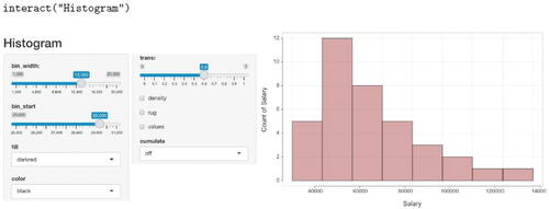
Running the provided Shiny files for each function demonstrates the output that results from changing various parameter values from their default values, such as bin_width for constructing a histogram. Using the controls for the interactive histogram in , increase the size of the bin width to 13,350, start the first bin at 30,000, change the bin color to darkred with a black border, and increase trans to 0.6 where 0 indicates no transparency and a 1 complete transparency. The student can re-create the resulting visualization as a static image by entering the given parameter names and values from the interactive display into a call to the Histogram() function.
Similar to the Rossman/Chance histogram bin width simulation (and others) available online Rossman and Chance (Citation2021), the change in the histogram’s shape given changes in bin width or bin starting point are readily demonstrated. For example, compare the default histogram in with the histogram with a different bin width and starting value in .
3.6 Simulations and Probabilities
3.6.1 Pedagogical Simulations
Simulation has been shown to facilitate student learning, particularly inferential concepts that rely upon understanding probability Lane (Citation2015); Hancock and Rummerfield (Citation2020). summarizes four different lessR simulation functions that facilitate understanding some core concepts of inferential statistics.
Table 1 lessR simulation functions to facilitate teaching statistical concepts.
Two required parameters of these functions are ns, the number of samples, and n, the number of values for each sample. Specify the population mean with mu and sigma for the population standard deviation, with respective default values of 0 and 1.
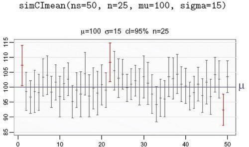
Similar to the mosaic function CIsim() (Pruim, Kaplan, and Horton, Citation2017), shows a simulation with simCImean() of the default 95% confidence interval of the mean for 50 repeated samples, each of size 25, sampled from a normal population with a mean of 100 and a standard deviation of 15. In this simulation, three confidence intervals or 6%, shown in red, failed to contain the population mean of 100, consistent with the expectation that, on average, 5 out 100 or 95% of confidence intervals fail to include the corresponding population mean.
Fig. 13 Fifty confidence intervals of the mean across repeated simulated samples.
In addition to the visualization, text output from simCImean() to the R console includes the summary statistics and confidence interval for each sample, a summary of performance, and the mean and standard deviation of the sample means. A parameter show_data, if set to TRUE, first displays the data for each repetition, followed by the corresponding confidence interval.
3.6.2 Probability Visualizations
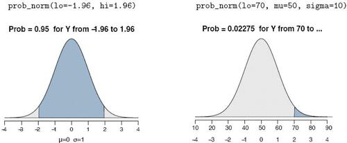
The teaching of statistics necessarily involves the computation of probabilities, including those based on the normal and t-distributions. Traditionally, these probabilities were obtained from probability tables, such as printed on the last pages of the course textbook. R includes functions that mitigate the need for probability tables, leveraged by functions such as xpnorm() included with the mosaic package. lessR also includes some probability functions, also with visualizations. lists the three lessR probability functions.
Table 2 lessR probability functions that generate a customized, corresponding visualization in lieu of standard probability tables.
The example in is of prob_norm(), which provides the normal curve probability and corresponding illustration for a single lower-tail cutoff with parameter lo, single upper-tail cutoff with parameter hi, or the interval in-between when both values are provided. Without specifying the population mean, mu and the population standard deviation sigma, the distribution defaults to the standard normal.
Fig. 14 Normal curve probability for the standardized normal (left) and for a normal distribution with a mean of 50 and standard deviation of 10 (right).
The prob_tcut() function lists the t-distribution for the specified degrees of freedom superimposed on the standard normal distribution, with the default value of . From this direct comparison, the student can easily visualize the penalty imposed by estimating the population standard error, necessitating the use of the t-distribution in place of the normal distribution described by the actual standard error.
The prob_znorm() visualization displays a specified normal curve with values of the standard deviation illustrated. No matter how large the standard deviation, the relationship of the area under the curve for any given range of standard deviation remains the same, which the student can directly visualize.
3.7 Aesthetics
The visualizations in the lessR system are produced consistent with the current color theme, beginning with the default theme” colors.” By default, the visualizations are designed to create an esthetically pleasing, vibrant presentation-ready visualization, comparable to the quality standard set by ggplot2 Wickham (Citation2016), but with less code and sometimes considerably less code Gerbing (Citation2020). Although switching color themes is not necessarily part of teaching the introductory course, the task is simple enough that students can explore different color themes with the style() function.
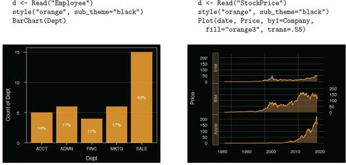
To prepare visualizations for slide presentations, switch to a black background. The examples in invoke the” orange” theme with sub_theme set to” black” for a bar chart and for a Trellis time series plot. Both data sets are included with lessR.
Fig. 15 For the” orange” color theme with a” black” sub_theme, the default bar chart (left) and a time series Trellis visualization (right).
Return to the default theme with an empty argument in the function call to style(). See all available themes and individual parameters subject to customization with style(show = TRUE). The availability of these optional visualization customizations, in conjunction with its data analytic features, provides the student with enough resources to continue to use lessR as an analytic system beyond the introductory course.
3.8.1 Vignettes
When accessing the lessR package with library(”lessR”), as shown in the Appendix, the following message announces the availability of vignettes that provide detailed examples of various analyses.
Learn about reading, writing, and manipulating data, graphics, testing means and proportions, regression, factor analysis, customization, and descriptive statistics from pivot tables. Enter: browseVignettes("lessR")
The student can access examples of the input and output of many analyses relevant to most material covered in the introductory course. Each vignette includes multiple examples with explanation. shows the output of the Base R browseVignettes() function.
Fig. 16 lessR vignettes.
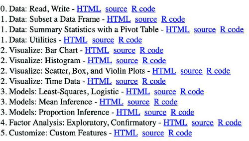
Clicking on an HTML link generates a web page of the corresponding vignette.
3.8.2 Online Introductory Chapter
Introductory content in the form of a book chapter, formatted as interactive web pages composed with the R bookdown package (Xie, Citation2016), introduces students with no previous R or programming experience to the R/lessR system of data analysis. Under development for some years, this content has been revised for clarity over multiple classes each year. Find the web pages for this introductory chapter at the following github location.
https://dgerbing.github.io/R_lessR_Intro/index.html
The focus of the chapter is the R command line, the use of RStudio, and the lessR functions Read(), BarChart(), and Histogram() for reading data followed by the specified analyses for counting the values of a variable. Both forms of bar charts, according to the distinction noted by Cooper (Citation2018) are discussed: bar charts from analysis of the measured data values and bar charts directly from a summary table that associates a number with each category. The chapter begins with an overview that includes a comparison of R to MS Excel, reproducible research, and an explanation of 13 examples for which the R/lessR code and related output are displayed. The chapter shows students how to open a text file for adding R function calls within RStudio, save the file, and run their function calls one at a time or at once from the text file window pane.
4 Summary
This work describes the use of the R package lessR, a set of functions developed to enable accessibility of the command-line R to the beginning statistics student with no previous programming or command-line experience. The mosaic package with the ggformula interface allows the student to engage with the R command-line environment according to a simplified and consistent formula interface. lessR provides an even simpler experience with a smaller number of functions than even mosaic to accomplish basic analyses. The tradeoff compared to Base R is simplicity versus richness in the R experience. An instructor who intended a richer R experience would likely choose mosaic. Both systems engage the student in the traditional R command-line interface. This knowledge of the command line, functions, and data organization also generalizes to other command-line systems.
In addition to serving the needs of introductory students as the core software for the course, the lessR system addresses the increasing number of students interested in further developing their statistical and data analytic skills to move forward into data science. As a re-expression of standard R functions, the provided data analytic functions are capable of application to many professional situations. Additionally, the vast array of data analytic functions included in the initial installation of R, Base R, and those available in the thousands of contributed R packages, provide more advanced analyses available to the student who grasps the command-line interface.
References
- Adams, B., Baller, D., Jonas, B., Joseph, A.-C., and Cummiskey, K. (2021), “Computational Skills for Multivariable Thinking in Introductory Statistics,” Journal of Statistics and Data Science Education, 29, S123–S131.
- Burckhardt, P., Nugent, R., and Genovese, C. R. (2021), “Teaching Statistical Concepts and Modern Data Analysis With a Computing-Integrated Learning Environment,” Journal of Statistics and Data Science Education, 29, S61–S73.
- Carver, R., Everson, M., Gabrosek, J., Horton, N., Lock, R., Mocko, M., et al. (2016), Guidelines for Assessment and Instruction in Statistics Education (GAISE) College Report (Tech. Rep.). Belmont, CA: American Statistical Association.
- Chambers, J. M., Cleveland, W. S., Kleiner, B., and Tukey, P. (1983), Graphical Methods for Data Analysis, Wadsworth.
- Cohen, J. (1988), Statistical Power Analysis for the Behavioral Sciences (2nd ed.), Hillsdale, NJ: Lawrence Erlbaum.
- Cooper, L. L. (2018), “Assessing Students’ Understanding of Variability in Graphical Representations That Share the Common Attribute of Bars,” Journal of Statistics Education, 26, 110–124. DOI: https://doi.org/10.1080/10691898.2018.1473060.
- Doi, J., Potter, G., Wong, J., Alcaraz, I., and Chi, P. (2016), “Web Application Teaching Tools for Statistics Using R and Shiny,” Technology Innovations in Statistics Education, 9, 1–33. DOI: https://doi.org/10.5070/T591027492.
- Donoghue, T., Voytek, B., and Ellis, S. E. (2021), “Teaching Creative and Practical Data Science at Scale,” Journal of Statistics and Data Science Education, 29, S27–S39. Available at: DOI: https://doi.org/10.1080/10691898.2020.1860725.
- Fawcett, L. (2018), “Using Interactive Shiny Applications to Facilitate Research-Informed Learning and Teaching,” Journal of Statistics Education, 26, 2–16. DOI: https://doi.org/10.1080/10691898.2018.1436999.
- Gerbing, D. (2020), R Visualizations: Derive Meaning from Data, Boca Raton, FL: CRC Press.
- Gerbing, D. (2021), “lessR: Less Code, More Results [Computer Software Manual].” Available at: https://cran.r-project.org/package=lessR (R package version 4.0.3)
- Hancock, S. A., and Rummerfield, W. (2020), “Simulation Methods for Teaching Sampling Distributions: Should Hands-on Activities Precede the Computer?” Journal of Statistics Education, 28, 9–17. DOI: https://doi.org/10.1080/10691898.2020.1720551.
- Horton, N. J., and Hardin, J. S. (2021), “Integrating Computing in the Statistics and Data Science Curriculum: Creative Structures, Novel Skills and Habits, and Ways to Teach Computational Thinking,” Journal of Statistics and Data Science Education, 29, S1–S3.
- Kaplan, D., and Pruim, R. (2021), “ggformula: Formula Interface to the Grammar of Graphics [Computer Software Manual].” Available at: https://CRAN.R-project.org/package=ggformula(Rpackageversion0.10.1)
- Kasprowicz, T., and Musumeci, J. (2015), “Teaching Students Not to Dismiss the Outermost Observations in Regressions,” Journal of Statistics Education, 23. DOI: https://doi.org/10.1080/10691898.2015.11889749.
- Kim, B., and Henke, G. (2021), “Easy-to-use Cloud Computing for Teaching Data Science,” Journal of Statistics and Data Science Education, 29, S103–S111. Available at: DOI: https://doi.org/10.1080/10691898.2020.1860726.
- Lane, D. M. (2015), “Simulations of the Sampling Distribution of the Mean do not Necessarily Mislead and can Facilitate Learning,” Journal of Statistics Education, 23. Available at: DOI: https://doi.org/10.1080/10691898.2015.11889738.
- Loy, A., Kuiper, S., and Chihara, L. (2019), “Supporting Data Science in the Statistics Curriculum,” Journal of Statistics Education, 27(1), 2–11. Retrieved from DOI: https://doi.org/10.1080/10691898.2018.1564638.
- Lumley, T. (2020), “Leaps: Regression Subset Selection [Computer Software Manual].” https://CRAN.R-project.org/package=leaps(Rpackageversion3.1)
- Murdoch, D., and Chow, E. D. (2020), “Ellipse: Functions for Drawing Ellipses and Ellipse-Like Confidence Regions [Computer Software Manual],” https://CRAN.R-project.org/package=ellipse(Rpackageversion0.4.2)
- Nolan, D., and Lang, D. T. (2010), “Computing in the Statistics Curricula,” The American Statistician, 64, 97–107. DOI: https://doi.org/10.1198/tast.2010.09132.
- Pruim, R., Kaplan, D. T., and Horton, N. J. (2017), “The Mosaic Package: Helping Students to ’Think With Data’ Using r,” The R Journal, 9, 77–102. DOI: https://doi.org/10.32614/RJ-2017-024.
- R Core Team. (2021), R: A Language and Environment for Statistical Computing [Computer software manual]. Vienna, Austria. Available at: https://www.R-project.org/
- Ross, K., and Sun, D. L. (2019), “Symbulate: Simulation in the Language of Probability,” Journal of Statistics Education, 27, 12–28. DOI: https://doi.org/10.1080/10691898.2019.1600387.
- Rossman, A., and Chance, B. (2021), Rossman/Chance Applet Collection. Available at: https://www.rossmanchance.com/applets/
- RStudio (2021), RStudio Education. Available at: https://education.rstudio.com/learn/beginner/
- Sarkar, D. (2008), Lattice: Multivariate Data Visualization With R, New York: Springer. (ISBN 978-0-387-75968-5)
- Schauberger, P., and Walker, A. (2021), openxlsx: Read, write and edit xlsx files [Computer software manual]. Available at: https://CRAN.R-project.org/package=openxlsx(Rpackageversion4.2.4)
- Sigal, M. J., and Chalmers, R. P. (2016), “Play It Again: Teaching Statistics With Monte Carlo Simulation,” Journal of Statistics Education, 24, 136–156. Available at: DOI: https://doi.org/10.1080/10691898.2016.1246953.
- Pandas Development Team (2021), pandas-dev/pandas: Pandas. Zenodo. Available at: DOI: https://doi.org/10.5281/zenodo.3509134.
- Tukey, J. W. (1977), Exploratory Data Analysis, Addison-Wesley.
- Wickham, H. (2014), “Tidy Data,” Journal of Statistical Software, 59, 1–23. DOI: https://doi.org/10.18637/jss.v059.i10.
- Wickham, H. (2016), ggplot2: Elegant Graphics for Data Analysis, New York: Springer-Verlag.
- Wickham, H. (2021), tidyr: Tidy Messy Data [Computer software manual]. Available at: https://CRAN.R-project.org/package=tidyr(Rpackageversion1.1.4)
- Wickham, H., François, R., Henry, L., and Müller, K. (2021), “dplyr: A Grammar of Data Manipulation [Computer software manual].” https://CRAN.R-project.org/package=dplyr(Rpackageversion1.0.7)
- Xie, Y. (2016), bookdown: Authoring Books and Technical Documents With R Markdown, Boca Raton, FL: Chapman and Hall/CRC. Available at: https://github.com/rstudio/bookdown (ISBN 978-1138700109)
Appendix.
Access R and lessR
A.1. Download and Install R
Download R from the network of worldwide R servers.
Windows: https://cran.r-project.org/bin/windows/base/click the first link such as Download R 4.1.2 for Windows.
Mac: https://cran.r-project.org/bin/macosx/
several paragraphs down the page, left margin, click the link such as R-4.1.2.pkg.
Run the installer, which offers both 32-bit and 64-bit versions. Unless your computer is more than 10 years old, run 64-bit software as you would any other app. Accept the given defaults for each step of the installation process. When installed, run the R app as you would any other application, such as double-clicking on the application’s icon in your file system display.
When you run the installer R may first attempt to write the R information to a protected system directory. If so you may be asked the following question:
Would you like to create a personal library to install packages into? (yes/No/cancel)
Respond with a yes. Otherwise you will need administrative privileges, understand the relevant security issues, and make the needed changes to your system.
Download and Install RStudio. Navigate to the following website:
https://www.rstudio.com/products/rstudio/download/
Choose the free version of RStudio Desktop.
Download and Install lessR. To access the lessR functions, run the R app, most commonly within RStudio (Citation2021). To install the lessR package, enter the following in response to the displayed ¿, the R command-line prompt:
install.packages("lessR")
Installing lessR downloads many related R packages. However, when a developer uploads the computer code (source) for a given package to the R servers, the CRAN network, it may take as long as a week or more for the R system to compile that computer code to a form (binary) that works specifically on Windows or Mac systems. When downloading a package for those days between the uploading of the source code by the developer and when the desired binary form finally becomes available, R presents the following dialogue, here illustrated for package mvtnorm.
There are binary versions available but the source versions are later: binary source needs_compilation mvtnorm 1.1-2 1.1-3 TRUE Do you want to install from sources the packages which need compilation? (Yes/no/cancel)
Having the absolute latest version of a dependent package is almost always irrelevant. And only the rare introductory student would have the necessary software tools to do local compilation, so answer no. Moreover, later versions can be installed by waiting a few days and then running update.packages() after they are compiled by the R system.
Once installed, begin each R session by loading and attaching the lessR functions with the standard R library() function:
library("lessR")
The Cloud. Run R code on a personal computer or in the cloud with a limited free account at rstudio.cloud, accessible to any device with a web browser such as a Chromebook or an iPad. R and RStudio are already installed, so just install lessR. Start a new project for each analysis by clicking on the New Project button.
Running in the cloud, R will not read data files directly from your computer. Instead, upload a data file to the cloud with the Upload button under the Files tab on the bottom-right RStudio window pane. Once uploaded, use the standard d ¡- Read(””) function call to read the data.
The free version of a cloud account provides limited available time each month but is usually sufficient for a student in the introductory course. However, in addition to CPU time, minutes of active time accrue with the project open, so students are encouraged not to linger online once the analysis is complete. The primary advantage of cloud use is that R data analysis can proceed without cost to the student and without needing a Windows or Mac computer.