
 ?Mathematical formulae have been encoded as MathML and are displayed in this HTML version using MathJax in order to improve their display. Uncheck the box to turn MathJax off. This feature requires Javascript. Click on a formula to zoom.
ABSTRACT
Simulation methods were developed to find p-values for univariate mixture distributions. Looking for the maximum elbow of the unexplained variance in a kernel density estimation was determined to be insufficient to evidence that data is multimodal. It is shown by theoretical and simulated results that random distributions have similar elbowing behaviour. It is only elbowing, or variance convergence, above the level in random distributions that indicates a mode has been found. However, kernel h-distance and variance by step were together found to be better predictors of confidence intervals of modal data. Confidence intervals of p = 0.1 and p = 0.01 are modelled in equations and can be applied to data with any standard deviation and sample sizes of 12 and over. The methods were tested on data generated from bimodal up to five modes.
1 Introduction
Clustering of data into modes has been attempted with many methods. However, the previous methods generally rely on subjective judgment to determine if the results are multimodal. The goal of this research is to have an evidence-based p-value that can be applied to any univariate multimodal or mixture distribution.
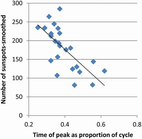
The motive for this is to understand patterns of sunspots. Cycles of sunspots last roughly a decade and have varying profiles of length, and time of the peak value. Only 24 complete solar cycles have been observed since the beginning of the collection of solar data. The internal dynamics of the Sun are not well understood so statistical methods are relied upon for understanding. Cycles of sunspots are dissimilar in shape but may be able to be grouped and have relationships between each other. For example, it has been established that the peak number of sunspots is negatively correlated to the cycle length of three cycles before (Du et al., Citation2006; Kakad & Kakad, Citation2021). Also, it has been determined that there is a relationship between the peak number of sunspots in a cycle and the time when that occurs in the cycle as shown in (Chowdhury et al., Citation2021; Karak & Choudhuri, Citation2011). The regression of sunspots in shows that many data points fall closely to the regression line. Then, there appears to be a banding of data above and below the regression curve.
Figure 1. Regression of Sunspots. As more time passes before the peak number of sunspots is reached, the count of sunspots at the peak reduces
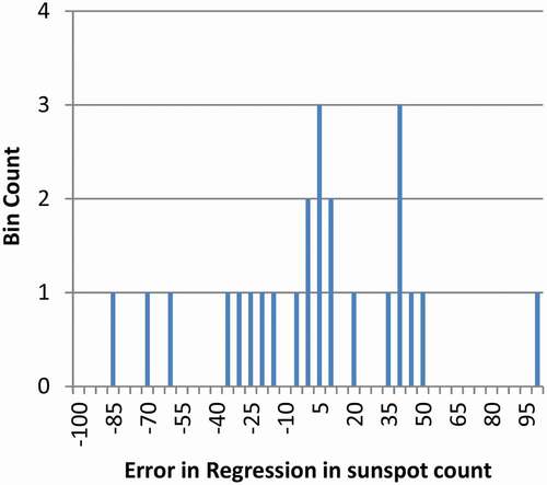
To determine if there is a banding of sunspots about the regression curve, the regression error for each cycle was determined. It is plotted in with bins equally an error of 10 sunspots from the regression. The hypothetical groups appear roughly evenly spaced. To determine if statistical methods support the existence of banding of sunspot data, then clustering methods need to be investigated.
Figure 2. Regression Error. About five groups appear in the sunspot data
2 Background
Random data can appear to be clustered into modes. It is possible to falsely identify random data as modal. For random data in a uniform distribution, the distance between the data points is exponentially distributed (Tanackov et al., Citation2019). It is related to random variables having maximum entropy (Singh et al., Citation2021). Some data points will be near other data points, and some data will have large gaps around it. Therefore, clusters will naturally form in random data. Several methods have been used to determine if data are in modes, but those methods have weaknesses.
One of the assumptions of linear regression is homoscedasticity or constant variance. Another assumption is the independence of the data. A third is the lack of perfect multicollinearity. Generally, data should be normally distributed around a regression line. Bands of data have previously been observed in epidemiological settings (Ntani et al., Citation2021). If data come from clustered groups of patients, each group may share other clinical characteristics and have its own regression and underlying governing phenomena. Therefore, there are precedents for grouping of data in bands around a regression like is hypothesized for the sunspot data.
Data that are bimodal with two equal modes can often be identified as non-normal. Pearson and others show that normal distributions must meet statistical measures using kurtosis, skewness, and other statistics, otherwise it is not a normal distribution (Choonpradub & Mcneil, Citation2005; Darlington, Citation1970; Decarlo, Citation1997; Haldane, Citation1952; Pearson, Citation1929). Goodness-of-fit and dip tests can also show data is not normally distributed (Gómez-Déniz et al., Citation2021; Haldane, Citation1952). However, the methods do not indicate that a distribution is bimodal rather than some other non-normal distribution, let alone provide a p-value of such. Additionally, these methods have a deficiency for multimodal distributions. Hypothetically, a trimodal distribution could be mixed in ratio that would roughly match a normal distribution. Therefore, kurtosis, skewness and the other tests could suggest that trimodal distributions are normally distributed. An exception is that with very high sample sizes (n) or with wide mode separation, goodness-of-fit tests may still indicate non-normality.
Optimization and finite mixture methods can fit distributions to the data (Everitt et al., Citation2011). However, this requires assumptions that the data is multimodal. Additionally, the distributions need to be assumed to be those of child modes. There are numerous methods for clustering multivariate distributions. Among them is the k-means method where cells of space are found around optimum centroid locations (Wu et al., Citation2020).
A dendogram is a clustering of data into a hierarchical structure (Csenki et al., Citation2020). Tree mode methods are good at clumping together data that is nearby. Minnotte (Minnotte, Citation1997) shows that test statistic can be created by chopping of tested peaks to see if they can fill the valleys and produce a non-modal distribution. However, this requires resampling data and that is not possible with some data sets. Additionally, this should be viewed as nothing more than an estimate of a p-value because the process uses arbitrary rules to find the closest non-modal distribution (Knapp, Citation2007).
3 Elbowing of kernel density estimates
A kernel density estimate is a method to approximate the underlying probability density function of a distribution (Chen, Citation2017; Everitt et al., Citation2011). The method for univariate distributions will be enhanced in this work. Discrete data is smoothed by converting each point into a distribution around the point. Any distribution can be used, but a Gaussian distribution works well with the following steps because it smooths the data. The width of the kernel is defined as the h-distance, and for Gaussian distributions the standard deviation is taken as the h-distance. The Gaussian distributions generated from point data are placed into bins so that the distributions may be cumulated into a pooled distribution.
When the h-distance is wide, usually around the standard deviation of the total sample, the distribution looks somewhat like a normal distribution. It will have only one mode (maxima), and no antimodes (minima). Then as the h-distance is reduced, individual Guassian distributions become smaller, and more modes and antimodes will appear in the pooled distribution. This could be continued until each data point has its own mode, but statistical relevance will disappear before that. The critical h-distance is defined as the lowest value of the h-distance for a mode, just before a new mode appears (Skrondal & Rabe-Hesketh, Citation2004).
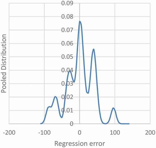
For the application to sunspots, shows that as the width of the individual Gaussian distributions is narrowed, individual modes begin to appear. Five maxima have appeared, and a sixth is near forming on the far left.
Figure 3. Pooled Distribution of Error in the Regression Sunspots. The plot is shown with an h-distance 7.0 which is the critical h-distance for five modes
As the number of modes increases, the variance of the sample decreases. With two or more modes, the second-order distance to each sample is less. In the research presented, the variance will be found by sorting the data to the closest mode, recalculating the mean for that subset, and then the variance. The mean will not necessarily be at the maxima, but analysis is necessary to find latent properties of distributions (Silverman, Citation1981).
It has been observed by others that the variance decreases asymptotically for data presumed to be modal (Thorndike, Citation1953). Often this is plotted on a scale of explained variance where the top is 100%. The plot is described as an elbow. The plot looks like , but upside down. is shown this way so that it ties to later information.
Figure 4. Theoretical Elbowing of Variance with Mode. Continuous distributions show elbowing with kernel step, so elbowing is not an indicator of modality
The elbow method is common in k-means clustering (Bholowalia & Kumar, Citation2014; Guo, Citation2021; Kodinariya & Makwana, Citation2013; Syakur et al., Citation2018). The number of clusters is chosen by previous researchers as the point of peak curvature in the elbow. By taking an early point on the curvature as the mode number, before it becomes to look flatter, is explained as parsimonious. No test statistic is given by these researchers. However, theoretical and simulated results will demonstrate that this rationalization is baseless and that better methods can be developed. This appears to apply to k-means clustering, which is multivariate, because simplifying k-means to one dimension would result in a similar process. In one dimension, the means are found with the kernel density estimate maxima.
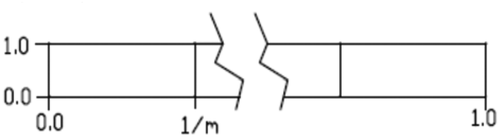
The solar data in appears to elbow around the fourth and fifth modes. This suggests that the data is modal. It will be shown that this method is incorrect. Random data analysed the same produces a similar elbowing curve. Therefore, elbowing by itself is not evidence. The first step in supporting this argument is by deriving the elbowing curve for a uniform distribution from 0 to 1 (U (0, 1)). In , a continuous U (0, 1) distribution is shown that is divided into m equal modes. The modes have a width of 1/m. The second order moment of the distributions about each of the centres of the modes is (1/12 (1.0) (1/m)3). The total variance for the continuous distribution is m times the variance of one mode. Therefore, the total variance is 1/(12 m2).
Figure 5. Model of continuous uniform distribution
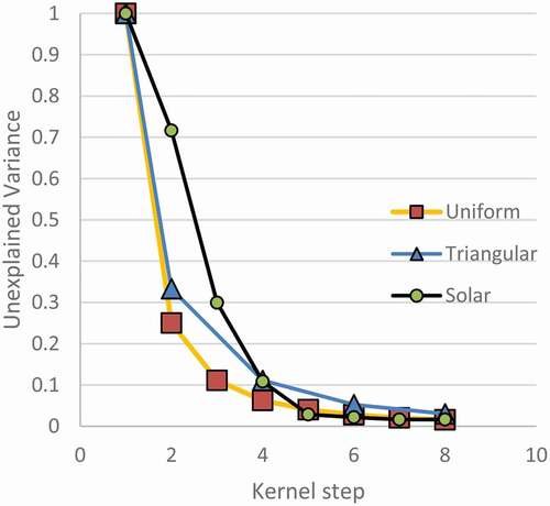
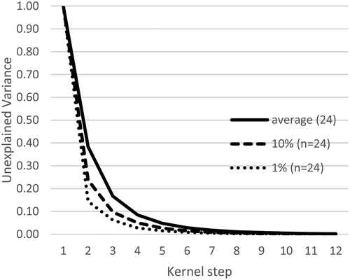
Since the variance is a second-order function of the number of modes m, as the number of modes increases, the variance will drop. The result is shown in . The plot is shown as unexplained variance instead of explained variance because that will fit with later work. Notice the elbow has a maximum curvature at the second or third kernel step, so a k-means analysis would suggest that this continuous uniform distribution has two or three modes. Often the first kernel isn’t shown, so scaling the plot would make the third mode look more like the answer.
A similar kerning was done for a triangular distribution with a peak in the middle, also called a Bates distribution with n = 2. Points were generated through numerical solution process. Only a few points for even steps are shown because they are easier to solve for by hand than odd modes. The plot for both distributions appears asymptotic with an elbow around two or three modes. The unimodal distribution is exactly predicted by a power regression because of its theory, but the triangular distribution is predicted with an R-squared of 0.998 by a power regression. Since both curves have this behaviour, they plot nearly linearly on a log–log scale. The difference between these curves is characteristic to the distribution type, and it will be shown that multimodal distributions also have a particular shape.
A continuous normal distribution is more like the continuous triangular distribution than it is to U (0,1) since the kurtosis of each is more similar. They are generally shaped more similar to each other than a uniform distribution. Therefore, it is expected that a continuous normal distribution will have a similar plot to Bates(n = 2).
In addition to the demonstrated elbowing with continuous distributions, simulation results on normally distributed random data will show the same phenomenon. However, more about the methodology needs to be presented first.
Random data will be expected to have more elbowing than a continuous distribution because of randomness. Therefore, in comparison to continuous distributions, random distributions may appear to have clusters of data. A clustering algorithm could find locations for false modes. When a false mode is found, the variance is reduced quicker than for continuous distributions. This is more likely to happen for small sample sizes because with large samples, the distribution will become smoother. Consequently, normally distributed random data should fall below the plot of the triangular distribution but converge to a plot similar to that with large sample sizes.
4 Methods
Large sets of random data were made. The data were clustered through kernel density estimation. Then the kerning was compared to theoretical continuous distributions and simulated data that was generated in modes.
Adobe Lingo was chosen as the programming language purely out of author familiarity and availability. A primary feature in selecting a program is that it generates numbers that are genuinely random. There are numerous tests that can be done on random number generators. However, the following tests were performed and passed: Goodness-of-fit tests (Kolmogorov-Smirnov and Chi-squared), and serial correlation. Goodness-of-fit is relevant because the data was generated from a desired distribution. Serial correlation is relevant because with clustering, it is not desired to have data correlated because that could produce clusters. Additionally, the logarithmic distribution of distances between random points can be tested (Tanackov et al., Citation2019). This was not tested in advance, but the results will show it was satisfied because it has obvious implications. Many of the other possible tests seem to be more relevant in the fields of cybersecurity and code breaking.
Random data were generated in a normal distribution with a standard deviation of one. Sets of 1000 trials were made for sample sizes of 12, 18, 24, 60, and 120. When modal data were generated, the mode standard deviations and spacings were equal, but the mixing ratio could be changed so that smaller versus larger modes could be made. The null hypothesis is that the data being tested can be represented by unimodal normally distributed data with the same number of samples.
For clustering, the kernel step was 0.01 of the total sample standard deviation. The bins for kerned data were 0.02 of the standard deviation.
Kernel seeds (h-distances) were reduced until new modes appeared in the data. The value just before was taken as the critical h-distance for the mode. When each new mode appeared, points were sorted into subsets based on closeness to the mode maxima, a new mean was calculated, and variance was found. The variance corresponding to unimodal distribution (m = 1) was the variance of the total sample.
The h-distance was continued to be reduced until a cut-off point. Kerning at low h-distances does not produce meaningful results because eventually every data point has its own mode. Additionally, the h-distance cannot be allowed to be smaller than the bin width because then smoothed distributions stay mostly contained only within one bin. For this reason, three times the bin width was the lower limit for h-distance. However, the number of modes was also limited to the point when multiple simultaneous modes started to appear, and that always controlled. The goal of the research was to provide a method for analysis of up to ten modes, so there was little point in identifying modes past that point except to have additional data to correlate into a generalized result. Later, the goal was reduced to five modes.
When comparing runs of simulated modal data, the data was scaled to a sample standard deviation of one. For example, when a distribution created with five modes was generated, the total sample standard deviation was scaled to one as well as the same factor was for h-distance, but the variance was converted by the square of the scale factor since it is a second-order term of the abscissa axis x. Alternatively, the original data could be scaled before anything beyond the standard deviation is calculated.
5 Preliminary results
Others’ use of the elbow of variance to determine the number of modes is built upon the concept that elbowing is evidence that modes are present (Kodinariya & Makwana, Citation2013). In , random data is plotted with 24 samples and 1000 trials in a normal distribution. The average variance per kerned mode and the percentiles of the greatest drop found in variance are shown. Elbowing of the data was found even with random data. The greatest drop in variance was labelled for p-values of 0.1 and 0.01. This represents the most modal that random data could appear. Bates(n = 2) falls nearly on top of the average for the normal distribution. The continuous uniform distribution falls on the plot of the 10th percentile. This meets the expectations that normally distributed data with a total of 24,000 samples would be near to the triangular distribution. Also, this demonstrates that random data can appear to elbow significantly as shown in the first and tenth percentile levels.
Figure 6. Variance of Random Data (n = 24) with Mode. Random data elbows, so elbowing alone is not an indicator of modal data
Tibshirani et al. (Tibshirani et al., Citation2001) discuss looking at the elbows on a log scale. There are advantages to looking at this plot on the log scale. First, the differences between plots can be seen more clearly. Second, the random data plots as nearly a straight line, therefore, it is easy to identify simulated modal data that does not conform to the null hypothesis. See .
Figure 7. Log Plot Variance of Data (n = 24) with Mode. Two trials of modal data are shown to fall outside of percentile for random data
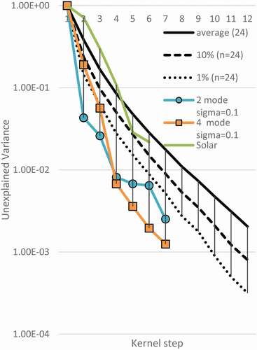
The simulated modal data in is made with 24 samples total. Data was made in modal distributions with a modal standard deviation of one-tenth of the mode separation. Data for 2 through 5 modes were analysed. Only modes 2 and 4 are shown so as not to clutter the figure. It is clear that the second mode of the bimodal data, and the fourth mode of the four-mode data fall well outside the first percentile for random data with a sample of 24. This supports that elbowing of variance can be used to identify modal data, but the elbowing has to be beyond the expectation of random data.
Notice both curves for simulated modal data stay outside the low percentiles once they are found to be significant. This is because variance does not increase in further modes but continues to slightly decrease. Therefore, when interpreting data, it is the first significant mode that should be taken as the description of the distribution. The simulated bimodal data would be explained as bimodal, not bimodal and trimodal, etc. An exception to this is that when multiple modes are simultaneously produced, they may appear to have the same variance, so the first of the simultaneous modes may look like the solution. However, the last mode in the series should be taken. A method to plot this to ease visual confusion would be to disregard plotting all but the last simultaneous mode.
The percentiles in are shown independently for each mode. Converting these to p-value limits is complicated. Factors to consider include that the randomly generated data in a trial tended to follow along a certain percentile line, whether it be the tenth percentile or the average. The appropriate way to find the p-value lines would be to set the p = 0.10 line so that only 10% of the trials ever fell beyond it at any point along their length. However, that is a function of the number of modes tested. A higher number of tests allows for more chances to exceed the limits. When testing only whether sample data is bimodal, the shown percentiles correspond to p-value lines, but then for higher modes, probability effects need to be considered. Rather than perform that analysis, a different method will be proposed below. However, the elbow method can still be used qualitatively.
The elbow procedure used by others can be used with revision. The mode number most likely equals the kernel step with the greatest deviation from a straight plot on a log curve, not the point of greatest change on a linear plot.
Several observations were made by looking at data. Data generated for sample sizes between 12 and 120 each with 1000 trials show that as sample size increases, the average and percentile curves move up and tighten. This meets predictions for how random data should vary. It is possible to have simulated data that fall outside the null hypothesis with only 12 samples, but the separation between the modes needs to be much greater than the modal standard deviation.
For the application to solar data, the variances are shown in . For most modes tested, the solar data look unremarkable. For the fifth mode, the plot of variance is close to the p-value for 10% but is not within the range to reject null hypothesis. However, the sunspot data would show elbowing when not plotted on a log–log plot.
6 The H-line method
The use of the kernel step as the abscissa in seems artificial. The critical h-distance is shown here to be a better predictor of variance. The h-distance is defined as the kernel smoothing standard deviation used with each point. If the number of modes is predicted correctly, the variance of the solution becomes the variance of the modes. Therefore, there should be a relationship between the smoothing standard deviation (kernel h-distance) and the mode variance. A larger smoothing distance should result in lower variances in modal data than in random data. The distances between points of random data are expected to be logarithmically distributed, so that means that in random data the h-distance and variance should have the form of exponential relationship. However, modal data should not follow that, except within a mode.
Tibshirani et al. (Tibshirani et al., Citation2001) looked at cluster information on a log scale. Rather than h-distance, they compared optimization gap parameters to random data.
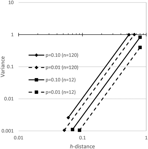
The critical h-distance was plotted versus the variance in . Only two sample sizes are shown so that the figure is not cluttered. The relationship is best realized by looking at all data on a log–log plot. Note that as the sample size increases, the allowed variance increases.
Figure 8. H-line Modality Confidence Limits for n = 120 and n = 12, when testing for five modes. Random data falls to the upper left of these plots. It varies by sample number and number of modes being tested
A regression was done on all points within 1000 trials for a sample size. Later, the p-value equations will show that the h-distance and variance in random data was related exponentially as expected. The factor in the equations reported as e was found experimentally to match its value to four significant figures, so e is used. This is an additional confirmation that the random data generation conformed to expectations since random data is exponentially distributed.
The p-values for the maximum extent of the data plots are shown for p = 0.1 and p = 0.01. To find the p = 0.10 line, the procedure was that no more than 10% of the trials could exceed the p-value line at any point along its plot. This is a more stringent requirement than saying only 10% of the points may independently fall beyond the limit. The limits are related to the mode being tested. When only bimodality is being tested, then only the bimodality of the random data needs to be checked. However, when five modes are being tested, five modes of random data need to be compared. Since that increases the chance that random data could have false modes, the test for more modes is more stringent.
The regression equations are made by best fits. The assumption of fitting data is that there is an underlying theory defining these curves. Since the theory for a continuous uniform distribution was derived, it should be possible to find them for other distributions. Since the data wereso consistent and easily predicted by the smoothed data, fitting was allowed to make the results generalized.
The general equation for the p-value limits is shown. For p = 0.1 and p = 0.01, the Equationequations (1)(1)
(1) and (Equation2
(2)
(2) ) apply, respectively
where Var = variance, n = number of total samples, m = number of modes tested equal to 2 or greater, and h is the critical h-distance. The worst case of exceedance by the regressions was with n = 24, m = 3, the proposed p-value of 0.10 would plot with 126 of 1000 samples exceeding it, which would indicate an experimental p of 0.126. That is not meaningfully different than 0.10. That doesn’t mean the equation is a poor fit, because after rerunning the trial with other random seeds there could be fewer exceedances here, but more elsewhere.
is interpreted to mean that in general, random data will not show modes unless the h-distance is small. As the variance decreases, even smaller h-distances are necessary to produce it in random data. However, if the modal h-distance is large, it would be best explained as modal.
Simulated modal data were plotted along the h-lines. shows data for with 2 through 5 modes each with a modal standard deviation of a tenth of the mode separation. For simplicity, only the confidence limits for testing five modes are shown. They are the most severe of the ones that would apply.
Figure 9. Significance of Simulated Modes with n = 120. Simulated modal data can be found to be significant when it plots to the right of the limits of random data. All simulated modes were found to be significant as expected
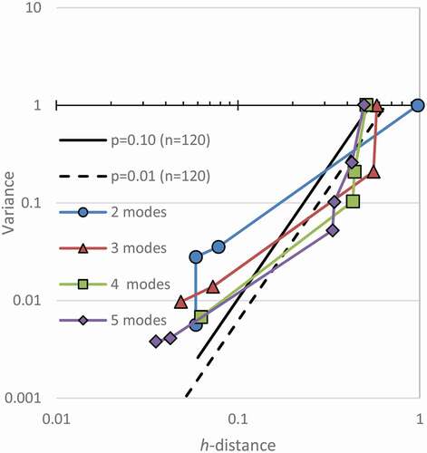
Note in that all simulated modes have points well outside the confidence limits. They exceed the expectations for the relationships of h-distance to variance in random data. Therefore, they are all identified as modal distributions.
Identifying the mode number of each can be done. For the simulated bimodal data in , the first point falls outside of bounds. The meaning of that point needs interpretation. If the first point is considered to represent the first mode, then the analysis would say that that mode is significant. That would appear to conflict with itself. It seems to say that the data cannot be unimodal because it falls out of bounds and must be unimodal because that is the identified mode. A case will be made that that point represents a transition from mode one to mode two. Notice that with three modes, the second point looks significant, and the pattern continues for all the simulated data. For the data made with three modes, this plot should be interpreted to mean that the third mode makes the variance drop into the range of random data. Therefore, it is significant, but with three modes. This resolves the conflict in the bimodal data because it is not conflicting with itself to be both unimodal and not unimodal. Being beyond the confidence limit shows it is modal, but the statistic applies to the second mode. Another explanation for this oddity could be that the critical h-distance is always taken as the minimum h-distance that can explain the model, but that could be taken as the transition between that mode and the next mode. Instead, if the critical value is taken as the maximum h-distance, then the plot would show the correct number of modes. The choice of picking which is the defined critical h-distance seems arbitrary, but this paper keeps the traditional definition, so the sample mode description is determined to be the number of the significant point plus one. If the maximum h-distance was used instead, the data used to make the confidence limits would also have to be reformulated, and different equations for the limits would result because the pairing of variance, and h-distance points would change. Also, the first point would not likely be plotted because the maximum h-distance for the first mode is unbounded and testing for it is not interesting.
In , some of the lower modes appear significant, but not to the level of the higher modes. Therefore, the last mode that is significant is the chosen explanation for each of these. For lower sample sizes, the first points more commonly fall on the other side of the confidence intervals, and only the true modal explanation plots to the right.
The points after the significant mode are within the bounds of random data in . This should be expected because within a mode, the points should be random as scattered by the probability distribution function.
As the modal standard deviation is increased, the modal data fall closer to the confidence interval. Bimodal data with 120 samples and a variance of one needs an h-distance according to the equations of at least 0.62 and 0.44 to be significant with p-values of 0.01 and 0.10, respectively. Experimentally varying the mode separation of bimodal data found that the h-line method could identify it as significant when the mode standard deviation was less than 0.34 and 0.43 for p-values of 0.01 and 0.10, respectively. However, with several trials, modes can sometimes be found in simulated data to have modal standard deviations slightly less than the goal, and in those cases, they can be found to be significant. However, when the modal standard deviation is slightly larger; then, no antimode exists in smoothed data.
It has been shown that when the modal standard deviation is half of the mode spacing, then in continuous distributions, no antimodes exist (Reschenhofer, Citation2001). The observation of finding modes when the mode standard deviation of 0.43 of the mode spacing for n = 120 supports the agreement of these results with previous work. With increasing sample size, it is expected that the detection limits of modes will approach closer to a mode standard deviation of 0.5 of the mode spacing.
Data with non-equal mixing ratios were generated too. For example, in bi-modal data, when the second mode has half as many samples as the main mode, the point for two modes plots to the left of where it had plotted otherwise. Therefore, a mixture of smaller modes makes it harder to determine if the data is modal.
Notice in that each of the peak modes for the simulated modal data follows a trend on the graph. A line can be drawn to connect them. These points represent nearly the most strongly modal that data can be made. A Bernoulli distribution that is graphed on the h-lines would plot at about the same points as this trend. Therefore, it represents the maximum h-distance that data can have with a variance and mode. Also, it was observed that the random data appeared to be log-normal with the same trend line being zero on the abscissa. From that, confidence limit equations could be generalized to any p-value.
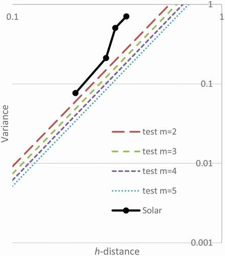
shows the h-line test for the sunspot data. None of the modes are significant. However, if the data continues with the same pattern until 120 samples are obtained, then the data would be significant on . The h-line limits happen at lower h-distances for larger samples. Unfortunately, that represents collection of about 1000 more years of data.
Figure 10. Significance at p = 0.10 of Simulated Modes with n = 24 with solar data. Hypothesized modes 2 through 5 are not significant
Between the two methods, it appears that the h-line method is superior. First, the results can be generalized to any sample size and any standard deviation. Second, the h-line method seems to have a better rationale than the elbowing method.
The proposed methodology was tested for up to five modes. However, by substitution of m, the p-value equations can be found for higher modes. For more modes, the significant mode would appear further down the h-lines. Although the plots of the h-lines are shown down to around an h-distance of 0.06, that is approaching the bin size and kernel step size. The process became unstable when the h-distance equalled those values. Therefore, the results should be cautiously interpreted if the number of modes increases beyond there. If data is investigated with potentially much larger modes numbers, then a similar study might have to be redone.
The method was not validated with sample sizes smaller than 12. However, the method seems well-behaved with large sample sizes. The fitted equations were not tested for large n such as 1000, but beyond 120 the band of data is very narrow, and the confidence limits don’t appear to change much with increasing n.
7 Conclusion
The general phenomenon of elbowing of kernel density estimates was investigated. It was shown that elbowing alone does not support that data is multimodal. It is only the elbowing beyond the expected value from randomness that shows the data have multimodal distribution. The amount of excess elbowing on a log plot is directly related to the p-value of modal data.
Significance values for modal can easily be found. Data are kerned with normally distributed seeds. The h-distance or size of the kernel is reduced until new modes appear. If the resulting variance and h-distance plot outside of the confidence interval, then the process will give a p-value for the specific ideal mode.
The results were applied to sunspot data relating the time of the peak number of sunspots to the count of sunspots. The kernel density estimates of the sunspot data elbowed. It plots somewhat straight on a log–log plot. Previous researchers would rationalize that it must therefore be modal data. However, two detailed analyses show that the null hypothesis cannot be rejected at p = 0.10.
Analysis of elbows is a common tool in many areas. This work suggests the revaluation of all of those applications.
Public Interest Statement
Clustering of data is important for determining whether subpopulations of data share characteristics. Previous clustering methods have subjective measures of whether verifiable subgroups exist. Random data was characterized to show that clustered data must be explained by modes more than random data can be.
Data Availability
Data and code are available at: http://hobackas.faculty.udmercy.edu/research-reports/2021-07/cluster-analysis-data-and-code.zip
Disclosure statement
No potential conflict of interest was reported by the author(s).
Additional information
Funding
References
- Bholowalia, P., & Kumar, A. (2014). EBK-means: A clustering technique based on elbow method and k-means in WSN. International Journal of Computers and Applications, 105(9), 17–10. https://www.ijcaonline.org/archives/volume105/number9/18405-9674
- Chen, Y. C. (2017). A tutorial on kernel density estimation and recent advances. Biostat & Epidem, 1(1), 161–187. https://doi.org/https://doi.org/10.1080/24709360.2017.1396742
- Choonpradub, C., & Mcneil, D. (2005). Can the box plot be improved? Songklanakarin Journal of Science and Technology, 27(3), 649–657. http://rdo.psu.ac.th/sjst/article.php?art=355
- Chowdhury, P., Jain, R., Ray, P. C., Burud, D., & Chakrabarti, A. (2021). Prediction of amplitude and timing of solar cycle 25. Solar Physics, 296(4), 1–5. https://doi.org/https://doi.org/10.1007/s11207-021-01791-8
- Csenki, A., Neagu, D., Torgunov, D., & Micic, N. (2020). Proximity curves for potential-based clustering. Journal of Classification, 37(3), 671–695. https://doi.org/https://doi.org/10.1007/s00357-019-09348-y
- Darlington, R. B. (1970). Is kurtosis really peakedness? The American Statistician, 24(2), 19–22. https://doi.org/https://doi.org/10.1080/00031305.1970.10478885
- Decarlo, L. T. (1997). On the meaning and use of kurtosis. Psychological Methods, 2(3), 292–307. https://doi.org/https://doi.org/10.1037/1082-989X.2.3.292
- Du, Z. L., Wang, H. N., & He, X. T. (2006). The relation between the amplitude and the period of solar cycles. Research in Astronomy and Astrophysics, 6(4), 489–494. https://doi.org/https://doi.org/10.1088/1009-9271/6/4/12
- Everitt, B. S., Landau, S., Leese, M., & Stahl, D. (2011). Cluster analysis (5th ed.). Wiley.
- Gómez-Déniz, E., Sarabia, J. M., & Calderín-Ojeda, E. (2021). Bimodal normal distribution: Extensions and applications. Journal of Computational and Applied Mathematics, 388(5), 113292. https://doi.org/https://doi.org/10.1016/j.cam.2020.113292
- Guo, X. Clustering of NASDAQ stocks based on elbow method and K-means. In Proceedings of the 4th International Conference on Economic Management and Green Development, Online. Springer, Singapore. 2021:80–87.
- Haldane, J. B. S. (1952). Simple tests for bimodality and bitangentiality. Ann Vs Eugene, 16(1), 359–364. https://doi.org/https://doi.org/10.1111/j.1469-1809.1951.tb02488.x
- Kakad, B., & Kakad, A. (2021). Forecasting peak smooth sunspot number of solar cycle 25: A method based on even-odd pair of solar cycle. Planetary and Space Science, 10(1), 105359. https://doi.org/https://doi.org/10.1016/j.pss.2021.105359
- Karak, B. B., & Choudhuri, A. R. (2011). The Waldmeier effect and the flux transport solar dynamo. Monthly Notices of the Royal Astronomical Society, 410(3), 1503–1512. https://doi.org/https://doi.org/10.1111/j.1365-2966.2010.17531.x
- Knapp, T. R. (2007). Bimodality revisited. Journal of Modern Applied Statistical Methods, 6(1), Article 3. https://doi.org/https://doi.org/10.22237/jmasm/1177992120
- Kodinariya, T. M., & Makwana, P. R. (2013). Review on determining number of cluster in K-means clustering. International Journal of Advance Research in Computer Science and Management Studies, 1(6), 90–95. https://www.academia.edu/5514429
- Minnotte, M. C. (1997). Nonparametric testing of the existence of modes. Annals of Statistics, 25(4), 1646–1660. https://doi.org/https://doi.org/10.1214/aos/1031594735
- Ntani, G., Inskip, H., Osmond, C., & Coggon, D. (2021). Consequences of ignoring clustering in linear regression. BMC Medical Research Methodology, 21(1), 1–13. https://doi.org/https://doi.org/10.1186/s12874-021-01333-7
- Pearson, K. (1929). Editorial note on Dr. Stevenson’s paper. Biometrika, 21(1–4), 319–321. https://doi.org/https://doi.org/10.1093/biomet/21.1-4.294
- Reschenhofer, E. (2001). The bimodality principle. Journal of Statistics Education, 9(1), 1–15. https://doi.org/https://doi.org/10.1080/10691898.2001.11910644
- Silverman, B. W. (1981). Using kernel density estimates to investigate multimodality. J of the Roy Stat Soc: Ser B, 43(1), 97–99. https://doi.org/https://doi.org/10.1111/j.2517-6161.1981.tb01155.x
- Singh, A. K., Senapati, D., Mukherjee, T., & Rajput, N. K. (2021). Adaptive applications of maximum entropy principle, Springer. In Progress in advanced computing and intelligent engineering (pp. 373–379). Springer.
- Skrondal, A., & Rabe-Hesketh, S. (2004). Generalized latent variable modeling: Multilevel, longitudinal, and structural equation models. CRC Press.
- Syakur, M. A., Khotimah, B. K., Rochman, E. M. S., & Satoto, B. D. (2018). Integration k-means clustering method and elbow method for identification of the best customer profile cluster. IOP Conference Series: Materials Science and Engineering, 336(1), 012017. https://doi.org/https://doi.org/10.1088/1757-899X/336/1/012017
- Tanackov, I., Sinani, F., Stankovic, M., Bogdanović, V., Stević, Ž., Vidić, M., & Mihaljev-Martinov, J. (2019). Natural test for random numbers generator based on exponential distribution. Mathematics, 7(10), 920. https://doi.org/https://doi.org/10.3390/math7100920
- Thorndike, R. L. (1953). Who belongs in the family? Psychometrika, 18(4), 267–276. https://doi.org/https://doi.org/10.1007/BF02289263
- Tibshirani, R., Walther, G., & Hastie, T. (2001). Estimating the number of clusters in a data set via the gap statistic. J of the Roy Stat Soc: Ser B, 63(2), 411–423. https://doi.org/https://doi.org/10.1111/1467-9868.00293
- Wu, T., Xiao, Y., Guo, M., & Nie, F. (2020). A general framework for dimensionality reduction of K-means clustering. Journal of Classification, 37(1), 616–631. https://doi.org/https://doi.org/10.1007/s00357-019-09342-4