Abstract
We use a new method based on point correlation maps and self-organising maps (SOMs) to identify teleconnection patterns in 60 yr of National Centres for Environmental Prediction/National Centre for Atmospheric Research (NCEP/NCAR) sea level pressure (SLP) re-analysis data. The most prevalent patterns are the El Nino Southern Oscillation (ENSO), the North Atlantic Oscillation (NAO) and the Southern Annular Mode (SAM). Asymmetries are found between base points in opposite centres of action of the NAO and the Pacific North America pattern (PNA). The SOM-based method is a powerful tool that allows us to efficiently assess how realistically teleconnections are reproduced in any climate model. The degree of agreement between modelled and re-analysis-based teleconnections (or between different models) can be summarised in a single plot. Here, we illustrate this by assessing the skill of the medium complexity climate model FORTE (Fast Ocean Rapid Troposphere Experiment). FORTE reproduces some realistic teleconnections, such as the Arctic Oscillation (AO), the NAO, the PNA, the SAM, the African Monsoon and ENSO, along with several other teleconnections, which resemble to varying degrees the corresponding NCEP patterns. However, FORTE tends to underestimate the strength of the correlation patterns and the patterns tend to be slightly too zonal. The accuracy of frequency of occurrence is variable between patterns. The Indian Ocean is a region where FORTE performs poorly, as it does not reproduce the teleconnection patterns linked to the Indian Monsoon. In contrast, the North and equatorial Pacific and North Atlantic are reasonably well reproduced.
To access the supplementary material to this article, please see Supplementary files under Article Tools online.
1. Introduction
Teleconnections span the timeframe between weather and climate, modulating average weather patterns on seasonal to decadal timescales. They manifest as spatially coherent sustained (weekly, monthly, seasonal, annual or decadal) fluctuations in the weather in two or more spatially distinct locations, with the fluctuations often being of the opposite sense between regions. They are one of the main sources of inter-annual to inter-decadal variation in weather and climate and are informative when producing long-range forecasts. Despite their importance, many of the mechanisms and behaviours of teleconnections are poorly understood and, although there is intense interest in the evolution of the Earth's climate, their representation in climate models is often inadequate (Joseph and Nigam, Citation2006).
Teleconnections are persistent fluctuations from the mean and therefore have some element of predictability to them. The El Nino Southern Oscillation (ENSO), which affects temperature and rainfall in the central Pacific, as well as having teleconnections with mid-latitudes, is quite well understood in terms of its mechanisms and evolution. It can be somewhat reliably predicted, especially from the preceding August onwards (Jin et al., Citation2008). The North Atlantic Oscillation (NAO), which affects the position of the jet stream over the North Atlantic, and the Pacific North America pattern (PNA), which affects temperature and precipitation over North America, are much less predictable than ENSO, as they are considered to be patterns primarily internal to the atmosphere (Straus and Shukla, Citation2002; Hurrell et al., Citation2003), with possible modulation by the ocean (Mosedale et al., Citation2006), and therefore do not benefit to the same degree from the long lead times the ocean can provide (Johansson, Citation2007) (All acronyms are summarised in a glossary in Appendix C).
Once teleconnections are identified and their predictability understood, they can help improve seasonal forecasts as the phase of the teleconnection affects the frequency of different weather types a region will experience; for example, the positive phase of the NAO is associated with more frequent depressions over the UK (Riviere and Orlanski, Citation2007). As the climate changes it is not known how teleconnections may change and what implications this will have for weather patterns, which makes it imperative to understand present day teleconnections and their associated physics. While the dynamics of teleconnections are poorly understood their accurate representation in climate models remains a challenge.
This study presents an approach that combines two existing methods to identify teleconnections from large gridded datasets, which can then be used to validate model data and to analyse projections of future teleconnections under differing climatic conditions.
There are several common methods to identify and monitor teleconnections. The simplest method is the use of indices, which typically relate the fluctuations of a variable at several different locations within the teleconnection to a non-dimensional number indicating the state of that teleconnection at that time. For example, the Southern Oscillation index, which is used to identify ENSO events, relates fluctuations in the sea level pressure (SLP) between Darwin in Australia and Tahiti. Indices require very little data, are very simple to construct and can capture the large-scale behaviour of a system over time in a single number. However, they are inflexible to changes in the location of the centres of action and cannot capture spatial structures. Additionally, the locations of the centres of action must already be known to define the index, which means this method cannot easily be used for identifying new teleconnections, or detecting changes in the teleconnection structure over time.
Point correlation maps are another way to visualise teleconnections and are useful to show the spatial relationships associated with a centre of action. They are constructed from gridded data by taking a time series located in one of the centres of actions and correlating it with the time series at all the other grid points. The location for the base point must be known beforehand, as for indices. The correlation map lacks the temporal dimension that indices provide and requires considerably more data. They have been used to identify teleconnections by combining multiple correlation maps into a ‘teleconnectivity map’ (Wallace and Gutzler, Citation1981), but this is restricted to identifying dipole teleconnections.
Another method used to investigate teleconnections, which addresses both their temporal and spatial aspects, is the empirical orthogonal function (EOF). This produces orthogonal spatial patterns with an associated time series showing the amplitude of each pattern over time. The disadvantage of this method is that there is not necessarily a physical basis for the patterns identified as they are based on explaining as much variance as possible, which means physical modes with similar variances may be arbitrarily split over several EOFs (North et al., Citation1982), making interpretation and physical understanding difficult.
A more recently developed method for identifying teleconnections is the self-organising map (SOM). It is a method that has similar benefits to EOF analysis, in that it can identify spatial patterns and be used to trace the evolution of patterns over time. However, it is much less rigid in its results and provides a compact way to summarise a large amount of information about teleconnections on one figure. The SOM (Kohonen, Citation1982) is a non-linear unsupervised neural network method and uses a simple iterative process to analyse high dimension data with the results arranged onto a grid so that similar data are close together and dissimilar data are further away. The ‘map’ aspect of SOMs refers to this grid of similarity rather than to a traditional geographic map.
Being topologically arranged (similar patterns together), the SOM allows clusters of pattern types to be identified. For example, typically in SOM investigations of ENSO, one side, or corner, of the SOM grid will represent cold phase patterns, while the other will represent warm phase patterns (Leloup et al., Citation2007; Leloup et al., Citation2008; Tozuka et al., Citation2008; Sakai et al., Citation2010). This is visually appealing and highlights the progression of patterns from one phase to another, showing how a particular phase is actually composed of several different subsets of a pattern; this is known as the ‘continuum perspective’ (Franzke and Feldstein, Citation2005). For example, when investigating the apparent shift in behaviour of the NAO in the 1970s using a SOM it was discovered that there was no emergence of a new pattern after the shift, only a change in the frequency of the different patterns that make up a particular phase (Johnson et al., Citation2008). In this way the SOM is a useful tool for summarising large quantities of high dimensional data in a single two dimensional plot and can be seen as a compromise between the small number of aggregate patterns produced by EOF analysis and the large number of individual patterns in the original data.
Once the SOM has been developed to investigate one set of data (the training data) it can be used as the basis for further investigations into subsets of the training data and even different datasets. For example, using a SOM trained with year round satellite scatterometer data Richardson et al. (Citation2003) compared seasonal subsets of the data to the SOM patterns and was able to identify the seasonally dominant wind patterns in the south-east Atlantic. The topological arrangement of the SOM clearly illustrates the transition of patterns from one season to the next and can be traced as a path around the SOM units.
One of the ways in which trained SOMs can be particularly useful for investigating different datasets is for evaluation of model data sets. For example, the possible changes in precipitation over the Arctic (Cassano et al., Citation2007) and Antarctic (Uotila et al., Citation2007) have been investigated using a re-analysis trained SOM compared to CMIP3 climate projections. This comparison technique has also been used to investigate teleconnections; for example, Leloup et al. (Citation2008) used a SOM trained with observational data to investigate the accuracy of ENSO representations in the CMIP3 models. This was done by defining a SOM grid that was much larger than the natural number of patterns in the observational dataset. This is often undesirable as SOM units may take the form of unrealistic data types that span the space between two or more genuine data types; however, these unrealistic units can be quickly identified, as none of the observational data will map to those units. In cases where the data of interest may be expected to have different characteristics to the training data, such as model data and observational data, the extra unphysical units can accommodate any unphysical data types from the model. This prevents them being associated with the most similar (but unrepresentative) realistic data types due to the lack of alternative. They are still included in the topological arrangement of units so contribute information about the nature of the difference between the two datasets.
Here we propose to combine the methods of point correlation maps and SOMs to identity teleconnection patterns in gridded datasets. Investigations using SOMs so far have used the data of interest directly as an input to the SOM. We suggest that the point correlation maps can be used as an intermediate step between the raw data and the SOM to identify the relationships within the data, before allowing the SOM to summarise and organise the correlation maps to reveal the teleconnections.
This method will be used to examine teleconnections in National Centres for Environmental Prediction/National Centre for Atmospheric Research (NCEP/NCAR) re-analysis data, which are then used as a benchmark to test the realism of teleconnections simulated by the medium complexity climate model FORTE (Fast Ocean Rapid Troposphere Experiment). Section 2.1 introduces the data, section 2.2 describes the combined correlation map SOM method, section 2.3 describes how the teleconnections are grouped together, and the results presented in section 2.4. The extension to the method to include model data is described in section 3, with the results and a comparison to the observed teleconnections in section 3.1. The results are discussed in section 4, with conclusions in section 5. A background introduction to how SOMs work is given in Appendix A and to illustrate how the combined method performs in comparison to the ‘traditional’ SOM methodology and EOFs Appendix B details an idealised experiment using the correlation map SOM method. Appendix C contains a glossary of definitions for the acronyms and terminology used throughout the paper.
2. Identifying teleconnections from correlation maps
2.1. Data
To determine the observed teleconnections we use monthly NCEP–NCAR re-analysis SLP (Kalnay et al., Citation1996) on a 2.5×2.5 grid for the period 01.1948 to 12.2008 (referred to as ‘NCEP’). The large number of observations used to constrain the NCEP–NCAR re-analysis ensures a realistic representation of teleconnection patterns. The simulated teleconnections are found from the last 60 years of SLP data generated by a control run of the FORTE model (Wilson et al., Citation2009; Sinha et al., Citation2012) with a resolution of 2.8×2.8. FORTE is a medium complexity coupled climate model with 15 sigma-levels in the atmosphere and 15 z-levels in the ocean, a thermodynamic sea ice model and ocean eddy parameterisation. The data are transformed into monthly anomalies by removal of the long-term monthly means (i.e. the annual cycle is removed) and interpolated onto a common 5×5 grid by linear interpolation to reduce computational demand during the processes described below.
2.2. Correlation map SOM
We construct point correlation maps for each grid point (or base point) for each dataset to reveal any teleconnections in the data (Wallace and Gutzler, Citation1981). The SLP at each base point in turn is correlated in time with the SLP at every grid point and displayed as a 2-D map, resulting in one map for every grid point in the dataset, for a total of some 2592 maps for each dataset. The NCEP correlation maps are used to ‘train’ (see Appendix A) a SOM with 15×20 units, which summarises the relationships within the correlation maps (many new terms are introduced in this section, which are summarised for reference in a glossary in Appendix C). Each SOM unit is a representation of a teleconnection the SOM has identified in the data during training. A 15×20 SOM was chosen after trials with smaller and larger dimensions as it is large enough that seemingly different patterns are not merged into single units, but small enough that there is still a large reduction in the number of patterns to examine compared to the initial number of correlation maps. The principles and general conclusions are, however, robust with regards to variations in the SOM dimensions once a minimum size is surpassed, below which patterns become sensitive to SOM size (Hewitson and Crane, Citation2002; Reusch et al., Citation2005; Liu et al., Citation2006b; Leloup et al., Citation2007; Johnson et al., Citation2008). For more details of how the SOM works, definitions of the terminology and an illustrative example using current meter data see Appendix A. A free software package called ‘SOM Toolbox for MATLAB’ (Vesanto et al., Citation2000) (available from: http://www.cis.hut.fi/projects/somtoolbox) is used to calculate the SOMs throughout this paper.
Once the SOM is trained, the NCEP correlation maps are compared to the representations of teleconnections that the SOM has identified and each map is assigned to the unit with the shortest Euclidean distance (termed its ‘best matching unit’ or BMU). The number of maps a unit has assigned to it is referred to as the number of ‘hits’ it received, which is the same as the frequency of occurrence of that unit pattern within the original dataset. The pattern represented by each SOM unit is calculated by averaging all the correlation maps for which that unit is BMU. A comparison between the SOM representation of the pattern and the result of the average of all the correlation maps for that unit is shown in (left panels) for unit 15, which is located in the bottom left corner of the SOM (marked with a green dashed hexagon on ) and represents a NAO-like pattern. The differences are relatively minor (shown in , bottom left), but the average correlation maps form is preferable as the relationships are then constructed from the original data rather than just being representations of the data.
Fig. 1 A comparison of the SOM representation for unit 15 (top left) with the pattern from averaging the correlation maps that are associated with unit 15 (middle left). The base points for all the correlation maps that contribute to the average pattern are shown by the green outline squares, the filled squares correspond to the base points of the correlation maps shown in the right column: light pink is the base point of the correlation map with the largest QE for unit 15, light blue is the base point for the correlation map with the minimum QE for unit 15 and yellow is the base point for the correlation map with the median QE for unit 15. Bottom left shows the difference between the SOM representation and the average correlation map pattern. Three of the correlation maps that are associated with this unit are shown on the right: top, the correlation map the greatest distance away from the unit pattern; middle, the correlation map the shortest distance from the unit; and bottom, the correlation map the median distance from the unit. The base point for each of the correlation maps on the right is indicated with a coloured square on the correlation map itself and on the average pattern from the correlation maps on the left. See for the location of unit 15 on the SOM.
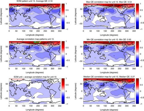
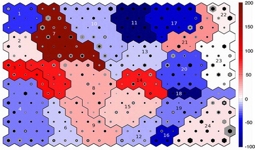
Fig. 2 SOM trained using NCEP data. The size of the black hexagon superimposed on each unit is proportional to the number of hits that unit received for the NCEP data. The colour of each cluster shows the frequency of occurrence of that cluster, the darker the blue, the more frequently it occurred in NCEP. The cluster numbers are written on each cluster. Unit outlined by a green dotted line (bottom left corner) is unit 15, which is shown in .
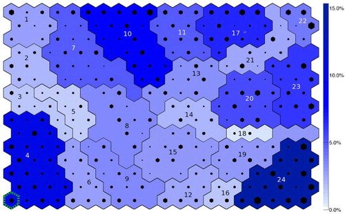
The trained SOM and the accompanying SOM patterns represent the range of teleconnection patterns observed within the NCEP data. Since there are a large number of SOM units, each with their own associated global pattern, it is not possible to display all the patterns, so the SOM is displayed using a hexagon to represent each unit, as in . The location of each hexagon reflects that unit's location on the SOM (adjacent units are similar to one another, while units placed further apart are less similar, due to the topological arrangement), while the size of the hexagons reflects the number of hits that unit received (the larger the symbol the greater the number of hits). The background colour of each unit can be used to display additional information, such as what type of teleconnection a region of the SOM represents via a key (e.g. ). This configuration of data display can seem a little abstract at first but the large amount of information that can be summarised and displayed by a SOM is one of its main strengths.
Fig. 3 Schematic showing which regions of the SOM correspond to which global teleconnection patterns. Where the teleconnection has no obvious established name the clusters are labelled with a very brief description of the pattern. Acronyms are listed in Appendix C.
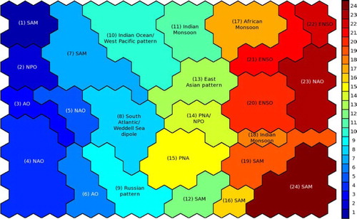
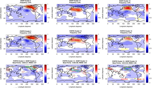
Fig. 4 NAO cluster patterns. Top row shows NCEP patterns, with the base points for each pattern indicated by the yellow contour. The title details the cluster number and the frequency of occurrence for that pattern. The middle row shows the same, but for FORTE. The bottom row shows the FORTE patterns minus the NCEP pattern; the green contour shows where the NCEP and FORTE base points agree, the red contour shows where FORTE has include base points that NCEP does not and the yellow contour shows where NCEP has base points that FORTE does not reproduce. The title details the RMSE between the NCEP and FORTE cluster patterns and a ratio of the proportion of NCEP base points FORTE is in agreement with compared to the number of base points FORTE has in the wrong location as a proportion of the total number of NCEP base points for that pattern.
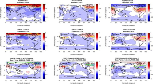
Fig. 5 Same as , except showing the PNA and NPO patterns.
A measure called ‘quantisation error’ (QE) can be used to check the SOM training has resulted in a configuration that represents the NCEP correlation maps well and is defined as the average Euclidian distance between the correlation maps and their BMUs. It can be either calculated for the map as a whole, for individual units or for a subset of the map (such as clusters). For example, unit 15 has a QE of 2.19 (the QE for the whole SOM is 2.98), which represents the distance between the SOM representation of the pattern and the correlation maps that correspond to that SOM pattern. shows three of the correlation maps that are assigned to this unit; one which is the greatest distance away from the SOM representation (top right panel), one that is the closest (middle right) and the correlation map that is the median distance away (bottom right). The location of the base points for those correlation maps are marked on the figure with filled squares, while the location of the base points of the rest of the correlation maps that are assigned to this unit are shown as unfilled squares (middle left panel). The area marked by the squares shows that correlation maps with base points in this region all produce a similar pattern and instead of having to each be examined individually these can be grouped together by the SOM to produce a single pattern that represents the teleconnections associated with that region. This is repeated for every unit on the SOM, summarising the teleconnections in the dataset.
2.3. Clustering
Each of the patterns that correspond to the SOM units represents part of the continuum of teleconnection patterns, including variations of a particular ‘type’ of teleconnection. For example, the units occupying the bottom left corner of the SOM are all types of NAO patterns, one variation of which is unit 15, shown previously in . It is useful to group these variations of a pattern type together to look at the overall properties of that pattern, while retaining the internal variation; this can be done using clustering. Agglomerative hierarchical clustering initially has as many clusters as there are SOM units (i.e. 15×20 in our case). The two clusters with the smallest Euclidian distance between them are then combined to make a new cluster, and this is repeated until only a single cluster remains. This produces a ‘tree’ of clusters (displayed in a dendrogram), which may be ‘cut’ at any point to provide the desired number of clusters. The number of clusters of interest will vary depending on the level of grouping required, for example, all patterns of a certain type in one group, or only subspecies of patterns grouped together. As with the size of the SOM, the number of clusters chosen does not materially affect the conclusions drawn, rather it controls the level of detail of the patterns examined; the higher up the dendrogram the cut is made the more agglomeration will have occurred and so the greater the generalisation of the patterns. In this case after investigating different levels of the dendrogram we chose 24 clusters as a balance between classifying SOM unit patterns into similar groups and retaining consistently modified versions of teleconnection patterns, for example, NAO and the Arctic Oscillation (AO). shows a schematic of the clusters on the SOM labelled with the teleconnection associated with each cluster. Unit 15, the example in , is thus classified as belonging to cluster 4 (NAO).
As mentioned in section 2.2., the identified teleconnection patterns are not sensitive to the size of the SOM. Reducing the number of SOM units rather than using clustering, leads to SOM unit patterns that are similar to the average patterns found for each cluster of a SOM that has a larger number of units (not shown). However, by reducing the number of SOM units we lose the continuum of variations that constitute a pattern type and the ability to investigate shifts within a pattern type.
Calculation of the QE between the NCEP correlation maps and the SOM unit representations within each cluster indicates that all cluster patterns are represented similarly well (mean QE=3.58, standard deviation=0.72), except cluster 4 (QE=2.16), which is particularly well represented and cluster 18 (QE=5.39), which is the worst represented; however, this is probably due to the low number of hits it received (0.5%) providing less opportunity for training.
The stable QE provides confidence that the SOM represents the correlation maps; however, to further minimise any errors between the SOM and the correlation maps, the SOM representations are not used directly. The pattern represented by each cluster is calculated by averaging all the correlation maps for which the units contained within that cluster were the BMU (i.e. an average of the unit patterns within that cluster, weighted by the number of hits they received). This prevents any unrealistic units, which have no hits, influencing the resultant cluster pattern, despite being classified into that cluster. Each cluster occupies an area on the SOM, with each area corresponding to a global teleconnection pattern. For example, the area of the SOM that corresponds to cluster 4, which depicts the NAO, is shown in , while the pattern for that cluster is shown in (see caption for explanation of figure). As clustering the SOM units retains the topological arrangement of the patterns, neighbouring clusters show teleconnections with related structures. For example, cluster 3 (see online supplement), which is adjacent to cluster 4, shows a more AO-like pattern, which has similarities to the NAO but is more zonally extensive.
Once the cluster patterns are identified, it is interesting to examine the origins of the correlation maps that correspond to each cluster. The location of the base points of the correlation maps that correspond to selected clusters are shown on the cluster patterns by the yellow contour in Figs. (–). The base regions show the area the global pattern is linked to and can provide insight into what physical processes might be influencing the teleconnection pattern. The next section presents the results of this method applied to the NCEP correlation maps.
Fig. 6 Same as , except showing the African Monsoon and ENSO.
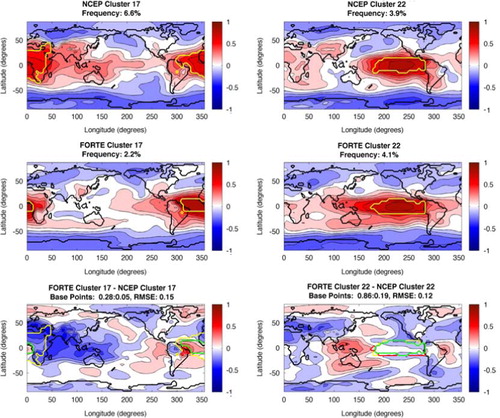
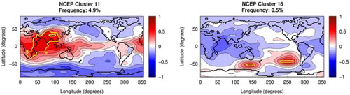
Fig. 7 Same as top row of except NCEP cluster patterns for the Indian Monsoon. FORTE provides no hits for these clusters, so there are no corresponding FORTE patterns.
2.4. Teleconnections from NCEP re-analysis data
The regions of the trained SOM that correspond to different global patterns are shown in . Where the teleconnection has no obvious established name the clusters are labelled with a very brief description of the pattern. Familiar teleconnections identified by the SOM clusters are the AO (cluster 3), the NAO (clusters 4, 5 and 23), the Indian Monsoon (clusters 11 and 18), the PNA (clusters 14 and 15), the Southern Annular Mode (SAM) (clusters 1, 7, 12, 16, 19 and 24), the African Monsoon (cluster 17) and ENSO (clusters 20 and 22). Selected cluster patterns are shown in (–) with all the cluster patterns available in the online supplement. The cluster patterns for the NAO are shown in , the patterns for the PNA and North Pacific Oscillation (NPO) are shown in , the African Monsoon and ENSO are shown in and the Indian Monsoon is shown in . shows the number of hits each unit on the SOM received by the size of the black hexagon. The frequency of occurrence of each cluster (the sum of the hits in that cluster) is shown by the colour of the cluster (the darker blue the cluster the higher the frequency). The frequencies of occurrence of each of the main patterns are reported in . ENSO, the NAO and the SAM emerge as the dominant patterns, with the highest frequencies, perhaps not surprisingly as these are often identified as the leading modes of variability when examining global (Tourre and White, Citation1995; Messie and Chavez, Citation2011), Northern Hemisphere (Wallace and Gutzler, Citation1981; Quadrelli and Wallace, Citation2004) and Southern Hemisphere (Mo and White, Citation1985; Gong and Wang, Citation1999; Carleton, Citation2003) data, respectively.
Table 1 The cluster numbers of the teleconnections identified by the SOM, with the associated frequencies of occurrence for NCEP and FORTE
There are a large number of clusters that represent the SAM compared to the other teleconnection patterns. The SOM aims to span the input space of the data so the more often a pattern occurs in the data the more topological space is devoted to the pattern by the SOM, so smaller variations in that pattern will be separated out rather than amalgamated into a single pattern. Since the SAM is the dominant pattern in the high latitude Southern Hemisphere it commands a lot of space on the SOM, with the associated variations in pattern. A similar fraction of the SOM is dominated by Northern high latitude patterns, but is split over several patterns because the uneven distribution of land between the Northern and Southern Hemispheres leads to a greater variety of teleconnections in the North. This is one of the strengths of the SOM and supports the ‘continuum perspective’ of teleconnections, which suggests that individual teleconnections are not a single pattern with a fixed structure, but composed of a range of patterns occurring at different frequencies, which together provide the characteristics for that teleconnection.
Cluster 5 (shown along with clusters 4 and 23 in ) depicts a relatively geographically contained NAO affecting only the North Atlantic and the important area for the formation of this pattern coincides with the path of the jet stream, which is to be expected; however, cluster 23, which shows a strong more northward positioned NAO with greater zonal extent, highlights the Azores high as being important. Clusters 4 and 23 are effectively the same pattern, with the signs of the correlations reversed, and the positioning of the clusters on the SOM reflects this, as opposite patterns are located on opposite sides of the SOM due to the topological arrangement of the units. The boundary between the centres of action of the NAO typically migrates depending on the phase of the teleconnection, with the jet stream being further north-east during the positive phase (Hurrell and Van Loon, Citation1997). This shift is observed between clusters 5 and 4/23, suggesting that cluster 5 may be a representation of the negative phase of the NAO, while clusters 4 and 23 reflect the positive NAO. The difference in the location of the regions important for these patterns suggests that the regions influencing the teleconnection vary with phase. This complements the findings of Chen and Van den Dool (Citation2003) who produced composites of the NAO based on the phase of the teleconnection to show there is an asymmetry of the patterns depending on the sign of the centres of action. Their positive composite shows a very similar pattern to cluster 5, while their negative composite resembles cluster 6, with the southern centre of action extending further over Europe. They also found that the structure of the NAO was sensitive to the zonal location of the base point. The correlation map SOM is ideal for detecting this kind of behaviour as base points with similar patterns are grouped together so patterns either side of a threshold are separated; however, all the NAO patterns found here have base points spanning the whole North Atlantic and do not show separate patterns for base points located in the east and west. Although the correlations used to construct the point correlation maps that determine the cluster patterns take into account both phases of the teleconnection pattern and are a linear function, the asymmetry of the patterns from opposite centres of action is still able to highlight non-linear aspects associated with the phase of the teleconnection and the location of areas of influence.
Understanding the regions that contribute to a particular configuration of the NAO is useful for developing informative indices of the teleconnection and also for improving seasonal forecasts, because if anomalies in specific locations contribute to a particular phase of the NAO they can be used to predict the statistics of the weather patterns expected in the following months. These clusters indicate three key regions for the NAO: the Arctic (cluster 4), the Jet Stream/Icelandic low (cluster 5) and the Azores high (cluster 23). This makes sense physically as the NAO is a manifestation of pressure anomalies in the Icelandic low and the Azores high, which affects the strength and position of the jet stream. It is also known to be dynamically linked to the polar stratospheric vortex (Ambaum and Hoskins, Citation2002), explaining the base region in cluster 4. Interestingly clusters 3 and 6, which are more characteristic of the AO as the patterns are more zonally symmetric, show a region of influence between that of cluster 4 and 5 and over northern Russia that could coincide with the edge of the Arctic polar vortex and the strength of the polar vortex, and hence its position, determines the phase of the AO (Thompson and Wallace, Citation1998).
A similar suggestion of asymmetry between phases can be seen for the PNA between clusters 14 and 15 (shown in ), with cluster 14 more characteristic of the positive phase, where the Aleutian high is strengthened and there is low pressure over south-east North America, while cluster 15 resembles the negative phase, with the Aleutian high weakening and high pressure replacing low pressure over the eastern Unites States (Franzke et al., Citation2011). The base points for each of these patterns show that the positive phase is more influenced by the subtropical high, while the negative phase is more influenced by the Aleutian low. These patterns again resemble those in the composites constructed by Chen and Van den Dool (Citation2003), with their negative composite similar to cluster 15 and cluster 14 resembling their positive composite, except for the absence of the secondary positive centre of action. Alternatively, cluster 14 could be viewed as the NPO due to its similarity with cluster 2, also shown in .
3. Extended method including model data
The patterns from the SOM trained using the NCEP–NCAR SLP are the forms of teleconnections that should be found in the model data, if it accurately represents reality (as characterised by the re-analysis data). To see if this happens, the patterns in the FORTE correlation maps can be compared to the patterns found in the SOM. This is the same process as calculating the hits for each SOM unit from the NCEP–NCAR data, but using the FORTE correlation maps instead. This results in each SOM unit
having two values for frequency of occurrence: one associated with the re-analysis data and one with the model data, with the NCEP–NCAR hits assumed to reflect reality. The frequency of occurrence for each cluster and the hits for each unit according to FORTE are shown on . The discrepancy between the number of hits for each data set indicates how well or poorly the model data is reproducing that pattern. This is plotted on using grey hexagons to show the FORTE hits, in addition to the NCEP hits shown by the black hexagons, to see how they compare. The background colours on are related to the under- or overestimation of the frequency of occurrence for each cluster, calculated as:
Fig. 8 SOM trained using NCEP data, but superimposed with FORTE hits. The size of the black hexagons is proportional to the number of hits FORTE had on that unit and are scaled the same on all figures (so hexagons of the same size on each figure represent the same number of hits.) The colour of each cluster shows the frequency of occurrence of that cluster, the darker the blue, the more frequently it occurred in FORTE. The cluster numbers are written on each cluster.
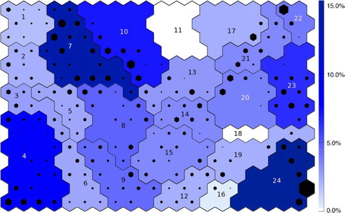
Fig. 9 NCEP trained SOM showing both NCEP and FORTE hits as black and grey hexagons, respectively. The colour of the cluster shows the percentage change in frequency between NCEP and FORTE. Red shows overestimation by FORTE, while blue shows underestimation. The cluster numbers are written on each cluster.
White shows where the value of this metric is close to zero, i.e. the frequencies match; blues show where FORTE underestimates the frequency, with the lowest possible value being −100, meaning that FORTE did not provide any hits for that unit; and reds show where FORTE overestimates the frequency and by how much; for example, a value of 50 would indicate that FORTE provided all the NCEP hits plus extra hits equivalent to 50% of the NCEP hits. Additionally, the root mean square error (RMSE) is calculated between the NCEP and FORTE cluster patterns as a measure of the similarity of the spatial patterns and is shown in .
Fig. 10 NCEP trained SOM showing both NCEP and FORTE hits as black and grey hexagons, respectively. The colour of the cluster shows the RMSE between the NCEP and FORTE patterns for that cluster. The darker the blue the higher the RMSE. Clusters in pink have an undefined RMSE as there are no FORTE correlation maps associated with them to use to calculate an RMSE. The cluster numbers are written on each cluster.

The RMSE is needed in addition to the difference in frequency of occurrence because even where FORTE reproduces the frequency and the location of the base points, the spatial patterns generated by those base points may still not be representative of the NCEP pattern (e.g. cluster 22, .), which is revealed quantitatively by the RMSE for that cluster. Cluster 14 () is an example of a low RMSE (0.05) where the patterns are very similar, while cluster 17 () is an example of a high RMSE (0.15) where FORTE does not reproduce the correct relationships over the Indian and Pacific Oceans and so the patterns are markedly different. The RMSE is particularly high when the distribution of hits within a cluster is poorly reproduced, even if the frequency is similar; for example, cluster 24 (pattern shown in the online supplement) has a high RMSE despite a small frequency discrepancy, because the SAM patterns produced by FORTE are biased towards the patterns occupying the right side of the cluster on the SOM rather than forming a continuum that transitions into the neighbouring SAM clusters.
To see if the discrepancies between the re-analysis data and the model are characteristic of the model or depend on the time period chosen, four consecutive 60 yr periods from the end of the model control run were chosen. The same process was then repeated for each of the new time periods by making correlation maps and comparing them to the SOM trained using the re-analysis data. The results were similar regardless of time period chosen; therefore, only the relationships from the last 60 yr are described here in detail.
In the next section the teleconnections from re-analysis data are compared to those found in the FORTE model data.
3.1. Teleconnections from FORTE model data
Selected cluster patterns from FORTE are shown in the second row of Figs. (–) and can be compared to the NCEP patterns in the first row; all patterns can be found in the online supplement. displays the hits for each unit and the frequency of occurrence for each cluster for FORTE on the SOM trained using NCEP data. It shows a marked difference in the distribution of hits compared to . When comparing hits between NCEP and FORTE, similarity between the number of hits a cluster receives and the distribution of those hits on the SOM illustrates where FORTE accurately reproduces a teleconnection pattern. The combined frequencies of occurrence for the FORTE teleconnection patterns compared to the frequencies for NCEP can be found in . For example, cluster 2 (), which is similar to the NPO, is well represented by FORTE in terms of the number and distribution of hits. Where differences occur, FORTE is not reproducing the teleconnections as found from the NCEP data. The similarities and differences between the distribution of hits for NCEP and FORTE can be seen in as the black and grey hexagons show the NCEP and FORTE hits, respectively; while the background colours are related to the difference in the frequency of occurrence for each cluster. The NCEP hits are fairly evenly distributed over the SOM, as during training the SOM aims to span the entire input space, so assigns more SOM space to patterns that occur more frequently. In comparison the FORTE hits are inhomogeneously spread across the SOM, as FORTE does not accurately reproduce the NCEP input space, providing too many hits in some areas and none in others.
The distribution of hits with regards to any given cluster can change between the re-analysis data and the model data in three main ways: the overall frequency of a cluster can stay similar, but the distribution of hits on the SOM units within that cluster can change; the frequency of the cluster can change but the pattern of distribution of hits on the SOM units remains the same; or the overall frequency of the cluster can change and the distribution changes. Each of these situations gives insight into how FORTE is not accurately reproducing the observed teleconnections. The first instance arises from the model producing enough of a given teleconnection type, but getting the frequency of the pattern variations (i.e. the continuum) that make up that teleconnection wrong. For example, cluster 10, which represents teleconnection patterns located over Oceania with negative correlations to the northeast and southeast Pacific and the North Atlantic, as well as over northern Russia and Antarctica, has a broadly similar number of hits for NCEP and FORTE. However, the distribution of hits on the SOM shows FORTE biases towards patterns more similar to cluster 7, which is a dipole pattern between the south Indian Ocean and Antarctica. The second situation occurs when the model accurately produces the correct ratio of constituent patterns of a teleconnection, but the teleconnection patterns occur too frequently or not frequently enough. For example, cluster 3, which is an AO-like pattern, has hits on the correct SOM units, but there are too few compared to NCEP. The third situation occurs when the model is performing poorly at reproducing both the overall frequency of a teleconnection and the pattern variations. A striking example of this is a teleconnection covering the Indian Ocean, similar to the Indian Monsoon, shown in clusters 11 and 18 (), which FORTE fails entirely to capture, as it provides no hits for these clusters.
To see why differences arise in the distribution of hits between the re-analysis data and the model data, the locations of the base points that map to each SOM pattern for both sets of data can be found and are marked on the NCEP and FORTE cluster patterns as a yellow contour in the top two rows of Figs. (–). This shows which regions are important for the formation of that pattern for each data set. Differences in frequency manifest as differences in spatial extent of the base region; this is because frequency of occurrence depends on the number of correlation maps that have that pattern as their BMU; therefore, the more hits, the more correlation maps, and so the greater the number of base points contributing to that pattern. This technique also reveals where re-analysis and model data may have similar frequencies, but the regions causing the patterns are not geographically the same. For example, the frequencies of NCEP and FORTE for cluster 2 are very similar, but the base points for FORTE are more zonally orientated because of base points missing in the southern US and those erroneously included over Canada (). This indicates different areas are important for creating this pattern in FORTE than in reality. Examining the base regions is useful because it reveals details of the way in which the model data is not reproducing the re-analysis data. For example, where the model fails to reproduce the Indian Ocean pattern (cluster 11, ), the area that should be contributing to this pattern in the model is instead included in cluster 7, indicating that in the model this region is contributing towards a pattern centred more over the southern Indian Ocean, the Southern Ocean and Antarctica than the Indian Ocean. This can then be used to direct investigations into the model dynamics to determine why these discrepancies occur.
The third row of Figs. (–) is the FORTE pattern minus the NCEP pattern to show where the discrepancies are. Also shown on this pattern is where the NCEP and FORTE base points for each pattern agree (green contour), where FORTE includes base points not present for NCEP (red contour) and where NCEP has base points that FORTE does not capture (yellow contour). Two metrics are determined to assess the success of the FORTE base regions in reproducing the NCEP base regions: the fraction of the NCEP base points that FORTE also includes (i.e. number of FORTE base points the same as NCEP divided by the total number of NCEP base points), and the fraction of the NCEP base points equivalent to the number of FORTE base points not within the NCEP region (i.e. number of FORTE base points outside NCEP base region divided by the total number of NCEP base points). These values are shown above each cluster pattern in the third row of Figs. (–).
The combination of these metrics and the RMSE shows not only whether FORTE is overestimating or underestimating the frequency of occurrence of a pattern, but also whether the location of base regions is correct and if, in turn, a realistic pattern is generated.
In general, the two main differences in the patterns between FORTE and NCEP are FORTE tends to underestimate the strength of the correlations and patterns from FORTE have a tendency to be slightly more zonal than those from NCEP. However, FORTE produces many remarkably realistic looking teleconnections, with most of them showing at least some resemblance to the corresponding NCEP pattern. Individual patterns are compared in more detail in the following section.
3.1.1. Atlantic patterns
For the clusters corresponding to the NAO (4, 5 and 23), shown in , the number of FORTE base points in the same location as for NCEP is 80–86%. However, in addition to FORTE agreeing with 86% of the base points for cluster 5, it also includes the equivalent of 92% of the NCEP base points outside of the NCEP locations. These ‘extra’ base points are some of those that are ‘missing’ from cluster 4 (shown by the area between the green and yellow lines). The FORTE pattern for cluster 5 still looks remarkably like the NCEP pattern for that cluster with a moderate RMSE, although the correlations are somewhat weaker. This shows that the ‘extra’ region, instead of contributing to an NAO signal with a strong Arctic/AO influence, is instead contributing to a more regionally confined ‘archetypal’ NAO in the model. The loss of the ‘missing’ base points from cluster 4 results in a loss of the NAO signal, but an increased correlation with the North Pacific. This indicates that the ‘missing’ region is important for the existence of the NAO as without it a more annular mode is produced. On the SOM, clusters 4 and 5 are separated by cluster 3, which has a more definite AO pattern, making migration of base points between the two clusters likely to experience AO-like changes. The ‘inverted’ version of the pattern, cluster 23, which arises from the Azores high centre of action, is well reproduced by FORTE, with only a small number of base points outside the NCEP locations and a very similar cluster pattern, although again, somewhat weaker and more zonal than displayed by NCEP.
The African Monsoon (cluster 17, ) shows reasonable agreement in the equatorial Atlantic, but due to the greatly reduced extent of the base region for FORTE (only 28% of the NCEP base points are included) the connections with southern and eastern Asia, the Indian Ocean and the western Pacific are lost. Additionally, there is an erroneous positive correlation extending into the equatorial eastern Pacific and the negative correlation over Alaska and the North Pacific spreads further to the north and east. These highly altered relationships result in a very high RMSE for this cluster. The ‘missing’ base points instead contribute to cluster 7 for those missing in the South Atlantic and Asia and cluster 21 for those in the North Atlantic, both of which are patterns with more of a Southern Hemisphere emphasis rather than the equatorial influence of the African Monsoon.
3.1.2. Pacific patterns
One of the patterns FORTE reproduced remarkably well is the NPO (clusters 2 and 14, ), with FORTE having 88% and 98% of the NCEP base points correct, respectively. In addition, the resulting FORTE patterns are very similar, with a low RMSE, although the FORTE patterns do suffer slightly from being more zonally orientated than NCEP. Cluster 14, however, has nearly as many FORTE base points outside the NCEP base region as it has within, indicating a region nearly twice the size of that of NCEP contributing to this pattern. In this case the ‘extra’ base points are ‘missing’ from neighbouring clusters 13, for the western base points, and 15, for the northern base points. As a result, cluster 15 (), which shows the PNA, only has a smaller number of base points in common with NCEP and is too weak in the model, as well as lacking a clearly defined centre of action over central North America. It additionally features a centre of action over Europe, which is not present in the NCEP pattern, caused by additional FORTE base points in that region.
Cluster 22 (), which describes an ENSO type pattern, is well represented by FORTE, with 86% of the NCEP base points included. The main discrepancies come from the positive correlation across Africa and southern Asia not extending far enough north, while the equatorial Pacific centre of action extends too far west. The other ENSO-like pattern is cluster 20, which FORTE represents less well, including 66% of the NCEP base points, with most of the discrepancy due to a lack of base points off the Pacific coast of subtropical North America. However, there are very few FORTE base points outside the NCEP base region for this cluster. The pattern resulting from the FORTE base points shows a southwardly displaced centre of action in the southern Pacific that is too zonally extensive, spreading into the Atlantic and western Pacific, while it lacks the negative centre of action seen in the NCEP pattern over the Indian Ocean, instead displaying a band of relatively strong negative correlation across the Southern Ocean and Antarctica. The resultant RMSE for the ENSO clusters is quite high as for both clusters FORTE biases hits to the left side of the clusters on the SOM, indicating that FORTE includes erroneous influences outside the tropical Pacific, as seen in the cluster patterns.
4. Discussion
The combination of correlation maps with SOMs has been demonstrated to identify the range of teleconnections contained within a gridded dataset, producing recognisable teleconnection patterns and identifying the regions that are important for their existence. The main difference in the results using correlation maps as the input to the SOM, rather than the raw data (as is usually done), is the raw data SOM reproduces the various stages of the evolution of the teleconnection, while the correlation map SOM identifies the underlying relationships between regions of the domain (see Appendix B for an example).
The analysis using NCEP SLP shows the ability of the method to identify the spatial form of temporal relationships in monthly weather anomalies and detect asymmetries in the form of teleconnections. The frequency of occurrence of any given pattern in the original dataset is valuable when aiming to understand the influence of a pattern. For example, equatorial patterns, such as clusters 10, 11, 17, 20 and 22, contain a large proportion of the hits. The tropics, and tropical convection in particular, are known to generate teleconnections not only within that region, but also with mid-latitude systems (Trenberth et al., Citation1998), meaning they have a large influence on global teleconnectivity, which is reflected in the hits they receive. Using the base points of the correlation maps that correspond to a particular pattern gives an indication of the regions that are important for the existence of a particular teleconnection; for example, the regions of the Icelandic low and Azores high are shown as being important for clusters 5 and 23, respectively, as would be expected for an NAO pattern.
Using the method to compare NCEP and FORTE shows that FORTE is able to produce realistic teleconnection patterns, albeit generally too zonally orientated, with geographically variable skill. The Indian Ocean emerges as a particularly weak point of the FORTE model, while the North and equatorial Pacific and North Atlantic are reasonably well reproduced. The accuracy of frequency of occurrence is highly variable between patterns, although all patterns show some agreement in the location of the base regions. The FORTE run used is a control run rather than a direct attempt to reproduce the conditions over the same period of time as NCEP, so this is likely to be the source of some of the discrepancies.
The identification of the regions where errors occur in the model via tracing patterns back to their base points allows future investigations to be more regionally focused when investigating the underlying causes of the discrepancies. For example, the West Indian Ocean is highlighted as important for the Indian Monsoon but is a region where FORTE performs poorly, so future investigations might focus on errors in convection, biases in sea surface temperatures or anomalous wind patterns in that region.
Using the SOM to compare the two datasets enables a more detailed analysis of discrepancies than alternative methods and the results can be summarised effectively on one figure for easy visualisation (e.g. ). The use of clustering on the SOM provides an extra level at which to examine the results, so not only the overall teleconnection pattern in that region of the SOM can be examined, but also the composition of that pattern, by examining the distribution of hits within the cluster.
The correlation maps used to identify these teleconnections use contemporaneous correlations and so, while the regions important for that pattern can be identified, the areas forcing the patterns (over a timescale longer than a month, as this is absorbed by the monthly averages) are not highlighted. This can easily be examined using this method by using lagged correlation maps either alongside, or instead of, the contemporaneous correlation maps. This would address the question of the predictability of teleconnections and could be developed in future work.
The SOM could be viewed simplistically as a clustering method; however, it has been repeatedly shown to produce superior information and partitioning compared to traditional clustering methods (Mangiameli et al., Citation1996; Kiang and Kumar, Citation2001; Astel et al., Citation2007; Budayan et al., Citation2009). This is mostly because of the lack of assumptions made about the data and the topologic arrangement of the patterns. It is most useful, however, because the trained SOM can then be used to investigate other datasets, as illustrated here using re-analysis data to train the SOM in order to investigate the properties of model data. The identification of the regions important for the teleconnection using the base points of the correlations maps is a unique advantage for the correlation maps SOM method that cannot be achieved by conventional methods.
The method described in this paper, which combines point correlation maps and SOMs, is comparable to EOFs in that the initial stages are similar, with EOFs initially calculating the covariance matrix of the dataset, before finding the eigenvectors, while here the correlations are calculated before the iterative SOM process is applied. Using EOFs the data set can be reconstructed by a linear combination of the modes, whereas this is not the case for the patterns found by the SOM, as there is no requirement for orthogonality. Other analogous aspects between SOMs in general and EOFs include using a time series of BMUs in a similar way to principal components and using the number of hits to show the prevalence of a pattern in a similar way to the percentage of variance accounted for with EOF modes.Footnote1
The SOM has advantages over EOFs due to the lack of constraints on the data and its ability to summarise results topologically on one diagram. For example, Reusch et al. (Citation2005), using a synthetic climatological dataset, showed that EOFs (both rotated and un-rotated) were unable to extract the predefined patterns, while SOMs were able to recover the patterns and correctly partition the variance. EOFs may arbitrarily mix modes with similar variances (North et al., Citation1982), while SOMs have been shown to accurately recover these modes (Tozuka et al., Citation2008). This mixing of variances by EOFs cannot be identified without prior knowledge of the patterns to be identified, whereas this is easily identified in SOM, as once the number of units is large enough to represent all patterns, no blending occurs and the same patterns will consistently be produced (Reusch et al., Citation2005). Additionally in a simple 1-D comparison of EOFs and SOMs, both were capable of identifying progressive wave patterns, but EOFs failed to identify independent sequential patterns. The orthogonal modes tended to be combinations of the different patterns, while the SOM accurately recovered the separate patterns (Liu et al., Citation2006b). This is important as these sequential patterns could be viewed as different configurations of a teleconnection, which when subjected to EOF analysis would be combined or split into different statistical modes. Sakai et al. (Citation2010) illustrate this problem using ENSO by showing that two modes, represented by two SOM units, distinct in spatial structure, seasonal dependence and dynamics, when projected onto EOF space occupied almost the same location and so were not recognised as separate processes by the EOF analysis. The patterns obtained from the correlation map SOM process are therefore more likely to have a physical basis than those obtained by EOF analysis and so be more directly applicable to understanding the teleconnections.
The main advantages of EOFs are that the time series can be reconstructed using linear combinations of the orthogonal modes, which is not possible with SOMs in general (although a time series of BMUs can be used in a similar way) and not possible specifically in this case because of the absorption of the time component by the correlation maps. The disadvantages of EOFs are that physical modes may be split between EOF modes due to the orthogonality constraint and they cannot be displayed in such a visually compact manner as the SOM. For example, shows the regions of the SOM that correspond to different teleconnections, it also shows the difference in frequency of occurrence for each cluster between NCEP and FORTE and, due to its topological arrangement, it shows the differences in the distribution of hits within a cluster between datasets (and therefore the bias of the model patterns). This provides a summary of the differing properties of the many teleconnections within the two datasets, without reference to multiple separate EOF patterns.
In contrast to EOFs, the SOM is a non-linear method and so able to detect non-linear patterns; however, correlation is a linear function so the correlation maps will only reliably extract those teleconnections with linear temporal relationships and the composite patterns of the clusters will reflect that constraint. However, as the base point for a correlation map moves between centres of action, ‘opposite’ versions of the same teleconnection are found, which are not constrained to be a mirror image of the correlation maps from the other centre of action. These ‘opposite’ patterns will be located on opposite sides of the SOM; for example, the NAO-like patterns of clusters 3 and 4 are on the left of the SOM, while cluster 23, which depicts the opposite, is on the right of the SOM. So in this way non-linear asymmetries in the patterns (as opposed to the time series) can still to some degree be examined. Chen and Van den Dool (Citation2003) showed how teleconnection patterns have different configurations depending on their phase and we find similar results from examining base points in opposite centres of action. To address the linear constraints of correlation, the correlation maps could be recalculated using rank correlations, which may give a different insight into the teleconnectivity.
Extensions to this methodology include presenting correlation maps of multiple variables to the SOM to investigate how the variables relate to one another; for example, a combination of SLP and geopotential height could be used to understand the vertical configuration of teleconnections and hence provide insight into the dynamics involved. Using a series of lagged correlation maps may help improve predictability of development and decay of teleconnections. The use of this method to examine model data could be extended to include the comparison of future projections of teleconnections, for example, using the Climate Model Intercomparison Project 5 (CMIP5) suite of simulations, to investigate how structures may change under different climate scenarios, in particular how their spatial extent may change, how the strengths of correlations may increase or decrease and whether the regions of importance for a given teleconnection migrate as the climate changes.
5. Conclusion
To address some of the shortcomings of current methods for investigating teleconnections and provide an alternative technique for approaching gridded datasets, this paper describes a method for identifying teleconnections that combines point correlation maps with SOMs. Using NCEP–NCAR re-analysis SLPs we have demonstrated that the method can identify well-known teleconnection patterns, such as ENSO, the NAO, the PNA and the Indian Monsoon, and associate each pattern with a frequency of occurrence. The region important for each pattern is also identified, which gives insight into what dynamics may be driving that pattern. Since contemporaneous correlations were used, nothing can be inferred about the teleconnections’ temporal development; however, this could be addressed by using a series of lagged correlation maps as the input to the SOM.
Furthermore, the trained SOM was used to investigate the realism of teleconnections within a control run of the medium complexity model FORTE. Differences in frequency of occurrence of teleconnection patterns between the re-analysis and model data highlight shortcomings in the model, particularly, in the Indian Ocean, while differences in the regions of importance for particular patterns indicates where the dynamics in the model may be contributing to those discrepancies. Combining additional variables into the correlation map SOM method, such as temperature or precipitation, could help address the mechanisms behind the discrepancies.
The power of the correlation map SOM method for the comparison of two datasets has been demonstrated, including the value of being able to summarise large amounts of information on a single diagram. However, it could easily be extended to include multiple models for comparison, for example, to investigate the representation of teleconnections in the CMIP5 suite of models under different representative concentration pathways (Taylor et al., Citation2011). Additional tools to address the characteristics of teleconnections historically, in the present day and in the future, whether in observations or numerical simulations, will help to determine if the models we currently depend on are reliable and, if they are, what changes in variability we can expect associated with the projected increase in average global temperatures.
7. Appendix
A.1. Self-organising maps
A.1.1. What is a self-organising map?
Self-organising maps (SOMs) (Kohonen, Citation1982) are classified as a non-linear unsupervised neural network method; however, it is essentially a simple iterative process used to analyse high dimension data with the results arranged onto a grid so that similar data are close together and dissimilar data are further away. This grid is referred to as the ‘map’, although it is a map of similarity rather than a map in its conventional geographical sense. Each ‘grid point’ on the map is a data type derived from the input data, which represents the properties of the data. The map is ‘self-organising’ because the iterative process arranges these ‘data types’ by properties inherent in the data, without being told what to look for, that is, it is unsupervised. To illustrate the way a SOM works, a time series of current speed and direction from a moored buoy in Loch Shieldaig, Scotland is used (collected by the Fisheries Research Service and downloaded from the British Oceanographic Data Centre). Many new terms are introduced in this section, which are collected together with definitions in Appendix C.
A.1.2. Defining the map
Before the data can begin to be organised a few decisions have to be made about the form of the SOM. The size and shape of the SOM are the main user specified variables. As with all methods, the appropriate form of the SOM will depend on the question it is being used to answer. Each ‘grid point’ on the map (known as a SOM unit) will represent a data type derived from the input data, so the larger the SOM the more data types it will represent. This affects how much detail is contained in each data type – the smaller the map, the fewer the data types, so the more generalised each data type is. Sometimes the desired number of data types is known beforehand, but often several different size SOMs will be constructed to find the required level of detail before deciding on the best size for the application. Some extensions of the SOM method seek to define the size of the SOM from the data itself, rather than it being user specified, such as ‘growing hierarchical SOMs’ (Liu et al., Citation2006a), although they still depend on a user defined parameter to control the growth.
The most common shape for a SOM is a rectangular lattice of either squares or hexagons. The ‘self-organising’ aspect of SOMs works by including neighbouring SOM units in the processing (described in detail below), so the choice of square or hexagonal SOM units affects the number of neighbours taken into account and alters the accuracy of the map. Hexagonal grids also help when visualising the SOM by preventing a human predisposition to identify vertical or horizontal patterns in the data (Kohonen, Citation2001).
In this example using current data a 4×4 grid of squares is used, as this provides 16 possible configurations of current speed and direction (these are the ‘data types’ in this instance) to be found within the dataset. The steps referred to throughout this section are illustrated for the current dataset in .
Fig. A1 Schematic of the SOM process, using current data as an example. Actual data is shown in red, SOM data is shown in dark blue. Green arrows show the iterative loop. Each step is described in more detail in the text.
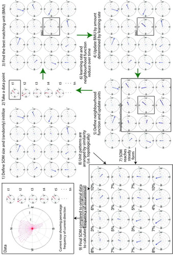
A.1.3. Initialising the map
Once the map has been defined it must be initialised to provide a starting point for the iterative process. Typically this is either done by assigning random numbers to each SOM unit (random initialisation), as is done in step 1, or by linearly initialising with values that lie between the first two principle components of the data set (linear initialisation). Linear initialisation improves the speed of stabilisation during the iterative stage (as some organisation is already introduced to the map) and can also provide small improvements in accuracy of the mapping (Liu et al., Citation2006b).
A.1.4. The iterative process
It is the iterative stage that ‘organises’ the map into different data types and arranges them according to similarity, this is also known as ‘training’ the SOM. Each record (for example, the speed and direction of the current at the buoy at a given time) is taken in turn and compared to the initialised SOM units (step 2). The SOM unit that is most similar to the data record (usually determined as having the shortest Euclidian distance) is selected as the ‘best matching unit’ (BMU) (step 3). This can be written as:Where x
k is the kth data record (e.g. the current speed and direction at one point in time), m
i is the unit pattern for the ith SOM unit and arg denotes the index of the unit (Liu et al., Citation2006b).
The BMU is then updated by a fraction called the ‘learning rate’ to become more similar to the data record (step 4), i.e. the BMU is altered to reduce the Euclidian distance between it and the data by a set fraction (the learning rate). This makes the SOM units begin to resemble the different types of data within the dataset.
In order to arrange the data types by similarity a ‘neighbourhood function’ is defined around the BMU (step 5). This function can take several forms, including Gaussian and step function, although the Epanechikov function produces the most accurate mapping (Liu et al., Citation2006b). All the units that fall within the neighbourhood function surrounding the BMU are also updated according to the learning rate – this ensures similar patterns are located near each other. This process is repeated with each data record.
The neighbourhood function and learning rate typically begin large, but as the number of iterations through the dataset increases the size of the neighbourhood function reduces, so that fewer neighbouring units are updated. The learning rate also decreases so that the changes made when updating the BMU and neighbouring units are much smaller (step 6). This means that at first the adjustment of the value and location of each data type (as represented by a SOM unit) is quite large, which sets up the basic layout of the SOM. As the neighbourhood function and learning rate decrease the SOM units are ‘fine tuned’ with smaller adjustments to end with a stable configuration (step 7) with the resulting units arranged topologically (step 8), and SOM units that accurately reflect the data types within the data set. A faster version of the algorithm, called the ‘batch’ version, does not require the specification of a learning rate. It must be emphasised that the SOM units are representations of the data types within the data set and do not contain any components of the actual data, in contrast to other methods, such as EOFs.
A.1.5. Comparing SOM units
After the SOM is trained each of the SOM units can be examined to find out what kind of data types it has identified within the original dataset. For example, the SOM trained with current data shows that the current at this location is dominated by flows with a northward component, but flows with a southward component do still occur. This is confirmed by examining the current rose made from the original data (step 9). While identifying these data types is useful, the SOM can provide further insight into the dataset by comparing the original individual data records to the data types the SOM has identified. The BMU from the trained SOM is found for each original data record. The number of times each SOM unit is the BMU after all the data has been compared is known as the number of ‘hits’ that unit received. This reflects how often that data type occurs in the original data; this is analogous, but not equivalent, to the percentage of variance accounted for by an EOF mode. This is shown for the current data as a percentage above each SOM unit. Looking at the current rose, the most frequent current direction is northwest and the SOM unit with the highest percentage of hits is also a northwest configuration, so the SOM is accurately reflecting the composition of the data, with the added information about the distribution of current magnitudes in addition to frequencies. This comparison stage is where most of the insight into the data is gained, and by using the comparison creatively different aspects of the data can be explored.
B.1. Idealised correlation map SOMs
This example shows the difference between using the raw data (as is usually done) and point correlation maps to train a SOM. A 10×14 rectangular grid was defined, with a time series of 200 steps for each grid point. Two scenarios were considered using simple oscillations with or without noise to represent teleconnection modes. For each scenario point correlation maps were calculated and the correlation maps (CMs) and the raw data (RD) were each presented to a 4×4 SOM. EOFs of the CMs and RD were also calculated. The scenarios are:
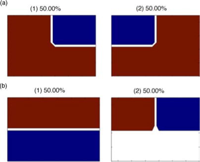
Scenario 1 – The time series consisted of a sine wave 180° out of phase in the Northern and Southern ‘Hemispheres’ (i.e. Northern Hemisphere= sin (t), Southern Hemisphere=−sin (t), where t=time) superimposed with an east-west oscillation in the Northern Hemisphere only, with half the frequency of the original oscillation (i.e. NE quadrant=sin(t) +sin (0.5t), NW quadrant=sin(t) − sin(0.5t))
Scenario 2 – Scenario 1 plus a random walk
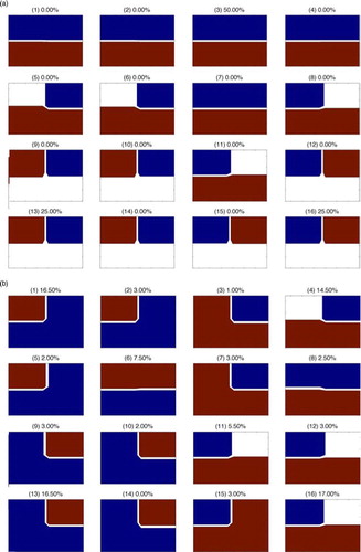
In scenario 1, the CM SOM accurately picks out the separate relationships between different regions of the domain and the hits reflect the occurrence of the patterns. The RD SOM, in contrast, attempts to reproduce the appearance of the system at different stages of the oscillation patterns, so has hits distributed across all units, rather than picking just the patterns that sum up the relationship between regions as the CM SOM does. See a for CM SOM patterns and b for RD SOM patterns with percentage frequency of hits for each unit for scenario 1.
Fig. A2 SOM units for CM SOM (a) and RD SOM (b) for scenario 1. Unit number is shown in parenthesise above each unit along with percentage frequency of hits for that unit. Red is positive, blue is negative, white is zero.
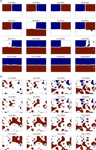
The addition of a random walk in scenario 2 produces surprising results in that the CM SOM very easily picks out the underlying relationships albeit with a small number of the hits spread to neighbouring units due to the additional noise, while the RD SOM fails entirely to produce recognisable patterns, see . This shows that the CM SOM is insensitive to noise and recovers the underlying patterns more effectively in the presence of noise than the RD SOM.
Fig. A3 As for using the results from scenario 2.
The EOFs of the raw data in each scenario succeeded in extracting the two underlying patterns, although the percentage of variance explained was not equivalent to their frequency of occurrence; for example, the north–south pattern accounts for 59% of the variance, although its frequency of occurrence is 50%. The EOFs of the CMs were more variable in the patterns that were extracted. In scenario 1 a relationship with one northern quadrant was identified in the first EOF and a relationship with the other northern quadrant was the second EOF more representative of the stages of the pattern evolution than the underlying relationships, shown in .
Fig. A4 First two EOFs for the correlation maps (a) and the raw data (b) under scenario 1. EOF number is shown in parenthesise above each unit along with percentage variance accounted for in each EOF. Red is positive, blue is negative, white is zero.
In these simple cases, the RD EOF does appear to provide similar information as the SOM; however, the SOM has significant advantages. The spreading of hits in a more realistic scenario need not be due to random noise, but may be interesting variations of a pattern. In this case, the EOF would not take account of these variations, but either combine them together to gain an ‘average’ type pattern or assign the differences to a higher EOF. These variations can be examined individually in a SOM and combined through clustering when appropriate or informative.
In summary, the CM SOM extracted the underlying relationships succinctly, while the RD SOM sought to represent the appearance of the stages of evolution of the combined oscillations. The RD SOM is therefore most useful for investigating the evolution of teleconnection patterns, while the CM SOM is most appropriate for identifying the underlying relationships.
C.1. Glossary of terms
AO – Arctic Oscillation.
BMU – best matching unit: the SOM unit that has the shortest Euclidian distance to the data record. Other measures of similarity can be used.
Cluster pattern – the pattern found when the correlation maps that map to the SOM units within a cluster are averaged.
CM – correlation maps.
CMIP5 – Climate Model Intercomparison Project 5. ENSO – El Nino Southern Oscillation.
EOF – empirical orthogonal function.
FORTE – Fast Ocean Rapid Troposphere Experiment: a medium complexity coupled climate model.
Hits – the number of times a SOM unit is the BMU when compared to the data (after training).
Learning rate – the fraction by which BMUs and their neighbours are updated. Reduces with time.
NAO – North Atlantic Oscillation.
Neighbourhood function – a function that determines how many and to what degree neighbours surrounding a BMU will be updated when the BMU is. The radius of the neighbourhood function reduces with time.
NCEP/NCAR – refers to the National Centres for Environmental Prediction/National Centre for Atmospheric Research re-analysis dataset.
NPO – North Pacific Oscillation.
PNA – Pacific North America pattern.
QE – quantisation error: the average Euclidian distance between a single or a group of SOM units and the correlation maps that correspond to them.
RD – raw data.
RMSE – root mean square error.
SAM – Southern Annular Mode.
SLP – sea level pressure.
SOM – self-organising map: an unsupervised non-linear neural network method for identifying underlying data types/patterns within a dataset and arranging them by similarity on a grid.
SOM unit – a single component of a SOM that represents an underlying data type/pattern in the data set used to train the SOM.
Training – the iterative process that determines the form of the SOM units.
Online Supplement
Download PDF (2.5 MB)6. Acknowledgements
This study uses data from Fisheries Research Services (FRS, now known as Marine Scotland Aberdeen Marine Laboratory), provided by the British Oceanographic Data Centre. The SOM Toolbox for MATLAB from Helsinki University of Technology was used to calculate the self-organising maps in this paper. We thank Peter Challenor, Adam Blaker and two anonymous reviewers for useful suggestions.
Notes
To access the supplementary material to this article, please see Supplementary files under Article Tools online.
1 In our case there is no time series of BMUs analogous to principal components as the time dimension is collapsed when the extra step of constructing correlation maps is included.
References
- Ambaum M. H. P , Hoskins B. J . The NAO troposphere-stratosphere connection. J. Clim. 2002; 15: 1969–1978.
- Astel A , Tsakovski S , Barbieri P , Simeonov V . Comparison of self-organizing maps classification approach with cluster and principal components analysis for large environmental data sets. Water Res. 2007; 41: 4566–4578.
- Budayan C , Dikmen I , Birgonul M. T . Comparing the performance of traditional cluster analysis, self-organizing maps and fuzzy C-means method for strategic grouping. Expert Syst. Appl. 2009; 36: 11772–11781.
- Carleton A. M . Atmospheric teleconnections involving the Southern Ocean. J. Geophys. Res. 2003; 108: 2156–2202.
- Cassano J. J , Uotila P , Lynch A. H , Cassano E. N . Predicted changes in synoptic forcing of net precipitation in large Arctic river basins during the 21st century. J. Geophys. Res.: Biogeosciences. 2007; 112: G04S49.
- Chen W. Y , Van den Dool H . Sensitivity of teleconnection patterns to the sign of their primary action center. Mon. Weather Rev. 2003; 131: 2885–2899.
- Franzke C , Feldstein S. B . The continuum and dynamics of Northern Hemisphere teleconnection patterns. J. Atmos. Sci. 2005; 62: 3250–3267.
- Franzke C , Feldstein S. B , Lee S . Synoptic analysis of the Pacific–North American teleconnection pattern. Q. J. Roy. Meteorol. Soc. 2011; 137: 329–346.
- Gong D , Wang S . Definition of Antarctic Oscillation index. Geophys. Res. Lett. 1999; 26: 459–462.
- Hewitson B. C , Crane R. G . Self-organizing maps: applications to synoptic climatology. Clim. Res. 2002; 22: 13–26.
- Hurrell J. W , Kushnir Y , Ottersen G , Visbeck M . An overview of the North Atlantic Oscillation. The North Atlantic Oscillation: climate significance and environmental impact. Geophys. Monogr. 2003; 134: 1–35.
- Hurrell J. W , Van Loon H . Decadal variations in climate associated with the North Atlantic Oscillation. Clim. Change. 1997; 36: 301–326.
- Jin E , Kinter J , Wang B , Park C. K , Kang I. S , co-authors . Current status of ENSO prediction skill in coupled ocean-atmosphere models. Clim. Dynam. 2008; 31: 647–664.
- Johansson A . Prediction skill of the NAO and PNA from daily to seasonal time scales. J. Clim. 2007; 20: 1957–1975.
- Johnson N , Feldstein S , Tremblay B . The continuum of Northern Hemisphere teleconnection patterns and a description of the NAO shift with the use of self-organizing maps. J. Clim. 2008; 21: 6354–6371.
- Joseph R , Nigam S . ENSO evolution and teleconnections in IPCC's twentieth-century climate simulations: realistic representation?. J. Clim. 2006; 19: 4360–4377.
- Kalnay E , Kanamitsu M , Kistler R , Collins W , Deaven D , co-authors . The NCEP/NCAR 40-year reanalysis project. Bull. Am. Meteorol. Soc. 1996; 77: 437–471.
- Kiang M. Y , Kumar A . An evaluation of self-organizing map networks as a robust alternative to factor analysis in data mining applications. Inform. Syst. Res. 2001; 12: 177–194.
- Kohonen T . Self-organized formation of topologically correct feature maps. Biol. Cybern. 1982; 43: 59–69.
- Kohonen T . Self-Organizing Maps. 2001; 3rd ed, Berlin: Springer-Verlag.
- Leloup J , Lachkar Z , Boulanger J.-P , Thiria S . Detecting decadal changes in ENSO using neural networks. Clim. Dynam. 2007; 28: 147–162.
- Leloup J , Lengaigne M , Boulanger J.-P . Twentieth century ENSO characteristics in the IPCC database. Clim. Dynam. 2008; 30: 277–291.
- Liu Y , Weisberg R. H , He R . Sea surface temperature patterns on the West Florida shelf using growing hierarchical self-organizing maps. J. Atmos. Ocean. Tech. 2006a; 23: 325–338.
- Liu Y , Weisberg R. H , Mooers C. N. K . Performance evaluation of the self-organizing map for feature extraction. J. Geophys. Res. 2006b; 111: 2156–2202.
- Mangiameli P , Chen S. K , West D . A comparison of SOM neural network and hierarchical clustering methods. Eur. J. Oper. Res. 1996; 93: 402–417.
- Messie M , Chavez F . Global modes of sea surface temperature variability in relation to regional climate indices. J. Clim. 2011; 24: 4314–4331.
- Mo K , White G . Teleconnections in the Southern Hemisphere. Mon. Weather Rev. 1985; 113: 22–37.
- Mosedale T. J , Stephenson D. B , Collins M , Mills T. C . Granger causality of coupled climate processes: ocean feedback on the North Atlantic Oscillation. J. Clim. 2006; 19: 1182–1194.
- North G. R , Bell T. L , Cahalan R. F , Moeng F. J . Sampling errors in the estimation of empirical orthogonal functions. Mon. Weather Rev. 1982; 110: 699–706.
- Quadrelli R , Wallace J. M . A simplified linear framework for interpreting patterns of Northern Hemisphere wintertime climate variability. J. Clim. 2004; 17: 3728–3744.
- Reusch D. B , Alley R. B , Hewitson B. C . Relative performance of self-organizing maps and principal component analysis in pattern extraction from synthetic climatological data. Polar Geogr. 2005; 29: 188–212.
- Richardson A. J , Risien C , Shillington F. A . Using self-organizing maps to identify patterns in satellite imagery. Progr. Oceanogr. 2003; 59: 223–239.
- Riviere G , Orlanski I . Characteristics of the Atlantic storm-track Eddy activity and its relation with the North Atlantic Oscillation. J. Atmos. Sci. 2007; 64: 241–266.
- Sakai K , Kawamura R , Iseri Y . ENSO-induced tropical convection variability over the Indian and western Pacific oceans during the northern winter as revealed by a self-organizing map. J. Geophys. Res. 2010; 115: 2156–2202.
- Sinha B , Blaker A. T , Hirschi J. J. M , Bonham S , Brand M , co-authors . Mountain ranges favour vigorous Atlantic meridional overturning. Geophys. Res. Lett.
- Straus D. M , Shukla J . Does ENSO force the PNA?. J. Clim. 2002; 15
- Taylor K. E , Stouffer R. J , Meehl G. A . An overview of CMIP5 and the experiment design. Bull. Am. Meteorol. Soc. 2011; 93: 485–498.
- Thompson D. W. J , Wallace J. M . The Arctic oscillation signature in the wintertime geopotential height and temperature fields. Geophys. Res. Lett. 1998; 25: 1297–1300.
- Tourre Y. M , White W. B . ENSO signals in global upper-ocean temperature. J. Phys. Oceanogr. 1995; 25: 1317–1332.
- Tozuka T , Luo J.-J , Masson S , Yamagata T . Tropical Indian Ocean variability revealed by self-organizing maps. Clim. Dynam. 2008; 31: 333–343.
- Trenberth K. E , Branstator G. W , Karoly D , Kumar A , Lau N.-C , co-authors . Progress during TOGA in understanding and modeling global teleconnections associated with tropical sea surface temperatures. J. Geophys. Res. 1998; 103: 14291–14324.
- Uotila P , Lynch A. H , Cassano J. J , Cullather R. I . Changes in Antarctic net precipitation in the 21st century based on Intergovernmental Panel on Climate Change (IPCC) model scenarios. J. Geophys. Res.: Atmos. 2007; 112: D10107.
- Vesanto J , Himburg J , Alhoniemi E , Parhankangas J . SOM Toolbox for Matlab 5. 2000; Helsinki: Helsinki University of Technology.
- Wallace J. M , Gutzler D. S . Teleconnections in the geopotential height field during the Northern Hemisphere winter. Mon. Weather Rev. 1981; 109: 784–812.
- Wilson C , Sinha B , Williams R. G . The effect of ocean dynamics and orography on atmospheric storm tracks. J. Clim. 2009; 22: 3689–3702.