
Figures & data
Figure 1. Subfigure (A) is the model’s temperature prediction that optimises the objective function, Dice similarity coefficient (DSC). Subfigure (A) is juxtaposed with a time frame from clinical MR thermometry that is near steady state, Subfigure (B). Subfigure (C) is the 57 °C isotherm map, showing where the thermometry and model overlap or do not. The threshold map of subfigure (C) is used to compute DSC. For this image, DSC is 0.88. Subfigure (D) displays the global optimisation of the model to this particular patient’s thermal dataset, seeking to optimise DSC. The vertical axis is the values of perfusion, ω, and the horizontal axis is the values of the effective optical coefficient, μeff. The single point that produces optimal DSC is the dot in subfigure (D), or μeff=166 m−1 and ω = 9.5 kg m−3 s−1.
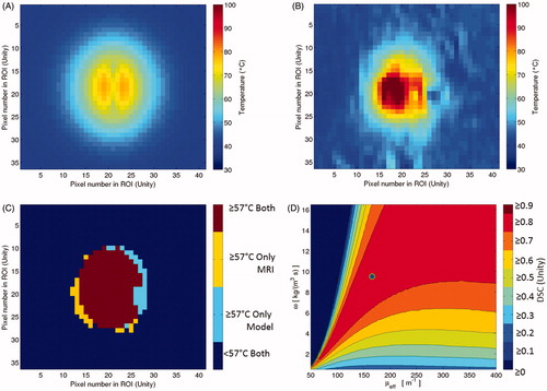
Figure 2. This diagram illustrates the four major components of the global optimisation, using the four images of . The gold standard measurement is the MR thermometry from a time point near steady state. This thermal image is compared to the steady state kernel via DSC of the 57 °C isotherms. The kernel is run with 11 400 μeff–ω values; each model realisation reports a DSC value and is recorded in the optimisation map at right.
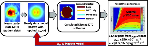
Figure 3. This is a cartoon demonstration of the superposition of individual datasets’ global optimisation in μeff–ω space. Each dataset’s optimisation performance, e.g. (A) and (B), can be superimposed pixel-wise in μeff–ω space to create an optimisation vector map (C). This optimisation vector map has N = 20 individual optimisation results for every sampled point in μeff–ω space. At every point in the optimisation vector map, descriptive statistics can describe the distribution’s behaviour at that μeff–ω point, see .
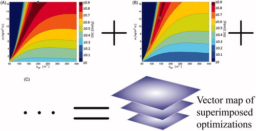
Figure 4. These are the descriptive statistic maps based on the vector map, described in . The diamond icons mark the naive literature value choice, μeff=180 m–1 and ω = 6 kg m–3 s–1. (A) is the mean; (B) is the median; (C) is the standard deviation; (D) is the number of individual patient datasets that pass DSC ≥0.7.
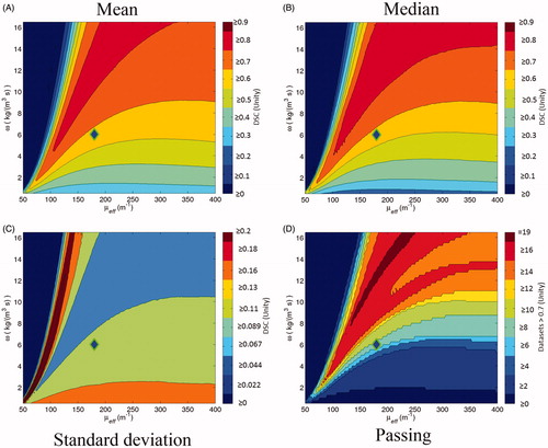
Figure 5. This scatter plot indicates the points in μeff–ω space that create optimal DSC values for individual datasets among the N = 20 datasets. There is a simple linear regression fit line (in blue) of the 18 optimal points (markers are blue with green outlines) that define the line. The fit line’s details are listed in the Results. There are two clearly outlying optimal points, isolated to the figure's right side. These points are excluded from the fit line, but are included in leave-one-out cross-validation. The scatter plot and fit line are superimposed over the mean of the DSC vector map; i.e. .
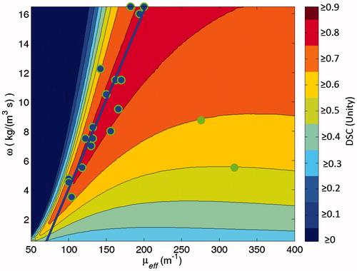
Figure 6. This is a box-and-whisker plot demonstrating the model’s sensitivity to isotherm choice during optimisation; each row represents the distribution of N = 20 patient cohort’s DSC performance during optimisation while using a particular isotherm temperature. 57 °C is the choice implemented in the rest of the work. In the box-and-whisker plot, the solid dots are the minima and maxima, i.e. the ends of the whiskers. The box is the 95% confidence interval and the line within the box is the median. A single dataset among the cohort is not robust with varied isotherm threshold. It is the leftmost outlier and performs worse with rising isotherm threshold, especially at 58 °C and higher. The other datasets do not vary much with isotherm choice.
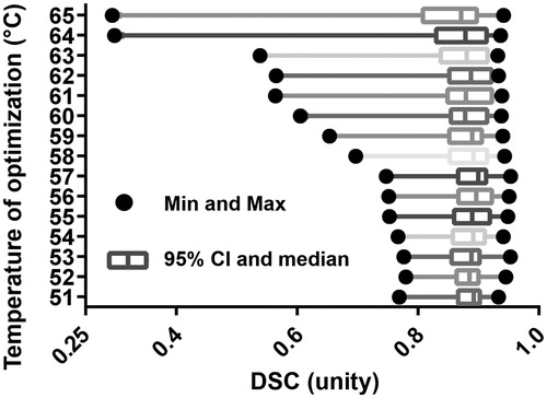
Table 1. Here are the descriptive statistics for DSC performance by using naïve literature values, optimised parameters, and during leave-one-out cross-validation using the vector map method for N = 20 datasets.
Figure 7. For the entire N = 20 cohort, this Figure displays the simulated predictive performance of the globally optimised model during leave-one-out cross-validation (solid line) versus a naïve literature value parameter choice (dashed line). A greater the area-under-the-curve, which is synonymous with the mean performance, indicates better performance.
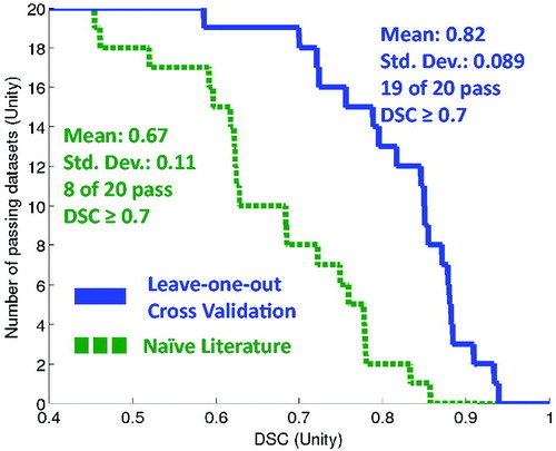
Table 2. These percentiles correspond to several interesting DSC thresholds using the N = 20 datasets.