Figures & data
Table 1. Characteristics and comparison between groups.
Figure 1. Classifying the pathogens of IVO and NVO at the phylum levelA, Group-phylum chord diagram. B, Group-phylum percentage stacked chord diagram. C, The differences in proportions of various phyla between the two groups (IVO and NVO) are illustrated by a bidirectional bar chart.
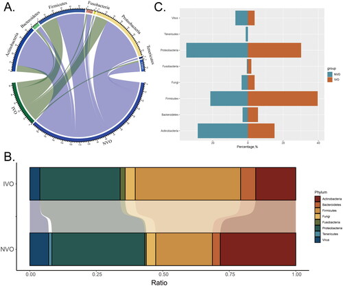
Figure 2. Classifying the pathogens of IVO and NVO at the genus level A, The bar chart illustrates the distribution of different pathogen species in the Native Vertebral Osteomyelitis (NVO) group. B, The bar chart illustrates the distribution of different pathogen species in the Iatrogenic Vertebral Osteomyelitis (IVO) group. C, The bidirectional bar graph demonstrates the distribution differences of pathogen species between the NVO and IVO groups.
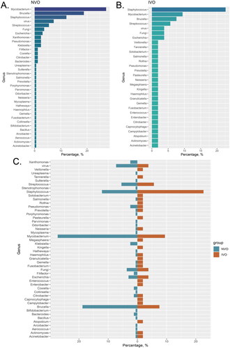
Figure 3. Comparison of routine serological indicators of IVO and NVOA-J, The observed significant differences or trends in parameters between the IVO and NVO groups are illustrated by box plots and scatter plots (*P<0.05, **P<0.01, ***P<0.001). K, Receiver operating characteristic (ROC) analysis for each variable based on the IVO and NVO groups. L, The bar chart represents the ranking of area under the curve (AUC) values for all ROC curves.
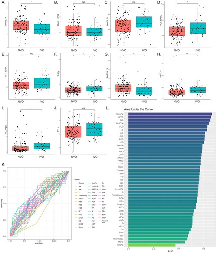
Table 2. Comparison of variables between the total study population, NVO and IVO.
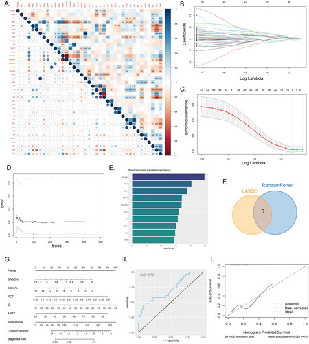
Figure 4. Machine learning and nomogram A, The correlation heatmap displays the correlations between various continuous variables. (*P<0.05, **P<0.01, ***P<0.001). B-C, Variable selection using LASSO regression. D-E, Variable selection using a random forest model to identify the top ten important variables. F, The Venn diagram illustrates the intersection between the results of LASSO regression and the random forest model. G, Nomogram model used to differentiate IVO and NVO. H, ROC curve of the nomogram model. I, Calibration curve of the nomogram model.