Figures & data
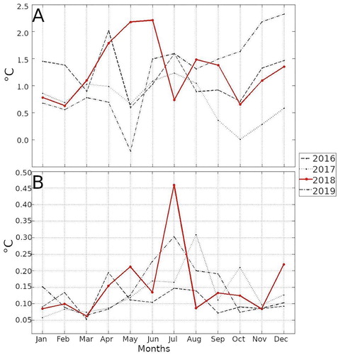
Figure 1.1.1. Overview on major outcomes of this 5th issue of the CMEMS Ocean State Report.
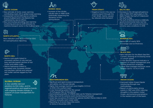
Table 2.1.1. Average sea-ice area transports through the Fram Strait.
Table 2.1.2. Average sea-ice volume transports through the Fram Strait. * Annual average calculated from 12 times monthly average.
Figure 2.1.1. Map showing the location of the sections across the Fram Strait between Greenland and Spitsbergen, the Barents Sea north between Svalbard and Franz Josef Land, and the Barents Sea east between Franz Josef Land and Novaya Zemlya, used to estimate the area and volume of sea ice transport. Mean sea ice drift speed during the time period 1993–2019 is overlaid in arrows. Black isobaths are drawn at 500-meter intervals.
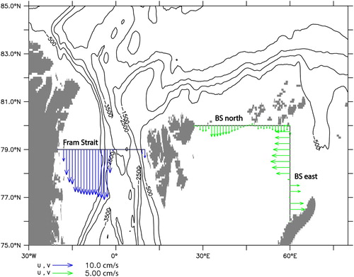
Figure 2.1.2. Seasonal cycle of modelled sea-ice area and volume transport and corresponding trend. (a) Black line shows monthly average sea-ice area transport through the Fram Strait for the period 1993–2019 (positive values southward). Grey shading shows the corresponding ±1 standard deviation. Red, broken line shows the linear trend per year for each month. (b) Similar to (a), but for sea-ice area transport into the Barents Sea (positive values into the Barents Sea). Note that the scale on the y axes are similar in (a) and (b). (c) Similar to (a), but showing sea-ice volume transport through the Fram Strait. (d) Similar to (c), but showing for the Barents Sea. Note that the scale on the y axes are similar in (c) and (d).
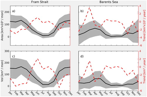
Figure 2.1.3. Time series showing modelled sea-ice thickness, area and volume transport. (a) Average monthly sea-ice thickness in the Fram Strait (black line). The red line shows the linear trend for the period 1993–2019. (b) Twelve-month cumulative sea-ice area transport through the Fram Strait (black line; positive southward). The red line shows the linear trend for the period 1993–2019. (c) Similar to (b), but showing sea-ice volume transport through the Fram Strait. (d) Similar to (a) but showing for the Barents Sea. The broken red lines show the linear trend for the periods 1993–2006 and 2007–2019, respectively. (e) Similar to (b), but showing sea-ice area transport into the Barents Sea. The broken red lines show the linear trend for the periods 1993–2006 and 2007–2019, respectively. (f) similar to (e), but showing sea-ice volume transport into the Barents Sea.
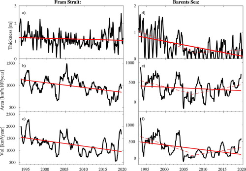
Figure 2.1.4. Composite sea-level pressure anomalies during periods of high sea-ice transport (left) and low sea-ice transport (right) through the Fram Strait (top; a,b), the Barents Sea north section (middle; c,d) and through the Barents Sea east section (bottom; e,f).
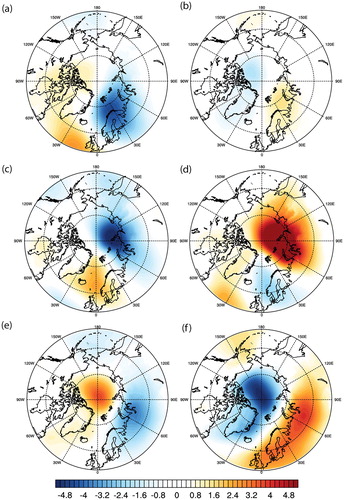
Figure 2.2.1. Time Series of 0–1000 m ocean heat content anomalies in the Lofoten (top) and Norwegian (bottom) basins estimated from Argo (Ref. No. 2.2.1) and the Global Ocean Reanalysis Ensemble product (Ref. No. 2.2.2). Note that GREP and Argo data represent three-monthly averaged OHCA, while ARMOR3D data represents annual OHCA.
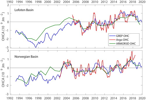
Figure 2.2.2. Linear OHC trends (converted to Wm−2) (a) of the upper 700 m and (b) below 700 m for 1993–2019 from the GREP (Ref. No. 2.2.2). Stippling denotes regions where trends are significant at the 95% confidence level. Figure (b) additionally indicates the location of water bodies referred to in the text: Iceland Sea (IS), Norwegian Sea (NS) with two basins Lofoten Basin (LB) and Norwegian Basin (NB), Greenland Sea (GS), and Barents Sea (BS).
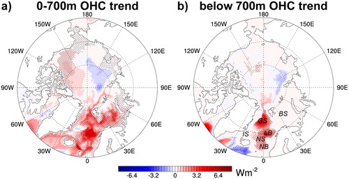
Figure 2.2.3. OHC anomaly (OHCA) of the upper 700 m in 1021 J relative to the 1993–2014 climatology for the Arctic Ocean north of 60 N and the partition into ice-covered regions (under_seaice) and ice-free regions (no_seaice). The partition is based on the annual mean sea ice concentration using a 30% threshold. Curves represent the GREP (Ref. No. 2.2.2) ensemble mean, and the shading represents the intra-ensemble spread. The dashed lines represent results from ARMOR3D (Ref. No. 2.2.3; based on annual mean values).
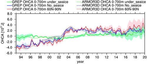
Figure 2.2.4. Linear OHC trends 1993–2019 for Arctic Ocean north of 60N and decomposition into ice-free and ice-covered ocean north of 60N (based on the 1993–2019 sea ice concentration climatology with a threshold of 30% concentration) estimated from the GREP (Ref. No. 2.2.2). Trends are converted to warming rates given in Wm−2. The conversion factor from Wm−2 to ZJ/yr is 0.51 for the pan-Arctic Ocean, 0.17 for the ice-free ocean, and 0.34 for the ice-covered ocean. Uncertainties are the 1σ-uncertainties.
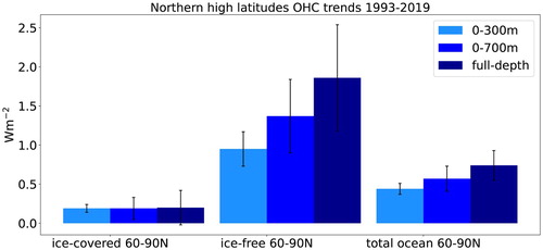
Figure 2.3.1. The Nordic Seas and all stations visited (blue dots) where nutrient data have been collected (product ref. 2.3.1; 2.3.2) and analysed in the period investigated (1990–2019). Black rectangles show the regions with data used in this study: NS (Norwegian Sea), BS (Barents Sea), GS (Greenland Sea).
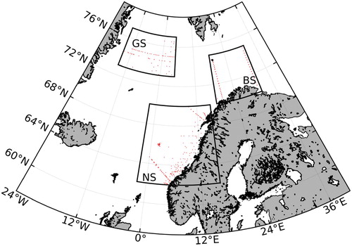
Figure 2.3.2. Box-whisker plots of silicate concentrations (in micromol per litre; obtained from product ref. 1.4.1) bin-averaged in 5-year periods. Blue box shows 25th–75th percentile, red bar shows median, red cross shows mean, and the whiskers show min/max values. (a) Norwegian Sea, 0–50 m. (b) Barents Sea, 0–50 m. (c) Norwegian Sea, 100–200 m. (d) Barents Sea, 100–200 m. (e) Greenland Sea, 100–200 m. Note the different scales on the y-axis. Sample size (n) is provided above each top whisker and shown in boldface where the change from the previous period is statistically significant (>95%).
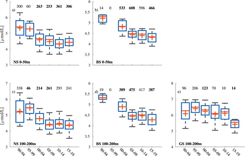
Figure 2.3.3. Same as Figure 1.4.2, but for nitrate (obtained from product ref. 1.4.1).
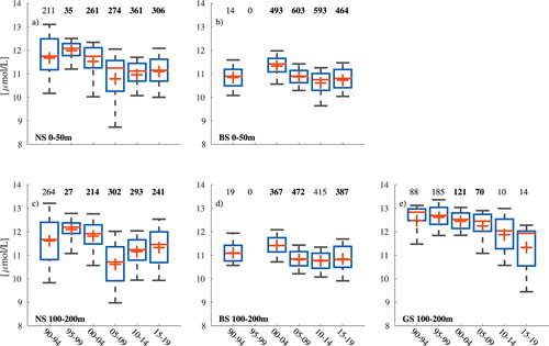
Figure 2.3.4. Same as , but for the nitrate:silicate-ratio (obtained from product ref. 2.3.1).
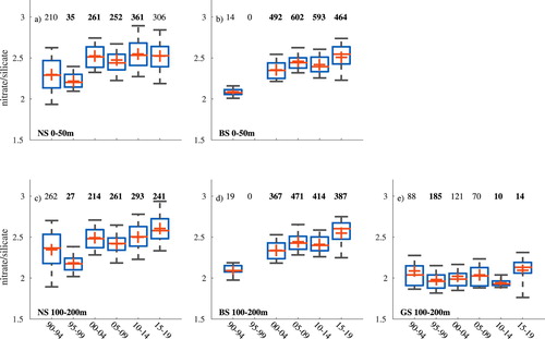
Figure 2.3.5. Time series of silicate concentrations (top panel, blue lines) and nitrate concentrations (bottom panel, blue lines) in the Norwegian Sea (solid line), the Barents Sea (dashed line) and the Greenland Sea (dash-dotted line) in the 100–200 m depth range. The data were obtained from product ref. 2.3.1; 2.3.2. Black lines show the annual Subpolar Gyre Index (data from Berx and Paye Citation2016). Values for the Norwegian and Barents seas represent January-March averages, and values from the Greenland Sea are annual deep water averages. Note that data from the Barents Sea only contain values from 1992 prior to the year 2000.
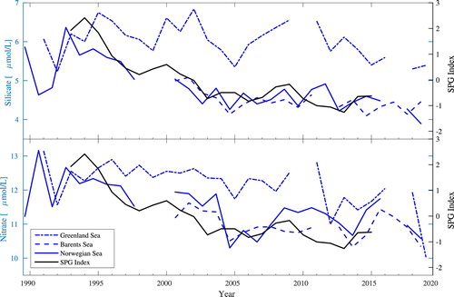
Figure 2.4.1. 2019 daily chlorophyll average for the North Atlantic Ocean (black), daily P90 (red) and P10 (blue) 1998–2017 climatological values, calculated using the CMEMS Ocean Colour ATL REP dataset (OC-CCI, product reference 2.4.1).
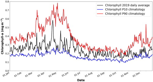
Figure 2.4.2. 2019 eutrophic indicator map for the North Atlantic Ocean, in terms of percentage of days with chlorophyll values above the 1998–2017 P90 climatological reference, calculated using the CMEMS Ocean Colour ATL REP dataset (OC-CCI, product reference 2.4.1).
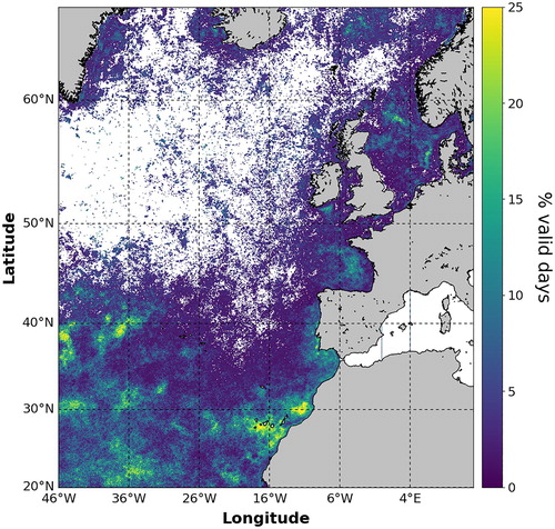
Figure 2.4.3. 2019 oligotrophic indicator map for the North Atlantic Ocean, in terms of percentage of days with chlorophyll values below the 1998–2017 P10 climatological reference, calculated using the CMEMS Ocean Colour ATL REP dataset (OC-CCI, product reference 2.4.1).
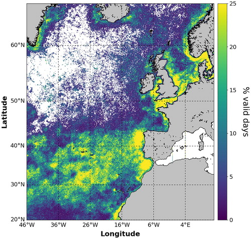
Figure 2.4.4. 2019 annual eutrophic (red) and oligotrophic(blue) flag indicator map calculated using the CMEMS Ocean Colour ATL REP dataset (OC-CCI, product reference 2.4.1). Active eutrophic flags indicate that more than 25% of the valid observations were above the 1998–2017 P90 climatological reference. Active oligotrophic flags indicate that more than 25% of the valid observations were below the 1998–2017 P10 climatological reference.
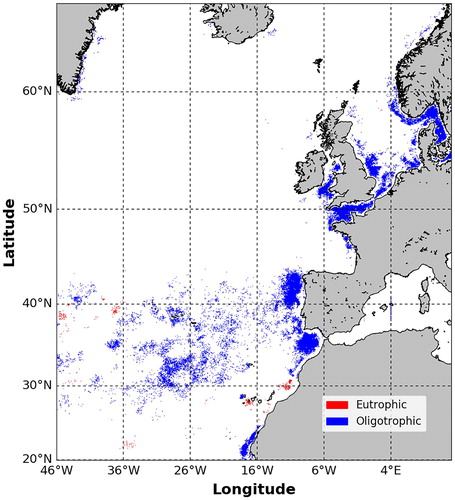
Table 2.5.1. Mean and standard deviation (SD) of the model reanalysis data and measurements, model bias (model minus observations), root mean square difference (RMSD) and cost function (CF) at the central Gotland basin (station BY15). Units are mmol/m3.
Figure 2.5.1. Stacked plot of time series of summarised dissolved nutrient pools: nitrate on (a), ammonium on (b), phosphate on (c) and dissolved oxygen on (d) in three different layers (Upper layer 0–15 m: blue; Intermediate layer 15–80 m: yellow; and Deep layer starting at 80 m and extending to the bottom: red) across the entire Baltic Sea. Time period is 1993–2017 (Product reference 2.5.1).
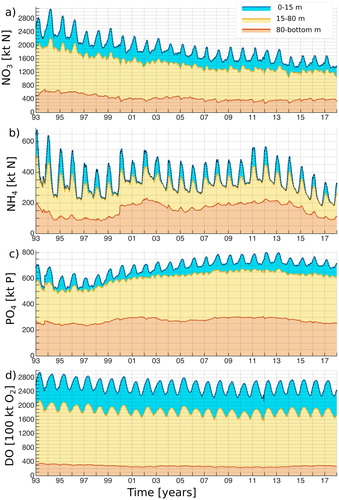
Table 2.5.2. Mean and standard deviation of different nutrient pools over the total period, first and last year.
Figure 2.5.2. The mean nitrate pools in the different layers in February during the period of 1993–1999 in the left panels (a, c, e) and their relative changes ((t − ref)/ref)*100 for the period of 2000–2017 in the right panels (b, d, f) in the Baltic Sea. The left plots show nitrate pools as the amount of nitrogen per square meter. Different layers are depicted as 0–15 m on (a–b), 15–80 on (c–d) and 80-bottom on (e–f). The contour lines on (b), (d) and (f) show relative changes with a 10% step. The grey line on (c) and (d) shows the location of the coastline (Product reference 2.5.1).
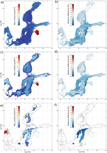
Figure 2.5.3. The mean ammonium pools in the different layers in February during the period of 1993–1999 in the left panels (a, c, e) and their relative changes ((t − ref)/ref)*100 for the period of 2000–2017 in the right panels (b, d, f) in the Baltic Sea. The left plots show ammonium pools as the amount of nitrogen per square meter. Different layers are depicted as 0–15 m on (a–b), 15–80 on (c–d) and 80-bottom on (e–f). The contour lines on (b), (d) and (f) show relative changes with a 10% step. The grey line on (c) and (d) shows the location of the coastline (Product reference 2.5.1).
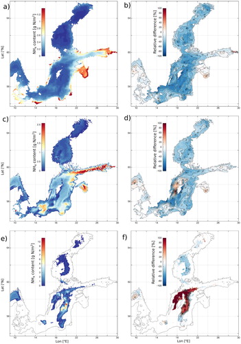
Figure 2.5.4. The mean phosphate pools in the different layers in February during the period of 1993–1999 in the left panels (a, c, e) and their relative changes ((t − ref)/ref)*100 for the period of 2000–2017 in the right panels (b, d, f) in the Baltic Sea. The left plots show phosphate pools as the amount of phosphorus per square meter. Different layers are depicted as 0–15 m on (a–b), 15–80 on (c–d) and 80-bottom on (e–f). The contour lines on (b), (d) and (f) show relative changes with a 10% step. The grey line on (c) and (d) shows the location of the coastline (Product reference 2.5.1).
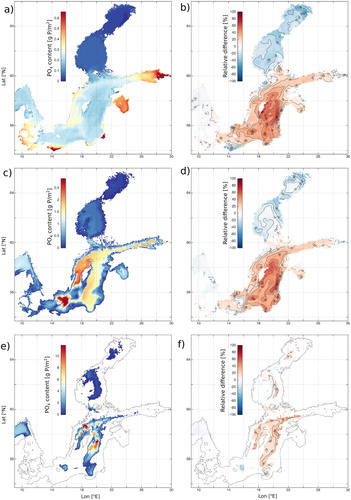
Figure 2.5.5. The mean DIN:DIP ratio (DIN/PO4) in the 0–15 m layer during the period of 1993–1999 (a) and during the period of 2000–2017 (b). The black contour corresponds to a DIN:DIP ratio of 16. The mean bottom dissolved oxygen concentration (ml/l) in February during the period of 1993–1999 (c) and the relative changes ((t − ref)/ref)*100 for the period of 2000–2017 (d). The contour lines on (d) show relative changes with a 30% step. The grey line on (d) shows the location of the coastline. Product reference 2.5.1.
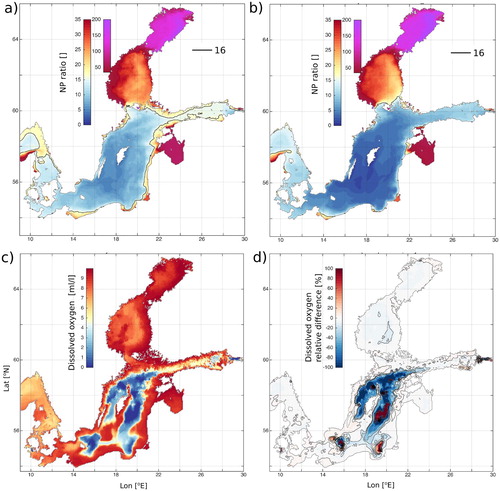
Table 2.5.3. Mean and standard deviations (STD) of oxygen pools in different layers (TL – total layer, UL – upper layer, ML – middle layer, BL – bottom layer).
Figure 2.6.1. (A) The Mediterranean Sea where deep (yellowish ellipses) and intermediate (reddish ellipses) water formation sites are highlighted as well as the circulation schemes for the Atlantic Water (AW, light blue arrow) and the LIW/CIW (red arrow), the black rectangles indicate the monitored areas; (B) zoom on the Sardinia Channel where the position of the deep mooring is shown (red diamond), that allows to intercept the eastward flowing WMDW (light brown arrow); (C) vertical schematic section of the transect between Sardinia and Tunisia, showing the four-layers system of water masses flowing in opposite directions (AW in blue flowing eastward, IW in red flowing westward, TDW in dark pink flowing westward, WMDW in light brown flowing eastward); (D) zoom on the Sicily Channel where the positions of the two moorings are shown (red diamonds), that allows to intercept the westward flowing IW (red arrows); (E) the vertical schematic section of the transect between Tunisia and Sicily, showing the two-layer system of water masses flowing in opposite directions (AW in light blue flowing eastward; IW in orange flowing westward, where the darker orange indicates higher salinity, the salinity maximum identifying the core of the IW) and the positions of instruments along the C01 and C02 lines located in two parallel deep trenches.
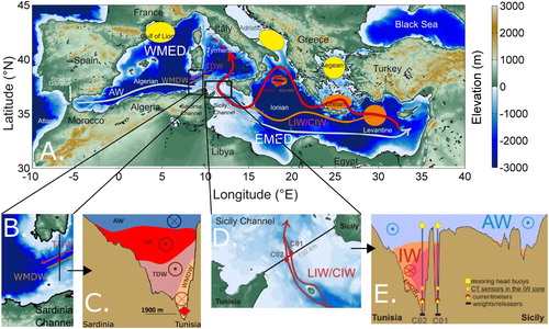
Figure 2.6.2. (new data set) Time series of (A) potential temperature (B) practical salinity and (C) density at 1900 m depth in the Sardinia Channel (mooring). The monthly mean time-series is shown in black. The green line represents the long-term trend line (data product used: 2.6.1).
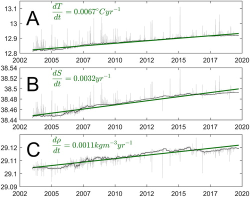
Figure 2.6.3. Daily (grey) and monthly (black) time series (1993–2017) of (A) temperature and (B) salinity at 400 m in the Sicily Channel (mooring, product ref. 2.3.1), updated from Schroeder et al. (Citation2017)
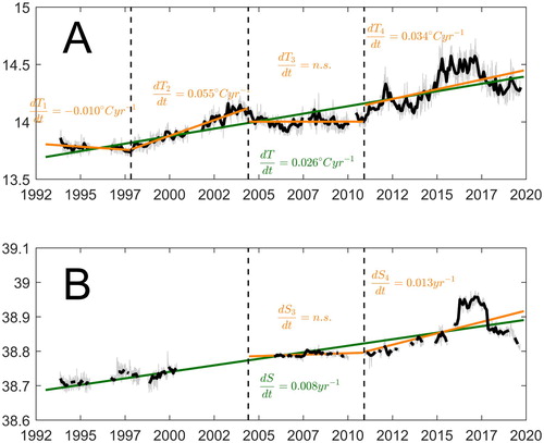
Figure 2.6.4. Temporal evolution of the TS diagram (potential temperature vs salinity) in the Sicily Channel at 400 m depth, the colour code indicates the years from 1993 to 2019 (data product used: 2.6.2).
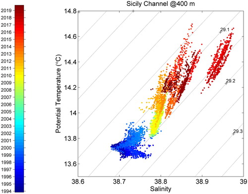
Table 2.6.1. Long-term θ and S increases (trends) computed in different locations and different periods in Mediterranean Sea.
Figure 2.7.1. (a) Mean sea surface velocity for the period 1993–2019 [cm/s]; (b) Mean geostrophic current anomaly for the period 1993–2019 [cm/s]; the black contours on both plots show the 200, 600, 1000, 1400 and 1800 m isobaths taken from GEBCO bathymetry (www.gebco.net); (c) the region between isobaths 200 and 1800 m used for the calculations further.
![Figure 2.7.1. (a) Mean sea surface velocity for the period 1993–2019 [cm/s]; (b) Mean geostrophic current anomaly for the period 1993–2019 [cm/s]; the black contours on both plots show the 200, 600, 1000, 1400 and 1800 m isobaths taken from GEBCO bathymetry (www.gebco.net); (c) the region between isobaths 200 and 1800 m used for the calculations further.](/cms/asset/1f4d4231-2fdd-46bf-aeb1-ded67af70dbb/tjoo_a_1946240_f0028_oc.jpg)
Figure 2.7.2. Annual mean sea surface velocity [cm/s] for the period 1992–2019 from the CMEMS Black Sea reanalysis data.
![Figure 2.7.2. Annual mean sea surface velocity [cm/s] for the period 1992–2019 from the CMEMS Black Sea reanalysis data.](/cms/asset/d4c8e8b1-35fd-43b4-bfb8-9cf297bb34e2/tjoo_a_1946240_f0029_oc.jpg)
Figure 2.7.3. BSRCI (green), BSRCIn (blue) and BSRCIs (red) for the period 1993–2019, calculated from Equation (1) for the regions in c. The grey curve represents the annual mean wind curl averaged for the Black Sea area based on the hourly ERA5 reanalysis.
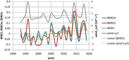
Table 2.7.1. The calculated values of the annual BSRCI for the period 1993–2019.
Figure 2.8.1. Mediterranean Sea significant (Hs) and maximum (<Hm> and <Cm>) wave height climate (reference period 1993–2018) and anomaly for 2019. Intensity and spatial variability of the 1993–2018 average annual 99th percentile (left) and 2019 anomaly of the 99th percentile (right) of Hs (top), maximum crest height <Cm> (middle) and maximum wave height <Hm> (bottom). Grey crosses (circles) in right panels depict locations where the 2019 anomaly of the 99th percentile heights exceeds the inter-annual (1993–2018) 90th percentile. Product ref. 2.8.4 (This dataset generated and analysed during the current study is available from the corresponding author on reasonable request).
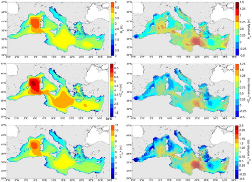
Figure 2.8.2. Black Sea significant (Hs) and maximum (<Hm> and <Cm>) wave height climate (reference period 1993–2018) and anomaly for 2019. Intensity and spatial variability of the 1993–2018 average annual 99th percentile (left) and 2019 anomaly of the 99th percentile (right) of Hs (top), maximum crest height <Cm> (middle) and maximum wave height <Hm> (bottom). Product ref. 2.8.1 and 2.8.2.
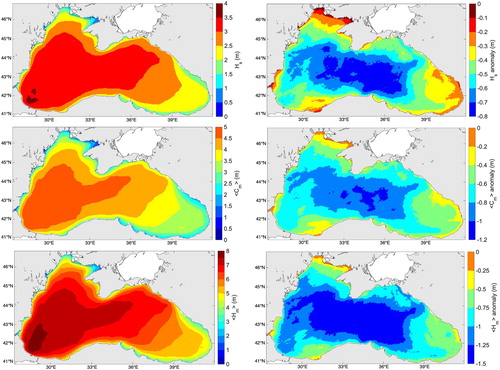
Figure 2.8.3. Anomaly for 2019 of the sea-level pressure (shaded area, in hPa) and of the geopotential height at the reference altitude of 500 hPa (black contour, in dam), for the quarters J-F-M (top-left), A-M-J (top-right), J-A-S (middle-left) and O-N-D (middle-right). The season separation is chosen to fit the seasonal dynamics of the cyclogenesis in the Mediterranean Sea (Trigo et al. Citation2002). On the bottom panel, the evolution of the NAO index (Visbeck et al. Citation2001) in the period 2018/10-2020/04 is depicted; the three months of April (A), July (J), and October (O) 2019 are indicated. The solid and dotted grey lines show the NAO values of +1 and −1, respectively. Data from NCEP/NCAR CDAS 40-year Reanalysis. Product ref. 2.8.5.
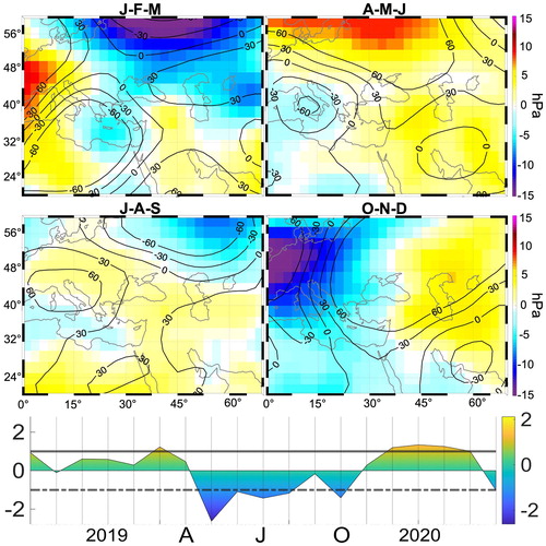
Figure 2.9.1. Time series of DMI based on SST and SLA, and the western and eastern regions of the Indian Ocean which are used in the calculation of DMI. The SST anomalies in the Niño3.4 region of the Pacific Ocean are also shown. The time series from the SST REP product are shown in black, SST NRT in red, SLA REP in blue and SLA NRT in green. Periods when the SST DMI is at least 1.2 are shown in grey.
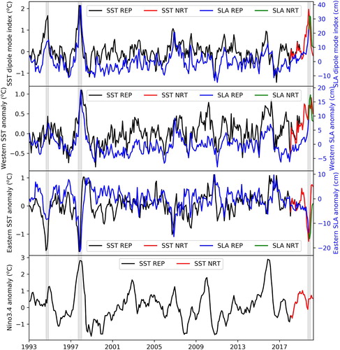
Table 2.9.1. Correlation between time series of DMI from SST and SLA and SST anomalies in the Niño34 region.
Figure 2.9.2. Correlation coefficient between the SST and SLA DMI time series and SST and precipitation anomalies.
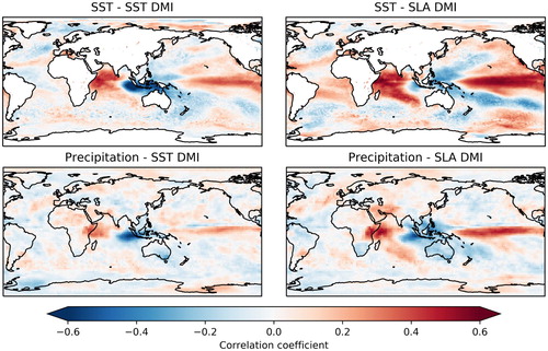
Figure 2.9.3. SST, sea level and precipitation anomalies at the peak of strong IOD events.
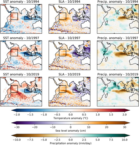
Figure 3.1.1. Schematic representation of time and space scales involved in the development of phytoplankton, zooplankton and fish. Productive fronts, which are areas of continuous primary production for weeks to months, are efficient vectors of energy from phytoplankton to medium-size zooplankton and appropriately tracked by daily ocean colour. This defines a high ecotrophic efficiency, i.e. a high proportion of the net annual production consumed by higher trophic levels.
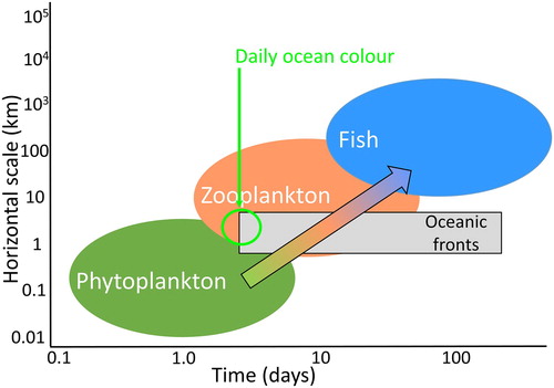
Figure 3.1.2. Example of daily chlorophyll-a processing from MODIS-Aqua sensor (product 3.1.3 in the product table) on 18 July 2019 in the western Mediterranean Sea: (a) original data, (b) data after median filter and Gaussian smoothing, (c) norm of horizontal gradient of chlorophyll-a, (d) zoomed area of the gradient norm using non-filtered data and (e) zoomed area of the gradient norm using filtered data. Note the reduced loss of coverage after the gradient computation (c, 45.8%) compared to the original data (a, 47.7%) due to the median interpolation at the edge (b, 51.9%). Slight sensor stripes on the original data (zoomed area in a) are removed after the Gaussian smoothing (zoomed area in b and e) and would be kept otherwise (d).
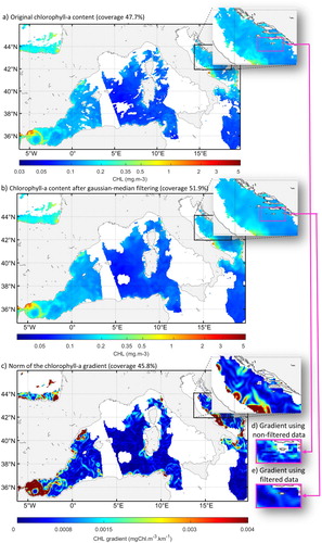
Figure 3.1.3. (a) Standardised frequencies of relative units of chlorophyll-a horizontal gradient (gradCHL; log-transformed) for the whole North Atlantic (background grey histogram) and only for locations where mesozooplankton are present (green histogram, 3-day mean values around the observation day were chosen to increase the number of matching points). The maximum slope of the cumulative distribution of mesozooplankton presence (green dashed line) was used to define the daily habitat linear function (orange line). The mean mesozooplankton biomass (pink line, relative unit) is superimposed. Compared to Druon et al. (Citation2019), this plot represents the latest calibration using the chlorophyll-a data reprocessed by NASA in 2018 (gradCHLmin = 0.0002 mg m−3 km−1, gradCHLint = 0.00876 mg m−3 km−1). (b) Example of daily mesozooplankton habitat for 18 July 2019 in the western Mediterranean Sea derived from the chlorophyll-a gradient (continuity of c) (also including 0.089 < CHL < 10.0 mg.m−3). See also .
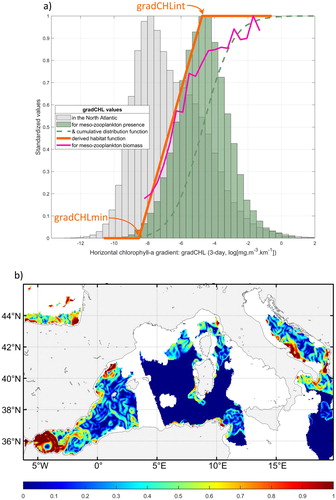
Table 3.1.1. Habitat parameterisation used to define the environmental envelope of mesozooplankton in the North Atlantic Ocean, where CHL and gradCHL are the sea surface chlorophyll-a content and horizontal gradient from the MODIS-Aqua sensor, respectively (CHL data reprocessed by NASA in 2018).
Figure 3.1.4. (a) Monthly mean mesozooplankton relative biomass (blue line), corresponding mean suitable habitat (red line) and mean habitat weighted by day length (dashed pink line) from 2003 to 2016 by 10° latitude range from 30°N to 70°N and for longitudes from 50°W to 10°W in the North Atlantic (see box in (a) and Druon et al. Citation2019 for details on the data). The 5th and 95th percentile are also represented in respective light colours (the number of matching points by latitude range from south to north are 452, 1929, 1203, 672). (b) Same data presented as mesozooplankton relative biomass versus habitat (red dots) and habitat weighted by day length in relative value (pink plus signs). The Spearman's rank coefficient correlation between the 4256 pairs of mesozooplankton biomass and habitat is 0.89 (p ≈ 0), and 0.935 (p ≈ 0) for the habitat weighted by day length.
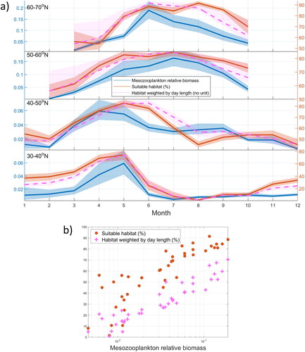
Figure 3.1.5. (a) Suitable feeding habitat for mesozooplankton in the global ocean as a mean value for 2003–2019 (the box refers to area used in , 200 m-depth contour is shown), (b) regional trends in absolute value (computed from the local annual means) and (c) global annual variability (expressed in absolute habitat value of the global surface ocean). The mesozooplankton feeding habitat is defined by the presence of large productivity fronts and is expressed as the frequency of occurrence weighted by the front gradient value. Positive regional trends represent an increase in frequency of occurrence of productivity fronts. Blank areas correspond to cloud or sea ice cover, or to habitat suitability with chlorophyll-a detection below 5% of the total number of days in the considered period.
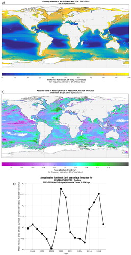
Figure 3.2.1. Left column: Event spread for each year and divided into quarters for marine heatwaves (red) and marine cold-spells (blue); red dots identify years with more widespread heatwaves and blue dots are years with cold Q1s. Right column: Annual and quarterly mean temperature event anomalies for marine heatwaves (red) and marine cold-spells (blue). Event data are for the North Sea south of 57°N using ocean reanalysis (product reference 3.2.1) and analysis/forecast (product reference 3.2.2) data.
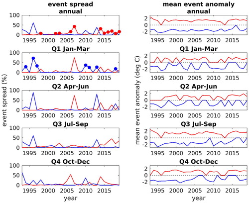
Figure 3.2.2. Left panel: average annual catches of European lobster (indicated by sizes of grey symbols). Middle and right panels: Change in annual catch of European lobster since the previous year (blue: increase; red: decrease), 5 years later than ‘typical’ years (middle) and 5 years later than the ‘heatwave’ years of 1998, 2002, 2003, 2006 and 2007. Sizes of blue and red symbols proportional to the change in catch per rectangle since the previous year (product reference 3.2.3).
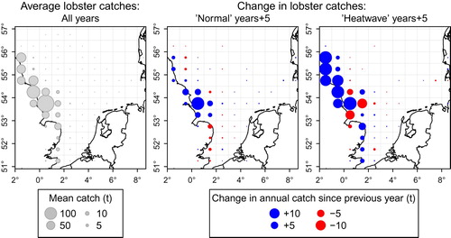
Table 3.2.1. Significant correlations (P-value < 0.05) between heatwave occurrence and detrended annual catches (product reference 3.2.3).
Figure 3.2.3. Left panels: average quarterly catches of edible crab (indicated by sizes of grey symbols), in quarter 1 (top) and in quarters 2–4 (bottom). Middle and right panels: increases (blue) or decreases (red) in edible crab catches since the previous year, compared between ‘typical’ years (middle) and years with extremely cold weather conditions during quarter 1 (right). Top panels: change in quarter 1 catches since the previous year; bottom panels: changes in quarter 2–4 catches (averaged per quarter) since the previous year. Sizes of symbols proportional to change in catches. Timespan: 1994–2016. ‘Cold-spell’ years are: 1994, 1996, 1997, 2010, 2011, and 2013.
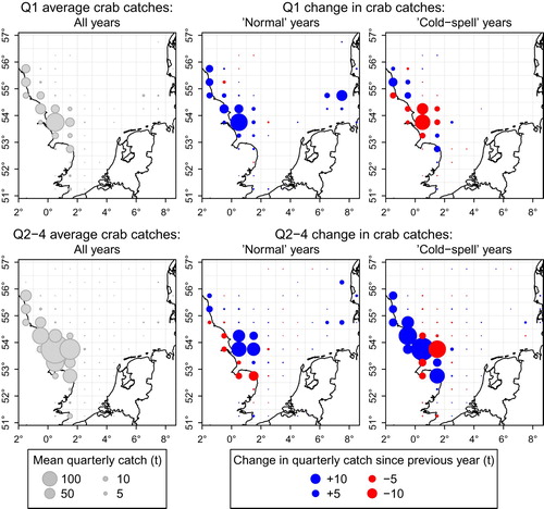
Table 3.2.2. Significant correlations (P-value < 0.05) between cold-spell occurrence and detrended annual catches (product reference 3.2.3) for sole, sea bass and red mullet, and Q1 catches for edible crab.
Figure 3.3.1. Monthly wind speed (m/s) and direction (at 10 m) in the Mediterranean Sea during March 2018 (CMEMS Product Ref. No. 3.3.2.).
Figure 3.3.2. Locations of all the sightings of Physalia physalis colonies in the Western Mediterranean Sea during April 2018 (Product Ref. No. 3.3.3).
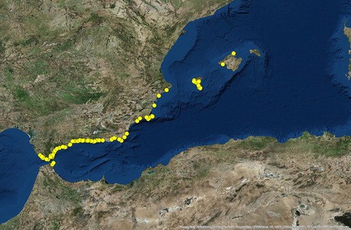
Figure 3.3.3. Output of the forecast model to predict the spread of Physalia physalis colonies in the Mediterranean basin. In order to compare with (), the red dots are the summary of all the beached Physalia physalis colonies during April 2018. The blue dots are the free colonies still floating in the water on 30 April 2018, that will continue to spread along the basin.
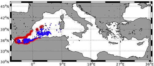
Figure 3.4.1. (a) Schematic representation of the main surface currents (solid arrows) and water masses (transparent arrows) in the SAP. Blue and green solid arrows describe the circulation of the WAC and EAC, respectively. Light blue and light red transparent arrows describe the outflow of deep waters (NABW and AdDW) and the inflow of surface and intermediate waters, respectively. Black circle shows the geographical location of the P-1200 station used for zooplankton measurements. Acronyms are defined in the text. (b) Float tracks (WMO 6901822 and WMO 3901978 – Product ref. 3.4.2) colour-coded by time and relative Hovmöller diagram of salinity (in PSU) in the SAP from 2013 to 2019. The vertical dotted line separates the profiles of the float WMO 6901822 from those of the float WMO 3901978.
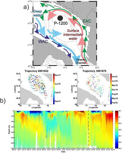
Figure 3.4.2. Histograms of zooplankton abundance distribution (Calanoida, Oithonida and Appendicularia; y-axis on the left) and Chl-a concentration integrated on the respective layer (horizontal black lines; y-axis on the right) at P-1200 station in the layers 0–50 m and 50–100 m for the period 2016–2018. The biweekly samples are averaged to obtain a monthly value and only the three years common months are displayed (data source: University of Dubrovnik – [email protected]).
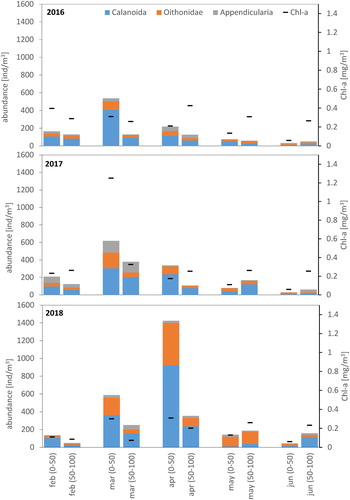
Figure 3.4.3. Estimates of potential for sustaining planktivorous fish biomass and relative error bars in the layers 0–50 m and 50–100 m for the period 2016–2018, which are estimated from zooplankton and phytoplankton community biomass using the energetic approach.
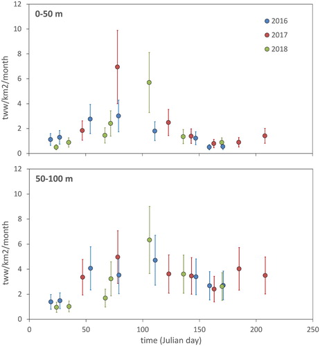
Figure 3.5.1. Figure from Stocker et al. (Citation2020). Automatic Identification System (AIS) data (product reference 3.5.4) from the Norwegian Coastal administration (Kystverket) was used to illustrate the number of unique vessels per month in the Svalbard Fisheries Protection Zone between January 2012 and September 2019. Green: fishing vessels, yellow: passenger vessels (oversea and expedition cruise ships) and grey: other categories (bulk carriers, container ships, research vessels, etc.).
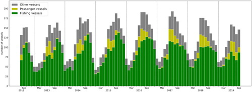
Figure 3.5.2. (a) Illustration of the IcySea service. The area in which calibrated ice drift forecasts are available is revealed by the red grid points. Ice movement is denoted by a set of points such that they form a trajectory; opaque red colour denotes the starting forecast days (initial point position) and transparent colours the end of the forecast (final point position). Tiled Sentinel-1 SAR images (product reference 3.5.1) are plotted in grey. (b) Zoomed example from the black subdomain in subfigure (a), of a Synthetic Aperture Radar image (product reference 3.5.1) from Sentinel-1 at 30 m spatial resolution showing the advantage of this data stream, to reveal the spatial sea-ice structure. Open sea and ice floes can be easily identified. Data layers can be easily turned off/on with a simple click of a button.
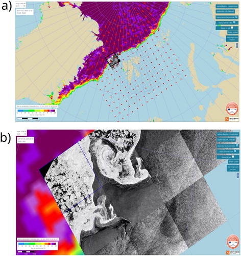
Figure 3.5.3. Performances of the calibrated forecasts and the TOPAZ4 forecasts (product reference 3.5.3) for the area shown in (a). The sea-ice drift observations from the product 3.5.2 (SAR observations) have been used as the reference in this evaluation. (a,b) Mean absolute error for the drift direction (a) and the drift speed (b). (c,d) Fraction of forecasts improved by the calibration for the drift direction (c) and the drift speed (d). The shaded areas represent the standard deviations of the results over 50 different selections of the datasets used for training and for testing the algorithms.
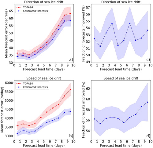
Figure 3.6.1. Performances of the best GAMs in describing the distribution of demersal species for models using a decreasing number of explanatory variables. The best model was Delta-GAM for European hake, common cuttlefish and mantis shrimp (shown the Delta-Gaussian in panels I, III and V, respectively), Gaussian for red mullet (panel II) and Tweedie for common sole (panel IV). For all species the starting model represents the one (model 0) including all the covariates resulting from VIF analysis and including spatiotemporal variables, environmental CMEMS variables and fishing effort (Product Ref. 3.6.1 and 3.6.2, respectively). Successively one variable at each step is removed to reach the minimal model (model 6 for European hake, common sole and mantis shrimp; model 7 for red mullet; model 5 for common cuttlefish) with spatiotemporal variables only. Box-plots synthesise results of the 50 runs of the training/testing procedure in terms of Akaike Information Criterion (AIC), explained deviance (dev-expl) on the 70% training dataset and correlation coefficient (R2) for the remaining testing dataset.
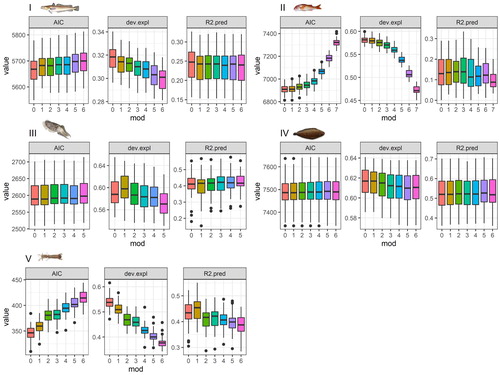
Figure 3.6.2. Yearly maps of estimated biomass (kg/km2) of European hake (left) and red mullet (right) in the Adriatic and Western Ionian Sea (GSA 17-18-19) obtained with the best GAM model applied on MEDITS trawl survey data for years 2008–2018 (Product Ref. 3.6.3) and with all the additional environmental and effort variables (model 0).
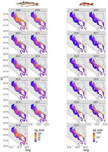
Figure 3.6.3. Yearly maps of estimated biomass (kg/km2) of common cuttlefish (left), common sole (centre) and mantis shrimp (right) in the Adriatic Sea (GSA 17-18) obtained with the best GAM model applied on SOLEMON trawl survey data for years 2008–2018 (Product Ref. 3.6.4) and with all the additional environmental and effort variables (model 0).
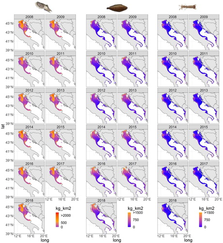
Table 3.6.1. Comparison among indicators calculated on observations, i.e. the original trawl survey data (Product Ref. 3.6.3, 3.6.4), on the results of the GAM model with spatiotemporal variables and on results of the best GAM model including additional oceanographic variables (Product Ref. 3.6.1, 3.6.2) and effort (model 0). Distribution indicators (first and third quartile, median), performance indicators (MAE, R2) and spatial indicators such as Spreading area (SA), latitudinal centroid (CGY) longitudinal centroid (CGX) and distance (D) of the centroid of model to that of data are reported for the five demersal species analysed. The column ‘improvement’ reports the improvement on the indicator value when using model with environmental variables with respect to indicator calculated on results of the model without additional variables (observations-model0/observations-model 6 or 7).
Figure 3.7.1. Monthly climatology of oxygen concentration in bottom waters (µM) as depicted by the BS-MFC-BIO-RAN (Product ref. 3.7.1) reanalysis over the period [1992–2009]. Dotted lines locate the 40, 80 and 120 m iso-bathymetric contours. Boundaries of Bulgaria (BG), Romania (RO) and Ukraine (UA) are indicated on the first panel, as well as the three major rivers that discharge into the area.
![Figure 3.7.1. Monthly climatology of oxygen concentration in bottom waters (µM) as depicted by the BS-MFC-BIO-RAN (Product ref. 3.7.1) reanalysis over the period [1992–2009]. Dotted lines locate the 40, 80 and 120 m iso-bathymetric contours. Boundaries of Bulgaria (BG), Romania (RO) and Ukraine (UA) are indicated on the first panel, as well as the three major rivers that discharge into the area.](/cms/asset/356a20b4-9836-42b4-8306-3b8c1de9d709/tjoo_a_1946240_f0057_oc.jpg)
Table 3.7.1. Summary of model skill metrics (e.g. Stow et al. Citation2009) in comparison with in-situ observations.
Figure 3.7.2. Seasonal variations (1992–2019) in oxygen concentration observed (blue) and simulated at observation locations (orange) over the northwestern shelf of the Black Sea. Left (resp. right) panel shows monthly distributions for surface (resp. bottom) values. Bold lines indicate the medians of these monthly distributions. Dotted lines repeat the monthly medians obtained for bottom (resp. surface) on the left (resp. right) panel in order to highlight the vertical gradient in oxygen profiles. Numbers on the X-axis indicate the number of available observations.
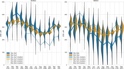
Figure 3.7.3. (a, b) Illustration of the elements considered in the computation of the BH-index. (c) The BH-60 and BH-120 values obtained annually from the BS-MFC-BIO-RAN (product ). (a) Example of the hypoxic area dynamics for the year 1994, using an hypoxic threshold of 60 µM. (b) In the hypothetical case where A(t), the hypoxic area as a function of year day, follows a Gaussian form, there is a direct relationship between maximum hypoxic area, duration of the hypoxia, and BH-index values indicated with coloured contours. Annual components of the BH-60 and BH-120 indexes are depicted for each year, highlighting 2019. (c) Interannual trends in BH-60 and BH-120 over the period 1992–2019.
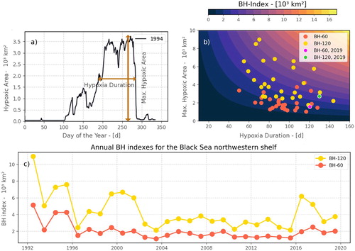
Figure 4.1.1. Sea-ice extent in (a) the entire Arctic and (b) the Svalbard-Barents Sea region, estimated from daily values in 2012, 2018 and 2019 (black, red and blue curves, respectively) and the median extent during the reference period 1981–2010 and corresponding quartiles and 10–90 percentiles in dark and light grey shading. (c) Ocean heat content in the upper 100 m in August–September 1999 with the Svalbard-Barents Sea region (grey outline), the northeast Svalbard region (black outline) and positions of the CTD profiles in 2019 (black circles) and isolines for mean September 15% sea-ice concentration (product 4.1.2) in 1999–2019 (yellow curves), where 2010, 2018 and 2019 isolines are highlighted as thick grey, red and blue curves, respectively. (d) Heat content in the upper 100 m estimated in the northeast Svalbard area. (e) Salinity profiles from individual years in northeast Svalbard region (thin grey curves) with 2010, 2018, and 2019 outlined in thick grey, red and blue curves, respectively. (f) Freshwater content in the upper 100 m estimated in the northeast Svalbard region.
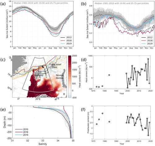
Figure 4.1.2. Left column: Sea ice thickness based on CryoSat-2 radar altimeter data for the Arctic winter month of October 2018 through April 2019 (product 4.1.3 and 4.1.4). Right column: Sea-ice thickness anomaly computed as the difference between monthly grid values (left column) to a mean thickness from the previous months in the CryoSat-2 data record since November 2010. The outlined box indicates the Svalbard-Barents Sea region (0–40°E, 72°N–85°N).
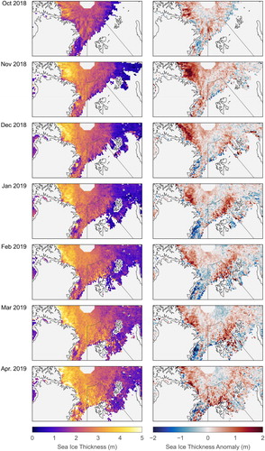
Figure 4.1.3. Left column: Sea-ice drift (arrows, product 4.1.1) and net divergence field (106 s−1; coloured background) with positive (negative) values representing divergence (convergence). Each arrow represents average drift over a ten-day period. Right column: Sea-ice drift anomaly (arrows) calculated relative to the monthly average of the eight previous years. Note, that these anomaly vectors represent a change in the drift field and not the drift itself. The background colour is the sea-ice type (product 4.1.5) representing ‘pure’ multiyear ice as dark grey, mixed classification of both first-year ice and multiyear ice as light grey, and first-year ice/water is colourless.
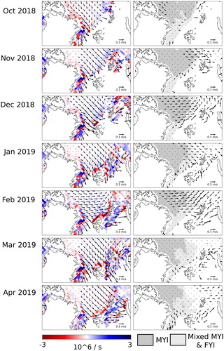
Table 4.1.1. Mean sea-ice thickness and thickness anomaly in the context of the range of thickness variability for the Svalbard-Barents Sea region (domain from 0°E to 40°E and 72°N to 85°N). All values indicate the mean of the ice-covered fraction of the region of interest. The two last columns represent the winters 2010/2011–2017/2018. In bold, is indicated monthly record-high ice thickness within the CryoSat-2 data record period.
Figure 4.2.1. Synoptic conditions and precipitation (in mm over 3 h) predicted for (a) 4 am on 24 February 2019, and (b) 1 am on 14 December 2019, in the Central Mediterranean. Time in GMT +1. Isolines show curves joining points of equal atmospheric pressure in millibars. Precipitation in mm represents accumulated values over 3 h. Product 4.2.6 with data elaboration from the MARIA/eta model run by the Physical Oceanography Research Group, University of Malta.
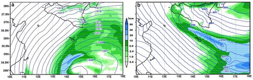
Figure 4.2.2. Marine sub-domains used to provide a multi-area early warning alert system for the Maltese Islands, covering the nearshore, coastal and open sea scales. Vectors show the wind in m s−1 from product 4.2.6, verified against product 4.2.1. The background map shows significant wave height in m from product 4.2.7 nested to product 4.2.4.
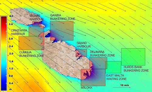
Figure 4.2.3. (a) Joint time series of area averaged surface kinetic energy per unit mass over the HF radar coverage during the two storms. Blue is for hourly HF radar measurements; Red is for 3 h averaged surface currents in the equivalent spatial bins from the ROSARIO hydrodynamic model. Products 4.2.5 and 4.2.9. (b) Scatter plot comparing HFR surface current kinetic energy per unit mass against model data from the ROSARIO Malta shelf forecasting system. Blue dots refer to data points; red dashed line gives the best linear fit. Correlation coefficient = 0.81; RMSD = 0.043. Products 4.2.5 and 4.2.9.
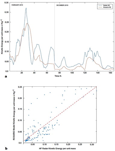
Figure 4.2.4. HF radar Eulerian maps for sea surface currents in the Malta-Sicily Channel during two storms in 2019. Product 4.2.5.
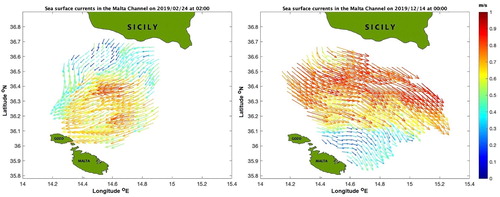
Figure 4.2.5. Time series of significant wave height (averaged in time and space) measured by the BARKAT HF radar station at three annular distances from shore for the February storm (upper panel) and the December storm (lower panel). Product 4.2.5. Insert shows the position of the four CALYPSO HF radars.
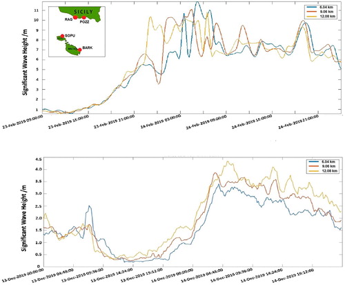
Figure 4.2.6. (a) Time evolution of the total surface kinetic energy per unit mass for the Qawra Bunkering zone area during the February 2019 storm, and (b) Model detail of sea surface currents (red vectors) and total kinetic energy in m2 s−2 (background map) during the second peak of the storm. Products 4.2.2 and 4.2.9.
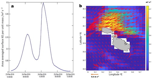
Figure 4.3.1. The MedFS regional ocean model bathymetry for (a) the Adriatic Sea region and (b) the northwestern Adriatic Sea. The solid and dashed red lines in (a) indicate the boundaries used for calculating average values over the Adriatic Sea and northern Adriatic Sea (N), respectively. The mountain ranges of the Apennines and Dinaric Alps are shown in light-brown colours (ETOPO1 1 Arc-Minute Global Relief Model). The location of Venice and the ISMAR Acqua Alta Platform are indicated with black dots in (b), note that the Venice lagoon is not part of the MedFS model domain.
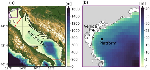
Figure 4.3.2. Time series (in UTC) of (a) water level, (b) wind direction, (c) wind speed and (d) air pressure for the period 11–18 November 2019. In situ point measurements from the ISMAR Acqua Alta Platform near Venice are shown at 10-minute intervals. Scatterometer (ASCAT) and model (ECMWF) spatial averages over the northern and rest of the Adriatic Sea are shown for all ascending and descending Metop satellite overpasses with sufficient data points. The astronomical tidal curve from the OTPS model for the Acqua Alta Platform location is included for reference. The blue vertical bars indicate the four extreme Acqua Alta events in this period.
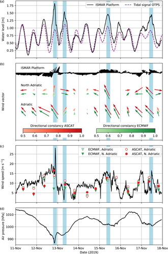
Figure 4.3.3. Surface wind fields over the Adriatic Sea region for the Metop overpass times closest to the four Acqua Alta events in the period 11–18 November 2019. The coloured dots (first column) illustrate the contribution of the three Metop ASCAT instruments to the mosaic images. Surface wind speed (colours) and wind direction (arrows) are shown for the trio of satellite scatterometers (Metop-A, Metop-B and Metop-C ASCAT, second column) and the ECMWF operational model collocated with the ASCAT observations (third column). The time span (in UTC) of the satellite observations over the Adriatic Sea is given in the upper right corner of each image.
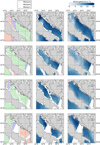
Figure 4.3.4. Top panel: Sea level at the ISMAR Acqua Alta Platform from measurements (black line) and model (MedFS + OTPS) forecasts. The forecast time series represent a concatenation of all the first days of forecasts produced from 10 to 18 November (blue line), all the second days of forecasts (green line) and all the third days of forecasts (red line). The astronomical tidal signal (dashed purple line) and the November 2019 mean sea level (dashed black line) are shown for reference. Bottom panel: Wind Speed at the ISMAR Acqua Alta Platform from measurements (black line) and ECMWF forecasts. The ECMWF time series at different lead times correspond to the MedFS forcing (3-hourly, 10 m wind speed) for the first day (blue line), second day (green line) and third day (red line) of the forecasts.
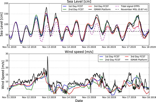
Table 4.3.1. Sea surface height metrics over the study period for the first three days of the MedFS model forecast and the observations at the Acqua Alta platform. Standard deviations (STD) are provided for the time series of the first, second and third day model forecasts and the observations. The root-mean-square error (RMSE), bias and Pearson correlation coefficient (R) are given for the model forecasts versus the observations.
Figure 4.4.1. Map of the northern Baltic Sea (Gulf of Bothnia) and locations mentioned in text. The purple and blue contours show sea ice extent on 03 January 2019 and climatological mean on 3rd January over the period of 1993–2014, respectively (Product reference 4.4.4 and 4.4.5). The storm track is visualised with a dashed purple line. Location of minimum air pressure, complemented with a timestamp and value, is shown with black dots. The grey shade shows the maximum depth of the low-pressure area over the period of 31 December 2018–2 January 2019. The inset in the lower left corner shows the coastline of the Baltic Sea. The minimum at 03:00 UTC 01 January 2019, located off the cyclone track, signifies the development of a secondary low due to the disruptive effect from Norwegian mountains, which later merges with the old low at around 09:00 UTC 01 January 2019 (Product reference 4.4.6).
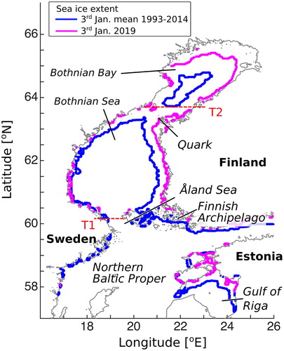
Figure 4.4.2. The map of the northern Baltic Sea with locations of stations (a), time series of measured wind at Kökar Bogskär (Product reference 4.4.7) on (b), sea level anomaly at coastal stations in the Bothnian Bay (blue shades) and the Bothnian Sea (red shades) (Product reference 4.4.1) on (c) and significant wave height measured by FMI and SMHI buoys (Product reference 4.4.1) on (d).
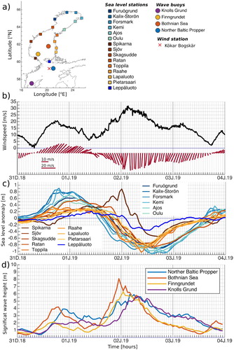
Figure 4.4.3. Horizontal distribution of 10 wind fields (Product reference 4.4.6) on (a–b), sea level (Product reference 4.4.2) on (c–d) and significant wave height (Product reference 4.4.3) on (e–f) at different time instances. Contour interval for sea level is 0.1 m, and for significant wave height it is 1 m.
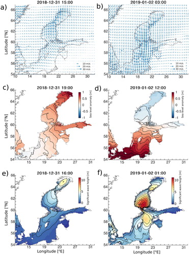
Figure 4.4.4. The time series of sea level difference between model and observed values for the stations of the Bothnian Bay (a) and the Bothnian Sea (b). Black dashed line shows the mean of sea level differences for the Bothnian Bay (a) and the Bothnian Sea (b). Scatter plot of modelled and observed significant wave height values on (c). The lines show the linear relationship between observed and model values.
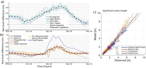
Figure 4.4.5. Transport through the Åland Sea (T1) and Quark (T2) and corresponding volumes (Product reference 4.4.2) as shown in (a). Temporal evolution of vertical distributions of meridional transports at Åland Sea and Quark as shown in (b) and (c), respectively. Transport of 1 Sv = 106 m3/s and positive values indicate northward transport.
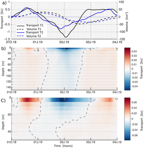
Table 4.5.1. Recorded sightings (2016–2019) of Pterois miles in the Ionian Sea.
Figure 4.5.1. Yearly differences in 8 m depth water potential temperature for the month of May for the years 2014–2019 (A–E), compared to the average summer temperatures (May–October) (F) for the region highlighted by the black box (Mani Peninsula–Southern Ionian Sea). Locations of recorded sightings obtained from the literature review are plotted (grey circles) based on observation year; sightings within the Ionian are highlighted in red.
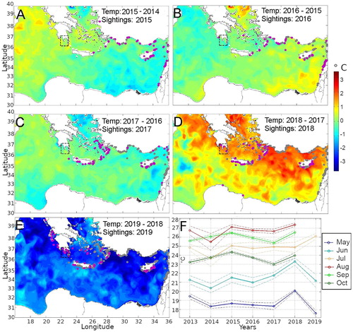
Figure 4.5.2. Sea surface temperature anomaly (°C) based on a pentad climatology for May 2016 (a), May 2017 (b), May 2018 (c), and May 2019 (d). The dotted square indicates the Mani Peninsula target area.
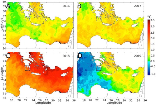
Figure 4.5.3. Eastern Mediterranean monthly sea surface temperature (8 m depth) for the month of May, year 2018, with isobars showing 1°C increments. Lionfish sightings for 1991–2018 plotted with black circles, and lionfish sightings of the following year (2019) highlighted in green.
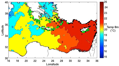
Figure 4.5.4. Time series of the monthly mean sea surface temperature anomaly (°C) for the Mani Peninsula area () for the period 2016–2019. The year 2018 is highlighted in red.