Figures & data
Table 1 GIS State: Frequency Analysis
Figure 1 Clustered bar chart based on the contingency table related to the interactions between GISs during lockdown and GISs before lockdown. The blue bar graph represents No GISs before lockdown, the red bar graph indicates yes GISs before lockdown, the horizontal axis NO represents No GISs during lockdown, the horizontal axis Yes represents yes GISs during lockdown. Crosstabs Person Chi-Square, p-value:0.000(<0.001).
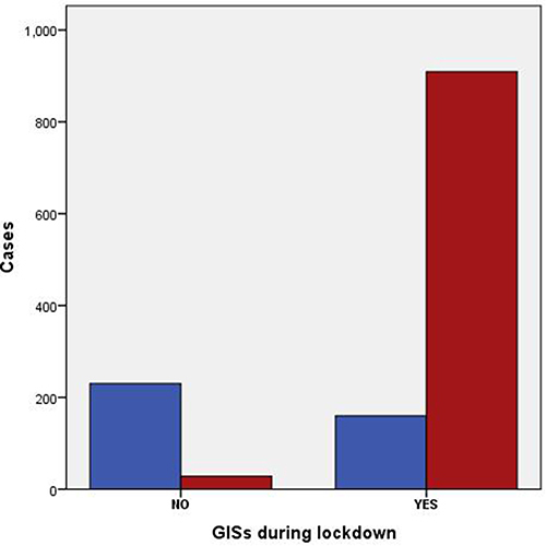
Figure 2 Clustered bar chart based on paired t-test of GISs before and during lockdown. In academic statistical analysis, NS typically denotes a P-value greater than 0.05, indicating a lack of statistical significance in the results. The symbol * is used to denote a P-value less than or equal to 0.05, signifying statistical significance. Similarly, ** represents a P-value less than or equal to 0.01, while ***indicates a P-value less than or equal to 0.001, highlighting varying degrees of significance in the findings.
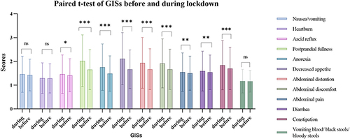
Table 2 Psychological Status Scores
Table 3 Anxiety and Depression State During Health Lockdown: Frequency Analysis
Figure 3 Clustered bar chart based on the contingency table related to the interactions between GISs and anxiety state during the lockdown period.The blue bar graph represents No anxiety, the red bar graph indicates light anxiety, the yellow bar graph indicates medium anxiety, the purple bar graph indicates heavy anxiety, the horizontal axis NO represents No GISs during lockdown, the horizontal axis Yes represents yes GISs during lockdown. Crosstabs Person Chi-Square, p-value:0.000(<0.001).
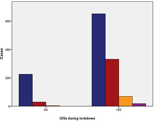
Figure 4 Clustered bar chart based on the contingency table related to the interactions between GISs and depression state during the lockdown period.The blue bar graph represents No depression, the red bar graph indicates light depression, the yellow bar graph indicates medium depression, the purple bar graph indicates heavy depression, the horizontal axis NO represents No GISs during lockdown, the horizontal axis Yes represents yes GISs during lockdown. Crosstabs Person Chi-Square, p-value:0.000(<0.001).
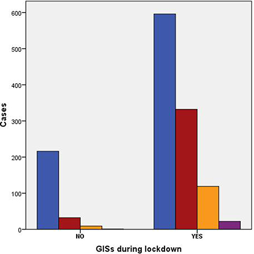
Table 4 Multiple Linear Regression of GISs During Health Lockdown
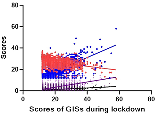
Figure 5 Multiple linear regression of GISs during lockdown. The red represents scores of life style, the blue represents scores of GISs before lockdown, the purple represents scores of anxiety, the black represents scores of depression. The multiple linear regression equation of GISs during health lockdown is 14.693–0.342*life style + 0.725*GISs before health lockdown + 0.218*anxiety + 0.564*depression.