
 ?Mathematical formulae have been encoded as MathML and are displayed in this HTML version using MathJax in order to improve their display. Uncheck the box to turn MathJax off. This feature requires Javascript. Click on a formula to zoom.
ABSTRACT
L’Aquila downtown (Central Italy) is situated in a highly seismic region, making it susceptible to numerous historical and recent earthquakes. Among these, the earthquake of Mw 6.3 on 6 April 2009, and the one of Mw 6.7 on 2 February 1703, caused severe damage or complete destruction of the majority of buildings in the historical center. An integrated statistical analysis of A-DInSAR and seismic related building damage data is illustrated. By comparing the seismic damage maps from the 2009 and 1703 earthquakes with the A-DInSAR map produced with Cosmo-SkyMed descending orbit images (acquired between 2010 and 2021), a correlation between post-seismic deformations (in terms of average velocity) and building damage intensity has been identified. Furthermore, ground and building velocities have been separately examined, in order to evaluate the impact of building features and reconstruction efforts on ground deformations. The geostatistical analysis revealed a widespread subsidence motion (until −2 mm/year) across the whole study area. Notably, neighboring points did not exhibit consistent deformation velocities, indicating a lack of spatial correlation. Additionally, Cluster Analysis has allowed recognition of recurring subsidence/uplift trends, which, in terms of shape of curve displacement vs. time, appears independent on building damage intensity or reconstruction interventions. Our results pave the way for a novel utilization of long-term series of satellite SAR data in high-risk seismic zones, serving as a valuable tool to map the most susceptible areas and mitigate seismic risk.
1. Introduction
The continuous development of remote sensing techniques, particularly SAR (Synthetic Aperture Radar) satellite technology, greatly supports the field of civil engineering, especially in urban planning. Advanced Differential Synthetic Aperture Radar Interferometry (A-DInSAR) techniques (Berardino et al. Citation2002; Ferretti, Prati, and Rocca Citation2001) is one of the most widely used tools in this regard as it enables the identification of surface deformations with extreme precision (up to the millimeter level), allowing for the assessment of their temporal evolution and spatial distribution and benefiting from having relatively low cost, short revisiting time and wide area coverage (Cigna et al. Citation2011; Ezquerro et al. Citation2020; Tomás et al. Citation2014). This technique is extensively employed in order to analyze various natural and anthropic deformation phenomena, e.g. slope instabilities (Bordoni et al. Citation2018; Bru et al. Citation2017; Mantovani et al. Citation2019), volcanoes (Di Traglia et al. Citation2021), subsidence (Nappo et al. Citation2020; Tomás et al. Citation2014), tailings dam (Mazzanti et al. Citation2021) and mining areas (Antonielli et al. Citation2021; Herrera et al. Citation2012). Through the characterization of ground deformations, A-DInSAR techniques are also used to study urban damage induced by various geological processes (Capes and Teeuw Citation2017; Ciampalini et al. Citation2014; Comerci et al. Citation2015; Del Soldato et al. Citation2019; Vallone et al. Citation2008). However, the comparison between post-seismic A-DInSAR maps and damage maps for recent and historical near-source earthquakes has not been extensively explored. Therefore, in this work, through the use of quantitative data and appropriate statistical analyses, we aim to deepen into this aspect. Indeed, mitigating seismic risk also necessitates mapping the most susceptible areas, especially in geological contexts such as the Central Apennines, which are prone to intense seismic activity (, panel A) and are often responsible for causing damage or destruction to towns and villages (Stucchi et al. Citation2011; Valensise et al. Citation2017).
Figure 1. Map of the seismic Hazard of Italy (panel A), showing peak ground accelerations (g) that have a 10% chance of being exceeded in 50 yr (Stucchi et al. Citation2011). The study area is located in central Italy, in a high seismic risk zone. In the panel B, a satellite image of the center of L’Aquila, enclosed within the medieval walls (in red), is shown. In panel C the position of the city surrounded by significant mountain ranges is depicted.
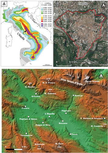
With a population of approximately 73,000 inhabitants (Tertulliani et al. Citation2012), L’Aquila is a medium-sized city in central Italy (), characterized by a notable cultural heritage. It is situated in a seismic zone (Galadini, Galli, and Moro Citation2003; Galli et al. Citation2002; Moro et al. Citation2013; Stucchi et al. Citation2011; Tertulliani et al. Citation2009; Valensise et al. Citation2017), surrounded by important mountain ranges (Tertulliani et al. Citation2011) (, panel A and C).
The city’s buildings exhibit several kinds of structures. The downtown area is predominantly characterized by stone masonry buildings, while the outer areas are mostly defined by more contemporary structures made of reinforced concrete and masonry. This diversity reflects the urban evolution of the city, which has been affected by numerous strong earthquakes over time. Historical sources indicate that the most significant earthquakes were those in 26 November 1461 (which led to the destruction of medieval buildings) and 2 February 1703 (Tertulliani et al. Citation2009, Citation2012) (locate at Pizzoli,15 km northwest of L’Aquila and with a macroseismic magnitude of Mw 6.7 (Gruppo di lavoro CPTI Citation2004). The 1703 earthquake, which marked the birth of the current urban plan (Tertulliani et al. Citation2011), ranks as one of the most devastating seismic catastrophes in Italy’s history. The impact of the 1703 earthquake extended over an expansive area, covering roughly 52,000 km2, spanning regions from northern to southern Italy, encompassing areas from Bologna to Naples. Even isolated, minor tremors were reported in distant locations like Milan and Venice (Locati et al. Citation2021; Rovida et al. Citation2020). The event on 2 February 1703, forms part of a broader seismic sequence, including two other significant events: the first, with its epicenter in Norcia on 14 January 1703, registered a magnitude of 6.92, and the second, occurring on January 16 of the same year with an epicenter in Montereale, had a magnitude of 6.0 (Locati et al. Citation2021; Rovida et al. Citation2020). The earthquake of 1703 decimated 44 villages within an area spanning approximately 19,000 km2, resulting in an estimated death toll of around 6,000 (Antinori Citation1971). In L’Aquila, the city closest to the epicenter (approximately 12 km away), it recorded an MCS intensity level of roughly 9. Indeed, every building in the city sustained damage, with at least 35% of buildings collapsing entirely.
After the 1703 earthquake, in Rome three arches of the Colosseum’s second-order collapsed, and there was damage to sections of the already poorly maintained Aurelian walls. Additionally, cracks and structural damage occurred in the domes and vaults of several churches. The seismic event occurred on 6 April 2009, when a Mw 6.3 earthquake (Ameri et al. Citation2009; Amoruso and Crescentini Citation2009; Anzidei et al. Citation2009; Atzori et al. Citation2009; Chiarabba et al. Citation2009; Tallini et al. Citation2019; Tallini, Lo Sardo, and Spadi Citation2020) severely damaged and destroyed most of the buildings in the historic center (Atzori et al. Citation2009; Tallini, Lo Sardo, and Spadi Citation2020; Walters et al. Citation2009). It is estimated that 47% of the buildings suffered moderate damage, while 20% experienced severe damage and over 40,000 individuals were rendered homeless, churches and monuments were heavily struck (Tertulliani et al. Citation2011). Following this seismic event, a building-by-building damage assessment, resulting in the production of a damage map, was carried out (Tertulliani et al. Citation2011). The survey was carried out under the European Macroseismic Scale (EMS98) (Tallini et al. Citation2019), to evaluate the local macroseismic intensity. Specific damage patterns were observed and attributed to a combination of geological factors and building vulnerability (Tertulliani et al. Citation2012). The most affected areas were the southern and southwestern sectors. The objective of this study consists of a in-depth analysis A-DInSAR deformation maps, in order to evaluate its potential use in predicting seismic effects at the scale of individual buildings, mapping high-susceptibility areas, and mitigating seismic risk in urban contexts.
To this aim, our analysis is mainly addressed at characterizing post-seismic subsidence/uplift motions as well as at individuating some potential controlling or correlated factors, such as, building damage intensity, reconstruction interventions, building typology, etc. For this purpose (i) deformations detected by A-DInSAR analyses of Cosmo-SkyMed data between 2010 and 2021 in the descending orbit have been compared with the seismic damage map for 2009 (Tertulliani et al. Citation2011) and with the damage map for 1703 (Colapietra Citation1978); (ii) ground and building velocities have been examined, in order to evaluate the possible impact of building’s vulnerability and reconstruction efforts on the LOS (Line of Sight) deformations; (iii) Geostatistical Analysis has been carried out to achieve a spatial characterization of deformations affecting the study area and (iv) statistical and cluster analyses have been performed in order to identify common trends in displacement time series of monitored points. This analysis was divided into the phases of data pre-processing, cluster analysis and inferential analysis. Data pre-processing was aimed at improving the quality of the data associated with each PS, as well as removing seasonal effects. The cluster analysis was aimed at identifying common subsidence/uplift trends, so as to be able to remove from the data sets time series showing anomalous trends, very different from that common to the class studied. These procedures allowed us to carry out an inferential statistical analysis on well-selected and quality improved data sets.
2. Materials and methods
2.1. Macroseismic data
After the 2009 earthquake, following the guidelines of the EMS98 (Tallini et al. Citation2019), a detailed building damage survey of L’Aquila historic center (located within the medieval city wall), was carried out, in which were classified and plotted into a geo-referenced map 1710 buildings (Tertulliani et al. Citation2011). The EMS98 (Tallini et al. Citation2019) takes into account an inventory of building types, ranked according to their seismic vulnerability, i.e. susceptibility to be damaged by an earthquake. In addition to vulnerability and damage, the database includes data on the area, perimeter, and height of each building.
The buildings, grouped in vulnerability classes, are displayed in and summarized in . Vulnerability is expressed with a letter from A to D (where A represents the maximum vulnerability and D the minimum) and to each building was assigned a grade of damage (DG). The survey resulted in the production of a damage map (), that classifies buildings using a scale ranging from DG0 (no damage) to DG5 (collapsed). describe DG under the EMS98 (Tallini et al. Citation2019).
Figure 2. The map on the left displays the vulnerability classification of buildings, while the one on the right illustrates the damage grade resulting from the 2009 earthquake in the historic center of L’Aquila. These maps are the outcome of a detailed building survey carried out by (Tertulliani et al. Citation2011) following the criteria of the EMS98 (Tallini et al. Citation2019). For a detailed explanation of the vulnerability classes and damage grades, please refer to , respectively.
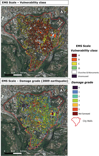
Table 1. Description of the vulnerability classes related to building type identified in L’Aquila downtown, from (Tertulliani et al. Citation2011). The number of buildings in each class is reported (modified from (Tertulliani et al. Citation2011)).
Table 2. Description of the damage grade related to building type identified in L’Aquila downtown from (Tertulliani et al. Citation2011). The number of buildings in each class is reported (modified from (Tertulliani et al. Citation2011)).
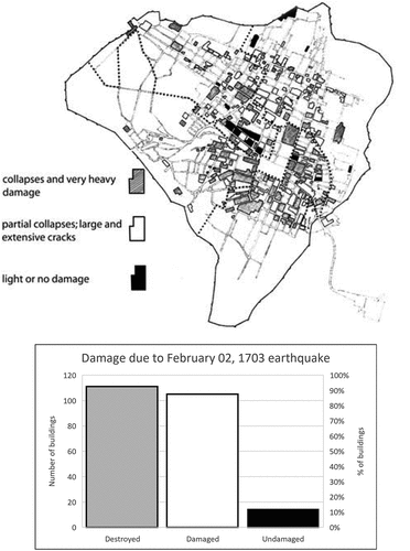
The map of earthquake damage from the 2 February 1703 earthquake, on the other hand, is the result of an extensive effort to collect historical sources conducted by (Colapietra Citation1978). In this map, shown in , buildings are categorized into three classes: undamaged, damaged, and destroyed. For each damage class, the graph in Figure xx presents both the number of buildings falling into that category and the corresponding percentage. In addition to (Colapietra Citation1978) used in this article, a wealth of information regarding the damage caused by the 1703 earthquake can be found in (Tertulliani and Graziani Citation2022) (and references therein), as well as in various other works (Tertulliani et al. Citation2011, Citation2012).
Figure 3. Map of the distribution of damage due to the 2 February 1703 event (modified by (Tertulliani et al. Citation2012), from (Colapietra Citation1978)). This earthquake was the third event of a long and strong seismic sequence that hit central Italy. The 2 February 1703 earthquake has been located 15km northwest of L’Aquila, with a macroseismic magnitude of Mw 6.7 (Gruppo di lavoro CPTI , Citation2004).
2.2. A-DInSAR data
COSMO-SkyMed images were processed through InSAR technique. By using a long time series (2010–2021) of images acquired over the same area, Advanced Differential Interferometric Synthetic Aperture Radar (A-DInSAR) allows for identifying of past or ongoing deformation processes over time and space with millimeter-level accuracy. This characteristic makes the technique one of the most powerful tools for studying ground deformations and estimating the temporal evolution of displacements during the investigated period (Ferretti, Prati, and Rocca Citation2001; Kampes Citation2006). The COSMO -SkyMed constellation, developed by the Italian Space Agency (ASI), is a high-resolution Synthetic Aperture Radar (SAR) satellite constellation. It provides detailed imaging of the Earth’s surface with fine resolution, enabling the detection and analysis of small-scale features. The SAR sensors operate independently of weather conditions, ensuring all-weather imaging capability. With multiple satellites (currently 6 in operation: 4 from the first generation and 2 from the second generation) that orbit at a height of 619.6 km and orbital inclination of 97.86°. All satellites are equipped with high-resolution X-band radar (3.1 cm of wavelength). The radar sensor of the Cosmo SkyMed satellite is capable of functioning in various data acquisition modes. These modes include spotlight, which concentrates on a specific area covering a few square kilometers and provides observations with a spatial resolution of up to one meter. There is also the Stripmap mode, which continuously observes a linear swath of the Earth’s surface, delivering a spatial resolution of 3 × 3 m. Lastly, the ScanSAR mode can cover a broader region spanning up to 200 km ().
Figure 4. SAR operative acquisition modes. A) type of acquisition data modes available for Cosmo-SkyMed radar sensor. B) Stripmap mode: the right-looking satellite observes a linear area of the Earth’s surface, providing a spatial resolution of 3x3 m (modified from (ASI) Citation2021).
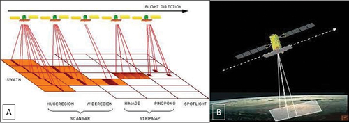
In the context of this study, we employed Stripmap HIMAGE images due to their superior geometric and temporal resolution characteristics, which are readily available in the ASI archive. When operating in Stripmap mode, the Synthetic Aperture Radar (SAR) instrument maintains a consistent set of parameters throughout the data acquisition process. The antenna is configured to emit a fixed beam with a constant azimuth and elevation direction. The satellite’s orbital motion naturally ensures coverage along the track direction.
COSMO -SkyMed offers frequent revisits, enhancing temporal resolution. However, due to its dual civilian and military purpose, there are some temporal gaps. In this case study, only the descending orbit geometry could be utilized. Ascending images were not employed in our study due to their insufficient level of detail for the conducted analysis. In fact, compared to the descending ones, they had lower coverage and limited temporal continuity. The Italian Space Agency (ASI) provides free access to COSMO-SkyMed data for research purposes.
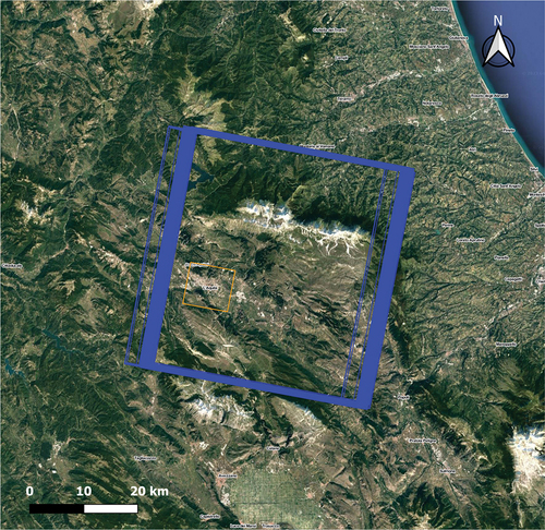
For this case study, a total of 161 Single Look Complex (SLC) images acquired in the descending orbit geometry by COSMO-SkyMed satellites from 14 April 2010, to 30 November 2021, were utilized (). In this work, we utilized the SARPROZ software for the A-DInSAR analysis. The PSI algorithm implemented in SARPROZ, the SAR processing tool developed by (Perissin, Wang, and Wang Citation2011) consists of the following processing steps. Initially, it involves selecting a reference image and defining a star graph to establish connections between images based on temporal and normal baseline parameters. Next, SLC image co-registration is performed on the master area, followed by the generation of a reflectivity map. Ground Control Points (GCPs) are then selected for geocoding the radar images to the ground. Differential interferograms are computed using the synthetic Digital Elevation Model (DEM) for image pairs exhibiting a high level of coherence. Furthermore, preliminary parameter estimation, including average velocity, non-linear displacements, and residual height, is carried out on the Persistent Scatterers Candidates (PSCs). Finally, atmospheric phase screen removal and the final parameter estimation are performed on all pixels.
Figure 5. In blue the footprints on descending orbital geometry of the COSMO-SkyMed images and in orange the master area analyzed.
A-DInSAR analysis charateristics are summarized in .
Table 3. A-DInSAR analysis charateristics are summarized.
We divided the A-DInSAR data into two categories: ground points (hereinafter GP) and building points (hereinafter BP) to analyze them separately and identify possible differences between these two categories of PSs.
Subsequently, to estimate the average deformation velocity of buildings with different levels of damage incurred during the 2009 earthquake, we clipped the interferometric dataset using the building boundary polygons, classified by the intensity of damage they suffered into five classes, ranging from Damage Grade (DG) 1 to DG 5 (in accordance with the EMS98 guidelines (Tallini et al. Citation2019)). For each group, we calculated the average values of satellite-recorded displacements. For all PS (Persistent Scatters) located on buildings with DG 3 or higher (damage classes with higher deformation velocities along the LOS), we further analyzed the interferometric dataset by distinguishing between reconstructed buildings and those that have undergone restoration. For this purpose, we accessed a database that provides extensive information about the buildings located in the L’Aquila downtown. This database offers various details, including the kind of undertaken intervention, the dates of commencement and construction completion works, the amount of funding allocated for maintenance or reconstruction, and other relevant information. The database is accessible at the Gran Sasso Science Institute website (Gran Sasso Science Institute Citation2023).
Indeed, we carried out a similar analysis by juxtaposing the satellite-identified deformations with the buildings affected by the 1703 earthquake. In order to compare the SAR deformation with the damage distribution for the 1703 earthquake, the damage map from (Colapietra Citation1978), in , was georeferenced in QGIS. We clipped the PS map using boundary polygons corresponding to buildings classified as undamaged, damaged, and destroyed. Subsequently, we computed the average cumulative displacement for each of these distinctive categories.
2.3. Geostatistical analysis
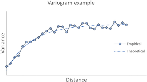
To achieve a spatial characterization of deformations affecting the study area, Geostatistical Analysis has been performed by calculating the variogram of the yearly average velocities of the monitoring points (each monitoring point represents a Persistent Scatter – PS – in the Geostatistical Analysis). A variogram (Diggle and Ribeiro Citation2007) is a function used in geostatistical analysis to describe the spatial variability of data. Denoting the average velocity (mm/year) of a generic PS by zi, such diagram shows the variance of the difference (zi – zj) of two points placed at a distance L in ordinates, as a function of the latter (in abscissae). In the most common geostatistical models, the considered variable (in our case, subsidence/uplift rate), if associated with a stochastic spatial process, shows a greater correlation with the closest points (and therefore a lower variance of the differences) than with the more distant. Therefore, in such cases, the variogram appears as an increasing curve. provides an example (which is not based on our field data) of the expected curve [e.g. Perissin, Wang, and Wang Citation2011].
Figure 6. Schematic representation of a typical variogram.
2.4. Trend recognition and cluster analysis
In order to assess whether or not PSs associated with different classes of building damage and category (10 classes) follow different preferential trends, as well as identify the related pattern, a cluster analysis was carried out. Denoting by yj(t) the vertical displacement time series of the j-th monitored Ps, the purpose of this analysis was to identify, within our data sets, curves yj(t) which exhibit analogous shape or pattern. This allowed us to separate time series associated with subsidence or uplift, as well as to remove from data sets of each class, time series showing anomalous trends, very different from that common to the class studied. The cluster analysis preceded the inferential statistical analysis, aimed at calculating the PS average velocity, for each class, as well as the related confidence intervals, to confirm or exclude any possible correlation with building damage intensity and/or with reconstruction interventions (Sects. 3.1.3. and 3.1.4.). Therefore, the use of cluster analysis provided the dual advantage of (i) identifying preferential subsidence/uplift patterns associated with each building class studied and (ii) allowing subsequent inferential statistical analyses based on selected/homogeneous samples, i.e. from which anomalous time series were removed. The cluster analysis was performed according to two different variants of the k-means algorithm (e.g (Bishop Citation2006; Ertel Citation2011); Appendix 1). The k-means algorithm is a Machine Learning criterion able to identify groupings (clusters) of elements in a given metric space (which is not to be confused with the Euclidean space, but which denotes a Cartesian system made up of variables of any nature). In our case, data consist of vectors with 158 components (i.e. 158 vertical displacement measurements recorded, for each PS, over about 12 years), each associated with a point in the monitored area. Each time series (and PS) is also associated with an average velocity value. In these hypotheses two curves yj(t) (which are actually made up of a discrete set of points, i.e. the above mentioned vectors) are considered coincident if the arrays yj(t) have all the components equal, “close” if the differences between the components are moderate and “distant” if these differences are significant. Therefore, two arrays which are close according to this criterion can be associated (and frequently are in our data set) with two points of the territory that are also geographically distant and vice versa. Two variants of the k-means algorithm (hereafter conventionally named method I and method II) have been used in this work, which differ in the definition of the cluster midpoint and in the distance. Method I is an ad hoc formulated variant for our data set, in which the distance between two vectors is defined as (D = 1 – Correlation(yj(t), yk(t))), an element is considered to belong to a cluster if D is less than a predetermined threshold value (e.g. D < 0.2) and the center of the cluster is given by the vector for which the sum of the distances from all its other elements is minimum. Note that, according to this definition, two vectors yj(t) and yk(t) have zero distance not only if they have equal components but also if (yj(t) = const. yk(t), ∀t), i.e. if they are associated with curves showing the same shape although with different displacement values. Method II follows a more usual criterion in which the distance is calculated as a Euclidean distance, in the 158-dimensional space , and the midpoint of the cluster is the barycentre (centre of mass) in that space, i.e. the vector y(t)* whose components are equal to the arithmetic average of those of the elements of the cluster itself. Furthermore, an element is considered to belong to the cluster if the distance from the midpoint is less than a desired threshold value and not to belong to it, otherwise. illustrates examples of curves near and far from midpoint. The threshold value used was such as to allow a not strong selection of the PSs, i.e. such as to discard only those curves that exhibited an anomalous trend, strongly different from that of the midpoint. As, according to this approach, two vectors are at zero distance only if the corresponding curves coincide, and since we are instead interested in comparing the displacement-time curves in terms of shape (e.g. local inflections and slopes) rather than net displacements, the components of each vector yj (t) have been preliminarily normalized (or re-scaled) by dividing by the mean subsidence/uplift rate (expressed in mm/year) corresponding to each vector.
Figure 7. Example of time series at several distance (see main text for definition) from the midpoint of a cluster. Note that the curve denoted by ‘near midpoint,’ in green color, has a distance value which is near the threshold defining exclusion from cluster. The curve in red color has distance value greater than such threshold.
The first variant of the k-means algorithm was used to identify, for each data set, the midpoint vectors of two clusters, one associated with subsidence and the other with uplift, which allowed us to analyze the spatial correlation trend between the values of displacement-time curves with the (geographical) distance between monitored points. Instead, in order to recognize common trends between data, it was decided to use the second variant of the k-means algorithm illustrated above, as it follows a more traditional approach whose validity is widely established. The cluster analysis was carried out, in a first phase, assuming that there were three clusters (we recall that in the k-means method the number of clusters to be searched for is a known datum of the problem; e.g (Ertel Citation2011)), nevertheless the results highlighted the occurrence, in each data set, in addition to a cluster of uplift curves, of two others of subsidence ones, which are substantially superimposable and which are probably the result of splitting of a single cluster. Therefore, for all the data sets this algorithm was applied to search for two clusters, one of uplift curves (less numerous) and one of subsidence curves.
2.4.1. Preliminary data treatments for cluster analysis
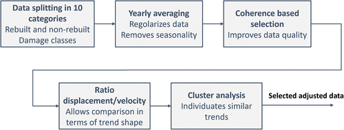
In order to assess whether the subsidence/uplift trend shows systematic variations in correspondence of buildings which have undergone reconstruction interventions or different levels of damage, the dataset has been divided into five categories based on the damage class, which were further divided into two further categories (for a total of 10 categories), i.e. reconstructed and non-reconstructed buildings. The data consist of arrays of 158 vertical displacement values (in mm) for each monitored point, sampled in the time interval from 14 April 2010 to 30 November 2021, at rather regular but not equally spaced time intervals. For each site, the data is presented with a noise that confers a certain irregularity to the displacement-time curves. This noise is the effect of multiple competing phenomena, such as measurement inaccuracy and seasonal alterations. The latter may likely be due to seasonal variations in the aquifer, as well as other effects of climate variations, including thermal expansion of buildings. The study of seasonal oscillations, although very interesting, does not fall within the scope of the present study and will be the subject of future research. Therefore, in order to achieve data distributed at regular time intervals, to mitigate the disturbance, as well as remove seasonal variations, each array was preliminarily regularized by performing a time average as follows: starting from 14 April 2010, the vertical displacement value is calculated every 26 days as the average of the values recorded in the previous and following six months (when there are any), thus obtaining an array of 158 values at equally spaced time intervals. In order to improve the data set reliability, data showing coherence values greater than or equal to an opportunely chosen threshold (Sect. 3.1.2.) were selected for the most numerous data sets, i.e. those relating to non-reconstructed buildings and, among the reconstructed ones, to the damage class only DG3. For the other kinds of reconstructed buildings, this selection was not applied otherwise it would have made the statistical sample too small.
A further preliminary treatment of the data set consists in normalizing the array values, dividing the components of each vector yj(t) by the associated average yearly velocity. This allowed to compare displacement vs time curves in terms of local inflections and slopes rather than net displacements or, namely, to compare these curves in terms of shape (i.e. of time trend). The data processing is summarized in .
Figure 8. Flowchart illustrating data processing.
2.4.2. Subsidence velocity statistical analysis
In order to confirm or exclude a possible correlation between subsidence velocity and building damage intensity, these velocity values have been grouped by damage category and by kind of intervention (i.e. reconstructed and not reconstructed) of the related buildings, for a total of 10 categories. Then, the 95% confidence intervals, according to the Student’s random variable, of the average of velocity values for each category were calculated. This analysis only involved values belonging to the cluster associated with subsidence, previously identified through cluster analysis. This made it possible to compare velocity values belonging to a homogeneous sample, thus discarding any anomalous values, outliers, etc.
3. Results
3.1. Recent and historical earthquake data
The 311,711 PSs resulting from the processing of COSMO-SkyMed images are shown in the in .
Figure 9. A-DInSAR map resulting from the processing of April 14, 2010, to November 30, 2021 descending orbit images. The study’s primary focus, as illustrated in , is the area contained within the boundaries of the city wall.
However, the interferometric map was limited to the ancient city, bounded by the medieval walls, which is the specific area of focus in this study (). The study area shows relatively slow deformation velocities, typically ranging between + 0.5 and −2.5 mm/year, and seldom exceeding − 5 mm/year. Existing literature (Antonielli et al. Citation2019; Bozzano et al. Citation2018) commonly reports measurement accuracy for COSMO-SkyMed datasets to be around ±1.5 mm/year. Nevertheless, as demonstrated by (Bozzano et al. Citation2020) and (Ferretti et al. Citation2014) the precision of millimetric measurements depends on factors such as the observed period, satellite revisit frequency, and satellite characteristics, particularly the wave length.
Thanks to the densely urbanized nature of the natural targets (man-made structures) with high backscattering quality and the extended revisit time of approximately 10 years provided by COSMO-SkyMed, we were able to extract a wealth of information from our results. This refinement has led to a scale reduction in the displacement rates of PSs, resulting in an instrumental error of approximately 0.3 mm/year.
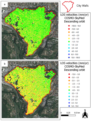
For this reason, the same A-DInSAR map in is visualized using two different scale (in panel a and b). In the first one green PSs are those with deformation velocity from −1.0 to 1.0 mm/year, in panel b stability value (green PSs) is in the range from −0.5 to 0.5 mm/year. Also, the transition from yellow to red (PSs moving away from the satellite) and from light blue to dark blue (PSs moving toward the satellite) is described, in the two maps, by different velocity intervals. Furthermore, it is emphasized that in the statistical analyses illustrated below, the variability of the average velocities is quantified using 95% confidence intervals. Therefore, the precision of the single measurement assumes a secondary role, as the confidence interval width provides a direct estimate of the aforementioned variability (Sect. 3.1.4.).
Figure 10. Two different color scales are used to represent the PS points in the study area. In the map in panel a, the range of deformations within the interval of −1.5 to 1.5 mm/year is considered as stable. In panel b, however, the instrumental error threshold is lower, and the PS points in green (stable points) are associated with a deformation of ± 0.5 mm/year.
The interferometric map obtained from the processing of images acquired by COSMO-SkyMed between 2010 and 2021 () has allowed to analyze the building damage distribution resulting from two seismic events that devastated the L’Aquila downtown: the Mw 6.3 earthquake on 6 April 2009, and the historic earthquake of 1703 with Mw between 6.0 and 6.9 (Bordoni et al. Citation2018; Ferretti, Prati, and Rocca Citation2001). The PS scale in the maps () ranges from red to blue, where warm colors indicate points moving away from the satellite along the Line Of Sight (LOS), and cool colors indicate points moving toward the satellite, i.e. with positive deformation velocity. Green PSs represent measuring points with displacement velocities ranging between −1 mm/year and 1 mm/year.
Figure 11. A-DInSAR maps, obtained using COSMO-SkyMed images acquired in descending orbit between 2010 and 2021, are clipped with buildings boundary polygons showing ground points (on the left) and building points (on the right). Green PSs are considered as stable; yellow-red PSs are moving away from the satellite; cyan-blue PSs are moving toward the satellite. The buildings in the center of L’Aquila (represented in reddish brown polygons in the ground point map and with transparent with black border polygons in the building point map) have been used as a mask to crop the interferometric dataset for a separate calculation of deformations on the buildings (BP) and ground points (GP). In the graph (left down), the x-axis represents the cumulative displacement (in mm), while the y-axis represents the number of Persistent scatterers (PSs).
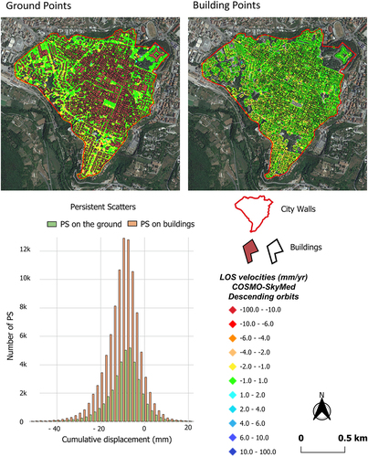
The A-DInSAR map highlights more pronounced deformations in the southern and southwestern sectors of the study area. We divided the A-DInSAR data into two categories: ground points (hereinafter GP) and building points (hereinafter BP) to analyze them separately (). Of all points, 71.96% are located on the buildings, with the remaining 28.04% being localized scatterers on the ground. The statistical distribution of cumulative displacement values recorded over 11 years along the satellite’s LOS was calculated for both types of points. BP show an average cumulative displacement of −9.53 mm with the first and third quartiles respectively equal to −13.57 mm and −4.76 mm. GP displacement values are only slightly different from those of BP, with an average of −9.4 mm, a maximum of −13.37 mm, and a minimum of −4.77 mm.
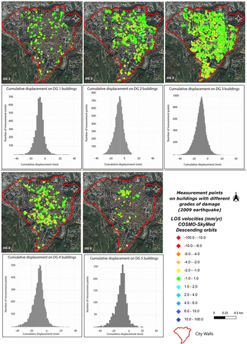
We utilized the damage map in to calculate the average velocity and cumulative displacement values recorded by the satellite over the 11 years following the earthquake on 6 April 2009, for buildings with different DG.
illustrates the calculated average velocity and cumulative displacement values for buildings ranging from DG1 to DG5. These data provide an overall picture of the correlation between average velocity and damage category. A more quantitative analysis, involving the estimate confidence intervals, is illustrated below, in Section 3.1.3.
Table 4. The table presents the average velocity and mean cumulative displacement computed from the descending COSMO-SkyMed map for each damage class associated with the buildings in L’Aquila’s historic center, resulting from the 2009 earthquake.
The statistical distribution of cumulative displacement values for each damage class is shown in . Severe damage, corresponding to a damage level of 3 or higher, was observed in 72.01% of the buildings. Among the severely damaged buildings, the majority (54.3%) belonged to DG3, followed by 14.25% in DG4, and 3.42% in DG5. Buildings with negligible to slight damage (DG1) accounted for 6.55%, while those with moderate damage (DG2) represented 21.41% of the total.
Figure 12. Statistical distribution of cumulative displacement values for each damage grade. The distribution of damage is depicted by the placement of Persistent scatterers (PS) in this figure, which are divided into damage classes. Each category is then associated with a cumulative displacement/number of PS graph, which describes the deformations corresponding to the respective damage grade. The colour scale used in the A-DInSAR maps refers to the legend in the figure, noting that negative velocity values correspond to displacements along the satellite’s line of Sight (LOS). Conversely, positive velocities indicate points moving towards the sensor.
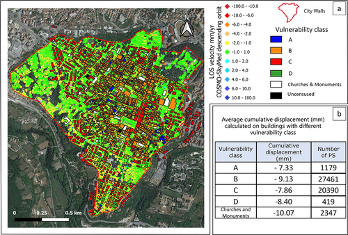
The comparison of the vulnerability map of the buildings with the distribution of deformations recorded by the satellite was also performed. The analysis involved the evaluation of average cumulative displacement data recorded by COSMO-SkyMed for each vulnerability class (as described in ). The results have been summarized in , panel b.
Figure 13. A) descending COSMO-SkyMed deformation map with classification of buildings based on their vulnerability. The color scale used in the map for PSs representation refers to the legend, noting that negative velocity values correspond to displacements along the satellite’s line of Sight (LOS). Conversely, positive velocities indicate points moving towards the sensor. b) average cumulative displacement data recorded by Cosmo-SkyMed for vulnerability class. A description of specifical characteristics of each vulnerability class is reported in .
3.1.1. GeostatisticalAnalysis
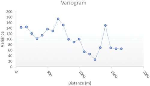
In order to characterize the spatial pattern of LOS displacement values (primarily subsidence) for the monitored points, we initially calculated the variogram of the annual average velocities (Diggle and Ribeiro Citation2007). By way of example, displays the variogram of the most abundant dataset, specifically for buildings with DG3 on non-reconstructed structures. Unlike what is observed in the most widespread spatial process related geostatistical models, in which the variogram appears as an increasing curve, our data exhibit a variogram with an irregular and moderately decreasing trend with distance. The subsidence rates associated with nearby points show little correlation (associated with high variance) whereas the variance shows a slight decrease between values in points increasingly distant from each other. Therefore, usual geostatistical models are not applicable to our data.
Figure 14. The variogram of the data pertaining to non-rebuilt buildings with damage category 3 is shown. The ordinate axis represents the variance of the differences in average velocity, expressed in mm/year, (zi - zj) between two points separated by a geographical distance L, on the abscissa.
3.1.2. Cluster analysis
For all PS (persistent scatters) located on buildings with DG3 or higher (damage classes with higher deformation velocities along the LOS), we further analyzed the interferometric dataset by distinguishing between reconstructed buildings (approximately 13% of the total) and non-reconstructed buildings (87%). Concerning the PS located on reconstructed buildings, the time series underwent a preliminary cleaning process. This involved removing the deformation interval prior to the reconstruction phase, also including minor intervention (e.g. adding new coats or materials as part of routine maintenance) capable of producing macroscopic variations (e.g. a few cm) between one measurement and the next, ensuring that only relevant data points were considered as PS. For this purpose, we accessed a database that provides extensive information about the buildings located in the L’Aquila downtown. Preliminary statistical analyses involving reconstructed and non-reconstructed buildings revealed an average displacement velocity (in mm/year) of −0.85 for the reconstructed category and −0.99 for the non-reconstructed buildings. The average cumulative displacement amounts to −9.95 mm and −11.59 mm, respectively.
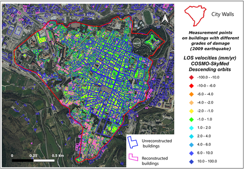
In , the COSMO-SkyMed A-DInSAR deformation map is displayed with a mask that delineates the buildings in the historic center. The mask distinguishes between buildings that have undergone restoration (in blue) and those that have been reconstructed (in pink) following the earthquake.
Figure 15. COSMO-SkyMed A-DInSAR deformation map is displayed with a mask that delineates the buildings in the historic center. The mask distinguishes between buildings that, following the 2009 earthquake, have undergone restoration (in blue) and those that have been reconstructed (in pink). The color scale used in the map for PSs representation refers to the legend in the figure, noting that negative velocity values correspond to displacements along the satellite’s line of Sight (LOS). Conversely, positive velocities indicate points moving towards the sensor.
Since the reconstructed buildings exhibit higher LOS deformations than the non-reconstructed ones, a Cluster Analysis has been carried out, in order to identify potential differences in temporal trends between the time series of reconstructed and non-reconstructed buildings.
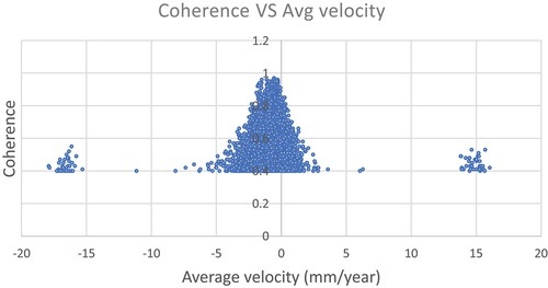
For data arrays indicated in Section 2.3.1. a coherence filter of 0.6 was preliminarily applied. Each data array is associated with a coherence value in the range (0–1), which can be viewed as a measure of data quality. It is observed that below the value of 0.6 the scattering increases significantly and two value clusters are detected with subsidence or uplift rates of more than 15 mm/year (). The two clusters corresponding to extreme positive and negative values are associated with anomalous deformations compared to the average values recorded in the area, most likely due to phenomena in which we are not interested. Therefore, we considered such values, associated with coherence < 0.6, as outliers. On the other hand, data filtering according to too high coherence values results in data selection which may lead to small samples. The value of 0.6 was chosen because it offered the best compromise between data homogeneity and sample size.
Figure 16. Coherence vs average velocity (mm/year) for non-rebuilt damage class 3 buildings. Considering consistency as a measure of data quality, it is observed that below the value of 0.6 the scattering increases significantly and two groupings of suspected outliers are detected with rates of over 15 mm/year.
illustrates the results of the analysis carried out according to the two different approaches described in Sect. 2.3, in which two clusters of curves were identified in the dataset relating to buildings with damage class 3 and reconstructed, one of subsidence curves and one of uplift. The two methods gave substantially similar results.
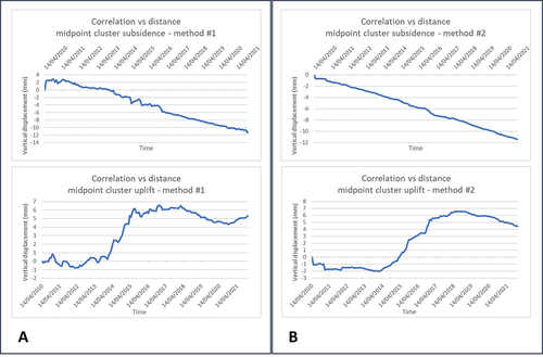
Figure 17. Midpoint of the two subsidence and uplift clusters identified according to the two approaches illustrated in Sect. 2.3. A) results following the first described variant of the k-means algorithm. B) results according to the second illustrated variant.
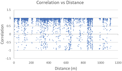
The midpoint vectors achieved by means of method I (Sect. 2.3.) allowed us to examine the correlation between the displacement-time curves and the geographical distance between monitored points (PS of COSMO-SkyMed descending map). depicts the correlation between the subsidence values recorded at the subsidence cluster midpoint and those of all other monitored sites, including those outside the cluster. This analysis specifically focuses on the dataset related to non-reconstructed buildings with DG3. Notably, the correlation values remain close to unity, indicating similar temporal trends among the curves, even for sites located at significant distances from each other. On the other hand, anti-correlation can be observed also among neighboring (or not far) sites.
Figure 18. Correlation between displacement-time curves in the dataset related to non-reconstructed buildings with damage class D3. In the diagram, each point represents the correlation between the subsidence values recorded, on the same date, at the most representative PS within the subsidence cluster and all other PSs, including those outside the cluster. The horizontal axis denotes the reciprocal distance between these points, while the vertical axis represents the correlation value.
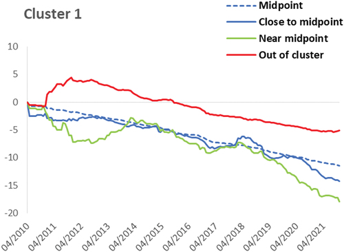
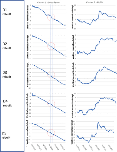
and 20 depict the midpoint curves of uplift and subsidence, achieved by means of the above illustrated method II (i.e. obtained as arithmetic average of the components of each vector belonging to the cluster, for each date). illustrates results related to non-reconstructed buildings, while to reconstructed ones.
Figure 19. Diagrams showing average vertical displacement vs time, for each cluster, for all DG (damage grade) of non-rebuilt buildings. Each curve represents the midpoint of its own cluster. Red circles outline an observed anomaly in subsidence trends. The two vertical dashed lines highlight the time range August-November 2016, in which the Amatrice-Norcia seismic sequence occurred. As the uplift curves are rather irregular (being achieved from small samples), such anomaly is not well recognisable. It should be remembered that the data relating to each curve have been preliminarily normalized with respect to the average velocity. Therefore, these curves only provide information about the shape of the subsidence trend and not about the cumulative displacement.
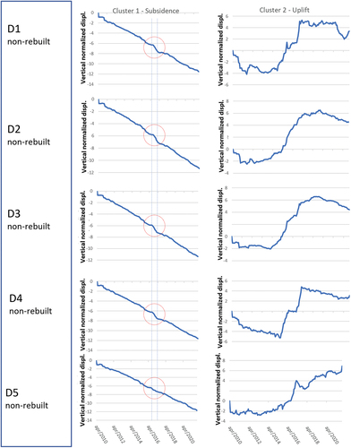
Figure 20. Diagrams showing average vertical displacement vs time, for each cluster, for all DG (damage grade) of non-rebuilt buildings. Each curve represents the midpoint of its own cluster. Red circles outline an observed anomaly in subsidence trends. The two vertical dashed lines highlight the time range August-November 2016, in which the Amatrice-Norcia seismic sequence occurred. As the uplift curves are rather irregular (being achieved from small samples), such anomaly is not well recognisable. Analogously to the case of non-rebuilt buildings, these curves only provide information about the shape of the subsidence trend and not about the cumulative displacement.
From this analysis, the following observations can be made:
For all 10 categories, the shape of the displacement-time curves, associated with midpoint of clusters, are analog regardless of the damage class and the kind of maintenance undergone by the buildings (renovation/reconstruction). Therefore, subsidence/uplift phenomena show different intensities but a common trend, for different building categories and damage classes.
Uplift curves exhibit an initial phase of modest displacements with possible sign changes, followed by a second phase of significant displacements, and a third phase of modest displacements with slight subsidence.
Subsidence curves, on the other hand, show a relatively consistent and constant trend (in statistical terms).
There is an anomaly in the subsidence curves close the time range associated with the Amatrice-Norcia seismic sequence (the anomaly is highlighted by a red circle, the time range August-November 2016, by means of two vertical dashed lines, in and 20). Therefore, it is plausible that such an event may have conditioned the subsidence trends or may be somehow related to these anomalies (i.e. both could have a common cause). This is a very interesting issue and will be of course subject of future research.
3.1.3. Subsidence velocity vs. damage intensity
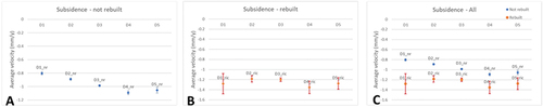
The statistical analysis carried out highlights a significant variation (in inferential sense) of the average subsidence velocity values with the various damage classes, as well as for reconstructed buildings and not. As regards the average uplift values, in many cases the statistical sample is small and, therefore, it is not possible to identify significant variations due to a considerable sample uncertainty on parameter estimates. shows the average subsidence rate values (mm/year), with the respective 95% confidence intervals (which are not clearly visible because they are very narrow), for the non-reconstructed buildings, and for time series belonging to cluster 1. With the exception for data relating to damage classes D4 and D5, whose intervals show overlapping (i.e. the difference between average values is not significant), the confidence intervals appear well distinct and highlight an increase in average subsidence velocity as the damage intensity increases. For the reconstructed buildings (time series belonging to cluster 1), as there are fewer samples, the 95% confidence intervals overlap (). compares the mean rates of subsidence for reconstructed and unreconstructed buildings. Between these two categories, the confidence intervals are well separated, pointing out an average difference of about 0.2–0.4 mm/year. A more accurate average value of such difference has been calculated as follows. The difference between cumulative displacement, over the studied time range, of rebuilt and non-rebuilt buildings for each damage class, has been weighted by using as weight function the inverse of standard deviation of the most uncertain value, (i.e. associated with the non-rebuilt category). Then, a weighted average of these five values have been calculated, which yielded a value of about 2 mm over 11 years. This is of course comparable (using, e.g. current legislation design values for buildings) to the deferred building deformation, given by the superposition of contraction of the vertical structures and bending of the floor on which the PS rest, as well as of the foundation soil in reloading conditions. Therefore, the difference in rate of subsidence between rebuilt and non-rebuilt buildings is to be considered as not relevant.
Figure 21. A) average values, with related 95% confidence intervals, of vertical subsidence velocity (mm/year) for all categories of not rebuilt buildings; B) average values, with related 95% confidence intervals, of vertical subsidence velocity (mm/year) for all categories of rebuilt buildings. C) comparison of rebuilt and not-rebuilt building data. It should be noted as the confidence intervals for non-rebuilt building are very narrow. This also outlines as opportune sampling and an effective statistical analysis considerably reduce uncertainties in subsidence A-DInSAR data.
3.1.4. Measurement errors and reliability of the inferential statistical analysis
The partition of data into damage categories and clusters, as well as data cleaning and processing (Sect. 2.3.1.), have allowed to carry out a parametric statistical analysis on well-selected and homogeneous datasets. This brings to light a systematic average subsidence velocity increase as damage severity increases, for non-reconstructed buildings. Here, we emphasize that the statistical significance of the observed dependence of subsidence rate on building damage severity is guaranteed by the fact that the 95% confidence intervals of the observed statistics are well-separated. It is worth recalling that the mean of a sample of random variables (in this case, subsidence rates) is itself a random variable, characterized by its own statistical variability described by the standard deviation. This latter, due to the well-known central limit theorem, is a function of the standard deviation of (individual) velocity values belonging to each analyzed cluster. Therefore, the effect of each cause which confers variability to each velocity measurement, such as, e.g. spatial variability, measure inaccuracy, is accounted for by the estimate confidence interval. Since a 95% confidence interval guarantees that the true value of the estimated statistic – here, the average subsidence rate associated with each cluster in each building category – is very unlikely to be outside that range, we can state that the estimates reported in are actually different, except for those associated with the DG4 and DG5 classes, whose intervals overlap.
3.2. February 02, 1703 earthquake
By utilizing the post-earthquake damage map from 1703 produced by (Colapietra Citation1978) and geo-referenced for this scope, we were able to carry out a comparative analysis with interferometric data achieved from COSMO-SkyMed (covering the time interval of 2010–2022). The descending COSMO-SkyMed deformation map was specifically cropped using polygons representing three distinct building types: destroyed buildings, damaged buildings, and undamaged buildings (Colapietra Citation1978) (). For each of these categories, we calculated the average deformation velocity (in mm/year) and the respective 90% confidence intervals. The obtained values are reported in the following .
Figure 22. Descending COSMO-SkyMed deformation map, cropped using polygons representing three distinct building types: destroyed, damaged, and undamaged. The color scale used in the map for PSs representation refers to the legend, noting that negative velocity values correspond to displacements along the satellite’s line of Sight (LOS). Conversely, positive velocities indicate points moving towards the sensor.
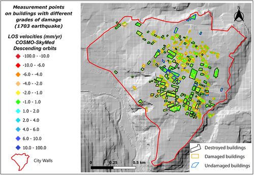
Table 5. The table shows the average velocity and related 90% confidence interval upper and lower limits, computed from the descending COSMO-SkyMed map for buildings which were destroyed, damaged and undamaged following 1703 earthquake.
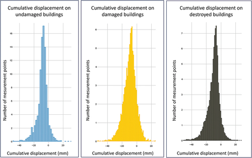
The statistical distribution of cumulative displacement values for each damage class is shown in the histograms in . Total collapse (“destroyed buildings” class) was observed in 48.26% of the buildings, damaged buildings represent the 45.65% and only the 6.08% of total structures suffered no damage.
Figure 23. Statistical distribution of cumulative displacement values for each 1703 seismic damage grade. The distribution of damage is depicted by the placement of Persistent scatterers (PS) in , which are cropped by means of polygons whose colors are associated with the three damage classes. For each 1703 seismic damage category the diagram illustrating number of PS vs. Cumulative displacement, is reported.
Even for the case of the 1703 seismic event, the average velocity values associated with the different damage classes have non-overlapping confidence intervals. This corroborates the hypothesis that the average subsidence velocity increases systematically as the intensity of damage to buildings increases. It should be noted that, since the damage data set for the 1703 seismic event is less extensive than that for 2009, the analysis was conducted according to a more simplified procedure than those illustrated in sections 3.1.2. to 3.1.4. In particular, the data were not selected on the basis of coherence or through cluster analysis, to avoid working with too few statistical samples. Furthermore, the 90% rather than 95% confidence interval was considered, as it was taken into account that the statistical sample was of lower quality. Therefore, the analysis relating to the 1703 seismic event presents results affected by greater uncertainty compared to that conducted on 2009 data and could benefit from future studies carried out according to more effective statistical methodologies. Although the conclusions reached regarding the correlation between subsidence velocity and degree of damage, relating to the 1703 seismic event, are weaker than in the case of the 2009 event, they strengthen this working hypothesis.
4. Discussions
The use of satellite SAR interferometry for the study of deformations that characterized L’Aquila downtown in the decade following the 2009 earthquake (the most recent seismic event that severely damaged the city) has revealed the presence of subsidence rates with velocities reaching and rarely exceeding −5 mm/year. Considering the remarkable precision of the employed A-DInSAR map (which benefits from an extensive PSs coverage and is generated using a 10-year-long time series of regularly obtained images), the deformation analysis has transcended the conventional instrumental threshold (set at ±1.5 mm/year). Following the footsteps of previous works by () and (Diggle and Ribeiro Citation2007), and despite the low deformation rates, this approach has allowed for the identification of a progressive increase in cumulative displacement of about −1 mm for each damage grade class. The building damages caused by the 2009 and 1703 earthquakes match with the deformations recorded by the satellite between 2010 and 2021. Satellite data consistently show that the most heavily damaged structures (D3, D4, D5 – for the 2009 earthquake – Destroyed and Damaged buildins – for the 1703 earthquake) exhibit the highest levels of deformation. In particular, a systematic increase in subsidence rate has been observed as the damage level increases. Consistent with the previously mentioned cumulative displacement data, a difference in velocity of approximately 0.1 mm/year has been observed for each damage grade class from DG 1 to DG 4. The average velocity values (and consequently, cumulative displacement) associated with damage classes DG 4 and DG 5 show overlapping confidence intervals, indicating that the observed difference is not statistically significant. In a similar vein, even though the urban sprawl in 1703 was considerably more limited than today, with areas like the southern sector of the city undergoing urbanization only in the past 80 years (Tertulliani et al. Citation2012), the findings revealed that the zones surrounding buildings destroyed by the 1703 earthquake exhibited higher levels of deformation captured by COSMO-SkyMed over the preceding decade. This stands in contrast to regions where structures had experienced only minor damage. Furthermore, there was a distinct reduction in deformation observed in areas that had remained undamaged during the 1703 event. Since the intensity of damage can be interpreted as an indicator of the intensity of local seismic strain intensity, the increase in subsidence rate can be attributed to a rise in seismic shacking. Considering that the zones exhibiting higher subsidence rates also suffered more extensive damage from both the 2009 and 1703 earthquakes and taking into account the substantial differences in urban layout between these two events, it’s plausible to hypothesize that there exist geological and/or tectonic conditions influencing the structural damage across various areas of the city. Indeed, the significant impact of surface geology on the dispersion of damage, not only for the 2009 earthquake but also for the 1703 earthquake, have already recognized (Tallini, Lo Sardo, and Spadi Citation2020). The damage increased with thickness of soils exhibiting higher compressibility was observed (Tallini, Lo Sardo, and Spadi Citation2020). If, on one hand, the study carried out by (Tallini, Lo Sardo, and Spadi Citation2020) focused on the effects of varying thickness of such lithologies on different types of buildings (e.g. reinforced concrete and masonry), the recognition of the absence of a difference in velocity between GP and BP (by mean A-DInSAR COSMO-SkyMed analysis) suggest that the deformations may not be directly influenced by buildings’ specific characteristics (). This observation it’s also validate by the comparison of vulnerability map of the buildings with the distribution of deformations recorded by the satellite (). With exception of churches and monuments, it doesn’t appear to be a direct correlation between vulnerability and satellite-recorded deformations for the rest of the buildings. Namely, cumulate displacement does not exhibit systematic variation as vulnerability increases. The different values detected at churches and monuments, are likely attributed to their reconstruction using rubble after the 1703 earthquake (Kampes Citation2006), and furthermore, as these are heavy buildings, in many cases associated with structures showing very high concentrated loads, such as towers and bell towers. The cluster analysis, which identified recurring trends in the time series of both reconstructed and non-reconstructed buildings, further supports the hypothesis that geological conditions influence deformation. Despite recording varying velocity and cumulative displacement values for different damage and intervention categories, in terms of the shape of subsidence curves, these exhibit similar patterns across the five damage classes, irrespective of whether buildings underwent renovation or reconstruction. Conversely, if the deformation phenomenon were determined by the building type, the shape of the displacement time series curves would differ from one building to another. The differences in cumulative displacements associated with reconstructed and non-reconstructed buildings align with the typical delayed settlements of reinforced concrete structures.
The observed geostatistical data reveals a widespread subsidence motion throughout the investigated area (see subsidence curves of cluster midpoints in ), with deformations exhibiting similar trends even for distant sites, while also displaying scattered values for neighboring points (as highlighted in ). The spatial variability of subsidence/uplift rates appears as a local phenomenon superimposed on a prevailing subsidence process, common for the whole area. Furthermore, the cluster analysis revealed the existence of a distinct cluster of Persistent Scatterers exhibiting uplift. These curves exhibit shared patterns but with varying degrees of internal variability. The recorded displacements in the uplift related cluster are relatively small. It’s worth noting that this cluster represents a mere 2% of the total dataset. The observed geostatistical data show a subsidence motion extended to the entire investigated area, with local variability and possible change of sign (uplift). Generalized subsidence can be associated with deformation of lithological layers present below the whole area. However, it cannot be excluded that the subsidence is extended to a regional scale and possibly associated with deformation of deeper layers. Local variations in subsidence rates are likely associated with local variations of lithology in the more superficial layers. The underlying cause for these deformations cannot be definitively determined, except to attribute them to the data processing involved in generating the A-DInSAR map. This process involves selecting a stable reference point to serve as the baseline for all other PS.
A further result of our analysis concerns the observation of an anomaly in subsidence rates during the period through the second half of 2016 and first half of 2017 (highlighted by the midpoint curves of the clusters in ). One possible cause that may have contributed to this anomaly is the seismic sequence of Amatrice-Norcia, which occurred in central Italy between August 2016 and January 2017. Although explaining these anomalies lies well beyond the scope of this work, this is a very interesting finding and will be object of future research. It should also be noted that the interferometric map used displays deformation values recorded along the satellite’s Line Of Sight (LOS) in descending orbit. For a better understanding of the observed flex in the various curves, it would be beneficial to evaluate the deformations recorded in ascending orbit and perform a decomposition of the deformations into their vertical and horizontal components. However, the coverage of COSMO-SkyMed images for the study area during the relevant period is limited, making such analysis unfeasible.
5. Concluding remarks and perspectives
The main conclusions arising from the interferometric analysis carried out in the decade following the seismic event that struck L’Aquila in 2009 are summarized below:
Post- seismic deformation pattern, acquired by means of A-DInSAR instrumental measurement, matches with both the damage map for 2009 and 1703. A systematic and statistically significative increase of subsidence rate (as well as cumulative displacement) has been observed as building damage level increases.
Therefore, since deformation identified by COSMO-SkyMed between 2010 and 2021 appears as not solely matching with 2009 seismic event effects but, rather, as characterizing risk features of the studied area in general, our findings pave the way for a new utilization of long-term time series of satellite SAR data in high-risk seismic areas, as a powerful tool aimed at mapping most vulnerable regions and effectively mitigating seismic risks. This would be a relevant goal, as this methodology allows large areas to be monitored at low cost. In this regard, in view of future research, this method may benefit from validation based on pre-seismic data (when they will be available).
The lack of differences in velocities between ground-level (GP) and building-based PS (BP) indicates that subsidence rates are not affected by building features and/or its presence. Furthermore, displacement spatial analysis outlines a locally variable displacement field (also exhibiting local uplift), overlying to a generalized subsidence, involving the whole studied area. These evidences corroborate the hypothesis that vertical ground displacement are mainly controlled by underground geological structure. A detailed study of such dependence lies beyond the scope of this work. Future studies will delve into a more comprehensive analysis of geological and geomorphological factors that impact deformation distributions within L’Aquila downtown, in order to reach a deeper understanding of the complex interplay between seismic events, geological features, and deformations in this area.
Further interesting evidence, issued by our analysis, regards an anomaly in subsidence rate, for all here considered building categories, along the time range associated with the Amatrice-Norcia 2016 seismic sequence, which will be subject of future research.
Author contributions
“Conceptualization, A.S., P.M., V.G., M.S., M.T.; methodology, R.M., V.G. P.M., A.S.; software, V.G.; validation, P.M., M.T.; formal analysis investigation A.S., V.G.; data curation, R.M., V.G., A.S.; writing – original draft preparation, A.S., V.G.; writing – review and editing, A.S., V.G., P.M., M.T., M.S.;.; visualization, A.S., V.G., P.M., M.T., M.S., R.M.; supervision, P.M., M.T.; project administration, P.M., M.T.; funding acquisition, M.T., P.M. All authors have read and agreed to the published version of the manuscript.”
Acknowledgments
We would like to thank the Editor and three reviewers for the useful and notable comments and suggestions.
Disclosure statement
No potential conflict of interest was reported by the author(s).
Data availability statement
The data that support the findings of this study are available from the corresponding author, A.S.
Additional information
Funding
References
- Ameri, G., M. Massa, D. Bindi, E. D’Alema, A. Gorini, L. Luzi, S. Marzorati, et al. 2009. “The 6 April 2009, Mw 6.3, L’Aquila (Central Italy) Earthquake: Strong-Motion Observations.” Seismological Research Letters 80(6). 951–30 https://doi.org/10.1785/gssrl.80.6.951.
- Amoruso, A., and L. Crescentini. 2009. “Slow Diffusive Fault Slip Propagation Following the 6 April 2009 L’Aquila Earthquake, Italy.” Geophysical Research Letters 36:1–5. https://doi.org/10.1029/2009GL041503.
- Antinori, A. L. 1971. Annali Degli Abruzzi Dalle Origini All’anno 1777. 17. edited by Sala Bolognese (Italy): Arnaldo Forni Editore.
- Antonielli, B., P. Mazzanti, A. Rocca, F. Bozzano, and L. D. Cas. 2019. “A-DInsar Performance for Updating Landslide Inventory in Mountain Areas: An Example from Lombardy Region (Italy).” Geosci 9. https://doi.org/10.3390/geosciences9090364.
- Antonielli, B., A. Sciortino, S. Scancella, F. Bozzano, and P. Mazzanti. 2021. “Tracking Deformation Processes at the Legnica Glogow Copper District (Poland) by Satellite Insar—I: Room and Pillar Mine District.” Land 10. https://doi.org/10.3390/land10060653.
- Anzidei, M., E. Boschi, V. Cannelli, R. Devoti, A. Esposito, A. Galvani, D. Melini, G. Pietrantonio, F. Riguzzi, V. Sepe, Serpelloni E. 2009. “Coseismic Deformation of the Destructive April 6, 2009 L’Aquila Earthquake (Central Italy) from GPS Data.” Geophysical Research Letters 36:3–7. https://doi.org/10.1029/2009GL039145.
- (ASI), A. S. I. COSMO-Skymed Seconda Generazione: System and Product Description 2021.
- Atzori, S., I. Hunstad, M. Chini, S. Salvi, C. Tolomei, C. Bignami, S. Stramondo, E. Trasatti, A. Antonioli, and E. Boschi. 2009. “Finite Fault Inversion of DInSar Coseismic Displacement of the 2009 L’Aquila Earthquake (Central Italy).” Geophysical Research Letters 36:1–6. https://doi.org/10.1029/2009GL039293.
- Berardino, P., G. Fornaro, R. Lanari, and E. Sansosti. 2002. “A New Algorithm for Surface Deformation Monitoring Based on Small Baseline Differential SAR Interferograms.” IEEE Transactions on Geoscience and Remote Sensing: A Publication of the IEEE Geoscience and Remote Sensing Society 40:2375–2383. https://doi.org/10.1109/TGRS.2002.803792.
- Bishop, C. M. 2006. Pattern Recognition and Machine Learning. New York: Springer, Ed. ISBN 9780387310732.
- Bordoni, M., R. Bonì, A. Colombo, L. Lanteri, and C. Meisina. 2018. “A Methodology for Ground Motion Area Detection (GMA-D) Using A-DInsar Time Series in Landslide Investigations.” Catena 163:89–110. https://doi.org/10.1016/j.catena.2017.12.013.
- Bozzano, F., P. Ciampi, D. Monte, F. Innocca, G. M. Luberti, P. Mazzanti, S. Rivellino, M. Rompato, S. Scancella, and G. Scarascia Mugnozza. 2020. Satellite a-dinsar monitoring of the vittoriano monument. Rome, Italy. https://doi.org/10.4408/IJEGE.2020-02.O-01.
- Bozzano, F., C. Esposito, P. Mazzanti, M. Patti, and S. Scancella. 2018. “Imaging Multi-Age Construction Settlement Behaviour by Advanced SAR Interferometry.” Remote Sensing 10. https://doi.org/10.3390/rs10071137.
- Bru, G., P. J. González, R. M. Mateos, F. J. Roldán, G. Herrera, M. Béjar-Pizarro, and J. Fernández. 2017. “A-DInSAR monitoring of landslide and subsidence activity: A case of urban damage in Arcos de la Frontera, Spain.” Remote Sensing 9:1–17. https://doi.org/10.3390/rs9080787.
- Capes, R., and R. Teeuw. 2017. “On Safe Ground? Analysis of European Urban Geohazards Using Satellite Radar Interferometry.” International Journal of Applied Earth Observation and Geoinformation: ITC Journal 58:74–85. https://doi.org/10.1016/j.jag.2017.01.010.
- Chiarabba, C., A. Amato, M. Anselmi, P. Baccheschi, I. Bianchi, M. Cattaneo, G. Cecere, L. Chiaraluce, M. G. Ciaccio, P. De Gori, De Luca G. 2009. “The 2009 L’Aquila (Central Italy) Mw6.3 Earthquake: Main Shock and Aftershocks.” Geophysical Research Letters 36:1–6. https://doi.org/10.1029/2009GL039627.
- Ciampalini, A., F. Bardi, S. Bianchini, W. Frodella, C. Del Ventisette, S. Moretti, and N. Casagli. 2014. “Analysis of Building Deformation in Landslide Area Using Multisensor PSInSartm Technique.” International Journal of Applied Earth Observation and Geoinformation: ITC Journal 33:166–180. https://doi.org/10.1016/j.jag.2014.05.011.
- Cigna, F., C. Del Ventisette, V. Liguori, and N. Casagli. 2011. “Advanced Radar-Interpretation of InSar Time Series for Mapping and Characterization of Geological Processes.” Natural Hazards and Earth System Sciences 11:865–881. https://doi.org/10.5194/nhess-11-865-2011.
- Colapietra, R. 1978. L’Aquila dell’Antinori. Strutture sociali ed urbane della città nel Sei e Settecento.” Antinoriana III: Studi per il bicentenario della morte di A.L. Antinori, L’Aquila (pp. 66–72). Roma: Nella sede della deputazione.
- Comerci, V., E. Vittori, C. Cipolloni, P. Di Manna, L. Guerrieri, S. Nisio, C. Succhiarelli, M. Ciuffreda, and E. Bertoletti. 2015. “Geohazards Monitoring in Roma from InSar and in situ Data: Outcomes of the PanGeo Project.” Pure & Applied Geophysics 172:2997–3028. https://doi.org/10.1007/s00024-015-1066-1.
- Del Soldato, M., D. Di Martire, S. Bianchini, R. Tomás, P. De Vita, M. Ramondini, N. Casagli, and D. Calcaterra. 2019. “Assessment of Landslide-Induced Damage to Structures: The Agnone Landslide Case Study (Southern Italy).” Bulletin of Engineering Geology and the Environment 78:2387–2408. https://doi.org/10.1007/s10064-018-1303-9.
- Diggle, P. J., and P. J. Ribeiro. 2007. Front Matter. New York: Springer - Verlag, Ed.
- Di Traglia, F., C. De Luca, M. Manzo, T. Nolesini, N. Casagli, R. Lanari, and F. Casu. 2021. “Joint Exploitation of Space-Borne and Ground-Based Multitemporal InSar Measurements for Volcano Monitoring: The Stromboli Volcano Case Study.” Remote Sensing of Environment 260:112441. https://doi.org/10.1016/j.rse.2021.112441.
- Ertel, W. 2011. Introduction to Artificial Intelligence, Ed. London: Springer. ISBN 9780857292988.
- Ezquerro, P., M. Del Soldato, L. Solari, R. Tomás, F. Raspini, M. Ceccatelli, J. A. Fernández-Merodo, N. Casagli, and G. Herrera. 2020. “Vulnerability Assessment of Buildings Due to Land Subsidence Using Insar Data in the Ancient Historical City of Pistoia (Italy).” Sensors (Switzerland) 20:1–23. https://doi.org/10.3390/s20102749.
- Ferretti, A., C. Prati, and F. Rocca. 2001. “Permanent scatterers in SAR interferometry.” IEEE Transactions on Geoscience and Remote Sensing: A Publication of the IEEE Geoscience and Remote Sensing Society 39:8–20. https://doi.org/10.1109/36.898661.
- Ferretti, A., A. Rucci, A. Tamburini, S. Del Conte, and S. Cespa. 2014. “Advanced InSar for Reservoir Geomechanical Analysis.” EAGE Workshop on Geomechanics in the Oil and Gas Industry 73–77. https://doi.org/10.3997/2214-4609.20140459.
- Galadini, F., P. Galli, and M. Moro. 2003. “Paleoseismology of Silent Faults in the Central Apennines (Italy): The Campo Imperatore Fault (Gran Sasso Range Fault System).” Annals of Geophysics 46(5): 793–814.
- Galli, P., F. Galadini, M. Moro, and C. Giraudi. 2002. “New paleoseismological data from the Gran Sasso d’Italia area (central Apennines).” Geophysical Research Letters 29:38-1-38–4. https://doi.org/10.1029/2001GL013292.
- Gran Sasso Science Institute. 2023. Open Data Ricostruzione – Interventi. https://opendataricostruzione.gssi.it/open-data.
- Gruppo di lavoro CPTI Catalogo Parametrico dei Terremoti Italiani. 2004. versione. Bologna: INGV. http://emidius.mi.ingv.it/CPTI04/.
- Herrera, G., M. I. Álvarez Fernández, R. Tomás, C. González-Nicieza, J. M. López-Sánchez, and A. E. Álvarez Vigil. 2012. “Forensic Analysis of Buildings Affected by Mining Subsidence Based on Differential Interferometry (Part III).” Engineering Failure Analysis 24:67–76. https://doi.org/10.1016/j.engfailanal.2012.03.003.
- Kampes, B. M. Radar interferometry: Persistent scatterer technique; 2006; Vol. 12; ISBN 140204576X.
- Locati, M., R. Camassi, A. Rovida, E. Ercolani, F. Bernardini, V. Castelli, C. H. Caracciolo, A. Tertulliani, A. Rossi, R. Azzaro, D’Amico S. 2021. “Database Macrosismico Italiano.”
- Mantovani, M., G. Bossi, G. Marcato, L. Schenato, G. Tedesco, G. Titti, and A. Pasuto. 2019. “New perspectives in landslide displacement detection using Sentinel-1 datasets.” Remote Sensing 11. https://doi.org/10.3390/rs11182135.
- Mazzanti, P., B. Antonielli, A. Sciortino, S. Scancella, and F. Bozzano. 2021. “Tracking Deformation Processes at the Legnica Glogow Copper District (Poland) by Satellite Insar—Ii: Żelazny Most Tailings Dam.” Land 10. https://doi.org/10.3390/land10060654.
- Moro, M., S. Gori, E. Falcucci, M. Saroli, F. Galadini, and S. Salvi. 2013. “Historical Earthquakes and Variable Kinematic Behaviour of the 2009 L’Aquila Seismic Event (Central Italy) Causative Fault, Revealed by Paleoseismological Investigations.” Tectonophysics 583:131–144. https://doi.org/10.1016/j.tecto.2012.10.036.
- Nappo, N., M. F. Ferrario, F. Livio, and A. M. Michetti. 2020. “Regression Analysis of Subsidence in the Como Basin (Northern Italy): New Insights on Natural and Anthropic Drivers from InSar Data.” Remote Sensing 12. https://doi.org/10.3390/RS12182931.
- Perissin, D., Z. Wang, and T. Wang. 2011. “The SARPROZ InSar Tool for Urban Subsidence/Manmade Structure Stability Monitoring in China.” 34th International Symposium on Remote Sensing of Environment. The GEOSS Era: Towards Operational Environmental Monitoring.
- Rovida, A., M. Locati, R. Camassi, B. Lolli, and P. Gasperini. 2020. The Italian Earthquake Catalogue CPTI15. Vol. 18, Netherlands: Springer.
- Stucchi, M., C. Meletti, V. Montaldo, H. Crowley, G. M. Calvi, and E. Boschi. 2011. “Seismic Hazard Assessment (2003-2009) for the Italian Building Code.” Bulletin of the Seismological Society of America 101:1885–1911. https://doi.org/10.1785/0120100130.
- Tallini, M., L. Lo Sardo, and M. Spadi. 2020. “Seismic Site Characterisation of Red Soil and Soil-Building Resonance Effects in L’Aquila Downtown (Central Italy).” Bulletin of Engineering Geology and the Environment 79:4021–4034. https://doi.org/10.1007/s10064-020-01795-x.
- Tallini, M., M. Spadi, D. Cosentino, M. Nocentini, G. Cavuoto, and V. Di Fiore. 2019. “High-Resolution Seismic Reflection Exploration for Evaluating the Seismic Hazard in a Plio-Quaternary Intermontane Basin (L’aquila Downtown, Central Italy).” Quaternary International: The Journal of the International Union for Quaternary Research 532:34–47. https://doi.org/10.1016/j.quaint.2019.09.016.
- Tertulliani, A., L. Arcoraci, M. Berardi, F. Bernardini, R. Camassi, C. Castellano, S. Del Mese, E. Ercolani, L. Graziani, I. Leschiutta, Rossi A. 2011. “An Application of EMS98 in a Medium-Sized City: The Case of L’Aquila (Central Italy) After the April 6, 2009 Mw 6.3 Earthquake.” Bulletin of Earthquake Engineering 9:67–80. https://doi.org/10.1007/s10518-010-9188-4.
- Tertulliani, A., and L. Graziani. 2022. “A Critical Overview of the January-February 1703 Seismic Sequence in Central Italy.” Bulletin of Geophysics and Oceanography 63:541–554. https://doi.org/10.4430/bgo00396.
- Tertulliani, A., I. Leschiutta, P. Bordoni, and G. Milana. 2012. “Damage Distribution in L’Aquila City (Central Italy) During the 6 April 2009 Earthquake.” Bulletin of the Seismological Society of America 102:1543–1553. https://doi.org/10.1785/0120110205.
- Tertulliani, A., A. Rossi, L. Cucci, and M. Vecchi. 2009. “L’Aquila (Central Italy) Earthquakes: The Predecessors of the April 6, 2009 Event.” Seismological Research Letters 80:1008–1013. https://doi.org/10.1785/gssrl.80.6.1008.
- Tomás, R., R. Romero, J. Mulas, J. J. Marturià, J. J. Mallorquí, J. M. Lopez-Sanchez, G. Herrera, F. Gutiérrez, P. J. González, J. Fernández, Duque S. 2014. “Radar Interferometry Techniques for the Study of Ground Subsidence Phenomena: A Review of Practical Issues Through Cases in Spain.” Environmental Earth Sciences 71:163–181. https://doi.org/10.1007/s12665-013-2422-z.
- Valensise, G., G. Tarabusi, E. Guidoboni, and G. Ferrari. 2017. “The Forgotten Vulnerability: A Geology- and History-Based Approach for Ranking the Seismic Risk of Earthquake-Prone Communities of the Italian Apennines.” International Journal of Disaster Risk Reduction 25:289–300. https://doi.org/10.1016/j.ijdrr.2017.09.014.
- Vallone, P., M. S. Giammarinaro, M. Crosetto, M. Agudo, and E. Biescas. 2008. “Ground Motion Phenomena in Caltanissetta (Italy) Investigated by InSar and Geological Data Integration.” Engineering Geology 98:144–155. https://doi.org/10.1016/j.enggeo.2008.02.004.
- Walters, R. J., J. R. Elliott, N. D’Agostino, P. C. England, I. Hunstad, J. A. Jackson, B. Parsons, R. J. Phillips, and G. Roberts Edinburgh. 2009. “The 2009 L’Aquila Earthquake (Central Italy): A Source Mechanism and Implications for Seismic Hazard.” Geophysical Research Letters 36:2–7. https://doi.org/10.1029/2009GL039337.
Appendix 1.
Recalls about the k-means method
The k-means algorithm is a Machine Learning criterion able to identify clusters of elements in a given metric space, which is not to be confused with the Euclidean space, but which denotes a Cartesian system made up of variables of any nature. Our data consist of vectors with 158 components (i.e., 158 vertical displacement measurements recorded, for each PS, over about 12 years), each associated with a point in the monitored area. In these hypotheses two curves yj(t) are considered coincident if the arrays yj(t) have all the components equal, “close” if the differences between the components are moderate and “distant” if these differences are significant. The algorithm progresses according to the following steps:
The number of clusters to be identified is initially fixed (this is a known parameter of the problem).
Plausible initial values are assigned for the coordinates of the cluster midpoints.
By using an appropriate criterion, the elements (in our case, the vectors yj(t)) belonging to each cluster are identified. In this case, an element is considered to belong to a cluster if its distance (defined as described above) is less than a desired threshold value. Otherwise, the element is considered outside the cluster.
The midpoint for each cluster is recalculated, and the process described in step #3 is repeated.
The process is repeated until, for each cluster, the distance between the midpoint calculated in the previous step and the current one is below a desired threshold value (or if they coincide).
This algorithm usually converges rather quickly. The choice of the criterion to measure the distance between two data arrays plays a key role in the analysis design. In this work, two alternative definitions of distance are used, and the related algorithms are conventionally denoted as method I and method II. In method I the distance between two vectors yj and yk is defined as (D = 1 – Correlation(yj(t), yk(t))). An array is considered to belong to a cluster if D is less than a predetermined threshold value (e.g., D < 0.2) and the cluster midpoint is given by the vector for which the sum of the distances from all its other arrays is minimum. In method II the components of each vector yj (t) have been preliminarily re-scaled by dividing by the mean subsidence/uplift rate (mm/year) corresponding to each vector. This allowed us to compare time series showing similar trend shape, independently from their subsidence size. In such method, the distance between two vectors yj and yk is calculated as a Euclidean distance, in the 158-dimensional space , and the midpoint of the cluster is the barycenter in that space, i.e., the array y(t)* whose components are equal to the arithmetic average of those of the arrays of the cluster itself. Furthermore, an element is considered to belong to the cluster if the distance from the midpoint is less than a desired threshold value and not to belong to it, otherwise.