Figures & data
Table 1. Estimated coefficients and test error results, for different subset and shrinkage methods applied to the prostate data.
Figure 1. Density and rug plots of the profile likelihood for the 256 models of the prostate cancer data in Example 1.
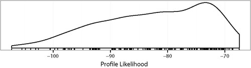
Figure 2. Profile log likelihoods of the 80 models in Example 1 that include at least three of lcavol, lweight, lbph, and svi. The base model indicates which other predictors are included. The five lines are for models that exclude either one or none of lcavol, lweight, lbph, and svi.
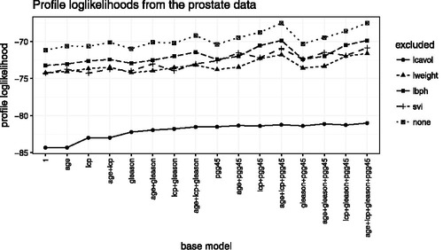
Figure 3. in the Harvard Forest. Over 100,000 data points.
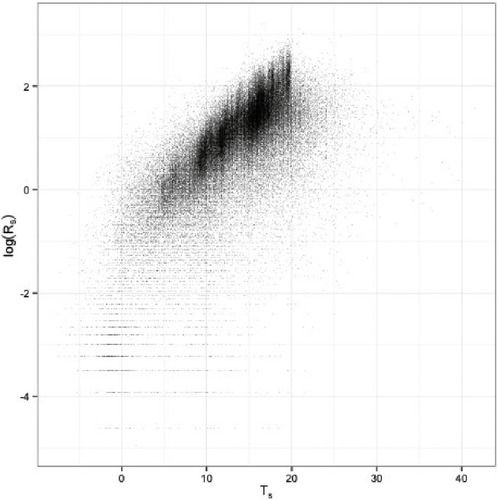
Table 2. Models and measures of fit as calculated by Wang et al. (Citation2012) in Example 2.
Figure 4. Example 4. Data generated from linear logistic model. Comparison of linear and quadratic logistic regression. (a) Jittered yi vs. xi. Small points are data. Dashed curve is the linear logistic fit. Dotted curve is the quadratic logistic fit. (b) Points are fitted values from quadratic and linear logistic regression. Line is y = x. (c) from quadratic and linear logistic regression. Line is y = x. (d) Boxplot of log-likelihood ratio
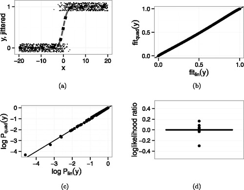
Figure 5. Example 4. Data generated from linear logistic model with one additional point ( − 20, 1). Comparison of linear and quadratic logistic regression. (a) Jittered yi vs. xi. Small points are data. Dashed curve is the linear logistic fit. Dotted curve is the quadratic logistic fit. (b) Points are fitted values from quadratic and linear logistic regression. Line is y = x. (c) from quadratic and linear logistic regression. The additional point is the one near ( − 17, −3.5). Line is y = x. (d) Boxplot of log-likelihood ratio
.
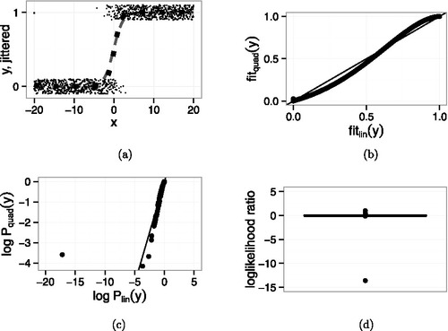
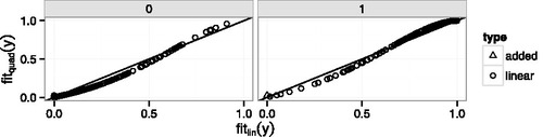
Figure 6. Fitted values from the quadratic model vs. fitted values from the linear model in Example 4. Left panel: y = 0; right panel: y = 1. Circles: points generated from the linear model. Triangle: the added point.