
Figures & data
Table 1. 2006 to 2010 American Community Survey estimates of African American median household income in a selected group of proximal tracts in Denver County, Colorado
Table 2. Geodemographic conceptual model
Figure 1. Dendrogram showing the 250 classes created via k-means and how they are combined into ten groups.
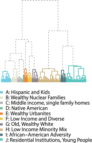
Figure 2. Average silhouette for partitions of the 250-class k-means solution. Vertical lines indicate the ten-class group level of the classification and the fifty-five-class type level of the classification.
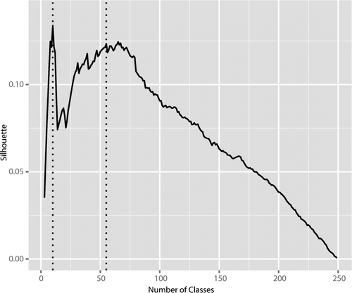
Figure 3. Summary of the ten-class group level of the classification by domain.
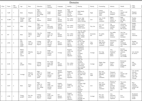
Figure 4. Group level (ten-class) map of census tracts in New York City and Chicago (maps not to scale).
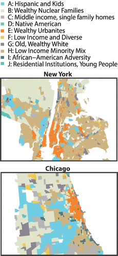
Figure 5. Group-level (ten-class) map of census tracts in the United States.
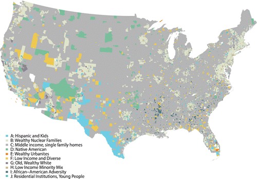
Figure 6. Variables from the population domain by group. Numbers represent the percentage of the national average for each variable in each group. For example, the top cell in Panel A indicates that in Group J the number of people with less than a high school education is 72 percent of the national average.
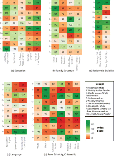
Figure 7. Variables from the economy domain by group. Numbers represent the percentage of the national average for each variable in each group. For example, in Panel B the 493 in the leftmost column indicates that the number of people without a car in Group E is 493 percent of the national average.
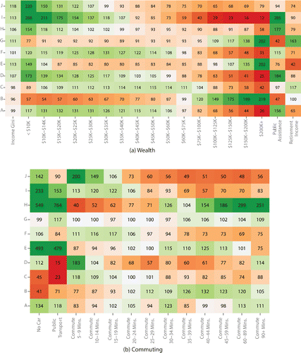
Figure 8. Housing variables form the environment domain by group.
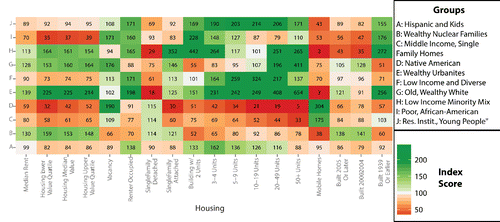
Figure 9. The type level of the classification for Group D in Arizona.
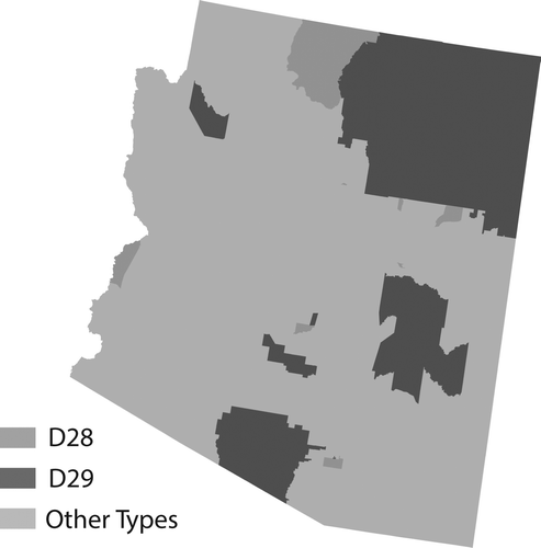
Figure 10. Population pyramids showing age distribution by gender for each group of the classification. Bars show five-year age intervals. The width of the bar denotes the amount of variation within each age category in each group. The vertical tick on each bar denotes the median for each age interval. Note the very large numbers of young people in Group J and the inverted pyramid in Group G.
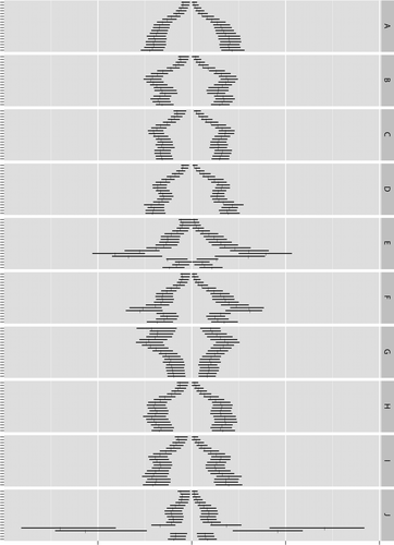
Table 3. Exogenous evaluation: Gini coefficient and index scores for Federal Election Commission profession and contribution amount
Table 4. Crime in Chicago