
Figures & data
Figure 1. Samples of two typefaces we evaluated. Eurostile (top row) and Frutiger (bottom row), illustrate their key design differences. Eurostile’s tight spacing, closed letter shapes, and highly uniform contours and proportions contrast with those of Frutiger. The at-a-glance legibility methods described here can test the performance characteristics of each. Figure adapted from Reimer et al. (Citation2014).
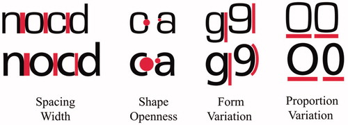
Figure 2. The eight commonly used sans serif typefaces assessed.
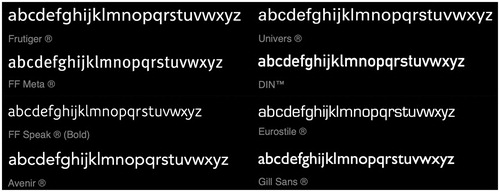
Figure 3. Legibility thresholds for the 8 typefaces under study (lower numbers indicate better legibility, and see ), in order of best to worst in the present study. Error bars represent ±1 mean-adjusted standard error. Note that Frutiger outperforms Eurosile ().
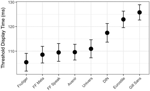
Table 1. Typeface by mean legibility threshold (in ms).
Table 2. Mixed model results.