Figures & data
Figure 1. From the top: Helvetica Neue Condensed with a height/width ratio of 1 h/0.3w and 21 units of spacing between two vertical strokes as in ‘nn’, Helvetica Neue Roman height/width ratio of 1 h/0.5w and 24 units of spacing between two vertical strokes, Helvetica Neue Extended height/width ratio of 1 h/0.6w and 23 units of spacing between two vertical strokes. Except for the variable of letter width, they all have near identical letter features.
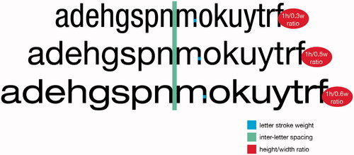
Figure 2. Mean recognition for the tested fonts. Error bars represent standard deviation. Comparisons marked with ‘*’ were significantly different (p < .05).
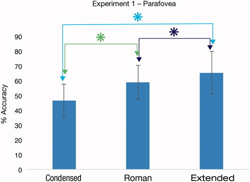
Figure 3. Mean mislocation rates for the tested fonts. Mislocation by chance is represented by the dotted line. Error bars represent standard deviation. Comparisons marked with ‘*’ were significantly different (p < .05).
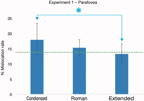
Figure 4. Mean recognition for the tested fonts. Error bars represent standard deviation. Comparisons marked with ‘*’ were significantly different (p < .05).
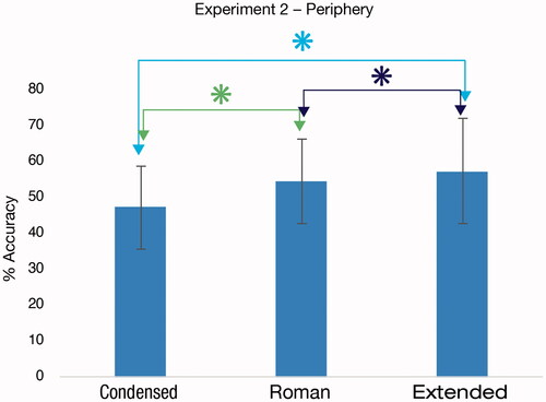
Figure 5. Mean mislocation rates for the tested fonts. Mislocation by chance is represented by the dotted line. Error bars represent standard deviation. Comparisons marked with ‘*’ were significantly different (p < .05).
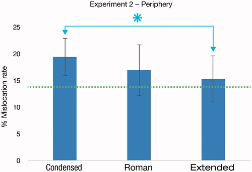
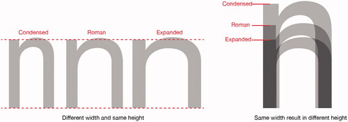
Figure 6. When the narrower fonts Helvetica Neue Condensed and Helvetica Neue Roman are proportionally magnified to have the same width as Helvetica Neue Extended, they take up more vertical space on the page.