
Figures & data
Figure 1. Heat map of disciplinary distances.
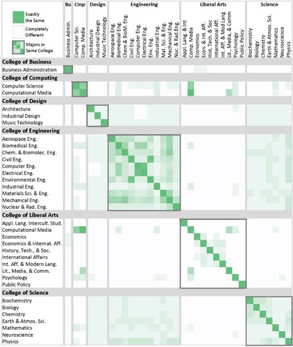
Figure 2. Visualization of cognitive distances between majors, developed in previous study. Figure adapted from (Sonnenberg-Klein, Coyle, and Saigal Citation2023) with permission.
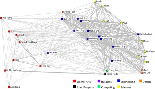
Figure 3. Distributions of two measures of interdisciplinarity: Number of majors, and Rao-Stirling diversity index: (a) Teams by Size and Number of Majors (b) Teams by Size and Diversity Index.
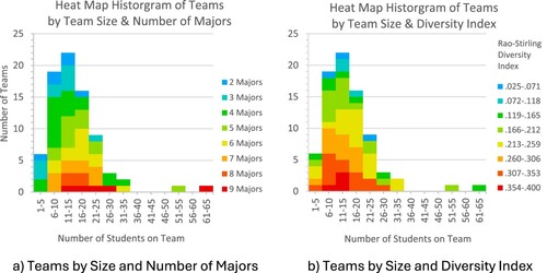
Figure 4. Diversity index by number of majors.
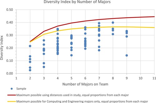
Figure 5. Diversity index by team size.
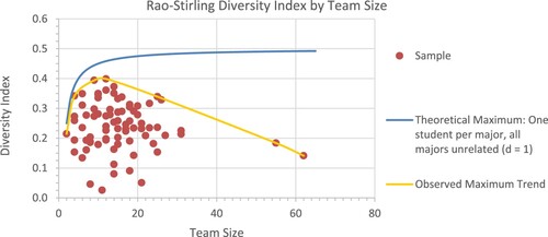
Figure 6. Rao-Stirling diversity index by team size and number of majors. Note: Number of majors on teams ranged from 2 to 9. For clarity, only three groupings are shown.
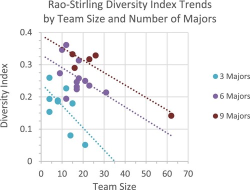
Figure 7. Overlay maps for four VIP teams, each with 7 majors: (a) Patagonia (b) Living Dynamical Systems (c) IOT in Health (d) Concussion Connect.
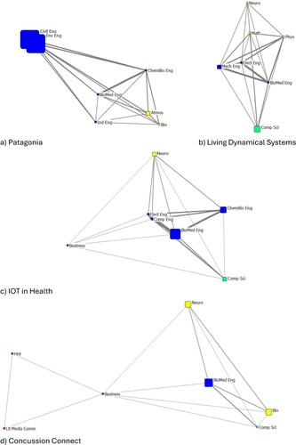
Table 1. Team composition and diversity indexes for four teams.