Figures & data
Table 1. Asset allocation in total assets for DB pension schemes in the Purple Book data set (weighted averages).
Table 2. Proportions of bond investment by DB pension schemes in the Purple Book data set (weighted averages).
Figure 1. Historical data used in the calibration of the time series model.
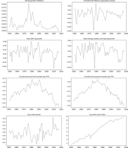
Figure 2. Set of basis functions used in the estimation of the historical mortality risk factors. With this particular choice, the risk factors ,
and
correspond to logistic survival probabilities of cohorts with age 18, 65 and 105.
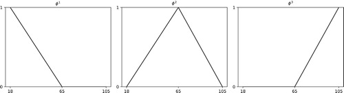
Figure 3. Historical values for the mortality risk factors in the UK. The comparison of the risk factors in the plot shows that survival probabilities decrease with increasing age () and that, in general, females are more likely to survive than males of similar age (
). The plots also show an interesting feature that is captured by the model: a decrease in the survival probabilities of young males during World War II.
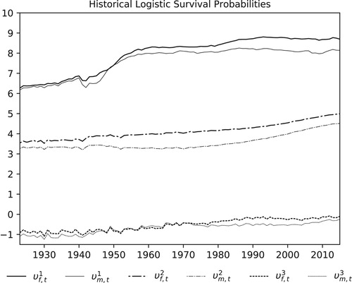
Figure 4. Comparison of historical survival ratios () with the corresponding estimated survival probabilities for females in the UK.
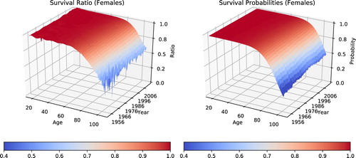
Figure 5. The pictures illustrate the matching of historical yields found in the Millennium database and in the ICE Index Platform. Yearly values from the latter were spliced with values from the first to provide the long time series necessary for the calibration of the time series model.
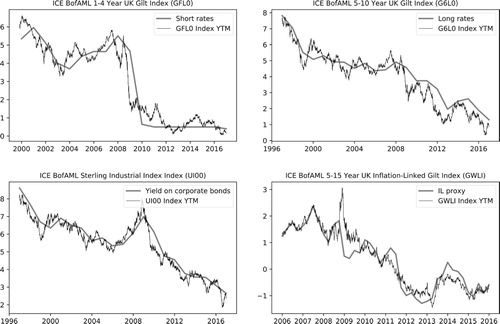
Table 3. Risk factors for the UK model
Table 4. Coefficients of the autoregression matrix A and their corresponding p-values (in parenthesis).
Table 5. Correlation coefficients and corresponding p-values (in parenthesis) for the risk factors in the time series model for UK pensions insurers.
Table 6. The adjusted  of bond return approximations.
Figure 6. Historical durations of the bond portfolios used in the UK model.
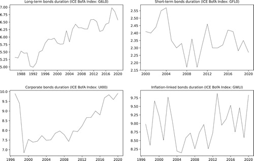
Table 7. Duration of bond portfolios, based on the end-of-year values recorded in 2019 for the ICE BofA indices mentioned in Section 5.1.
Figure 7. The four topmost pictures illustrate the historical data used in the calibration of corporate bonds. The residuals used to estimate the recovery rate are illustrated in the bottom left picture. Next to it, the QQ-plot illustrating their good adherence to the lognormal model.
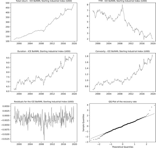
Table 8. Short-term forecasts and long-term views used in the model. Yearly percentage change values from the long-term economic determinants published by the Office for Budget Responsibility (OBR).
Table 9. Decomposition of the autoregression matrix: .
Table 10. Specification of long-term views using the vectors c of long-term means of and d of long-term means of .
Figure 8. Simulated scenarios for the economic and financial risk factors. The plots show the historical risk factors with a single-simulated scenario and the 95% and 99% confidence bands.
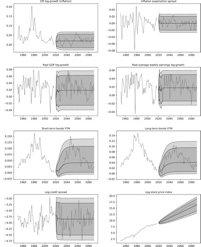
Figure 9. Simulated scenarios for the survival probabilities of the 18, 65 and 105 year-old cohorts. The plots show the historical probabilities with a single simulated scenario and the 95% and 99% confidence bands.
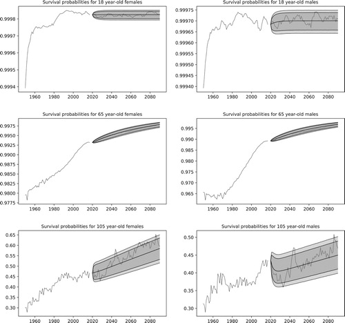
Figure 10. The picture illustrates the distribution of the asset returns for a specific year using density plots.
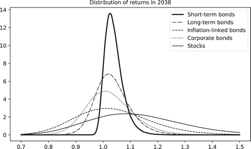
Table 11. Computation times in seconds for the simulation of risk factors.
Figure 11. Simulation of population sizes with survival probabilities from the UK model. Plots on the left show the median values of the population size with the 95% and 99% confidence bands for cohorts of 18-year-old females with sizes 10, 100 and 1000. Results for 85-year-old females are shown on the right. The top plots clearly illustrate the discrete nature of the Binomial random variables used to model the population sizes.
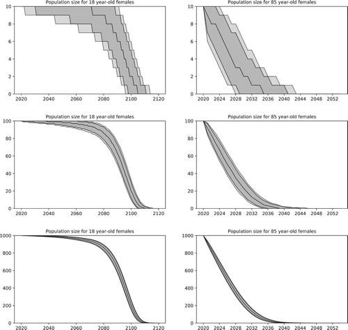
Figure 12. The picture illustrates the median, the 95% and 99% confidence bands for the survival probabilities of females in a specific year.
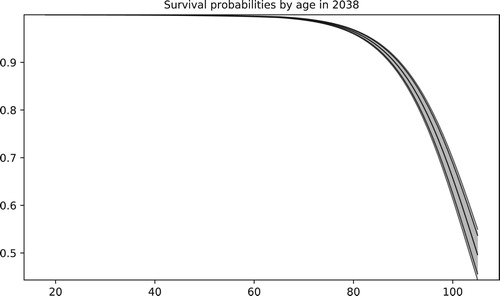
Figure 13. Benefit adjustment function adopted by the Universities Superannuation Scheme (USS). As illustrated, no adjustments are made in the case of negative inflation, and only partial adjustments are offered for high inflation.
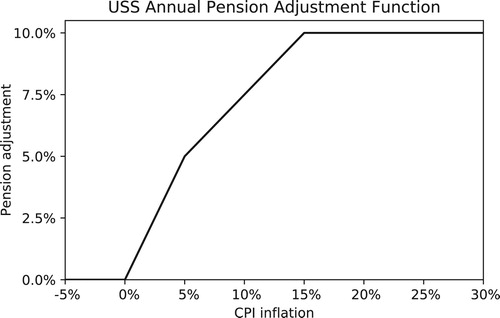
Figure 14. Illustration of the effects of indexation risk and longevity risk on pension payments expressed in real terms. In the top left, both are fixed to their median values. In the top right, inflation is fixed. Bottom left, longevity is fixed. Bottom right, both are stochastic.
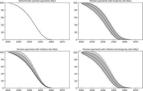
Figure 15. The leftmost picture shows the distribution of the risk factor in 2035. The center plot shows, at the end of the same year, the distribution of population sizes for a cohort that had one thousand 85 year-old females in 2020. Corresponding pension payments are shown in the rightmost plot. Dashed lines show the impact of a 10% reduction in GDP in 2024.
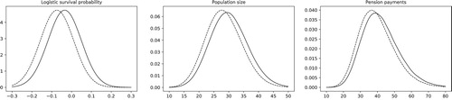
Figure 16. The plots compare simulations for the wealth of a pension fund using the 2008 and 2019 average asset allocations from Tables and . In the most recent allocation, over 60% of the funds are invested in bonds, resulting in lower risks, but also in lower gains on average, as illustrated by the median of the wealth in the plots. The 95% and 99% quantiles are also illustrated in the plots.
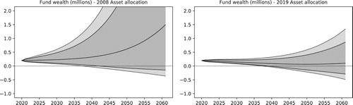
Table 12. Short-term forecasts used in the COVID-19 impact study to model the economic impact of the pandemic, based on the Office for Budget Responsibility's Coronavirus reference scenario.
Figure 17. The plots compare pension payments in real terms and remaining asset value in the pre- and post-COVID-19 settings, as described in Section 6.6. Liabilities correspond to a cohort of 100 85 year-old females. The median and the 95% and 99% quantiles are illustrated in the plots.
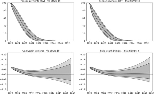
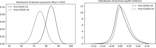
Figure 18. Kernel density plots for the distribution of pension payments in 2022 and for the terminal wealth of the DB fund under pre- and post-COVID-19 views.