Figures & data
Table 1. Maximal time in years for which a pooled annuity fund can provide a stable income with and
and varying income ratio m/M. Members are initially 70 years old and follow UK period data for both sexes from the Human Mortality Database (Citation2020).
Figure 1. Maximal time for which a pooled annuity fund can provide a stable income with and
. Pooling two subgroups with a fixed total member size of 1000 (coloured graphs) and separated subgroups with varying member sizes (dotted and black lines). The graphs show the impact of changing the initial number of poor members and the income ratio m/M (coloured graphs only). Members are initially 70 years old and follow UK period data for both sexes from the Human Mortality Database (Citation2020).
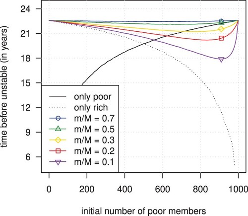
Figure 2. The value and the approximation (left) and their difference (right) of the maximal time that a pooled annuity fund can provide a stable income with and
. Pooling two subgroups with a total member size of 1000 (coloured symbols) and a single subgroup with varying member sizes (black dots). Different symbols indicate different income ratios (coloured symbols only). Members are initially 70 years old and follow UK period data for both sexes from the Human Mortality Database (Citation2020).
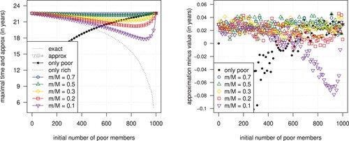
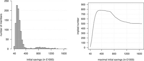
Figure 3. A random sample of 1000 members split into 50 subgroups (left) and the implied numbers of cumulative subgroups with increasingly higher savings (right).