Figures & data
Figure 1: Distribution of utilisation of public hospitals, by per capita household expenditure quintile, 1993–2008
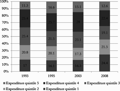
Figure 2: Distribution of utilisation of public clinics, by per capita household expenditure quintile, 1993–2008
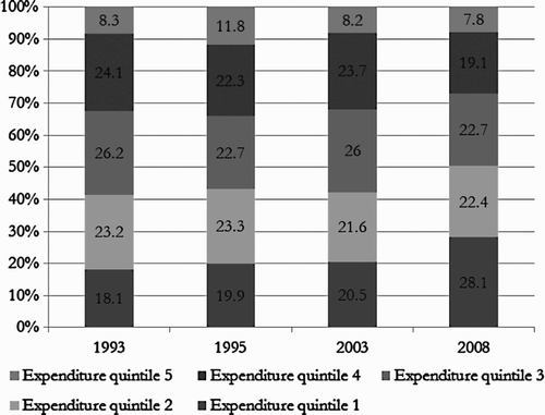
Figure 3: Share of clinics in total utilisation of public health facilities, by per capita household expenditure quintile, 1993–2008
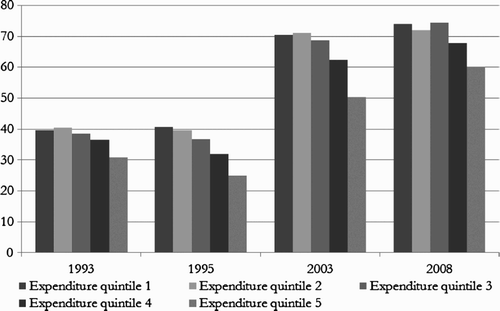
Figure 4: Share of public health care facilities in total health care utilisation, by per capita household expenditure quintile, 1993–2008
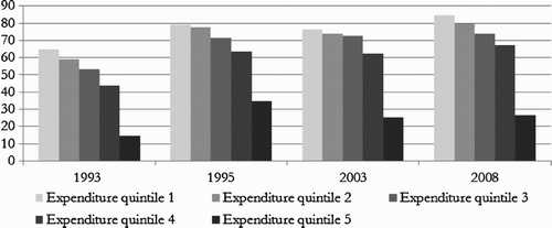
Table 1: Prevalence of reported illness and injury and proportion of those ill and injured who reported consulting a health worker over the last month by per capita household expenditure quintile, 1993–2003
Figure 5: Concentration curves for public clinics, 1995–2008
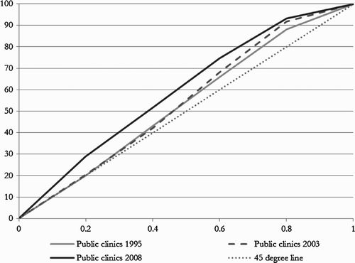
Figure 6: Concentration curves for public hospitals, 1995–2008
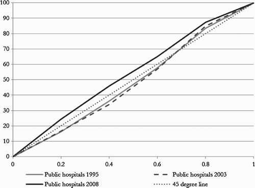
Figure 7: Concentration curves for public health spending (public clinics and public hospitals combined), 1995–2008
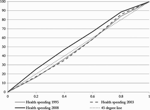
Table 2: Concentration indices for hospital and clinic spending, 1993–2008
Figure 8: Percentage of users who paid for their visit to public clinics by per capita household expenditure quintile, 1993–2008
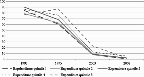
Figure 9: Percentage of users who paid for their visit to public hospitals by per capita household expenditure quintile, 1993–2008
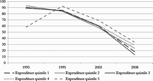
Table 3: Average affordability ratios for the uninsured by per capita household expenditure quintile, 1993–2008 (%)
Table 4: Prevalence of catastrophic expenditure for the uninsured by per capita expenditure quintiles, 1993–2008 (%)
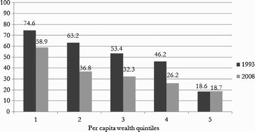
Figure 10: Private provider share of out-of-pocket expenditure by per capita household expenditure quintile, 1993 and 2008
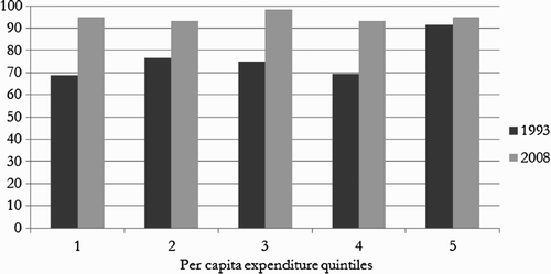
Table 5: Prohibitive cost cited as reason for not consulting a health worker, 1993–2009 (%)
Figure 11: Percentage of respondents reporting more than 30 minutes travel time to the closest public health facility, 1993 and 2008