
Figures & data
Figure 1. Flowchart of participants selected from the NHANES 2017–2018.
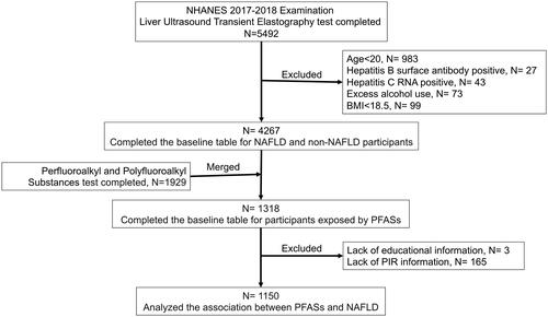
Table 1. Baseline characteristics among the healthy control and NAFLD.
Table 2. The P value of Chi-square tests conducted by PFASs quartile grouping.
Figure 2. DAG was made based on the results of baseline characteristics comparison and prior knowledge.
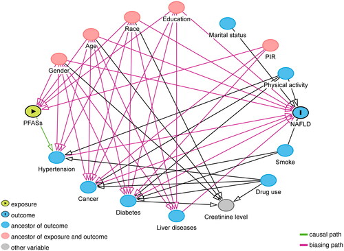
Figure 3. Effect of PFASs exposure on the risk of developing NAFLD. (A) Logistic regression result of NAFLD and single PFASs. Odds ratios (OR)1 and P1 for model 1 without adjusted; OR2 and P2 for model 2 with adjusted by gender, age, race and education and PIR. ‘#’ was the result of P for trend. (B) RCS results of NAFLD and ln (PFDeA). The median value of ln (PFDeA) was used as a reference point. Blue was the density of the ln (PFDeA) distribution.
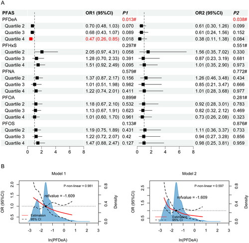
Table 3. The P value of the Kruskal-Wallis tests which were conducted by PFASs quartile grouping.
Figure 4. Correlation analysis (A) Spearman correlation coefficients between PFASs and NAFLD biomarkers. (B) Pearman correlation coefficients among PFASs logarithm. The correlation coefficient was shown in color. Blue was a positive correlation and red was a negative correlation. Color darker, circle bigger implied a stronger correlation. Demerit marks showed p > 0.05.
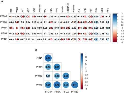
Figure 5. The association between PFASs and hepatic fibrosis-related biomarkers was analyzed by GLM. Model 1 was unadjusted; model 2 was adjusted by gender, age, race and education and PIR.
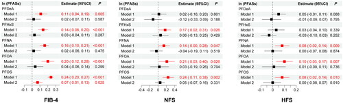
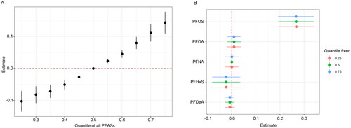
Figure 6. The overall and individual exposure effect of PFASs on FIB-4. (A) The overall effect of the PFASs mixture being fixed to different percentiles as compared to their 50 percentiles. (B) The estimated values of the individual effect were calculated by comparing the FIB-4 increase risk when a single PFAS was at its 75th percentile as compared to when that was at its 25th percentile, where all of the remaining PFAS were fixed at their 25th (red line), 50th (green line), or 75th (blue line) percentile.
Supplemental Material
Download MS Word (7.1 MB)Data availability statement
Data will be made available on request.