Figures & data
Table 1. List of institutional variables considered in the STEM success study.
Figure 1. Circular migration plot for STEM students – Cohorts 2001 to 2008. Unit is 1000 per axis tick.
Department abbreviations are as follows: Psychology PSY, Aerospace Engineering and Engineering Mechanics AE & EM, Information and Decision Systems IDS; Chemistry and Biochemistry CHEMISTRY, Computer Science CS, Mathematics and Statistics MATH, Electrical and Computer Engineering E & COMP E, Mechanical Engineering ME, Civil, Construction and Environmental Engineering C & ENVR E. The circle “crust” includes an outer, thick-lined arc that represents the total volume of students moving to and/or from these departments/majors. The crust also includes an inner, thinner-lined arc that represents the number of students entering the university in these departments/majors.
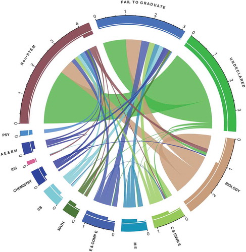
Figure 2. Important course predictor to graduation success with cutoff grade: the threshold is determined from the variable importance [Algorithm 1].
![Figure 2. Important course predictor to graduation success with cutoff grade: the threshold is determined from the variable importance [Algorithm 1].](/cms/asset/a521df35-c54b-4a33-a0d5-eeba59feeabb/uaai_a_1483121_f0002_oc.jpg)
Figure 3. Sequential analysis plot: quantification of student migration within STEM and out of STEM based on performance in a key major pre-requisite progression course (here Calculus for Biology II). Note that the course grades are from the students’ first attempt at the course.
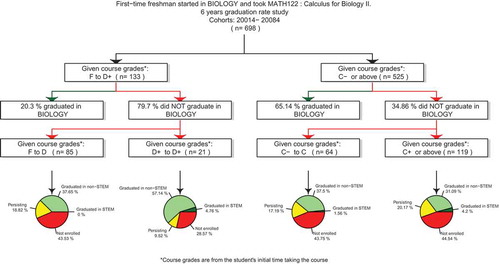
Figure 4. Success score gauge plot. Red zone represents “at risk” (), orange zone represents “warning” (10–25%), yellow zone represents “safe” (25–75%), light green zone represents “on track” (75–90%), and green zone represents “succeeding” (
). The black arrow pointer indicates the success score for the student under consideration. The grey arrow pointer presents a predicted student success score following a behavioral change, for example an intervention strategy in which the student partakes or a change in performance.
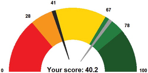
Figure 5. ROC curve using proposed analytic algorithms through random forest. Data was extracted for predicting the success of 1st, 2nd, 3rd, and 4th semester Biology students graduating in the same department within 6 years.
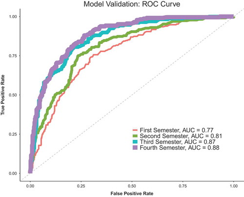
Figure 6. Conceptual representation of our analytics workflow for designing and deploying dashboards using the proposed predictive modeling outcomes.
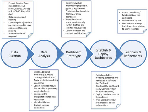
Figure 7. Conceptual representation of our workflow for prototyping and establishing the STEM student success dashboards. Though we use Tableau as our BI solution, any BI platform may be used in those workflow bubbles.
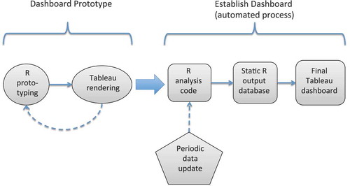
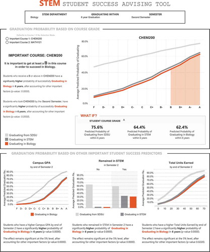
Figure 8. Screen shot of the prototype student success dashboard from R shiny dashboard.
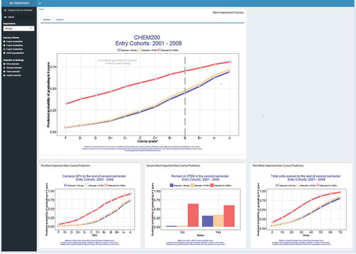
Figure 9. Screen shot of the student success dashboard from Tableau.