Figures & data
Table 1. Country aggregates of gross output, final consumption and supply and demand shock inputs.
Figure 1. Comparison of different shock propagation mechanisms.
Note: The y-axis denotes aggregate gross output levels normalized by pre-shock levels as predicted by the rationing and optimization methods. The x-axis shows the same for aggregate final consumption levels. The Random rationing diamond represents the average taken from 100 samples and the error bars indicate the interquartile range.
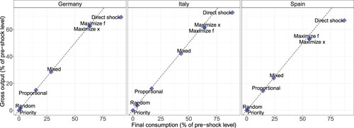
Figure 2. Economic impact as a function of shock magnitude.
Note: (a) Aggregate gross output levels as a function of scaling only demand shocks between 0 and 1 (). All methods yield the same economic impact estimates which scale linearly with
. The black horizontal line indicates that there is no adverse economic impact from supply side constraints. (b) Aggregate gross output levels as a function of scaling only supply shocks between 0 and 1 (
). The Random rationing line represents the average taken from 100 samples and the shades indicate the interquartile range. We do not distinguish further between the two maximization methods as results are almost identical.
![Figure 2. Economic impact as a function of shock magnitude.Note: (a) Aggregate gross output levels as a function of scaling only demand shocks between 0 and 1 (αS=0,αD∈[0,1]). All methods yield the same economic impact estimates which scale linearly with αS. The black horizontal line indicates that there is no adverse economic impact from supply side constraints. (b) Aggregate gross output levels as a function of scaling only supply shocks between 0 and 1 (αD=0,αS∈[0,1]). The Random rationing line represents the average taken from 100 samples and the shades indicate the interquartile range. We do not distinguish further between the two maximization methods as results are almost identical.](/cms/asset/d1065723-e8a2-4a10-a3ba-b5ea9c745265/cesr_a_1926934_f0002_oc.jpg)
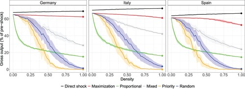
Figure 3. Economic impact as a function of network density.
Note: The network density is changed by randomly eliminating links in the IO network. Solid lines are predicted output values obtained from averaging over 50 samples and shades indicate the interquartile range. Since random rationing is stochastic by itself, we apply this algorithm 50 times to every network sample and take averages and quantiles over the full (pooled) density-specific sample. The actual data corresponds to the very right of the x-axis, as indicated by the diamonds.