Figures & data
TABLE 1. Energy related data used in this study, along with their original reported units.
Figure 1. Schematic representation of the global energy trade modeling approach.
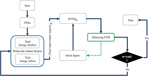
Figure 2. Structure of the Energy Trade Matrices (ETMs), based on 51 exporters and 59 importers. The gray cells indicate the countries involved in the bilateral trade. The cells with the rows and columns summations refer to the total export and import flows of each country, respectively.
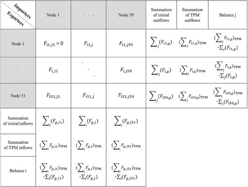
Figure 3. Performance of the RAS method with respect to the simulation of energy flux for (a) two major importers and (b) two major exporters in 2016.
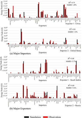
Figure 4. Projected annual fossil fuel energy trade at the global scale.
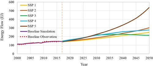
Figure 5. Visualization of the projected global fossil fuel energy trade network at the country scale under SSP1 and SSP5 in 2050 (remaining scenarios shown in Figure S11).
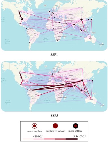
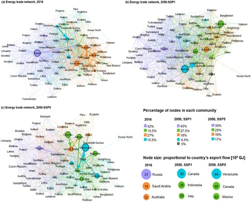
Figure 6. Networks of fossil fuel energy trade in (a) 2016 and 2050 under (b) SSP1 (green road) and (c) SSP5 (fossil fuels) scenarios. Nodes are colored according to their community evaluated with the modularity optimization algorithm. For each community, the percentage of included nodes is shown in the legend. Node size is proportional to export flow, and the top three exporters of each scenario are represented in the legend. Link color is in accordance with source nodes to highlight the energy flow sources of each community.