Figures & data
Table 1. Examples of food-related indices.
Figure 1. Conceptual framework. The FRI production sub-index of Ricketts Hein et al. (Citation2006) is used and applied to Hungary to map the IFRnj in the Hungarian counties and Budapest. The boxes show measures that can be interpreted in both the British and Hungarian contexts. A methodological refinement is suggested to account for the potential for local food production development (IFRrj). The ratio of agricultural areas expresses the biophysical limits; for convenience, in the model the ratio of non-agricultural areas in county j is used. The newly introduced PIFRI shows where rural development programme measures are expected to be the most successful in the support local food production.
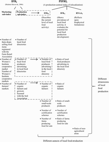
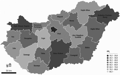
Figure 2. IFRn in the Hungarian counties and the capital (Model 1). Darker colours show better performance. Source: Own compilation, based on the calculations. Prepared with Esri ArcGIS, Adobe Illustrator. No permission was needed to publish the image.
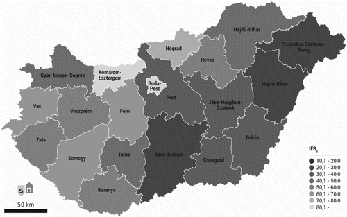
Table 2. The values of the IFRn and the composing indicators for the Hungarian counties and Budapest (Model 1). Lower IFRn indicates better performance.
Figure 3. The ratio of agricultural areas in the Hungarian counties and Budapest. Darker colours show better biophysical conditions for agricultural production. Country average: 57%. Source: own compilation, based on the data of the Central Statistical Office. Data refer to 2010. Prepared with Esri ArcGIS, Adobe Illustrator.
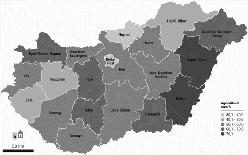
Table 3. The results of the tests on normal distributions
Figure 4. IFRr in the capital and counties of Hungary (Model 2). The index reflects the expected speed of local food production development. Darker colours show better performance (faster development). Source: Own compilation, based on the calculations. Prepared with Esri ArcGIS, Adobe Illustrator.