
Figures & data
Figure 1. Study workflow.
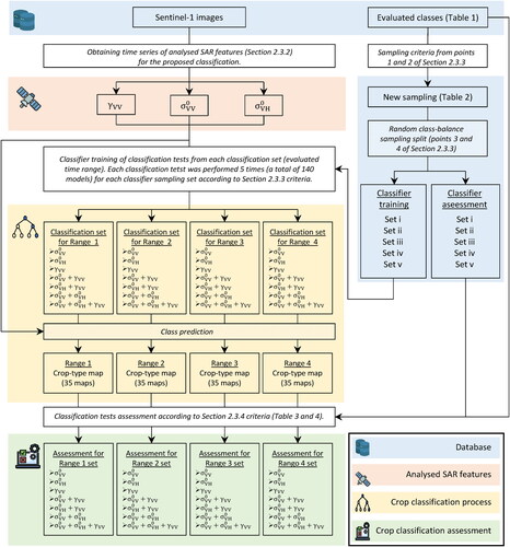
Figure 2. On the right side, in yellow, the study area location in the north of Buenos Aires province. On the left side, study area extension represented by the yellow rectangle (background: ‘color-infrared’ composite from Landsat-9 images acquired on March 27, 2022).
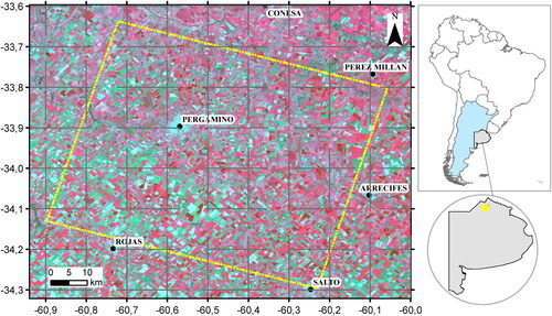
Table 1. Polygons of the classes used in the present study for both classifications training and assessment.
Table 2. Polygons corresponding to the whole dataset of evaluated classes.
Figure 3. The five upper plots correspond to the time series of backscatter coefficient of the classes at VV (magenta) and VH (green) polarization. Points represent the average values, while vertical lines represent standard deviation for all polygons of each class. For crop classes, horizontal line represents the seasonal crop calendar with the seeding period (light blue), vegetative stage (green), reproductive stage (yellow) and harvest period (brown). The lower plot corresponds to the daily precipitation data registered by the Pergamino (red) and Arrecifes (blue) stations.
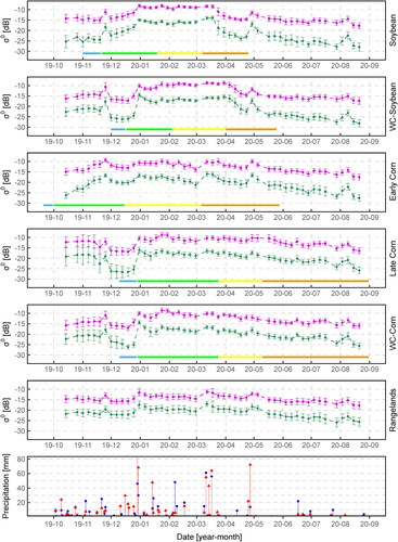
Figure 4. The five upper plots correspond to the time series of coherence of the classes at VV polarization. Points represent the average values, while vertical lines represent standard deviation for all polygons of each class. For crop classes, horizontal line represents the seasonal crop calendar with the seeding period (light blue), vegetative stage (green), reproductive stage (yellow) and harvest period (brown). The lower plot corresponds to the daily precipitation data registered by the Pergamino (red) and Arrecifes (blue) stations.
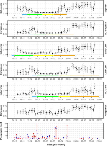
Table 3. Randomly selected polygons from the whole dataset according to the classifier training strategy (points 1 and 2 of Section 2.3.3).
Figure 5. Example of the proposed crop-type map. It corresponds to the obtained using the +
+
SAR features for Range 4 to train the classifier. Urban areas were masked out with the Global Man-made Impervious Surface (GMIS) Dataset from LANDSAT (Brown de Colstoun et al. Citation2017).
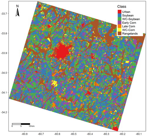
Table 4. Overall accuracy and kappa index scores corresponding to each classification test for the analysed time ranges.
Table 5. User’s and producer’s accuracy for all classification test corresponding to each evaluated classification set.