Figures & data
Table 1 Resulting values of the criterion for choosing K (cf. formulation (9) of the Supplementary Material), calculated for all network examples considered in Section 4. Entries refer to the factor of 104. The optimal value per network is highlighted in bold.
Table 2 Details about real-world networks used as application examples.
Figure 1 Exemplary stochastic block smooth graphon model with three communities. is represented as heat map on the left. A simulated network of size 500 based on this SBSGM is given on the right, with node coloring referring to the simulated Ui
’s. This network exhibits a clear community structure (global division) but also smooth transitions within the communities (local structure).
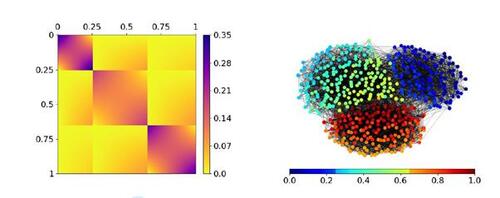
Figure 2 Disjoint univariate linear B-spline bases, colored in blue, orange, green, and red, respectively. Applying the tensor product yields the basis to construct blockwise independent B-spline functions for approaching SBSGMs. Note that this illustration shows the special case of equal community proportions.
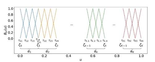
Figure 3 Adjustment of the distribution of the Ui
’s and the community boundaries. Top: Three distributions for the latent quantities which are equivalent in terms of representing the same data-generating process (under applying transformation (11) to accordingly). The solid line represents the density f(u), while the dashed line illustrates the frequency density over the communities, i.e.
. Bottom: Implementation of the adjustment in the algorithm with regard to the empirical cumulative distribution function (including the realizations of
as vertical bars at the bottom). The gray star illustrates the proportion of the two communities against the community boundary.
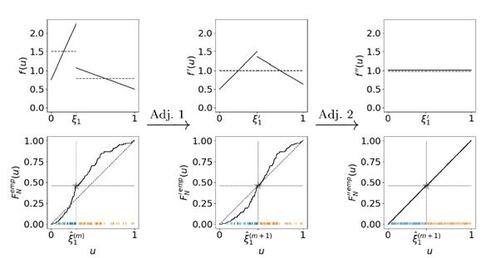
Figure 4 Estimation result for the synthetic SBSGM from Figure 1 (shown again at top left, rescaled according to the estimate’s range from 0 to 0.45). The top right plot illustrates the final estimate of , i.e. after convergence of the algorithm. The estimation is based on the simulated network of size N = 500 at the bottom left, where nodes are colored according to
. A comparison between the simulated Ui
’s and their estimates is illustrated at the bottom right.
![Figure 4 Estimation result for the synthetic SBSGM from Figure 1 (shown again at top left, rescaled according to the estimate’s range from 0 to 0.45). The top right plot illustrates the final estimate of wζ(·,·), i.e. after convergence of the algorithm. The estimation is based on the simulated network of size N = 500 at the bottom left, where nodes are colored according to Ûi∈[0,1]. A comparison between the simulated Ui ’s and their estimates is illustrated at the bottom right.](/cms/asset/4d6cf581-7cb2-4c94-a22a-a0837f50bb8e/ucgs_a_2374571_f0004.jpg)
Figure 5 Estimation results for two synthetic SBSGMs, (a) and (b). (a2) is equivalent to (a), meaning these are two different model representations (with different numbers of groups) for the same data-generating process. Corresponding estimates with number of groups adopted from the model representations above are illustrated in the lower row, denoted by ( ), (
), and (
), respectively. The estimation is based on simulated networks of size N = 500.
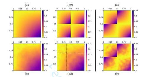
Figure 6 SBSGM estimation on the political blog network. Manually labeled political orientations (see Adamic and Glance, 2005) are illustrated in the top plot. The estimate of (in log scale) is depicted at the bottom left. The node colors in the bottom right plot represent the inferred node positions
.
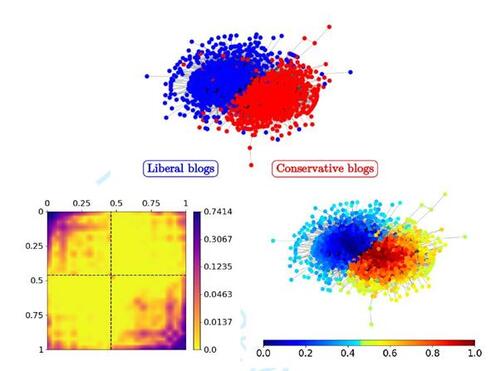
Figure 7 SBSGM estimation on the human brain functional coactivation network (top right, coloring referring to ). The estimate of
(in log scale) is depicted at the top left. The three bottom plots show the local positions of the human brain regions in anatomical space (from left to right: side, front, and top view) with coloring referring to
.
![Figure 7 SBSGM estimation on the human brain functional coactivation network (top right, coloring referring to Ûi∈[0,1]). The estimate of wζ(·,·) (in log scale) is depicted at the top left. The three bottom plots show the local positions of the human brain regions in anatomical space (from left to right: side, front, and top view) with coloring referring to Ûi∈[0,1].](/cms/asset/0b6b74d8-12b5-442b-999f-afd3a40e1e6b/ucgs_a_2374571_f0007.jpg)
Figure 8 Top plot: root-mean-square error between true underlying and inferred edge probabilities based on indicated modeling frameworks. Results refer to the simulation scenarios from Section 4.1 with simulated networks of size N = 500. Bottom row: precision-recall curves for real-world networks from Section 4.2. Predictions refer to network entries that have been randomly modified to imitate unstructured noise. Proportions of (potentially) modified entries are 10% for political blog and human brain network and 30% for military alliance network. Values given in the legend (square brackets) declare the area under the curve. Dashed purple line illustrates result under random classifier.
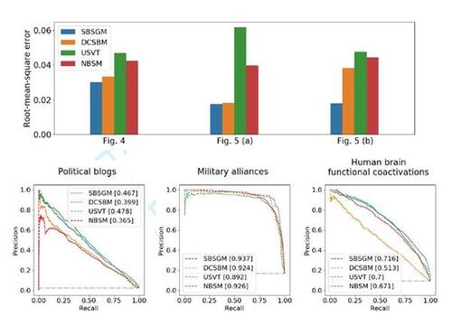
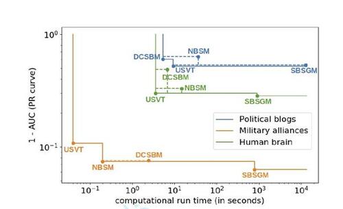
Figure 9 Pareto front with respect to accuracy and run time for all three real-world examples, cf. legend (axes in log scale). Corner points are labeled by associated methods. Dashed lines integrate results that are not part of the Pareto front. Values on the vertical axis correspond to the results depicted in the bottom row of Figure 8.