
Figures & data
Table 1. Original 26 survey items for factor analysis organized by factors (in bold).
Table 2. List of predictor variables.
Table 3. Factor loadings for the 22 items that had acceptable loadings (>.3).
Table 4. Univariate model output for geoscientist representations.
Table 5. Univariate model output for curricular choices.
Table 6. Univariate model output for learning strategies.
Table 7. Univariate model output for career pathways.
Table 8. Means, standard deviations, and ANOVA results for each factor.
Figure 1. Frequency charts for survey questions loading on the geoscientist representations factor (Q17a, b, and c). Percentage of faculty respondents selecting each response is noted above the bars.
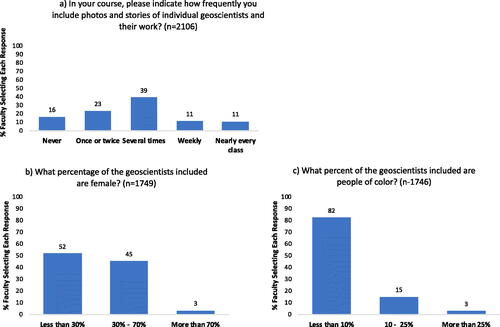
Figure 2. Frequency chart for survey questions loading on the curricular choices factor. Percentage of faculty respondents selecting “yes” for each question is noted above the bars.
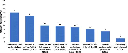
Figure 3. Frequency chart for survey questions loading on the learning strategies factor. Percentage of faculty respondents selecting “yes” for each question is noted above the bars.
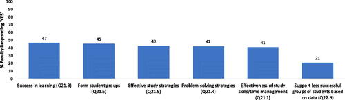
Figure 4. Frequency chart for survey questions loading on the career pathways factor. Percentage of faculty respondents selecting “yes” for each question is noted above the bars (n = 2056).
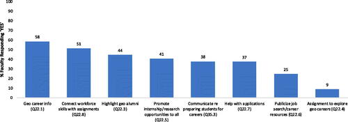
Figure 5. Radar graphs were constructed for the predictor variables using the mean scores from normalized to a common score range of 0–100. Note that plots shown are constructed with axes from 0 (center) up to 50 (outer), given that normalized scores were at or below 50. The four variables plotted are the same on all graphs. The four corners correspond to the four factors: geoscience representations (GR, top), curricular choices (CC, right), learning strategies (LS, bottom), and career pathways (CP, left). Predictor variables plot further out on the radar graphs when they more strongly correspond with reported use of practices that support inclusive learning environments.
For example, in the radar graph, the three categories of teaching style—active learning, active lecture, and traditional lecture—are plotted against the four factors. Overall, the larger the area outlined, the more faculty with that teaching style report using practices that are connected with supporting diversity and inclusion; such that we can interpret that these practices were generally more frequently reported for courses with active learning than for those dominated by traditional lecture. In addition, we can look at how each of the teaching styles plots with regards to the four factors. The three teaching styles plot close together at the apex of the graph, so we can interpret that there is relatively little difference across the teaching style categories for use of geoscience representation. In contrast, at the bottom of the graph, active learning plots furthest out on the radar graph; thus, we can interpret that active learning is more of a predictor for incorporation of learning strategies than active lecture or traditional lecture.
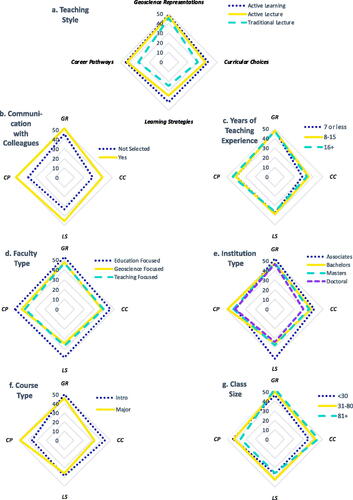
Table 9. Summary of predictors for each outcome variables.