Figures & data
Figure 1. Atlanta metropolitan statistical area with counties, major highways, and monitoring stations studied (monitors: filled triangle, AQS CO station ROS; filled star, AQS NOx station GT; open star, AQS NOx station TUC; open square, SEARCH CO and NOx station JST).
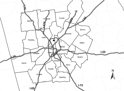
Figure 2. MOVES fraction of annual total VMT in each month of the year.
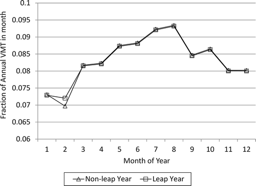
Table 1. Summary of on-road inventory development methods by year
Table 2. Overview of concentration and emission data in trend analyses
Table 3. Atlanta MOVES-based on-road emissions in January and July 1995–2009
Table 4. NOx emission standards for Tier 2* and pre-Tier 2** (National Low Emission Vehicle program and Tier 1)
Table 5. Relative fraction of the nationwide light-duty vehicle fleet that complies with Tier 2 emission standards in 1995, 2005, and 2010
Table 6. Annual average on-road emissions in Fulton County estimated from MOBILE6 and MOVES
Figure 3. Trend in annual NOx on-road emissions in Atlanta during 1995–2009.
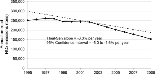
Figure 4. Trend in annual VOC on-road emissions in Atlanta during 1995–2009.
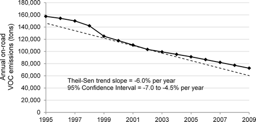
Figure 5. Trend in annual CO on-road emissions in Atlanta during 1995–2009.
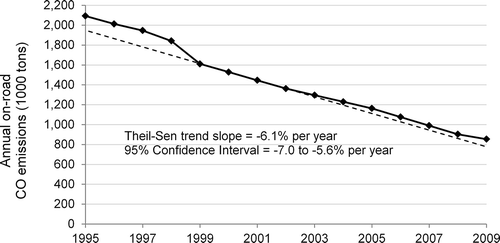
Figure 6. Trend in annual average NOx concentrations at the AQS site GT during 1998–2009.
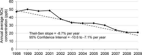
Figure 7. Trend in annual average NOx concentrations at the AQS site TUC during 1995–2009.
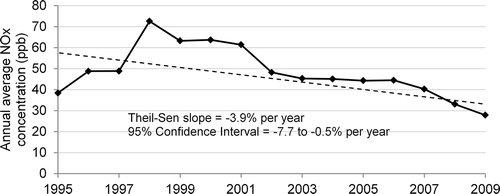
Figure 8. Trend in annual average NOx concentrations at the SEARCH site JST during 2000–2009.
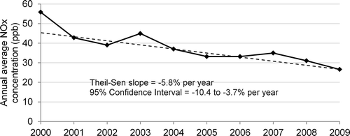
Figure 9. Trend in annual second highest 8-hr average CO concentrations at the AQS site ROS during 1995–2009.
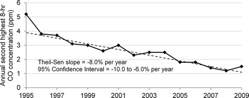
Figure 10. Trend in annual second highest 8-hr average CO concentrations at the SEARCH site JST during 1999–2009.
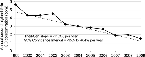
Table 7. Correlation between on-road emissions and air concentrations in Atlanta
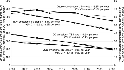
Figure 11. Trends in summertime O3 concentrations and on-road NOx, VOC, and CO emissions in Atlanta during 2001–2009.