Figures & data
Rebecca Klemm

Richard B. Schlesinger

Thomas J. Grahame
Table 1. Global BC emission estimates by region and by sector in 2010 based on RCP 4.5 (unit: Gg/year)
Figure 1. Risk of arteriosclerotic hearth disease mortality in tunnel officers relative to bridge officers, as a function of age and calendar year, after introduction of ventilation in 1970. Adapted from Stern et al. (Citation1988). © Oxford University Press. Reproduced by permission of Oxford University Press. Permission to reuse must be obtained from the rightsholder.
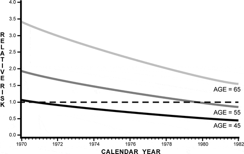
Figure 2. Incidence rate ratios and 95% confidence intervals for the association between an interquartile range increase in particle constituents and ischemic stroke onset in the following 24 hr among 1060 patients hospitalized for acute ischemic stroke who resided in the Boston, MA, metropolitan area, 2003–2008. The results are presented for models with parameters for constituent concentration (a), constituent concentration adjusted for total particulate matter (b), and constituent residuals (c). © Oxford University Press. Reproduced by permission of Oxford University Press. Permission to reuse must be obtained from the rightsholder.
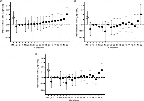
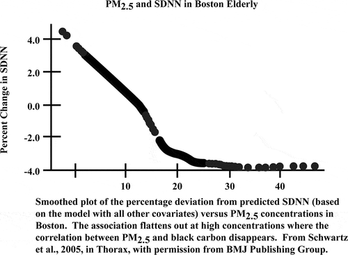
Figure 3. Smoothed plot of the percentage deviation from predicted SDNN (based on the model with all other covariates) versus PM2.5 concentrations in Boston. The association flattens out at high concentrations where the correlation between PM2.5 and black carbon disappears. From Schwartz et al. (2005). © BMJ Publishing Group Ltd. Reproduced by permission of BMJ Publishing Group Ltd. Permission to reuse must be obtained from the rightsholder.