
Figures & data
J.R. Brook

Figure 1. Northern Alberta showing the Athabasca River, the Peace River, the Peace-Athabasca Delta (PAD), and the oil sands deposits.
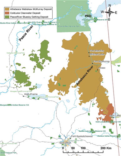
Figure 2. Long-term trend in PACs in lake sediment cores sampled from the five to six lakes proximate to major oil sands operations. Data represented as standardized values (Z scores). Upper graph (A) shows a change in visible reflectance spectroscopy (VRS) of chlorophyll (indicative of productivity). Middle graph (B) shows the total polycyclic aromatic hydrocarbon (PAH) concentrations, and the bottom graph (C) shows the total dibenzothiophene (DBT) concentrations. The lines are from two segmented, piecewise linear regression models to identify the timings of breakpoints (from Kurek et al. Citation2013).
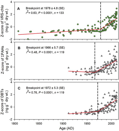
Figure 3. Increase in average column nitrogen dioxide (NO2) over the oil sands region between 2005–2007 and 2008–2010 observed from the “OMI satellite.” Upper right images show spatial patterns in column NO2, and the lower accompanying images show the growth in development between 2005 and 2009 from Landsat. The background image is 2005–2010 average column NO2 from OMI over northwestern United States and western Canada.
(adapted from McLinden et al. Citation2012)
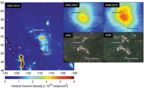
Figure 4. Sources of emission data for criteria air contaminants from the oil sands facilities. Results are summarized from the Alberta Environment Sustainable Resource Development (AESRD; now part of Alberta Environment and Parks) industrial survey on quantification of criteria air contaminant emissions from nonconventional oil and gas sectors (JOSM Citation2016).
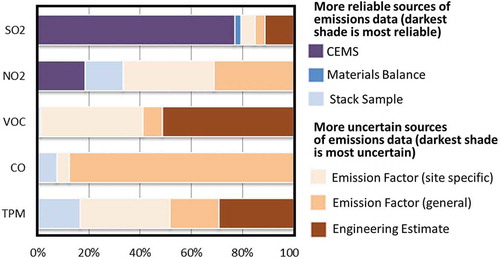
Figure 5. Interpolated observations of PM2.5 obtained from the box aircraft flight around the Syncrude Mildred Lake (SML) facility during flight F12 on August 24, 2013. The arrows show the mean wind direction at different flight altitudes corresponding to the maximum plume concentrations on the box walls. Plumes for PM2.5 can be seen moving northward away from the facility, and there appears to be multiple sources related to the plants and surface mining activities.
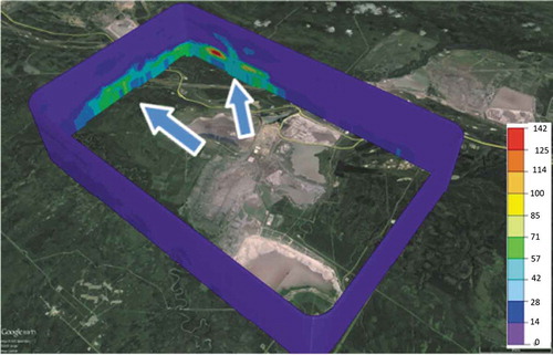
Figure 6. Comparison of 2013 emission rates for the individual species reported to the Canadian National Pollutant Release Inventory (NPRI) with the measurement-based emission rates for the same species. Each dot represents a reported species under either Part 1 or Part 5 of the NPRI reporting requirements. The horizontal bars represent the uncertainty range of the measurement-based emission rates (Li et al. Citation2017).
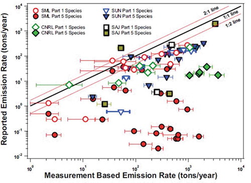
Figure 7. Comparison of PM2.5 emissions between base case annual emissions obtained from all available bottom-up emission inventory information and the aircraft-observation-based (top-down) estimates for the two summer months (August and September 2013) for the six oil sands mining facilities (Zhang et al. Citation2018).
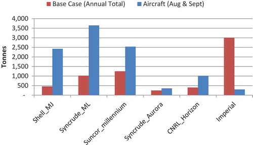
Figure 8. Organic aerosol (OM) observations at varying distances and times downwind from the main oil sands surface mining region (S). The aircraft flew at multiple heights perpendicular to the wind direction to capture the complete plume as it dispersed and transformed. Clear increases in OM after the first transect (A) can be seen by more red, yellow, and green colors in B, C, and D. The yellow text indicates estimates of the amount of secondary organic aerosol (SOA) formed between the separate transects (Liggio et al. Citation2016).
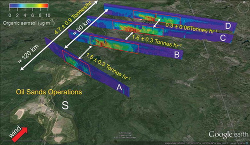
Figure 9. Comparison of the observed and model histograms of VOC categories simulated by the GEM-MACH model. The first column is from aircraft observations obtained from flights during two summer months (August and September 2013). The second column is from GEM-MACH using the available bottom-up emission inventory information for VOCs and organic aerosol. The third column is model estimates using revised VOC emissions obtained from the aircraft-observation-based (top-down) emission estimates (Li et al. Citation2017). The 99th percentile values for the different VOC groups and total organic aerosol are displayed in each graph (Stroud et al. Citation2018).
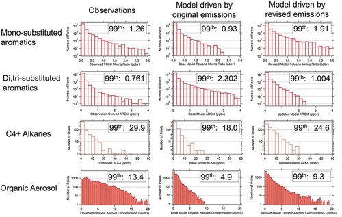
Figure 10. Histogram of surface PM2.5 using Wood Buffalo Environmental Association (WBEA) surface monitoring data (blue), and the 2-bin (red) and 12-bin (purple) configurations of the GEM-MACH model (Akingunola et al. Citation2018).
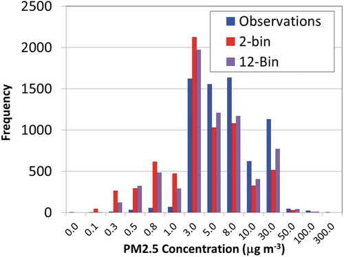
Figure 11. Predicted terrestrial ecosystem critical load exceedances with respect to Sdep + Ndep (deposition), using (a) NEG-ECP (Citation2001) and (b) CLRTAP (Citation2017) methodologies (eq ha−1 yr−1). (from Makar et al., Citation2018). Lower left of each panel: percentage of the entire critical load data area which is in exceedance, and the total area in exceedance, in km2. Circled region: 140 km radius circle around the Athabasca oil sands.
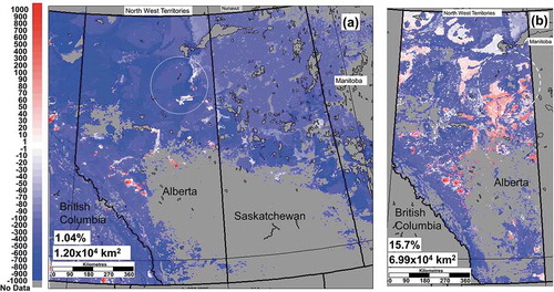
Figure 12. (a) Predicted lake ecosystem critical load exceedances with respect to Sdep. GEM-MACH Sdep scaled using precipitation deposition observations and NEG-ECP (Citation2001) methodology (eq ha−1 yr−1). (b) Predicted aquatic ecosystem critical load exceedances with respect to Sdep, corrected to match precipitation observations, CLRTAP (Citation2017) methodology (eq ha−1 yr−1). (c) Predicted aquatic ecosystem critical load exceedances with respect to Sdep +Ndep, corrected to match precipitation observations (eq ha−1 yr−1) (Makar et al. Citation2018).
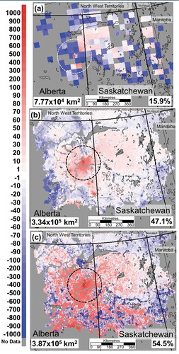
Figure 13. (a) Emission sources to air for PAHs in the oil sands region derived from the JOSM emission database (Qiu et al. Citation2018). (b) Inset map of western Canada showing the Athabasca oil sands region. (c) Zoomed-in map of emissions over the surface-mineable area. Line sources include transportation emissions. Area sources include tailings pond, mine face, mine fleet, community heating, airport, and traffic emissions. Note: oil sands region boundaries are based on 2009 data (Harner et al. Citation2018).
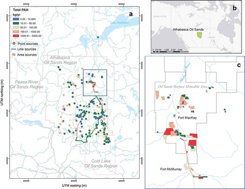
Figure 14. Winter 2011, 2012, 2013 and 2014 snowpack total PAC loadings (mg/m2) versus distance (0–25 km) from site AR6, located on the Athabasca River near the Suncor and Syncrude upgraders and roughly in the centre of the major oil sands industrial area (Manzano et al. 2016).
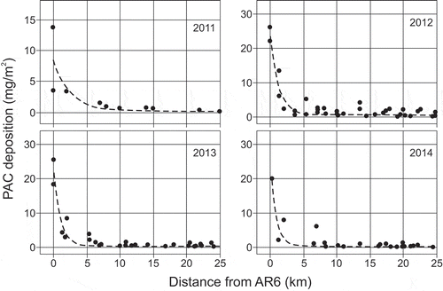
Figure 15. Total mass of the sum of PAHs deposited with distance from the oil sands operations. Case 1 (dotted line) uses the data from only the north and south transect sites, case 2 (dashed line) uses data from only the west and east transect sites, and case 3 (solid line) used data from all transect sites (Cho et al. Citation2014; Harner et al. Citation2018).
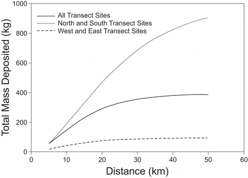
Figure 16. Deposition of THg (left) and MeHg (right) to the Athabasca oil sands region in winter 2012. Contours of THg and MeHg loads (ng m-2) were produced through Kriging of the measured values shown by the colored circles (Kirk et al. Citation2014).
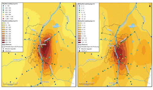
Figure 17. Mean annual (2012–2014) concentrations of dissolved arsenic (diss As), dissolved selenium (diss Se), and total vanadium (total V) at upstream (U) and downstream (D) sites on three Athabasca River tributaries (Ells, Muskeg, Steepbank). Significant differences (P < 0.05) are identified (*) between upstream and downstream sites on the same river (Ells, Muskeg, or Steepbank) or the three rivers overall (Chambers et al. Citation2018).
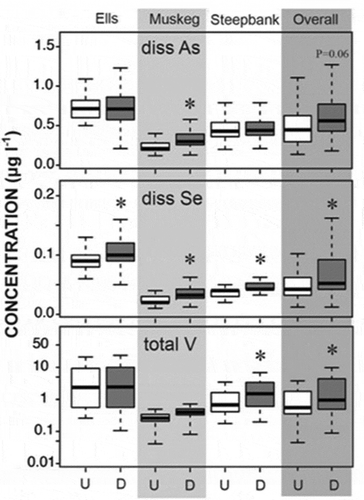
Figure 18. Muskeg River watershed showing: (a) the three aggregate study sites: MU7, situated up stream of development; MU4, situated just downstream of development and; MU1 (near the river mouth), situated downstream of development as well as incisement of the McMurray formation; (b) concentrations of dissolved As, dissolved Se and total V at the upstream site (MU7) and two downstream sites sampled prior to development; (c) average daily loads (kb/day) of dissolved As, dissolved Se and total V at the downstream site (MU1), with the stage of mining operations identified for the period of record; (d) annual loads (2012-14) only) of dissolved As, dissolved Se and total V at upstream (MU7) and downstream (MU1) sites. (Chambers et al., 2018).
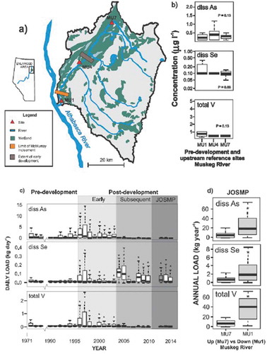
Figure 19. Concentration of C4-phenanthrenes/anthracenes (ng/L) from 2013 to 2015 at seven Athabasca River main stem sites (M0 through M9), tributaries, and wetlands in the Peace-Athabasca Delta (PAD) and the Peace and Slave Rivers (Glozier et al. Citation2018).
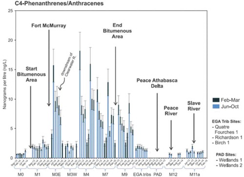
Figure 20. Polycyclic aromatic compounds (PACs) levels in female slimy sculpin collected from the Steepbank River during the fall of 2012–2013. Sites represent the Steepbank lower site (lower and RAMP lower: same site), Steepbank mid site (MC Mid), Steepbank upper site (MC Upper), and a site further upstream (RAMP Upper). Values represent the mean ± SE. Parent PAHs: pink; alkylated PAHs: green; total PAHs: blue. (Reproduced from Culp et al. Citation2018b.)
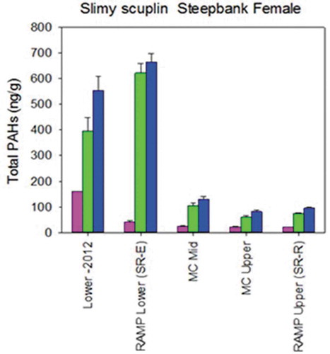
Table 1. JOSM Wildlife Contaminants and Toxicology Component sentinel species.
Figure 21. (A) ∑PACs detected in SPMDs (ng SPMD−1) deployed in the Athabasca oil sands region (AOSR). Field blank corrected. Bars represent the mean, with error bars representing the standard error of the mean from duplicate (Gateway 2014, Hat-S5) and triplicate SPMD deployments. Wetlands study sites are arranged on the x-axis from nearest to furthest from oil sands upgraders. (B) ∑PACs accumulated in SPMDs (ng SPMD−1) deployed in 2013 and 2014 as a negative exponential relationship with distance from oil sands industrial development (r2 = 0.89). PAC values are field blank corrected; error bars represent the standard error of the mean of detected PAC analytes. Note: Gateway wetland was not included in this analysis because it is adjacent to a reclaimed overburden pile. (C) ∑PACs accumulated in SPMDs represented as Cfree (pg L−1) deployed in 2013 and 2014 as a negative exponential relationship with distance to upgraders (r2 = 0.66). As noted above, Gateway wetland is not included in this analysis (Mundy et al. Citation2018).
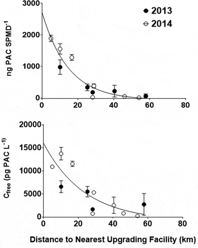
Figure 22. The concentrations of the six major PAHs measured in nestling tree swallows (ng/g wet weight). Concentrations were similar between the reference birds (REF1, REF2), and significantly higher (P ≤ 0.05) in the birds from the oil sands mining–related sites (OS1, OS2) in the Athabasca oil sands region (Fernie et al. Citation2018a).
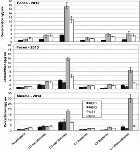
Figure 23. Geometric mean (± 95% confidence intervals) total mercury (THg) concentrations in gull eggs collected from three regions: south (<58°N, sites 1–5), downstream of the Athabasca River (58.9°N–59.4°N, sites 6–8), and north (>59°N, sites 9–12). Site numbers are shown in . (a) Regional means based on non-normalized THg data. (b) Regional means based on THg data normalized for trophic position (δ15NBulkPhe) and species. Letters above means indicate statistical differences (means with the same letter are not different). Phe = phenylalanine (Dolgova et al. Citation2018b).
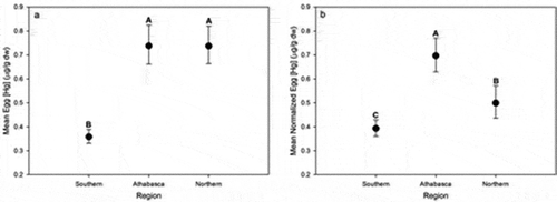
Table 2. Criteria supporting use of the tree swallow as an indicator of OS air pollution impacts.