Figures & data
Figure 1. (a) Visible satellite imagery from the VIIRS instrument aboard Suomi-NPP and fire hot spot detections (red) from the VIIRS instrument aboard the Suomi-NPP satellite for October 9, 2017. The image is downloaded from NASA Worldview website. (b) Fire perimeters of the Atlas, Tubbs, Nuns, Redwood Valley, and Pocket wildfires (red). Other prescribed fires and wildfires occurring during the Oct 8–20, 2017 time period are shown in blue. Fire perimeters are from the GEOMAC system and hot spot locations are from the MODIS and VIIRS instruments aboard the Terra, Aqua and SUOMI-NPP satellites
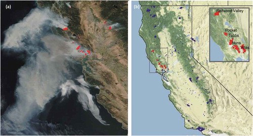
Figure 2. Locations of PM2.5 air quality monitors. Circles are permanent monitors from the EPA AQS System. Triangles are temporary monitors deployed for wildfires. The circles and triangles are color-coded by the Air Quality Index by the maximum measured 24-hr average PM2.5 value during the October 6–20, 2017 time period
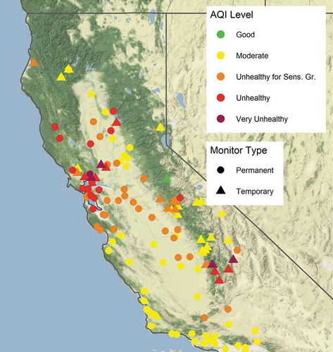
Table 1. WRF-CMAQ model simulation summary
Table 2. Data fusion and machine learning approaches
Figure 3. Illustration of the components involved in data fusion. (a) Surface PM2.5 monitoring data from EPA AQS and (b) MODIS AOD merged to create (c) a surface of PM2.5 concentrations on a 3-km grid for October 9, 2017
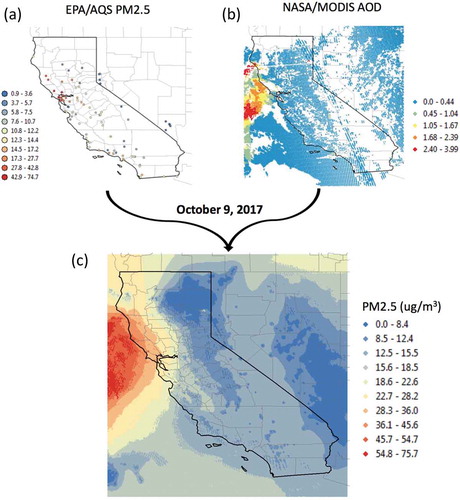
Table 3. Definitions of quantitative analysis metrics. M = modeled data. O = observed data
Figure 4. Hourly PM2.5 emissions from wildfires and prescribed fires in California, October 8–20, 2017. Black line (Baseline): diurnal profile of the emissions from the five Wine Country wildfires, calculated using BSF and allocated hourly based on the default profile in CMAQ. Dashed line (GTP): hourly emissions from the five Wine Country wildfires, calculated using BSF and allocated hourly based on GOES-16 FDC data. Gray line (Other Fires): hourly emissions from all other fires, calculated using BSF and allocated hourly based on the default profile in CMAQ
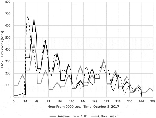
Figure 5. Panel of visible satellite imagery and WRF-CMAQ runs at 11:00 am PDT October 9, 2017. (a) Visible GOES-16 satellite imagery and surface 24-hr average PM2.5 concentrations (circles) from EPA AirNowTech color-coded by air quality index (Figure: NOAA AerosolWatch) (b) the Baseline total column PM2.5, (c) the Baseline surface 1-hr average PM2.5 concentration, and (d) the GTP surface 1-hr average PM2.5 concentrations (same scale of PM2.5 concentrations as in 5c)
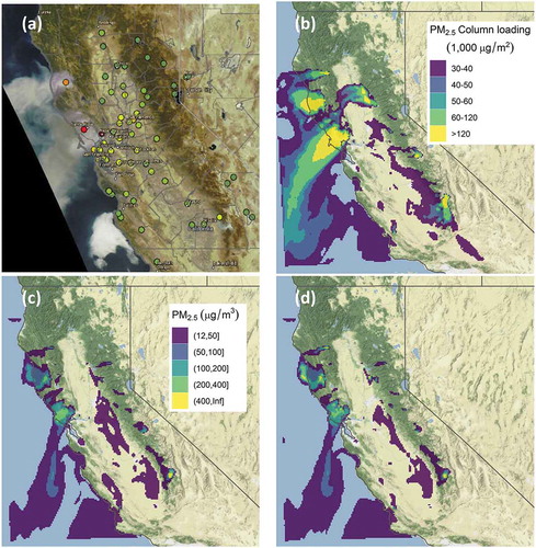
Figure 6. (a) Locations of PM2.5 monitors grouped by region. (b) Time series comparison of measured and modeled 24-hr average PM2.5 concentrations by region. Black lines: observations; colored lines: WRF-CMAQ model simulations (NoFires, Baseline, and GTP), data fusion (DF), and three machine-learning analyses (GB, MLR, and RF). See key at top
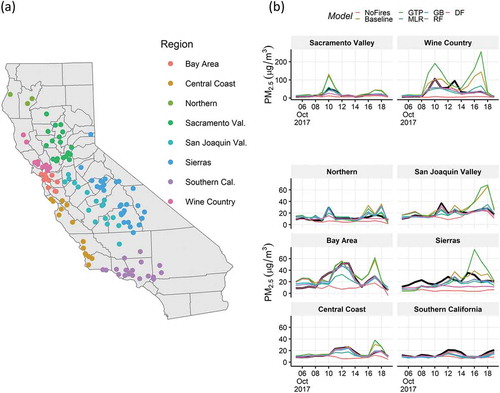
Table 4. Permanent monitor location analysis. Numbers in bold and italics are the best and second-best model performer respectively. 1179 data points (mean and standard deviation) or data pairs (other metrics) for all cases except in the DF case, where there are 1327 data points/pairs
Table 5. Temporary monitor location analysis. Numbers in bold and italics are the best and second-best model performer respectively. 406 data points (mean and standard deviation) or data pairs (other metrics) for all cases
Figure 7. Comparison of measured (x-axis) and modeled (y-axis) 24-hr average PM2.5 concentrations at all monitoring locations. Red circles: permanent monitors; blue circles: temporary monitors. The top panels are the three WRF-CMAQ modeling results and the four bottom panels are the data fusion (DF) and machine learning (MLR, GB, and RF) results
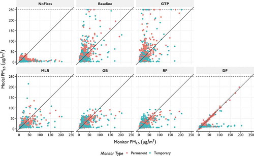
Figure 8. Daily model performance at the permanent (red) and temporary (blue) monitor locations in terms of (a) root mean square error (RMSE) and (b) mean bias. Vertical blue lines indicate October 8, 2017, the start of the wildfires
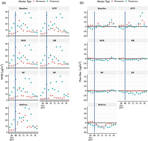
Figure 9. PM2.5 bias by Air Quality Index (AQI) category. The numbers at the bottom of each panel are the number of model-monitor pairs in the AQI category
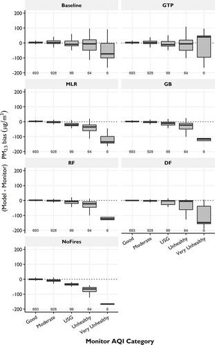
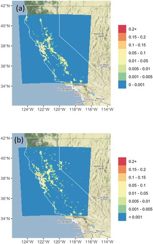
Figure 10. Multiple-cause mortality attributable to PM2.5 exposure using a relative risk of 1.1% (95% CI: 0, 0.26%) per 10 μg/m3 increase of surface PM2.5 concentration (Johnston et al. Citation2012). (a) Mortality related to PM2.5 exposure from the NoFires case and (b) the additional mortality due to smoke from the wildland fires (the five Wine Country wildfires and other smaller wildland fires) from the RF case