
Figures & data
Figure 1. Relative union membership rates by gender in 14 countries. Own elaboration. Data: ESS (Citation2018).
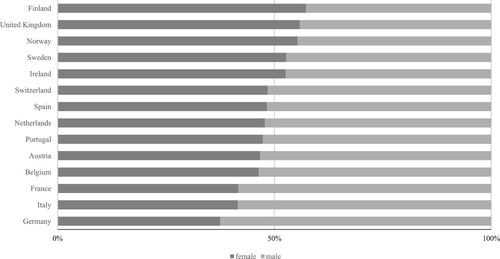
Table 1. Centralization, routine involvement in policy-making and female-to-male membership ratios by country (N = 20) and welfare cluster across different periods (Visser, Citation2019).
Figure 2. Cartesian graph mapping countries according to leaves generosity and female-to-male union density odds ratio (pooled averages 1980–2010). Black solid lines represent median values. Different dots indicate welfare regime families (Nordic; Liberal; Continental; Mediterranean).
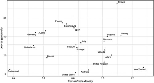
Figure 3. Scatterplots of countries’ leaves generosity and female/male union density ratios in different corporatist contexts (‘low’ vs. ‘high’ levels of routine involvement of trade unions in policy-making; pooled averages 1980-2010). Black solid lines indicate the best fit using OLS. ‘High’: above the median value of ‘routine involvement in policy-making’; ‘low’: below median.
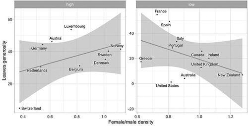
Figure 4. Scatterplot of leaves generosity and union centralization (pooled averages 1980–2010). The black solid line indicates the best fit using OLS.
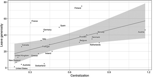
Table 2. Regression results from fixed-effects designs, including lagged dependent variables and country-clustered robust standard errors (in parentheses).