Figures & data
Table 1. Locations and details for the ten deflation patches
Figure 1. Map showing the locations of the study sites near Kangerlussuaq, Greenland. TN = Town, SL = Sugarloaf, LL = Long Lake, IL = Inland. For coordinates of study sites, see . Background is a Landsat-7 image from 2000, courtesy USGS
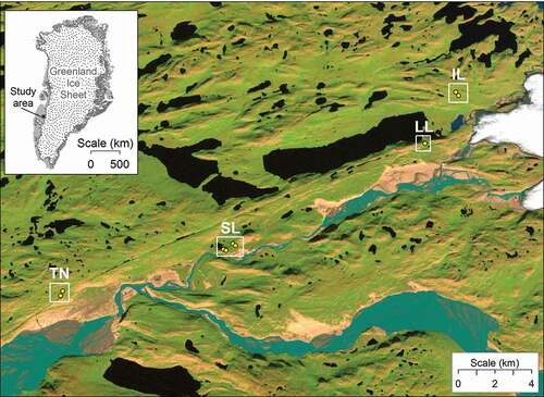
Figure 2. Four terrestrial photographs of soil deflation patch LLGRID5. Note the scarp, visible in all photos. For scale, the ground control mat is roughly 38 × 44 cm. Photos taken June 24, 2014
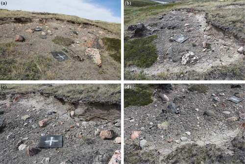
Figure 3. Establishment of a local coordinate system for deflation patch LLGRID5. Top: Textured model of patch with camera locations superimposed in blue; distances among three control points in white. Bottom: Resulting coordinate system with origin at point A and x axis along segment AB
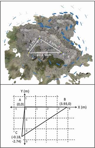
Table 2. Tie points and registration error between the 2014 and 2016 models for each site
Table 3. Significance thresholds for scarp and center zones for each patch. The significance threshold was calculated in M3C2 using the registration error unique to each patch and the local surface roughness
Table 4. Percentages of points experiencing significant positive and negative change for each zone at all deflation patches. Averages across sites are reported as mean ± standard error
Figure 4. Results of M3C2 change detection for the scarp and center zones from two deflation patches, ILSCARP18 (A, C, E, G), and LLGRID6 (B, D, F, H). From top to bottom, the rows show (1) the shapes of the scarp and center zones superimposed on the 2014 point clouds (A–B), (2) the spatial distribution of significant change in green (C–D), (3) the magnitude of change between the 2014 and 2016 point clouds (E–F), and (4) histograms of measured change for the scarp (black) and center (gray) zones (G–H)
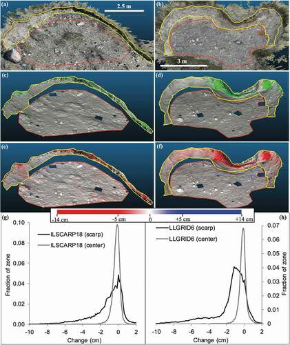
Table 5. Magnitude of change detected for scarp and center zones for all deflation patches. For each zone, we report the mean negative change, the mean positive change, the mean for all points, and the standard deviation for all points. Asterisks mark mean values that exceed the significance threshold reported in . Averages across patches are reported as mean ± standard error
Figure 5. Examples of negative and positive change along two scarps, LLGRID6 (A, C, E) and ILGRID1 (B, D, F). From top to bottom, the rows show (1) the 2014 point clouds, with the locations of the cross-sections in white (A–B); (2) the magnitude of change between the 2014 and 2016 point clouds (C, D); and (3) cross-sections through the 2014 (green) and 2016 (orange) point clouds (E, F)
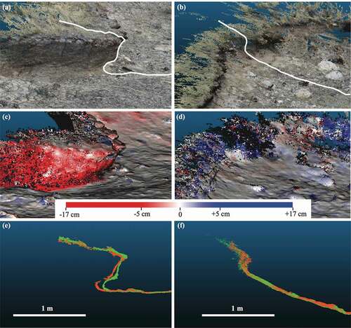
Figure 6. Examples of vegetation change from ILGRID1 (A, C, E) and LLGRID5 (B, D, F). From top to bottom, the rows show (1) the Betula nana shrubs and outlines (A–B), (2) the spatial distribution of significant change in green (C–D), and (3) the magnitude of change between the 2014 and 2016 point clouds (E, F)
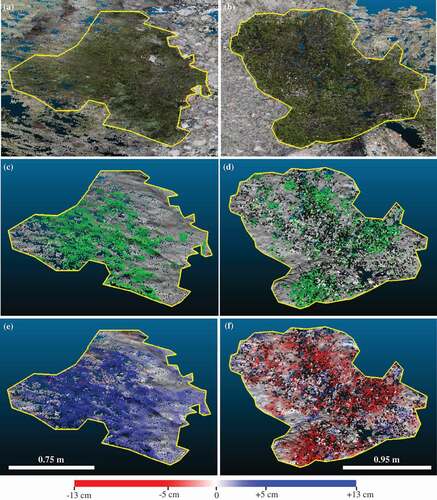
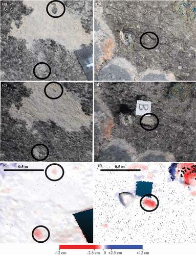
Figure 7. Examples of biological soil crust change from SLSCARP9 (A, C, E) and SLSCARP10 (B, D, F). From top to bottom, the rows show (1) the 2014 point clouds, circles highlight areas of interest (A–B); (2) the 2016 point clouds (C–D); and (3) the magnitude of change between the 2014 and 2016 point clouds (E–F)