Figures & data
Figure 1. Map of the study area on the north and east slopes of Mount Rainier, showing the approximate extent of continuous debris cover according to the methods outlined in the main text. Background image is the panchromatic band from a Landsat 8 OLI scene captured during the field study.
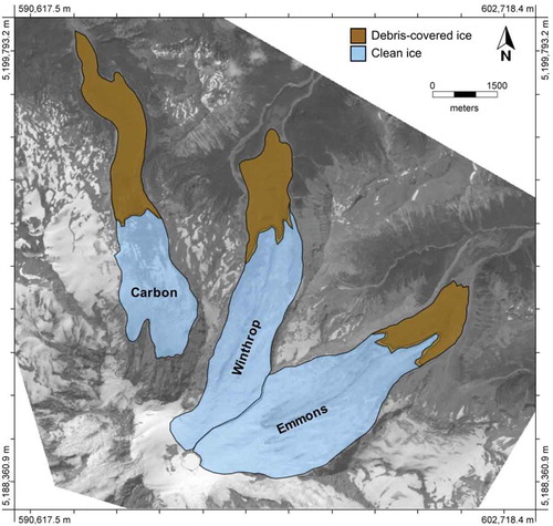
Figure 2. View across the debris-covered terminus of Emmons Glacier toward the summit of Mount Rainier (right) and Little Tahoma (left). Field measurements in 2014 took place just beyond the triangle-shaped boulder rising above the debris-covered ice in the middle ground.
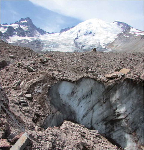
Table 1. Debris properties and observations at ablation stake sites, Emmons Glacier, August 2014.
Figure 3. Data from the temporary meteorological station and wireless temperature sensors installed on Emmons Glacier during early August 2014. (a) Air temperature 2 m above the glacier surface (left axis) and incoming shortwave radiation (right axis). (b) Debris temperature measured by thermistors (points) and Hobo pendant loggers (lines) at uniform depth intervals throughout a 0.5-m debris layer.
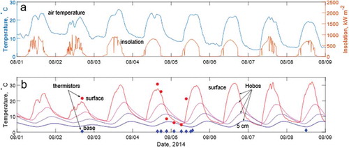
Table 2. Values of variables and constants used in simplified energy balance model (Equation 2) and satellite retrieval of thermal resistance (Equation 6).
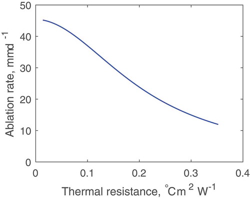
Figure 4. Ablation rate, averaged over 8 days of measurement, plotted as a function of debris thickness. Dots are field measurements, while the line represents a numerical solution of the energy balance model of Nicholson and Benn (Citation2006) driven with averaged in situ measurements of solar radiation and estimated thermal conductivity from the Emmons Glacier field site over the measurement interval. Horizontal error bars represent uncertainty in debris thickness determination, estimated as 0.25 times the largest particle diameter adjacent to the stake. Vertical error bars represent one standard deviation of the daily variation in melt rate at each stake.
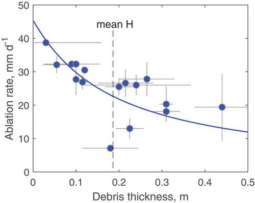
Table 3. Size and estimated debris extent of study glaciers from remote-sensing analysis.
Figure 5. Estimated thermal resistance [°C m2 W−1] of the Carbon, Winthrop, and Emmons (from upper left to lower right) debris-covered termini, overlain on a hillshade map. The color scale remains fixed over all three termini, and warmer colors indicate higher thermal resistance.
![Figure 5. Estimated thermal resistance [°C m2 W−1] of the Carbon, Winthrop, and Emmons (from upper left to lower right) debris-covered termini, overlain on a hillshade map. The color scale remains fixed over all three termini, and warmer colors indicate higher thermal resistance.](/cms/asset/fa5a84be-6ce8-4ecc-9d37-60e9f966947b/uaar_a_1582269_f0005_oc.jpg)
Figure 6. Normalized discrete (a–c) and cumulative (d) frequency distributions of thermal resistance on each debris-covered glacier terminus. Equivalent debris thickness, according to the best fit function given in the main text, is shown as an upper (nonlinear) horizontal axis for reference. The colors in the bar charts (a–c) match the color of the corresponding cumulative frequency curve (d).
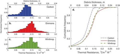
Figure 7. Modeled relationship between thermal resistance and daily ablation rate for average weather conditions observed on Emmons Glacier during 1–10 August 2014, including the apparent increase in effective thermal conductivity on thermal resistance.