Figures & data
Figure 1. Glacier areas in Southern Patagonia: Gran Campo Nevado (GCN), Santa Inés Icefield (SII), Cordillera Darwin Icefield (CDI), and Cloue Icefield on Hoste Island (HI).
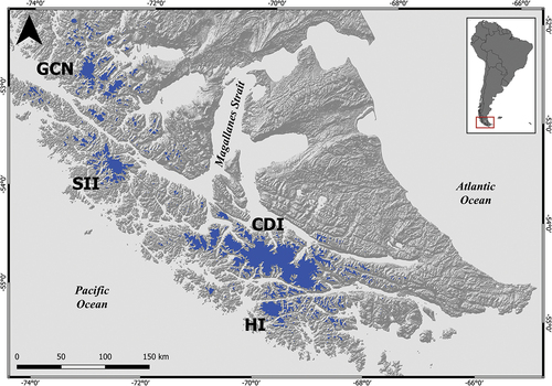
Figure 2. Glacier inventory (2020) displayed over a Sentinel-2 image from 31/03/2017 using a real color composition with the saturation enhanced using the near-infrared band. The turquoise outlines represent the 12 glaciers selected for the analysis of area changes (1945–2020) and thickness changes (2000–2014); the purple outlines correspond to the remaining glaciers of the Santa Inés Icefield; and orange lines are the 2017 ELA of each glacier.
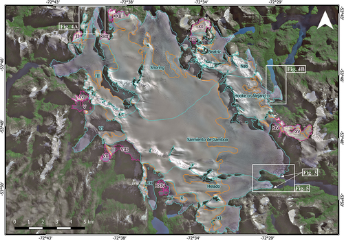
Table 1. Aerial photographs and satellite images used for the glacier inventory and area changes of Santa Inés Icefield. Imagery sources are United States Aerial Force (USAF); United States Geological Survey (USGS); European Space Agency (ESA).
Table 2. Glacier inventory. Randolph Glacier Inventory ID (RGIID); (01Region) first order region number; (GlacType) land-terminating (0), freshwater (1), tidewater (2); (Lmax) length of the longest surface flowline of each glacier; (Z) minimum, maximum, and average elevation of each glacier; Accumulation-Area Ratio (AAR).
Table 3. For the 12 selected glaciers: Surface area (km2), area change (km2; %), and annual change (km2 a−1) for the longest period available; thickness changes (ma−1; 2000–2014) obtained from SRTM (2000) and TanDEM-X (2014) digital elevation models.
Figure 3. Fronts of Helado (left) and Sarmiento de Gamboa (right) glaciers in December 2018. Photographs by Paulo Rodríguez.
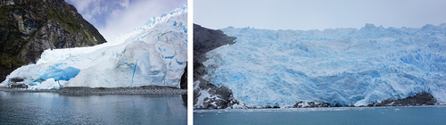
Table 4. Surface area variation and annual change for the periods with the whole Santa Inés Icefield surface area estimated.
Figure 4. Area changes (1986–2020) and thickness changes (2000–2014) of Glaciar I (Figure 4a) and Glaciar Hooke or Alejandro (Figure 4b). Thickness changes reflect an average for the whole glacier, including ablation and accumulation areas. Background image Sentinel-2 of 31/03/2017. Note that Glaciar Hooke or Alejandro (Figure 4b) shows an increase in the area in the upper zone between 1998 and 2005. However, this change most likely corresponds to the presence of seasonal snow, as the only image available for 2005 was from the beginning of austral spring (03/10/2005) when seasonal snow was still present at high elevations.
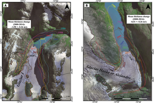
Figure 5. Area changes (1945–2020) and thickness changes (2000–2014) of Helado and Sarmiento de Gamboa glaciers. Thickness changes reflect an average for the whole glacier, including ablation and accumulation areas.
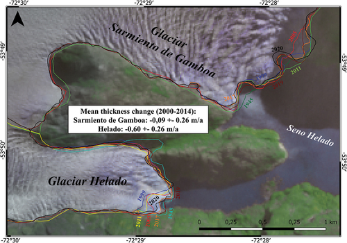
Figure 6. Thickness changes between the years 2000 (SRTM) and 2014 (TanDEM-X). The green line represents the 2017 ELA, and the red lines represent the median values in 50 meters bins to visualize the trends without the influence of outliers.
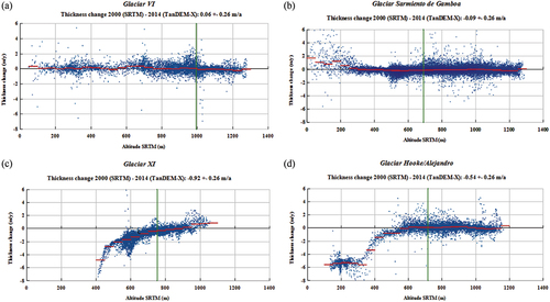
Figure 7. Average temperature at 850 mb for radiosonde observed data (garnet: summer; red: annual; orange: winter) and for ERA5 reanalysis data (purple: summer; blue: annual; turquoise: winter) at Punta Arenas between 2000 and 2016.
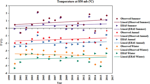
Table 5. Surface area, volume, average thickness, and response time of the twelve glaciers analyzed.
Figure 8. Glacier inventory comparison displayed on the Sentinel-2 image of 31/03/2017 using a real color composition with enhanced saturation using the near-infrared band. The staggered yellow line indicates the inventory of Meier, Hochreuther, and Braun (Citation2018), while the pink line shows our glacier inventory.
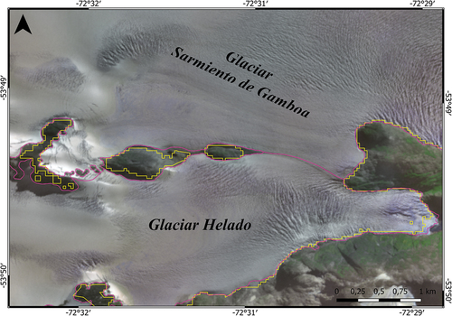
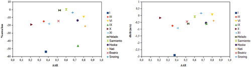
Figure 9. Accumulation Area Ratio (AAR) vs area loss (%) and mean elevation change (ma−1) for the 12 glaciers.