
Figures & data
Table 1. Clinical characteristics of the NPC patients.
Figure 1. Construction of two m6A-related subclasses in NPC A. The workflow of this study. B. Forest plot showing the results of the Univariate Cox regression analysis between m6A regulators and PFS. C. Consensus matrices of the GSE102349 dataset for k = 2. D-E. T-SNE analyses show the stratification into two m6A-related subclasses of GSE102349 and GSE53819 datasets. F. Submap matrix analysis validated the similarity of molecular classes from GSE102349 and GSE102349 datasets.G. The expression of 10 prognostic-related m6A regulators (IGF2B1, ALKBH5, YTHDF2, ELAVL1, WTAP, LRPPRC, HNRNPA2B1, CBLL1, RBM15B, YTHDF1) between two m6A-related subclasses. H. Kaplan-meier survival plot showing the PFS between two m6A-related subclasses.
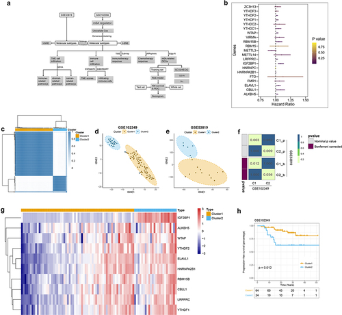
Table 2. Identification of 21 m6A regulators with prognostic significance in the GSE102349 dataset based on Univariate Cox analysis.
Table 3. Clinical characteristics of NPC patients from GSE102349 dataset in distinct subclasses.
Figure 2. Characteristics analysis of tme cell infiltration in two m6a-related subclasses a. heatmap showing gsva enrichment analysis of the various pathways between two m6a-related subclasses. b. heatmap showing gsva enrichment analysis of the biological processes between two m6a-related subclasses.C. heatmap showing gsva enrichment analysis of 50 hallmark cancer-related pathways between two m6a-related subclasses.D. heatmap showing gsva enrichment analysis of oncogenic and TME cell-infiltrating related pathways between two m6a-related subclasses.E. boxplot showing the distinction of oncogenic and TME cell-infiltrating related pathways between two m6a-related subclasses.
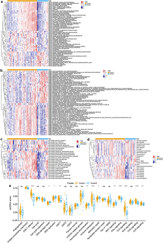
Figure 3. Immune infiltration characterization in two m6A-related subclasses a-c. Violin plot indicating stromal score, immune score and estimate score between two m6A-related subclasses. d. Heatmap showing the TME cell infiltrating between two m6A-related subclasses. e. Boxplot showing distinct TME cell infiltrating between two m6A-related subclasses. f. The staked abundance of immune cells between two m6A-related subclasses. g. Differences in immune cells between two m6A-related subclasses.
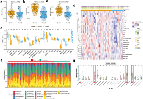
Figure 4. Correlation of the two m6A-related subclasses and the immunotherapy responses a. Boxplot indicating the distinct expression of HLA genes (HLA-A/B/C/E/F/G/DRB1/DQB1/DQA1/DPB1/DRA/DRB5/DPA1/DMA/DMB/DQA2/DOA/DQB2/DOB) between two m6A-related subclasses. b. Boxplot indicating the distinct expression of immune checkpoints (IDO1, PD-L1 (CD274), PD-L2 (PDCD1LG2), TIM-3 (HAVCR2), PD-1 (PDCD1), CTLA-4, CD80, CD86) between two m6A-related subclasses. c. Violin plot indicating TIDE score between two m6A-related subclasses. D. Submap matrix analysis showing response to checkpoint inhibitors PD-1 and CTLA4 in between two m6A-related subclasses.
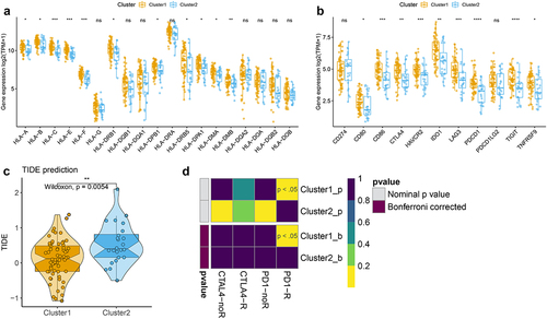
Figure 5. Correlation of the two m6A-related subclasses and chemotherapy response a-d. Violin plot showing IC50 value of BMS.708163, ATRA, temsirolimus, and methotrexate for each patient from two m6A-related subclasses.
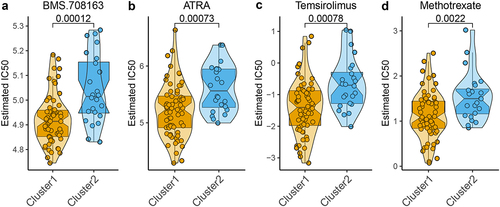
Figure 6. Identification of the DEGs and their function enrichment in two m6A-related subclasses a. Volcano plot showing the DEGs between two m6A-related subclasses. b. Heatmap showing the DEGs between two m6A-related subclasses. c. Bubble plot indicating the GO enrichment of DEGs between two m6A-related subclasses, including top 10 biological processes (BP), top 10 cellular components (CC), and top 10 molecular functions (MF) terms. d. Bubble plot indicating the KEGG pathways enrichment of DEGs between two m6A-related subclasses.
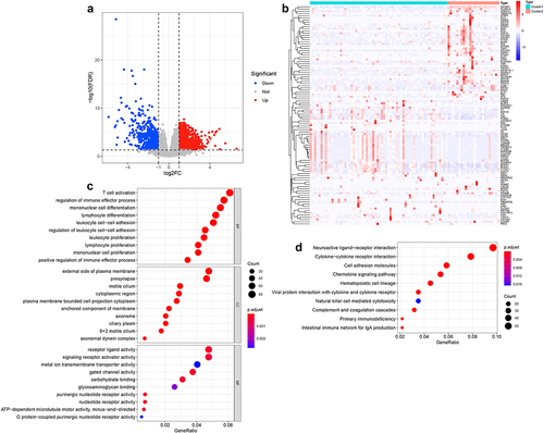
Table 4. Univariate Cox regression analysis of m6A-related DEGs associated to survival in GSE102349 dataset.
Figure 7. Identification of m6A-related prognostic signature in NPC A. Least absolute shrinkage and optimal LASSO coefficients of the 160 DEGs. B. Determination of the number of factors by the LASSO regression analysis. C. The sheet of showing the LASSO coefficients of four genes (REEP2, TMSB15A, DSEL, and ID4). D-F. The differences between high-risk score and low-risk score groups both in the training set, test set, and whole set. Upper: the distribution of risk core. Middle: the survival status of patients both in the high-risk score and low-risk score groups. Bottom: heatmap showing expression of m6A-related prognostic signature both in the high-risk score and low-risk score groups. G-I. Kaplan-Meier survival plot showing the PFS between high-risk score and low-risk score groups in the training set, test set, and the whole set. J-L. ROC curves indicate the 1-, 2-, 3-years survival of NPC patients both in the training set, test set, and whole set.
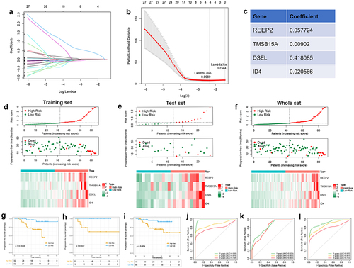
Figure 8. Validation of the expression of the DSEL, ID4, REEP2, and TMSB15A in NPC. a-b. IHC analyses of the levels of DSEL, ID4, REEP2, and TMSB15A in NPC samples (n = 255) compared with non-tumor samples (n = 255) (scale bars = 100 μm). c. Correlation between the levels of DSEL, ID4, REEP2, and TMSB15A and TNM stages. d. Kaplan-meier curves showing the OS of the NPC patients with high- and low-expression of DSEL, ID4, REEP2, and TMSB15A. ****, p < .0001.
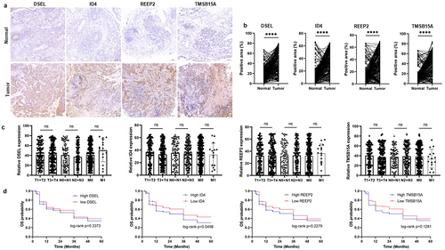
Figure 9. Development of a predicated model for NPC A. A predicating nomogram predicting PFS of NPC patients. B-E. Calibration plots assess the accuracy and specificity of the prognostic nomogram.F. Heatmap showing the correlation between prognostic signature and 10 m6A regulators.
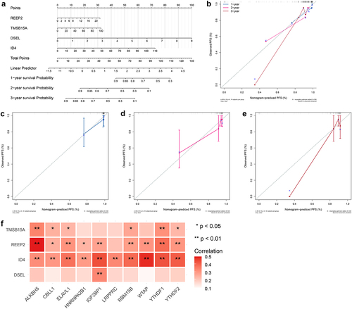
Figure 10. GSEA and transcription factor prediction of DSEL, ID4, REEP2, and TMSB15A a. TOP 10 KEGG enrichment of GSEA for DSEL, b.TOP 10 KEGG enrichment of GSEA for ID4, c.TOP 10 KEGG enrichment of GSEA for REEP2, d.TOP 10 KEGG enrichment of GSEA for TMSB15A, e. Transcription factor prediction of DSEL, ID4, REEP2, and TMSB15A.
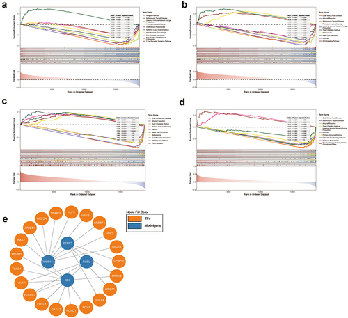
Table 5. TOP 10 KEGG enrichment of GSEA for DSEL.
Table 6. TOP 10 KEGG enrichment of GSEA for ID4.
Table 7. TOP 10 KEGG enrichment of GSEA for REEP2.
Table 8. TOP 10 KEGG enrichment of GSEA for TMSB15A.